Making a machine learning project in Python. Part 1

Translation of A Complete Machine Learning Project Walkthrough in Python: Part One .
When you read a book or listen to a training course on data analysis, there is often a feeling that there are some parts of a picture that do not come together in front of you. You may be intimidated by the prospect of taking the next step and completely solving some problem using machine learning, but with the help of this series of articles you will gain confidence in the ability to solve any problem in the field of data science.
')
In order to finally create a complete picture in your head, we suggest that you analyze the project of using machine learning using real data from beginning to end.
Let's go through the stages:
- Cleaning and formatting data.
- Exploratory data analysis.
- Design and selection of features.
- Comparison of metrics of several machine learning models.
- Hyperparametric adjustment of the best model.
- Evaluate the best model on the test dataset.
- Interpreting the results of the model.
- Conclusions and work with documents.
You will learn how the stages go into one another and how to implement them in Python. The whole project is available on GitHub, the first part is here. In this article we will look at the first three stages.
Task Description
Before writing code, you need to understand the problem being solved and the available data. In this project, we will be working with shared energy efficiency data for buildings in New York.
Our goal is to use the available data to build a model that predicts the amount of Energy Star Score for a particular building, and interpret the results to find the factors that affect the final score.
The data already includes Energy Star Score scores, so our task is machine learning with controlled regression:
- Managed (Supervised): we know the signs and the goal, and our task is to train a model that can match the first with the second.
- Regression: The Energy Star Score is a continuous variable.
Our model must be accurate - so that it can predict the value of the Energy Star Score close to true, and interpreted - so that we can understand its predictions. Knowing the target data, we can use it when making decisions as we go deeper into the data and create a model.
Data cleansing
Not every dataset is a perfectly matched set of observations, without anomalies and missing values (hint of datasets mtcars and iris ). There is little order in real data, so before proceeding with the analysis, they need to be cleaned and brought to an acceptable format. Data cleansing is an unpleasant, but mandatory procedure for solving most data analysis tasks.
First, you can load data as a Pandas data frame (dataframe) and examine it:
import pandas as pd import numpy as np # Read in data into a dataframe data = pd.read_csv('data/Energy_and_Water_Data_Disclosure_for_Local_Law_84_2017__Data_for_Calendar_Year_2016_.csv') # Display top of dataframe data.head() 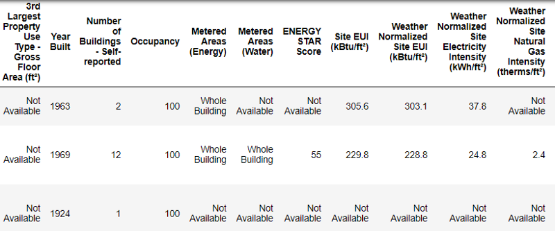
This is the real data.
This is a fragment of a table of 60 columns. Even here there are several problems: we need to predict
Energy Star Score , but we do not know what all these columns mean. Although this is not necessarily a problem, because it is often possible to create an exact model without knowing anything about variables at all. But interpretability is important to us, so you need to figure out the value of at least a few columns.When we received this data, we did not ask about the values, but looked at the file name:

and decided to search for "Local Law 84". We found this page , which said that we are talking about the law in force in New York, according to which the owners of all buildings of a certain size must report on energy consumption. Further search helped find all the values of the columns . So do not neglect the file names, they can be a good starting point. In addition, this is a reminder that you do not hurry and do not miss something important!
We will not study all the columns, but we’ll just look at the Energy Star Score, which is described as follows:
The ranking is based on percentiles from 1 to 100, which is calculated based on the energy consumption reports for the year independently filled in by the building owners. Energy Star Score is a relative measure used to compare the energy efficiency of buildings.
The first problem was solved, but the second remained - missing values marked as “Not Available”. This is a string value in Python, which means that even strings with numbers will be stored as
object data types, because if there is a string in the column, Pandas converts it into a column that consists entirely of strings. The types of data columns can be found using the dataframe.info() method: # See the column data types and non-missing values data.info() 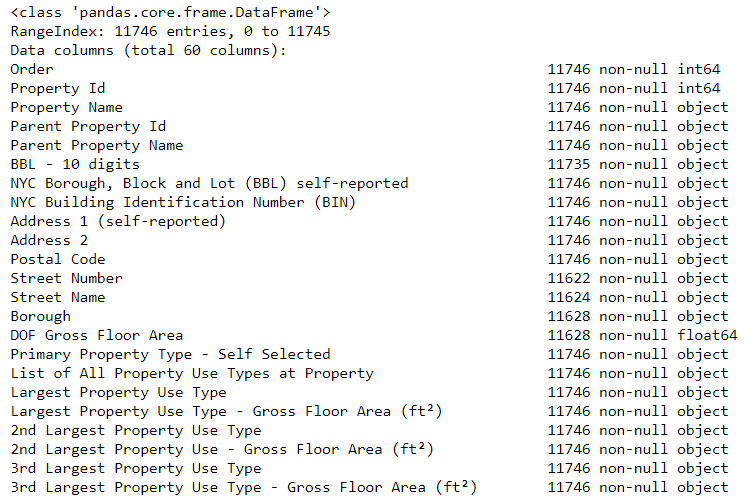
Certainly some columns that explicitly contain numbers (for example, ft²) are saved as objects. We cannot apply numerical analysis to string values, so we convert them into numeric data types (especially
float )!This code first replaces all “Not Available” with not a number (
np.nan ), which can be interpreted as numbers, and then converts the contents of certain columns into the float type: # Replace all occurrences of Not Available with numpy not a number data = data.replace({'Not Available': np.nan}) # Iterate through the columns for col in list(data.columns): # Select columns that should be numeric if ('ft²' in col or 'kBtu' in col or 'Metric Tons CO2e' in col or 'kWh' in col or 'therms' in col or 'gal' in col or 'Score' in col): # Convert the data type to float data[col] = data[col].astype(float) When the values in the corresponding columns become numbers, we can begin to explore the data.
Missing and anomalous data
Along with incorrect data types, one of the most common problems is missing values. They can be absent for various reasons, and before training the model, these values must either be filled in or deleted. First, let's find out how much we lack in each column (the code is here ).
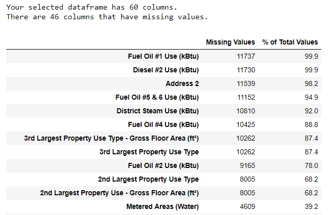
To create a table, a function from a branch on StackOverflow is used .
It is always necessary to remove information with caution, and if there are no many values in the column, then it probably will not benefit our model. The threshold after which it is better to throw out the columns depends on your task ( here is a discussion ), and in our project we will delete columns that are more than half empty.
Also at this stage it is better to remove the anomalous values. They may occur due to typos during data entry or due to errors in the units of measurement, or they may be correct but extreme values. In this case, we will remove the "extra" values, guided by the definition of extreme anomalies :
- Below the first quartile - 3 ∗ interquartile range.
- Above the third quartile + 3 ∗ interquartile range.
The code that removes columns and anomalies is shown in a notebook on Github. Upon completion of the data cleansing process and the removal of anomalies, we have more than 11,000 buildings and 49 signs left.
Exploratory data analysis
A boring, but necessary stage of data cleaning is over, you can proceed to the study! Exploratory data analysis (AHR) is a time-unlimited process, during which we calculate statistics and look for trends, anomalies, patterns, or relationships in the data.
In short, AHRF is an attempt to figure out what the data can tell us. Usually the analysis begins with a superficial review, then we find interesting fragments and analyze them in more detail. The findings may be interesting in their own right, or they may contribute to the choice of model, helping to decide which signs we will use.
Single variable charts
Our goal is to predict the value of the Energy Star Score (renamed “
score ” in our data), so it makes sense to start by examining the distribution of this variable. A histogram is a simple but effective way to visualize the distribution of a single variable, and it can be easily constructed using matplotlib . import matplotlib.pyplot as plt # Histogram of the Energy Star Score plt.style.use('fivethirtyeight') plt.hist(data['score'].dropna(), bins = 100, edgecolor = 'k'); plt.xlabel('Score'); plt.ylabel('Number of Buildings'); plt.title('Energy Star Score Distribution'); 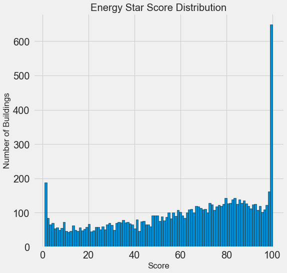
It looks suspicious! The Energy Star Score is a percentile, so you should expect a uniform distribution when each score is assigned to the same number of buildings. However, a higher and lower number of buildings received a disproportionately large number of buildings (for Energy Star Score, the more, the better).
If we look again at the definition of this score, we will see that it is calculated on the basis of “self-filled in by building owners of reports”, which may explain the excess of very large values. Asking building owners to report their energy use is like asking students to report their grades in exams. So this is probably not the most objective criterion for assessing the energy efficiency of real estate.
If we had an unlimited supply of time, it would be possible to find out why so many buildings received very high and very low scores. To do this, we would have to select the appropriate buildings and carefully analyze them. But we only need to learn how to predict points, and not to develop a more accurate assessment method. You can mark yourself that the points have a suspicious distribution, but we will focus on forecasting.
Relationship Search
The main part of the AHRF is the search for interrelations between signs and our goal. The variables that correlate with it are useful for use in the model because they can be used for prediction. One way to study the effect of the categorical variable (which accepts only a limited set of values) on the goal is to plot the density using the Seaborn library.
The density graph can be considered a flattened histogram , because it shows the distribution of a single variable. You can color individual classes on the graph to see how the categorical variable changes the distribution. This code builds the Energy Star Score density chart, colored according to the building type (for a list of buildings with more than 100 measurements):
# Create a list of buildings with more than 100 measurements types = data.dropna(subset=['score']) types = types['Largest Property Use Type'].value_counts() types = list(types[types.values > 100].index) # Plot of distribution of scores for building categories figsize(12, 10) # Plot each building for b_type in types: # Select the building type subset = data[data['Largest Property Use Type'] == b_type] # Density plot of Energy Star Scores sns.kdeplot(subset['score'].dropna(), label = b_type, shade = False, alpha = 0.8); # label the plot plt.xlabel('Energy Star Score', size = 20); plt.ylabel('Density', size = 20); plt.title('Density Plot of Energy Star Scores by Building Type', size = 28); 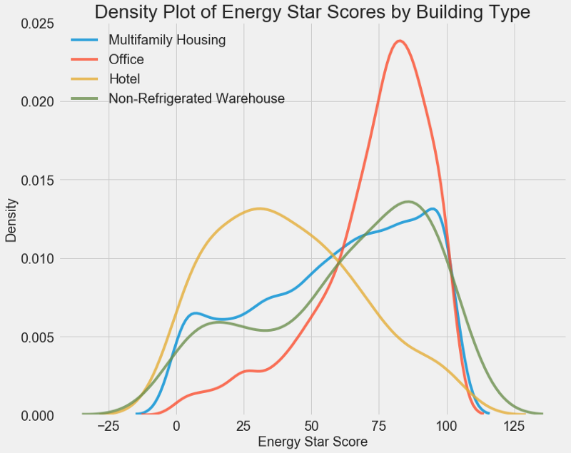
As you can see, the type of building greatly affects the number of points. Office buildings usually have a higher score, and hotels lower. So you need to include the type of building in the model, because this feature affects our goal. As a categorical variable, we must perform one-hot coding of the building type.
A similar graph can be used to estimate the Energy Star Score by areas of the city:
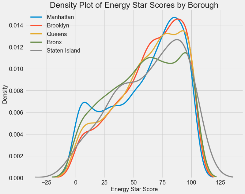
The area does not affect the score as much as the type of building. Nevertheless, we will include it in the model, because there is a slight difference between the districts.
To calculate the relationships between variables, you can use the Pearson correlation coefficient . This is a measure of the intensity and direction of the linear relationship between two variables. A value of +1 means a perfectly linear positive relationship, and -1 means a perfectly linear negative relationship. Here are some examples of Pearson correlation coefficient values:

Although this coefficient cannot reflect non-linear dependencies, it is possible to begin an assessment of the interrelationships of variables. In Pandas, you can easily calculate correlations between any columns in a data frame (dataframe):
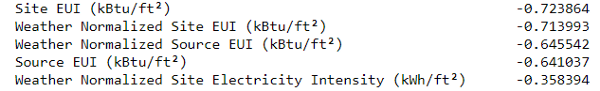
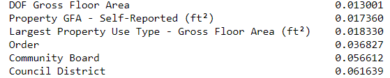
# Find all correlations with the score and sort correlations_data = data.corr()['score'].sort_values() The most negative correlations with the goal:
and the most positive ones:
There are several strong negative correlations between the signs and the goal, and the largest of them belong to different EUI categories (methods for calculating these indicators differ slightly). EUI (Energy Use Intensity ) is the amount of energy consumed by a building divided by square foot square. This specific value is used to assess energy efficiency, and the smaller it is, the better. Logic dictates that these correlations are justified: if the EUI increases, then the Energy Star Score should decrease.
Two-variable charts
We use scatter diagrams to visualize the relationship between two continuous variables. Additional information can be added to the point colors, for example, a categorical variable. The following shows the relationship between the Energy Star Score and the EUI, the different building types are indicated in color:
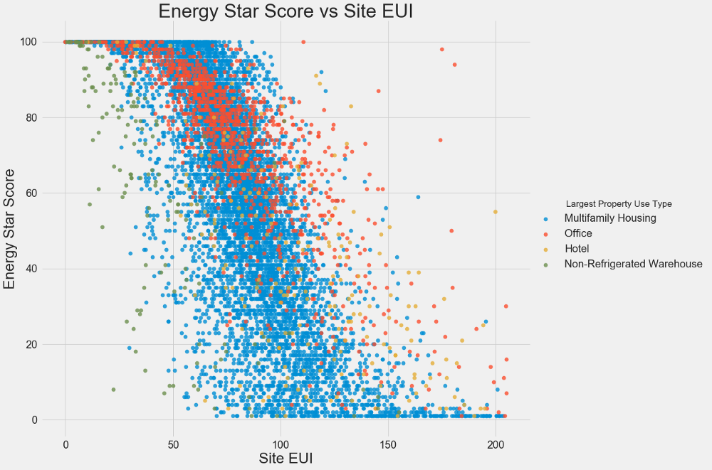
This graph allows you to visualize the correlation coefficient of -0.7. As the EUI decreases, the Energy Star Score increases, this relationship is observed in buildings of different types.
Our latest research schedule is called Pairs Plot . This is a great tool to see the relationships between different pairs of variables and the distribution of single variables. We will use the Seaborn library and the PairGrid function to create a pairwise graph with a scatter diagram in the upper triangle, with a histogram diagonally, a two-dimensional kernel density diagram, and correlation coefficients in the lower triangle.
# Extract the columns to plot plot_data = features[['score', 'Site EUI (kBtu/ft²)', 'Weather Normalized Source EUI (kBtu/ft²)', 'log_Total GHG Emissions (Metric Tons CO2e)']] # Replace the inf with nan plot_data = plot_data.replace({np.inf: np.nan, -np.inf: np.nan}) # Rename columns plot_data = plot_data.rename(columns = {'Site EUI (kBtu/ft²)': 'Site EUI', 'Weather Normalized Source EUI (kBtu/ft²)': 'Weather Norm EUI', 'log_Total GHG Emissions (Metric Tons CO2e)': 'log GHG Emissions'}) # Drop na values plot_data = plot_data.dropna() # Function to calculate correlation coefficient between two columns def corr_func(x, y, **kwargs): r = np.corrcoef(x, y)[0][1] ax = plt.gca() ax.annotate("r = {:.2f}".format(r), xy=(.2, .8), xycoords=ax.transAxes, size = 20) # Create the pairgrid object grid = sns.PairGrid(data = plot_data, size = 3) # Upper is a scatter plot grid.map_upper(plt.scatter, color = 'red', alpha = 0.6) # Diagonal is a histogram grid.map_diag(plt.hist, color = 'red', edgecolor = 'black') # Bottom is correlation and density plot grid.map_lower(corr_func); grid.map_lower(sns.kdeplot, cmap = plt.cm.Reds) # Title for entire plot plt.suptitle('Pairs Plot of Energy Data', size = 36, y = 1.02); 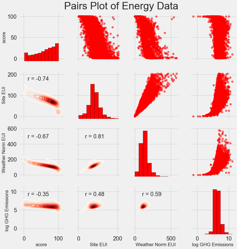
To see the relationship of variables, look for the intersection of rows and columns. Suppose you need to look at the
Weather Norm EUI correlation and score , then we look for the Weather Norm EUI series and the score column, at the intersection of which the correlation coefficient is -0.67. These graphs not only look great, but also help to select variables for the model.Design and selection of features
Designing and selecting features often brings the greatest return in terms of the time spent on machine learning. First we give the definitions:
- Designing traits: the process of extracting or creating new traits from raw data. To use variables in a model, you may have to convert, say, take the natural logarithm, or extract the square root, or apply one-hot coding of categorical variables. Designing features can be viewed as creating additional features from raw data.
- Feature Selection: the process of selecting the most relevant features from the data, during which we remove some features to help the model better summarize the new data for the sake of a more interpretable model. The choice of signs can be considered as the removal of "excess", so that only the most important remains.
The machine learning model can only learn from the data we provide, so it is crucial to make sure that we include all the information relevant to our task. If you do not provide the model with correct data, it will not be able to learn and will not produce accurate predictions!
We will do the following:
- Apply to categorical variables (quarter and type of property) one-hot coding.
- Add the taking of the natural logarithm of all numeric variables.
One-hot coding is necessary to include categorical variables in the model. The machine learning algorithm will not be able to understand the type of “office”, so if the building is office, we will assign it sign 1, and if not office, then 0.
Adding transformed attributes will help the model learn about non-linear relationships within the data. In data analysis, it is normal practice to extract square roots, take natural logarithms, or somehow transform the signs , it depends on the specific task or your knowledge of the best techniques. In this case, we add the natural logarithm of all numeric characters.
This code selects numeric attributes, calculates their logarithms, selects two categorical attributes, applies one-hot coding to them, and combines both sets into one. Judging by the description, there is a lot of work to be done, but in Pandas everything is pretty simple!
# Copy the original data features = data.copy() # Select the numeric columns numeric_subset = data.select_dtypes('number') # Create columns with log of numeric columns for col in numeric_subset.columns: # Skip the Energy Star Score column if col == 'score': next else: numeric_subset['log_' + col] = np.log(numeric_subset[col]) # Select the categorical columns categorical_subset = data[['Borough', 'Largest Property Use Type']] # One hot encode categorical_subset = pd.get_dummies(categorical_subset) # Join the two dataframes using concat # Make sure to use axis = 1 to perform a column bind features = pd.concat([numeric_subset, categorical_subset], axis = 1) We now have over 11,000 observations (buildings) with 110 columns (features). Not all signs will be useful for predicting Energy Star Score, so let's take a choice of signs and remove some of the variables.
Feature selection
Many of the 110 signs available are redundant because they are strongly correlated with each other. For example, here is a graph of the EUI and Weather Normalized Site EUI, in which the correlation coefficient is 0.997.
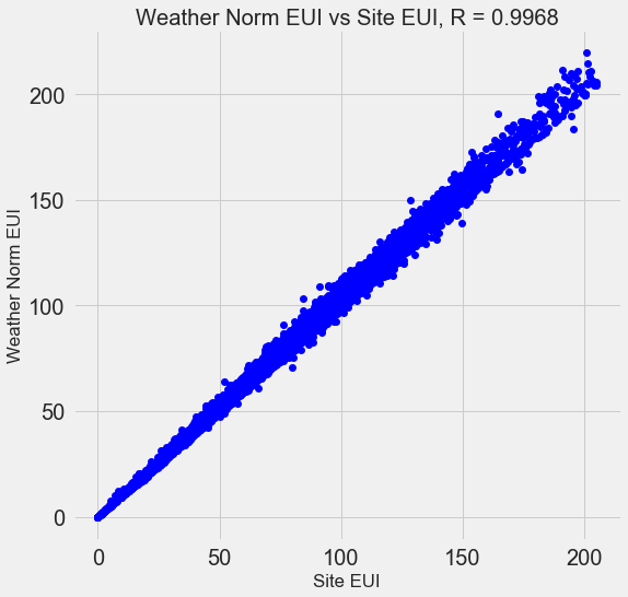
Signs that strongly correlate with each other are called collinear . Removing one variable in such pairs of attributes often helps the model to generalize and be more interpretable . Please note that this is a correlation of some signs with others, and not a correlation with a goal that would only help our model!
There are a number of methods for calculating the collinearity of features, and one of the most popular is the variance inflation factor . We use the B-correlation coefficient (thebcorrelation coefficient) to find and remove collinear signs. Drop one pair of signs if the correlation coefficient between them is greater than 0.6. The code is in notepad (and in response to Stack Overflow ).
This value looks arbitrary, but in fact I tried different thresholds, and the one above allowed me to create the best model. Machine learning is empirical , and one often has to experiment to find the best solution. After choosing, we have 64 signs left and one goal.
# Remove any columns with all na values features = features.dropna(axis=1, how = 'all') print(features.shape) (11319, 65) Choose a baseline
We cleared the data, conducted an exploratory analysis, and constructed the signs. And before proceeding to the creation of a model, you need to select the initial baseline (naive baseline) - a kind of assumption with which we will compare the results of the models. If they are below the base level, we will assume that machine learning is not applicable to the solution of this problem, or that we need to try a different approach.
For regression problems, as a baseline, it is reasonable to guess the median goal value on the training set for all examples in the test set. These kits set a barrier that is relatively low for any model.
As a metric, we take the average absolute error (mae) in the predictions. There are many other metrics for regressions, but I like the advice of choosing one metric and evaluating models with it. And the mean absolute error is easy to calculate and interpret.
Before calculating the base level, you need to split the data into training and test suites:
- The training set of features is that we provide our model along with the answers during the training. The model must learn the consistency of the target.
- A test feature set is used to evaluate a trained model. When she processes the test set, she does not see the correct answers and should predict based only on the available signs. We know the answers for the test data and can compare the prediction results with them.
For training use 70% of the data, and for testing - 30%:
# Split into 70% training and 30% testing set X, X_test, y, y_test = train_test_split(features, targets, test_size = 0.3, random_state = 42) Now we calculate the indicator for the original base level:
# Function to calculate mean absolute error def mae(y_true, y_pred): return np.mean(abs(y_true - y_pred)) baseline_guess = np.median(y) print('The baseline guess is a score of %0.2f' % baseline_guess) print("Baseline Performance on the test set: MAE = %0.4f" % mae(y_test, baseline_guess)) The baseline guess is a score of 66.00
Baseline Performance on the test set: MAE = 24.5164
The average absolute error on the test set was about 25 points. As we estimate in the range from 1 to 100, the error is 25% - a rather low barrier for the model!
Conclusion
You of this article went through the first three stages of solving a problem using machine learning. After setting the problem, we:
- Cleared and formatted raw data.
- Conducted an exploratory analysis to examine the available data.
- We developed a set of attributes that we will use for our models.
, , .
Scikit-Learn , .
Source: https://habr.com/ru/post/425253/
All Articles