CSS Grid - Swiss Army Knife for Website and Application Layouts
Over the past two months, I have gone deep into learning CSS Grid. In this post I want to share my main points. To make it clearer, I will explain everything with diagrams.
You are probably already familiar with the block CSS model for regular elements. Let's start with a similar “general review” for the CSS Grid:
At the heart of the CSS Grid structure is the main container, which is a regular
In this case, we have 3
')
Note that the lines can be counted in the opposite direction, using a negative coordinate system.
The grid from the example above is 5 by 4 cells. This is defined as follows:
The number of rows and columns is determined according to the set values. Lines and extra padding are located between the cells. The rows and columns between the lines are called grid bars. The number of lines will always be equal to [the number of cells + 1] in a given direction. So 5 columns will have 6 lines, while 4 lines will have 5 lines. In the following example, we see 7 columns and only 1 row:
One of the first features that can be noted in the CSS grid behavior (by default, the CSS grid has no border, so lines 1 from top to bottom and 1 from left to right start in the upper left corner of the first element, no indent is applied to them; the grid line is placed in the middle of the indent; even if the
First, it should be noted regarding the CSS grid that the external lines do not depend on the size of the interval. Internal lines only. We will take a closer look at this later when we look at the fractional ( fr ) units.
The CSS grid is two dimensional. Elements can be placed horizontally (column) or vertically (row). Set the value of the
It works the same way as Flex:
Use
Imagine an abstract grid:
So, we have a general idea of how this works.
The creative part begins when you are faced with the problem of juggling element placement to create a responsive layout. CSS Grid offers several features to achieve this. We will look at them in the next section of this note.
Let's consolidate the knowledge gained by looking at a few examples:
I used only two
But what happens if we add another item to the list?
Adding item 3 to the same layout will automatically expand it (blue item). This new space is created automatically by copying the values from the first row. Let's add element 4?
Again, the CSS grid decided to stretch element 4 to the remaining space in the second line. This happened because
The placement of the blue elements was not indicated by you explicitly. This is an implicit (automatic) placement. Elements just fall into this space.
This is what you would expect from cells if you set values for all list items:
In fact, you can control the size in all consecutive rows by adding more values using the
CSS Grid offers several properties to automatically stretch cells by variable / unknown value. Here are the main examples of automatic extensions for columns and rows:
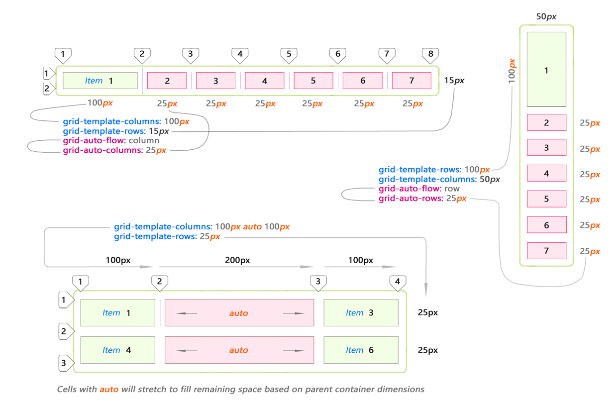
The bottom example shows the use of the auto keyword. This means that the cell will stretch to fill the entire remaining space in the parent container after it is filled with explicit elements.
Speaking of CSS Grid, it is impossible to ignore the indents. Padding is the space horizontally and vertically between the grid cells.
The intervals are controlled by the

You can use different indents for both directions. This can be useful for creating video or image galleries:

Indents for different directions (between columns and rows) may differ. But the size of the interval is indicated once for the entire grid in a given direction. As you can see, indents of different sizes for one direction are not allowed:
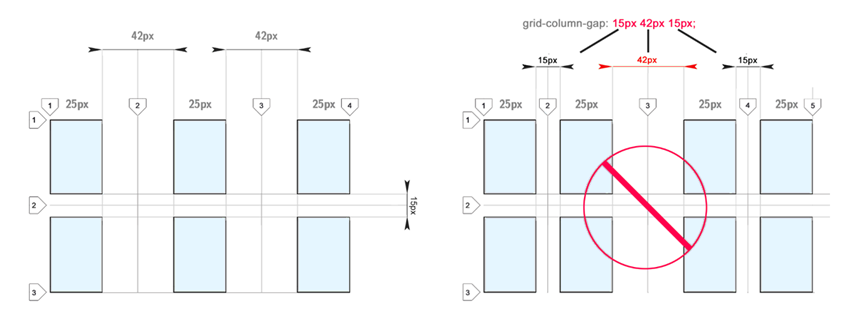
I would like to be able to set different sizes of indents. I think it would be convenient. Some suggest using blank bands to achieve a similar effect.
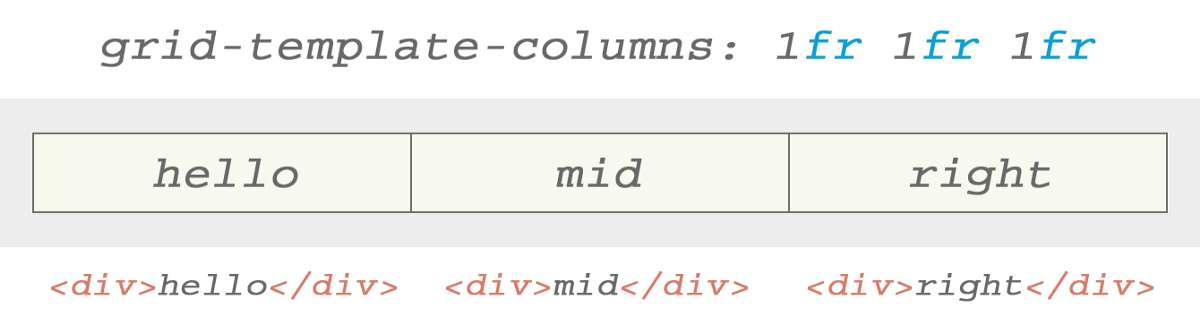
Fractional parts ( fr ) are unique to the CSS Grid. The fractional part allocates space depending on the remaining elements in the parent container:
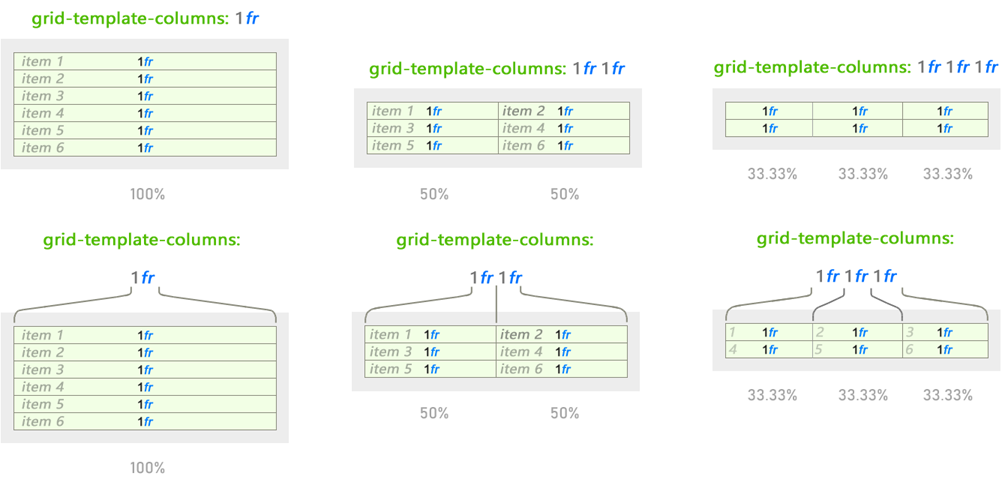
The behavior changes, but 1fr remains unchanged, regardless of the use of other values. The fractional part works like percentage values, but is easier and more intuitive when dividing the space:
The behavior of changing fractional units is based on all values presented for this direction.
In this example, for clarity, only the behavior for the columns is shown. But it works the same for strings. Just use the
The space defined by fractional parts is changed based on indents. The same value of 1fr within the same parent container will be reduced to a smaller size when the intervals are added:
We added spacing between cells given by units fr
As we can see, this gives us a pretty good set of tools for placing content at intervals almost as you please, without worrying about the values in pixels.
These new changes leave pixel-by-pixel design in the past. Now we think about design using an intuitive approach.
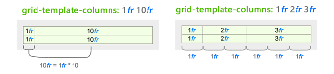
Finally, it gives interesting ideas about the use of non-integer fr - look at the funny grid I created. You can define a grid using also numbers with a comma:
We just looked at the CSS Grid structure. I hope you got an idea of how the content in CSS Grid is structured. Now we have to show imagination and place some elements inside the grid. After that, the standard CSS grid behavior may change. How this happens, we now consider.
To order elements within cells or grid layout areas, you must refer to them along the lines between the cells. No
CSS Grid allows you to use spacing to determine the width and height of the content area (in cell space), just as it does in a table. We will touch it. But you can and probably should indicate the starting cell using the line number or its name (more on this later). It depends on your preference.
Regarding the placement of content on several cells, the most obvious and attractive is the union of cells.
You can combine elements in multiple cells.
Important : the union changes the location of the surrounding elements.
We use the
The blue elements changed position after several cells were merged to place element 7. The orange elements were pushed to the next row.
There is another way to do the same.
...
I deleted items after 15 (orange), because they are no longer needed:
Set these properties directly for the element to which they are to be applied.
Stretching the contents of columns and rows works in both directions.
The values of
Let's look at this sample. This is our starting point. We change the situation a bit to see how the min / max values affect the cells.
Let's see what results will be obtained if we change one of the columns using
With the text from one word there is no difference between the results, whether we use
But everything becomes more interesting for more complex text. The following example demonstrates the key idea for
Here
I noticed that by default the text was centered when I used
I put an image of a blue rose in a cell. And, as expected, the grid has expanded to allocate enough space for the image:
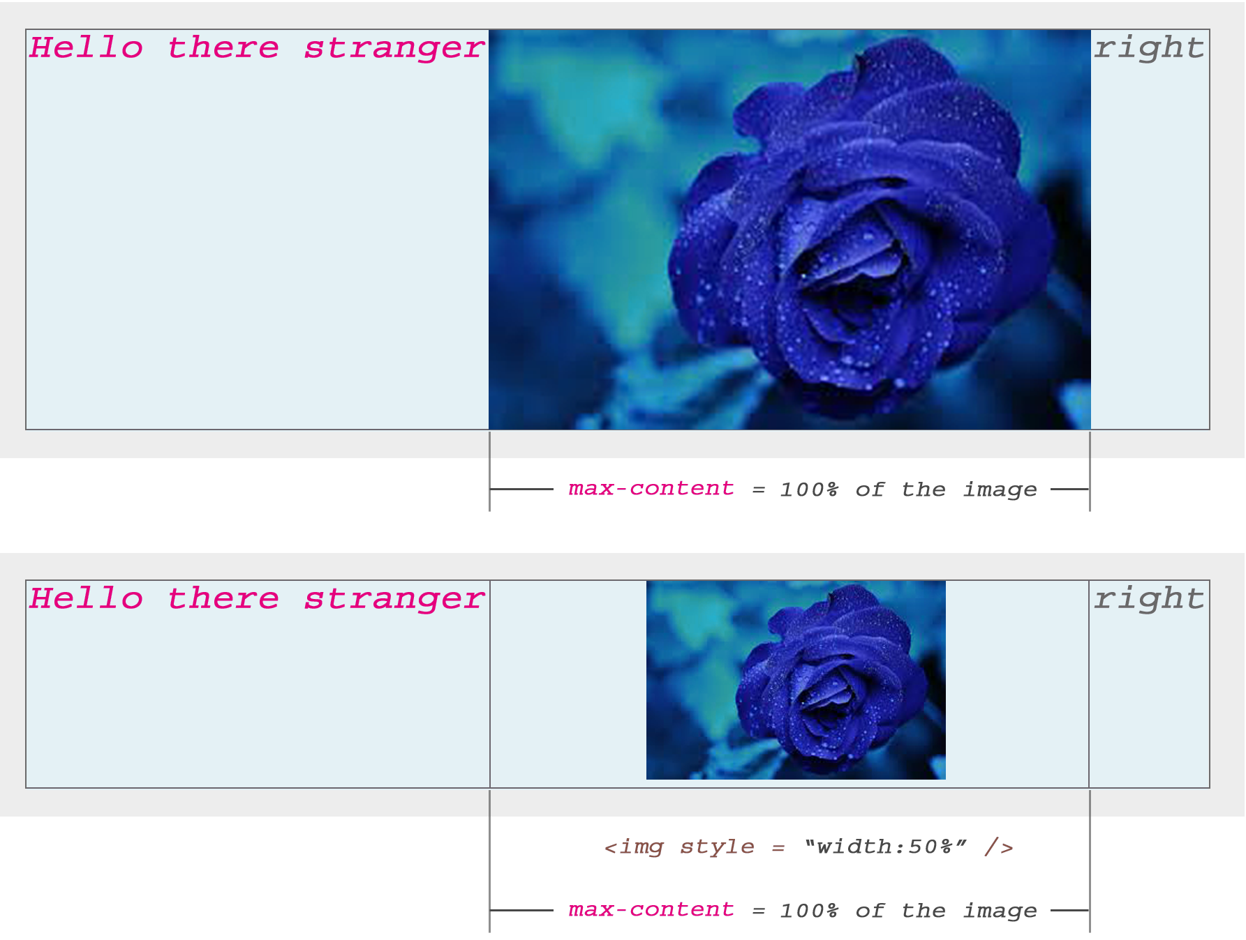
When I set the image exactly 50%, just to see the result, the CSS Grid still retains the cell width at 100% of the image size, but displays it with a width of 50% (as expected) and automatically centers it horizontally inside the cell .
Both text and image (or other content) will automatically be centered in the CSS Grid cells by default.
Up to this point we have talked in general about the structure of the CSS Grid. Next, we consider how to achieve "multidirectional" displacement within the cell. Of course, we will not use the
I do not think that the specificity of the CSS Grid calls us to this. However, it is possible to set the offset within 360 °.
It works the same with lowercase and block elements! I think this is my favorite feature from the entire set of CSS Grid.
All 9 combinations are possible using the
This property helps to position the content vertically.
Use
Use
Use
This property helps to position the content horizontally.
Use
Use
Use
You can use any of the 9
Area patterns are defined using the
Notice that the area patterns for each line are enclosed in double quotes. Each column is separated by a space. In this example, I just explained how to name the windows. To truly take advantage of the benefits of region patterns, you need to group rectangular blocks of cells with the same name. Tetris blocks are not allowed. You can only use rectangles:
Here Left is an area that combines 3 cells. CSS Grid automatically views it as a single unit. The same with Right. In this simple example, I created 2 columns. But you get the idea. Merge larger areas by giving them names.
To place an item in this area, simply use the
No spaces can be used in the template name. Here I used a dash.
Now we know how to combine rectangular areas. Let's look at a potential scenario. I will demonstrate a very simple layout.
I created a primitive website layout that has two sidebars, a header and a footer. The main area is located in the center and covers an area of 3 x 2 cells:
Here we have only 5 elements. Add more and they will be pushed out of the main region into the implicit cells.
Just make sure your windows are always square or rectangular.
Instead of always referring to the lines by their number, you can name them. Thus, it is easier to remember them for stretching elements in several cells. Numbers can be so tiring!
Below is what it looks like:

Use square brackets to name lines. Then use these names to determine the length that your elements should be stretched with a forward slash.
CSS Grid is a comprehensive, complex subject.
Of course, this is far from a complete tutorial on how to create layouts using CSS Grid. I used only one example for each part as a starting point for studying the grid.
I hope the information presented here was useful and inspired to create websites using CSS Grid.
CSS Grid is not only part of HTML. This is a whole system for creating responsive websites and applications.
Its properties and values are based on technologies based on more than a decade of experience creating websites using ordinary HTML tags.
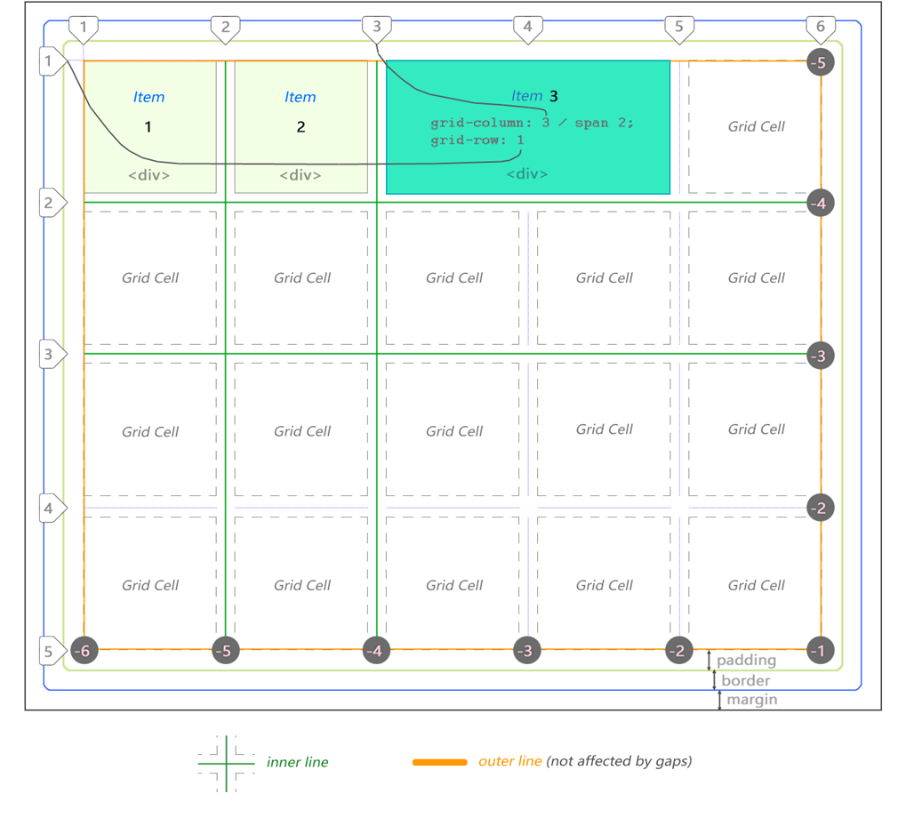
You are probably already familiar with the block CSS model for regular elements. Let's start with a similar “general review” for the CSS Grid:
At the heart of the CSS Grid structure is the main container, which is a regular
div , having a margin , border and padding . To create a CSS grid container, add the display: grid property. The mesh elements are descendants placed inside the parent container. They are usually defined as a list describing the header , sidebar , footer or other similar elements of the site layout, depending on its design.In this case, we have 3
div . The third is stretched to 2 cells.')
Note that the lines can be counted in the opposite direction, using a negative coordinate system.
The grid from the example above is 5 by 4 cells. This is defined as follows:
div#grid { /* This is our CSS grid parent container */ display: grid; grid-template-columns: 100px 100px 100px 100px 100px; /* 5 cols */ grid-template-rows: 100px 100px 100px 100px; /* 4 rows */ } The number of rows and columns is determined according to the set values. Lines and extra padding are located between the cells. The rows and columns between the lines are called grid bars. The number of lines will always be equal to [the number of cells + 1] in a given direction. So 5 columns will have 6 lines, while 4 lines will have 5 lines. In the following example, we see 7 columns and only 1 row:
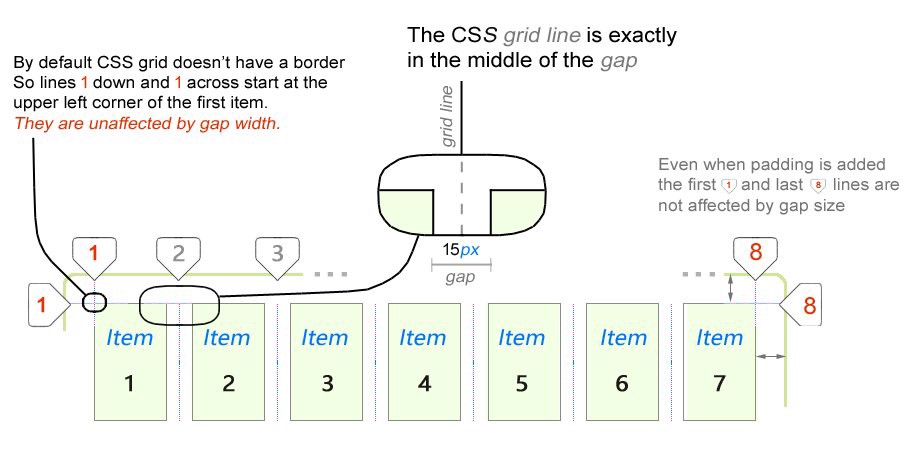
One of the first features that can be noted in the CSS grid behavior (by default, the CSS grid has no border, so lines 1 from top to bottom and 1 from left to right start in the upper left corner of the first element, no indent is applied to them; the grid line is placed in the middle of the indent; even if the
padding property is set, no indent is applied to the first and last lines)First, it should be noted regarding the CSS grid that the external lines do not depend on the size of the interval. Internal lines only. We will take a closer look at this later when we look at the fractional ( fr ) units.
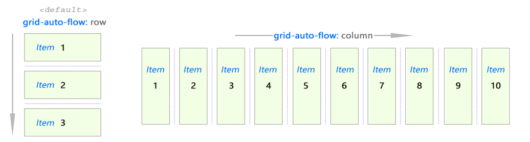
The CSS grid is two dimensional. Elements can be placed horizontally (column) or vertically (row). Set the value of the
grid-auto-flow property.It works the same way as Flex:
Use
grid-auto-flow: row or grid-auto-flow: column to determine the direction of filling the grid with elements.Imagine an abstract grid:
So, we have a general idea of how this works.
The creative part begins when you are faced with the problem of juggling element placement to create a responsive layout. CSS Grid offers several features to achieve this. We will look at them in the next section of this note.
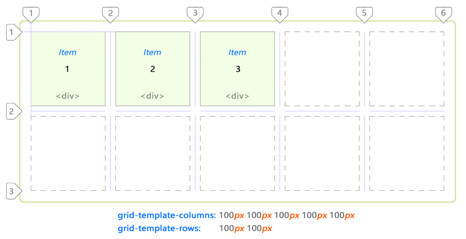
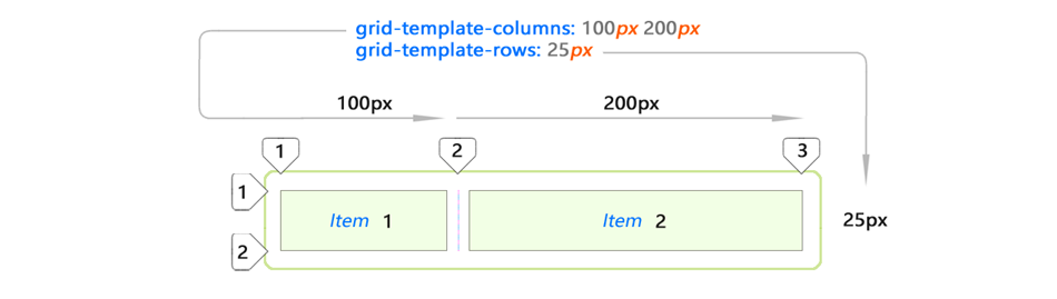
Let's consolidate the knowledge gained by looking at a few examples:
I used only two
div elements. And such a grid turned out.Implicit and explicit content placement
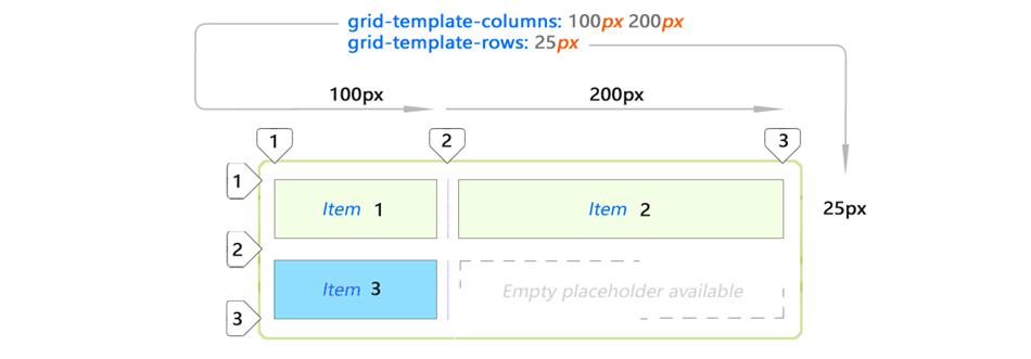
But what happens if we add another item to the list?
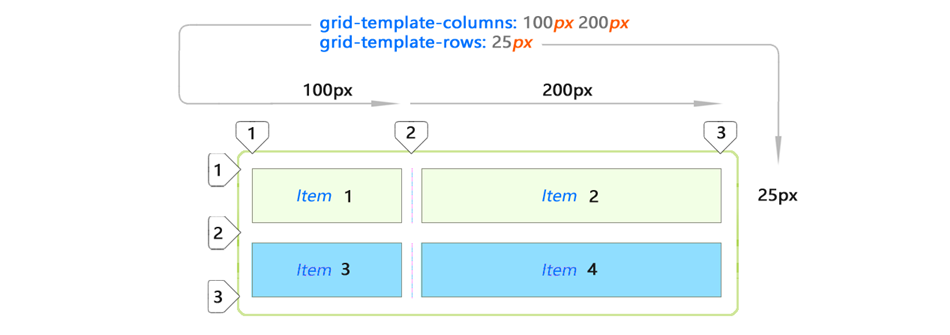
Adding item 3 to the same layout will automatically expand it (blue item). This new space is created automatically by copying the values from the first row. Let's add element 4?
Again, the CSS grid decided to stretch element 4 to the remaining space in the second line. This happened because
grid-template-rows precisely defines space for only 1 row. The rest is automatic.The placement of the blue elements was not indicated by you explicitly. This is an implicit (automatic) placement. Elements just fall into this space.
Explicit content placement
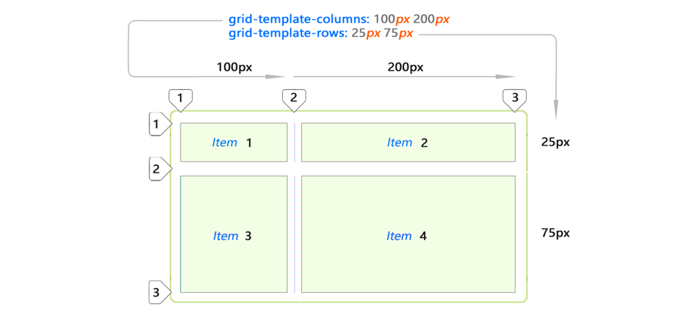
This is what you would expect from cells if you set values for all list items:
In fact, you can control the size in all consecutive rows by adding more values using the
grid-template-rows property. Notice, in this case, the elements are no longer hidden. You defined them exactly (25px 75px).Auto Spacing
CSS Grid offers several properties to automatically stretch cells by variable / unknown value. Here are the main examples of automatic extensions for columns and rows:
The bottom example shows the use of the auto keyword. This means that the cell will stretch to fill the entire remaining space in the parent container after it is filled with explicit elements.
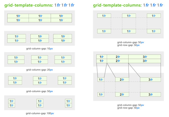
CSS Grid Indents
Speaking of CSS Grid, it is impossible to ignore the indents. Padding is the space horizontally and vertically between the grid cells.
The intervals are controlled by the
grid-column-gap and grid-row-gap properties:You can use different indents for both directions. This can be useful for creating video or image galleries:
Indents for different directions (between columns and rows) may differ. But the size of the interval is indicated once for the entire grid in a given direction. As you can see, indents of different sizes for one direction are not allowed:
I would like to be able to set different sizes of indents. I think it would be convenient. Some suggest using blank bands to achieve a similar effect.
Fr units (fractional part)
Fractional parts ( fr ) are unique to the CSS Grid. The fractional part allocates space depending on the remaining elements in the parent container:
The behavior changes, but 1fr remains unchanged, regardless of the use of other values. The fractional part works like percentage values, but is easier and more intuitive when dividing the space:
The behavior of changing fractional units is based on all values presented for this direction.
In this example, for clarity, only the behavior for the columns is shown. But it works the same for strings. Just use the
grid-template-row property.Fractional parts and their interaction with indents
The space defined by fractional parts is changed based on indents. The same value of 1fr within the same parent container will be reduced to a smaller size when the intervals are added:
We added spacing between cells given by units fr
As we can see, this gives us a pretty good set of tools for placing content at intervals almost as you please, without worrying about the values in pixels.
These new changes leave pixel-by-pixel design in the past. Now we think about design using an intuitive approach.
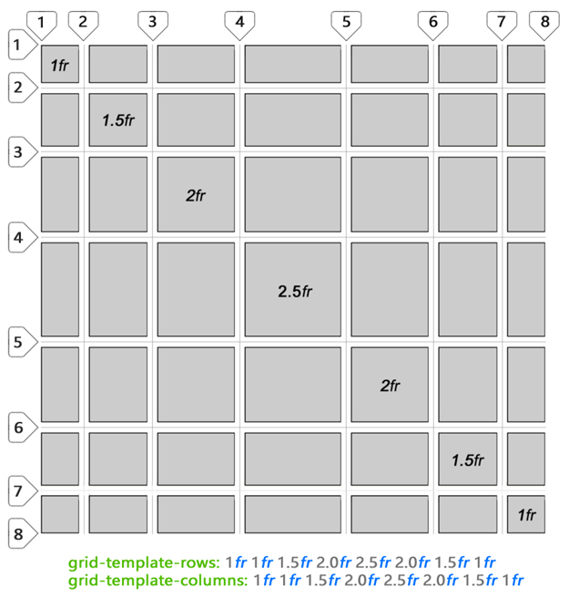
Finally, it gives interesting ideas about the use of non-integer fr - look at the funny grid I created. You can define a grid using also numbers with a comma:
Content placement
We just looked at the CSS Grid structure. I hope you got an idea of how the content in CSS Grid is structured. Now we have to show imagination and place some elements inside the grid. After that, the standard CSS grid behavior may change. How this happens, we now consider.
To order elements within cells or grid layout areas, you must refer to them along the lines between the cells. No
table intervals.CSS Grid allows you to use spacing to determine the width and height of the content area (in cell space), just as it does in a table. We will touch it. But you can and probably should indicate the starting cell using the line number or its name (more on this later). It depends on your preference.
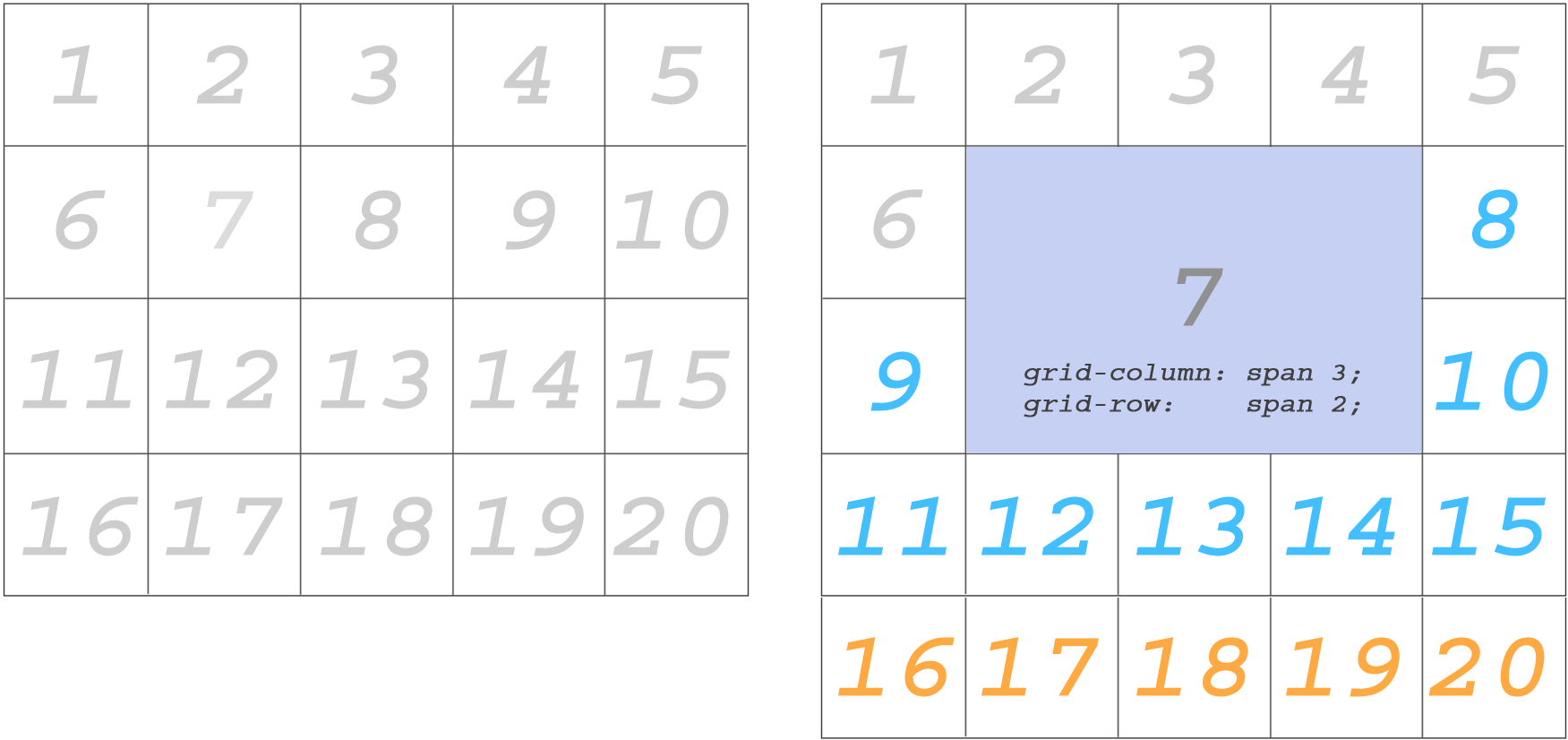
Regarding the placement of content on several cells, the most obvious and attractive is the union of cells.
Merging cell contents
You can combine elements in multiple cells.
Important : the union changes the location of the surrounding elements.
Merge using grid-column and grid-row
We use the
grid-column and grid-row properties for the following element:The blue elements changed position after several cells were merged to place element 7. The orange elements were pushed to the next row.
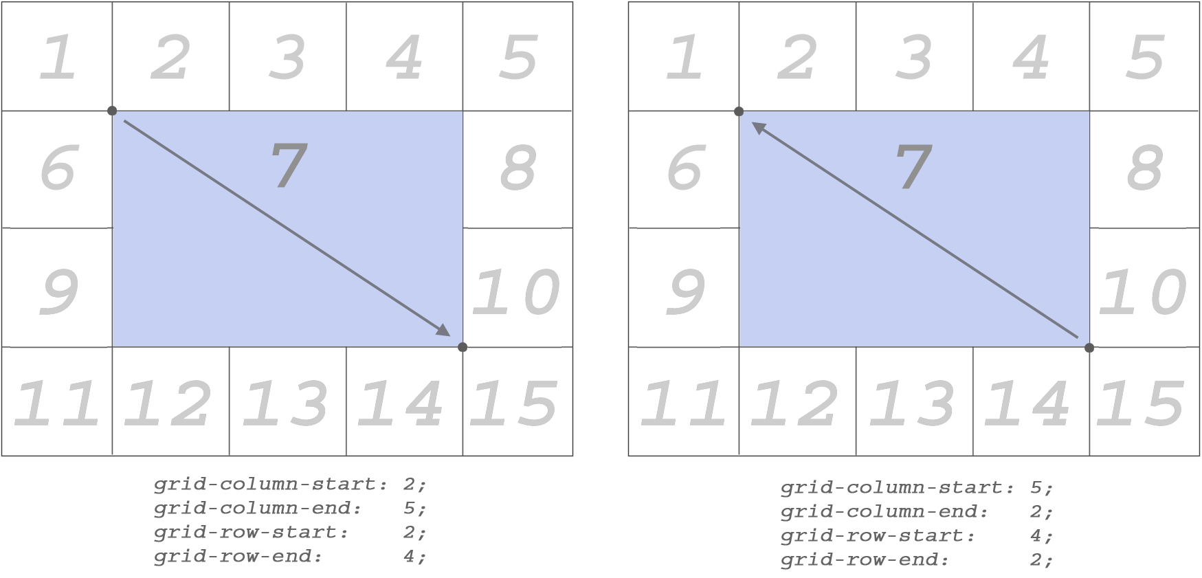
There is another way to do the same.
Merging with grid-column-start ...
...
grid-column-end , grid-row-start and grid-row-end — you can define specific starting and ending points for which you want to merge cells.I deleted items after 15 (orange), because they are no longer needed:
Set these properties directly for the element to which they are to be applied.
Stretching the contents of columns and rows works in both directions.
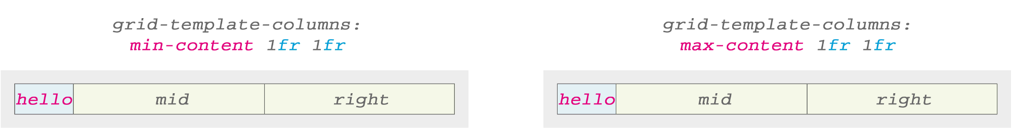
min-content and max-content
The values of
min-content and max-content are used in the grid-template-columns or grid-template-rows properties, as well as any other value associated with the size (for example, px , 1fr , etc.).Let's look at this sample. This is our starting point. We change the situation a bit to see how the min / max values affect the cells.
Let's see what results will be obtained if we change one of the columns using
min-content and max-content :With the text from one word there is no difference between the results, whether we use
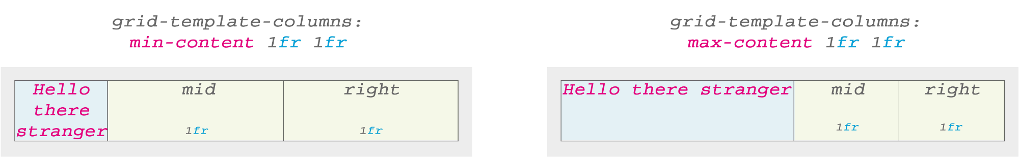
min-content or max-content . Hello is the only word. Its minimum and maximum value is the same.But everything becomes more interesting for more complex text. The following example demonstrates the key idea for
min-content or max-content :Here
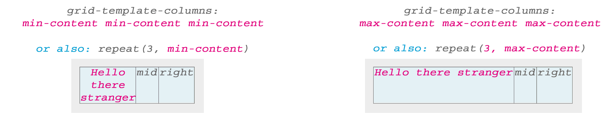
min-content used the longest word in the sentence (stranger) as the base width. If you use max-content , the entire text string with spaces fills the cell space. But what happens if we apply min-content or max-content to all the cells?I noticed that by default the text was centered when I used
min-content , although text-align: center not set.Images and max-content
I put an image of a blue rose in a cell. And, as expected, the grid has expanded to allocate enough space for the image:
When I set the image exactly 50%, just to see the result, the CSS Grid still retains the cell width at 100% of the image size, but displays it with a width of 50% (as expected) and automatically centers it horizontally inside the cell .
Both text and image (or other content) will automatically be centered in the CSS Grid cells by default.
Content positioning
Up to this point we have talked in general about the structure of the CSS Grid. Next, we consider how to achieve "multidirectional" displacement within the cell. Of course, we will not use the
float property.Offset in different directions
I do not think that the specificity of the CSS Grid calls us to this. However, it is possible to set the offset within 360 °.
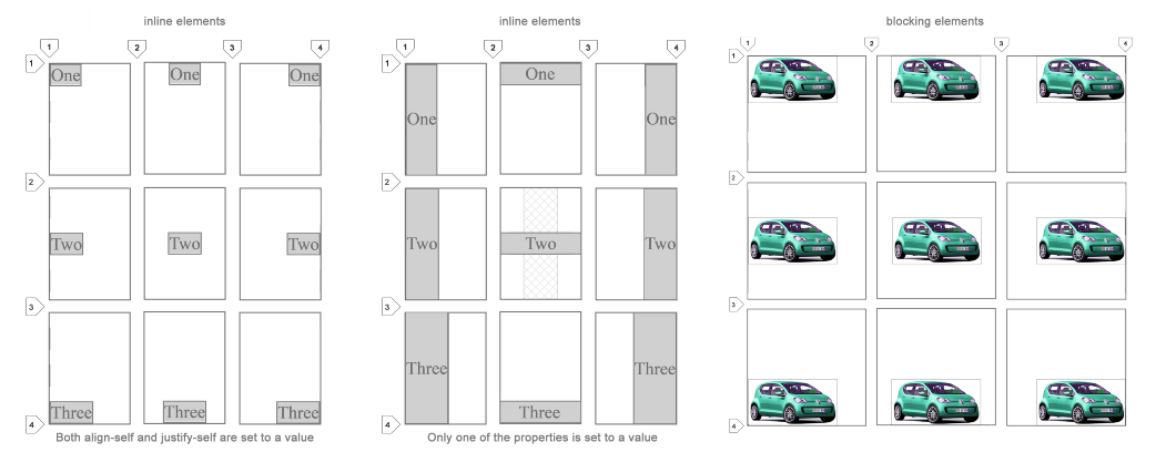
It works the same with lowercase and block elements! I think this is my favorite feature from the entire set of CSS Grid.
All 9 combinations are possible using the
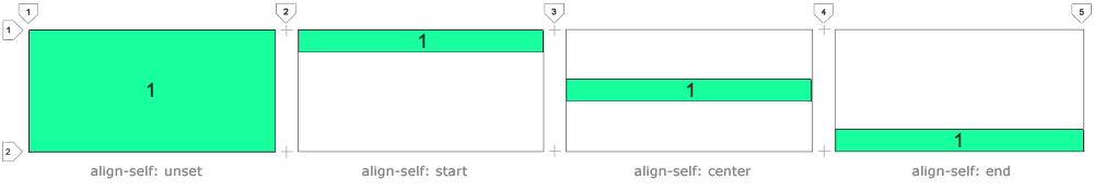
align-self and justify-self properties. I will explain them below.align-self
This property helps to position the content vertically.
Use
align-self: start to align the contents at the top edge of the cell.Use
align-self: center for vertical centering.Use
align-self: end to align with the bottom edge of the cell.justify-self
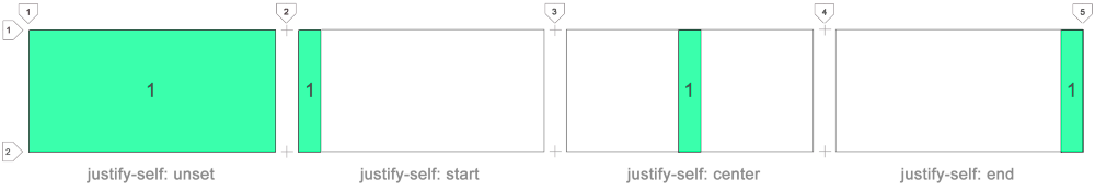
This property helps to position the content horizontally.
Use
justify-self: start to align the content on the left edge of the cell.Use
justify-self: center for horizontal centering.Use
justify-self: end to align with the right edge of the cell.You can use any of the 9
justify-self and align-self combinations to align anything in any direction.Area templates
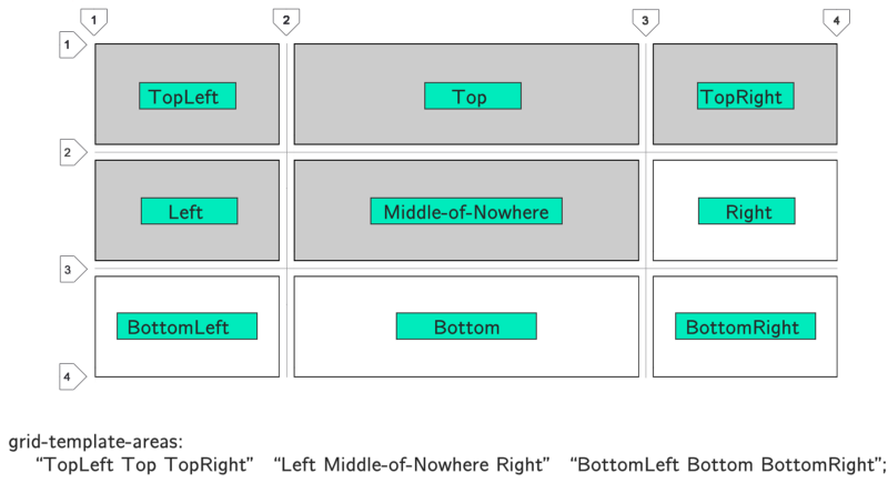
Area patterns are defined using the
grid-template-areas property.Notice that the area patterns for each line are enclosed in double quotes. Each column is separated by a space. In this example, I just explained how to name the windows. To truly take advantage of the benefits of region patterns, you need to group rectangular blocks of cells with the same name. Tetris blocks are not allowed. You can only use rectangles:
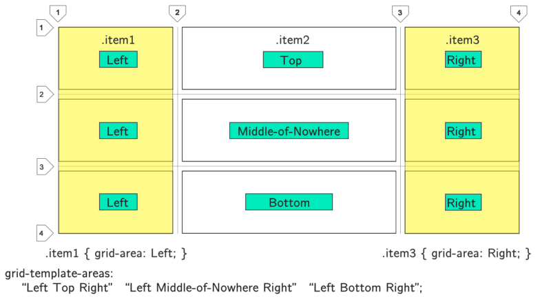
Here Left is an area that combines 3 cells. CSS Grid automatically views it as a single unit. The same with Right. In this simple example, I created 2 columns. But you get the idea. Merge larger areas by giving them names.
To place an item in this area, simply use the
grid-area: TemplateName property. In this case, grid-area: Left or grid-area: Right .No spaces can be used in the template name. Here I used a dash.
A practical example of using the template areas in the CSS Grid
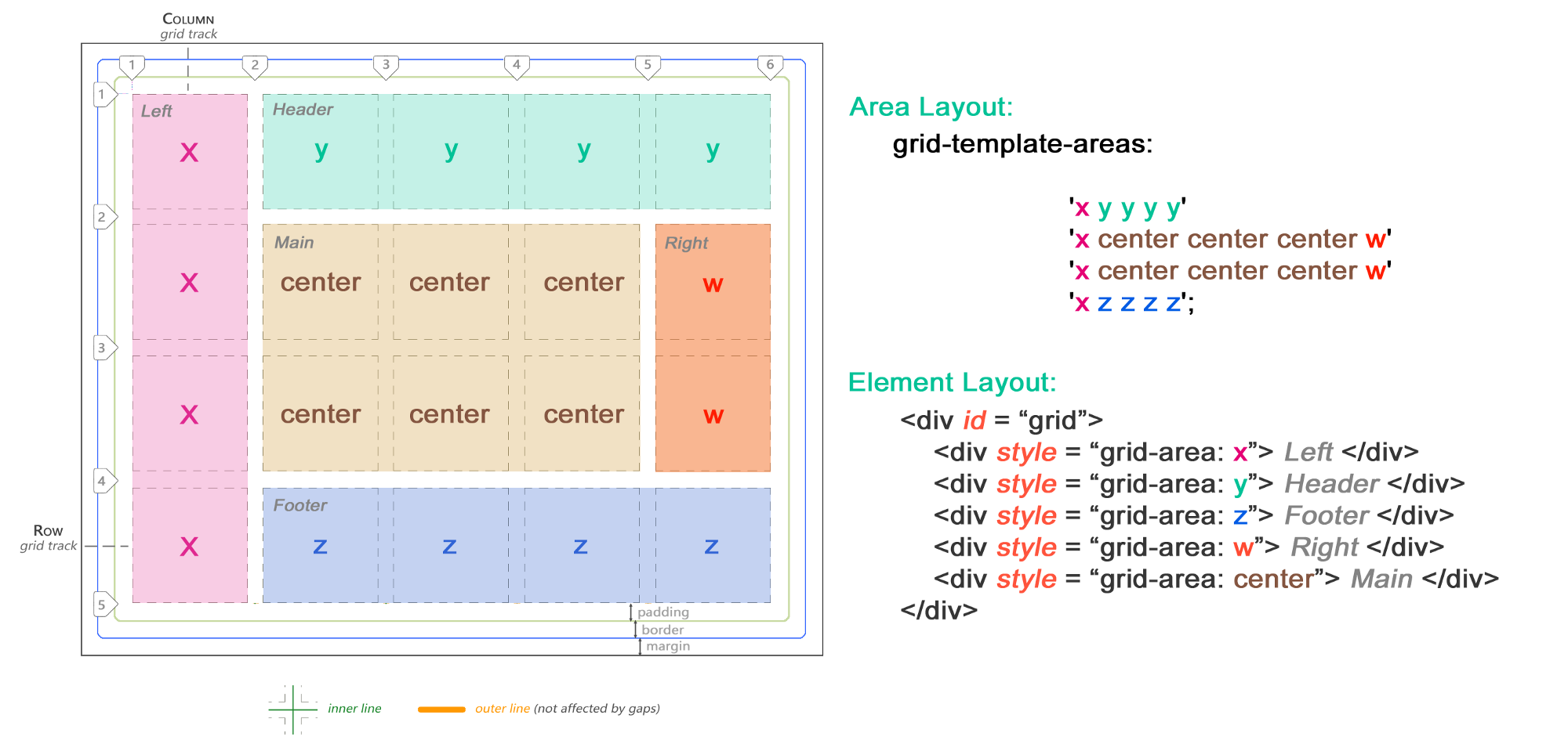
Now we know how to combine rectangular areas. Let's look at a potential scenario. I will demonstrate a very simple layout.
I created a primitive website layout that has two sidebars, a header and a footer. The main area is located in the center and covers an area of 3 x 2 cells:
Here we have only 5 elements. Add more and they will be pushed out of the main region into the implicit cells.
Just make sure your windows are always square or rectangular.
Line names
Instead of always referring to the lines by their number, you can name them. Thus, it is easier to remember them for stretching elements in several cells. Numbers can be so tiring!
Below is what it looks like:
Use square brackets to name lines. Then use these names to determine the length that your elements should be stretched with a forward slash.
Finally
CSS Grid is a comprehensive, complex subject.
Of course, this is far from a complete tutorial on how to create layouts using CSS Grid. I used only one example for each part as a starting point for studying the grid.
I hope the information presented here was useful and inspired to create websites using CSS Grid.
CSS Grid is not only part of HTML. This is a whole system for creating responsive websites and applications.
Its properties and values are based on technologies based on more than a decade of experience creating websites using ordinary HTML tags.
LOOKING.HOUSE - the project collected more than 150 points looking glass in 40 countries. You can quickly execute the host, ping, traceroute, and mtr commands.

Source: https://habr.com/ru/post/423709/
All Articles