Lazy loading images using IntersectionObserver
Nowadays, the main stumbling block on the way to high-speed download sites are images. This is especially true for e-commerce projects. The images on them, usually quite “heavy”, make up the bulk of the content of the pages. This, as a rule, leads to the fact that in order to show the user a page, his browser needs to load several megabytes of image data. How to speed up page loading in this situation? The answer to this question is devoted to the material, the translation of which we are publishing today.

Consider, for example, the home page of the Home section on Walmart.

Page with many images
')
Here is information about how many images are being loaded to form this page:

Images uploaded when forming the page
As you can see, there are 137 images here! This means that more than 80% of the data needed for the page output and transmitted over the network is in the form of graphic files.
Let us now analyze the network requests that are performed when the page loads:

Network queries that are performed during the formation of the page
In this case, the files resulting from the separation of the project code are loaded later than they could. This happens because you first need to download the main
How to fix it? In fact, it’s not really possible to “fix” this, but you can do a lot to optimize the loading of images. There are many approaches to optimizing images used on web pages. Among them - the use of different formats of graphic files, data compression, the use of blur animation techniques, the use of CDN. I would like to dwell on the so-called “lazy loading” of images (lazy loading). In particular, we will talk about how to implement this technique on React sites, but since it is based on JavaScript mechanisms, it can be integrated into any web project.
Let's start with this extremely simple React-component
It accepts, as a property, a URL, and uses it to render the HTML

Page with image output
In order to implement the method of lazy loading of images in this component, you need to perform the following three steps:
Let's sort these steps.
At this step, the image is not displayed immediately after the download.
Here we set up mechanisms that allow you to detect when an image hits the viewing area.
Let's sort this code. Here is what is done here:
What is
At first glance, this API feature may not seem very clear, but, in fact, it is very simple. Several parameters are passed to the
The reason why using
Now we need to set up a callback that is called when an intersection of the
When a crossing is detected by a callback, an array of
So, when it turns out that the element has crossed the bottom of the container, I manually set its
Now, in the fourth, secret step of our work, you can admire the result and enjoy the success. Here is the code that contains what we just talked about.

The result of applying the technique of lazy loading images
However, if we take a closer look at what we did, it turns out that here you can find something that is not very good. In order to see this, I quickly scrolled the page, slowing down the speed of the network connection.
The behavior of the page when it scrolls quickly and slows down the speed of the network connection
Since we load the image only after it has reached the area in which it should already be visible, the user does not have the opportunity to scroll the page and see the area occupied by the image, and, of course, the image itself before loading it. When sites are viewed from ordinary computers connected to high-speed Internet, this does not cause problems. But many modern users visit sites from their phones, sometimes they use 3G networks or, even worse, EDGE connections.
With this problem, however, is not so difficult to cope. This can be done due to the fact that the Intersection Observer API provides the developer with the opportunity to expand or narrow the boundaries of the root element (in our case, this is the
In the
Here is the code that implements this technique.
Improving the technique of lazy loading images
As a result, it turns out that when we scroll the page only to the 4th list item, the image is loaded in an area that is 200 pixels below the visible area of the page.
Now, it would seem, everything was done. But it is not.
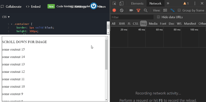
If you have carefully studied the above GIF illustrations, then you may have noticed that the scrollbar performs a “jump” after the image is loaded. Fortunately, this problem is easy to handle. Its reason is that the element that displays the image initially has a height of 0, which, after loading the image, is equal to 300 pixels. Therefore, to correct the problem, it is enough to set the element to a fixed height by adding the attribute
What results did we, at Walmart, achieve after applying a lazy image upload on this page? In fact, the specific results vary greatly depending on a variety of circumstances, including the client’s connection speed to the network, the availability of the CDN, the number of images per page, and the rules for detecting the intersection with the root element applied to them. In other words, you, in order to assess the impact of lazy loading of images on your own project, it is best to implement and test it yourself. But if it is still interesting for you to take a look at what the lazy loading of images gave us, here are a couple of Lighthouse reports. The first is formed before optimization, the second - after.
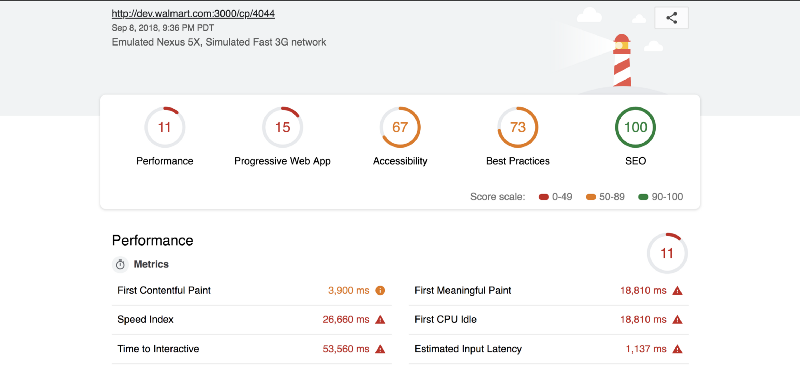
Lighthouse report generated before optimization

Lighthouse report generated after optimization
Today we looked at how to optimize web pages using lazy image loading. If the pages of your site are full of pictures, then, quite possibly, this technique is useful to you.
Dear readers! How do you optimize images and upload them?

General provisions
Consider, for example, the home page of the Home section on Walmart.
Page with many images
')
Here is information about how many images are being loaded to form this page:
Images uploaded when forming the page
As you can see, there are 137 images here! This means that more than 80% of the data needed for the page output and transmitted over the network is in the form of graphic files.
Let us now analyze the network requests that are performed when the page loads:
Network queries that are performed during the formation of the page
In this case, the files resulting from the separation of the project code are loaded later than they could. This happens because you first need to download the main
cp_ny.bundle . This bundle could be downloaded much faster, if it was not disturbed by 18 images competing with each other for bandwidth.How to fix it? In fact, it’s not really possible to “fix” this, but you can do a lot to optimize the loading of images. There are many approaches to optimizing images used on web pages. Among them - the use of different formats of graphic files, data compression, the use of blur animation techniques, the use of CDN. I would like to dwell on the so-called “lazy loading” of images (lazy loading). In particular, we will talk about how to implement this technique on React sites, but since it is based on JavaScript mechanisms, it can be integrated into any web project.
Pilot project
Let's start with this extremely simple React-component
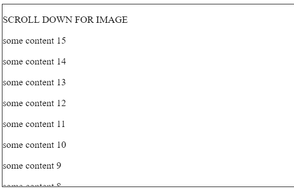
Image : class Image extends PureComponent { render() { const { src } = this.props; return <img align="center" src={src} />; } } It accepts, as a property, a URL, and uses it to render the HTML
img element. Here is the corresponding code on the JSFiddle. The following image shows the page containing this component. Please note that in order to see the image displayed by him, you need to scroll through the contents of the page.Page with image output
In order to implement the method of lazy loading of images in this component, you need to perform the following three steps:
- Do not render the image immediately after loading.
- Configure image appearance detection in the content viewing area.
- Display the image after it is detected that it has fallen into the viewing area.
Let's sort these steps.
Step 1
At this step, the image is not displayed immediately after the download.
render() { return <img />; } Step 2
Here we set up mechanisms that allow you to detect when an image hits the viewing area.
componentDidMount() { this.observer = new IntersectionObserver(() => { // }, { root: document.querySelector(".container") }); this.observer.observe(this.element); } .... render() { return <img ref={el => this.element = el} />; } Let's sort this code. Here is what is done here:
- Added ref attribute to
imgelement. This allows you to later update the link to the image insrcwithout having to re-render the component. - A new instance of
IntersectionObserver(we'll talk about this below). - The
IntersectionObserverobject is proposed to observe the image using theobserve(this.element)construction.
What is
IntersectionObserver ? Considering that the word “intersection” is translated as “intersection”, and “observer” is an “observer”, one can already guess the role of this object. If you look for information about it on MDN , then you can find out that the Intersection Observer API allows web applications to asynchronously monitor the change in the intersection of an element with its parent or viewport document scope.At first glance, this API feature may not seem very clear, but, in fact, it is very simple. Several parameters are passed to the
IntersectionObserver instance. In particular, we used the root parameter, which allows you to specify the root DOM element, considered as a container, about the intersection of the element with the border of which we need to know. By default, this is the area in which the visible fragment of the page (viewport) is located, but I explicitly set it to use the container that is in the JSFiddle iframe element. This is done in order to, later, consider one possibility, which is not designed to use iframe elements.The reason why using
IntersectionObserver to determine when an element becomes visible is more popular than more traditional methods, such as the use of onScroll and getBoundingClientRect() , because IntersectionObserver mechanisms run outside the main thread. However, a callback, called after the IntersectionObserver detects the intersection of an element with a container, is executed, of course, in the main thread, so its code should not be too heavy.Step 3
Now we need to set up a callback that is called when an intersection of the
target element ( this.element in our case) with the root container (in our case, the div element .container ) is .container . .... this.observer = new IntersectionObserver( entries => { entries.forEach(entry => { const { isIntersecting } = entry; if (isIntersecting) { this.element.src = this.props.src; this.observer = this.observer.disconnect(); } }); }, { root: document.querySelector(".container") } ); .... When a crossing is detected by a callback, an array of
entries passed, which resembles a set of snapshots of the state of all target elements for which an intersection of a given boundary is detected. The isIntersecting property indicates the direction of intersection. If the element for which the observation is organized falls outside the root element, it is true . If an element leaves the root element, then it is false .So, when it turns out that the element has crossed the bottom of the container, I manually set its
src property and turn off monitoring it, which is no longer necessary.Step 4 (secret)
Now, in the fourth, secret step of our work, you can admire the result and enjoy the success. Here is the code that contains what we just talked about.
The result of applying the technique of lazy loading images
However, if we take a closer look at what we did, it turns out that here you can find something that is not very good. In order to see this, I quickly scrolled the page, slowing down the speed of the network connection.
The behavior of the page when it scrolls quickly and slows down the speed of the network connection
Since we load the image only after it has reached the area in which it should already be visible, the user does not have the opportunity to scroll the page and see the area occupied by the image, and, of course, the image itself before loading it. When sites are viewed from ordinary computers connected to high-speed Internet, this does not cause problems. But many modern users visit sites from their phones, sometimes they use 3G networks or, even worse, EDGE connections.
With this problem, however, is not so difficult to cope. This can be done due to the fact that the Intersection Observer API provides the developer with the opportunity to expand or narrow the boundaries of the root element (in our case, this is the
.container element). In order to use this opportunity, it is enough to add one line of code to where the root container is configured: rootMargin: "0px 0px 200px 0px" In the
rootMargin property, rootMargin need to write a string whose structure conforms to the CSS rules used to configure the indentation parameters for elements. In our case, we inform the system that the lower boundary used to detect the intersection of an element with a container should be increased by 200 pixels. This means that the corresponding callback will be called when the element falls into an area that is 200 pixels below the lower border of the root element (the default value is 0).Here is the code that implements this technique.
Improving the technique of lazy loading images
As a result, it turns out that when we scroll the page only to the 4th list item, the image is loaded in an area that is 200 pixels below the visible area of the page.
Now, it would seem, everything was done. But it is not.
Image height problem
If you have carefully studied the above GIF illustrations, then you may have noticed that the scrollbar performs a “jump” after the image is loaded. Fortunately, this problem is easy to handle. Its reason is that the element that displays the image initially has a height of 0, which, after loading the image, is equal to 300 pixels. Therefore, to correct the problem, it is enough to set the element to a fixed height by adding the attribute
height={300} to the image.About optimization results
What results did we, at Walmart, achieve after applying a lazy image upload on this page? In fact, the specific results vary greatly depending on a variety of circumstances, including the client’s connection speed to the network, the availability of the CDN, the number of images per page, and the rules for detecting the intersection with the root element applied to them. In other words, you, in order to assess the impact of lazy loading of images on your own project, it is best to implement and test it yourself. But if it is still interesting for you to take a look at what the lazy loading of images gave us, here are a couple of Lighthouse reports. The first is formed before optimization, the second - after.
Lighthouse report generated before optimization
Lighthouse report generated after optimization
Results
Today we looked at how to optimize web pages using lazy image loading. If the pages of your site are full of pictures, then, quite possibly, this technique is useful to you.
Dear readers! How do you optimize images and upload them?
Source: https://habr.com/ru/post/423485/
All Articles