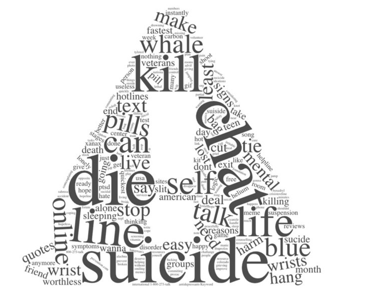
Preventive interface: Google search results page redesign based on suicidal queries
As a college student, I turned out to be one of five who is prone to anxiety and depression. Desperate desire to study well, looking for a job, a relationship, just the feeling that I was “entering adulthood” - all of this merged into an avalanche of worries that swallowed me (looking back, I understand that many of them were fiddling).
Once, in my first year of study, I had a particularly busy day - one of those days when the schedule is already packed to capacity, and new problems and meetings all come and go. That night I was completely exhausted in bed, but I could not close my eyes because of paranoia. After three hours, and having failed to fall asleep, I got out of bed and googled: "simple ways to die."
And that's what I saw:
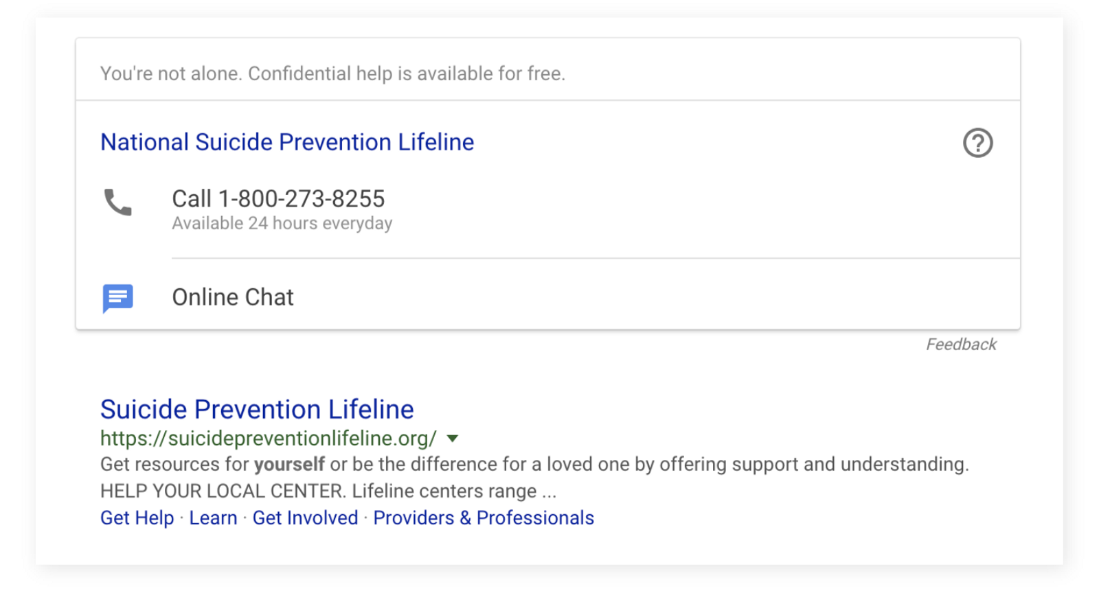
Here it is necessary to clarify something. Yes, I suffered a mild form of depression, but I did not have suicidal tendencies. By this action, I was pushed by the annoyance that reached the unhealthy limits (moreover, aggravated by lack of sleep), and not a serious intention to commit suicide. But even to me the words: “You are not alone; we provide free confidential help. Dial 1–800–273–8255 ”seemed very dry and official. It’s as if you heard someone’s cry for help and in response would have thrust a psychologist’s business card without even looking in the direction of the speaker.
')
Fortunately, I just made stinging remarks about the text and eventually fell asleep. But I still can not imagine how lightweight such support would seem to a person who is ready for anything to die. This is a lazy, mechanistic reaction and a bland, watery sincerity.
1. The problem
I survived and life got better. However, I still could not forget how the response sounded lifeless, which in theory should save lives. After a while, I came back to see if anything had changed.

Issuance pages for requests related to suicidal intent. Clockwise: Google, Yahoo, Bing and Facebook.
Unfortunately, I saw only variations of the same scheme: the simple provision of contact numbers for hotlines. The ultimate goal here is to stop suicidal thoughts and convince the user to pick up the phone and call where they can help him in the future. For this to happen, the user must:
- Perceive information and realize that he needs help. At this stage, most people are already very deep in the labyrinth of dark thoughts. They are extremely difficult to impress, and the phone number will definitely have no effect on them. (Barrier)
- Take the phone and dial the number. Physical limitations only add an extra step to the whole process. What if the phone is somewhere far away? (Barrier)
- Wait for the answer specialist on the line. The caller will be greeted with automatically played recorded text. Personally, my answering machines always leave me feeling impersonal, a couple of times I even hung up, without waiting for me to be connected with a living person. (Barrier!)
But these users initially did not ask for help at all - they asked for simple methods of suicide. If we confine ourselves to passively giving them a proposal of support as one of the options, it will not work. Instead, you need something personal, something that will find a response in them, so that they feel that there are people who care, and an opportunity to get help.
2. Turn to numbers
I used a couple of tools to analyze search traffic to better understand the extent of the problem.
Google Trends: determine relevant keywords and trends
Google Trends tool allows you to determine the popularity of certain keywords. It also provides “More Related” and “Related Queries” lists, which are very useful for assessing relevance and accuracy.
For example, as a first trend for analysis, I, of course, took “suicide”. However, similar inquiries that the system issued for him showed that the result is influenced by some viral requests, such as the film "Suicide Squad" or an incident involving Logan Paul.
To get rid of these results, distorting the overall picture, I began to try more substantive requests, in the spirit of "how to commit suicide", but in similar requests there were still mixed references to sensational incidents from the world of media, mostly celebrity news, which tragically gone from life.
Finally, I decided to abandon the word "suicide" altogether and replaced the request with "how to commit suicide." In the bull's eye - in the number of similar now appeared only requests related to mental illness and thoughts about suicide.

From the above list, I chose the ten most popular queries that provide a sufficiently complete search range of people with suicidal tendencies. Putting the data on them together, I built a graph showing the dynamics of the group over the past five years.
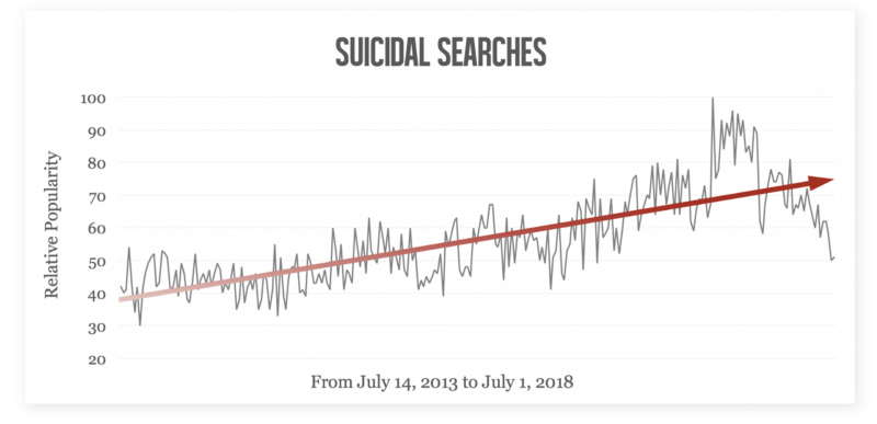
Search trends on the topic of suicide for 2013-2018
Undoubtedly, the number of depressive and suicidal requests is increasing with frightening constancy.
Ahrefs Keywords Explorer - we are looking for additional short-circuits and clarify statistics
AKE is a great tool that gives you access to accurate search metrics. First, I checked the performance of those ten short-circuit, which have already selected in Google Trends. AKE showed that each of these requests is part of a larger thematic group (for example, “how to make a loop”, “I hate life” and “kill me”). Having deployed all the groups, I received hundreds of child requests that related to the subject of suicide and depression.

After that, I analyzed all thematically related requests. The results were stunning: only the United States receives 611,000 suicidal requests every month (this is more than the entire population of Wyoming). Worse, only 40,000 people click on the first link in the issue (Suicide Prevention Lifeline). Of course, this says little about conversion, and yet 6% of clicks for the first result on a page are so small that it suggests: there must be more effective ways to help people when they are on the verge and are about to make a decision, which can cost them their lives.
According to a study conducted in 2017, 89% of people who survived a suicide attempt say they acted under the influence of the moment. 52% of survivors believe that they would give up their intentions if they received support and care. In the light of this depressing statistics, it becomes clear: there is nothing more to wait for, it is necessary to figure out how to pacify the impulsive craving for suicide and push people to seek help.
3. Sources of Inspiration
The first thing that came to my mind was a suicide prevention pilot project that was implemented in Korea. There is a bridge in Seoul, from where almost every day those who decide to commit suicide rush into the water. Someone from the townspeople proposed a brilliant solution: to stick banners with words of support on the railing. Anyone who wants to jump will unwillingly read them.
Some phrases were quotes from famous people, others were written in a conversational style, which is used by close friends and family members: “How are you, mate?”, “It's cool today,” “Have you already eaten?”. The city administration commented on it this way: "We wanted not to put obstacles in front of people, but to change the course of their thoughts in the right direction."
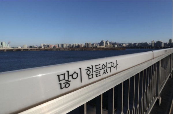
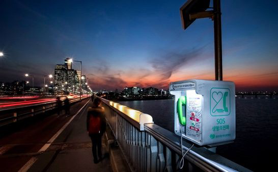
Photos of the bridge in Seoul: a banner with a quote ("You must have gone through a lot," written in the style of a wise old man) and a booth with a telephone to call the hotline
Reading the banners and moving forward along the bridge, the person finally comes to the telephone booth with access to the hotline: with its help, you can directly contact a psychologist. The whole experience, starting from the moment when a person in a depressed state rises onto the bridge and ending with the decision to call the hotline under the influence of encouraging words, was planned flawlessly.
Criticism
Depression has one very important feature: everyone faces different problems and what worked for one, in the other case can have the opposite effect. On the railing of the bridge came across phrases that can be called controversial:
- “Do you want to go down and have a cup of coffee with friends?” - These words should evoke a sense of peace by reminding you of something pleasant and ordinary. But they will negatively affect those who have no or practically no friends, as well as those who cannot afford a glass of coffee because of problems with money.
- “And this too will pass. Think of your troubles as a gust of wind ”- the message here is that the difficulties pass sooner or later and everything is getting better. But it will have a negative impact on those who are incurably sick or burdened with unsustainable debts.
Many also expressed concern about the long-term effect and scope of the project. The inscriptions really helped to ward off thoughts of suicide at the very moment when a person stands on the bridge. But whether he would receive the necessary support afterwards — this remained unclear. Without long-term work with a psychologist, thoughts of suicide may return at any time, and quotes may not have such a strong effect a second time. This initiative works as an emergency painkiller, but does not always eradicate the virus itself.
Decision
An online search website is the most appropriate platform to convince the user to seek help and thus provide more effective preventive measures. In addition, by making the content interactive and constantly developing it, we can recreate and improve the thoughtful experience that was built in the project with the bridge. In the absence of physical limitations, we can also provide a much greater degree of personalization by appealing to the user's personality, which will allow us to resolve the chronic problems that have characterized many methods in the past.
4. Basic components

Identify sources of suicidal thoughts to understand users.
This is the first step to personalizing content. You need to know your enemies - by defining the reasons for the actions of users, we will be able to show more sympathy for them. According to a Korean Ministry of Health study, the leading causes of suicide attempts include: mental illness (31%), further relations (23%), conflict situations (14.1%), financial difficulties (10.5%) and health problems (7.5%).
I wrote out as many reasons as possible, based on both research and personal experience, and sorted them into five main categories — very broad, so that any victim could feel involved in at least one of them.
- Relationships (death of loved ones, quarrels)
- Achievements (study, career)
- Society (gender inequality, sexual identity, middle age crisis)
- Physiology and psychology (physical and mental illness, dependence, violence)
- Emotions (guilt, regret for decisions made)
Responsive design for engagement and engagement
The interface, which delivers content automatically, leaves a feeling of impersonality, because the response is too uniform (and the sterility of the design also leaves an imprint). On the contrary, the interface that reacts to the actions of the user creates the feeling that they take care of him, his problems are penetrated. An open conversation is much more effective than unilaterally issuing information when it comes to generating a personalized message.
Universal quote to attract attention
I needed some kind of powerful motto that could at first glance suppress thoughts of suicide, at least for a short time, and capture the user's attention. The quote I chose at first was based on the idea that, although death may seem the only way out, in fact, if you get proper support, there are always better options.
“There is always a choice better than to take one’s life”
This text was also chosen with the intent to arouse interest - the user will naturally want to continue the interaction to find out which “best choice” is in question.
The second quote suddenly came to my mind when I was already finalizing the design. This thought brought me to the scene from the original comic book series about Dedpool (by the way, thanks to Cheongo, a colleague who recommended them to me). In it, Deadpool saves a woman who was ready to jump off the roof, with the help of her trademark black humor. Downstairs, she asks Deadpool to take her home, but instead he brings her to a rehabilitation center with these words: “I have enough sense to understand that it will not be enough for you to help you. But these people will do better. ”
It was like an electrical discharge. I realized how arrogant my first quote might seem. Neither I nor my computer are able to fully understand people's problems, much less point to the right solution. A search engine is simply an intermediary who leads users to professionals who are really able to prompt them. Based on this, I decided that the following quote would be much more appropriate:
“Our search engine does not know the answers to the most difficult questions in your life. But we can help you find them. ”
By adopting such a Socratic approach and recognizing that we are not omnipotent, we can finally pave the way for the user to professional help, instead of mindlessly giving unqualified advice. In addition, when you speak openly about your imperfections, this creates a more friendly and psychologically comfortable atmosphere.
Personalize text to avoid misunderstandings
A serious lack of initiative with the bridges of Seoul was that some quotes could not fit the specific situation. This can be avoided if you ask the user what exactly makes him think about suicide, and pick up the content based on his answer.
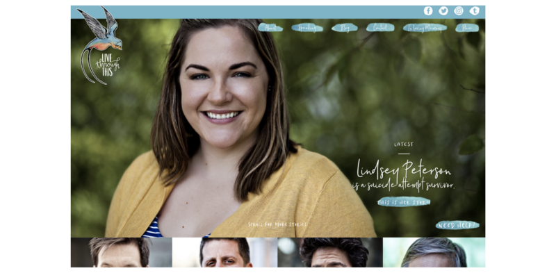
www.livethroughthis.org is a resource where people with depression and suicidal thoughts can read the stories of those who survived a suicide attempt.
Success stories to demonstrate the “best yield”
Any words will sound more convincing when they come from people who have experienced the same difficulties as the user. By reading life stories that resemble his own experience, the user will be motivated to follow the example of the survivors and seek help to survive the tragedy.
5. Design
Save the DNA of Google Design
In this case, I am doing a redesign, and not launching a new service. The principle to which I attach particular importance can be formulated as follows: when reworking an existing design, respect the original principles. The essence of design is not to “make beautiful”. Design is a manifestation of the company's philosophy, its basic values, which are approved on the basis of years of research and tests.
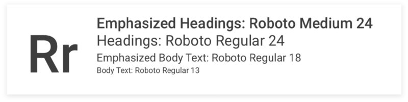
Initially, I planned to display the content in full screen for a deeper immersion. However, I was very familiar with Google's card design, which breaks up content into thematic blocks, and decided to follow the same pattern. Using the Google Chrome developer tools, I carefully studied the search results grid and tried to recreate it in Sketch.

I also took the same font that Google uses on the search results pages - Roboto, just played around with the size and shape, hoping that small differences would not be too noticeable. I chose the symbols and icons from the Google Material Design Library to also maintain consistency here.

“Blue is the warmest color”
In full accordance with the name of the film (see if there is a desire to prydat), blue has a relaxing effect on our psyche, it is not accidentally used in therapy more actively than all other colors. The blue color relieves stress throughout the body and has a positive effect on patients with anxiety disorder and depression.
Given the mood of the audience, I would like to exclude aggressive shades. I chose not too saturated colors, calm, but not muddy (like the summer sky in San Francisco), in order to create a sense of peace in the victims of suicidal thoughts. For the buttons that needed to be highlighted, I chose shades a bit more creative to create a contrast.


6. Experience "from and to"
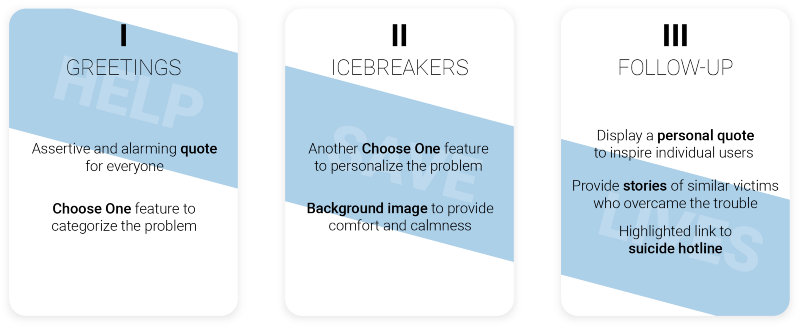
Scheme of three blocks: Greeting (universal quote + category selection) - Contact (positive background image + another request for information) - Response (personalized quote + survivor history + contact information)
Greeting

This is the very first screen that users will see and respond to after entering a suicide request.
Above there will be a quote that should attract the attention of any user (“There is always a better way ...” or “Our search engine ...”). Below, the user will be kindly asked to choose one of the five main reasons for thoughts of suicide. The categories are very broad and abstract, but if you hover the mouse over the icon, for each one there is a list of examples of specific situations. In the lower right corner there will be contact information so that the user can ask for help at any time.
Contact
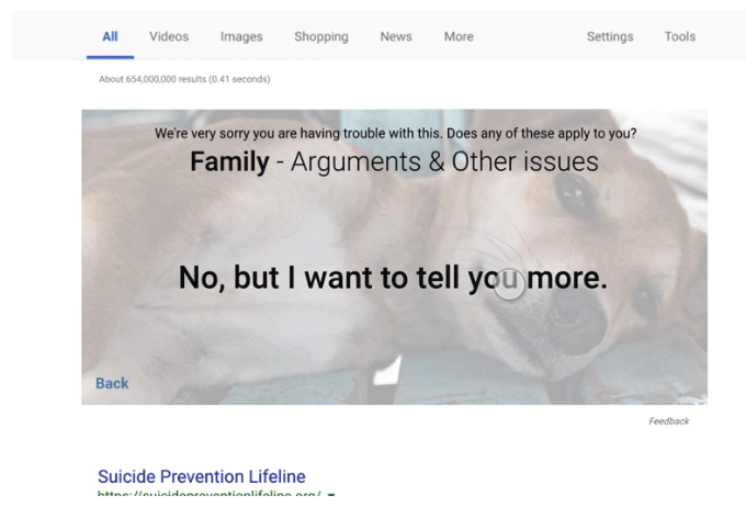
Inside the selected category, the user will be asked to narrow the spectrum, specifying the type of problem that torments him. If it seems to him that he has chosen the wrong category, there is always an option to return to the beginning. If nothing of what he sees causes associations with his own situation, he can click on the last point: “No, but I want to tell you more”. In this case, he will be redirected to a page with a text field, where he will be able to state his difficulties freely - I firmly believe that simply by splashing out my feelings outside, you can reduce the level of stress to some degree.
Response
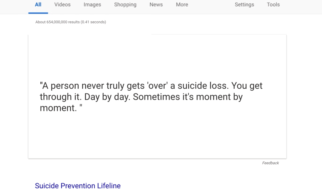
Based on which items the user chose in the previous steps, targeted content will be selected for him: an encouraging quote and a story of a person who has experienced something similar. At the end of the journey, the user will again see the contact information and telephone hotline, now highlighted brighter. For those who choose “No, but I want to tell more”, the system will give a more neutral quotation and story, which will fit a wide range of circumstances.
7. Conclusion and future plans
I wanted to design an automatic response that would leave a feeling of genuine concern. But computers have sincerity things are more complicated than people (at least for now). Recognition of this fact turned out to be an important step - it allowed me to focus on the fact that computers do better than ours: the processing of variable values and the display of dynamic content. If you properly combine the strengths of people and machines, you can overcome the physical barriers faced by previous preventive methods and provide sincere support to a huge number of people. The new interface, acting as a modest intermediary between the dark and light side, will lead users to the most reliable path that we have - the path of human mutual assistance.
Over the past couple of months I have collected a wealth of information about suicide from online sources. However, the project is still far from perfect, and I would not be surprised if it reveals a lot of mistakes and shortcomings. But in my opinion, this is it not bad as a starting point. I would be happy to work closely with experts in psychology, design, human-computer interaction, and related areas to identify the project’s weaknesses, discuss how to improve it, and possibly save more lives.
Source: https://habr.com/ru/post/423133/
All Articles