Improved effects with background layer blending in CSS
If one picture deserves a thousand words, then the mixture of two pictures deserves much more. In the same way, the design possibilities that open up with the advent of the possibility of mixing layers in CSS are much more than you think.
When you hear a discussion of the CSS Blend Modes features, there are usually three new CSS properties that have received good support in modern browsers.
These properties are:
')
Anyway, this article will be devoted to
CSS gradients can be used in the
But the
But now, when we have the
Let's apply three gradients to make a background with an almost full range of colors that can be displayed on a monitor.
This effect was previously possible only in the form of a picture that occupied tens of kilobytes. But we just reproduced it using CSS less than 200 bytes in size, not to mention saving an HTTP request.
We can also create interesting patterns that mimic a checkered plaid using a gradient and
Here is another background, now using a radial gradient:
With the help of Yoksel and Una Kravets, I prepared a collection of 24 templates made using blending that will make your website faster and more attractive.
Although
We can use CSS to make the photo to the left look like a pencil sketch. We do not need Photoshop, HTML5 canvas, WebGL, Javascript libraries. Five CSS properties are all that will be required.
Although we can use other block elements, such as
Let's start the simulation.
Below in the first square is the result of our first step:

Now add the blend mode:
Oh no, where did it go? We got a completely black square. The subtraction mode for blending takes two backgrounds and takes away pixel by pixel the darker color of one background from the lighter color of another background.
If you are confused about what is happening, let's see what happens when we slightly shift the two backgrounds with
Using a comma, we set two background positions, each of which corresponds to one copy of the background image. The first image we move from the center along the x axis to the left one pixel and from the center along the y axis upwards to a pixel. For the second copy of the background image, we do the opposite, moving it down and to the right.
We've got two background images that are slightly offset, but the whole picture is still centered in our element. Now, when the subtraction mode detects the difference between the two images, the edges in the photo are visible. Great, isn't it?
Finally, we will use the
For this particular photo, we will also increase the brightness, which has a secondary effect regarding increasing the contrast of the lines.
Here is the final CSS snippet for this effect:
We can recreate the effect of the blackboard by following the steps for the pencil sketch effect and eliminating the
Let's recreate another effect with the CSS mixing capabilities and take a photo that looks like we made it through a lens in a night vision device.
There are three parts of our background that we will mix together using the
First we set the background image, this time one.
Now add the gradient and blending properties of the background layers. Here we use a radial gradient from translucent lime to black.
Not so bad, you can leave it all that way. But I have another idea that can make the effect more authentic - add a few fake scan lines with a repeating gradient background to the background.
And finally, here is the full CSS snippet used for this effect:
I made a gallery of 20 images with CSS effects that you can use for your sites.
The good news is that the
In part, the good news is that it has sufficient support in Safari in terms of the effects that we covered here, but Safari does not currently support
The bad news is that Internet Explorer and IE Edge do not support CSS mixing properties at all.
This means that we must take into account the presence of browsers that still do not support
For the first example, we take our spectral background gradient and provide backup options in case the
And here the effect of a pencil sketch with a fallback. We check two important properties that are required to create an effect:
Blending Modes Demystified by Justin McDowell
Basics of CSS Blend Modes by Chris Coyier
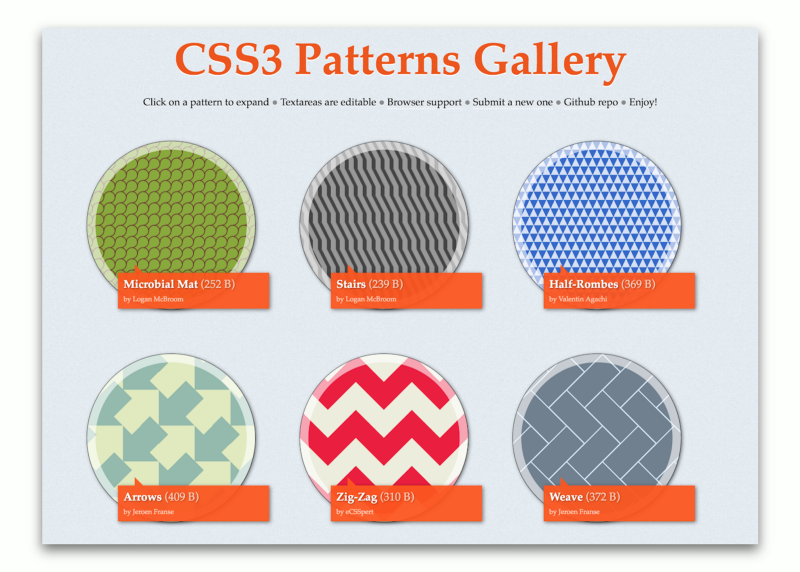
CSS3 Patterns Gallery by Lea Verou
Una Kravets' 6-part CSS Image Effects Series
Can I use ... Support for background-blend-mode
Image Effects with CSS by Bennett Feely
New CSS Gradient Options with Bennett Feely
Experimental Polyfill for background-blend-mode by Rik Cabanier
Compositing and Blending Level 1 Specification by W3C
When you hear a discussion of the CSS Blend Modes features, there are usually three new CSS properties that have received good support in modern browsers.
These properties are:
')
background-blend-mode- for blending background images, gradients and background color of elements;mix-blend-mode- for mixing elements with other elements;isolationis a less used property that is used with mix-blend-mode to prevent mixing of elements.
Anyway, this article will be devoted to
background-blend-mode , the property that enjoys the most widespread support, and the possibilities of using it to create attractive backgrounds and photo effects on your website that were once possible only in Photoshop.Combining CSS gradients with background-blend-mode
CSS gradients can be used in the
background property. Functions such as linear-gradient() , radial-gradient() , repeating-linear-gradient() and repeating-radial-gradient() have broad support and more strict, standardized syntax in browsers.But the
background property can allow more than one gradient, displaying them on top of each other, if you list each next one separated by commas. Lea Verou showed impressive patterns that can be created using this technique: from chess boards to bricks and stars.But now, when we have the
background-blend-mode property, we can create all new gradients and patterns.Spectral background
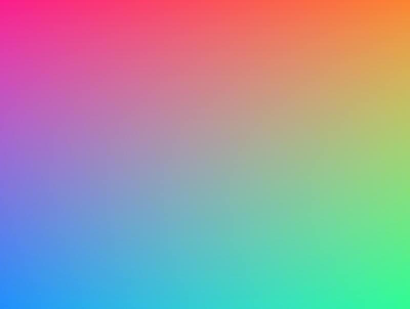
Let's apply three gradients to make a background with an almost full range of colors that can be displayed on a monitor.
.spectrum-background { background: linear-gradient(red, transparent), linear-gradient(to top left, lime, transparent), linear-gradient(to top right, blue, transparent); background-blend-mode: screen; } This effect was previously possible only in the form of a picture that occupied tens of kilobytes. But we just reproduced it using CSS less than 200 bytes in size, not to mention saving an HTTP request.
Checkered background
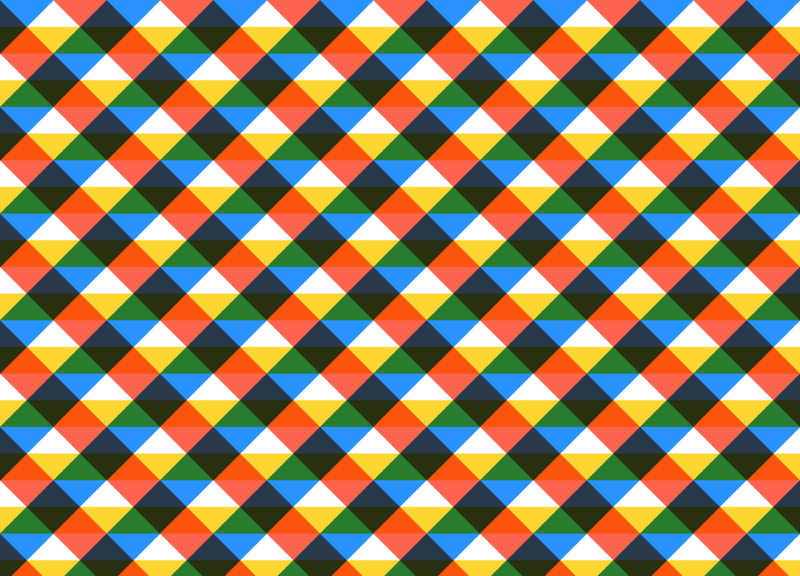
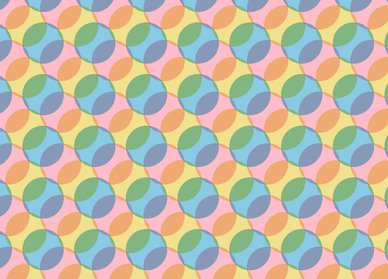
We can also create interesting patterns that mimic a checkered plaid using a gradient and
background-blend-mode . .plaid-background { background: repeating-linear-gradient( -45deg, transparent 0, transparent 25%, dodgerblue 0, dodgerblue 50% ), repeating-linear-gradient( 45deg, transparent 0, transparent 25%, tomato 0, tomato 50% ), repeating-linear-gradient( transparent 0, transparent 25%, gold 0, gold 50% ), white; background-blend-mode: multiply; background-size: 100px 100px; } Circle background
Here is another background, now using a radial gradient:
.circles-background { background: radial-gradient( khaki 40px, transparent 0, transparent 100% ), radial-gradient( skyblue 40px, transparent 0, transparent 100% ), radial-gradient( pink 40px, transparent 0, transparent 100% ), snow; background-blend-mode: multiply; background-size: 100px 100px; background-position: 0 0, 33px 33px, -33px -33px; } More backgrounds
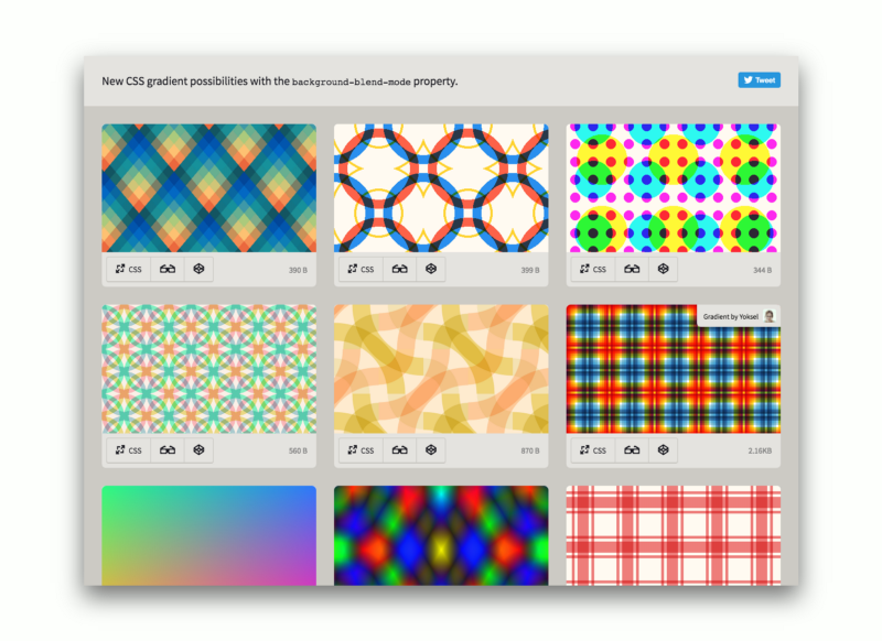
With the help of Yoksel and Una Kravets, I prepared a collection of 24 templates made using blending that will make your website faster and more attractive.
Photo effects with background-blend-mode
Although
background-image allows you to set several gradients for an element, the trick is that in the same way we can set several background images using the url() construct. When we combine this with background-blend-mode and properties like filter , something really interesting can turn out.Pencil sketch effect
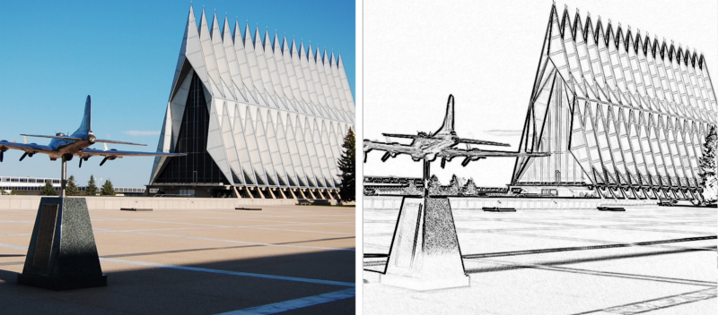
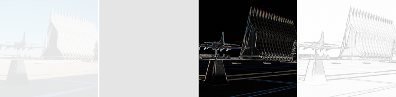
We can use CSS to make the photo to the left look like a pencil sketch. We do not need Photoshop, HTML5 canvas, WebGL, Javascript libraries. Five CSS properties are all that will be required.
Although we can use other block elements, such as
body , section , figure , we first use the following HTML: <div class=”pencil-effect”></div> Let's start the simulation.
chapel.jpg with the url of the image you are using. We will set the background image twice and save its background size. .pencil-effect { background: url(chapel.jpg), url(chapel.jpg); background-size: cover; } Below in the first square is the result of our first step:
Now add the blend mode:
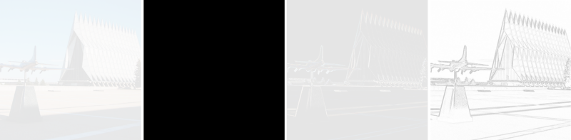
background-blend-mode: difference; Oh no, where did it go? We got a completely black square. The subtraction mode for blending takes two backgrounds and takes away pixel by pixel the darker color of one background from the lighter color of another background.
If you are confused about what is happening, let's see what happens when we slightly shift the two backgrounds with
background-position and calc() . background-position: calc(50% — 1px) calc(50% — 1px), calc(50% + 1px) calc(50% + 1px); Using a comma, we set two background positions, each of which corresponds to one copy of the background image. The first image we move from the center along the x axis to the left one pixel and from the center along the y axis upwards to a pixel. For the second copy of the background image, we do the opposite, moving it down and to the right.
We've got two background images that are slightly offset, but the whole picture is still centered in our element. Now, when the subtraction mode detects the difference between the two images, the edges in the photo are visible. Great, isn't it?
Finally, we will use the
filter property to invert the photo and translate it into shades of gray. filter: brightness(3) invert(1) grayscale(1); For this particular photo, we will also increase the brightness, which has a secondary effect regarding increasing the contrast of the lines.
Here is the final CSS snippet for this effect:
.pencil-effect { background: url(photo.jpg), url(photo.jpg); background-size: cover; background-blend-mode: difference; background-position: calc(50% — 1px) calc(50% — 1px), calc(50% + 1px) calc(50% + 1px); filter: brightness(3) invert(1) grayscale(1); } School board effect
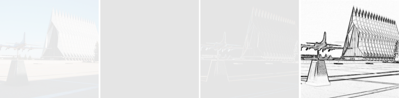
We can recreate the effect of the blackboard by following the steps for the pencil sketch effect and eliminating the
invert(1) function in the final stage.Night Vision Effect
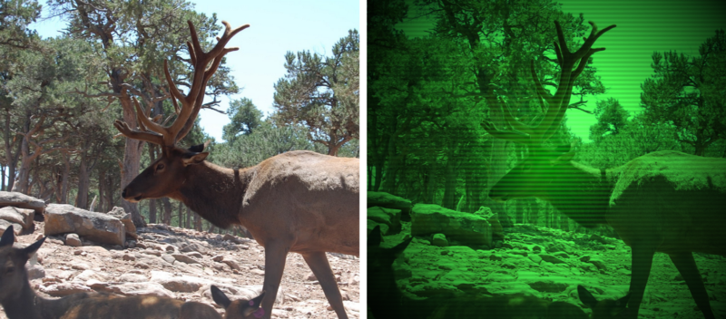
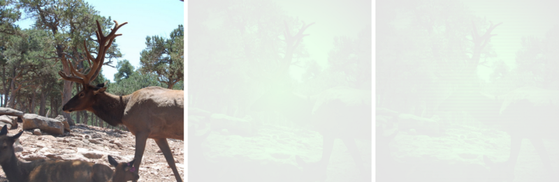
Let's recreate another effect with the CSS mixing capabilities and take a photo that looks like we made it through a lens in a night vision device.
There are three parts of our background that we will mix together using the
overlay mode. This blend mode brightens and darkens the background, and works as a combination of two other blend modes — multiply and screen .First we set the background image, this time one.
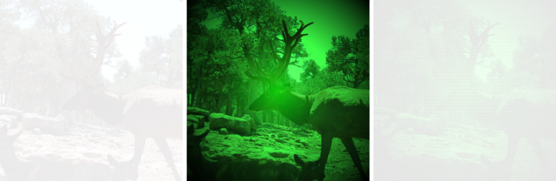
background: url(moose.jpg); background-size: cover; background-position: center; Now add the gradient and blending properties of the background layers. Here we use a radial gradient from translucent lime to black.
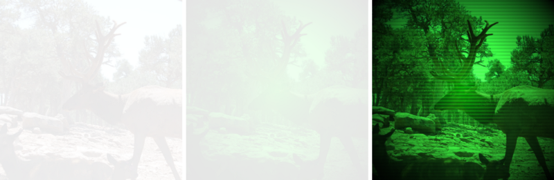
background: url(moose.jpg), radial-gradient( rgba(0,255,0,.8), black ); background-blend-mode: overlay; Not so bad, you can leave it all that way. But I have another idea that can make the effect more authentic - add a few fake scan lines with a repeating gradient background to the background.
background: url(moose.jpg), radial-gradient( rgba(0,255,0,.8), black ), repeating-linear-gradient( transparent 0, rgba(0,0,0,.2) 3px, transparent 6px ); And finally, here is the full CSS snippet used for this effect:
.night-vision-effect { background: url(moose.jpg), radial-gradient( rgba(0,255,0,.8), black ), repeating-linear-gradient( transparent 0, rgba(0,0,0,.2) 3px, transparent 6px ); background-blend-mode: overlay; background-size: cover; } More photo effects
I made a gallery of 20 images with CSS effects that you can use for your sites.
Browser support and gradual degradation
The good news is that the
background-blend-mode property is fully supported in Firefox, Chrome and Opera.In part, the good news is that it has sufficient support in Safari in terms of the effects that we covered here, but Safari does not currently support
saturation , hue , color and luminosity .The bad news is that Internet Explorer and IE Edge do not support CSS mixing properties at all.
This means that we must take into account the presence of browsers that still do not support
background-blend-mode . The remarkable @supports CSS @supports makes it quite simple. Here are two examples.For the first example, we take our spectral background gradient and provide backup options in case the
background-blend-mode function is not supported. We use for our example background: gray as a reserve, but in this place you can use any CSS. .spectrum-background { background: gray; @supports (background-blend-mode: screen) { background: linear-gradient(red, transparent), linear-gradient(to top left, lime, transparent), linear-gradient(to top right, blue, transparent); background-blend-mode: screen; } } And here the effect of a pencil sketch with a fallback. We check two important properties that are required to create an effect:
filter and background-blend-mode . If the user's browser does not support them (or if the browser does not support CSS @supports ), we will return to the original photo. .pencil-effect { background-image: url(photo.jpg); background-size: cover; @supports (background-blend-mode: difference) and (filter: invert(1)) { background-image: url(photo.jpg), url(photo.jpg); background-blend-mode: difference; background-position: calc(50% — 1px) calc(50% — 1px), calc(50% + 1px) calc(50% + 1px); filter: brightness(3) invert(1) grayscale(1); } } Sources:
Blending Modes Demystified by Justin McDowell
Basics of CSS Blend Modes by Chris Coyier
CSS3 Patterns Gallery by Lea Verou
Una Kravets' 6-part CSS Image Effects Series
Can I use ... Support for background-blend-mode
Image Effects with CSS by Bennett Feely
New CSS Gradient Options with Bennett Feely
Experimental Polyfill for background-blend-mode by Rik Cabanier
Compositing and Blending Level 1 Specification by W3C
LOOKING.HOUSE - the project collected more than 150 points looking glass in 40 countries. You can quickly execute the host, ping, traceroute, and mtr commands.

Source: https://habr.com/ru/post/423115/
All Articles