Flutter for Android developers. How to create a UI for an Activity using Flutter

This article is written for Android developers who want to apply their existing knowledge to create mobile applications using Flutter. In this article we will look at the equivalent of Activity in Flutter.
Prerequisites
It is assumed that you have already set up Flutter on your PC and can run the “Hello World” application. If not, do it .
Dart is based on the concept of OOP, so it’s easy for an Android developer to start using it.
purpose
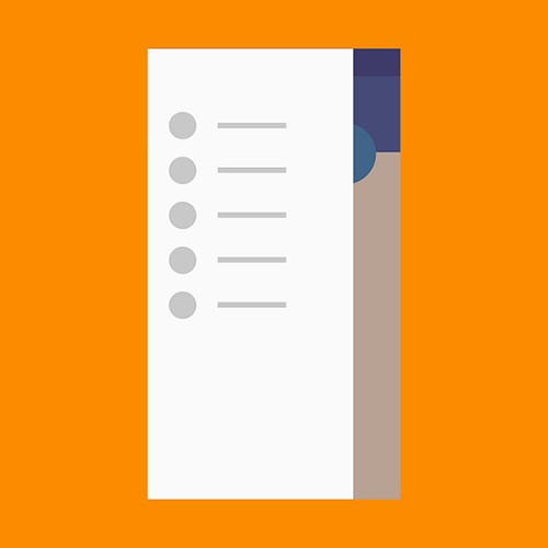
At the end of the article we will be able to create a user interface for the Activity using Flutter widgets, which will look like this:

In general, if you look inside an Android project generated using Flutter and open the AndroidManifest.xml file, you will find that there is only one Activity there, for example, FlutterActivity . But in this article we will focus on designing the user interface for the Activity in Flutter. How? With scaffold (English scaffolding ).
Scaffold
Scaffold is a set of widgets that visually represent the user interface for an Activity. As a rule, an Activity is used to display a single screen, which consists of many View components, such as a toolbar, a menu, a side menu, a snack bar, a FAB, etc. And FrameLayout used as a container for fragments in the Activity. In scaffold, all this is presented in the form of widgets.
Remember, any component in Flutter is a widget .
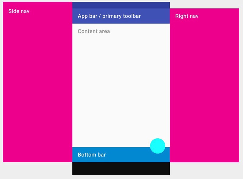
The image above clearly demonstrates the components of scaffold, which provides an API for displaying sidebar menus, bottom panel, toolbar, and content area.
Since scaffolds are material widgets, they must be inherited from some other material components, but we will discuss this in more detail in other articles. Now we will focus on creating a scaffold widget.
import 'package:flutter/material.dart'; void main() => runApp(new MaterialApp( home: new Scaffold( ), )); When you run this code, you will see a white blank screen, because you have not added anything to scaffold yet. So let's define the background color using the backgroundColor property and set the color to yellow:
void main() => runApp(new MaterialApp( home: new Scaffold( backgroundColor: Colors.yellowAccent, ), )); Now you will see a completely yellow screen of your application. You can play with other scaffold properties, a full list of which can be found in the official documentation .
Now we know how to create scaffold. Let's explore its basic properties one by one.
1. AppBar (Toolbar)
AppBar is essentially the same Toolbar that we use in our Activity. The picture shows where the properties of AppBar are displayed .
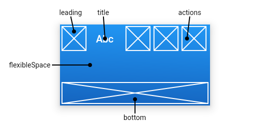
leading : the widget that appears in front of the title. This can be a hamburger menu icon or the back button.
title : toolbar title wrapped in a
Textwidget.actions : this is equivalent to
menu.xml, in which we create a<item/>to display menu items. The actions property accepts a list of widgets to display in the menu. Typically, these widgets are represented as IconButtons , which are equivalent to<item/>.bottom : Usually used for
TabBar, located under AppBar.flexibleSpace : This widget is used to create a
CollapsingToolbarLayouteffect (a collapsing toolbar).
So you can create a simple appbar with an icon, a title and a menu:
import 'package:flutter/material.dart'; void main() => runApp(new MaterialApp( home: new Scaffold( backgroundColor: Colors.yellowAccent, appBar: new AppBar( leading: new Icon(Icons.menu), title: new Text("My Title"), actions: <Widget>[ new IconButton( icon: new Icon(Icons.shopping_cart), onPressed: () {}, ), new IconButton( icon: new Icon(Icons.monetization_on), onPressed: () {}, ) ], ), ), )); 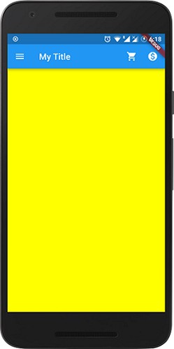
This is the result. It looks just like a regular toolbar, which we usually use. You can experiment with adding or removing widgets, adding style or color to a specific widget.
As a practical exercise, you can explore the rest of the AppBar properties and work with them.
2. Body (container for any view component)
This is the main component of scaffold. It works just like the Fragment Container in Android. A widget is required to display in the container area. This is the area where we display the main content to the user. In our example, for simplicity, we add red color to the body. In real life, in addition to the background color, many other widgets are used, for example, ListView, Row, Column, Stack, etc.
import 'package:flutter/material.dart'; void main() => runApp(new MaterialApp( home: new Scaffold( backgroundColor: Colors.yellowAccent, appBar: new AppBar( leading: new Icon(Icons.menu), title: new Text("My Title"), actions: <Widget>[ new IconButton( icon: new Icon(Icons.shopping_cart), onPressed: () {}, ), new IconButton( icon: new Icon(Icons.monetization_on), onPressed: () {}, ) ], ), body: new Container( color: Colors.red, ), ), )); 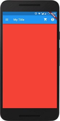
The body is displayed behind the AppBar, FAB and sidebar. Despite the fact that we applied a yellow background to scaffold, the red color of the body overlapping the scaffold background is displayed on the screen.
3. Drawer (DrawerLayout)
This widget is an Android DrawerLayout that travels from the left side of the Activity to display the navigation links of the application.
Drawer is usually used with the Scaffold.drawer property. As in Android, we use the NavigationView inside DrawerLayout . The table below shows equivalent view components on Android and Flutter.

The child component of a Drawer widget is usually a ListView , whose first item is the DrawerHeader , which displays information about the current user. The remaining list items are usually created using ListTiles . The following code shows how Drawer is created:
import 'package:flutter/material.dart'; void main() => runApp(new MaterialApp( home: new Scaffold( backgroundColor: Colors.yellowAccent, appBar: new AppBar( title: new Text("My Title"), actions: <Widget>[ new IconButton( icon: new Icon(Icons.shopping_cart), onPressed: () {}, ), new IconButton( icon: new Icon(Icons.monetization_on), onPressed: () {}, ) ], ), drawer: new Drawer( child: new ListView( children: <Widget>[ new DrawerHeader( child: new Text("Drawer Header"), decoration: new BoxDecoration( color: Colors.blue, ), ), new Text("Item 1"), new Text("Item 2"), new Text("Item 3"), new Text("Item 4"), new Text("Item 5"), new Text("Item 6"), ], ), ), ), )); 
This is the result you should get. It is worth noting that when adding a Drawer widget to scaffold, the hamburger menu icon is automatically added to the AppBar, so all other icons should be removed.
For more information about this widget, you can familiarize yourself with a practical example from the documentation or a separate article on this topic.
4. BottomNavigationBar (BottomNavigationView)
The material widget displayed at the bottom of the application, BottomNavigationBar consists of several elements in the form of text and icons.
BottomNavigationBar is typically used with the Scaffold.bottomNavigationBar property.
In Android, you define menu items in BottomNavigationView using the app:menu="@menu/my_navigation_items" property app:menu="@menu/my_navigation_items" , where my_navigation_items is a list of all menu items in the <item/> . In Flutter, the items property is used, which takes as an argument the BottomNavigationBarItem list, each of which consists of an icon, a title and a background color in the menu.
import 'package:flutter/material.dart'; void main() => runApp(new MaterialApp( home: new Scaffold( backgroundColor: Colors.yellowAccent, appBar: ..., body:..., drawer: ..., bottomNavigationBar: new BottomNavigationBar(items: [ new BottomNavigationBarItem( icon: new Icon(Icons.home), title: new Text("Home"), ), new BottomNavigationBarItem( icon: new Icon(Icons.search), title: new Text("Search"), ) ]), ), )); 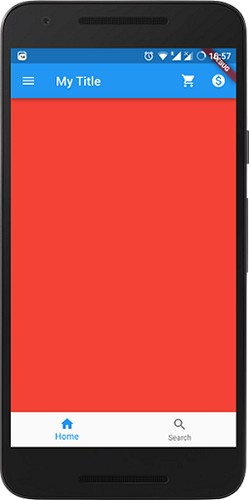
Now we have a BottomNavigationBar with two menu items.
To handle clicks and content changes in scaffold, you need a widget that supports state saving and some manual work. This topic is beyond the scope of this article, but you can read about it in the official documentation .
Also, let's add FAB to scaffold. Below is the complete code for creating our Activity user interface using scaffold.
import 'package:flutter/material.dart'; void main() => runApp(new MaterialApp( home: new Scaffold( backgroundColor: Colors.yellowAccent, appBar: new AppBar( title: new Text("My Title"), actions: <Widget>[ new IconButton( icon: new Icon(Icons.shopping_cart), onPressed: () {}, ), new IconButton( icon: new Icon(Icons.monetization_on), onPressed: () {}, ) ], ), body: new Container( color: Colors.red, ), drawer: new Drawer( child: new ListView( children: <Widget>[ new DrawerHeader( child: new Text("Drawer Header"), decoration: new BoxDecoration( color: Colors.blue, ), ), new Text("Item 1"), new Text("Item 2"), new Text("Item 3"), new Text("Item 4"), new Text("Item 5"), new Text("Item 6"), ], ), ), bottomNavigationBar: new BottomNavigationBar(items: [ new BottomNavigationBarItem( icon: new Icon(Icons.home), title: new Text("Home"), ), new BottomNavigationBarItem( icon: new Icon(Icons.search), title: new Text("Search"), ) ]), floatingActionButton: new FloatingActionButton( onPressed: (){}, child: new Icon(Icons.add), ), ), ));
Now on onPressed method is onPressed . Therefore, the button will not respond to touch. If necessary, you can add handling of this event.
Finally, we got the result we talked about at the beginning of this article.
Conclusion
Flutter is a powerful tool for quickly developing a high-quality, beautiful user interface. It provides many widgets to create a flexible interface with attractive animation. Scaffold is one of them, and this is just the tip of the iceberg. In the following articles we will discuss other topics.
')
Source: https://habr.com/ru/post/423091/
All Articles