Learning the climate of Russian cities with Python
In Python, you can work with data and visualize it. Not only programmers use this, but also scientists: biologists, physicists, and sociologists. Today, together with shwars , the curator of our Python jumpstart for AI course, we will briefly turn into meteorologists and study the climate of Russian cities. From libraries to visualize and work with data we use Pandas, Matplotlib and Bokeh.

We conduct the research ourselves in Azure Notebooks , the cloud version of Jupyther Notebook. Thus, to start working with Python, we will not need to install anything on our computer and it will be possible to work directly from the browser. It is only necessary to log in with your Microsoft Account, create a library and in it - a new Python 3 laptop. Then you can take code snippets from this article and experiment!
First of all, we import the main libraries that we need. Pandas is a library for working with tabular data, or so-called data frames, and pyplot will allow us to build graphs.
')
Source data is easy to find on the Internet, but we have already prepared data for you in a convenient CSV format. CSV is a text format in which all columns are separated by commas. Hence the name - Comma Separated Values.
Pandas can open CSV files from the local disk or immediately from the Internet. The data itself is in our repository on GitHub , so we just need to specify the correct URL.

Rename the table columns to make it easier to refer to them by name. We also need to convert strings to numeric values in order to operate on them. When we try to do this using the
An important morality follows from this problem: the data usually comes in a “dirty” form that is inconvenient to use, and the data scientist’s task is to bring this data to a good view.
You can see that some of the columns in our table are of type
Now that we have clean data, we can try to build interesting graphs.
For example, let's see how the average temperature depends on latitude.

From the graph it can be seen that the closer to the equator - the warmer.
Now take a look at the cities that are temperature record holders, and see if there is a correlation between the minimum and maximum temperature in the city.
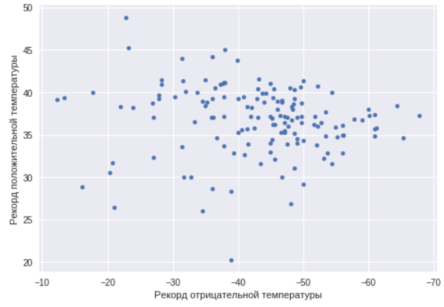
As you can see, in this case there is no such correlation. There are cities with a sharply continental climate, and just warm and cold cities. We will find cities with a maximum temperature range, that is, just cities with a sharply continental climate.
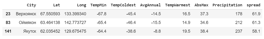
This time we took not the record figures, but the average of the warmest and coldest month. As expected, the largest variation is in cities from the Republic of Sakha (Yakutia).
For further research we will consider cities within a radius of 300 km from Moscow. To calculate the distance between points in latitude and longitude, we use the geopy library, which must first be installed using
Let's add one more column to the table - the distance to Moscow.

Use the expression to select only the lines of interest.
For these cities we will build a schedule of minimum, average annual and maximum temperatures.
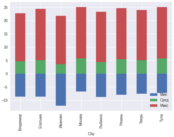
In general, there are no anomalies within 300 kilometers around Moscow. Ivanovo is located north of other cities, so the temperature there is a few degrees lower.
Now let's try to map the average annual rainfall with reference to cities and see how precipitation depends on the geographical location. To do this, use another visualization library - Bokeh . It also needs to be installed.
Then we calculate another column - the size of the circle, which will show the amount of precipitation. The coefficient is chosen empirically.
To work with the map, you need the Google Maps API key. It must be independently obtained on the site .
More detailed instructions on using Bokeh to plot graphs on maps can be found here and here .
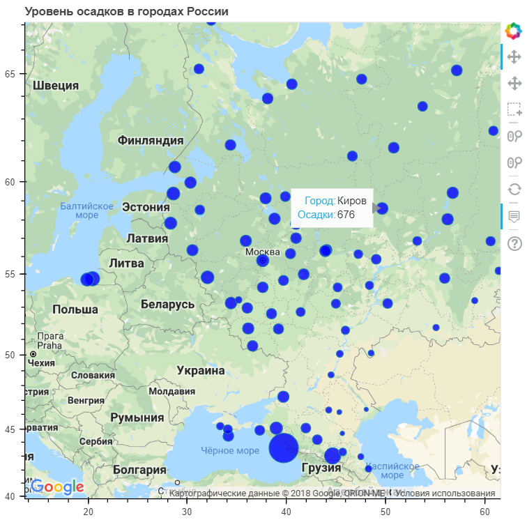
As you can see, the most precipitation falls in coastal cities. Although there are quite a large number of such cities, where the average precipitation is even lower than the national one.
All the code with comments, written by Dmitry Soshnikov, you can independently see and run here .
We showed the possibilities of the language without using complex algorithms, specific libraries or writing hundreds of lines of code. However, even with standard tools, you can analyze your data and draw some conclusions.
Datasets are not always perfectly composed, so before you start working with visualization, you need to put them in order. The quality of visualization will largely depend on the quality of the data used.
There are a huge number of various types of charts and graphs, and not necessarily limited to standard libraries alone.
There is Geoplotlib , Plotly , Minimalistic Leather and others.
If you want to learn more about working with data in Python, as well as get acquainted with artificial intelligence, then we invite you to a one-day intensive from the Binary District - Python jumpstart for AI .
We conduct the research ourselves in Azure Notebooks , the cloud version of Jupyther Notebook. Thus, to start working with Python, we will not need to install anything on our computer and it will be possible to work directly from the browser. It is only necessary to log in with your Microsoft Account, create a library and in it - a new Python 3 laptop. Then you can take code snippets from this article and experiment!
Get the data
First of all, we import the main libraries that we need. Pandas is a library for working with tabular data, or so-called data frames, and pyplot will allow us to build graphs.
')
import pandas as pd import matplotlib.pyplot as plt Source data is easy to find on the Internet, but we have already prepared data for you in a convenient CSV format. CSV is a text format in which all columns are separated by commas. Hence the name - Comma Separated Values.
Pandas can open CSV files from the local disk or immediately from the Internet. The data itself is in our repository on GitHub , so we just need to specify the correct URL.
data = pd.read_csv("https://raw.githubusercontent.com/shwars/PythonJump/master/Data/climat_russia_cities.csv") data Rename the table columns to make it easier to refer to them by name. We also need to convert strings to numeric values in order to operate on them. When we try to do this using the
pd.to_numeric function, we find that a strange error occurs. This is due to the fact that instead of a minus in the text is used the sign of a long dash. data.columns=["City","Lat","Long","TempMin","TempColdest","AvgAnnual","TempWarmest","AbsMax","Precipitation"] data["TempMin"] = pd.to_numeric(data["TempMin"]) --------------------------------------------------------------------------- ValueError Traceback (most recent call last) pandas/_libs/src/inference.pyx in pandas._libs.lib.maybe_convert_numeric() ValueError: Unable to parse string "−38.0" ... ... ... ValueError: Unable to parse string "−38.0" at position 0 An important morality follows from this problem: the data usually comes in a “dirty” form that is inconvenient to use, and the data scientist’s task is to bring this data to a good view.
You can see that some of the columns in our table are of type
object , and not numeric type float64 . In such columns, we replace the dash with a minus and then convert the entire table into a numeric format. Columns that can not be converted (city names) will remain unchanged (for this we used the key errors='ignore' ). print(data.dtypes) for x in ["TempMin","TempColdest","AvgAnnual"]: data[x] = data[x].str.replace('−','-') data = data.apply(pd.to_numeric,errors='ignore') print(data.dtypes) City object Lat float64 Long float64 TempMin object TempColdest object AvgAnnual object TempWarmest float64 AbsMax float64 Precipitation int64 dtype: object City object Lat float64 Long float64 TempMin float64 TempColdest float64 AvgAnnual float64 TempWarmest float64 AbsMax float64 Precipitation int64 dtype: object Examine the data
Now that we have clean data, we can try to build interesting graphs.
Average annual temperature
For example, let's see how the average temperature depends on latitude.
ax = data.plot(x="Lat",y="AvgAnnual",kind="Scatter") ax.set_xlabel("") ax.set_ylabel(" ") From the graph it can be seen that the closer to the equator - the warmer.
Record cities
Now take a look at the cities that are temperature record holders, and see if there is a correlation between the minimum and maximum temperature in the city.
ax=data.plot(x="TempMin",y="AbsMax",kind="scatter") ax.set_xlabel(" ") ax.set_ylabel(" ") ax.invert_xaxis() As you can see, in this case there is no such correlation. There are cities with a sharply continental climate, and just warm and cold cities. We will find cities with a maximum temperature range, that is, just cities with a sharply continental climate.
data['spread'] = data['TempWarmest'] - data['TempColdest'] data.nlargest(3,'spread') This time we took not the record figures, but the average of the warmest and coldest month. As expected, the largest variation is in cities from the Republic of Sakha (Yakutia).
Winter and summer
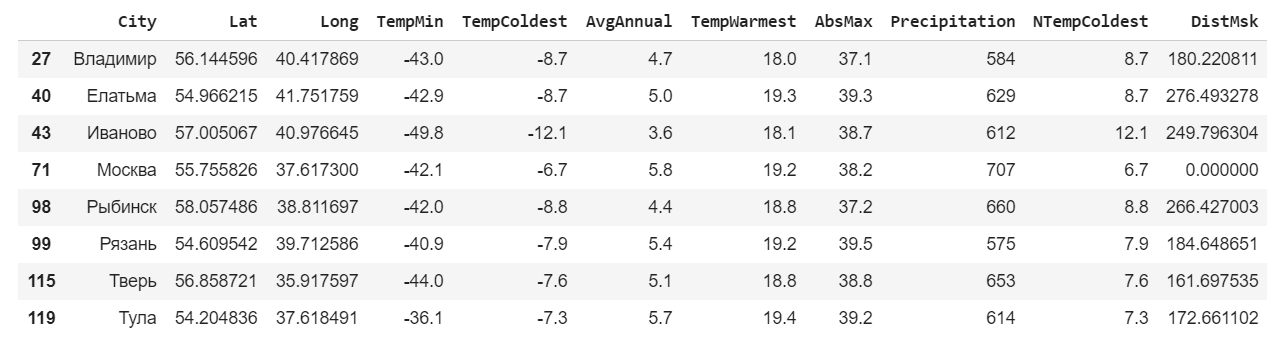
For further research we will consider cities within a radius of 300 km from Moscow. To calculate the distance between points in latitude and longitude, we use the geopy library, which must first be installed using
pip install . !pip install geopy import geopy.distance Let's add one more column to the table - the distance to Moscow.
msk_coords = tuple(data.loc[data["City"]==""][["Lat","Long"]].iloc[0]) data["DistMsk"] = data.apply(lambda row : geopy.distance.distance(msk_coords,(row["Lat"],row["Long"])).km,axis=1) data.head() Use the expression to select only the lines of interest.
msk = data.loc[data['DistMsk']<300] msk For these cities we will build a schedule of minimum, average annual and maximum temperatures.
ax=msk.plot(x="City",y=["TempColdest","AvgAnnual","TempWarmest"],kind="bar",stacked="true") ax.legend(["","",""],loc='lower right') In general, there are no anomalies within 300 kilometers around Moscow. Ivanovo is located north of other cities, so the temperature there is a few degrees lower.
Work with geo-data
Now let's try to map the average annual rainfall with reference to cities and see how precipitation depends on the geographical location. To do this, use another visualization library - Bokeh . It also needs to be installed.
Then we calculate another column - the size of the circle, which will show the amount of precipitation. The coefficient is chosen empirically.
!pip install bokeh from bokeh.io import output_file, output_notebook, show from bokeh.models import ( GMapPlot, GMapOptions, ColumnDataSource, Circle, LogColorMapper, BasicTicker, ColorBar, DataRange1d, PanTool, WheelZoomTool, BoxSelectTool, HoverTool ) from bokeh.models.mappers import ColorMapper, LinearColorMapper from bokeh.palettes import Viridis5 from bokeh.plotting import gmap To work with the map, you need the Google Maps API key. It must be independently obtained on the site .
More detailed instructions on using Bokeh to plot graphs on maps can be found here and here .
google_key = "<INSERT YOUR KEY HERE>" data["PrecipSize"] = data["Precipitation"] / 50.0 map_options = GMapOptions(lat=msk_coords[0], lng=msk_coords[1], map_type="roadmap", zoom=4) plot = gmap(google_key,map_options=map_options) plot.title.text = " " source = ColumnDataSource(data=data) my_hover = HoverTool() my_hover.tooltips = [('', '@City'),('','@Precipitation')] plot.circle(x="Long", y="Lat", size="PrecipSize", fill_color="blue", fill_alpha=0.8, source=source) plot.add_tools(PanTool(), WheelZoomTool(), BoxSelectTool(), my_hover) output_notebook() show(plot) As you can see, the most precipitation falls in coastal cities. Although there are quite a large number of such cities, where the average precipitation is even lower than the national one.
All the code with comments, written by Dmitry Soshnikov, you can independently see and run here .
Results
We showed the possibilities of the language without using complex algorithms, specific libraries or writing hundreds of lines of code. However, even with standard tools, you can analyze your data and draw some conclusions.
Datasets are not always perfectly composed, so before you start working with visualization, you need to put them in order. The quality of visualization will largely depend on the quality of the data used.
There are a huge number of various types of charts and graphs, and not necessarily limited to standard libraries alone.
There is Geoplotlib , Plotly , Minimalistic Leather and others.
If you want to learn more about working with data in Python, as well as get acquainted with artificial intelligence, then we invite you to a one-day intensive from the Binary District - Python jumpstart for AI .
Source: https://habr.com/ru/post/422463/
All Articles