User Perception Games and Website and Application Speed
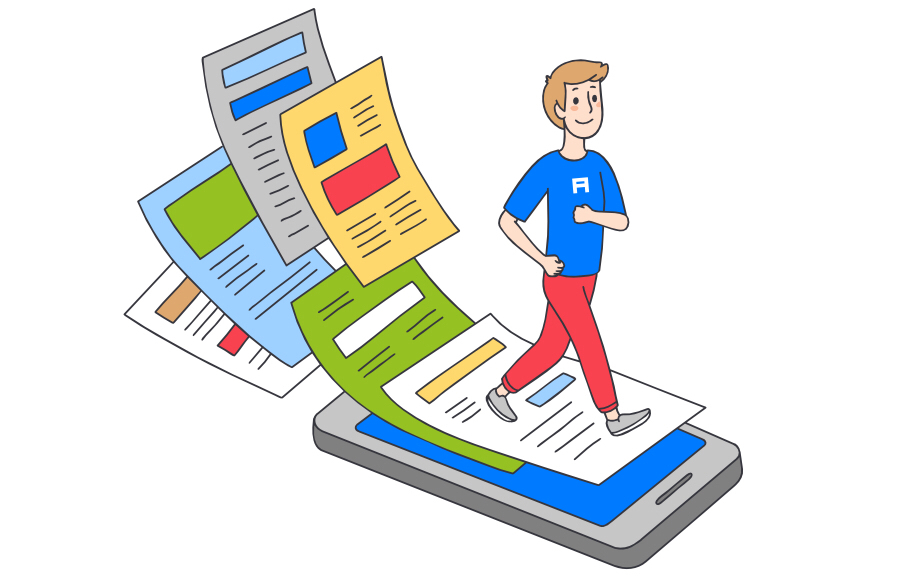
In this article I will talk about the different approaches in design, which will help to create the impression that the site (or application) is faster.
NOTE. The article is inspired by a conversation with Ada Cannon , which protects the interests of developers in the project of the Internet browser Samsung Internet and in the series of our Google Chrome Developers YouTube clips “Designer and Developer”. You can listen to a more complete recording of the conversation by downloading it or subscribing to our podcast on the platform of iTunes or Google Play Music .
Have you ever wondered why when you call somewhere in support, do you turn on the music while waiting? And you imagine your feelings, if instead of music there would be a dead silence. CNN conducted a survey , which showed that if the call was placed on hold, in 70 percent of cases the caller would hang up in the first 60 seconds of silence: it may seem that the call was dropped, and the wait itself seems longer. Therefore, the meaning of "music" is to fill with something waiting and take the time of the subscriber.
')
At Houston airport there was a similar problem: passengers complained that they had to wait a long time for baggage. After the aircraft landed at the terminal, the passengers quickly got to the carousel, and therefore they had to wait for their luggage on average seven minutes - and they did not stop complaining, even when the airport expanded its staff. Therefore, it was decided to take the aircraft farther from the terminal so that passengers had to go longer - and the complaints dropped to almost zero .
Transferred to Alconost
Time perception
How a person perceives time depends on the level of anxiety, on whether a person moves or is at home. In a study that we conducted on Google, it turned out that if users were at home, 75 percent of them thought that the site was fast, but outside the home, this figure dropped to 52%. Users younger download sites seem slower than older people. In general, the delay we perceive when loading is 80 milliseconds longer than in reality. And if you are forced to just wait, it seems that time flows even more slowly.
Websites and applications can and will load slowly, even if they are optimized, and it will still seem to 30 percent of users that they are slower than they really are. What to do with it? Obviously: to occupy the user with some things.
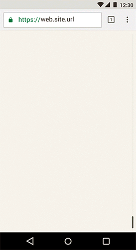
Loading
You can not show a blank screen, you can not force people to wait without any reaction from the application - but the load indicator also has flaws.
Here is an example of a mobile application layout for a newspaper, which I called the Tailpiece. The user has to wait for the page to load, so the load time seems longer. In addition, it seems that the application “thinks” rather than “works”.

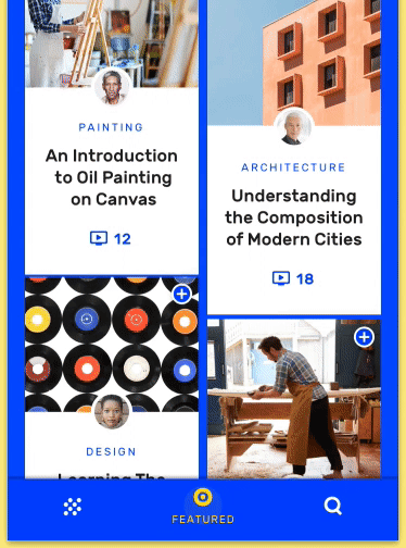
Screen fill
In this example, instead of the download indicator, we fill the screen with content that reflects the structure of the future page. This option is already better, but using this solution in itself is not the most effective approach: there is still a feeling of some kind of error and we see no context as to what kind of content should appear.

Step loading
Using a preview of the page structure, contextual metadata and partially loaded blurry images, you distract the user's attention for a longer time, and it begins to seem to him that the page is faster. The point is to give the user a hint about what he sees, and at the same time download everything as quickly as possible.
To hide the load time, you can do step-by-step animations - for example, how we do it in the examples on “material” design below.


Step-by-step animation in examples of "material" design
Step-by-step loading works well, because it causes the user interest before the actual transition to the content - well, it distracts from the wait, of course.


Step-by-step animation smooths important transitions.
Navigation
Facebook , RedBooth , Spotify and Google Plus conducted research in which it turned out that if the menu items are not shown, the user will not search for them and use them. In addition, Facebook learned that the application with the bottom navigation bar seems to be faster . Because, firstly, out of sight - out of mind, and secondly - the sooner you can find the desired item, the better. Therefore, keep the main navigation buttons in plain sight in the same place. From the example below with the application in the “material” design of Owl, you can see that this approach does not interfere with the original design. In addition, on mobile devices, navigation from the bottom is more convenient: the user can go to the desired section with one hand, and working with the application seems to be faster and more natural.
Reaction and informing
It is very important to prompt the user what happens next, but you need to give a reaction to the actions performed by the user - so it will seem to him that the application (or site) is faster. To inform the user that the desired action is being performed, you can use motion, hover, and ripple animations.
Applying the listed techniques in the design of the project, you can direct the user to where he needs to, and distract from the wait, creating the impression that the application is faster. You can read more about user perception and how to take it into account when designing in our book Speed Matters .
About the translator
The article is translated in Alconost.
Alconost is engaged in the localization of games , applications and websites in 70 languages. Language translators, linguistic testing, cloud platform with API, continuous localization, 24/7 project managers, any formats of string resources.
We also make advertising and training videos - for websites selling, image, advertising, training, teasers, expliners, trailers for Google Play and the App Store.
Read more
Source: https://habr.com/ru/post/422437/
All Articles