Games with time: we accelerate the application at the level of perception
A recent study from Google in collaboration with Awwwards found that speed currently holds the highest place in the UX hierarchy. It is unlikely that anyone will be surprised: the pace of everyday life is increasing, mobile solutions tend to integrate into it as organically as possible - all this sets a certain bar of expectations. Users expect minimal downtime.

In this article we will not dwell on technical methods to honestly speed up the site loading and processing operations. Instead, we dissect the temporal aspect of user experience: see what actually stands behind the words “long” and “fast”, how and why the perception of time is distorted, and what UX practices exist for managing expectations.
Let's start with the definition of concepts. What is generally meant by “fast” loading and where does the line between tolerable and unacceptable speed go? According to a study by Google and Awwwards, the user wait time scale looks like this:
')
Here, however, it is necessary to make two reservations. First, the above scheme becomes valid in the course of working with the site or application. At the start, the patience credit that the user is ready to allocate is noticeably lower - most will wait for the download for no more than three seconds. Secondly, absolute values are given on the scale, while the subjective perception of time may distort the assessment. In general, users tend to overestimate a little waiting time in the mind - the estimated values are somewhere around 80 milliseconds higher than the real ones. This perceptual gap may increase under the influence of some factors:
So, the requirements for speed sites, multiplied by the psychological and situational particular, are quite stringent. Statistics show that from a technical point of view, they are quite realistic (70% of the sites reviewed in the study loaded in less than 4 seconds, and one third of them were enough for one), however, those who work with bulky, heavy content or a lot of scripts may encounter problems.
In this case, comes to the rescue ... all the same specificity of time perception. The characteristics of our thinking make it possible to build the UX in such a way as to conceal or compensate for the prolonged waiting. The entire set of recommendations on this subject can be summarized in three basic principles, in accordance with which a general emotional picture of interaction with the site or application is formed.
Waiting is of two varieties - active and passive. The psychological difference between them can be illustrated by an instructive example from the airport in Houston. The airport administration faced a common problem: customers were annoyed by the need for a long time (up to seven minutes) to stand idle near the conveyor belt while waiting for baggage. Optimization of work processes did not give a result, and as a result a very elegant way out was found - the layout was changed so that the distance from the terminal to the runway increased. The waiting period has not shrunk, but now people have spent a significant part of it in motion. Miraculously, the stream of complaints stopped: time no longer seemed to customers to be wasted, simply because they were busy with something.
Similarly, site visitors are much more sensitive to passive waiting (that is, contemplating a blank page) than waiting, seasoned with at least some mental activity, even if it is objectively useless. How can this be taken advantage of?
Some developers make a separate entertainment event out of expectations, up to mini-games, which can be cut on the loading screen while the site is “thinking”. However, animations are much more widely used, the best option in terms of the ratio of labor to effect. Animations are visually attractive and dynamic, which allows them to keep the user's attention for a couple of precious seconds and ensure a smooth transition to the main content.

Animation that you can watch for a long time
The Google team provides the following guidelines for creating animations:
Another approach is not to distract the visitor from being beautiful, but to provide content immediately, just in small portions. In this case, the download begins with the most basic elements, which do not require much time, the more “heavy” ones are loaded in the following stages. It also eliminates the effect of a blank screen: even if the components of the first echelon are not too informative, the user will still be able to satisfy a cognitive hunger for a short time, until something more substantial arrives.
The following may be used as replacement elements:

Facebook offers a page skeleton as a lightweight spoiler.
During the study , the UIE company found an amusing illustration of this principle. Respondents at the request of the experimenters evaluated the speed of sites, and the vast majority, comparing the sites of Amazon and About.com, gave the championship to Amazon. For reference, the average download time for About.com was then about 8 seconds, and the average download time for Amazon was about 36 seconds. It was explained simply: during the interaction, users simply did not suspect that Amazon was not fully loaded. The functionality they needed became available in a matter of seconds, and they no longer paid attention to background processes.
Hence the conclusion: the earlier the user can start the desired operation, the less the total load time has. By breaking down the load into several stages on a pragmatic basis, we create the illusion of speed. This can be done in different ways:
Download "within the screen" . In other words, first of all, only what is visible on the screen immediately after the transition is loaded. Content below this feature is left for later. Naturally, this method works only if the upper screen is informatively saturated and the user has no desire to flip further for some time. For example, it is very popular on the pages of goods in online stores, where the first positions usually successfully hold attention while the system loads other materials.
Preload . Everything is transparent here: while the user is working with the current page, the system in the background loads everything that can be needed when he opens the next one. Accordingly, by the time of the request, enough will be done to provide a “momentary” transition. This method works well on linear, predictable sections of user travel — for example, when filling in multi-page forms or on the login screen.
Optimistic design . In this case, it only seems to the user that he has successfully completed the operation - the system issues the corresponding status before completion (and sometimes even before it starts) of processing, literally milliseconds after the click. For example, you can refer to social networks like Twitter and Instagram, and remember how deceptively instantly they allow you to like posts. Such optimism is fraught with a known risk - there is always the possibility that something will go wrong. Silence in such cases leads to unpleasant discoveries and disappointments, so errors should be reported after the fact, even if it creates a contradictory impression.
If something in the boot process and works for us, then this is the effect of irrecoverable costs. After you have already spent some time working with the site, you will not leave just because the next step takes too much time. However, there is one caveat: at some point, the user will inevitably have a doubt that the protracted operation will in principle reach the end. The suspicion that something is not working and the journey has reached a dead end prompts to close the page much more than just impatience.
Accordingly, this important point should be taken into account when designing transition states and loading windows - the user must always be sure that everything is going according to plan. The following rules can help:
Accordingly, the total downtime should be assessed honestly, without overcoming the first half of the indicator much faster than the second. The most common recommendation is to keep the pace steady and not allow stops in the field to be filled in: they, again, create the feeling that the process is interrupted and may not resume. If you wish, you can act on the contrary: to start filling slowly and pick up speed as you go - this will be a pleasant surprise for users.
Non-life status indicator
If you move deeper into the rabbit hole, there are some harmless tricks that allow you to visually speed up the filling process, which, in turn, changes the perception of time, so the application seems to be faster ... For example, unlike spinners, progress indicators should be done larger - they are easier to observe movement, which enhances the feeling of continuity. The stripes also create the illusion of speed if they are tilted against the direction of movement.
In general, expectations management practices largely overlap with the trends prevailing in design in recent years: dynamic, interactive interfaces, smooth transitions, elements of “delight” in the UX. Perhaps, this was to be expected - the feeling of quickness and continuity sewn into modern aesthetics at a basic level. Good luck in the game ahead of the curve!
In this article we will not dwell on technical methods to honestly speed up the site loading and processing operations. Instead, we dissect the temporal aspect of user experience: see what actually stands behind the words “long” and “fast”, how and why the perception of time is distorted, and what UX practices exist for managing expectations.
Let's start with the definition of concepts. What is generally meant by “fast” loading and where does the line between tolerable and unacceptable speed go? According to a study by Google and Awwwards, the user wait time scale looks like this:
')
- 200 milliseconds - Action estimated as instant
- 1 second - The sense of continuity is not disturbed.
- 5 seconds - the operation is perceived as part of a common chain
- 8 seconds - Attention weakens, the user drops out of the process
Here, however, it is necessary to make two reservations. First, the above scheme becomes valid in the course of working with the site or application. At the start, the patience credit that the user is ready to allocate is noticeably lower - most will wait for the download for no more than three seconds. Secondly, absolute values are given on the scale, while the subjective perception of time may distort the assessment. In general, users tend to overestimate a little waiting time in the mind - the estimated values are somewhere around 80 milliseconds higher than the real ones. This perceptual gap may increase under the influence of some factors:
- Demographics of the audience . As polls show, the most categorical in terms of time is the user group in the range of 18-24 years. Older generations are much more tolerant: after the turn in 25 years, the likelihood that a visitor will rate a site as fast increases by almost 50%.
- Conditions of interaction . If the scenarios for using the application or site involve working from home, in a relaxed atmosphere, then you can relax. If people will turn to the product mainly on the go (say, view maps or track traffic), be prepared for the fact that their demands will increase by the same 50%.
- The psychological state of the user . Internal perception strongly influences time: in situations of stress, mental overload or severe anxiety, time begins to flow for us almost twice as fast.
So, the requirements for speed sites, multiplied by the psychological and situational particular, are quite stringent. Statistics show that from a technical point of view, they are quite realistic (70% of the sites reviewed in the study loaded in less than 4 seconds, and one third of them were enough for one), however, those who work with bulky, heavy content or a lot of scripts may encounter problems.
In this case, comes to the rescue ... all the same specificity of time perception. The characteristics of our thinking make it possible to build the UX in such a way as to conceal or compensate for the prolonged waiting. The entire set of recommendations on this subject can be summarized in three basic principles, in accordance with which a general emotional picture of interaction with the site or application is formed.
Principle number 1: The sense of time is dulled when the user has something to focus on.
Waiting is of two varieties - active and passive. The psychological difference between them can be illustrated by an instructive example from the airport in Houston. The airport administration faced a common problem: customers were annoyed by the need for a long time (up to seven minutes) to stand idle near the conveyor belt while waiting for baggage. Optimization of work processes did not give a result, and as a result a very elegant way out was found - the layout was changed so that the distance from the terminal to the runway increased. The waiting period has not shrunk, but now people have spent a significant part of it in motion. Miraculously, the stream of complaints stopped: time no longer seemed to customers to be wasted, simply because they were busy with something.
Similarly, site visitors are much more sensitive to passive waiting (that is, contemplating a blank page) than waiting, seasoned with at least some mental activity, even if it is objectively useless. How can this be taken advantage of?
Some developers make a separate entertainment event out of expectations, up to mini-games, which can be cut on the loading screen while the site is “thinking”. However, animations are much more widely used, the best option in terms of the ratio of labor to effect. Animations are visually attractive and dynamic, which allows them to keep the user's attention for a couple of precious seconds and ensure a smooth transition to the main content.
Animation that you can watch for a long time
The Google team provides the following guidelines for creating animations:
- The optimal speed is not higher than 60 frames per second; each frame should render in about 16 milliseconds
- The optimal duration is 200-500 milliseconds. In animations that use bouncing effects, the elasctic rate of time rises to 800-1200 milliseconds.
- Animations where speed is linear look less natural than those where the movement is gradually accelerating or slowing down.
- Slow-motion animations create a feeling of quick response — this can be very useful when interacting with interface elements.
- Accelerating animations are best not to apply if the waiting time is long.
- CSS animations are suitable for simple, short transitions. More complex animations and transformational effects are more convenient to do in Javascript.
Another approach is not to distract the visitor from being beautiful, but to provide content immediately, just in small portions. In this case, the download begins with the most basic elements, which do not require much time, the more “heavy” ones are loaded in the following stages. It also eliminates the effect of a blank screen: even if the components of the first echelon are not too informative, the user will still be able to satisfy a cognitive hunger for a short time, until something more substantial arrives.
The following may be used as replacement elements:
- Page Skeleton: a markup showing which blocks (text, headers, images) are loaded and where they will be located.
- Pixelized or low-quality images that are gradually “getting clear before the eyes of the user” - the so-called progressive download.
- Metadata that suggests the overall essence of the downloadable item.
- Previous page or its individual components. Experts recommend borrowing repetitive elements to the maximum - firstly, it makes the transition smoother, and secondly, this is content with which you can continue to interact.
Facebook offers a page skeleton as a lightweight spoiler.
Principle # 2: The download is considered complete after the successful start of the interaction.
During the study , the UIE company found an amusing illustration of this principle. Respondents at the request of the experimenters evaluated the speed of sites, and the vast majority, comparing the sites of Amazon and About.com, gave the championship to Amazon. For reference, the average download time for About.com was then about 8 seconds, and the average download time for Amazon was about 36 seconds. It was explained simply: during the interaction, users simply did not suspect that Amazon was not fully loaded. The functionality they needed became available in a matter of seconds, and they no longer paid attention to background processes.
Hence the conclusion: the earlier the user can start the desired operation, the less the total load time has. By breaking down the load into several stages on a pragmatic basis, we create the illusion of speed. This can be done in different ways:
Download "within the screen" . In other words, first of all, only what is visible on the screen immediately after the transition is loaded. Content below this feature is left for later. Naturally, this method works only if the upper screen is informatively saturated and the user has no desire to flip further for some time. For example, it is very popular on the pages of goods in online stores, where the first positions usually successfully hold attention while the system loads other materials.
Preload . Everything is transparent here: while the user is working with the current page, the system in the background loads everything that can be needed when he opens the next one. Accordingly, by the time of the request, enough will be done to provide a “momentary” transition. This method works well on linear, predictable sections of user travel — for example, when filling in multi-page forms or on the login screen.
Optimistic design . In this case, it only seems to the user that he has successfully completed the operation - the system issues the corresponding status before completion (and sometimes even before it starts) of processing, literally milliseconds after the click. For example, you can refer to social networks like Twitter and Instagram, and remember how deceptively instantly they allow you to like posts. Such optimism is fraught with a known risk - there is always the possibility that something will go wrong. Silence in such cases leads to unpleasant discoveries and disappointments, so errors should be reported after the fact, even if it creates a contradictory impression.
Principle number 3: The user is more tolerant to downtime in the presence of feedback
If something in the boot process and works for us, then this is the effect of irrecoverable costs. After you have already spent some time working with the site, you will not leave just because the next step takes too much time. However, there is one caveat: at some point, the user will inevitably have a doubt that the protracted operation will in principle reach the end. The suspicion that something is not working and the journey has reached a dead end prompts to close the page much more than just impatience.
Accordingly, this important point should be taken into account when designing transition states and loading windows - the user must always be sure that everything is going according to plan. The following rules can help:
- Buttons and other active elements should have a clear marking of the current state and display any changes immediately. Many mobile browsers automatically have a delay of 300-350 milliseconds before issuing a response after a tap — it is better to get rid of it by writing to the head: meta name = ”viewport” content = ”width = device-width”
- Google strongly recommends the maximum use of micro-interactions throughout the user’s work with the site, including minor actions within one page (add to favorites, send text via the contact form).
- Animated elements work better than static ones: they entertain the user and create a sense of dynamism.
- Spinner, a common type of animation for the standby mode, is good because it clearly conveys the status of “in progress”, but is bad for its lack of information. Experts recommend using it only at very short distances - definitely not more than ten seconds. If possible, you should also strive to ensure that the animation does not visually block the rest of the available content. For example, when sending a message, you can limit yourself to a small spinner next to the input field, and not center it, darkening the page.
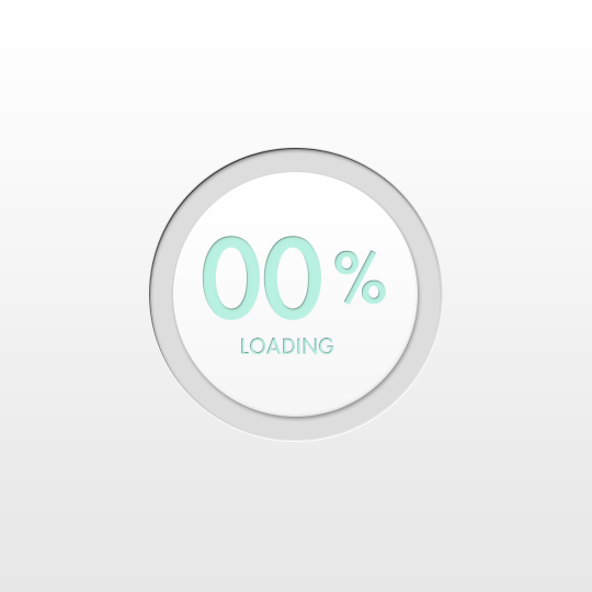
- The progress indicator is the optimal feedback format: it makes it clear that the process is running, and allows you to track how much time is left before it is completed. However, it is important to resist the temptation to overstate expectations: the majority of visitors do not tolerate the "99 percent curse" at the genetic level. At a minimum, it will cause severe irritation and reduce the likelihood of return.
Accordingly, the total downtime should be assessed honestly, without overcoming the first half of the indicator much faster than the second. The most common recommendation is to keep the pace steady and not allow stops in the field to be filled in: they, again, create the feeling that the process is interrupted and may not resume. If you wish, you can act on the contrary: to start filling slowly and pick up speed as you go - this will be a pleasant surprise for users.
Non-life status indicator
If you move deeper into the rabbit hole, there are some harmless tricks that allow you to visually speed up the filling process, which, in turn, changes the perception of time, so the application seems to be faster ... For example, unlike spinners, progress indicators should be done larger - they are easier to observe movement, which enhances the feeling of continuity. The stripes also create the illusion of speed if they are tilted against the direction of movement.
In general, expectations management practices largely overlap with the trends prevailing in design in recent years: dynamic, interactive interfaces, smooth transitions, elements of “delight” in the UX. Perhaps, this was to be expected - the feeling of quickness and continuity sewn into modern aesthetics at a basic level. Good luck in the game ahead of the curve!
Source: https://habr.com/ru/post/422355/
All Articles