CSS Font-Size: em vs. px vs. pt vs. percent
One of the most confusing aspects of CSS is the use of the font-size attribute to scale text. Using CSS, you can change the size of the text in the browser using four different units of measurement. Which of these four units is best for the web? This is a question that has generated a variety of discussions and criticism. Finding the final answer is difficult because the question itself is complex.
1. “Ems” (em): “em” is a scalable unit that is used in web documents. “Em” is equal to the current font-size, for example, if the font-size in a 12pt document, 1em is 12pt. “Em” is scalable in nature, so 2em will be equal to 24pt, 0.5em will be equal to 6pt, etc. The use of "em" is becoming increasingly popular in web documents due to its scalability and the ability to usefully be used in mobile devices.
2. Pixels (px): "px" have a fixed size of units that are used on screens (for example, to read on a computer screen). One pixel is equal to one point on the computer screen (the smallest element of the resolution of your screen). Many web designers use px in web documents to get a pixel-perfect (pixel-perfect) presentation of their site displayed in a browser. One of the problems with using px is that these units do not allow zooming for visually impaired readers or mobile devices.
3. Points (pt): “pt”, traditionally used in print media (everything that should be printed on paper, etc.). One "pt" is equal to 1/72 inch. "Pt", as well as "px", have a fixed unit size and cannot be scaled.
4. Percents (%): Units in% are similar to "em", with the exception of a few fundamental differences. First, the current font-size is 100% (i.e. 12pt = 100%). When using "%", your text becomes fully scalable for mobile devices and user convenience (accessibility).
It will be easy to understand the difference between font-size units when you see them in action. As a rule, 1em = 12pt = 16px = 100%. When using these font sizes, let's see what happens when you increase the base font size (using the body CSS selector) from 100% to 120%.
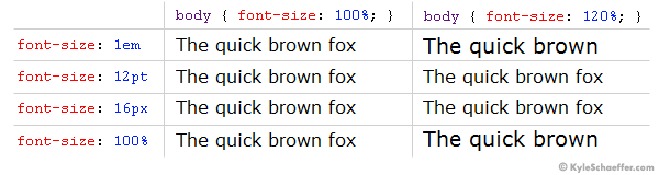
Font-size change from 100% to 120%.
')
As you can see, the “em” and “%” increased the font size, while the “px” and “pt” did not. Setting the absolute size for your text can be a simple matter, but it is much better for your visitors to use scalable text that can be displayed on any device or any machine. For this reason, the units “em” and “%” are preferable to use for the text of a web document.
We found that the px and pt units are not the best for web documents, which forces us to use em and%. In theory, the units “em” and “%” are identical, but in practice they have minor differences that are important to consider.
In the example above, we used percentages (in the body tag) as the base unit of the font-size. If you change your basic font-size unit from "%" to "em" (that is, body {font-size: 1em;}), you should not notice the difference. Let's see what happens when “1em” is our basic unit, and when a client changes the “Font size” in the settings of his browser (this feature is provided in many browsers, for example, Internet Explorer).
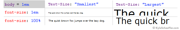
Font size when the client resizes the text in the browser.
When in the client’s browser the text size is set to “medium”, there is no difference between “em” and “%”. However, if the parameter is changed, the difference becomes very large. When installing “Smallest”, “em” is much smaller than “%”, and when installing “Largest”, on the contrary, “em” is displayed much more than “%”. And while many argue that the units in “em” scale as intended, in practice, the text in “em” scales too sharply, while the smallest text becomes illegible on some machines.
In theory, the “em” units are the new and upcoming font size standard on the Internet, but in practice, the units in “%” allow you to display text for users more consistently and conveniently. When changing client parameters, the text in "%" changed in reasonable proportions, which allows designers to preserve readability, accessibility, and design.
Winner : Percentage (%).
Meet - units
1. “Ems” (em): “em” is a scalable unit that is used in web documents. “Em” is equal to the current font-size, for example, if the font-size in a 12pt document, 1em is 12pt. “Em” is scalable in nature, so 2em will be equal to 24pt, 0.5em will be equal to 6pt, etc. The use of "em" is becoming increasingly popular in web documents due to its scalability and the ability to usefully be used in mobile devices.
2. Pixels (px): "px" have a fixed size of units that are used on screens (for example, to read on a computer screen). One pixel is equal to one point on the computer screen (the smallest element of the resolution of your screen). Many web designers use px in web documents to get a pixel-perfect (pixel-perfect) presentation of their site displayed in a browser. One of the problems with using px is that these units do not allow zooming for visually impaired readers or mobile devices.
3. Points (pt): “pt”, traditionally used in print media (everything that should be printed on paper, etc.). One "pt" is equal to 1/72 inch. "Pt", as well as "px", have a fixed unit size and cannot be scaled.
4. Percents (%): Units in% are similar to "em", with the exception of a few fundamental differences. First, the current font-size is 100% (i.e. 12pt = 100%). When using "%", your text becomes fully scalable for mobile devices and user convenience (accessibility).
So what is the difference?
It will be easy to understand the difference between font-size units when you see them in action. As a rule, 1em = 12pt = 16px = 100%. When using these font sizes, let's see what happens when you increase the base font size (using the body CSS selector) from 100% to 120%.
Font-size change from 100% to 120%.
')
As you can see, the “em” and “%” increased the font size, while the “px” and “pt” did not. Setting the absolute size for your text can be a simple matter, but it is much better for your visitors to use scalable text that can be displayed on any device or any machine. For this reason, the units “em” and “%” are preferable to use for the text of a web document.
"Em" vs "%"
We found that the px and pt units are not the best for web documents, which forces us to use em and%. In theory, the units “em” and “%” are identical, but in practice they have minor differences that are important to consider.
In the example above, we used percentages (in the body tag) as the base unit of the font-size. If you change your basic font-size unit from "%" to "em" (that is, body {font-size: 1em;}), you should not notice the difference. Let's see what happens when “1em” is our basic unit, and when a client changes the “Font size” in the settings of his browser (this feature is provided in many browsers, for example, Internet Explorer).
Font size when the client resizes the text in the browser.
When in the client’s browser the text size is set to “medium”, there is no difference between “em” and “%”. However, if the parameter is changed, the difference becomes very large. When installing “Smallest”, “em” is much smaller than “%”, and when installing “Largest”, on the contrary, “em” is displayed much more than “%”. And while many argue that the units in “em” scale as intended, in practice, the text in “em” scales too sharply, while the smallest text becomes illegible on some machines.
Verdict
In theory, the “em” units are the new and upcoming font size standard on the Internet, but in practice, the units in “%” allow you to display text for users more consistently and conveniently. When changing client parameters, the text in "%" changed in reasonable proportions, which allows designers to preserve readability, accessibility, and design.
Winner : Percentage (%).
Source: https://habr.com/ru/post/42151/
All Articles