Design system in Figma. A look at the interface through components

What should be the optimal design system in Figma? What is a reusable component? How is it clearer and more convenient to organize the structure inside the Instance panel? What are the stages of developing a similar product? And so on. I will try to give answers to these and many other questions in this article.
Most recently, I developed my already 4th library for Figma and only now I am ready to structure the knowledge and experience gained in the development of this and previous systems.
By the way, if you use Figma , I recommend paying attention to our ready-made design systems . They help freelancers complete more orders per month, programmers can create beautiful applications on their own, and the Timlids run sprints faster using ready-made design systems for teamwork.
And if you have a serious project, our team is ready to deploy a design system within the organization based on our developments and tailor it to specific tasks using Figma. Web / desktop, and any mobile. We are also familiar with React / React Native. Write to T: @kamushken
')
Comprehension of the application comes after HYIP
Like any innovation on the market, the design systems experienced a hype and moved to the stage of practical rethinking. From now on, they can be applied completely in different cases and for solving a larger type of problem. For a large organization it is a visual language, branding, order, unity of design and code. For small organizations, this is the command library at Figma, where a small staff of developers and designers is effective. The design system can also be used by a private freelancer for its tasks - this is also the automation of client edits (through the master components it quickly moves the pixels, changes colors and shapes) and the gradually growing UI base of widgets (they are all ordered and logically rebuilt during resize). The speed of performing tasks with such a product increases several times. Today, everyone can find for themselves the benefits of working inside a design system.

How would I explain the essence of the design system in Figma in simple language? In just four words: “Changed here - changed everywhere.” This is the main principle of using components and instances when developing any interface, which, with the correct sequence of using atoms and molecules to create templates, will turn into a complete system over time.
Look at the world and see the components
Previously, the designer was just enough to draw and move the pixels. Sometimes he even ordered and neatly named layers and groups. Then symbols appeared and gave semi-automation of processes. Now came the components and changes can be translated automatically into different fragments of artboards, scattered throughout the design system. The use of components has changed the very approach to visual development.

Component development of interfaces consists primarily of unification and consistency. As I said, before it was enough just to move the pixels, but with the advent of components in the design of interfaces, the designer has to keep in mind the arrangement of constraints, the logic of instances, the categorization of all elements in the system, and also remain consistent when creating complex components from simple ones. On the one hand, the process of creating an interface has been greatly simplified due to the software of the new generation. On the other hand, the emergence of innovations makes one learn and acquire new skills, go into specialization. A visual designer of design systems is perhaps a very promising profession in the near future.
Unification of components and reusability
Effective design system does not contain unnecessary components. Any such product begins with a study about the possibility of summarizing the recurring blocks and reusing them in different cases. A simple example, the List component can be used as a file directory entry, as well as, for example, visualizing customer feedback. This is the whole essence of unification and reusability:

Do you see? Both components are identical in structure, only the size and density of the font, the content in the round element is different.
To create an interface it is impossible to come up with any new module. All lists, tables, headings and accordions already exist, but are sometimes used differently. When planning the composition of components, one should start with a search for a visually similar search in order to try to reduce it to one component in the system, a copy of which will be reused with different content. Although Figma is now powerful enough to store 500 or more components in one library, it is better to try to keep them to a minimum so that it is easier to organize the structure. So, it is time to finally move on to the product itself ...
Case: web design system for landing sites. Meet Websy!
This article will focus on website construction. The word “design” was used for a reason. This design system is a designer in order to quickly create any templates from the provided blocks and customize them even faster. Both for mobile devices and for desktop. It is the component architecture that will allow to do this effectively; so that in the future you can simply clone the source, quickly change colors, typography and create new themes. “Changed here - changed everywhere.” Remember?
Research and analysis of the future composition
Landing sites are the ideal scope for the component approach. There are enough fingers of two hands to count all the blocks that make up a classic website advertising a product, service or service: Header, Footer, Call to action, Features, Testimonials, Download, Video and so on. The principle of such a system for designing in the presence of sufficient combinations of all the listed blocks. Thus, it is possible as a puzzle to assemble any site + mobile version. It remained only as a study to study hundreds of fresh landing-sites and collect the most frequently used items. I will redraw them in the future, create components, set a certain style and at the end collect templates. Looking ahead, I’ll say that I managed to collect 18 full-fledged templates: 9 full-screen and 9 mobile versions. I tried to create universal templates that would be equally suitable for the presentation of services, applications, portfolios and any other products.

Most sites are mostly faceless.
It was to such conclusions that I came when I tried to just google. The web as a whole is quickly becoming outdated and this is normal. After all, to be in the current design is always a change. And we treat change with caution, caution. If the old site works and somehow sells itself, then it is better not to interfere with the mechanism to work. But there are companies that are engaged in the optimization of internal processes. And product design for them is not in last place. I managed to find the majority of good sites to conduct an audit on hyperpixel.io and www.lapa.ninja . I assume I’ve looked at 100+ different links and this is only a small part of the list. There must be a sense of proportion to understand the volume required for the first version (read MVP). Therefore, I stopped when the volume of components in the Text blocks section (various text blocks, possibly with forms and buttons) reached the number 30:

Product appearance
How exactly should the product look like? One of the important issues at the design stage. Huge resources of the companies are spent for search of the answer and researches. For myself, I decided so - the product must be visually relevant. Design and style should not be yesterday's, not tomorrow's, but in the form that is now in trend. A simple example: today you rarely see the Open Sans font in the western web, although it was very relevant three years ago. If Google as a brand moves to Product Sans, you should look closely to similar fonts. If Intercom uses papercut style in its product design, you need to understand how to use similar techniques in your projects. Now typography is at the same time design, message and mood. Let's start with it.
A good font is half the battle.
The idea came quite suddenly. Incredibly proportional neo-grotesque Objectivity (alas, there is no Russification) immediately struck me with its relevance. Alex Slobzheninov did a great job and allowed free commercial use. I immediately wanted to “design” something based on this font. For a while, I spun it over artboards in Figme before I realized “This is the perfect font for the web!”. Apparently at that moment the plan for creating a system for the web was born.
A good design system in Figma is:
- Using global styles (typography, color, shadows)
- Considered logic of internal objects displacement when the component is resize (constraints)
- Using instances for different object states (hover, active, etc.)
- Naming with the “/” symbol to create a convenient instance structure
- Creation of complex components from simple (molecules → templates)
- Built-in library with ordered icons
Now I would like to tell about each item separately, so ...
Using global styles
With the advent of the ability to declare globally colors, text and shadow parameters, the speed of customization in Figma has increased significantly. Increased productivity in general. Global styles allow you to quickly change the font in hundreds of objects, change the color scheme and, in fact, get a new style.
Colors
How many colors are stored in the system? I met design systems under Sketch in which all the colors of the rainbow + ten colors for each were announced. In reality, this is too much and 80% of such a palette will never be used. In my system Websy, which I begin to talk about in detail from now on, only 8 colors are stored: white, black, the main color (action), the additional color (secondary), and 4 gradations of black. With white and black, I suppose everything is clear. Action & Secondary colors we use for color elements with which you can interact (buttons, icons, links). Secondary color can be used to accent. For example, to highlight an important phrase, slogan, etc. A declaration of Success / Warning colors is allowed if your system is more about interfaces than about sites.

Shadows
I am an adherent of material design, so I keep in the system several options for elevation. In Websy you will find 4 shadow combinations: 2dp, 4dp, 8dp, 16dp. They are different offset and blur (blur). For example, for a regular card it is recommended to use 2 / 4dp shadows. For drop-down lists, onhover states and dialogs, you can use 8 / 16dp. The attentive designer has already noticed that some Google products now use reflex shadows and double shadows, which are more realistic. Therefore, in addition, several multilayered shadows are announced in the system, which give a very realistic effect:

Through global styles, shadows are switched in just a couple of clicks.
Stroke
The Stroke parameter in Websy is regulated through several separate components that differ in different corner rounding options. Stroke is most often used for buttons and text fields. Similarly to the shadows, 5 rounding options are announced: 0px, 4px, 8px, 16px and 99px. Why so much? I’ll start with an example of how the stroke component is generally used, for example for a button:
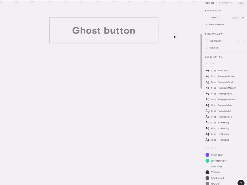
By placing the button, which by default has a 4dp stroke, you can select the Stroke component and switch the rounding of corners through the Instance panel to a smaller or larger side. This is a slightly more complicated method, but allows you to store different types of fillets in a separate master component. The easiest way is to change the degree of rounding through the input field in the right panel. A similar scheme is applicable for text fields, cards or any background components.
Layout constraints for components.
Let me talk about this paragraph and the rest in the next chapter. Much needs to be said about the behavior of modules and elements when resizing. We will also move on to a very interesting part - the description of all the components of the Websy web design system. And, perhaps, consider some ready-made templates for landing pages. We will discuss their composition and the flexibility of changing blocks in order to customize to any needs and goals ... Subscribe if you are interested.
For dessert, a small video.
In this video, I use layouts to create layouts that will be used as presentation screens for the system using ready-made components. I liked the first option less, and I took the second one (starting from 1:30 ) as the main one:
Source: https://habr.com/ru/post/421111/
All Articles