Everything you need to know about alignment in Flexbox
About the author : Rachel Andrew is not only the chief editor of Smashing Magazine, but also a web developer, writer and speaker. She is the author of several books, including The New CSS Layout , one of the developers of the Perch content management system. He writes about business and technology on his website rachelandrew.co.uk .
Summary: in this article we will look at the alignment properties in the Flexbox and some basic rules of how the alignment on the main and transverse axes works.
 In the first article in this series, I explained what happens when I declare a
')
In the entire history of CSS, correct alignment along both axes seemed like the most difficult problem. The emergence of this feature in the Flexbox for many has become the main advantage of this technology. Alignment has been reduced to two lines of CSS .
Alignment properties are now fully defined in the Box Alignment specification . It details how alignment works in different layouts. This means that in the CSS Grid you can use the same properties as in the Flexbox - and in the future in other layouts too. Therefore, any new Flexbox alignment feature will be described in detail in the Box Alignment specification, and not in the next version of Flexbox.
Many find it difficult to remember whether to use properties that start with
It really helps thinking in terms of the main and transverse axes, rather than horizontal and vertical. It does not matter how the axis is physically directed.
Align the main axis with
Let's start with the alignment on the main axis. It is implemented using the
The initial

Note that the

If you specify

You can do other things with this space. For example, distribute it between our elements using

We can allocate space with

A new

You can play with all the values in the demo .
Values in the same way work vertically, that is, if the
Axis alignment with
If the container has multiple axes and
Then I can apply
If
As in the case with
Property by
In the Box Alignment specification, you can find the
Corresponds to this:
And such code:
Equivalent to the following:
Axis alignment with
We now know that we can align a set of elements or strings as a group. However, there is another way to align the elements relative to each other on the transverse axis. The container has a height that is determined by the height of the tallest element.

Alternatively, it can be defined by the

Why elements stretch to the size of the tallest element is because the initial value of the
Notice that in a multi-line container, each line acts as a new container. The highest element in this line will determine the size of all elements in this line.
In addition to the initial

The

If you use the
We can also align them to the baseline. This ensures text alignment on a single base, as opposed to field alignment around text.

All these options can be tried in the demo .
Individual alignment with
The
In the following example , the container uses

Why not
The question often arises why it is impossible to align one element or group of elements along the main axis. Why is there no -self property in
It may also be useful to think about how
If you have ever centered a block in CSS (for example, a wrapper for the content of the main page, setting the fields on the left and right in
Automatic fields work very well in Flexbox to align individual elements or groups of elements on the main axis. The following example shows a typical case. There is a navigation bar, the elements are displayed as a string and use the initial value
We take this element and specify the value

If you use automatic fields on the main axis, then
For each leveling method, a fallback is described - what happens if a given alignment is not possible. For example, if you have only one element in the container, and you specify
In the current specification, you cannot change the spare alignment. There is a note to the specifications that allows for the possibility of specifying an arbitrary fallback in future versions.
The concept of safe and unsafe alignment using the safe and unsafe keywords has become a recent addition to the Box Alignment specification.
In the following code, the last element is too wide for the container, and in the case of unsafe alignment and a flexible container on the left side of the page, the element is truncated because the overflow goes beyond the page boundaries.

Secure alignment prevents data loss by moving the overflow to the other side.

These keywords are not yet supported by all browsers, but demonstrate how Box Alignment specifications add controls to the Flexbox.
The alignment properties started with a list in Flexbox, but now have a custom specification and apply to other layout contexts. Here are a few key facts to help remember their use in the Flexbox:
Summary: in this article we will look at the alignment properties in the Flexbox and some basic rules of how the alignment on the main and transverse axes works.
In the first article in this series, I explained what happens when I declare a display: flex property for an element. Now consider the alignment properties and how they work with Flexbox. If you have ever been confused, apply align or justify , I hope this article will clarify a lot!')
Alignment history in Flexbox
In the entire history of CSS, correct alignment along both axes seemed like the most difficult problem. The emergence of this feature in the Flexbox for many has become the main advantage of this technology. Alignment has been reduced to two lines of CSS .
Alignment properties are now fully defined in the Box Alignment specification . It details how alignment works in different layouts. This means that in the CSS Grid you can use the same properties as in the Flexbox - and in the future in other layouts too. Therefore, any new Flexbox alignment feature will be described in detail in the Box Alignment specification, and not in the next version of Flexbox.
Properties
Many find it difficult to remember whether to use properties that start with
align- or justify- . It is important to remember the following:justify-aligns along the main axis in the same direction as theflex-direction;align-aligns the axis across theflex-direction.
It really helps thinking in terms of the main and transverse axes, rather than horizontal and vertical. It does not matter how the axis is physically directed.
Align the main axis with justify-content
Let's start with the alignment on the main axis. It is implemented using the
justify-content property. This property treats all elements as a group and controls the distribution of space between them.The initial
justify-content value is flex-start . That's why when declaring display: flex all flex elements are lined up at the beginning of a line. In writing, from left to right, elements are grouped on the left.Note that the
justify-content property produces a visible effect only when there is free space . Therefore, if your set of elements occupies all the space on the main axis, justify-content will not give anything.If you specify
flex-end for justify-content , then all elements will be moved to the end of the line. Free space is now at the beginning.You can do other things with this space. For example, distribute it between our elements using
justify-content: space-between . In this case, the first and the last element will be located at the ends of the container, and the entire space will be equally divided between the elements.We can allocate space with
justify-content: space-around . In this case, the available space is divided into equal parts and placed on each side of the element.A new
justify-content value can be found in the Box Alignment specification; it is not listed in the Flexbox specification. This is space-evenly . In this case, the elements are evenly distributed in the container, and the additional space is equally distributed between the elements and on both sides.You can play with all the values in the demo .
Values in the same way work vertically, that is, if the
flex-direction is applied to column . However, you may not have space in the column for distribution, if you do not add height or block-size container, as in this demo .Axis alignment with align-content
If the container has multiple axes and
flex-wrap: wrap specified, then you can use align-content to align the lines on the transverse axis. But extra space is required. In this demonstration, the transverse axis runs in the direction of the column, and I indicated the height of the container 60vh . Since this is more than necessary to display all the elements, free space appears vertically.Then I can apply
align-content with any of the values .If
column specified as flex-direction , then align-content works as in the following example .As in the case with
justify-content , we work with a group of strings and allocate free space.Property by place-content
In the Box Alignment specification, you can find the
place-content property. Using this property means that you simultaneously set justify-content and align-content . The first value is for align-content , the second is for justify-content . If only one value is given, then it applies to both properties: .container { place-content: space-between stretch; } Corresponds to this:
.container { align-content: space-between; justify-content: stretch; } And such code:
.container { place-content: space-between; } Equivalent to the following:
.container { align-content: space-between; justify-content: space-between; } Axis alignment with align-items
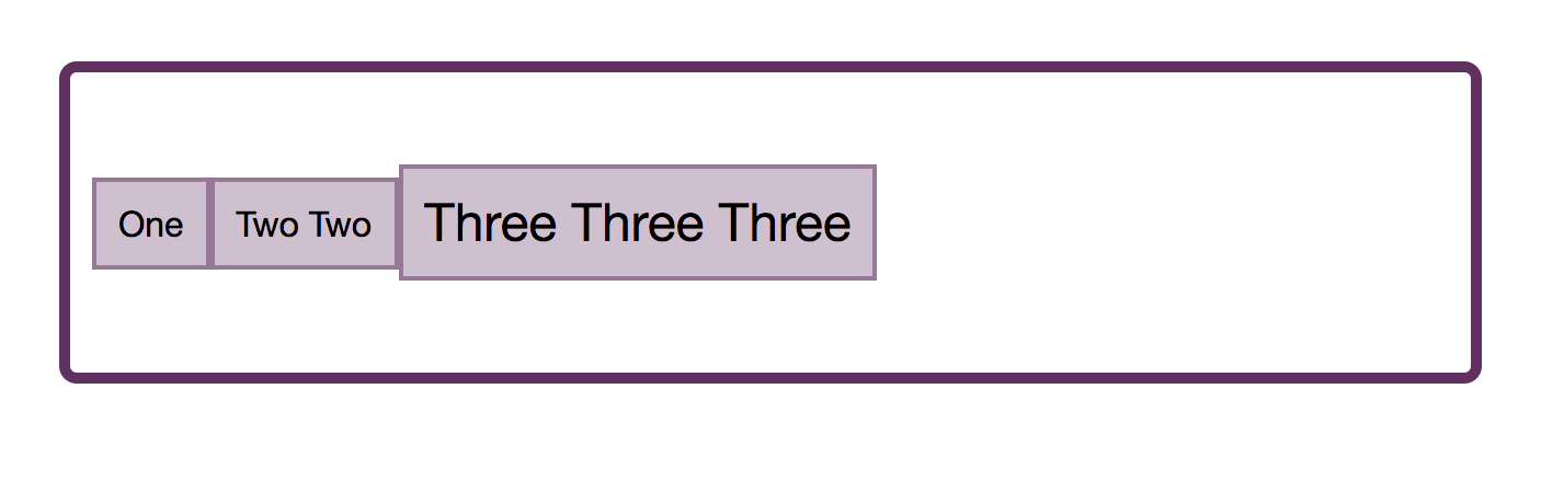
We now know that we can align a set of elements or strings as a group. However, there is another way to align the elements relative to each other on the transverse axis. The container has a height that is determined by the height of the tallest element.
Alternatively, it can be defined by the
height property in the container:Why elements stretch to the size of the tallest element is because the initial value of the
align-items parameter is stretch . Elements stretch along the transverse axis to the size of the container in this direction.Notice that in a multi-line container, each line acts as a new container. The highest element in this line will determine the size of all elements in this line.
In addition to the initial
stretch value, you can assign flex-start elements to align-items , in which case they are aligned at the beginning of the container and no longer stretch in height.The
flex-end value moves them to the end of the container along the transverse axis.If you use the
center value, then the elements are centered relative to each other:We can also align them to the baseline. This ensures text alignment on a single base, as opposed to field alignment around text.
All these options can be tried in the demo .
Individual alignment with align-self
The
align-items property sets the alignment of all items at the same time. In fact, it sets the align-self values for all elements of the group. You can also use the align-self property for any single element to align it within the string and with respect to other elements.In the following example , the container uses
align-items to align the entire group in the center, but also align-self for the first and last items.Why not justify-self ?
The question often arises why it is impossible to align one element or group of elements along the main axis. Why is there no -self property in
-self for alignment with the main axis? If you present justify-content and align-content as a way to allocate space, the answer becomes more obvious. We deal with elements as with a group and place free space in a certain way: either at the beginning, or at the end of a group, or between elements.It may also be useful to think about how
justify-content and align-content work in CSS Grid Layout. In the Grid, these properties are used to allocate free space in the grid container between grid tracks . Here, too, we take a group of tracks - and with the help of these properties we distribute free space between them. Since we operate in a group both in the Grid and in the Flexbox, we cannot take a separate element and do something else with it. However, there is a way to get the layout design that layout makers want when they talk about the self property on the main axis. This is the use of automatic fields.Using automatic fields on the main axis
If you have ever centered a block in CSS (for example, a wrapper for the content of the main page, setting the fields on the left and right in
auto ), then you already have some experience with automatic fields. The auto value for the fields fills the maximum space in the set direction. To center the block, we set both left and right margins in auto : each of them tries to take as much space as possible, and therefore places our block in the center.Automatic fields work very well in Flexbox to align individual elements or groups of elements on the main axis. The following example shows a typical case. There is a navigation bar, the elements are displayed as a string and use the initial value
justify-content: start . I want the last item to be displayed separately from the others at the end of the line - provided that there is enough space in the line for that.We take this element and specify the value
auto for the margin-left property. This means that the field is trying to get as much space as possible to the left of the element, that is, the element is pushed to the right border.If you use automatic fields on the main axis, then
justify-content will cease to operate, since automatic fields will occupy all the space that would otherwise be distributed using justify-content .Spare alignment
For each leveling method, a fallback is described - what happens if a given alignment is not possible. For example, if you have only one element in the container, and you specify
justify-content: space-between , what should happen? In this case, flex-start spare alignment is applied — one element will be aligned to the beginning of the container. In the case of justify-content: space-around , the center alignment is used.In the current specification, you cannot change the spare alignment. There is a note to the specifications that allows for the possibility of specifying an arbitrary fallback in future versions.
Safe and unsafe alignment
The concept of safe and unsafe alignment using the safe and unsafe keywords has become a recent addition to the Box Alignment specification.
In the following code, the last element is too wide for the container, and in the case of unsafe alignment and a flexible container on the left side of the page, the element is truncated because the overflow goes beyond the page boundaries.
.container { display: flex; flex-direction: column; width: 100px; align-items: unsafe center; } .item:last-child { width: 200px; } Secure alignment prevents data loss by moving the overflow to the other side.
.container { display: flex; flex-direction: column; width: 100px; align-items: safe center; } .item:last-child { width: 200px; } These keywords are not yet supported by all browsers, but demonstrate how Box Alignment specifications add controls to the Flexbox.
Conclusion
The alignment properties started with a list in Flexbox, but now have a custom specification and apply to other layout contexts. Here are a few key facts to help remember their use in the Flexbox:
justify-for the main axes, andalign-for the transverse;- free space is required for
align-contentandjustify-content; - the
align-contentandjustify-contentproperties are applied to the elements in the group, distributing the space between them. You cannot specify the alignment of a single element, because the-selfproperty-selfmissing; - if you want to align one element or break a group along the main axis, use automatic fields;
align-itemssets the samealign-selfproperties for the entire group. Usealign-selffor a child of a group to set its value individually.
Source: https://habr.com/ru/post/420935/
All Articles