Analysis of the report by Dmitry Stolyarov on monitoring Kubernetes
Oh, more than a year has passed since the previous analysis, but it is time to return the traditions. Today we look at the report of Dmitry distol Stolyarov “Monitoring and Kubernetes”, which was presented in May of this year at the RIT ++ festival, and we try to understand by his example why people usually like the reports of Dmitry.
Slides (all 344 pieces) can be found here .
Disclaimer : about monitoring and Kubernetes is not the article itself, but a report that understands it.
Dmitry begins his story with three stories. Their meaning is to ask the audience and the speaker a common understanding of what good monitoring should be. This is an important point: it is necessary to clarify the system requirements, but most speakers do not try to give them an interesting, memorable form. The list of bullets like " Timeliness of reporting incidents " in this place is very common and leads to the loss of half of the audience. Stories are much better because they are more interesting .
I love the SKOLKOVO business school congress hall (the main hall of RIT and Highload ++) for the fact that you can see very well from above how many devices with luminous screens are included in the hall. This is a very simple and reliable metric of whether people are interested in looking at the scene. In our video, the general plan of the hall happens a little after the gathering of requirements, but it is clear that the interest has not yet died out. Consider a shot at 2:58 pm:
')
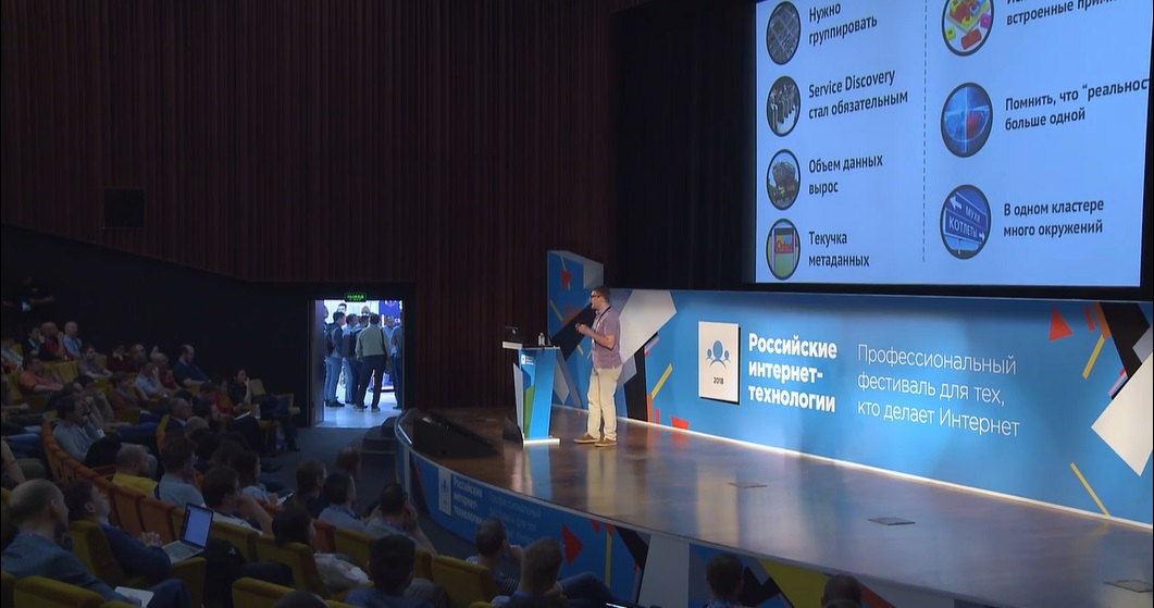
I see here one included computer, and its owner clearly looks at the speaker. This coincides with my impressions: the introductory (often boring) part of the report was able to be presented in such a way that it was interesting to watch and did not want to be distracted. Stories have played an important role in this.
I note that in the stories Dmitry actively uses metaphors, and I don’t like this technique very much. The fact is that the metaphor is not always and equally understood by everyone. In particular, in medium mathematics, I dare to hope, I can do quite well, and what happened to the car and the odometer is obvious to me. It is equally obvious to me and the connection of this with the theme of the report. But I never dealt with monitoring as such, and what exactly should be the analogue of a blood test and a tomograph, remains a mystery to me. I am not a target audience, but with examples of what could be monitored, but now they don’t do that, even I would understand everything.
In general, in my opinion, the metaphor is often a weed that is better to ruthlessly weed out.
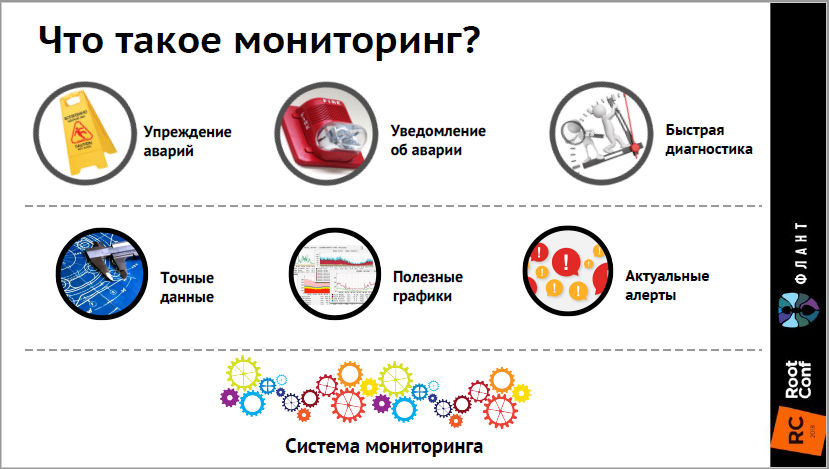
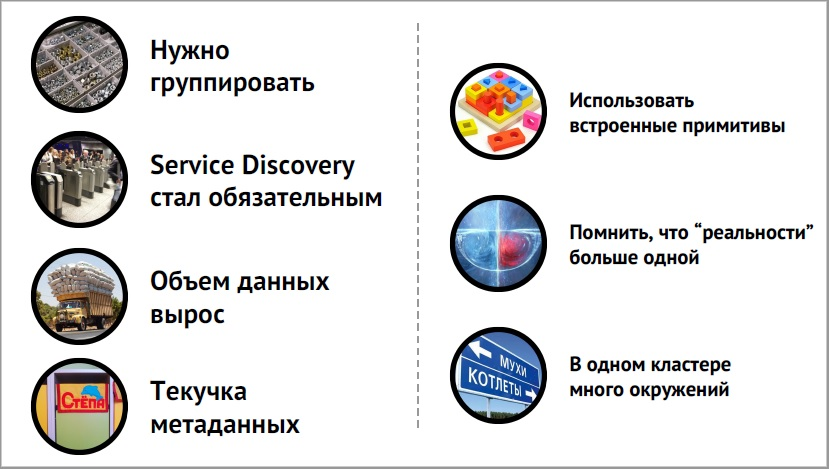
The video section with conclusions starts at 49:28 . Dmitry reminds about the requirements for a well-tuned monitoring system (this is important), and about the innovations of Kubernetes (this is also important). But not the fact that such reminders work well. Yet on both of these slides, there are six to seven points, we did not repeat them so often during the report that they were fixed in the memory, and at the end the viewers do not have time to reconsider them again. It seems to me that the goal is “to make the audience remember how to relate to monitoring,” but this is not fully achieved.
The second point that I would like to expand is the proposal to remember that there are a lot of nuances. The most expensive of these nuances was worth repeating here again. For example, briefly list for what parameters Kubernetes must be monitored.
A good summary enshrines the main thoughts that viewers should take out of the performance, and in this case it could be done more effectively.
Pay attention to the story "Who ate the whole cluster," which begins at 45:10 . The purpose of the story, in fact, is to show how the drill down works, to bring us to the diagram from slide 326:
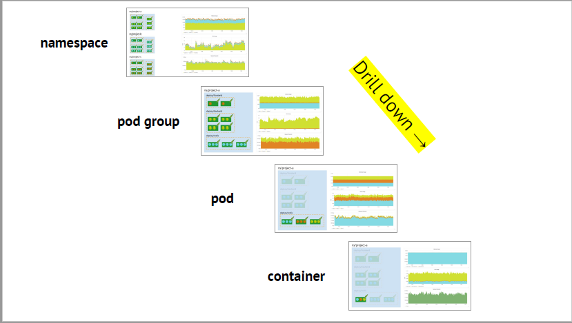
But it would be boring to show this scheme directly, and Dmitry tells us the story of the investigation of the problem on the cluster in which this scheme appears naturally. The meaning of the reception in this case is that we are telling the audience some interesting practical situation, and the main material that I really want to convey, acts as a decoration, an entourage to this situation. So you can achieve much more attention from the audience, which Dmitry successfully does.
The ending is a bit blurred: the butler-killer was never found; what happened to the Redis master was left off-screen. But the spectators kept the attention to the necessary point, and this is the main thing.
I have already mentioned above that there are 344 slides in the report of Dmitry, and now is a good time to talk about the fact that there is nothing wrong with that. To begin with, the slide is a purely technical concept. You can speak with materials in PowerPoint, Keynote, Google presentations or any other tool that allows animations, or you can convert it all into .pdf, bringing each change to a new page. The visual row does not change, and the formal number of slides is dramatically increasing.
Surprisingly many people have survived to this day, who measure time by the number of slides, without thinking about what is shown on these slides. They are afraid to break their complicated slides into sequences, because it seems to them that the timing of the report will grow from this, they are accustomed to “minute by slide” and do not want to retreat from it. Dmitry's speech is an example of timing remaining under control. Only, perhaps, the finger on the clicker will be tired.
Instead of the technical notion “slide”, I would suggest operating with the semantic notion “frame”: one picture, one visual context. For example, here is a frame
It is built on the screen on seven consecutive slides (30 - 36), and takes a minute and fourteen seconds from 05:05 on time. This is a very important, fundamental frame for the report, the rest are mostly faster (Dmitry still has many more frames than minutes in the story).
This approach is indispensable for the demonstration of complex schemes. For example, slides from 296 to 304 perfectly show the meaning of the architecture depicted on them, precisely because of the dynamics.
I urge everyone to take an example from the speaker and, without a doubt, add new elements of information to the slide through a click, and not immediately show the final picture. So much easier to follow the speech: the speaker all the time talking about the object that appeared on the screen last. It does not matter if you are using an animation or creating a new slide for each change, do as you prefer.
With this approach, there is one technical difficulty that needs to be remembered: the software for slideshow in .pdf format at many conferences is Acrobat Reader, but it does not have a preview mode of the next slide. That is, all of your more than three hundred clicks must be remembered in order to synchronize speech and video sequence. It looks rather sad when the speaker says something under a static picture, and then he catches himself and clicks over the slides with the comments, “so, I already told it, it also told ...”
If you look at the previous picture again (slide 36), you will notice that the circles, symbolizing the elements and properties of good monitoring, are spread out unevenly on it. It seems that there is some intention: in the top row they are larger and with a gray outline, and on average they are smaller with black, so that the coordinates can be non-random. But I cannot understand this idea, and in my head unproductive thoughts of a kind arise at such moments: did the author want to say something to me, or did he simply lose sight?
This is not the only case, there are others with a similar problem, for example, slide 76:
In addition to the alignment of the circles here, the font in the left and right sides of the screen is different. Is this a bug or a feature?
The main rule of working with pictures in a presentation is as follows: if an image makes up the whole meaning of a slide, it should occupy the entire slide. Here everything is very clear, nothing superfluous:

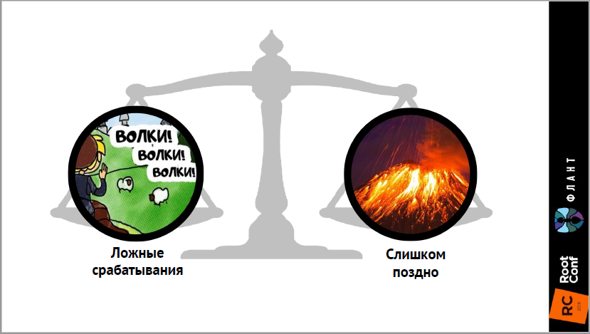
But what can be improved is the unity of the stylistics of the images. It looks unnatural when photographic pictures coexist with cartoon-like pictures. The intersection of two worlds causes discomfort in the viewer, although it is not always easy to formulate it.
Who Framed Roger Rabbit?
It seems to me that the secret of success and high ratings of Dmitry’s reports is the following:
Well, the topic is relevant, so that there.
If you want to get feedback on your performance, I’ll be happy to give it to you. It happens that for a long time I have been flooded with work or for some reason there is a break for several months, but progress, as we know, is unstoppable.
Slides (all 344 pieces) can be found here .
Disclaimer : about monitoring and Kubernetes is not the article itself, but a report that understands it.
Plot
Outset
Dmitry begins his story with three stories. Their meaning is to ask the audience and the speaker a common understanding of what good monitoring should be. This is an important point: it is necessary to clarify the system requirements, but most speakers do not try to give them an interesting, memorable form. The list of bullets like " Timeliness of reporting incidents " in this place is very common and leads to the loss of half of the audience. Stories are much better because they are more interesting .
I love the SKOLKOVO business school congress hall (the main hall of RIT and Highload ++) for the fact that you can see very well from above how many devices with luminous screens are included in the hall. This is a very simple and reliable metric of whether people are interested in looking at the scene. In our video, the general plan of the hall happens a little after the gathering of requirements, but it is clear that the interest has not yet died out. Consider a shot at 2:58 pm:
')
I see here one included computer, and its owner clearly looks at the speaker. This coincides with my impressions: the introductory (often boring) part of the report was able to be presented in such a way that it was interesting to watch and did not want to be distracted. Stories have played an important role in this.
I note that in the stories Dmitry actively uses metaphors, and I don’t like this technique very much. The fact is that the metaphor is not always and equally understood by everyone. In particular, in medium mathematics, I dare to hope, I can do quite well, and what happened to the car and the odometer is obvious to me. It is equally obvious to me and the connection of this with the theme of the report. But I never dealt with monitoring as such, and what exactly should be the analogue of a blood test and a tomograph, remains a mystery to me. I am not a target audience, but with examples of what could be monitored, but now they don’t do that, even I would understand everything.
In general, in my opinion, the metaphor is often a weed that is better to ruthlessly weed out.
findings
The video section with conclusions starts at 49:28 . Dmitry reminds about the requirements for a well-tuned monitoring system (this is important), and about the innovations of Kubernetes (this is also important). But not the fact that such reminders work well. Yet on both of these slides, there are six to seven points, we did not repeat them so often during the report that they were fixed in the memory, and at the end the viewers do not have time to reconsider them again. It seems to me that the goal is “to make the audience remember how to relate to monitoring,” but this is not fully achieved.
The second point that I would like to expand is the proposal to remember that there are a lot of nuances. The most expensive of these nuances was worth repeating here again. For example, briefly list for what parameters Kubernetes must be monitored.
A good summary enshrines the main thoughts that viewers should take out of the performance, and in this case it could be done more effectively.
Detective order of presentation
Pay attention to the story "Who ate the whole cluster," which begins at 45:10 . The purpose of the story, in fact, is to show how the drill down works, to bring us to the diagram from slide 326:
But it would be boring to show this scheme directly, and Dmitry tells us the story of the investigation of the problem on the cluster in which this scheme appears naturally. The meaning of the reception in this case is that we are telling the audience some interesting practical situation, and the main material that I really want to convey, acts as a decoration, an entourage to this situation. So you can achieve much more attention from the audience, which Dmitry successfully does.
The ending is a bit blurred: the butler-killer was never found; what happened to the Redis master was left off-screen. But the spectators kept the attention to the necessary point, and this is the main thing.
Slides
amount
I have already mentioned above that there are 344 slides in the report of Dmitry, and now is a good time to talk about the fact that there is nothing wrong with that. To begin with, the slide is a purely technical concept. You can speak with materials in PowerPoint, Keynote, Google presentations or any other tool that allows animations, or you can convert it all into .pdf, bringing each change to a new page. The visual row does not change, and the formal number of slides is dramatically increasing.
Surprisingly many people have survived to this day, who measure time by the number of slides, without thinking about what is shown on these slides. They are afraid to break their complicated slides into sequences, because it seems to them that the timing of the report will grow from this, they are accustomed to “minute by slide” and do not want to retreat from it. Dmitry's speech is an example of timing remaining under control. Only, perhaps, the finger on the clicker will be tired.
Instead of the technical notion “slide”, I would suggest operating with the semantic notion “frame”: one picture, one visual context. For example, here is a frame
It is built on the screen on seven consecutive slides (30 - 36), and takes a minute and fourteen seconds from 05:05 on time. This is a very important, fundamental frame for the report, the rest are mostly faster (Dmitry still has many more frames than minutes in the story).
This approach is indispensable for the demonstration of complex schemes. For example, slides from 296 to 304 perfectly show the meaning of the architecture depicted on them, precisely because of the dynamics.
I urge everyone to take an example from the speaker and, without a doubt, add new elements of information to the slide through a click, and not immediately show the final picture. So much easier to follow the speech: the speaker all the time talking about the object that appeared on the screen last. It does not matter if you are using an animation or creating a new slide for each change, do as you prefer.
With this approach, there is one technical difficulty that needs to be remembered: the software for slideshow in .pdf format at many conferences is Acrobat Reader, but it does not have a preview mode of the next slide. That is, all of your more than three hundred clicks must be remembered in order to synchronize speech and video sequence. It looks rather sad when the speaker says something under a static picture, and then he catches himself and clicks over the slides with the comments, “so, I already told it, it also told ...”
Neatness and leveling
If you look at the previous picture again (slide 36), you will notice that the circles, symbolizing the elements and properties of good monitoring, are spread out unevenly on it. It seems that there is some intention: in the top row they are larger and with a gray outline, and on average they are smaller with black, so that the coordinates can be non-random. But I cannot understand this idea, and in my head unproductive thoughts of a kind arise at such moments: did the author want to say something to me, or did he simply lose sight?
This is not the only case, there are others with a similar problem, for example, slide 76:
In addition to the alignment of the circles here, the font in the left and right sides of the screen is different. Is this a bug or a feature?
Use of images
The main rule of working with pictures in a presentation is as follows: if an image makes up the whole meaning of a slide, it should occupy the entire slide. Here everything is very clear, nothing superfluous:
But what can be improved is the unity of the stylistics of the images. It looks unnatural when photographic pictures coexist with cartoon-like pictures. The intersection of two worlds causes discomfort in the viewer, although it is not always easy to formulate it.
Who Framed Roger Rabbit?
Summarize
It seems to me that the secret of success and high ratings of Dmitry’s reports is the following:
- The story develops very dynamically, something happens all the time.
- A lot of things are illustrated with examples, stories and analysis of specific practical situations.
- Visual materials are also dynamic, complement , rather than struggle with speech, and are well synchronized with it.
Well, the topic is relevant, so that there.
Regular Parsing
If you want to get feedback on your performance, I’ll be happy to give it to you. It happens that for a long time I have been flooded with work or for some reason there is a break for several months, but progress, as we know, is unstoppable.
What is needed for this?
All this needs to be sent to the habrayuzer p0b0rchy , that is, to me, Roman Poblec. I promise that the review will be constructive and polite, as well as highlight the positive aspects, and not just what needs to be improved.
- Link to the video recording of the speech.
- Link to slides.
- Application from the author. Without the consent of the speaker himself, we will not analyze anything.
All this needs to be sent to the habrayuzer p0b0rchy , that is, to me, Roman Poblec. I promise that the review will be constructive and polite, as well as highlight the positive aspects, and not just what needs to be improved.
The most effective thing you can do to learn how to perform cool is to perform.
Therefore, friends, I invite you to submit an application for HighLoad ++ 2018. Deadline on September 1 , it’s no longer possible to think about the topic for a long time, but there will be time to prepare a report. This I promise you, as well as tips, debriefings, runs and everything you need to make you cool.
And subscribe to the newsletter for speakers (where all such materials regularly fall).
Source: https://habr.com/ru/post/420563/
All Articles