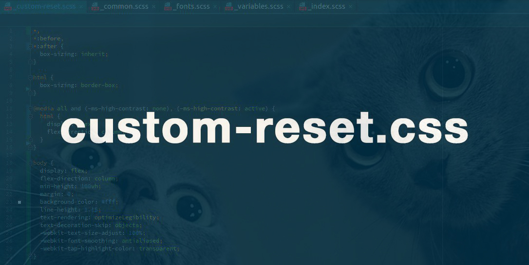
Custom approach to normalize and reset styles (custom-reset.css)
Here I will share my work to normalize and reset styles.
For several years I have formed a small file, the basis of which, initially, was taken as normalize.
Why normalize, not reset. He is sharpened just for cross-browser compatibility, which is very important. But in its pure form, it did not suit me at all, various indents, boarders, etc., only interfered with me, because I adjusted it a little to fit my needs, removing what I did not need.
Over time, the file grew, the excess from the normalize was removed, the missing was added.
The main purpose of its creation was to prepare the basis for any project as much as possible, which in my opinion turned out, even very well. The file turned out to be quite universal, but still, before preparing the project, you need to look into it and perhaps correct something.
')
I hope you will emphasize something useful for yourself, here you can read it.
custom-reset.css
Short description
- Ability to change tags without compromising layout. That corresponds to the principle of DRY (- minimizing the amount of editing necessary for making changes).
- Full zeroing browser styles.
The fact that an element has default styles does not mean at all that they will be needed exactly in the place where this tag is used. - Normalization of the necessary browser pieces.
- IE 10+
- Some simple helpful snippets.
- and advice
Block Model Definition
*, *:before, *:after { box-sizing: inherit; } html { box-sizing: border-box; } Such a definition makes it possible to override
box-sizing , if necessary, for a specific area, for example, if a project has been added to a project that has box-sizing: content-box;Basic settings
body { margin: 0; background-color: #fff; line-height: 1; text-rendering: optimizeLegibility; text-decoration-skip: objects; -webkit-text-size-adjust: 100%; -webkit-font-smoothing: antialiased; -webkit-tap-highlight-color: transparent; } text-rendering- defines how the browser optimizes text rendering.optimizeLegibility- high-quality display is more important than speed, allows kerning and ligatures.text-decoration-skip: objects;
Makes an underline usingtext-decoration: underline;unsharp (where it works).
-webkit-text-size-adjust: 100%;- prohibit the adjustment of font size after changing orientation in iOS.-webkit-font-smoothing: antialiased;- makes the text more subtle in Safari on Macs (the outline is smoothed and sharp at the same time, it's nice to read.).-webkit-tap-highlight-color: transparent;- removes blue highlighting when clicking on devices.
focus is important, outline is not
:focus { outline: none; } The state of focus is a very important point for interaction with interesting elements. (How and why here ). But the
outline often does not fit into the design. And the designers themselves rarely draw this state, therefore duplication of hover styles has become a frequent practice.This is a lazy way.
.no-touch { &:hover, &:focus { ... } } Normal designers always draw the state of focus.
Three basic states must always be present on each interactive element (
:hover, :focus, :active ).
→ Codepen
Indentation
Indents are zero, text properties are inherited.
p, dd, dl, figure, blockquote { margin: 0; } /* <dl>. . (): dl>div*3>dd{value}+dt{prop} */ blockquote, q { quotes: none; } ul, ol { padding: 0; margin: 0; list-style-type: none; } table { border-collapse: collapse; border-spacing: 0; } th { font-weight: inherit; } h1, h2, h3, h4, h5, h6 { margin: 0; font-size: inherit; font-weight: inherit; } audio, video { display: block; } img { display: block; border: none; /*max-width: 100%;*/ } iframe { border: none; } pre, code, kbd, samp { font-family: monospace, monospace; font-size: inherit; } If you need indents for custom content (and they are needed), there must be a wrapper class and a styling guide.
Example:
.description { h1, h2, h3, h4 { /* style */ } p { /* style */ } /* . . */ } Text content also needs to be able to correctly typeset by setting the correct indents and line height.
Here is an article on this topic.
How user content can be:

Text elements
Full inheritance. Links are no longer blue, strong is not bold, it is not Italian. Em, strong are semantic elements, they are not used for decoration. For example, for the names of goods in the cards. The fact that they have styles by default does not mean that they will be needed exactly in the place where this tag is used.
The color and underlining of a link interferes with this link as a button or as a large button with a picture and text.
a { background-color: transparent; text-decoration: none; color: inherit; } abbr { border: none; text-decoration: none; } b, strong { font-weight: inherit; } i, em { font-style: inherit; } dfn { font-style: inherit; } mark { background-color: transparent; color: inherit; } small { font-size: inherit; } sub, sup { position: relative; vertical-align: baseline; font-size: inherit; line-height: 0; } sub { bottom: -.25em; } sup { top: -.5em; } Form elements:
All styles assigned to buttons and inputs are deleted, which may seem controversial to someone.
It happens, there are inconveniences with buttons when changing tags, most often this happens with a link to a button and vice versa.
button, input, optgroup, select, textarea { padding: 0; margin: 0; border: none; border-radius: 0; box-shadow: none; background-color: transparent; font: inherit; /* , , */ color: inherit; letter-spacing: inherit; } button, input { overflow: visible; } button, select { text-align: left; text-transform: none; } button, [type='button'], [type='reset'], [type='submit'] { cursor: pointer; -webkit-appearance: none; } textarea { resize: none; overflow-y: auto; overflow-x: hidden; } button::-moz-focus-inner, [type='button']::-moz-focus-inner, [type='reset']::-moz-focus-inner, [type='submit']::-moz-focus-inner { border: none; padding: 0; } button:-moz-focusring, [type='button']:-moz-focusring, [type='reset']:-moz-focusring, [type='submit']:-moz-focusring { outline: none; } [type='number']::-webkit-inner-spin-button, [type='number']::-webkit-outer-spin-button { height: auto; } [type='search']::-webkit-search-decoration { -webkit-appearance: none; } [type='search'] { outline: none; } ::-webkit-file-upload-button { -webkit-appearance: button; font: inherit; } (The
button tag cannot be used as a flex container. On IOS, it will break.)fieldset and legend
fieldset { padding: 0; margin: 0; border: none; } legend { display: block; padding: 0; white-space: normal; } Often I met that these semantic elements of the forms were used for decorative purposes.
For this:
Never do that, this is an example of worse practice. Here are a couple of examples with a normal implementation:
→ Example 1 , Example 2
(The
fieldset tag cannot be used as a flex container. It does not work simply.)select
Cancel the standard select display
select { -webkit-appearance: none; -moz-appearance: none; appearance: none; } select::-ms-expand { display: none; } → We make select ourselves: codepen
placeholder
::-webkit-input-placeholder { color: inherit; opacity: 1; transition: opacity .3s; } ::-moz-placeholder { color: inherit; opacity: 1; transition: opacity .3s; } :-moz-placeholder { color: inherit; opacity: 1; transition: opacity .3s; } :-ms-input-placeholder { color: inherit; opacity: 1; transition: opacity .3s; } :focus::-webkit-input-placeholder { opacity: 0; } :focus::-moz-placeholder { opacity: 0; } :focus:-moz-placeholder { opacity: 0; } :focus:-ms-input-placeholder { opacity: 0; } Placeholder will delight the color. Disappears with focus.

svg (work with icons)
The
svg tag, though a full-fledged tag that supports any properties, I always use a wrapper for it, which I set the dimensions and color. This approach is very convenient for working with sprites of 2 types.I'll tell you how we work with icons:
Icon font we do not use.
We have 2 types of icons:
- one-color
- color (icons and small images).
All of them are in svg format.
For single-color svg sprite is used, which is stored separately, and cached. It looks like this:
<svg xmlns="http://www.w3.org/2000/svg" xmlns:xlink="http://www.w3.org/1999/xlink"> <symbol id="search" viewBox="0 0 24 24"> <path></path> </symbol> </svg> And it is included on the page like this:
<svg class="alert__ico"> <use xmlns:xlink="http://www.w3.org/1999/xlink" xlink:href="../img/sprites/sprite.svg#search"></use> </svg> And styles for it: ( this code is added to the file )
svg { display: block; width: 100%; height: 100%; fill: currentColor; } For color css sprite is used:
.icon-ico-color:after { background-image: url("data:image/svg+xml,%3Csvg%20width%3D...; } And styles for him:
[class*='icon-']:after { content: ''; display: block; width: 100%; height: 100%; background-size: contain; background-position: center; background-repeat: no-repeat; } Loading css sprite asynchronously
<script> $(document).ready(function() { $("head").append("<link rel='stylesheet' type='text/css' href='../css/icons.min.css' />"); }) </script> This is generated, of course, by a galp.
What gives such an approach
For an icon, a container of the desired size is made, and regardless of whether the icon is colored or not, it will fit perfectly into it.
<div class="elem__ico"> <svg class="alert__ico"> <use xmlns:xlink="http://www.w3.org/1999/xlink" xlink:href="../img/sprites/sprite.svg#search"></use> </svg> </div> <div class="elem__ico icon-ico-color"></div> 
hidden
[hidden] { display: none; // IE10 } An attribute that hides an item. It will be useful.
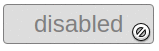
: disabled
:disabled, .disabled { cursor: not-allowed; } The correct cursor. Since the link button can be a button, the pseudo-class will no longer work, because the link is not a form element. To do this, add a class.
:: - ms-clear
Pseudo-element in IE for erasing text.
::-ms-clear { display: none; } We remove it.

: -webkit-autofill

:-webkit-autofill { box-shadow: 0 0 100px #fff inset; -webkit-text-fill-color: currentColor; } Using the inner shadow, paint this pseudo-element for the desired color. And inherits the given color.
:: selection
::selection { color: #fff; background-color: #004fe4; } 
Classes
.clearfix
.clearfix:after { content: ''; display: block; clear: both; } Even though flexes are used at full speed, you should not forget about floats, and even more so you should not forget about cleaning the flow for floats.
.visually-hidden
.visually-hidden { position: absolute; z-index: -1; width: 0; height: 0; padding: 0; margin: 0; border: none; overflow: hidden; } For semantics: When you need to hide the title, which should be , but it is not in the design. Hiding in this way is not ignored by the screen reader.
For customization tsekboksov / radiobuttonov:

Hide with
display: none; or the hidden attribute is a bad idea, since the input loses its ability to receive focus, and the focus (as we know) is important.And if you hide using the class
.visually-hidden then the input does not lose the ability to receive focus .The “padding-bottom” method for images (.cover-pic, .contain-pic.)
In working with images, namely with the tag
<img> There are some difficulties:
- While the image is not loaded, it does not have a height, which usually leads to jerking layout during loading.
- If the image is not loaded, the layout can “break”.
- Not suitable sizes and proportions of images.
The padding-bottom method is great for solving these problems. The image size is controlled by the wrapper.
<div class="img-wrap"> <img src="" alt=""> </div> But you can not just set the height of the wrapper or the image, because when you resize the page you will lose the necessary proportions.
And so that this does not happen, the height is set by padding in% for the pseudo-element of the wrapper ( : before ). As it is known, padding in% takes the value of the width of the parent , no matter whether vertical or horizontal values are given.
(padding in% is incorrectly displayed in the moselle if it is given a flex item).
.img-wrap { position: relative; width: 30%; } .img-wrap:before { content: ''; display: block; padding-bottom: 60%; } The image itself must be positioned absolutely relative to the wrapper. When it is necessary that the image occupies all the space (like background-size: cover;). Used class .cover-pic
.cover-pic, .contain-pic { position: absolute; top: 0; left: 0; width: 100%; height: 100%; } .cover-pic { object-fit: cover; } .contain-pic { object-fit: contain; } When it is necessary that the image does not occupy the entire space (like background-size: contain;). The class used is .contain-pic
The result is:
- The image is rubbed.
- It has the necessary proportions (set by design).
- Does not pull the content when loading.
Among the shortcomings: Support for
object-fit IE. Because you have to use polyfil .The same method is used for creating images in an instagram, only they are cut into the desired shape and there is no need for object-fit.
→ Example
Pressing the footer
html { height: 100%; } body { display: flex; flex-direction: column; min-height: 100%; } .footer-page { margin-top: auto; } Fix when pressing the footer for IE. In a block with min-height (which in this case is the body), flex does not work correctly.
@media all and (-ms-high-contrast: none), (-ms-high-contrast: active) { html { display: flex; flex-direction: column; } } The above shows one of the most optimal ways. Pressing with the help of tables and grids does not require knowing the height of the footer either, but the tabular method is somehow not accepted (and a little inconvenient) to use, and the grids are not very cross-browser.
→ Codepen
So why not reset or not normalize? They can not fully prepare the project, in any case, you have to add a lot, and therefore almost every layout designer has his own work.
Thank you for reading my article, I hope it will be useful to you. Questions and suggestions, ideas and comments are welcome.
PS I advise you to get acquainted with the publication of the Margin indentation in the layout (margin / padding) . And I advise you to use css linter. And anyone interested, can solve the css puzzle .
Source: https://habr.com/ru/post/420539/
All Articles