How we fit the tables in the screen of the smartphone and unified in the framework of the design system
We develop working tools for employees and partners of the customer. Most of the modules created by us contain tables, registries, cards with detailed information.
Initially, the bulk of the modules were sharpened for the web, because office workers from desktop computers work with the systems. We wrote earlier about how we worked out the design system for the web.
But life is constantly accelerating, so that the speed of decision-making increases significantly. Our users need to be in the know at any time, and not just sitting in the workplace. And we understand that we must provide with mobile information sufficient for making operational decisions.
')
For design design, this gives us 2 tasks:
1. Turn big into small - translate bulky lists into a mobile view.
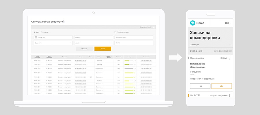
2. Develop an approach to unification - unify the mobile view for different lists within our ecosystem. That the user experience was uniform, regardless of the module with which the user works.
In this note we will share how we approached the solution of problems of translating tables into lists and unifying the presentation of different lists.
We agree on concepts on the shore
The object of design we have, in fact, the line table.
For example,
Further in the article we will call our object a line.
First of all, we gathered together and analyzed all of our services, in essence, sorting them out into components.
Despite the fact that there is a lot of data, and they are different, each unit - the lines of the table (application, transaction, news, etc.) - has an identification number, a humanoid name, a date (creation, update), status and possibility with this do something. And only then begin the variations and details.
How do we fit this amount of data on one page? The Material Design system from Google is similar in structure to ours, and their solutions turned out to be quite applicable to our realities.
In the aterial Design concept, data is shown by lists ( List ) and cards ( Card , Card collection ).
We decided to work with the cards, because there is a lot of information and it needs to be clearly separated. A list is more suitable for simple structures.
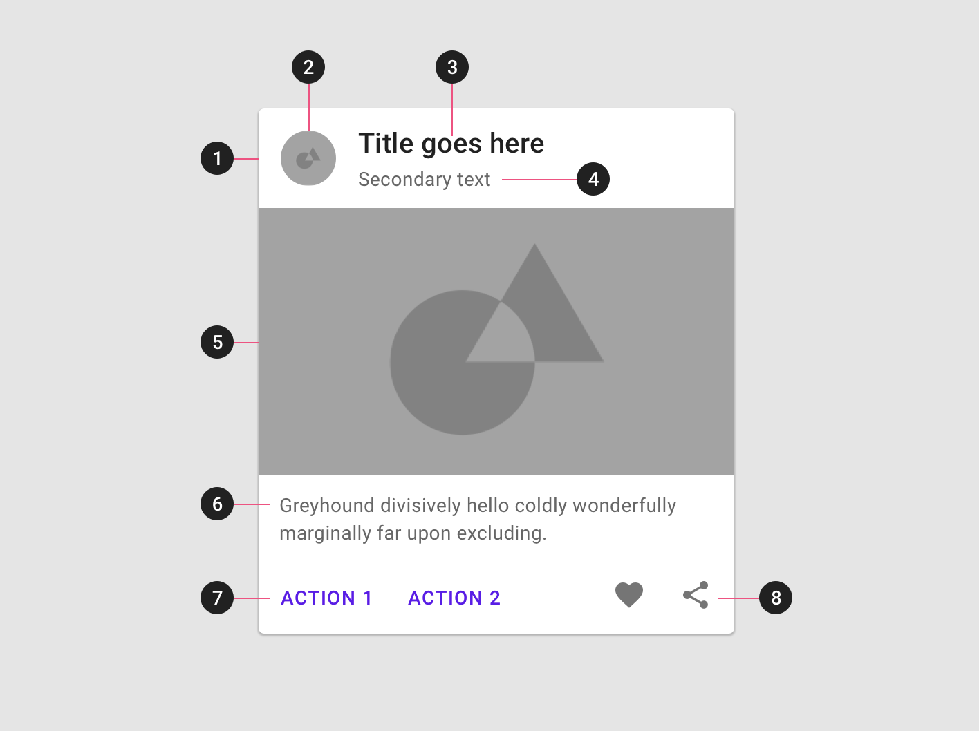
Image source
In fact, the card is a single, self-sufficient and indivisible block of information. Plus, the cards have many options, how to show additional information and actions, which is important for business data.
Creating a system, it is important to ensure uniformity so that the cards are presented equally regardless of the nature of the information.
In order for the user to immediately recognize the desired card in the list, we select the information that identifies the line, and make the additional data less noticeable.
We divided the content of the card into 3 degrees of importance:
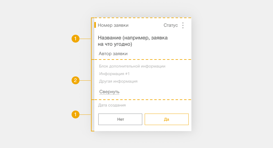
1. Key information - it is necessary, but perhaps not sufficient to make a decision. But this is what exactly is in all modules, and it is precisely her presentation that we unify.
1.1. Object ID - ID, number, date and other unique values for each card.
1.2. Status is what happens to the object. According to the status, users decide what to do with the card. Often they just come from the smartphone to check the status.
We put actions nearby, because status, as a rule, determines possible actions, and actions lead to a change of status.
1.3. Actions - each line always has target actions (accept / reject) and a number of additional actions (redirect, ask a question, etc.).
Key actions can not be more than one or two. We make them available in an explicit form - we place it directly on the card. And we hide additional under ction.
2. Specific information of each of the modules - details that clarify information and are important for understanding the problem and making decisions. We hide them in a detailed view and show on request. This way we avoid overloading with details, leaving additional information easily accessible.
3. Additional details , information that is needed to study the situation in depth, but does not affect decision making. We do not take it to the mobile presentation at all. It remains only in the web version.
We act in accordance with the F-pattern .
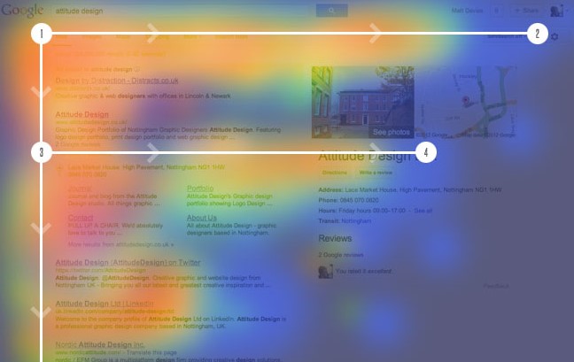
Image source
Image source
Image source

Regardless of whether it is a web or a mobile view, a table or cards, any complex list needs sorting and filtering.
For the mobile presentation, we agreed on the following:
So, guided by the techniques described above, we prepared mobile views for different modules of the customer's ecosystem:

We have unified the list data in the mobile application by structure and appearance. Regardless of the essence of the possible actions with the card or the essence of the information in it, the cards look uniform. In each case, it is intuitively clear what actions will lead to what result.
The development of mobile views for the following modules is limited to what is needed
Initially, the bulk of the modules were sharpened for the web, because office workers from desktop computers work with the systems. We wrote earlier about how we worked out the design system for the web.
But life is constantly accelerating, so that the speed of decision-making increases significantly. Our users need to be in the know at any time, and not just sitting in the workplace. And we understand that we must provide with mobile information sufficient for making operational decisions.
')
For design design, this gives us 2 tasks:
1. Turn big into small - translate bulky lists into a mobile view.
2. Develop an approach to unification - unify the mobile view for different lists within our ecosystem. That the user experience was uniform, regardless of the module with which the user works.
In this note we will share how we approached the solution of problems of translating tables into lists and unifying the presentation of different lists.
We agree on concepts on the shore
The object of design we have, in fact, the line table.
For example,
- travel application,
- advance report
- sales information
- application for connecting a partner and so on.
Further in the article we will call our object a line.
Decompose the task
First of all, we gathered together and analyzed all of our services, in essence, sorting them out into components.
Determine the data that needs to be transferred to the mobile version
Despite the fact that there is a lot of data, and they are different, each unit - the lines of the table (application, transaction, news, etc.) - has an identification number, a humanoid name, a date (creation, update), status and possibility with this do something. And only then begin the variations and details.
Determine the pattern of tables
How do we fit this amount of data on one page? The Material Design system from Google is similar in structure to ours, and their solutions turned out to be quite applicable to our realities.
In the aterial Design concept, data is shown by lists ( List ) and cards ( Card , Card collection ).
We decided to work with the cards, because there is a lot of information and it needs to be clearly separated. A list is more suitable for simple structures.
Image source
In fact, the card is a single, self-sufficient and indivisible block of information. Plus, the cards have many options, how to show additional information and actions, which is important for business data.
Fixed the rules, how will we unify the data
Creating a system, it is important to ensure uniformity so that the cards are presented equally regardless of the nature of the information.
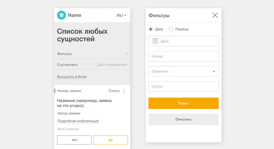
- Uniform card construction rules. Cards should be similar in structure: the user should not be retrained for each new service. Therefore, information blocks and the priority of their display are enshrined in the rules.
- The card - not all, but the most essential information from the table - should be visible in the smartphone screen.
- Methods for obtaining (displaying) additional detailed information from the table should also be uniform.
We collect the designer
Select the essence of the line
In order for the user to immediately recognize the desired card in the list, we select the information that identifies the line, and make the additional data less noticeable.
We divided the content of the card into 3 degrees of importance:
1. Key information - it is necessary, but perhaps not sufficient to make a decision. But this is what exactly is in all modules, and it is precisely her presentation that we unify.
1.1. Object ID - ID, number, date and other unique values for each card.
1.2. Status is what happens to the object. According to the status, users decide what to do with the card. Often they just come from the smartphone to check the status.
We put actions nearby, because status, as a rule, determines possible actions, and actions lead to a change of status.
1.3. Actions - each line always has target actions (accept / reject) and a number of additional actions (redirect, ask a question, etc.).
Key actions can not be more than one or two. We make them available in an explicit form - we place it directly on the card. And we hide additional under ction.
2. Specific information of each of the modules - details that clarify information and are important for understanding the problem and making decisions. We hide them in a detailed view and show on request. This way we avoid overloading with details, leaving additional information easily accessible.
3. Additional details , information that is needed to study the situation in depth, but does not affect decision making. We do not take it to the mobile presentation at all. It remains only in the web version.
Card construction principle
We act in accordance with the F-pattern .
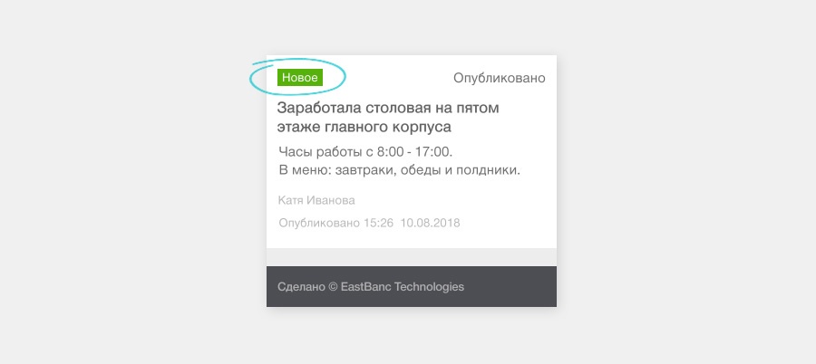
- We place the key information in the upper left corner.
Image source
- We place the information on the left edge - this is familiar to the user, he is more likely to read the information located there in the first place.
Image source
- We present information in text, not pictures or icons. They did this because in our case they clutter up the place and can often be ambiguously perceived.
- Avoid unnecessary content and do not transfer additional details from the web.
Image source
Filters and sorting
Regardless of whether it is a web or a mobile view, a table or cards, any complex list needs sorting and filtering.
For the mobile presentation, we agreed on the following:
- Sections with filters and sorting are minimized to the look of a button.
- Clicking on the filters opens a lightbox with settings.
- When you click on the sorting, the device’s native drop-down list opens.
Result
So, guided by the techniques described above, we prepared mobile views for different modules of the customer's ecosystem:
- Requests for connecting a partner to an agent network
- Corporate News Administration Panel
- Travel Requests
Total
We have unified the list data in the mobile application by structure and appearance. Regardless of the essence of the possible actions with the card or the essence of the information in it, the cards look uniform. In each case, it is intuitively clear what actions will lead to what result.
The development of mobile views for the following modules is limited to what is needed
- Define a set of information
- Prioritize information blocks
- Write the appropriate texts in the interface,
- "Placement date" / "Departure date" / "Date of publication".
- “Agree / Reject” or “Agree / Disagree”.
- If necessary, work out individual visual elements.
Source: https://habr.com/ru/post/420289/
All Articles