We write CSS better and more beautiful
Let's be honest: writing good CSS is difficult.
Many developers don't like writing CSS. Anything, but not this! Just not CSS.
When developing applications had to take on CSS, it was not the most joyful part of the job. But you can't avoid it, right? Today, it is so important to please the user with the design of the application that there is no way without CSS.
')
When the project begins, everything goes well. You just have a couple of selectors:
.title , input , #app - simple.But gradually the application grows, and it’s scary to look into CSS: it's not so easy to figure out all these selectors. You start to write something like
div#app .list li.item a , some pieces of code are repeated again and again, and all your writings are dumped at the end of the file: you don't care, because CSS is crap. The result - 500 lines of CSS-code, which is impossible to maintain.
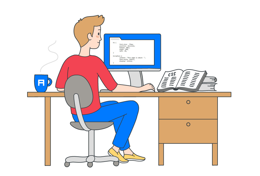
This is me when fighting with CSS
Transferred to Alconost
My task today is to teach you how to write CSS better. I want, looking at the old projects, you thought: “O gods! How could you write this?
What about CSS frameworks? - you ask. After all, they were invented for this - to write good CSS-code.
Right. But they have flaws:
- The design at the exit is often boring.
- It can be difficult to make the necessary settings or go beyond the capabilities of the framework.
- To use frameworks, you first need to learn them.
Well, you are reading this article - it means there is a reason, right? So, without further ado, go ahead, learn how to write CSS better.
Note. This article is not about how to create beautiful applications, but about how to write supported CSS-code and how to organize it.
SCSS
In the examples, I will use SCSS .
SCSS is a CSS preprocessor, in essence, a CSS superset that adds some cool features, such as variables, nesting, imports, and impurities (“mixins”).
Next, I will tell you what features we will use here.
Variables
There are variables in SCSS, and their main advantage is reuse. Suppose you have a color palette for the application, and the main color is blue.
Therefore, you have blue everywhere:
background-color buttons, color of color headers, links. BLUE - EVERYWHERE.And suddenly you lost the blue. A new favorite is green.
- If you have not used variables, you will have to change all the lines that are blue.
- And with variables, it is enough to change the value of one of them.
// $primary-color: #0099ff; // h1 { color: $primary-color: } Nesting
You can use nesting in SCSS. Therefore, from the fragment
h1 { font-size: 5rem; color: blue; } h1 span { color: green; } You can make this code:
h1 { font-size: 5rem; color: blue; span { color: green; } } The latter is better read, right? Nesting allows you to spend less time writing complex selectors.
Import and partial files
If you need to ensure maintainability and readability, storing all the code in one huge file is a bad idea. If you are experimenting or writing a small application, it is still tolerable, but on a professional level ... do not even try. Fortunately for us, SCSS solves this problem.
We can create “partial files” - where the name starts with an underscore :
_animations.scss, _base.scss, _variables.scss and so on.To import them, use the corresponding directive:
@import . For example, you can do this: // _animations.scss @keyframes</i> appear { 0% { opacity: 0; } 100% { opacity: 1; } } <i>// header.scss</i> <b>@import "animations";</b> h1 { animation: appear 0.5s ease-out; } You might think, “Aha! He has a mistake here! You need to write
_animations.scss , not animations . ”Nah SCSS is smart enough to understand that in this case we are talking about a partial file.
That's all we need to know about variables, nesting, partial files, and import. SCSS has other options - impurities, inheritance, and various directives (
@for , @if , ...), but I will not touch them here.If you're interested, read the documentation : it is quite clear and well written.
CSS Code Ordering: BEM Methodology
I've used common names for CSS classes countless times. Well, you know:
.button .page-1 .page-2 .custom-input .Often we have no idea which name to choose - although naming is an important task. Imagine that you started writing an application and then decided to postpone this business for several months - or, even worse, someone took over your project. If you do not think up the naming in the CSS-code, it will be difficult to immediately understand what is meant in a specific line.
BEM helps solve this problem. BEM is a naming convention; stands for block, element, modifier.
This methodology will help to structure the code, make it more modular and simplify reuse. Let us see what the "block", "element" and "modifier" mean.
Blocks
A block can be thought of as a component. Take, for example, Lego Designer.
How to make a simple house from a designer? You will need a window, a roof, a door, a couple of walls - that's all. Just these are our blocks - they carry meaning by themselves.
Naming: block name:
.blockExamples:
.card, .form, .post, .user-navigationItems
And how to make a window from cubes of the designer? You can find cubes that look like parts of the frame, and collect from them a beautiful window. These will be our elements . They are necessary parts of a block, but outside the block are useless by themselves.
Naming: block name +
__ + element name: .block__elementExamples:
.post__author, .post__date, .post__textModifiers
So, we made some kind of window. Now we needed a green or, for example, a small window. These will be our modifiers. They represent the flags on the blocks and elements that are used to change the behavior, appearance, etc.
Naming: block name OR element +
-- + modifier name: .block__element--modifier, .block--modifierExamples:
.post--important, .post__btn--disabledNotes
- BEM implies naming classes and only classes . No identifiers or tags - only classes .
- Blocks and elements may be embedded in other blocks and elements, but they must be completely independent. Necessarily independent . Therefore, it is not necessary to add fields to the button so that it is under the heading, otherwise it will be tied to the heading. It is better to use helper classes.
- Yes, the HTML file will be overloaded, but that's not a big deal: the advantages of BEM outweigh this disadvantage.
Example
A little exercise for readers. Go through the sites that you often visit, and think about what kind of blocks, elements and modifiers could be there.
For example, I can imagine such a picture in the Google store:

Now you. Show curiosity and think what could be done better. And of course, to improve your own skills, you need to independently search, experiment, and write code.
Organizing CSS files: the “7–1” principle
I have not tired you yet? Fine! Let's see how to organize CSS files. This will greatly enhance the work efficiency and help you instantly find the CSS code that needs to be fixed.
It's time to get acquainted with the principle of "7-1".
These numbers don't tell you anything, do you?
But it's pretty simple. Two rules must be followed:
- Place partial files in 7 folders.
- Import them all into one
main.scssfile located in the root. That's all.
Seven folders:
- The
basefolder is a template CSS code that you write whenever you start a new project. These can be layout rules, animations, helper classes (for example,margin-right-large,text-center, ...) and so on. - The
componentsfolder is all the components used to form the pages: buttons, forms, paging modules — swipers, pop-up windows, etc. layoutfolder - for layout of different parts of the page, that is, caps, basement, navigation, sections, own grid, etc.pagesfolder - for pages that need a separate style, different from the standard one.- The
themesfolder - for various themes of the application (dark mode, administration, etc.). - Folder
abstracts- all functions, variables and impurities. In short, auxiliary things. - The
vendorsfolder is external libraries, without which, perhaps, no application can do. Thevendorsfolder contains files that are independent of you: the Font Awesome files, Bootstrap and all that.
Main file
All partial files are imported here.
@import abstracts/variables; @import abstracts/functions; @import base/reset; @import base/typography; @import base/utilities; @import components/button; @import components/form; @import components/user-navigation; @import layout/header; @import layout/footer; … 
Yes, it looks a little bloated, I admit. But this architecture was invented for large projects - and there is another option for smaller tasks.
First, we don’t need the
vendors folder: all external CSS code will be in the link tag placed in the header. Also the themes folder is not needed: most likely, a small application will have only one theme. Finally, there will be no styles for specific pages - so we remove the corresponding folder. So, there are four folders left - great!Now we have two options:
- If you follow the “7–1” principle, you must save the
abstracts,components,layoutandbasefolders. - If you prefer to work with a large folder with all partial files and
main.scss, you get something like this:
sass/ _animations.scss _base.scss _buttons.scss _header.scss … _variables.scss main.scss You decide.
Convinced How to apply all this? I mean, browsers don't support
scss files, right?Tooting! In the final step, we will compile SCSS into CSS.
From SCSS do CSS
We need Node.js and NPM (or Yarn ).
We will use the
node-sass , which will allow compiling .scss files to .css .The interface is pretty simple:
node-sass <> <> [] We will use only two parameters:
- The
-wis to track the directory or file. Thenode-sasswill wait for changes in the code, and as soon as it finds them, it will immediately compile the corresponding file in CSS, which is very convenient during development. - Parameter
--output-style- what the output CSS-file will look like. It can take the following values:nested|expanded|compact|compressed. We will use this parameter when building a CSS file.
If you're curious (I hope it is: the developer should be curious!), Full documentation is here .
Now we know what tools will be used. The rest is made even easier:
- Create a project:
mkdir my-app && cd my-app - Initialize it:
npm init - Add the
node-sass:npm install node-sass --save-dev - We create the necessary folders,
index.htmlandmain.scss:
touch index.html mkdir -p sass/{abstracts,base,components,layout} css cd sass && touch main.scss - Add the following scripts to the
package.jsonfile:
{ … "scripts": { "watch": "node-sass sass/main.scss css/style.css -w", "build": "node-sass sass/main.scss css/style.css --output-style compressed" }, … } - Add a link to the compiled CSS file to the head tag of the index.html file:
<!DOCTYPE html> <html lang="en"> <head> <meta charset="UTF-8"> <meta name="viewport" content="width=device-width, initial-scale=1.0"> <meta http-equiv="X-UA-Compatible" content="ie=edge"> <b><link rel="stylesheet" href="css/style.css"></b> <title>My app</title> </head> <body> <h1 class="heading">My app</h1> </body> </html> That's all! When you write code, run
npm run watch and open the index.html file in your browser. To reduce CSS, just run npm run build .Something else
Reboot on the fly
To work better, you can add an automatic restart of the local
index.html file.To do this, do this:
- Install the
live-serverpackage:npm install -g live-server
Note: This is a global package. - Add
npm-run-allto the project dependencies:npm install npm-run-all --save-dev- this will allow you to run several scripts at the same time. - Add the following scripts to
package.json:
{ … "scripts": { <b> "start": "npm-run-all --parallel liveserver watch", "liveserver": "live-server",</b> "watch": "node-sass sass/main.scss css/style.css -w", }, … } Now, if you start
npm run start , the changes will be displayed immediately - without any extra movement on your part.Automatic prefixes
We set up development tools - great! Now let's talk about the build tools, in particular - about this: Autoprefixer .
This tool (or rather, the postcss plugin) analyzes CSS and adds vendor prefixes to CSS rules using values from Can I Use .
When creating a website can be used new features that are not supported in all browsers. Provider support allows implementing such functions.
An example of how it will look like:
-webkit-animation-name: myAnimation; -moz-animation-name: myAnimation; -ms-animation-name: myAnimation; Yes, writing it by hand is tiring. The life tool for us will be easier for us to automatically add prefixes, which will make CSS-code compatible with browsers without additional efforts.
So, to build CSS:
- Compile all SCSS files into one CSS file.
- Add prefixes using Autoprefixer.
- Compress the CSS file.
There is nothing left - do not switch the channel.
- Add two dependencies -
postcss-cliandautoprefixer:npm install autoprefixer postcss-cli --save-dev - Modify the
buildscript and add these lines topackage.json:
{ … "scripts": { "start": "npm-run-all --parallel liveserver watch", "liveserver": "live-server", "watch": "node-sass sass/main.scss css/style.css -w", <b> "compile": "node-sass sass/main.scss css/style.css", "prefix": "postcss css/style.css --use autoprefixer -o css/style.css", "compress": "node-sass css/style.css css/style.css --output-style compressed", "build": "npm-run-all compile prefix compress"</b> … } Now, when running
npm run build , vendor prefixes will be added, and the CSS code itself will be compressed. Just magic!Do you want a little more magic? I picked up the repository - so you can figure it out quickly?
If you are interested in how I applied these skills on the page of my portfolio, take a look at this repository and admire the result . I hope these examples will help to better understand what was discussed in the article.
And ... it's all for today! Now you can write supported modular CSS-code with the possibility of reuse.

About the translator
The article is translated in Alconost.
Alconost is engaged in the localization of games , applications and sites in 68 languages. Language translators, linguistic testing, cloud platform with API, continuous localization, 24/7 project managers, any formats of string resources.
We also make advertising and training videos - for websites selling, image, advertising, training, teasers, expliners, trailers for Google Play and the App Store.
Read more
Source: https://habr.com/ru/post/419095/
All Articles