What's new in ConstraintLayout 1.1
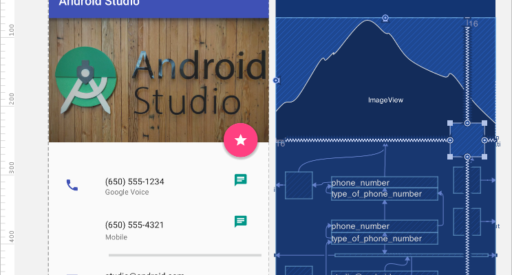
ConstraintLayout simplifies the creation of complex layouts in Android, allowing you to create most of your user interface using the visual editor in Android Studio. It is often called the more powerful RelativeLayout . With the help of ConstraintLayout you can avoid multiple levels of nesting with the imposition of complex screens.
A stable version of ConstraintLayout 1.1 was recently released, and now it looks very mature. Its full optimization further increases its speed, and new elements, such as barriers and groups, turn the creation of a truly cool design into a rather trivial task.
Android gradle
To use new functions in a project, you need to add ConstraintLayout 1.1 to the project as a dependency:
dependencies { implementation 'com.android.support.constraint:constraint-layout:1.1.2' } New functionality in 1.1
Interest
In order for View to occupy a certain percentage of the screen, at least two dependencies were necessary in ConstraintLayout 1.0 . In ConstraintLayout 1.1, the solution to this problem was simplified to a simple indication of the percent width or height.
The width of the button is given in percent, and it takes up all the free space and retains its appearance:

All View components support the layout_constraintWidth_percent and layout_constraintHeight_percent attributes . They allow you to limit the View component to the percentage within the entire available space. Thus, in order for the button to stretch by 70% within the free space for it, you need only a few lines:
<Button android:layout_width="0dp" android:layout_height="wrap_content" app:layout_constraintWidth_percent="0.7" /> Chains
When positioning several components with the help of a chain , it is possible to control the space between them. In 1.1 several bugs with chains were fixed and now they can work with a large number of View components. To create a chain, you need to add dependencies in both directions to the View component:
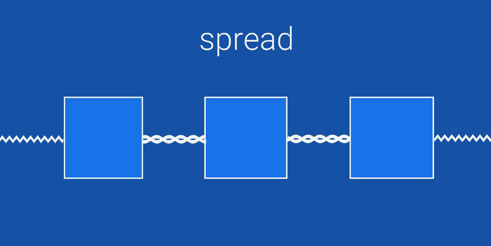
The main ( head ) View component of the chain has an app: layout_constraintVertical_chainStyle property available, which can be set to spread , spread_inside or packed .
- spread evenly distributes all View components in a chain
- spread_inside places the first and last components along the edges and evenly distributes the rest.
- Packed groups all components in the center of the chain.
Barriers
When you have several View components that can dynamically resize, you can use a barrier to limit them. The barrier can be placed at the beginning, at the end, above or below of several components. This is very similar to creating a virtual group of components. Virtual, because this group does not exist physically, and, therefore, it does not complicate the hierarchy of components.
Barriers are really useful when you create localized strings or display user-created content, the size of which you cannot predict.
Barriers allow you to create dependencies on several View components:

The barrier is always located directly outside the virtual group and can be used to build dependencies with other View components. In this example, the View component on the right is always at the end of the longest component of the virtual group.
Groups
Sometimes you need to show or hide several components at once. This is why groups were added to ConstraintLayout .
The group does not add an additional level of nesting to the hierarchy of View components. A group is simply a way of virtual association. In the example below, we combine profile_name and profile_image under one id - profile .
This is useful when you have several components that are displayed or hidden together.
<android.support.constraint.Group android:id="@+id/profile" app:constraint_referenced_ids="profile_name,profile_image" /> Once you have created a profile group, you can change the visibility of the whole group, and it will apply to both profile_name and profile_image .
profile.visibility = GONE profile.visibility = VISIBLE Circular dependencies
In ConstraintLayout, most of the dependencies and constraints are defined by the screen size - horizontal and vertical. In Constraint Layout 1.1 a new type of dependency appeared - constraintCircle , which allows you to specify dependencies in a circle. Instead of horizontal and vertical indents, you can specify the angle and radius of the circle. This is convenient for View- components shifted at an angle, such as a radial menu!

When creating circular dependencies, the angles start at the top and change clockwise. For example, in this way you need to describe the middle button in the example above:
<android.support.design.widget.FloatingActionButton android:id="@+id/middle_expanded_fab" app:layout_constraintCircle="@+id/fab" app:layout_constraintCircleRadius="50dp" app:layout_constraintCircleAngle="315" /> ConstraintSet Animation
ConstraintLayout can be used with ConstraintSet to simultaneously animate multiple elements. ConstraintSet works only with dependencies from ConstraintLayout . ConstraintSet can be created in the code or added directly to the xml file.
To start the animation, use TransitionManager.beginDelayedTransition () `from the support library . This function will launch all animations defined in ConstraintSet **.
In this video you can learn a little more on this topic:
New optimizations
ConstraintLayout 1.1 adds several new optimizations that improve its speed. Optimizations are performed in order to reduce the number of dependencies required to position View components on the screen.
The essence of optimizations is getting rid of redundant constants in layouts.
There is a new attribute - layout_optimizationLevel , which adjusts the level of optimization. It can be given the following values:
- Barriers locates barriers and replaces them with simpler dependencies.
- direct optimizes components that are directly connected to other fixed components, such as the sides of the screen, and continues to optimize any components directly related to them.
- standard is the default optimization that includes barriers and direct
- dimensions is currently experimental optimization and can lead to some problems. Optimizes layout by calculating dimensions
- The chains are currently also in the experimental stage. Optimizes the construction of chains of components with fixed sizes
If you want to try out experimental optimization dimensions and chains , you need to include them in ConstraintLayout using
<android.support.constraint.ConstraintLayout app:layout_optimizationLevel="standard|dimensions|chains" ')
Source: https://habr.com/ru/post/419017/
All Articles