Methods and tools for developing styles of web pages
Let's not beat around the bush, let's face it: the process of writing good CSS code can be very, very hard. Many developers don't want to mess with styles. They are ready to do anything, but not CSS.

The author of the material, the translation of which we offer today to your attention, says that he himself didn’t like that part of web development that is related to CSS. But this is not going anywhere. Nowadays, great attention is paid to design, and what is called “user experience”, and CSS can’t do without it. The purpose of this material is to help everyone improve their skills in developing and applying styles for web pages.
At the very beginning of a new project, styles usually look simple and clear. Let's say there are very few CSS selectors, such as
')
But as the application grows, styles become a nightmare. The developer starts to get confused in CSS selectors. He discovers that he writes something like
I would like to read this article, you would look at your previous projects and think: “Well, wow, how could I write this?”.
Perhaps you are thinking now that “writing CSS” means using CSS frameworks. After all, they are intended precisely in order to facilitate the work with styles, and it is with their use that they write good CSS code. All this is true, but CSS frameworks have certain disadvantages:
And, after all, you are not reading this in order to familiarize yourself with a certain framework? So let's do some CSS. Immediately I would like to note that the material is not about how to create beautiful designs for applications. It is about how to write high-quality CSS-code that is easy to maintain, and how to organize it correctly.
In my examples, I will use SCSS . This is a CSS preprocessor. In fact, SCSS is a superset of CSS. It has some very interesting features, such as variables, nested constructions, file import, mixins. Let's discuss the possibilities of SCSS, which we will use.
You can use variables in SCSS. The main advantage of using variables is the possibility of their reuse. Imagine that we have a set of colors for the application. Primary color is blue. As a result, this color is applied literally everywhere. It is used in the
And now you, suddenly, decide to change the blue to the green. If you perform such a replacement without using variables, you will have to edit all the code, all the lines where the old color is used. If you use a variable, then you only have to change its value. Here is the use of variables:
SCSS supports nested constructs. Here is the usual CSS:
Thanks to the support of nested constructions, it can be transformed as follows:
This option is much easier to read, right? In addition, through the use of nested constructions, the time to create complex selectors is reduced.
When it comes to supporting styles and their readability, it becomes clear that it’s impossible to keep all the code in one file. One style file can be used for experimental purposes, or when developing a small application, but if you reach a professional level ... it’s better not to try. Fortunately for us, there are mechanisms in SCSS that allow us to conveniently organize code styles.
Files containing fragments of style descriptions can be created by adding an underscore at the beginning of their names:
To import these files, the
It may seem to you that there is an error in this code. Indeed, because the file we want to import is called
That is all we need to know about variables, nested constructs, fragmentation of styles, and import. There are other possibilities in SCSS, like mixins, inheritance, and other directives (among them are
If you want to get a closer look at SCSS, take a look at the relevant documentation .
I don’t remember how many times I used universal terms for naming CSS classes. As a result, I got such names, I think, familiar to everyone:
Often we simply do not know how to call certain entities. But it is very important. What if you were developing an application, and then, for some reason, postponed work for several months? Or, and this is much worse, what if someone else took on this project? If the CSS code uses inappropriate names, it will be difficult to understand without analyzing other parts of the application.
The BEM methodology (Block, Element, Modifier) is a component approach to web development. In particular, we are talking about the agreement on the naming of entities. This methodology allows you to structure the code, helps to break it down into modules and helps in its reuse. Let's talk about blocks, elements and modifiers.
Blocks can be viewed as components. Surely, you played as a child in Lego. Therefore, turn on the time machine.
How did you build, say, an ordinary house? You will need a window, a roof, a door, walls, and, in general, this is enough. All this is our blocks. They are significant in their own right.
Naming: block name -
Examples:
How to make a window out of Lego? Probably, some cubes look like frames, so if you combine four such cubes, you get a beautiful window. These are the elements. They are parts of blocks, we need them in order to create blocks. However, elements outside the blocks are useless.
Naming:
Examples:
Once you have a window, you may want to change it. For example - paint in a different color. Such changes are made to the base blocks or elements using modifiers. These are the flags of blocks or elements, and they are used to change their behavior, appearance, and so on.
Naming:
Examples:
Here is an exercise for you. Look carefully at the sites that you like, or those that you most often use, and think about what might be a block on them, what is an element, and what is a modifier.
For example, this is what I got as a result of analyzing the Google Store.
Site analysis
Now you. Look at the site, think about how it can be improved. In order to develop in a certain area, a person must independently search for information, experiment and create something new.
Here is an example prepared by means of Codepen, demonstrating the capabilities of BEM. Here we make out in different ways something like publications in a certain blog. Here is the HTML code for this example.
Here are the SCSS styles:
But what eventually happened.
Making “publications” using BEM
Consider another example . Here, using BEM, we make out the buttons. Here is the HTML code for this example.
Here are the SCSS styles.
And here is the result.

Design of buttons using the BEM methodology
Let's talk about organizing CSS files. What you learn from this part of our conversation will allow you to work more productively, and will help, in appropriate situations, instantly find the CSS code that needs to be changed. In order to achieve all this, we need to study the template "7-1".
Perhaps now it will seem to you that somehow this template is too strangely called. However, there is nothing strange here, and it is very simple to use it. It is enough to follow two simple rules:
The name of the template, as a result, can be decrypted as “7 folders - 1 file”. As you can see, everything is not so difficult. Let's talk about this template in more detail.
Here are the folders in question:
It is in this file that all those fragments of styles that are laid out in the seven folders described above are imported. Some part of this file may look like this:
I can not agree that the whole structure of seven folders looks quite large. However, here it should be noted that this architecture is designed for large projects. For small projects, you can use an adapted version of the template "7-1". Features of this version are that it can do without some folders. So, here you can opt out of the
Next, doing a small project, you can go one of two ways:
What exactly to choose depends on your preferences.
Here, if you are imbued with the idea of using SCSS, you may have a question about how to use such styles, since browsers do not support them. In fact, this is a good question that leads us to the final stage of our conversation, to the compilation of SCSS in CSS.
In order to convert the SCSS code to CSS, you need the Node.js platform and the NPM (or Yarn ) package manager.
We will use the
There are many options available. We will focus on two:
If you are a curious person (I hope it is so, because curiosity is only for the benefit of the developer), then you will most likely be interested in looking at the documentation for the
So, with the tools we have decided, now the simplest remains. In order to convert SCSS to CSS, you must perform the following steps:
Create a project folder and navigate to it:
Initialize the project:
Add the
Create an
Add the following to
Add the link leading to the compiled CSS file to the
That's all. Now, when you are working on a project, execute the
Perhaps you, to increase productivity, want to organize an interactive page reload. It is more convenient to manually restart
Install the
Add the
Add the following to
Now, having executed the
At this stage, you have a customized development environment, which is very good. Now let's talk about the tools for building the project, and in particular, the package autoprefixer . This is a tool (this is a postcss plugin) that parses the CSS code and adds browser vendor prefixes to the CSS rules using data from Can I Use .
During the creation of the site, the programmer may use some new features that are not fully supported by all browsers. Browser prefixes are aimed at solving a number of tasks, including the development of cross-browser web applications.
The code with browser prefixes looks like this:
It is easy to see that writing such code is very tedious. In order to facilitate the task of ensuring the compatibility of our CSS-code with different browsers, without overriding the project, we will use the package
This is, in general, the final stage of the project. So, this is what you need to do to use
Add two dependencies to the project -
Add the following code to
, ,
, CSS, , , CSS-, , .
Dear readers! -?

The author of the material, the translation of which we offer today to your attention, says that he himself didn’t like that part of web development that is related to CSS. But this is not going anywhere. Nowadays, great attention is paid to design, and what is called “user experience”, and CSS can’t do without it. The purpose of this material is to help everyone improve their skills in developing and applying styles for web pages.
CSS issues
At the very beginning of a new project, styles usually look simple and clear. Let's say there are very few CSS selectors, such as
.title , input , #app , which will not seem difficult to work with.')
But as the application grows, styles become a nightmare. The developer starts to get confused in CSS selectors. He discovers that he writes something like
div#app .list li.item a . However, the work can not be stopped, so the programmer continues to use similar constructs, CSS-code is stuffed somewhere at the end of the file. And really - who are interested in styles? And by itself, CSS is such nonsense ... The result is 500 lines of completely unsupported, terrible CSS.I would like to read this article, you would look at your previous projects and think: “Well, wow, how could I write this?”.
Perhaps you are thinking now that “writing CSS” means using CSS frameworks. After all, they are intended precisely in order to facilitate the work with styles, and it is with their use that they write good CSS code. All this is true, but CSS frameworks have certain disadvantages:
- Often their use leads to a boring, monotonous, banal design.
- Framework styles are difficult to customize, complexity can also be caused by the need to do something that goes beyond the framework.
- Frameworks, before using them, must be studied.
And, after all, you are not reading this in order to familiarize yourself with a certain framework? So let's do some CSS. Immediately I would like to note that the material is not about how to create beautiful designs for applications. It is about how to write high-quality CSS-code that is easy to maintain, and how to organize it correctly.
SCSS
In my examples, I will use SCSS . This is a CSS preprocessor. In fact, SCSS is a superset of CSS. It has some very interesting features, such as variables, nested constructions, file import, mixins. Let's discuss the possibilities of SCSS, which we will use.
▍ Variables
You can use variables in SCSS. The main advantage of using variables is the possibility of their reuse. Imagine that we have a set of colors for the application. Primary color is blue. As a result, this color is applied literally everywhere. It is used in the
background-color property of the buttons, in the color property of the page header, and in many other places.And now you, suddenly, decide to change the blue to the green. If you perform such a replacement without using variables, you will have to edit all the code, all the lines where the old color is used. If you use a variable, then you only have to change its value. Here is the use of variables:
// $primary-color: #0099ff; // h1 { color: $primary-color; } ▍ Nested constructions
SCSS supports nested constructs. Here is the usual CSS:
h1 { font-size: 5rem; color: blue; } h1 span { color: green; } Thanks to the support of nested constructions, it can be transformed as follows:
h1 { font-size: 5rem; color: blue; span { color: green; } } This option is much easier to read, right? In addition, through the use of nested constructions, the time to create complex selectors is reduced.
▍Fragmentation and import
When it comes to supporting styles and their readability, it becomes clear that it’s impossible to keep all the code in one file. One style file can be used for experimental purposes, or when developing a small application, but if you reach a professional level ... it’s better not to try. Fortunately for us, there are mechanisms in SCSS that allow us to conveniently organize code styles.
Files containing fragments of style descriptions can be created by adding an underscore at the beginning of their names:
_animations.scss , _base.scss , _variables.scss , and so on.To import these files, the
@import directive is @import . Here is how to use this mechanism: // _animations.scss @keyframes appear { 0% { opacity: 0; } 100% { opacity: 1; } } // header.scss @import "animations"; h1 { animation: appear 0.5s ease-out; } It may seem to you that there is an error in this code. Indeed, because the file we want to import is called
_animations.scss , and we, in the header.scss file, use the @import "animations" command. However, there is no error. SCSS is an intelligent enough system to understand what a developer has in mind in this situation the corresponding file.That is all we need to know about variables, nested constructs, fragmentation of styles, and import. There are other possibilities in SCSS, like mixins, inheritance, and other directives (among them are
@for , @if and some more), but we are not going to talk about them here.If you want to get a closer look at SCSS, take a look at the relevant documentation .
CSS Code Organization: BEM Methodology
I don’t remember how many times I used universal terms for naming CSS classes. As a result, I got such names, I think, familiar to everyone:
.button , .page-1 , .page-2 , .custom-input .Often we simply do not know how to call certain entities. But it is very important. What if you were developing an application, and then, for some reason, postponed work for several months? Or, and this is much worse, what if someone else took on this project? If the CSS code uses inappropriate names, it will be difficult to understand without analyzing other parts of the application.
The BEM methodology (Block, Element, Modifier) is a component approach to web development. In particular, we are talking about the agreement on the naming of entities. This methodology allows you to structure the code, helps to break it down into modules and helps in its reuse. Let's talk about blocks, elements and modifiers.
Blocks
Blocks can be viewed as components. Surely, you played as a child in Lego. Therefore, turn on the time machine.
How did you build, say, an ordinary house? You will need a window, a roof, a door, walls, and, in general, this is enough. All this is our blocks. They are significant in their own right.
Naming: block name -
.blockExamples:
.card , .form , .post , .user-navigation▍Items
How to make a window out of Lego? Probably, some cubes look like frames, so if you combine four such cubes, you get a beautiful window. These are the elements. They are parts of blocks, we need them in order to create blocks. However, elements outside the blocks are useless.
Naming:
+ __ + - .block__elementExamples:
.post__author , .post__date , .post__text▍ Modifiers
Once you have a window, you may want to change it. For example - paint in a different color. Such changes are made to the base blocks or elements using modifiers. These are the flags of blocks or elements, and they are used to change their behavior, appearance, and so on.
Naming:
+ -- + - .block__element--modifier , .block--modifierExamples:
.post--important , .post__btn--disabled▍Notes
- When using BEM, names are given exclusively to classes. No IDs or tags — only classes.
- Blocks or elements may be nested in other blocks or elements, but they must be completely independent. It is very important. Therefore, for example, it is not necessary to assign fields to a button due to the fact that you want to place it under the title, otherwise the button will be associated with the title. Use helper classes instead.
- When applying the BEM methodology, the HTML files will be overloaded with names, but this is a small price to pay for the features that BEM gives us.
▍Exercise
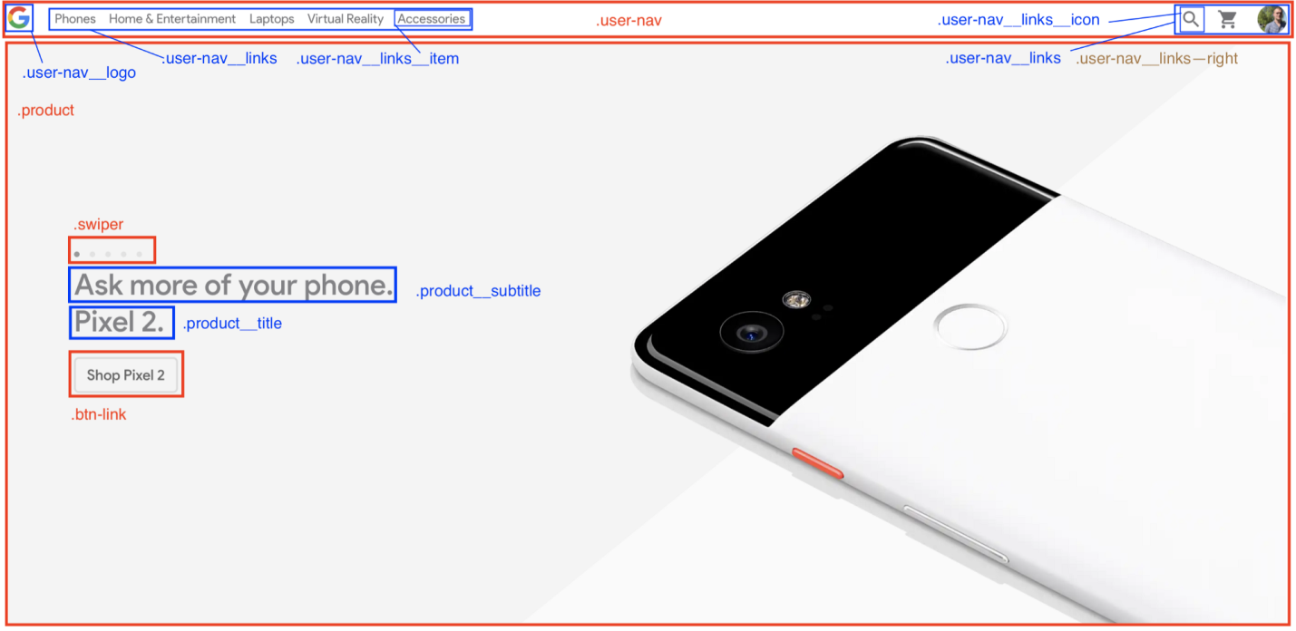
Here is an exercise for you. Look carefully at the sites that you like, or those that you most often use, and think about what might be a block on them, what is an element, and what is a modifier.
For example, this is what I got as a result of analyzing the Google Store.
Site analysis
Now you. Look at the site, think about how it can be improved. In order to develop in a certain area, a person must independently search for information, experiment and create something new.
▍Examples
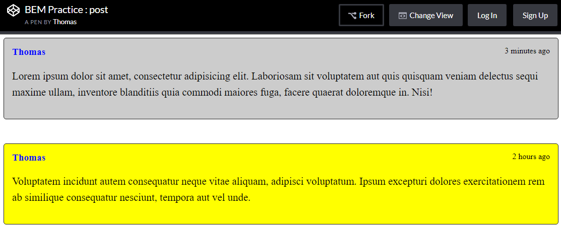
Here is an example prepared by means of Codepen, demonstrating the capabilities of BEM. Here we make out in different ways something like publications in a certain blog. Here is the HTML code for this example.
<div class="post"> <span class="post__author">Thomas</span> <span class="post__date">3 minutes ago</span> <p class="post__text">Lorem ipsum dolor sit amet, consectetur adipisicing elit. Laboriosam sit voluptatem aut quis quisquam veniam delectus sequi maxime ullam, inventore blanditiis quia commodi maiores fuga, facere quaerat doloremque in. Nisi!</p> </div> <div class="post mt-large post--important"> <span class="post__author">Thomas</span> <span class="post__date">2 hours ago</span> <p class="post__text">Voluptatem incidunt autem consequatur neque vitae aliquam, adipisci voluptatum. Ipsum excepturi dolores exercitationem rem ab similique consequatur nesciunt, tempora aut vel unde.</p> </div> Here are the SCSS styles:
.post { display: inline-block; padding: 1rem; background-color: #ccc; border: 1px solid #222; border-radius: 5px; &--important { background-color: yellow; } &__author { font-size: 1.2rem; font-weight: bold; color: blue; } &__date { float: right; } &__text { line-height: 2rem; font-size: 1.3rem; } } .mt-large { margin-top: 3rem; } But what eventually happened.
Making “publications” using BEM
Consider another example . Here, using BEM, we make out the buttons. Here is the HTML code for this example.
<div> <button class="btn"> Click me </button> <button class="btn btn--danger"> Danger </button> <button class="btn btn--success"> Success </button> <button class="btn btn--small"> Small </button> <button class="btn btn--big"> Big </button> <button class="btn btn--border"> Border </button> </div> Here are the SCSS styles.
.colors { font-size: 1.5rem; font-family: sans-serif; } .btn { background-color: #FF6B93; color: #fff; text-transform: uppercase; padding: 1.5rem 2.5rem; border-radius: 4px; transition: all .2s; font-size: 1.3rem; border: none; letter-spacing: 2px; cursor: pointer; &:hover { background-color: #D15879; } &:focus { outline: none; } &--danger { background-color: #FF3B1A; &:hover { background-color: #D43116; } } &--success { background-color: #00D123; &:hover { background-color: #00AB1D; } } &--small { padding: 1rem 2rem; font-size: 1rem; } &--big { padding: 1.8rem 4.5rem; font-size: 1.7rem; } &--border { background-color: #fff; color: #FF6B93; border: 1px solid #FF6B93; &:hover { background-color: #FF6B93; color: #fff; } } } And here is the result.
Design of buttons using the BEM methodology
CSS Files Organization: Template "7-1"
Let's talk about organizing CSS files. What you learn from this part of our conversation will allow you to work more productively, and will help, in appropriate situations, instantly find the CSS code that needs to be changed. In order to achieve all this, we need to study the template "7-1".
Perhaps now it will seem to you that somehow this template is too strangely called. However, there is nothing strange here, and it is very simple to use it. It is enough to follow two simple rules:
- All files with SCSS fragments should be placed in 7 different folders.
- All these files need to be imported into one file,
main.scss, located in the root directory where all these folders are located.
The name of the template, as a result, can be decrypted as “7 folders - 1 file”. As you can see, everything is not so difficult. Let's talk about this template in more detail.
▍7 folders
Here are the folders in question:
base: in this folder you need to place all, so to speak, "sample" code. The “template” code here means all that CSS code that you have to write when creating a new project. For example: typographic rules, animations, utilities (that is, classes likemargin-right-large,text-center), and so on.components: the name of this folder clearly indicates what will be stored in it. We are talking about the styles of components used to build pages. These are buttons, forms, all kinds of sliders, pop-ups, and so on.layout: this folder is used to store page layout element styles. These are the header and footer of the page, the navigation area, the various sections of the page, the grid, and so on.pages: sometimes the project needs pages that have their own specific style, which is different from the style of other pages. Descriptions of styles for such special pages and fall into this folder.themes: if a web project involves the use of different themes (for example, something like “dark mode”, or “admin”), styles for them should be put here.abstracts: this folder contains all sorts of auxiliary things - functions, variables, mixins.vendors: rare site without external dependencies. Styles that are not created by those who develop a specific site are stored in this folder. Here, for example, you can save the project files Font Awesome, styles Bootstrap and so on.
MainFile main.scss
It is in this file that all those fragments of styles that are laid out in the seven folders described above are imported. Some part of this file may look like this:
@import abstracts/variables; @import abstracts/functions; @import base/reset; @import base/typography; @import base/utilities; @import components/button; @import components/form; @import components/user-navigation; @import layout/header; @import layout/footer; I can not agree that the whole structure of seven folders looks quite large. However, here it should be noted that this architecture is designed for large projects. For small projects, you can use an adapted version of the template "7-1". Features of this version are that it can do without some folders. So, here you can opt out of the
vendors folder by placing links to external style files in the link tag. Further, you can do without the themes folder, since the themes will probably not be used in a small web application. And finally, you can get rid of the pages folder, since in this project, most likely, there will be no pages whose style is very different from the general style. As a result, of the seven folders there are only four.Next, doing a small project, you can go one of two ways:
- If you prefer to take advantage of what remains of the “7-1” template, then you keep the
abstracts,components,layoutandbasefolders. - If you decide to do with one large folder, then all files with fragments of styles, along with the
main.scssfile, fall into this folder. It might look something like this:
sass/ _animations.scss _base.scss _buttons.scss _header.scss ... _variables.scss main.scss What exactly to choose depends on your preferences.
Here, if you are imbued with the idea of using SCSS, you may have a question about how to use such styles, since browsers do not support them. In fact, this is a good question that leads us to the final stage of our conversation, to the compilation of SCSS in CSS.
Compiling SCSS to CSS
In order to convert the SCSS code to CSS, you need the Node.js platform and the NPM (or Yarn ) package manager.
We will use the
node-sass , which allows you to compile .scss files into .css files. This is a command line tool, easy to use. Namely, the node-sass looks like this: node-sass <input> <output> [options] There are many options available. We will focus on two:
- The option
-wallows you to organize the monitoring of a folder or file. That is,node-sasswill monitor changes in the code, and, when they occur, automatically compile the files in CSS. This feature is very useful in the development process. - The
--output-styleoption defines the style of the output CSS file. There are several options available:nested,expanded,compact,compressed. We will use this option to build the finished CSS file.
If you are a curious person (I hope it is so, because curiosity is only for the benefit of the developer), then you will most likely be interested in looking at the documentation for the
node-sass .So, with the tools we have decided, now the simplest remains. In order to convert SCSS to CSS, you must perform the following steps:
Create a project folder and navigate to it:
mkdir my-app && cd my-app Initialize the project:
npm init Add the
node-sass package to the project: npm install node-sass --save-dev Create an
index.html file, folders with styles, main.scss file: touch index.html mkdir -p sass/{abstracts,base,components,layout} css cd sass && touch main.scss Add the following to
package.json : { ... "scripts": { "watch": "node-sass sass/main.scss css/style.css -w", "build": "node-sass sass/main.scss css/style.css --output-style compressed" }, ... } Add the link leading to the compiled CSS file to the
head tag of the index.html file: <!DOCTYPE html> <html lang="en"> <head> <meta charset="UTF-8"> <meta name="viewport" content="width=device-width, initial-scale=1.0"> <meta http-equiv="X-UA-Compatible" content="ie=edge"> <link rel="stylesheet" href="css/style.css"> <title>My app</title> </head> <body> <h1 class="heading">My app</h1> </body> </html> That's all. Now, when you are working on a project, execute the
npm run watch and open the index.html file in your browser. To minify CSS, run the npm run build .Additional utility
▍Interactive page reload
Perhaps you, to increase productivity, want to organize an interactive page reload. It is more convenient to manually restart
index.html . Here's how to do it:Install the
live-server package (note that it is installed globally): npm install -g live-server Add the
npm-run-all package to the project dependencies, which allows you to simultaneously run several scripts: npm install npm-run-all --save-dev Add the following to
package.json : { ... "scripts": { "start": "npm-run-all --parallel liveserver watch", "liveserver": "live-server", "watch": "node-sass sass/main.scss css/style.css -w", }, ... } Now, having executed the
npm run start command, you, in the course of working on the project, will instantly see the changes made to it, without reloading the page manually.AutoPackage autoprefixer
At this stage, you have a customized development environment, which is very good. Now let's talk about the tools for building the project, and in particular, the package autoprefixer . This is a tool (this is a postcss plugin) that parses the CSS code and adds browser vendor prefixes to the CSS rules using data from Can I Use .
During the creation of the site, the programmer may use some new features that are not fully supported by all browsers. Browser prefixes are aimed at solving a number of tasks, including the development of cross-browser web applications.
The code with browser prefixes looks like this:
-webkit-animation-name: myAnimation; -moz-animation-name: myAnimation; -ms-animation-name: myAnimation; It is easy to see that writing such code is very tedious. In order to facilitate the task of ensuring the compatibility of our CSS-code with different browsers, without overriding the project, we will use the package
autoprefixer . Here you will need to perform the following steps:- Compile all SCSS files into one main CSS file.
- Add browser prefixes to this file using
autoprefixer. - Squeeze this CSS file.
This is, in general, the final stage of the project. So, this is what you need to do to use
autoprefixer :Add two dependencies to the project -
postcss-cli and autoprefixer : npm install autoprefixer postcss-cli --save-dev Add the following code to
package.json and modify the build script: { ... "scripts": { "start": "npm-run-all --parallel liveserver watch", "liveserver": "live-server", "watch": "node-sass sass/main.scss css/style.css -w", "compile": "node-sass sass/main.scss css/style.css", "prefix": "postcss css/style.css --use autoprefixer -o css/style.css", "compress": "node-sass css/style.css css/style.css --output-style compressed", "build": "npm-run-all compile prefix compress" ... } npm run build , CSS-, . , , . — , , ., ,
Results
, CSS, , , CSS-, , .
Dear readers! -?
Source: https://habr.com/ru/post/418825/
All Articles