How to quickly prototype apps with a CSS grid and CSS variables
Both the CSS grid and CSS variables are powerful tools for frontend developers. The first allows you to significantly simplify the creation of web site layouts, while the second gives you all the power of variable style sheets.
In this article, I will show you how to use both tools to quickly prototype application design.
Our applications will work with CSS-grid, a module that allows you to quickly create layouts and manage them. This is useful, in particular, if you are working with the grid-template-areas property. (I'll show you how to use it below).
')
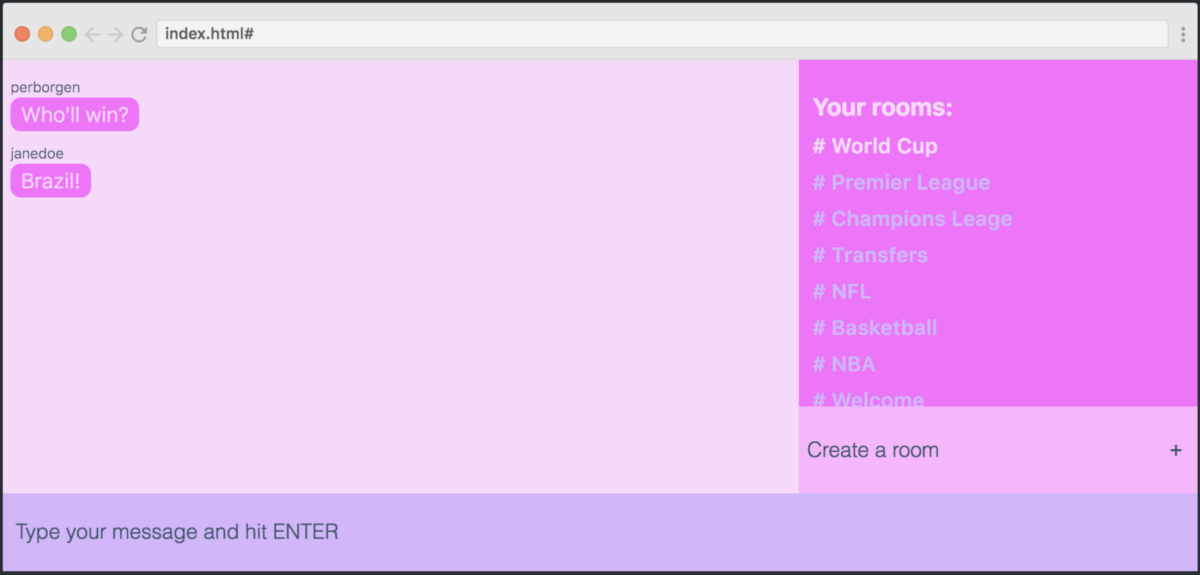
Let's evaluate the appearance of our application - this is a chat:

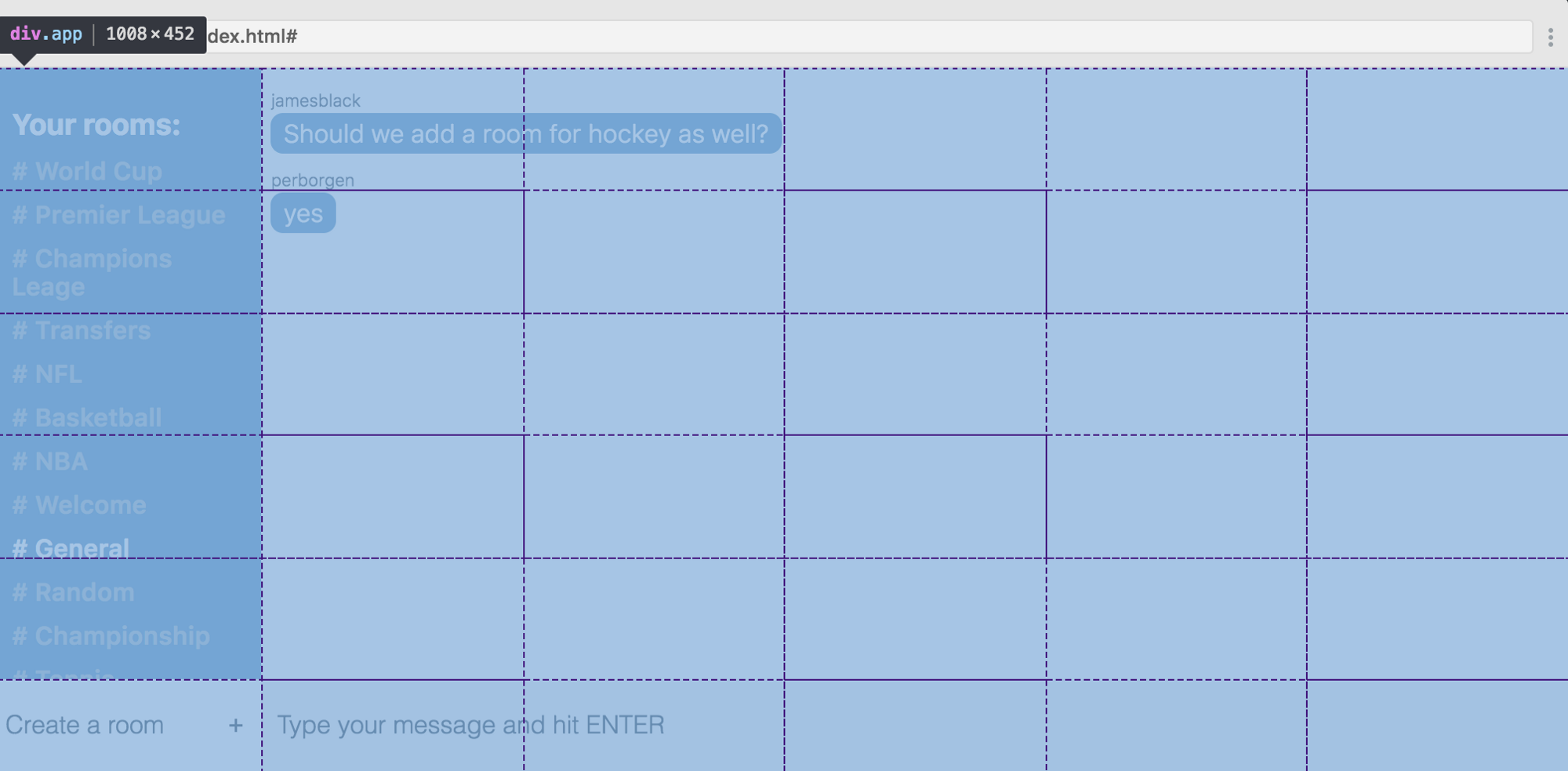
If we open the developer tools in Chrome, we can see what this grid is. As you can see, there are six columns and six rows.
Here is the code for creating such a grid:
First we create a container for it. Then we say that we would like to get six columns at the output, and each of them should be 1fr wide. This means part of the free space. Thus, we divide the free space of the screen into six parts of equal width.
But with the lines differently. The height of each of the first five lines is also 1 fr, but we limit the height of the last one to 60px instead of 1fr.
Now, when we have marked the grid, we proceed to the next part - the placement of elements.
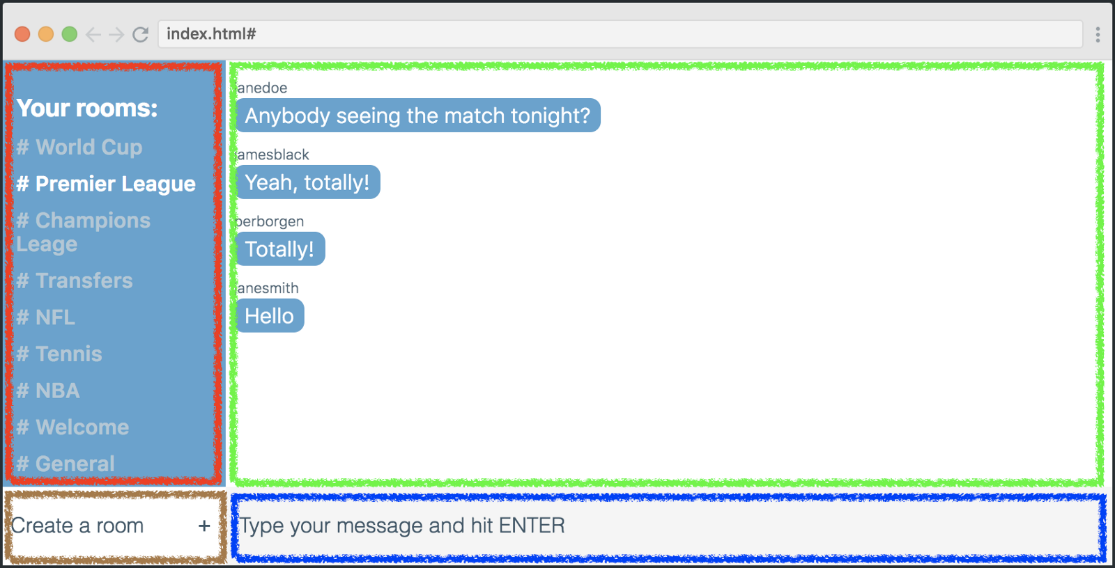
Each straight "heir" of the mesh container is a mesh element. In total, we have four elements, each of which is placed in a rectangle, as shown in the screenshot below.
In order for the elements to be placed exactly as shown above, we need to use the grid-template-areas property.
Each of the lines of code represents one row of the table, and each character is a grid cell. Symbols have a semantic relation to the grid elements that they represent (a list of rooms, a list of messages, a new room form, a message form).
Now we need to use symbols with their grid-area values to place our elements according to grid-template-areas. Here's how:
Of course, these classes also apply to our grid elements in your HTML. However, I will not discuss this in detail, as you most likely know how to add classes to HTML tags.
From this moment we start experimenting with the layout. We can change a lot by changing the values of grid-template-areas.
As shown in the illustration above, I try to use four different layouts, changing the positions of the “List of Rooms” element and the new elements of the room shape. The only thing I am changing is the grid-template-areas property.
Below are four of these options. Try to match each of them with the appropriate layout.
Well, now we will try to change the color of the application using CSS variables. If you have not worked with them until now, let's see what they are.
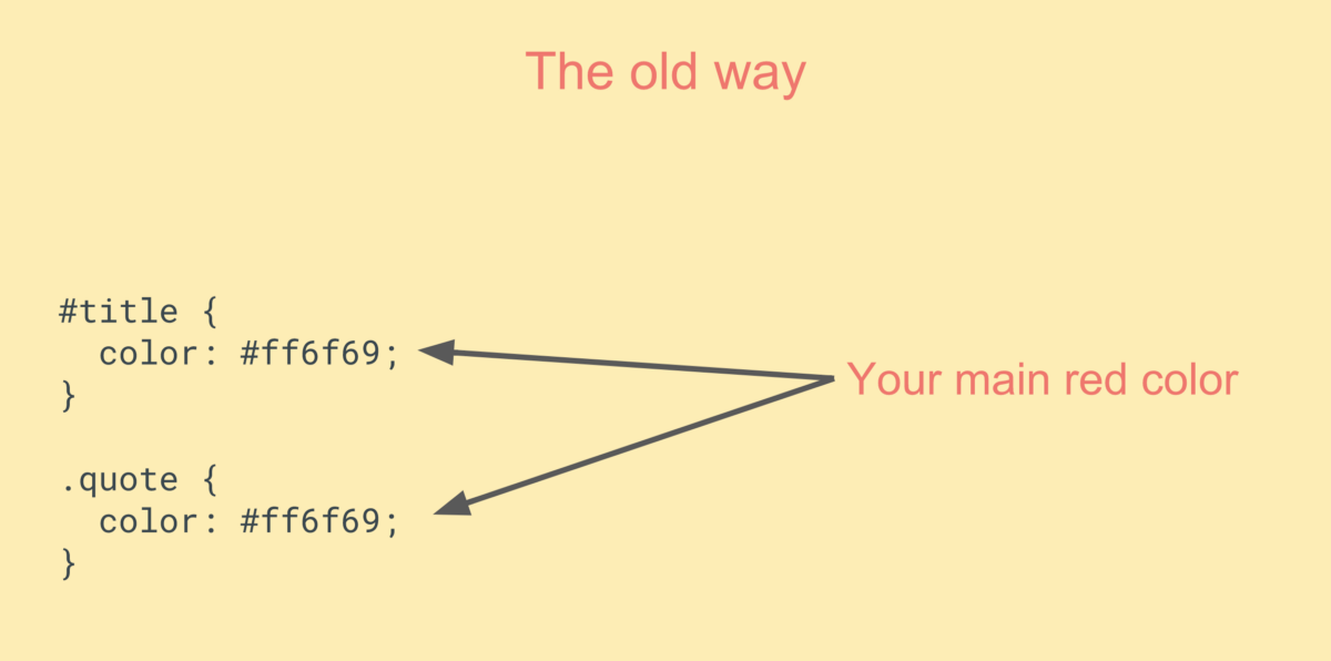
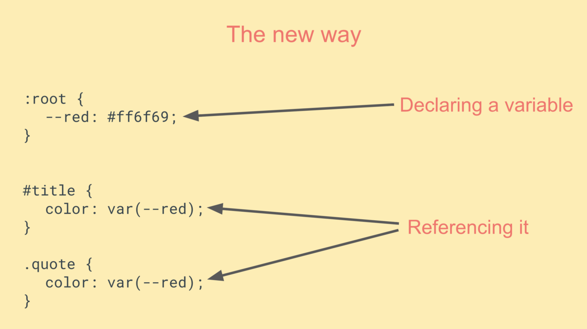
The method shown in the bottom picture makes the code somewhat easier to read, because, if you can put it that way, the variable name is more semantic than hexadecimal. In addition, the second method provides greater flexibility in the question of changing the code.
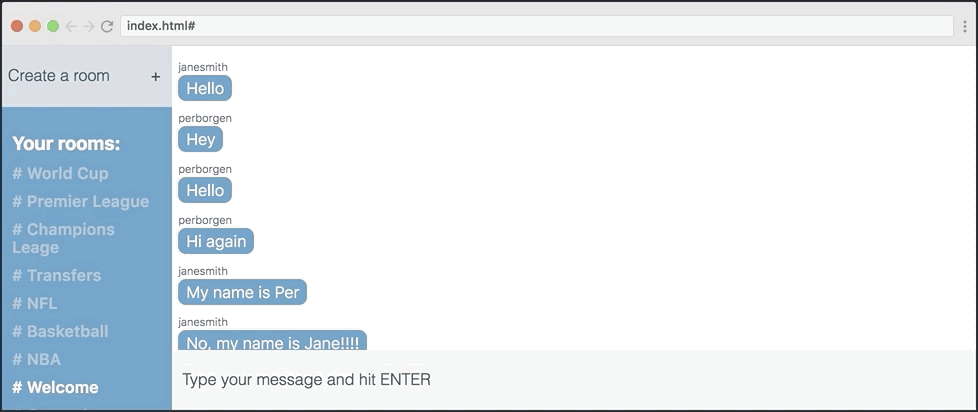
Let's see what can be done with our application using different variable values.
They are repeated 17 times in our layout. But we will not check all the locations, let's better see how the main color works as applied to the color of messages and the left sidebar.
This is how we beat it all in the code.
Variables are good because we can edit their declaration, and this will be enough to change the entire application. Example:
And here is the result:
We can simply change the variable declaration in: root, which will allow us to play with the appearance of the application.
Let's replace some colors in: root, using the palette above.
The result is a completely different chat appearance:
If we combine all this, we will be able to completely change the design of our chat. Let's do that.
This is how the initial version looks compared to the final one. As you can see, I changed both the palette and the layout. The only difference between these two examples is the 11 lines of code that I highlighted here.
Really cool?
In this article, I will show you how to use both tools to quickly prototype application design.
Skillbox recommends: online UX analytics course
We remind: for all readers of Habr - a discount of 10,000 rubles when writing to any Skillbox course on the promotional code "Habr".
Customize mesh container
Our applications will work with CSS-grid, a module that allows you to quickly create layouts and manage them. This is useful, in particular, if you are working with the grid-template-areas property. (I'll show you how to use it below).
')
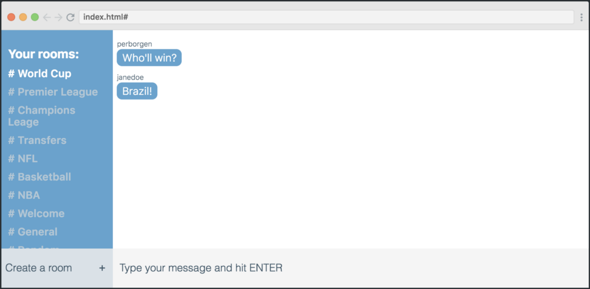
Let's evaluate the appearance of our application - this is a chat:
If we open the developer tools in Chrome, we can see what this grid is. As you can see, there are six columns and six rows.
Here is the code for creating such a grid:
.app { display: grid; grid-template-columns: 1fr 1fr 1fr 1fr 1fr 1fr; grid-template-rows: 1fr 1fr 1fr 1fr 1fr 60px; } First we create a container for it. Then we say that we would like to get six columns at the output, and each of them should be 1fr wide. This means part of the free space. Thus, we divide the free space of the screen into six parts of equal width.
But with the lines differently. The height of each of the first five lines is also 1 fr, but we limit the height of the last one to 60px instead of 1fr.
grid-template-rows: 1fr 1fr 1fr 1fr 1fr 60px; Now, when we have marked the grid, we proceed to the next part - the placement of elements.
Mesh placement
Each straight "heir" of the mesh container is a mesh element. In total, we have four elements, each of which is placed in a rectangle, as shown in the screenshot below.
In order for the elements to be placed exactly as shown above, we need to use the grid-template-areas property.
.app { display: grid; grid-template-columns: 1fr 1fr 1fr 1fr 1fr 1fr; grid-template-rows: 1fr 1fr 1fr 1fr 1fr 60px; grid-template-areas: "rmmmmm" "rmmmmm" "rmmmmm" "rmmmmm" "rmmmmm" "nsssss"; } Each of the lines of code represents one row of the table, and each character is a grid cell. Symbols have a semantic relation to the grid elements that they represent (a list of rooms, a list of messages, a new room form, a message form).
Now we need to use symbols with their grid-area values to place our elements according to grid-template-areas. Here's how:
.new-room-form { grid-area: n; } .rooms-list { grid-area: r; } .message-list { grid-area: m; } .send-message-form { grid-area: s; } Of course, these classes also apply to our grid elements in your HTML. However, I will not discuss this in detail, as you most likely know how to add classes to HTML tags.
From this moment we start experimenting with the layout. We can change a lot by changing the values of grid-template-areas.
As shown in the illustration above, I try to use four different layouts, changing the positions of the “List of Rooms” element and the new elements of the room shape. The only thing I am changing is the grid-template-areas property.
Below are four of these options. Try to match each of them with the appropriate layout.
grid-template-areas: "nmmmmm" "rmmmmm" "rmmmmm" "rmmmmm" "rmmmmm" "rsssss"; grid-template-areas: "rmmmmm" "rmmmmm" "rmmmmm" "rmmmmm" "rmmmmm" "nsssss"; grid-template-areas: "mmmmmr" "mmmmmr" "mmmmmr" "mmmmmr" "mmmmmr" "sssssn"; grid-template-areas: "mmmmmn" "mmmmmr" "mmmmmr" "mmmmmr" "mmmmmr" "sssssr"; Color change using CSS variables
Well, now we will try to change the color of the application using CSS variables. If you have not worked with them until now, let's see what they are.
The method shown in the bottom picture makes the code somewhat easier to read, because, if you can put it that way, the variable name is more semantic than hexadecimal. In addition, the second method provides greater flexibility in the question of changing the code.
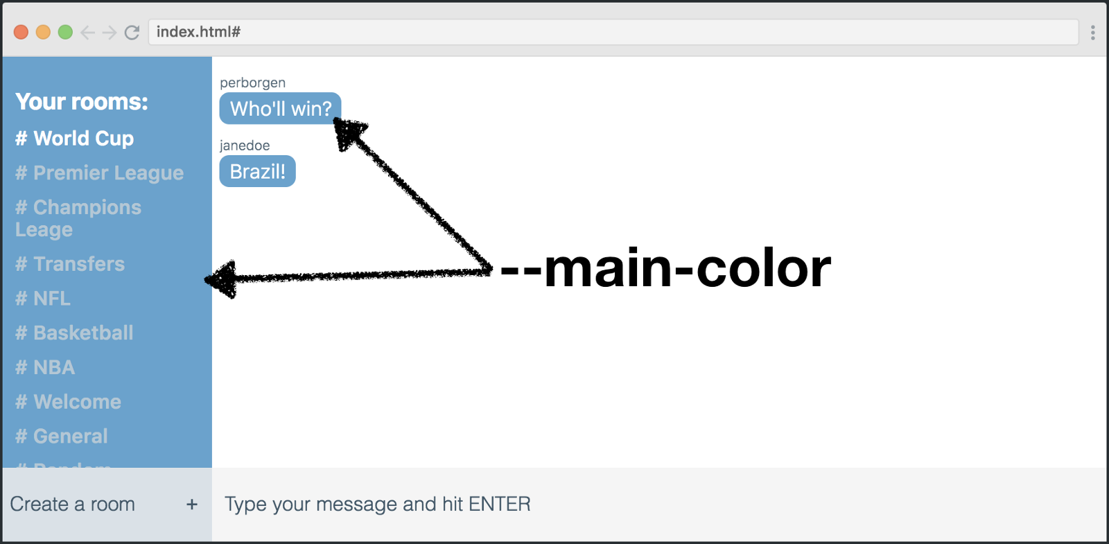
Let's see what can be done with our application using different variable values.
:root { --main-color: #5ea3d0; --secondary-color: white; --main-text-color: #3e5869; --secondary-text-color: #b0c7d6; --new-room-form: #d9e1e8; --send-message-form: #F5F5F5; } They are repeated 17 times in our layout. But we will not check all the locations, let's better see how the main color works as applied to the color of messages and the left sidebar.
This is how we beat it all in the code.
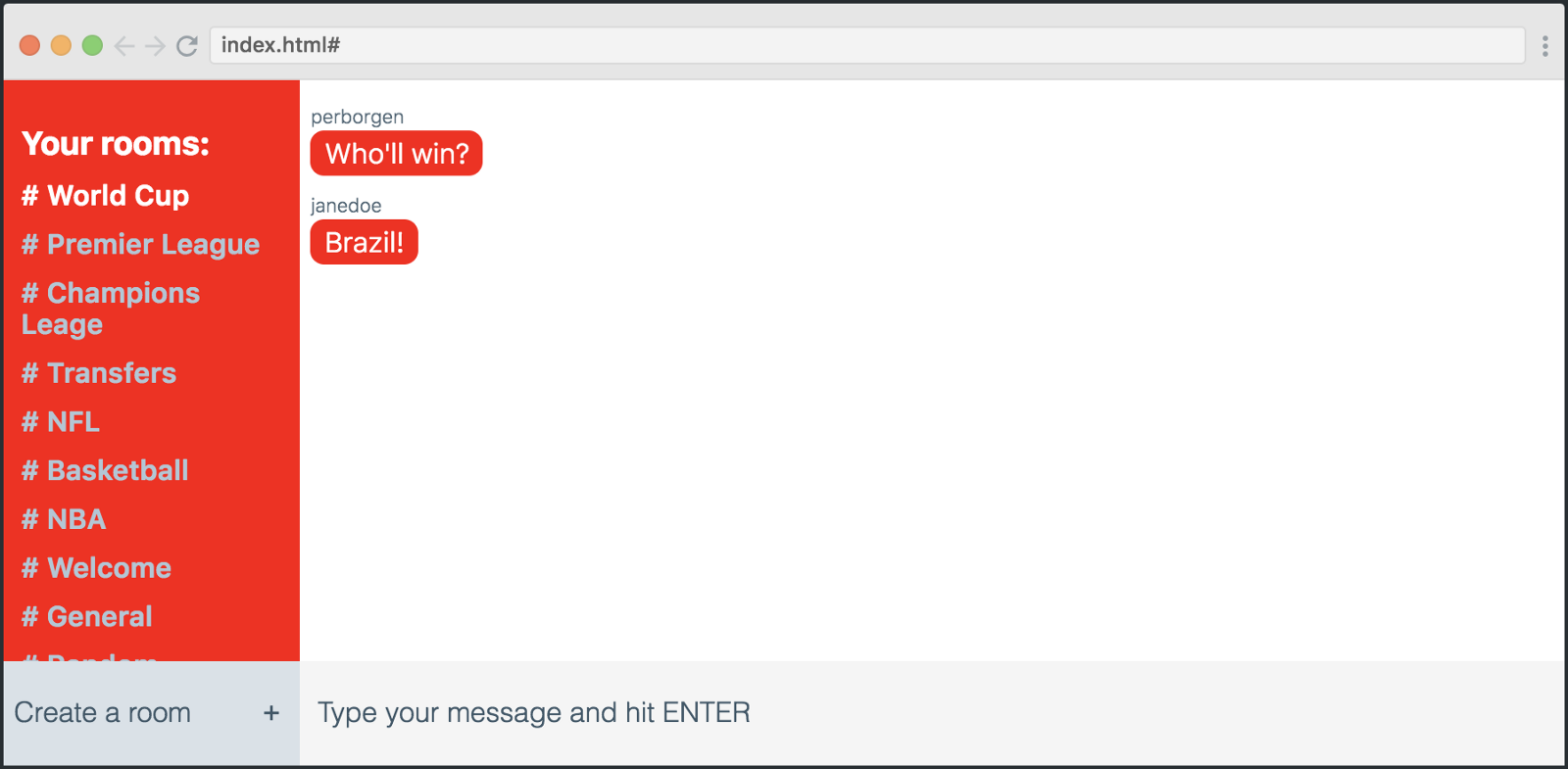
.rooms-list { background: var(--main-color); } .message-text { background: var(--main-color); } Variables are good because we can edit their declaration, and this will be enough to change the entire application. Example:
:root { --main-color: red; } And here is the result:
We can simply change the variable declaration in: root, which will allow us to play with the appearance of the application.
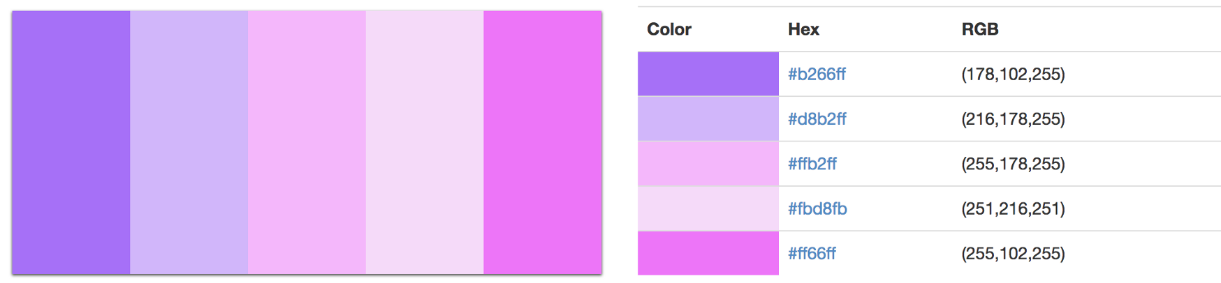
Let's replace some colors in: root, using the palette above.
:root { --main-color: #5ea3d0; --secondary-color: white; --main-text-color: #3e5869; --secondary-text-color: #b0c7d6; --new-room-form: #d9e1e8; --send-message-form: #F5F5F5; } The result is a completely different chat appearance:
Merge the grid and variables
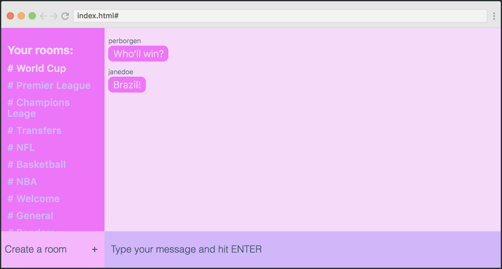
If we combine all this, we will be able to completely change the design of our chat. Let's do that.
This is how the initial version looks compared to the final one. As you can see, I changed both the palette and the layout. The only difference between these two examples is the 11 lines of code that I highlighted here.
:root { --main-color: #ff66ff; --secondary-color: #fbd8fb; --main-text-color: #3e5869; --secondary-text-color: #d8b2ff; --new-room-form: #ffb2ff; --send-message-form: #d8b2ff;x } .app { display: grid; grid-template-columns: repeat(6, 1fr); grid-template-rows: 1fr 1fr 1fr 1fr 1fr 60px; grid-template-areas: "mmmmrr" "mmmmrr" "mmmmrr" "mmmmrr" "mmmmnn" "ffffff"; } Really cool?
Skillbox recommends:
- Practical course PHP developer from 0 to PRO .
- Annual online course "Profession Web Developer" .
- Practical two-month course Python-developer from scratch .
Source: https://habr.com/ru/post/418067/
All Articles