Game interface and what it eats
Hello! This article is about game interfaces and how to work with them. It is intended primarily for those who work in the gaming industry and in one way or another influences the development of the interface, but at the same time is not a UI / UX specialist. Project managers, producers, game designers, programmers working with GUI, artists - I wrote this text, thinking about you guys.
Opening speech. In my practice, I have repeatedly come across the fact that people who are not directly involved in this area are involved in the development and design of game interfaces. I will say more, often these are people for whom the duties associated with the interface are an additional and undesirable burden. Most often, this is a bundle of game designer + artist, in which the game designer thinks about the functionality and layout of the screens, and the artist conscientiously tries to “make beautiful”. However, often neither the one nor the other has experience with interfaces, do not think about usability, user scenarios or uniformity of elements, and generally do not understand how to organize the process of working with the interface in order to get a guaranteed good result. And this happens through no fault of artists or game designers, it’s just that the niche of game interfaces is very specific and narrow, there’s very little information on how to work with them, and there’s no place for people to gain experience. I would like to share my experience and observations in this area and suggest a certain structure, a checklist with which to consult when developing a game interface on (your) project.
A few words about myself: I started working in game development in 2011 as a flash and web designer. Since 2013 I work exclusively as an interface designer for game projects, mostly mobile. During this time, I worked in the offices of both small start-ups and large, well-established companies; I tried myself as a freelancer and remote “expert”. In total, I participated in the creation of about two dozen games of different scale and quality, of which about a dozen survived to release and are in the market. If anyone is interested in specific titles - write in a personal.
And let's agree at once: what is written below is by no means the ultimate truth. My experience is limited. If you think that somewhere I wrote nonsense (or know how to do something better) - please contact me or describe your vision in the comments.
')
Okay, now to the point. Let's take a look at the whole sequence of steps that I propose at once, and then I will try to explain why we need each of them and what kind of rake you risk collecting by skipping or underestimating each of the steps.
1) Definition of the structure and main functional parts of the interface.
2) Prototyping of key screens in the form of diagrams.
3) Collect and test the prototype. Search for style and appearance.
4) Drawing screens, composing UI kit. Documentation.
5) Introduction to the game engine, acceptance and quality control.
6) Adding interface animations.
7) Analytics results.
Let's go in order.
Step one. Definition of the structure and main functional parts of the interface.
Development of the interface (ideally) begins after the design document is created, which describes the basic functionality of the project. Based on it, the game is divided into logical parts (for example, a combat session, a global map, clan interfaces, etc.), which, in turn, are divided into specific screens. Then the team, which includes all interested, is typed in the negotiation and goes through each part of the project, in a discussion form trying to answer the question “what exactly should be there?”. As a result of such discussions, TK for the first mockups are formed, which then fall into the hands of UX specialists.
In the process of throwing these primary mockups, the “rules” will be materialized by which the interface is built on this particular project. How is the navigation? Where will the buttons be located? How much text will be needed and what size will it be? Do we need tooltips and other pop-up elements, and if so, where and in what format?
At the exit, you should get a general scheme of the project screens, if possible, while minimizing the number of “white spots” on it. It looks something like this:


What you should pay attention to here:
I want to focus your attention on one important, in my opinion, thought: game design should be significantly ahead of graphic design. At the stage when there are no detailed descriptions of the screens, or when they are, but only for one or two screens, you do not need to start working with the interface, at least not on the final one - use plugs. Otherwise, you will lose a lot of time and money on rework. Remember that redrawing layouts in a dummy format is many times easier and faster than redoing an already “finalized” interface, not to mention compiled and implemented. Moreover, the more basic gaming features you set aside for “later”, the more problems you will encounter in the future, trying to cram the new functionality into an already installed system of interaction.
It is clear that in reality it is impossible to think things through in advance, and you will constantly encounter a situation where you have to “add here this and that”. This is absolutely normal, be prepared for such situations: pre-lay the possibility of adding new elements to the screen, discuss this question with game designers or project managers (“what do you think, what else can be added to this screen in the near future?”) that each screen has its own limit of durability, upon reaching which you realize that it is easier to remove everything and do it differently than to continue trying to cram the unwrapped.
This, by the way, is a classic and inevitable problem of long-lived projects, especially mobile and browser-based ones. The longer the game lives, the wider and more diverse its functionality becomes, the more ugly, more wickedly its interface looks.
Step two. Build a prototype, search for style.
So, we have a design document in our hands, a general, more or less integral block diagram of the screens and the connections between them. Now we already more or less understand how much work on the interface is to be done, we understand the number of screens and the approximate set of elements on each of them. This is a great moment to start collecting an ugly interface prototype from squares and circles on your knee. Yes, you will never show it to your friends and mother, but he will answer many questions, including interface ones:


In parallel with the assembly of the prototype interface (which usually takes time), it makes sense to begin work on finding its style and visualization.
Why not earlier, you ask? Before schemes and, perhaps, even to a design document? It is possible before. But in this case, you run the risk of facing a (very possible) situation when a picture drawn on an abstract TOR does not fit into the real requirements of your particular project, and you have to look for style from the beginning.
Before starting to draw screens, the performer (artist or designer - in short, the one who will draw) must first of all ask the customer as thoroughly as possible about how he sees the project interface. What will it look like? What games (according to the customer) are close to your project visually and atmospheric? And what games do the customer himself like, what does he play, what projects does he respect? It's great if you already have some kind of atmospheric concepts on your hands that reflect the style of the future game, or fake screens, but most often this luxury is not available at this stage.
In general, communication with the customer is a very important part of the work, which can save (or lose, in the case of a pass) everyone in the production chain a lot of time. Unfortunately, most designers can hardly be called a benchmark in terms of communication with the client (by the way, I am not an exception here). That is why it is so important to make a psychological effort over yourself, and also to explain (both to yourself and the customer) the meaning and importance of what is happening. Acceptance of interfaces, as well as the acceptance of art, is a purely subjective matter, you cannot get away from this, and it revolves around the customer’s identity and value system. In the process of work, you can give recommendations or advice, express opinions and give examples, but the last word always remains with the customer or his representative, and this is logical. And customers are very different: someone is well, what he wants, someone - no. Some may formulate a request in the form of pictures (which is just fine), others are ready to describe in words (which is not bad either), the third lacks the experience or experience (and sometimes the desire, because they consider themselves to do the work of others) and they need help with the formulation of thoughts. In general, this is a topic for a separate article. As part of this material, we will not linger on this.
A note in the margin: it is better to fix the requirements and wishes of the customer in writing - thus it is more difficult for him to later “change his mind” or “forget” what was said. And never settle for “oh, I don’t know, there you are let's draw something, and there we will understand”. This is a monkey work that nobody needs, including the customer.
The results of the interface with the second stage:
First of all, a prototype of the interface based on diagrams and a blind visual is being built or is underway.
Secondly, a set of references for the finishing visual, which are liked and approved by the customer, is assembled. Each ref can hook the customer with something specific (color scheme, main menu solution, navigation system) or just a general impression of the picture. Keep these refs as the apple of their eye - they will become the cornerstone for the next stage.
Examples of ref lists:


A note on the margins: first of all, it is better to type references from the same market niche as your project. The fact is that if you collect excellent refs from AAA PC games, while you yourself are developing a mobile game, it may be easier to reconcile them, but it will be almost impossible to realize all this beauty in a limited mobile format. As a result, at some stage you will encounter a legitimate question from the customer: "We picked up such steep refs, why did this result in HERE IT?".
Another note on the margin: devote more time and energy to studying competitors at this stage. See screenshots, read reviews, go on YouTube, in the end. The more your discretion is, the easier it will be for you to understand what works (or does not work) better in similar projects and the easier it is to argue your opinion. Do not rush to reinvent the wheel and do not be afraid of simplicity.
Step three. Running in a prototype, rendering previews of screens.
So, we have a working prototype in which the dummy interface is implemented. It generally works, performs its function. We also have a visual reference point for drawing screens as a set of references. It's time to combine them: “wear” several screens in your favorite “skin”.
In the process of selecting refs, the main directions for drawing the first screen previews are usually clear: Let's say if you have a sci-fi setting, and in customer-approved refs Deus Ex and XCOM ... well, I would say that you have to do a preview in two variations:

And if in the refs there are some screens similar in style (the same XCOM and, say, Mass effect) and there is not very much time, then it is quite possible to do with one:

After we have brought one screen preview to a state that the customer likes, it makes sense to draw a couple more in the same style, choosing them according to the principle “as different as possible”. For example, if the first was a screen with a small number of large elements, then it makes sense in addition to it to take a screen with a large number of small elements (for example, inventory) and something tabular (such as a rating table or combat statistics). Thus, at the start you will work out the maximum number of different elements and will be more or less sure that the chosen “clothes” are universal and will look decent on any screen.
At the stage of drawing thumbnails, it is possible to neglect some elements or make assumptions in the style of “this frame will have to be corrected later, otherwise it will not be inserted into the engine” or “these icons will have to be adjusted to one size”. Here it is important for the minimum amount of time to get the most presentable, “selling” picture, which is not ashamed to show investors, use in presentations, etc.
The result of this stage: 3-4 “clean” quality rendered screens, approved by the customer and the interface scheme run-in in the prototype.
Step Four. Screen drawing, UI kit compilation, documentation.
This is the most voluminous stage of working with the interface, occupying approximately 70% of the total working time. And for him I don’t have any tricks and life hacks, only hard work and a cast-iron backside. Systematically and gradually, the screen behind the screen is drawn and embedded in the engine. At the same time, their composition and functionality are updated (because usually a lot has changed since the moment of drawing the schemes), and documentation is being compiled.
A few words about the documentation. As practice has shown, it is very useful to describe the functionality of the screens. In writing. For some, this sounds like obvious advice from a cap, but you will be surprised how often this stage is missed (especially in small companies). Not least, this happens because, firstly, no one likes bureaucracy (do we have gamedev and rock-n-roll or what?), And secondly, because you need to know how to work with documentation. This implies both the ability to correctly formulate the description from the side of the State Duma or UI / UX designers, as well as the ability and habit to use it when assembling the screen by programmers. And thirdly, the documentation must be kept fresh and regularly updated. This also takes time, effort, desire and, most importantly, understanding why it is all needed.
Without written screen descriptions, you run the risk of encountering all the problems associated with human factors, forgetfulness and communication problems. Your UX designer suddenly quits and flies to Bali. Programmers collect screens not as intended, but in the way that they consider correct, appealing to the fact that “they were not told about it”. A game designer or project manager forgets the decisions made, since they were not fixed, and each time a new version is issued.
In short, train yourself to work with the documentation. Agree within the team exactly how to do it: what should be the structure, what tools to use, what to focus on. And if you are already using all the documentation on the project and now you are only knowingly grinning while twisting, take the cookie, you are cool.
Then a little about the GUI pack (or, as it is also called, the UI kit or design case ). After drawing several basic screens, it usually becomes clear the main set of elements that make up your interface, as well as the rules for their composition. In the course of further work with screens, it will be approximately 60-80% composed of a reuse of ready-made elements according to ready-made rules. It makes sense to bring this “constructor” with elements and descriptions into a separate, reference file. It looks something like this:
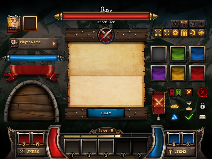
Image by Johnny Waterman
With a ready-made UI KIT, everyone in the team (especially for designers and programmers) will know where the latest reference versions of all interface elements are contained. At the same time, in the layouts of specific screens, designers will not be able to keep dozens of duplicate layers, like all the states of buttons and switches.
Step five. The introduction of the game engine, quality control.
This stage is conditionally highlighted, since assembly of interfaces in the engine usually goes parallel to their development. They took the screen from the circuit, rendered it, cut it, gave it to the programmers, they started the next one. In this case, you “lead” the screen, which is in production, to the victorious end. Only when it is assembled in the version for target devices (by the way, did you forget about the tablets?), It looks and works on them as originally planned, you can breathe out and mentally put a tick in the “done” box. Until the next iteration.
Remember that the result of the work of UX / UI specialists is not a static photoshop image and not an abstract scheme, but a beautiful and, most importantly, functional interface that the user will work with. How good the final product is, shows how well you are specifically as a specialist. Therefore, be strict and attentive to all links in the production chain, and first of all to yourself. Do not close your eyes to all I get on the pretext that it is “not my responsibility”.
Step Six. Polishing and adding animations.
This is a bonus stage. Let's be frank: when approaching the release date (usually already several times postponed), everyone in the team begins to glow different parts of the body. There is never enough time for polishing (and especially polishing the interface, which historically has been assigned a secondary importance). Therefore, it is important to initially think about what and when you will finish, as well as interface animations. There is a possibility - add them immediately, even when you first assemble the screen. There is no such possibility - allocate for this a separate, specific time in the development plans. Stand firm on your own and do not agree to postpone the additions and animations to an indefinite “later”, regularly remind about them.
A good game interface “lives” and dynamically responds to the actions of players. Interface animation is like a pinch of spices that can transform the taste and sensations of the whole “dish”. It makes the interface more smooth, connected, consistent. It smooths out sharp transitions, draws attention to the right places, entertains - in short, improves the gaming experience of users in general. At the same time, as in cooking, it is important not to overdo it and not to succumb to the temptation to animate everything. Know the measure.
Step Seven. Interface analytics.
Another catch bonus stage. In an ideal world, developers test the main hypotheses (including interface ones), attracting real users from their target audience for tests, and make decisions based on the data obtained. With the right approach, this method allows (in theory) to reflect a more or less objective state of affairs and to give an answer to the question of what works and does not work in the interface.
In reality, this is rare: not everyone can afford expensive play tests, few people can work with them and understand why they are needed. Even after a soft lunch, only basic indicators like DAU, WAU ROI, etc. are often analyzed, not directly related to interfaces. Those. The fact that some button does not lead anywhere will be noticed at the soft-lunch stage, but the fact that players do not know what to call the pop-up hint will no longer be indicated.
In my practice, to my regret and shame, I have not yet come across full UX testing and subsequent analytics of the results. The main method of decision making has always been the so-called. "expert review. This is when decisions on a topic are made by one person (or a small group of people) who are considered to have the necessary experience and competence. It is clear that this is not the most accurate and, to put it mildly, a rather subjective method.
However, the fact that I personally did not come across with UX testing in game devs does not mean that it does not exist in nature. As far as I know, individual gaming companies have the ability and desire to conduct full-fledged play-tests and actively use them. It would be very interesting to me to learn about their methods and results, as well as how they came to this in organizing such events. If you have something to say on this topic - please contact me or tell about this experience in the comments or your own material.
On this, perhaps, everything. In spite of the fact that I described many things very briefly or missed them altogether, the article appeared longer than originally calculated. Thank you for being persistent and read it to the end! I hope that you have found something useful and interesting for yourself. It will be doubly pleasant if something from the reading seemed interesting enough to you to try it out in practice.
I would be grateful for any comments, questions and comments in essence, as well as just interesting life stories related to game interfaces. Feel free to write to the mail .
Good luck to all!
Opening speech. In my practice, I have repeatedly come across the fact that people who are not directly involved in this area are involved in the development and design of game interfaces. I will say more, often these are people for whom the duties associated with the interface are an additional and undesirable burden. Most often, this is a bundle of game designer + artist, in which the game designer thinks about the functionality and layout of the screens, and the artist conscientiously tries to “make beautiful”. However, often neither the one nor the other has experience with interfaces, do not think about usability, user scenarios or uniformity of elements, and generally do not understand how to organize the process of working with the interface in order to get a guaranteed good result. And this happens through no fault of artists or game designers, it’s just that the niche of game interfaces is very specific and narrow, there’s very little information on how to work with them, and there’s no place for people to gain experience. I would like to share my experience and observations in this area and suggest a certain structure, a checklist with which to consult when developing a game interface on (your) project.
A few words about myself: I started working in game development in 2011 as a flash and web designer. Since 2013 I work exclusively as an interface designer for game projects, mostly mobile. During this time, I worked in the offices of both small start-ups and large, well-established companies; I tried myself as a freelancer and remote “expert”. In total, I participated in the creation of about two dozen games of different scale and quality, of which about a dozen survived to release and are in the market. If anyone is interested in specific titles - write in a personal.
And let's agree at once: what is written below is by no means the ultimate truth. My experience is limited. If you think that somewhere I wrote nonsense (or know how to do something better) - please contact me or describe your vision in the comments.
')
Okay, now to the point. Let's take a look at the whole sequence of steps that I propose at once, and then I will try to explain why we need each of them and what kind of rake you risk collecting by skipping or underestimating each of the steps.
1) Definition of the structure and main functional parts of the interface.
2) Prototyping of key screens in the form of diagrams.
3) Collect and test the prototype. Search for style and appearance.
4) Drawing screens, composing UI kit. Documentation.
5) Introduction to the game engine, acceptance and quality control.
6) Adding interface animations.
7) Analytics results.
Let's go in order.
Step one. Definition of the structure and main functional parts of the interface.
Development of the interface (ideally) begins after the design document is created, which describes the basic functionality of the project. Based on it, the game is divided into logical parts (for example, a combat session, a global map, clan interfaces, etc.), which, in turn, are divided into specific screens. Then the team, which includes all interested, is typed in the negotiation and goes through each part of the project, in a discussion form trying to answer the question “what exactly should be there?”. As a result of such discussions, TK for the first mockups are formed, which then fall into the hands of UX specialists.
In the process of throwing these primary mockups, the “rules” will be materialized by which the interface is built on this particular project. How is the navigation? Where will the buttons be located? How much text will be needed and what size will it be? Do we need tooltips and other pop-up elements, and if so, where and in what format?
At the exit, you should get a general scheme of the project screens, if possible, while minimizing the number of “white spots” on it. It looks something like this:
What you should pay attention to here:
- On the connection between the screens.
- On the functional (is it convenient to do what the screen is for)?
- On the size and location of the main elements.
I want to focus your attention on one important, in my opinion, thought: game design should be significantly ahead of graphic design. At the stage when there are no detailed descriptions of the screens, or when they are, but only for one or two screens, you do not need to start working with the interface, at least not on the final one - use plugs. Otherwise, you will lose a lot of time and money on rework. Remember that redrawing layouts in a dummy format is many times easier and faster than redoing an already “finalized” interface, not to mention compiled and implemented. Moreover, the more basic gaming features you set aside for “later”, the more problems you will encounter in the future, trying to cram the new functionality into an already installed system of interaction.
It is clear that in reality it is impossible to think things through in advance, and you will constantly encounter a situation where you have to “add here this and that”. This is absolutely normal, be prepared for such situations: pre-lay the possibility of adding new elements to the screen, discuss this question with game designers or project managers (“what do you think, what else can be added to this screen in the near future?”) that each screen has its own limit of durability, upon reaching which you realize that it is easier to remove everything and do it differently than to continue trying to cram the unwrapped.
This, by the way, is a classic and inevitable problem of long-lived projects, especially mobile and browser-based ones. The longer the game lives, the wider and more diverse its functionality becomes, the more ugly, more wickedly its interface looks.
Step two. Build a prototype, search for style.
So, we have a design document in our hands, a general, more or less integral block diagram of the screens and the connections between them. Now we already more or less understand how much work on the interface is to be done, we understand the number of screens and the approximate set of elements on each of them. This is a great moment to start collecting an ugly interface prototype from squares and circles on your knee. Yes, you will never show it to your friends and mother, but he will answer many questions, including interface ones:
In parallel with the assembly of the prototype interface (which usually takes time), it makes sense to begin work on finding its style and visualization.
Why not earlier, you ask? Before schemes and, perhaps, even to a design document? It is possible before. But in this case, you run the risk of facing a (very possible) situation when a picture drawn on an abstract TOR does not fit into the real requirements of your particular project, and you have to look for style from the beginning.
Before starting to draw screens, the performer (artist or designer - in short, the one who will draw) must first of all ask the customer as thoroughly as possible about how he sees the project interface. What will it look like? What games (according to the customer) are close to your project visually and atmospheric? And what games do the customer himself like, what does he play, what projects does he respect? It's great if you already have some kind of atmospheric concepts on your hands that reflect the style of the future game, or fake screens, but most often this luxury is not available at this stage.
In general, communication with the customer is a very important part of the work, which can save (or lose, in the case of a pass) everyone in the production chain a lot of time. Unfortunately, most designers can hardly be called a benchmark in terms of communication with the client (by the way, I am not an exception here). That is why it is so important to make a psychological effort over yourself, and also to explain (both to yourself and the customer) the meaning and importance of what is happening. Acceptance of interfaces, as well as the acceptance of art, is a purely subjective matter, you cannot get away from this, and it revolves around the customer’s identity and value system. In the process of work, you can give recommendations or advice, express opinions and give examples, but the last word always remains with the customer or his representative, and this is logical. And customers are very different: someone is well, what he wants, someone - no. Some may formulate a request in the form of pictures (which is just fine), others are ready to describe in words (which is not bad either), the third lacks the experience or experience (and sometimes the desire, because they consider themselves to do the work of others) and they need help with the formulation of thoughts. In general, this is a topic for a separate article. As part of this material, we will not linger on this.
A note in the margin: it is better to fix the requirements and wishes of the customer in writing - thus it is more difficult for him to later “change his mind” or “forget” what was said. And never settle for “oh, I don’t know, there you are let's draw something, and there we will understand”. This is a monkey work that nobody needs, including the customer.
The results of the interface with the second stage:
First of all, a prototype of the interface based on diagrams and a blind visual is being built or is underway.
Secondly, a set of references for the finishing visual, which are liked and approved by the customer, is assembled. Each ref can hook the customer with something specific (color scheme, main menu solution, navigation system) or just a general impression of the picture. Keep these refs as the apple of their eye - they will become the cornerstone for the next stage.
Examples of ref lists:
A note on the margins: first of all, it is better to type references from the same market niche as your project. The fact is that if you collect excellent refs from AAA PC games, while you yourself are developing a mobile game, it may be easier to reconcile them, but it will be almost impossible to realize all this beauty in a limited mobile format. As a result, at some stage you will encounter a legitimate question from the customer: "We picked up such steep refs, why did this result in HERE IT?".
Another note on the margin: devote more time and energy to studying competitors at this stage. See screenshots, read reviews, go on YouTube, in the end. The more your discretion is, the easier it will be for you to understand what works (or does not work) better in similar projects and the easier it is to argue your opinion. Do not rush to reinvent the wheel and do not be afraid of simplicity.
Step three. Running in a prototype, rendering previews of screens.
So, we have a working prototype in which the dummy interface is implemented. It generally works, performs its function. We also have a visual reference point for drawing screens as a set of references. It's time to combine them: “wear” several screens in your favorite “skin”.
In the process of selecting refs, the main directions for drawing the first screen previews are usually clear: Let's say if you have a sci-fi setting, and in customer-approved refs Deus Ex and XCOM ... well, I would say that you have to do a preview in two variations:
And if in the refs there are some screens similar in style (the same XCOM and, say, Mass effect) and there is not very much time, then it is quite possible to do with one:
After we have brought one screen preview to a state that the customer likes, it makes sense to draw a couple more in the same style, choosing them according to the principle “as different as possible”. For example, if the first was a screen with a small number of large elements, then it makes sense in addition to it to take a screen with a large number of small elements (for example, inventory) and something tabular (such as a rating table or combat statistics). Thus, at the start you will work out the maximum number of different elements and will be more or less sure that the chosen “clothes” are universal and will look decent on any screen.
At the stage of drawing thumbnails, it is possible to neglect some elements or make assumptions in the style of “this frame will have to be corrected later, otherwise it will not be inserted into the engine” or “these icons will have to be adjusted to one size”. Here it is important for the minimum amount of time to get the most presentable, “selling” picture, which is not ashamed to show investors, use in presentations, etc.
The result of this stage: 3-4 “clean” quality rendered screens, approved by the customer and the interface scheme run-in in the prototype.
Step Four. Screen drawing, UI kit compilation, documentation.
This is the most voluminous stage of working with the interface, occupying approximately 70% of the total working time. And for him I don’t have any tricks and life hacks, only hard work and a cast-iron backside. Systematically and gradually, the screen behind the screen is drawn and embedded in the engine. At the same time, their composition and functionality are updated (because usually a lot has changed since the moment of drawing the schemes), and documentation is being compiled.
A few words about the documentation. As practice has shown, it is very useful to describe the functionality of the screens. In writing. For some, this sounds like obvious advice from a cap, but you will be surprised how often this stage is missed (especially in small companies). Not least, this happens because, firstly, no one likes bureaucracy (do we have gamedev and rock-n-roll or what?), And secondly, because you need to know how to work with documentation. This implies both the ability to correctly formulate the description from the side of the State Duma or UI / UX designers, as well as the ability and habit to use it when assembling the screen by programmers. And thirdly, the documentation must be kept fresh and regularly updated. This also takes time, effort, desire and, most importantly, understanding why it is all needed.
Without written screen descriptions, you run the risk of encountering all the problems associated with human factors, forgetfulness and communication problems. Your UX designer suddenly quits and flies to Bali. Programmers collect screens not as intended, but in the way that they consider correct, appealing to the fact that “they were not told about it”. A game designer or project manager forgets the decisions made, since they were not fixed, and each time a new version is issued.
In short, train yourself to work with the documentation. Agree within the team exactly how to do it: what should be the structure, what tools to use, what to focus on. And if you are already using all the documentation on the project and now you are only knowingly grinning while twisting, take the cookie, you are cool.
Then a little about the GUI pack (or, as it is also called, the UI kit or design case ). After drawing several basic screens, it usually becomes clear the main set of elements that make up your interface, as well as the rules for their composition. In the course of further work with screens, it will be approximately 60-80% composed of a reuse of ready-made elements according to ready-made rules. It makes sense to bring this “constructor” with elements and descriptions into a separate, reference file. It looks something like this:
Image by Johnny Waterman
With a ready-made UI KIT, everyone in the team (especially for designers and programmers) will know where the latest reference versions of all interface elements are contained. At the same time, in the layouts of specific screens, designers will not be able to keep dozens of duplicate layers, like all the states of buttons and switches.
Step five. The introduction of the game engine, quality control.
This stage is conditionally highlighted, since assembly of interfaces in the engine usually goes parallel to their development. They took the screen from the circuit, rendered it, cut it, gave it to the programmers, they started the next one. In this case, you “lead” the screen, which is in production, to the victorious end. Only when it is assembled in the version for target devices (by the way, did you forget about the tablets?), It looks and works on them as originally planned, you can breathe out and mentally put a tick in the “done” box. Until the next iteration.
Remember that the result of the work of UX / UI specialists is not a static photoshop image and not an abstract scheme, but a beautiful and, most importantly, functional interface that the user will work with. How good the final product is, shows how well you are specifically as a specialist. Therefore, be strict and attentive to all links in the production chain, and first of all to yourself. Do not close your eyes to all I get on the pretext that it is “not my responsibility”.
Step Six. Polishing and adding animations.
This is a bonus stage. Let's be frank: when approaching the release date (usually already several times postponed), everyone in the team begins to glow different parts of the body. There is never enough time for polishing (and especially polishing the interface, which historically has been assigned a secondary importance). Therefore, it is important to initially think about what and when you will finish, as well as interface animations. There is a possibility - add them immediately, even when you first assemble the screen. There is no such possibility - allocate for this a separate, specific time in the development plans. Stand firm on your own and do not agree to postpone the additions and animations to an indefinite “later”, regularly remind about them.
A good game interface “lives” and dynamically responds to the actions of players. Interface animation is like a pinch of spices that can transform the taste and sensations of the whole “dish”. It makes the interface more smooth, connected, consistent. It smooths out sharp transitions, draws attention to the right places, entertains - in short, improves the gaming experience of users in general. At the same time, as in cooking, it is important not to overdo it and not to succumb to the temptation to animate everything. Know the measure.
Step Seven. Interface analytics.
Another catch bonus stage. In an ideal world, developers test the main hypotheses (including interface ones), attracting real users from their target audience for tests, and make decisions based on the data obtained. With the right approach, this method allows (in theory) to reflect a more or less objective state of affairs and to give an answer to the question of what works and does not work in the interface.
In reality, this is rare: not everyone can afford expensive play tests, few people can work with them and understand why they are needed. Even after a soft lunch, only basic indicators like DAU, WAU ROI, etc. are often analyzed, not directly related to interfaces. Those. The fact that some button does not lead anywhere will be noticed at the soft-lunch stage, but the fact that players do not know what to call the pop-up hint will no longer be indicated.
In my practice, to my regret and shame, I have not yet come across full UX testing and subsequent analytics of the results. The main method of decision making has always been the so-called. "expert review. This is when decisions on a topic are made by one person (or a small group of people) who are considered to have the necessary experience and competence. It is clear that this is not the most accurate and, to put it mildly, a rather subjective method.
However, the fact that I personally did not come across with UX testing in game devs does not mean that it does not exist in nature. As far as I know, individual gaming companies have the ability and desire to conduct full-fledged play-tests and actively use them. It would be very interesting to me to learn about their methods and results, as well as how they came to this in organizing such events. If you have something to say on this topic - please contact me or tell about this experience in the comments or your own material.
On this, perhaps, everything. In spite of the fact that I described many things very briefly or missed them altogether, the article appeared longer than originally calculated. Thank you for being persistent and read it to the end! I hope that you have found something useful and interesting for yourself. It will be doubly pleasant if something from the reading seemed interesting enough to you to try it out in practice.
I would be grateful for any comments, questions and comments in essence, as well as just interesting life stories related to game interfaces. Feel free to write to the mail .
Good luck to all!
Source: https://habr.com/ru/post/418055/
All Articles