Data visualization for your web project

Author: Alexander Kasheverov, Senior JavaScript Developer
Welcome and enjoy reading!
')
An article for those who have not previously used graphics on the web, but is going to. Also for those who want to learn more about this topic.
The goal is to highlight the subject area and simplify the problem of choosing a specific solution. Consider the differences between libraries and look at the popular options, there will be examples and quite a bit of theory.
For a better understanding, you need knowledge of JavaScript and a general idea of how the web works.
Of course, data visualization has its own history (we will not touch on this in the article), if you're interested - you can find it, for example, here .
My article is probably not comprehensive, so please write comments and personal messages, I am ready to listen to criticism and add material.
So let's go!
Let's say you have a website ...
... which you want to color with data visualization.
It can be as the simplest graphics, and completely non-trivial. Static or interactive. Several drawn elements or several tens of thousands. What solution is suitable for a particular case - this is the task that needs to be solved.
Projects where you can use graphics are different. These can be simple business cards made in Wordpress in one day, or huge industrial monsters that have been developed by large teams for many years. Of course, approaches to the development and choice of solutions in these cases will differ.
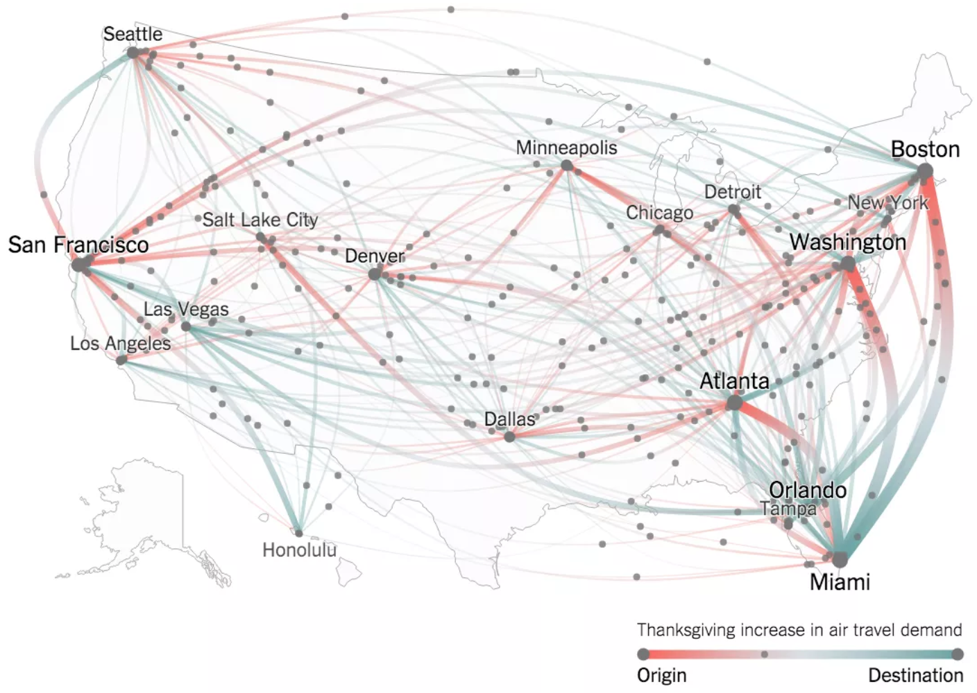
Take, for example, the visualization of the demand for air tickets within the United States on Thanksgiving Day, which the New York Times presented in 2015. How to implement such a visualization is not immediately obvious.
How will you solve the problem without knowing the subject area? Most likely choose one of the options:
- Take "friend help";
- Google, study the question yourself and choose the right tool.
A friend with relevant experience may not be, and the process of self-search can take a long time, we, programmers, can dig into details, and this takes time. Let's pretend that we are friends. And I just studied this area. So I will try to share my experience and save valuable time.
So, the task is to visualize the data on the site. Consider in more detail the problem and from what solutions we can choose?
Technological diversity
Technically, we can implement the presentation of data on the page in different ways:
- HTML - why not? After all, we can draw the simplest bar-chart using HTML tags and CSS.
- SVG - vector graphics, it guarantees a clear image, regardless of scale. Its syntax is XML-like. However, if for complex visualization you need several tens of thousands of points, this can significantly affect performance.
- Canvas - here we can draw almost anything. To do this, we need to create an element on the page and access it via the API. Draw something, add color, background, text, etc. With Canvas, large amounts of data are usually rendered.
- WebGL - allows you to draw three-dimensional graphics.
- VML is Microsoft’s obsolete technology, XML-like. Suitable for those who need to ensure the normal operation of the site in the Internet Explorer browser older versions than the tenth.
Of course, all of these options can be combined. You can, for example, implement dynamic switching from SVG to Canvas depending on the amount of displayed data.
Functional diversity
Charts can:
- be of different types:
linear, columnar, tree, etc.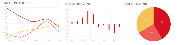
Pictures taken from here . - be adaptive:
react to resize page.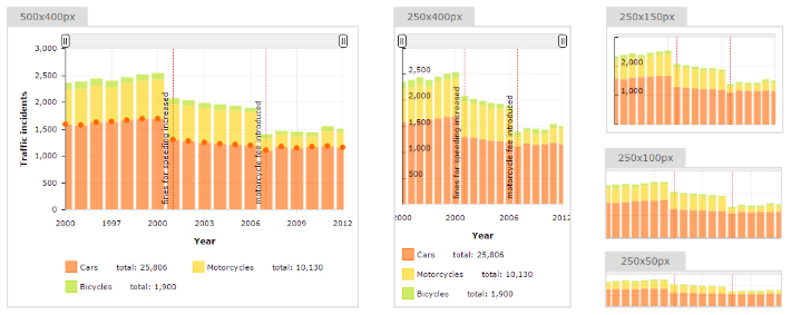
The picture is taken from here . - be animated:
For example, to allow the appearance and removal of elements.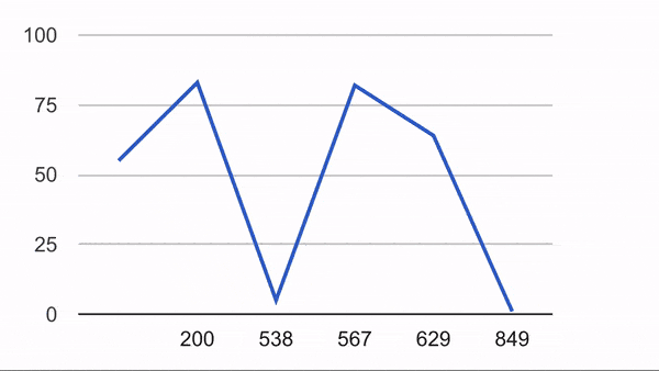
An example is taken here . - be open or closed for customization:
for example, the well-known D3 library can be very finely tuned to fit your needs, unlike many other libraries. - be stable or not:
For example, when loading data, the value of some parameter equal to null / undefined can lead to a complete non-drawing of the graph.
- be cross-browser or not:
Will the schedule work in Mobile Opera?
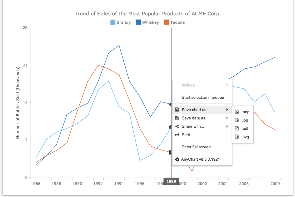
- support export (save) graphics to the picture.
- support integration with frameworks:
Now it is difficult to imagine a large application on pure JS without Angular / React / the like.
- support save / load state:
for example, save a state when a series of points on a line graph is hidden.
Of course, this is not a complete list and can be further detailed. But it seems to me, I called the main characteristics.
Look at non-technical specifications
Here they are:
- Community. For example, Google Charts or D3 have large and active communities where you can get answers to many questions. If you chose a little-known library, you will have to go into the code yourself and deal with all this.
- Support. The concept is applicable rather to paid solutions. Your questions will be answered by the developers.
- License. Is the library available for commercial use? For example, Google Charts allow you to use your library for free, but the library must be downloaded from Google servers.
- Relevance. Of the variety of libraries, a good half of potentially suitable ones are no longer supported and forgotten.
We now turn to practice and consider the real products that are on the market.
Solutions popular in 2018
Paid solutions
This is not a complete list, but it is worthwhile to list a number of popular libraries:
- Fusioncharts by FusionCharts team, India, 2002.
- Anychart by AnyChart team, United States, 2003.

- Amcharts by amCharts team, Lithuania, 2004.
- Highcharts by Highsoft team, Norway, 2009.

- Zingchart by ZingChart team, USA, 2009.

We will not elaborate on paid solutions. I can only say that with a high degree of probability, among them there will be what is needed exactly in your case. However, it will have to pay a round sum.
Free solutions
- Google Charts by Google, USA, 2007.

- Description
The product offers a huge selection: from the simplest linear to complex combined, multi-level graphs. There are many ready-made examples. Features are easy to apply, for example, graphics can be embedded or exported as images. The library is compatible with different browsers and platforms, works on iOS and Android, supports older versions of IE and does not require installation of plug-ins. Uses HTML, SVG, VML for visual rendering. There is a minus - according to the license, you can not use library files locally. - License
The product is free, but not open source. You must download the source code of the library from Google servers. - An example of the simplest graphics
- Examples
- Description
- D3.js by Mike Bostock , USA, 2011.

- Description
The library claims to be the embodiment of a certain data-driven approach. Unlike many others, allows you to display data exactly the way you want. This is due to the flexible API you need to get used to. The functionality of the library allows you to customize any graphics and provides more opportunities than Google Charts (the latter presents the most common options for graphs). For display, you can use any option: html, svg, canvas, webgl, ... - License
BSD-3 - An example of the simplest graphics
- Examples
- Description
- Echarts by Chinese Baidu , China, 2013.

- Description
Free library for visualizing data from our friends from China. It is really worthy of attention, provides a set of ready-made, fairly well customizable standard graphs and their combinations. I note a pleasant UI and interactivity out of the box. The library works well with large amounts of data and includes many examples, including 3D graphics. Written in pure JS, uses the zrender library as a drawing engine for Canvas. Of the minuses - not all the description is in English and the English-speaking community is small. - License
BSD - An example of the simplest graphics
- Examples
- Description
- Chart.js by open-source contributors , Worldwide, 2013.

- Description
The library suggests using a basic set of graphs of several types (8 at the time of writing). Uses Canvas for drawing graphics. Very nice tube library for a quick start. I note the UI and beautiful design, as well as ease of development. - License
MIT - An example of the simplest graphics
- Examples
- Description
- Chartist by an individual developer Gion Kunz , Switzerland, 2014.
- Description
Offers beautiful responsive charts, some customization and a quick start. Of the minuses - only three types of charts (at the time of writing), plus some of their combinations. Uses SVG to render graphics. Another warm, lamp library with its beauty, but rather narrow scope. - License
MIT - An example of the simplest graphics
- Examples
- Description
- Plotly by Plotly team, Canada, 2015.

- Description
At the heart of this library is D3.js and stack.gl . Noticeable high-level, declarative approach. Offers 20 types of graphs (at the time of this writing), including three-dimensional. D3js, which is the basis, allows us to customize graphics well. Uses SVG, WebGL for drawing graphics. The combination of the quantity and quality of graphics with the MIT license can be attractive to developers of large products. - License
MIT - An example of the simplest graphics
- Description
I hope these details will help determine the solution that is appropriate for your problem. Finally, some interesting examples of visualizations for inspiration.
Examples
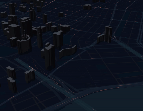
- Visualization of the traffic from Uber . Uber visualizes a large amount of traffic data using JavaScript and WebGL. The library for this Uber develop themselves, and with the MIT license.
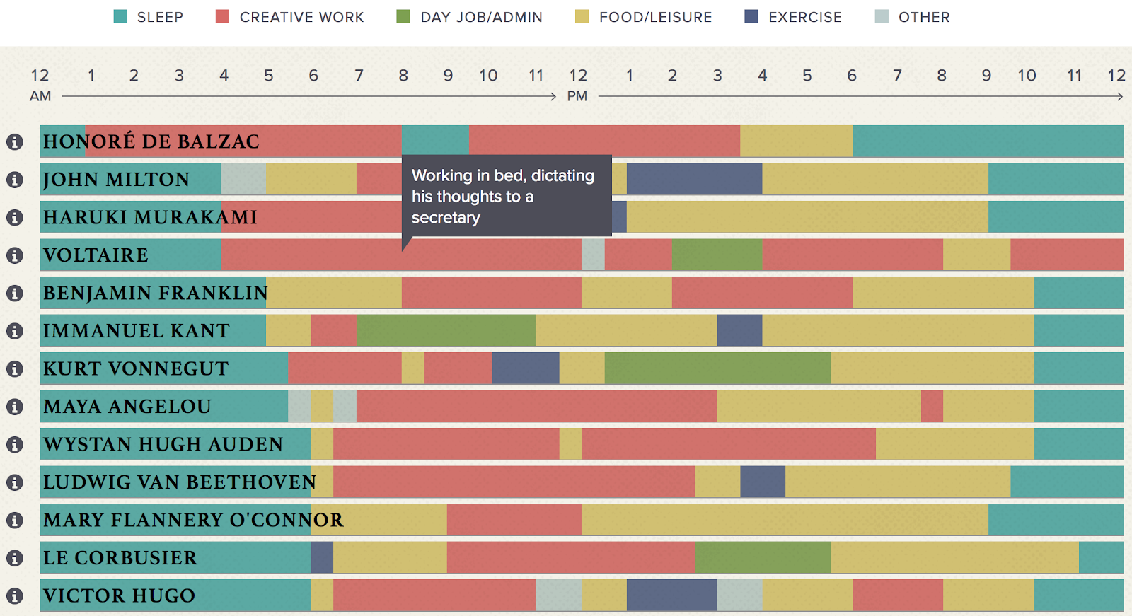
- Interactive infographics: "The daily routine of famous creative people . " Implemented in a simple HTML + CSS layout.
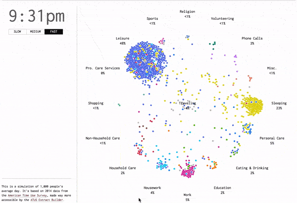
- Occupations of the average American during the day . The data is obtained on the basis of the survey, and their visualization is done on D3, SVG is used.
Thanks to all!
Source: https://habr.com/ru/post/417947/
All Articles