Collection of demographic stories in one map
In the latest issue of The Lancet magazine my article is published - a curious map and a small explanation to it. I decided to tell about it on Habré, because there is a hope that the implemented method of data visualization can be useful to someone else.
Kashnitsky , I., & Schöley , J. (2018). Regional population structures at a glance. The Lancet , 392 (10143), 209–210. https://doi.org/10.1016/S0140-6736(8) 311194-2
Actually, here is a map in high resolution (clickable).
The card can be reproduced to a tee in a few minutes, the code on the githaba .
Data creates colors
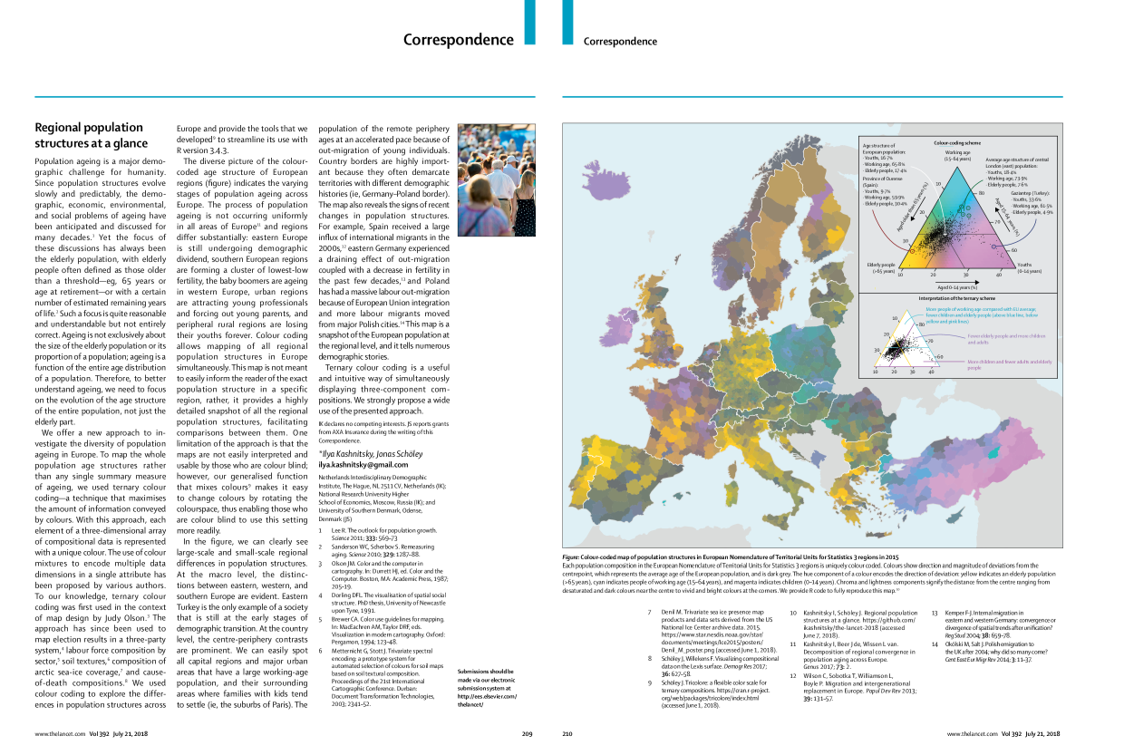
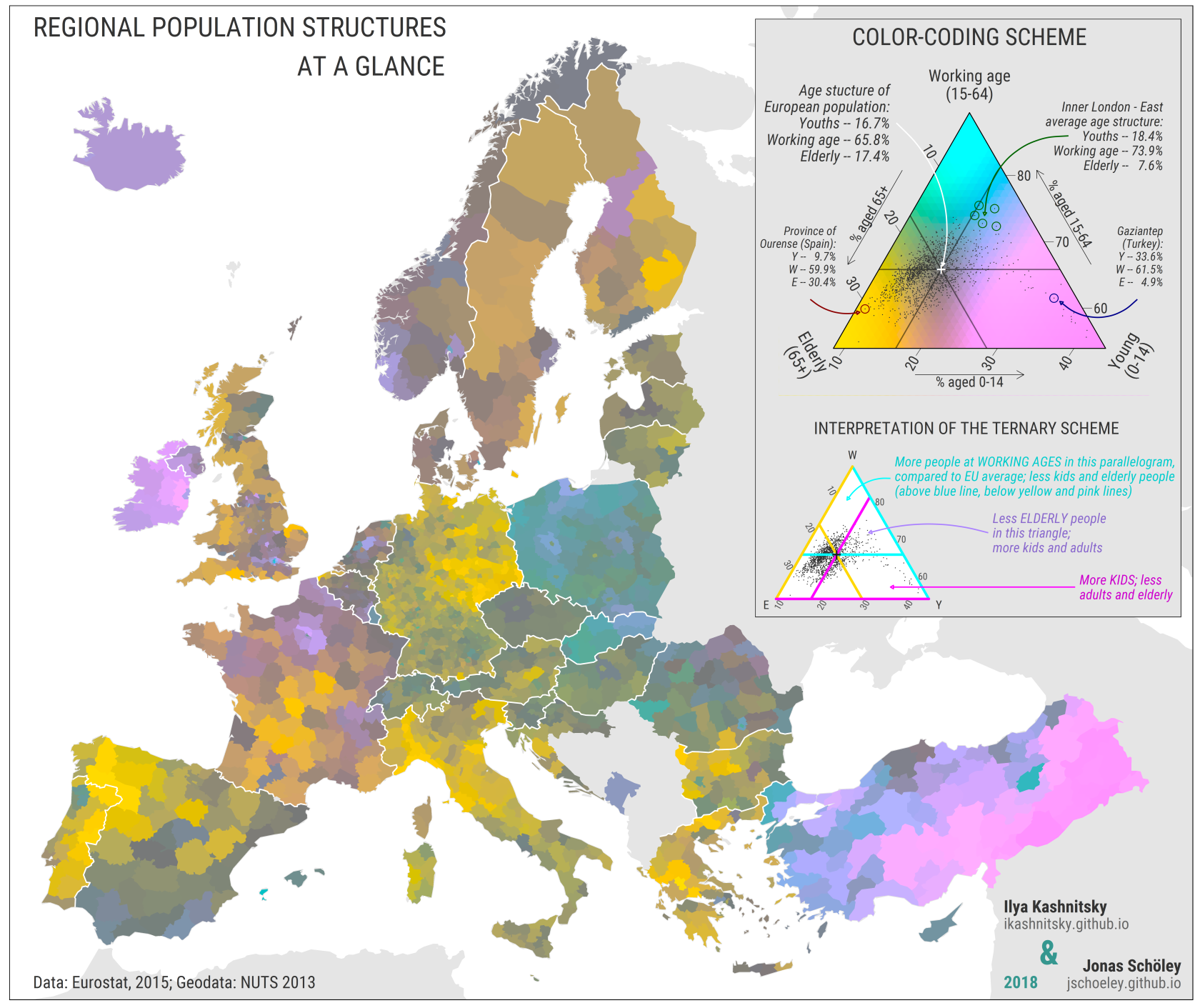
This map is a “snapshot” of regional population age structures in modern Europe. The ratios of children, adults and the elderly to the population of each of the regions are color coded — the data "create colors themselves." The age structure of the European population corresponds to the gray color, which is obtained by mixing in equal proportions of pink, blue and yellow. The more the age structure of the population of the region differs from the average European one, the more one of three colors dominates: yellow - if the population is dominated by the elderly, pink - by children, blue - people of working age.
One card can tell us an infinite number of demographic stories. Kurdistan, the southeastern part of Turkey, has not yet completed the demographic transition, Eastern Europe is experiencing a demographic dividend in recent years, while Western Europe is rapidly aging. The metropolitan regions are burdening the working-age population, the impoverished regions are young families with children, and the elderly remain in the provinces. Close the map and you will see a clear border between Belgium and Flanders - Wallonia. Do you know what a bright lilac spot in Finland is? It turns out that there are Ladians , extremely traditional Protestants who prefer the pious position “how much God will send” to family planning issues - Finnish demographers told me at the European Conference on Population Studies. And look at Spain, the coastal regions of which, together with the capital region, received an incredible influx of international migration in zero years, in contrast to the internal periphery of the country.
tricolore
The colors are created using our tricolore R package. This package, we hope, will allow researchers from different fields of science to easily display the ternary data compositions in color. To “feel” the capabilities of the method, you can play around with the built-in interactive example, the shiny application.
install.packages("tricolore") library(tricolore) DemoTricolore() All github code
- My PhD project - Regional demographic convergence in Europe
- Post with the first version of the map presented at Rostock Retreat Visualization in June 2017
- An article (Schöley & Willekens 2017) in which the original ideas of the tricolore package are published.
- Another example of my use of the method for coding color ternary mortality compositions by causes of death
- My article, which explores the regional differences in age structures in Europe
UPD 2018-07-24: Placed yesterday a map on reddit ( r / dataisbeautiful ). Per day 450K + views, 11.5K + rating, 365 comments. And the discussion, at times, is very sensible. [ link to post ]
')
Source: https://habr.com/ru/post/417889/
All Articles