Becoming Color Blind: An Experiment in Empathy
Empathy. Empathy. The word has become fashionable in the industry, as more and more companies tend to meet customers. At first, this is sort of easy, but over time, business owners, industry experts, and the latest data can load you - and distract from the empathy for the average user.
As designers of UX, we must always put the needs and desires of others above our own when planning and developing interfaces.
In light of this, I decided to conduct an experiment on empathy and understand what it is like to be in a strange place. In particular, in the place of my colleague Peter.
Empathy requires understanding
Our director, Peter Bender, is color blind. More precisely, it is deuteranomal. This is the most common type of color blindness, affecting 5% of men . In principle, this means difficulty in perceiving the green color: it is difficult to distinguish it from the others. The golden rule in the office is never to mark emails or spreadsheets red and green because Peter doesn’t see the difference.
')
I confess that my colleagues had to remind me of this rule several times before it was fixed in the memory. Although I sympathize with Peter, I didn’t understand the situation enough to show empathy. What is the difference between sympathy and empathy? This little cartoon from Dr. Bren Brown explains the difference very well.
In order to better understand Peter's situation, I agreed to become a color blind for three days using the See extension for Chrome. It distorts web pages according to how users with various visual impairments see them. I activated the setting of deuteranomalies on the desktop, laptop and phone - and began to look at the world through the eyes of Peter.
Seeing is believing
At the beginning of the experiment, I knew only that for Peter the red and green colors resemble each other, and I did not think about it anymore. But what does this mean in reality?
Does green look red?
Are all the trees red for him?
If so, how can he tell when the trees change color in the fall?
Or does red appear green?
Warning signs look like stickers on environmentally friendly products?
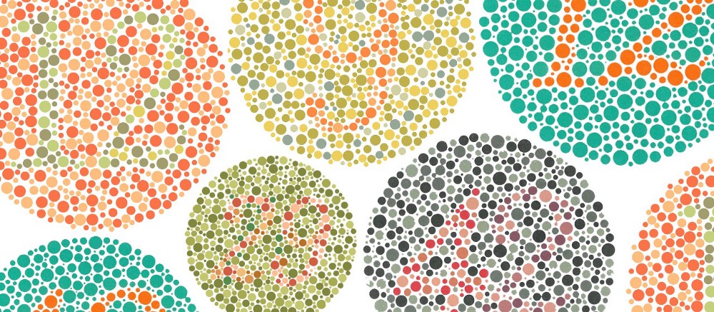
As soon as I clicked the switch - and saw the Internet through Peter’s eyes, I immediately understood everything. In reality, he sees neither green nor red. They are both brown. Violet turns blue with a brownish tinge, and orange turns yellow with a brownish tinge. The visual palette consists only of various shades of blue, yellow and brown.

Left: as a person with normal vision sees a standard color palette. Right: how the deuteranomal sees it
I was incredibly surprised how different things look to Peter. After a couple of hours, I approached him and exclaimed:
“Your world is so boring! The palette is really limited. ”
To which he replied:
“I don't know the difference. I do not see what is missing. "
Although I looked at sites like Peter, but I realized that I could never perceive them like him. I have more than 30 years of experience viewing the full spectrum of colors: I cannot erase these memories so that the mental perception completely coincides with its perception. But it is interesting that he still associates red with danger and anxiety, and green with peace and nature, although for them they seem similar. He has learned the same color associations and can speak the same language of colors as most people, although he perceives colors quite differently.
Wrestling
Having overcome the initial bewilderment and started doing daily activities, I quickly realized that I would have to change many of the daily habits, patterns and attitudes in order to adapt to the new vision limitations.
I usually mark a lot with color, especially email replies. When I answer a few questions, I often mark my answers under each question with different colors. I can even mark the answers in one color, and additional questions - in another. Often people respond in the same way and maintain a color-coding system, maintaining the appropriate color for their answers. When I tried to do this during my experiment, emails began to look like brown army camouflage and it became difficult to decipher them. By the end of the first day, I only highlighted the text in bold and italic. I understood why Peter does this.
Another key system that had to be changed was the system of colored stars in Gmail, which I mark up letters based on importance or necessary actions. The system quickly failed: the six set colors are not sufficiently different. They look like three very similar yellow, two illegible blue and one dark brown. Fortunately, there is an option with colors AND symbols. Now I understand why.
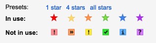
Gmail asterisk options for a person with normal vision
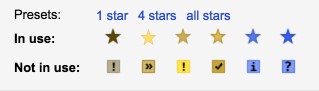
Gmail asterisk options for deuteranomal
Finally, the most unrecoverable problem is that I am terribly typing. I rely on the built-in spell checker in Chrome, Gmail, Word, etc. to emphasize typos. Unfortunately, the red underlining turned brown, which is not as noticeable as the usual red, and I had to significantly increase my vigilance while typing.
Design rules for visual barrier free
Although I had to adjust my habits and attitudes, in some situations I was lost and did not know what to do. In these cases, the design did not satisfy my basic needs in a barrier-free environment. However, all these situations could have been avoided if the designers followed two key rules.
Rule 1: The main thing - color contrast
In online stores, I twice came across large banners that looked almost empty or there was definitely something missing. In both cases, a red font was used on a neutral halftone background. To me it seemed medium brown to medium gray. Designers relied on the dynamism of the red color, which I did not see. In order to adapt the design for users with variations of color blindness, as well as other visual impairments, you should make sure that the colors for the object and the background provide the necessary level of color contrast .
The W3C Website Content Accessibility Guidelines has established specific color contrast ratios that should be followed for large and small fonts in order to meet AA or AAA standards. Fortunately, there are excellent tools to check.
This site tests the color contrast of text and background in accordance with AA and AAA standards for large and small fonts.
If your color combination does not match the selected WCAG contrast standard, this site will find similar color combinations that meet the standards.
Rule 2: Do not rely only on color
On the banking site you had to fill out a form. I clicked Submit - and nothing happened. I tried again. It looked like it was being processed, but then again nothing. It turns out that the site used red and green contours to indicate, respectively, verified form fields and fields with errors. But for me they all looked the same. It was impossible to determine which fields are correct and which are not. As a designer, do not rely only on color as an indicator . It is also necessary to use symbols. Better yet, display an error message explaining what is wrong. Because not only color blind people, but also people with normal eyesight can not guess what they did wrong.
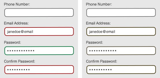
Left: as a person with normal vision sees a form with color indicators. Right: as a deuteranomal person sees the same shape with color-based indicators.
Empathy is a powerful tool. It is important for understanding the needs, desires and problems of our users, so it allows you to create effective interfaces. Without it, WCAG is just a list of tedious requirements, and not a useful guide that helps create interfaces that are pleasant to everyone. If we create a design solely on the basis of our own habits and preferences, then we will inevitably give a miss and create a useless product. And with the help of empathy, we not only create the best design, but also develop our professional qualities.
Source: https://habr.com/ru/post/417421/
All Articles