How did Google and Apple maps change over the year?
Shortly after the author published a map comparison in June of last year, he noticed that Google had updated some of the sites:
Coincidence or not, it was curious. The author thought about what else will change if we continue to follow the maps. Will google continue to detail the map? And will Apple start following the example of Google too?
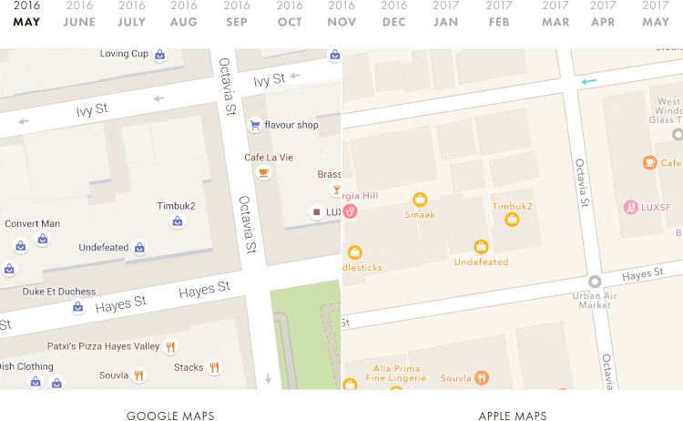
The author decided to write a script that takes screenshots of Google and Apple maps [1] . After thirteen months, it was possible to collect data for the whole year:
')
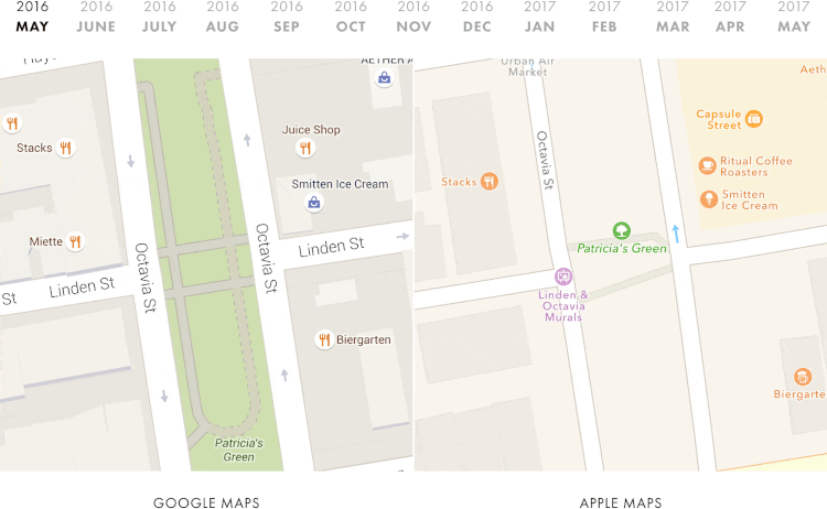
On Apple maps, the terrain looks almost the same as a year earlier. But with Google maps, everything is completely different - during all these months, more and more new details have appeared on the Google map. Now Google has a full map with paths in the park.
Nice to see how google maps have changed over the past year. But it also surprises how much the Apple cards have changed.
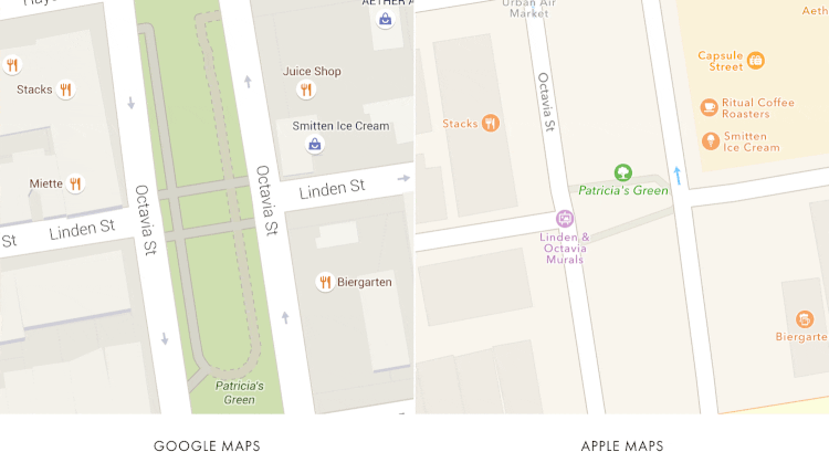
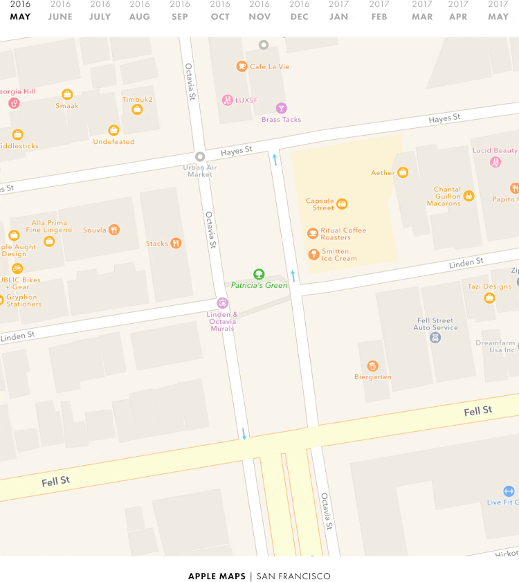
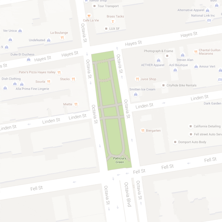
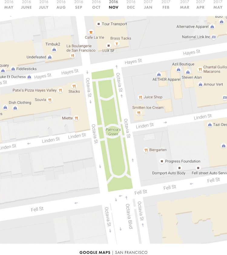
Patricia Green Park, pictured above, is the heart of a lively fashion district in the heart of San Francisco, a few blocks from the city government building . Moreover, for both Apple and Google, San Francisco is close in every sense; if we talk about the place in which the cards show themselves in all their glory, then this is San Francisco [2] .
In my last year’s comparison, I wrote the following:
According to Google Analytics, this article had more than 1,000 visits from computers on the Apple corporate network, mainly from Apple campuses in Sunnyvale and Cupertino. Despite this, even a year later, the green park of Patricia Green on Apple maps is still not painted green.
Again, TomTom’s main data provider Apple also lacks these details.
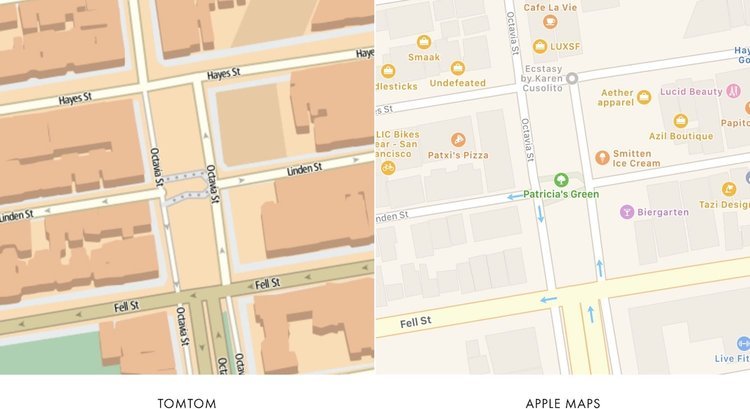
If you compare the roads on these two maps, without paying attention to their design (for example, color and depth), it seems that Apple does take data about the roads and paths from TomTom. Note that the roads are shown at the same angle and have grooves in the same places:
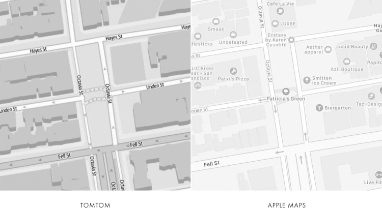
So, if Apple relies on TomTom in this kind of data, it would explain why the park on their maps has not changed.
But as for the Patricia Green Park, here Apple is clearly miscalculated. Despite the fact that the image of the park has not changed at all over the past year, the Apple card itself has changed. Take another look - many companies and places moved and changed almost monthly:
Let's zoom in on the Apple map and take a closer look ...
On the map you can see a lot of changes - some places are added, others are deleted.
To better appreciate the picture, let's mark the green dots of the places that are added monthly, and the red ones - which disappear.

Let's now calculate the number of monthly changes:

On the Apple card, places are added and removed almost every month.
Do we see a similar picture on Google maps? Let's get a look…

Just like Apple maps, there is a noticeable amount of change.
Let's do it for clarity, just like with Apple cards:
Curiously, Google has fewer monthly changes than Apple does:
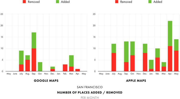
If you add up the statistics for all months, Apple has twice as many of these changes:
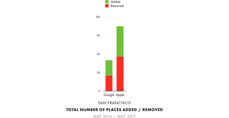
It seems that Apple updates its cards more often than Google.
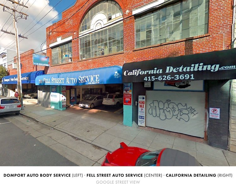
But, if we look into this issue in more detail, the reality is somewhat different than it seems at first glance. For example, in the southeast corner of the park there is a group of three car repair companies: Domport Auto Body Service, Fell Street Auto Service and California Detailing.
Each of them has a separate location on the Google map. Apple also shows them in the same place ...
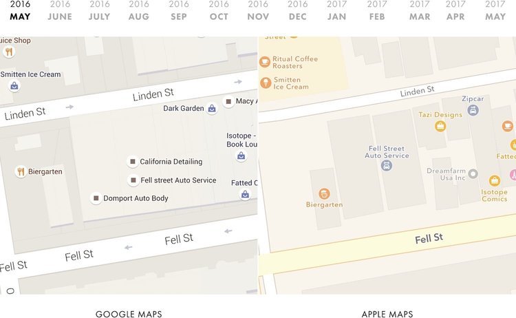
... and at the same time, every month Apple replaces one company name with another again and again, which, in fact, is reflected in our statistics of adding / deleting objects:
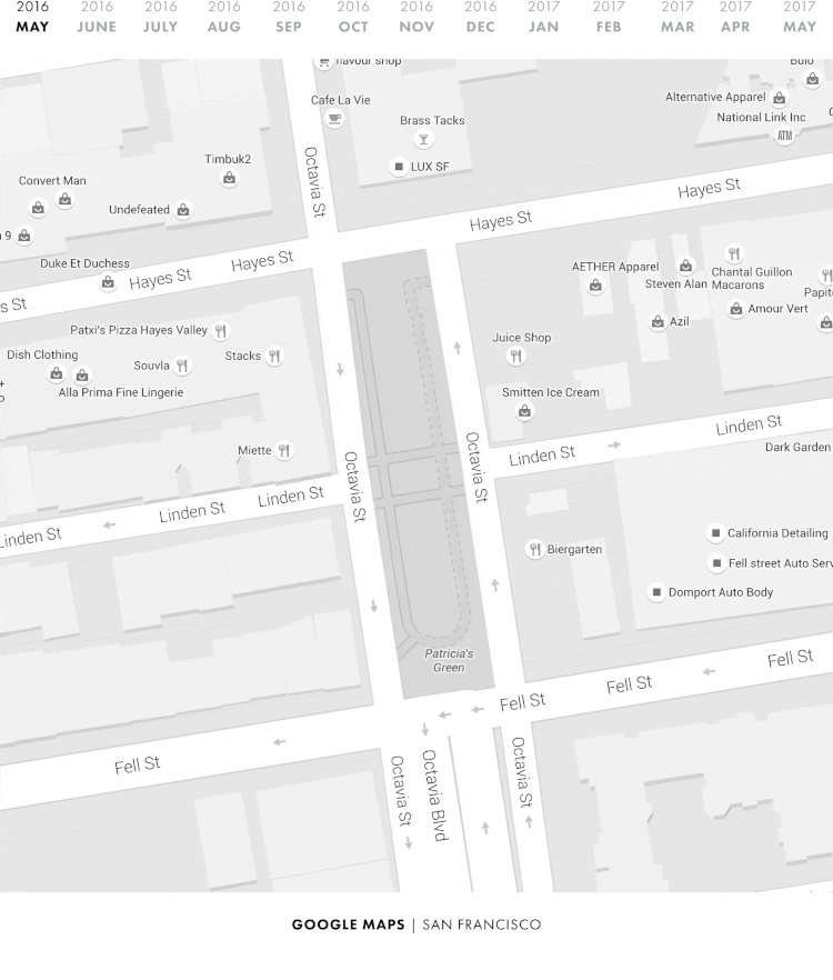
A similar situation can be seen in the northwestern corner of the park, where Timbuk2 and La Boulangerie are located on the first floor of the same building:

On the Google map, both are shown and located in separate places. Apple has them in the same place. In some months we see Timbuk2, in others - La Boulangerie. But we never see them together:
The statistics of additions and deletions on the Apple map, which we quoted earlier, is similar, with companies constantly replacing each other in the same place.
All this seems to indicate that Google’s location data is more accurate than Apple’s (or that Apple’s geocoder contains a lot of bugs). Perhaps we are seeing the fruits of the ten-year Google Street View project.

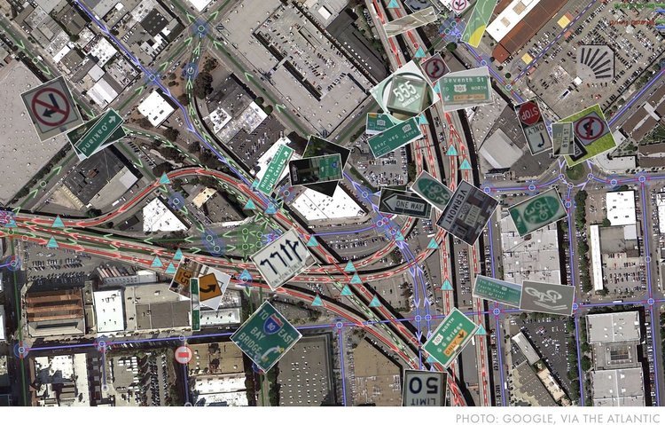
Google has used machine vision and training, through which it obtained information about company names and their location from images taken in the Street View project. As of 2014, Google has covered 99% of public roads in the United States.
Apparently, these images also increased the accuracy of data on places on Google maps. And with the example of Timbuk2 and La Boulangerie, we saw that such increased accuracy allows Google to fit more companies on its map than Apple.
Actually, on the maps that we showed earlier, in all months except one, Google has designated more places than Apple:
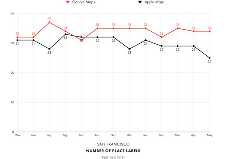
For an average of thirteen months, Google added 34 place marks on the map, while Apple averaged only 30 tags.
* * *
Speaking of tags, have you noticed that Google has been constantly changing their design throughout the year?
And that is not all. Over the past year, the trails in the park on the Google map had at least three different design options:
Three different design options? What generally happens with the design of Google maps?
* * *
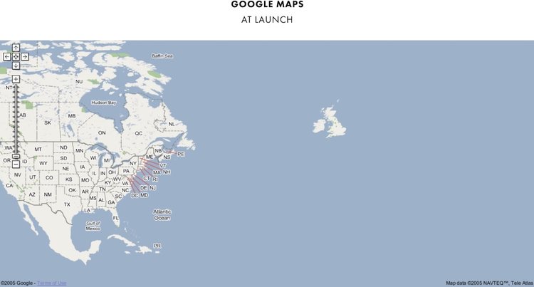
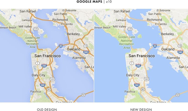
When in the distant 2005 Google maps just appeared, they looked like nothing more than a map of North America and the British Isles:
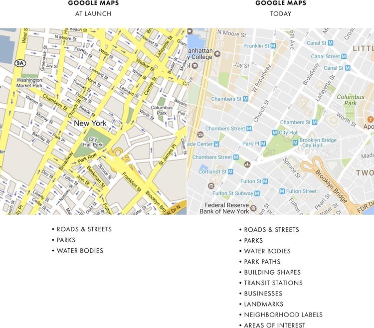
Over time, Google has covered the whole world, gradually adding many other functions and types of data:
Given how much Google has added over the years, one would assume that the map will become very cluttered. But this did not happen.
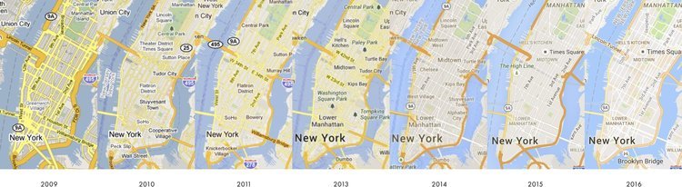
Just as a software developer performs refactoring (reworking) of his code before launching, Google constantly reworked the design of its map, adding new data sets. This is clearly seen on the dynamics of changes in Google maps:
As new types of data were added, Google constantly changed the color balance, the workload and density of objects already placed on the map, each time increasing its capacity.
Therefore, when last year Google added a new type of data “Places of Interest”, it was quite natural that it would once again change the design of the maps. In the end, without redoing the new function would not be convenient. Let me explain all these points.
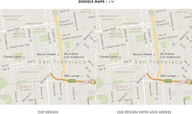
Below, I showed the old design of Google maps (image on the left) and added a new feature “Places of Interest” (image on the right) to it. Comparing these two images, it is quite difficult to see the changes that I made.

Approaching gives nothing - interesting places are still barely visible.
Google needed to do something to make it easier to see interesting places, so they decided to change the background color.
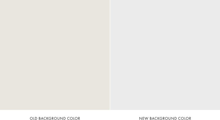
Despite the fact that both colors do not differ much from each other, look what actually happened:
Thanks to a small trick with flowers, the interesting places were immediately visible more clearly.
But Google went further and similarly changed most of the rest of the colors on the map.
Understanding why Google changed the background color was pretty simple, but what drove it to the other changes remains less pronounced.
Maps are mainly used outside, most often in bright light. And many new colors made sections of the map less distinct and noticeable, especially the roads:
In some cases, the roads have become completely invisible:

What was the point? Why did Google need to spoil your map?
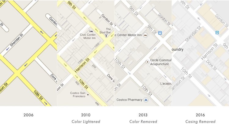
In addition to color changes, Google also made the map more flat, removing coastal shadows that were added just a couple of years ago, and most of the intersections of roads.
If changes were made to free up space, the summer reworking of the design in Google maps seems to have gone too far, leaving too much extra space. In general, due to the changes, the map turned out to be pale, “clean”, if you wish, as if the whole feature of the map was completely lost.
It no longer looked like the good old google map.

However, it seems that a “cleaner” map was the goal of Google. The company even mentioned the word “cleaner” three times in its blog post about new design.
The emphasis was on purity, but even more characteristic was the chosen point in time.
In the past, Google was careful about map changes and never made too many changes too quickly, preferring gradual changes to large updates.
Google also sought to make major changes in the most quiet time of the year. The peak of using maps in the USA is in the summer, and the last update of Google maps was in the middle of a deep winter.
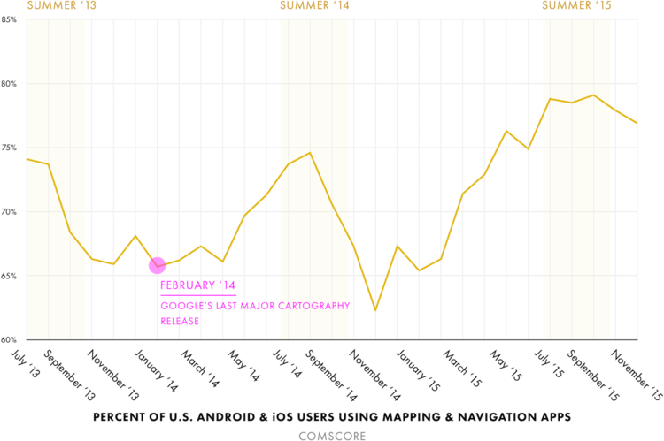
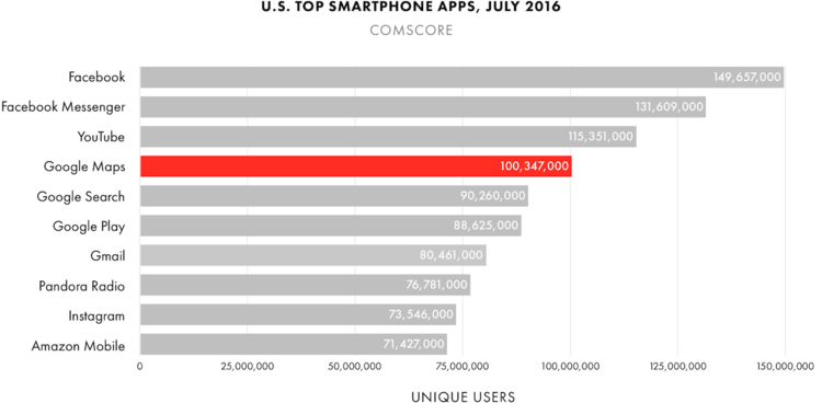
But this time, Google introduced a redesign of its maps at the end of July (at the very peak of the travel season), when they became the fourth most popular usage among other applications in the USA.
Unlike previous Google products, this release was not preceded by any press conference; it was not mentioned at the Google I / O conference (which took place two months before). No open and private beta versions, no custom articles in the Fast Company and no warnings. Just a short blog entry.
It looked like Google did not consider this a major change.
Only a few months later, during which we saw all the changes in the map, it became clear what we really wanted to do at Google ...
* * *
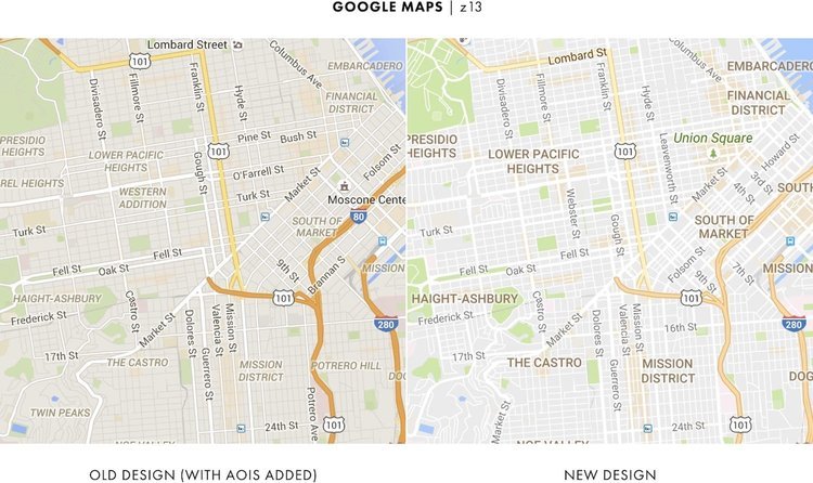
If you forget about San Francisco and go to New York, here we can again compare what Google maps looked like before and after the summer redesign.
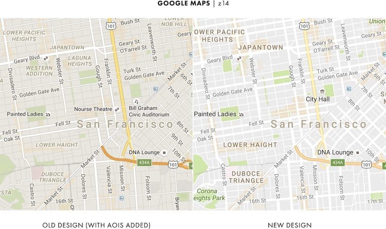
However, look at how the map looked in summer and autumn.

Incredible increase in the number of place marks.
And if you compare the autumn picture with the winter one, these labels became colored:
The differences between how the map looked last spring and this spring are especially striking.
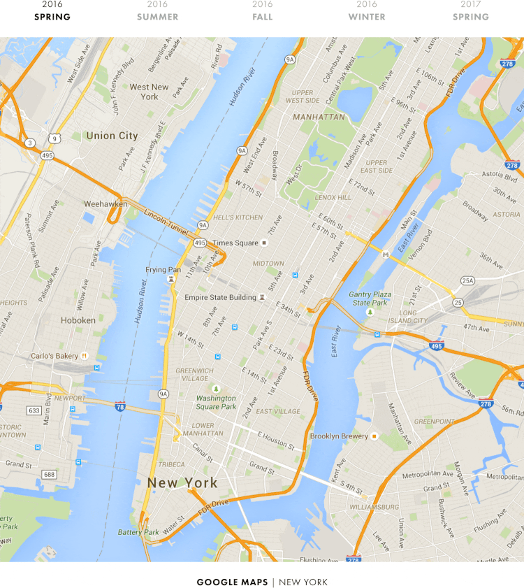
In just one year, Google quietly changed its map from head to toe, turning it from a regular road map into a map of places.
A year ago, the roads were the most significant part of the map - something that everyone noticed right away. Now this part is the place.
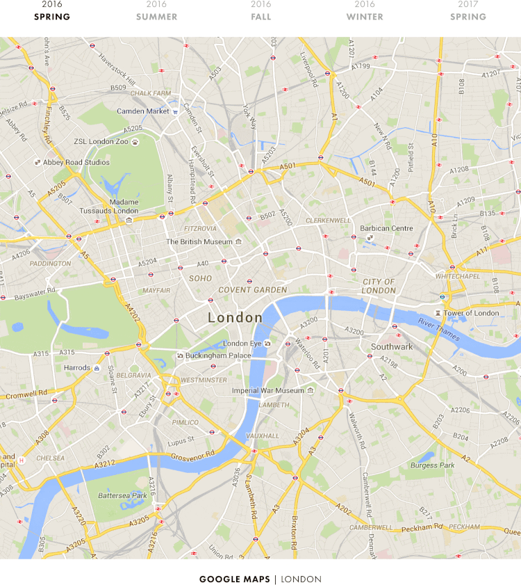
And this is not only in New York ... Here’s what London looks like:
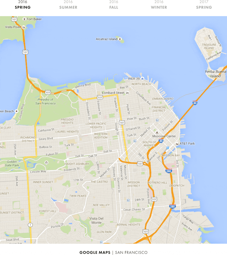
And San Francisco:
Now we are realizing what really happened last summer. Clarifying and making the map more flat, Google actually cleared and prepared the map for all the objects that they planned to add later. And last summer's redesign was just the first stage of these changes.
You probably care about what else Google plans.
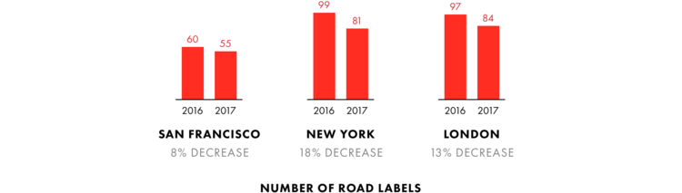
If you look at the screenshots of New York, London and San Francisco again, then from year to year there is an increase in the number of place marks ...
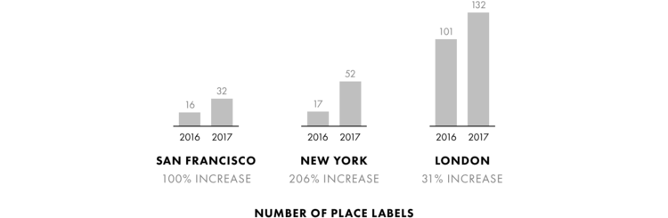
... and reducing the number of road signs.
The same can be seen from the visual side. Google has gradually shifted its focus to places and attractions ...

..., gradually reducing the emphasis on the roads.
These changes just explain what we saw in the Patricia Green Park - Google reduced visibility of paths for a year, making them brighter, and later more subtle.
At the same time, Google increased its emphasis on places and attractions.
Curiously, the icons of places in Google are now more like Apple icons.
Here's what they looked like last year:

And so they look this year:

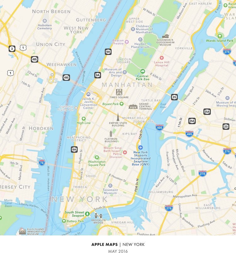
As for sites, Google also increased the variety of places displayed.
In our comparison made last year, we determined that, overall, Apple showed a wider variety of places than Google.
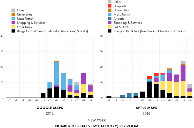
And look at the results of our Google research a year later:
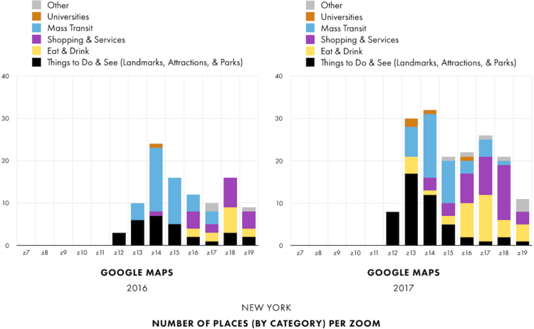
The difference is significant, and the variety of objects in Google is now closer to the one that Apple has.
As for Apple ... What did this company conceive while Google implemented all these changes? Do not forget that Apple announced the "completely new design" of its cards just a couple of weeks before the summer redesign of Google.
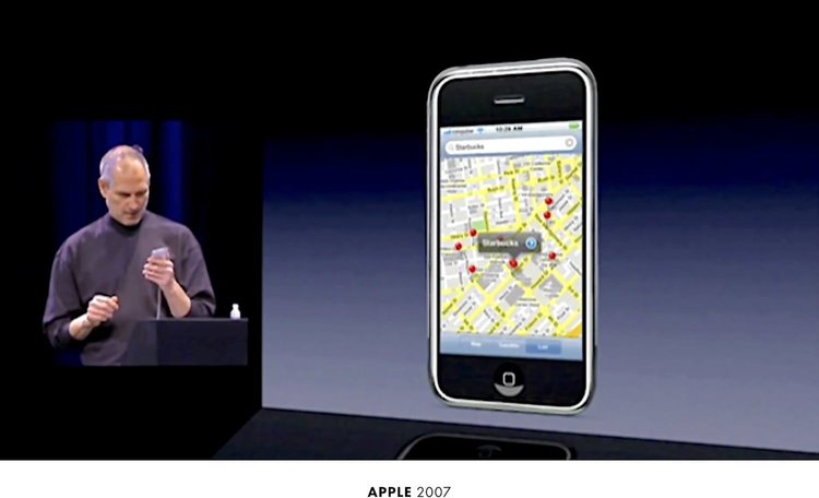
Let's take a look at how the Apple map looked a year ago before the release of a new design:
And now let's look at how she looks now:

Do you see the difference?
I do not see either.
1 We consider only standard cards (without personalization) ︎ ↑
2 As soon as either of these two companies releases a new application or map function, we are almost always shown a demo version in San Francisco. Starting with Steve Jobs, who is looking for Starbucks on Google Maps, on the first iPhone presentation in 2007 ...
... Google, which shows 3D images of the building of the San Francisco city government from a satellite in 2012 ...

... and Apple map views ...
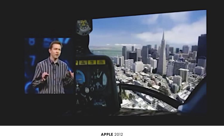
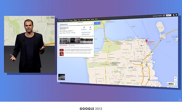
... and ending with the presentation of "new" Google maps in 2013 ...
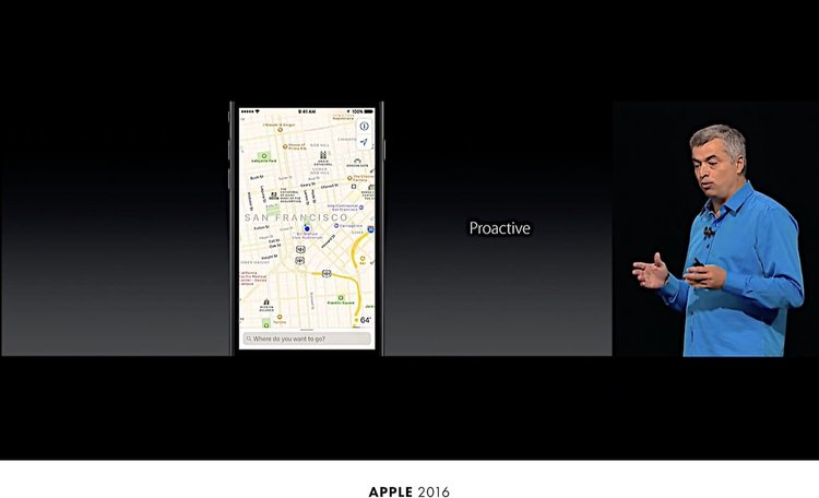
... and the presentation of the "brand new design" of Apple cards last year ...
Therefore, if there is a place on Earth in which the map is made just perfect, then most likely it will be San Francisco ↑

Coincidence or not, it was curious. The author thought about what else will change if we continue to follow the maps. Will google continue to detail the map? And will Apple start following the example of Google too?
The author decided to write a script that takes screenshots of Google and Apple maps [1] . After thirteen months, it was possible to collect data for the whole year:
')
On Apple maps, the terrain looks almost the same as a year earlier. But with Google maps, everything is completely different - during all these months, more and more new details have appeared on the Google map. Now Google has a full map with paths in the park.
Nice to see how google maps have changed over the past year. But it also surprises how much the Apple cards have changed.
Patricia Green Park, pictured above, is the heart of a lively fashion district in the heart of San Francisco, a few blocks from the city government building . Moreover, for both Apple and Google, San Francisco is close in every sense; if we talk about the place in which the cards show themselves in all their glory, then this is San Francisco [2] .
In my last year’s comparison, I wrote the following:
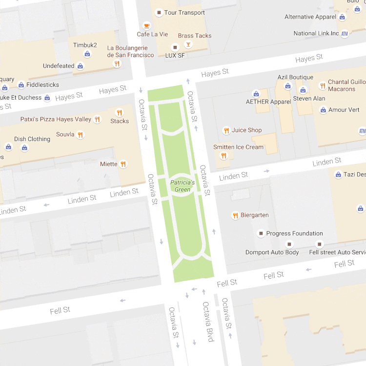
Let's take another look at the maps of San Francisco, namely the approximate image of the Patricia Green Park. There are paths on Google map and even some buildings and structures that are not on the Apple map. And on the Apple map, the Patricia Green Park is not even green (from Green. Green is green).
According to Google Analytics, this article had more than 1,000 visits from computers on the Apple corporate network, mainly from Apple campuses in Sunnyvale and Cupertino. Despite this, even a year later, the green park of Patricia Green on Apple maps is still not painted green.
Again, TomTom’s main data provider Apple also lacks these details.
If you compare the roads on these two maps, without paying attention to their design (for example, color and depth), it seems that Apple does take data about the roads and paths from TomTom. Note that the roads are shown at the same angle and have grooves in the same places:
So, if Apple relies on TomTom in this kind of data, it would explain why the park on their maps has not changed.
But as for the Patricia Green Park, here Apple is clearly miscalculated. Despite the fact that the image of the park has not changed at all over the past year, the Apple card itself has changed. Take another look - many companies and places moved and changed almost monthly:
Let's zoom in on the Apple map and take a closer look ...
On the map you can see a lot of changes - some places are added, others are deleted.
To better appreciate the picture, let's mark the green dots of the places that are added monthly, and the red ones - which disappear.
Let's now calculate the number of monthly changes:
On the Apple card, places are added and removed almost every month.
Do we see a similar picture on Google maps? Let's get a look…
Just like Apple maps, there is a noticeable amount of change.
Let's do it for clarity, just like with Apple cards:
Curiously, Google has fewer monthly changes than Apple does:
If you add up the statistics for all months, Apple has twice as many of these changes:
It seems that Apple updates its cards more often than Google.
But, if we look into this issue in more detail, the reality is somewhat different than it seems at first glance. For example, in the southeast corner of the park there is a group of three car repair companies: Domport Auto Body Service, Fell Street Auto Service and California Detailing.
Each of them has a separate location on the Google map. Apple also shows them in the same place ...
... and at the same time, every month Apple replaces one company name with another again and again, which, in fact, is reflected in our statistics of adding / deleting objects:
A similar situation can be seen in the northwestern corner of the park, where Timbuk2 and La Boulangerie are located on the first floor of the same building:
On the Google map, both are shown and located in separate places. Apple has them in the same place. In some months we see Timbuk2, in others - La Boulangerie. But we never see them together:
The statistics of additions and deletions on the Apple map, which we quoted earlier, is similar, with companies constantly replacing each other in the same place.
All this seems to indicate that Google’s location data is more accurate than Apple’s (or that Apple’s geocoder contains a lot of bugs). Perhaps we are seeing the fruits of the ten-year Google Street View project.
Google has used machine vision and training, through which it obtained information about company names and their location from images taken in the Street View project. As of 2014, Google has covered 99% of public roads in the United States.
Apparently, these images also increased the accuracy of data on places on Google maps. And with the example of Timbuk2 and La Boulangerie, we saw that such increased accuracy allows Google to fit more companies on its map than Apple.
Actually, on the maps that we showed earlier, in all months except one, Google has designated more places than Apple:
For an average of thirteen months, Google added 34 place marks on the map, while Apple averaged only 30 tags.
* * *
Speaking of tags, have you noticed that Google has been constantly changing their design throughout the year?
And that is not all. Over the past year, the trails in the park on the Google map had at least three different design options:
Three different design options? What generally happens with the design of Google maps?
* * *
Visual processing and summer of 2016
When in the distant 2005 Google maps just appeared, they looked like nothing more than a map of North America and the British Isles:
Over time, Google has covered the whole world, gradually adding many other functions and types of data:
Given how much Google has added over the years, one would assume that the map will become very cluttered. But this did not happen.
Just as a software developer performs refactoring (reworking) of his code before launching, Google constantly reworked the design of its map, adding new data sets. This is clearly seen on the dynamics of changes in Google maps:
As new types of data were added, Google constantly changed the color balance, the workload and density of objects already placed on the map, each time increasing its capacity.
Therefore, when last year Google added a new type of data “Places of Interest”, it was quite natural that it would once again change the design of the maps. In the end, without redoing the new function would not be convenient. Let me explain all these points.
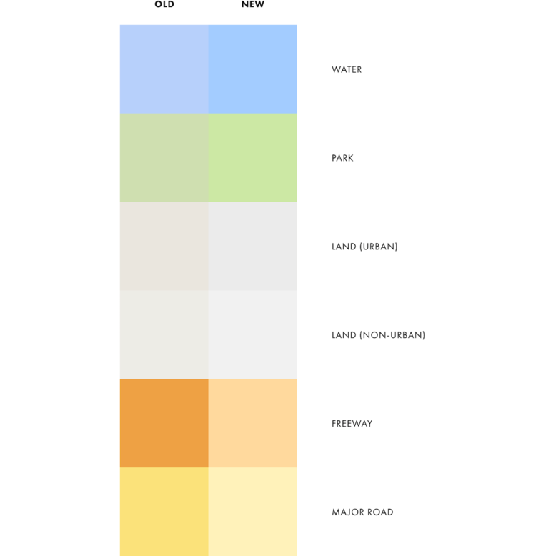
Below, I showed the old design of Google maps (image on the left) and added a new feature “Places of Interest” (image on the right) to it. Comparing these two images, it is quite difficult to see the changes that I made.
Approaching gives nothing - interesting places are still barely visible.
Google needed to do something to make it easier to see interesting places, so they decided to change the background color.
Despite the fact that both colors do not differ much from each other, look what actually happened:
Thanks to a small trick with flowers, the interesting places were immediately visible more clearly.
But Google went further and similarly changed most of the rest of the colors on the map.
Understanding why Google changed the background color was pretty simple, but what drove it to the other changes remains less pronounced.
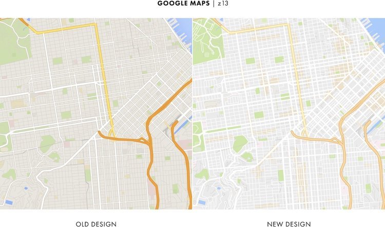
Maps are mainly used outside, most often in bright light. And many new colors made sections of the map less distinct and noticeable, especially the roads:
In some cases, the roads have become completely invisible:
What was the point? Why did Google need to spoil your map?
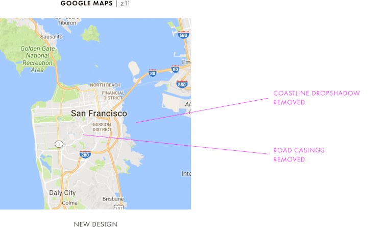
In addition to color changes, Google also made the map more flat, removing coastal shadows that were added just a couple of years ago, and most of the intersections of roads.
If changes were made to free up space, the summer reworking of the design in Google maps seems to have gone too far, leaving too much extra space. In general, due to the changes, the map turned out to be pale, “clean”, if you wish, as if the whole feature of the map was completely lost.
It no longer looked like the good old google map.
However, it seems that a “cleaner” map was the goal of Google. The company even mentioned the word “cleaner” three times in its blog post about new design.
The emphasis was on purity, but even more characteristic was the chosen point in time.
In the past, Google was careful about map changes and never made too many changes too quickly, preferring gradual changes to large updates.
Google also sought to make major changes in the most quiet time of the year. The peak of using maps in the USA is in the summer, and the last update of Google maps was in the middle of a deep winter.
But this time, Google introduced a redesign of its maps at the end of July (at the very peak of the travel season), when they became the fourth most popular usage among other applications in the USA.
Unlike previous Google products, this release was not preceded by any press conference; it was not mentioned at the Google I / O conference (which took place two months before). No open and private beta versions, no custom articles in the Fast Company and no warnings. Just a short blog entry.
It looked like Google did not consider this a major change.
Only a few months later, during which we saw all the changes in the map, it became clear what we really wanted to do at Google ...
* * *
Four seasons of google
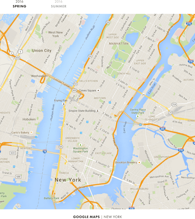
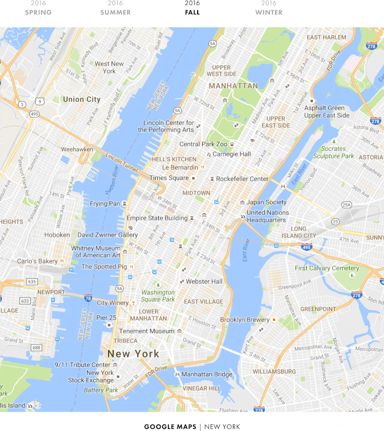
If you forget about San Francisco and go to New York, here we can again compare what Google maps looked like before and after the summer redesign.
However, look at how the map looked in summer and autumn.
Incredible increase in the number of place marks.
And if you compare the autumn picture with the winter one, these labels became colored:
The differences between how the map looked last spring and this spring are especially striking.
In just one year, Google quietly changed its map from head to toe, turning it from a regular road map into a map of places.
A year ago, the roads were the most significant part of the map - something that everyone noticed right away. Now this part is the place.
And this is not only in New York ... Here’s what London looks like:
And San Francisco:
Now we are realizing what really happened last summer. Clarifying and making the map more flat, Google actually cleared and prepared the map for all the objects that they planned to add later. And last summer's redesign was just the first stage of these changes.
You probably care about what else Google plans.
If you look at the screenshots of New York, London and San Francisco again, then from year to year there is an increase in the number of place marks ...
... and reducing the number of road signs.
The same can be seen from the visual side. Google has gradually shifted its focus to places and attractions ...
..., gradually reducing the emphasis on the roads.
These changes just explain what we saw in the Patricia Green Park - Google reduced visibility of paths for a year, making them brighter, and later more subtle.
At the same time, Google increased its emphasis on places and attractions.
Curiously, the icons of places in Google are now more like Apple icons.
Here's what they looked like last year:
And so they look this year:
As for sites, Google also increased the variety of places displayed.
In our comparison made last year, we determined that, overall, Apple showed a wider variety of places than Google.
And look at the results of our Google research a year later:
The difference is significant, and the variety of objects in Google is now closer to the one that Apple has.
As for Apple ... What did this company conceive while Google implemented all these changes? Do not forget that Apple announced the "completely new design" of its cards just a couple of weeks before the summer redesign of Google.
Let's take a look at how the Apple map looked a year ago before the release of a new design:
And now let's look at how she looks now:
Do you see the difference?
I do not see either.
1 We consider only standard cards (without personalization) ︎ ↑
2 As soon as either of these two companies releases a new application or map function, we are almost always shown a demo version in San Francisco. Starting with Steve Jobs, who is looking for Starbucks on Google Maps, on the first iPhone presentation in 2007 ...
... Google, which shows 3D images of the building of the San Francisco city government from a satellite in 2012 ...
... and Apple map views ...
... and ending with the presentation of "new" Google maps in 2013 ...
... and the presentation of the "brand new design" of Apple cards last year ...
Therefore, if there is a place on Earth in which the map is made just perfect, then most likely it will be San Francisco ↑
Source: https://habr.com/ru/post/402839/
All Articles