Saw, Shura: how we created the design of the mobile application tracker for dogs Mishiko
The tracker project for dogs Mishiko has been developed since 2015, and during this time we have gone through dozens of iterations in the design - both the tracker itself and the mobile application.
Especially for our blog, we asked leading designer Mishiko Daria Ivaschenko to tell the story of the design of the application Mishiko.
Daria Ivaschenko, Mishiko:
')
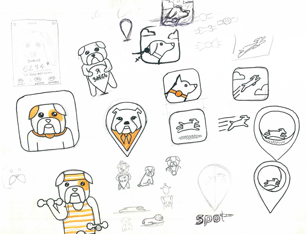
When a project is created for several years, it is impossible to avoid global change. In the case of Mishiko, the mobile application is only one part of a large cycle, which includes the platform, hardware, and production. The evolution - or, rather, the change of the project development vectors - can be traced already by the application icon and how dramatically it changed from time to time:


But let's start in order.
So, the first thing we encountered was the development of the main page of the application. At the start, we reflected on the content, which should be displayed here. It could be a Facebook-type feed, or just basic information about dog activity. Either the main function is the location of the dog, and everything else should have been in additional tabs?
We thought a lot about different elements of gamification, achivkami and badges like Foursquare, and therefore we wanted to place on the first page as much information as possible about friends of dog owners of the gadget owner. The parallel functionality (from which we, however, did not refuse) was the idea of a social network to search for lost dogs. Therefore, at the same time, we had an idea with a map of dogs nearby (including announcements about “losers”), as well as the opportunity to simply meet new friends near the house.
By our logic, to get achievements, it was not necessary to take new records every time. On the contrary - you give everyone a lucky one: did the dog lie at home all day? Catch the "stone" achivka. But such comic rewards did not interfere with the main line with the achievement of new goals and competitions in activity with neighboring dogs.
We had a lot of thoughts about gamification and socialization inside the application. Ideally, we wanted to do these two things together. We think that it would be cool not just to share with friends information about new achievements of goals, but also about beaten records. That is, when your dog was most active in the history of using Mishiko.
Finally, we also wanted to make special achievements. For example, visiting the same places many times: you walk with a dog to a pet-shop and you go, and bam: you have a badge “main on the district”. Or you have 50 friends of dog breeders - hurray, get an achivka. Or your pug became the most active dog in the area that day! Keep a new badge.
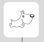
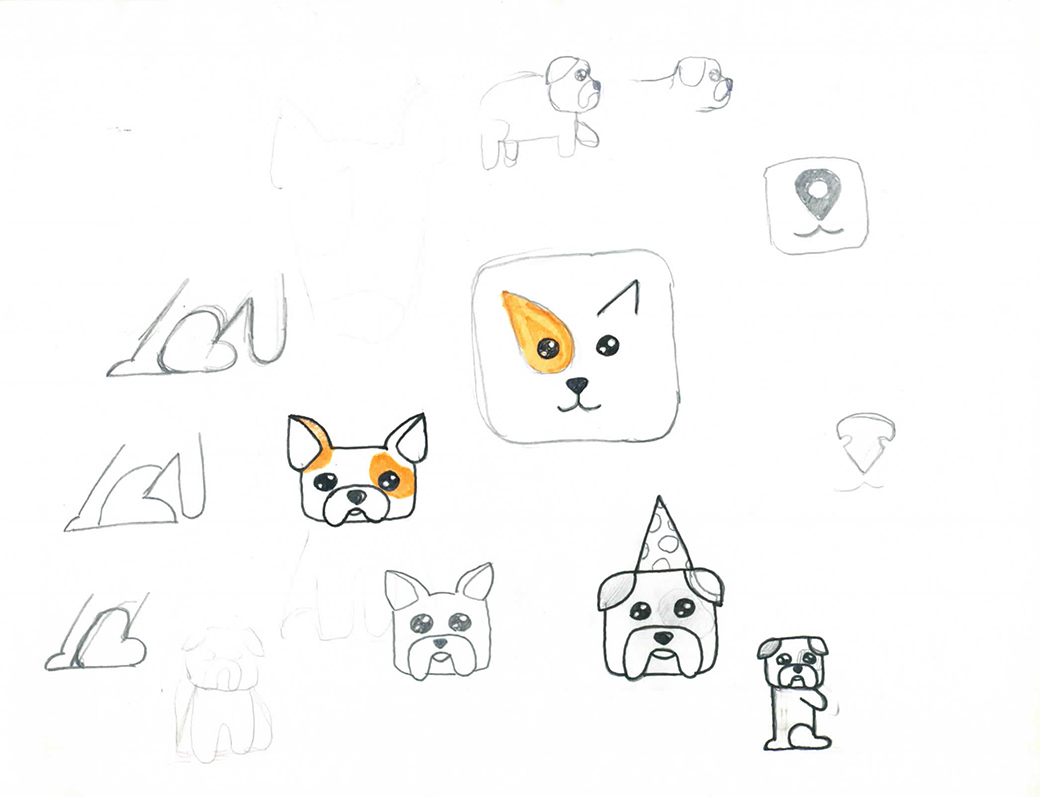
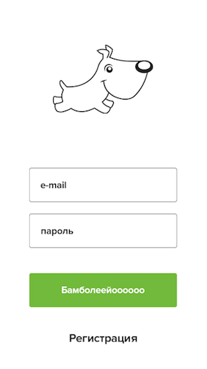
The idea of achivok especially turned our heads when we initially chose the overall cartoon style of the project. Then this guy should be the main character mascot:
Why did we decide to give it up? Because our business tasks have changed.
Yes, it's a little sad when you had to redraw everything so much, but in general, the situation is normal. It is important to understand that we were constantly tied to the "iron", which is constantly changing, on the final price of the device and other issues - and all this influenced the style of Mishiko. The cartoon style began to look simply ridiculous when we received more or less final versions of the tracker's industrial design, its layout and, of course, when we learned its final price - about 10 thousand rubles.
Bye, cartoon style!
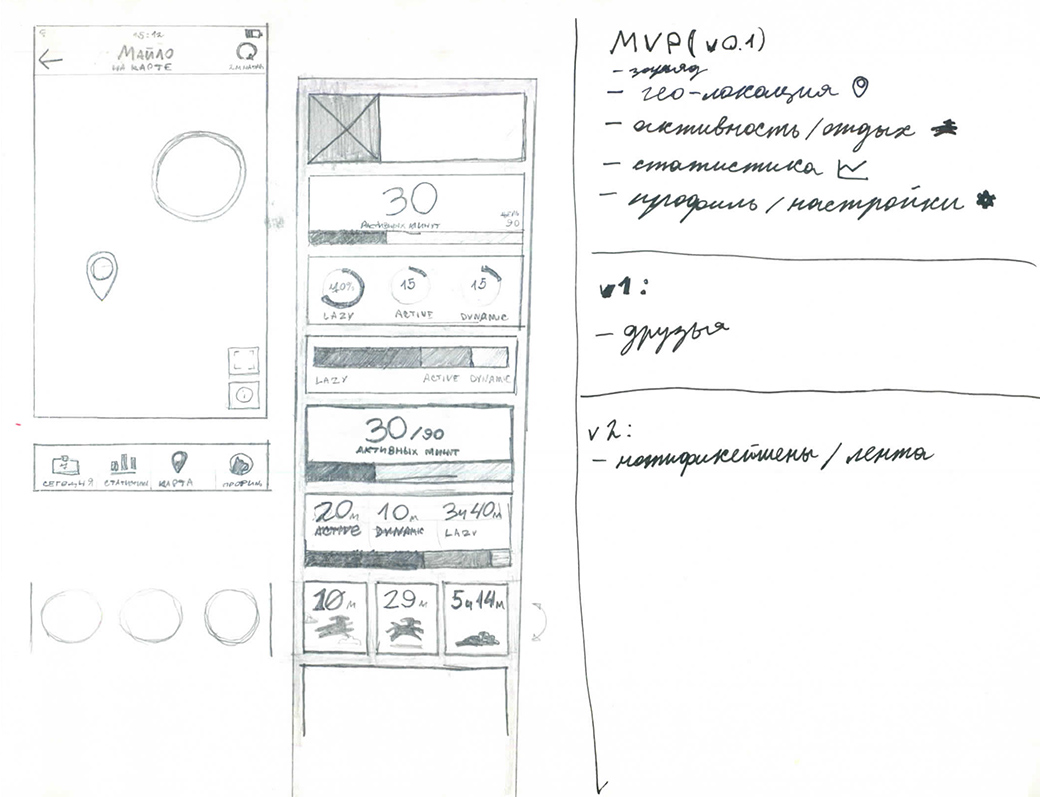
When developing the first MVP of the application, we began with the development of draft wiframes. Here they are:
And already at this stage, one of the first hypotheses surfaced, which we rejected almost immediately - this is navigation from the “left”, like this:
The very first tests showed that navigation in the bottom in our case increases the user’s time in the application several times. Using the Mishiko app is much more like Instagram than any tracking app like car sharing. We do not want the user to log in, see the pet's location - and run away. Instead, our goal is for him to come in, look at interesting data on the activity of the dog, study in the charts the data on activity for a week or a month, he remembered his walks. Well, or went to the calendar of events and updated the list of "dog affairs" like going to the vet or grooming salon. We do not want the user to use the application in a hurry.
Understanding that we cannot move from MVP to the final product in one step, we began to cut the main and optional features. The first thing I had to refuse to release was a tape like Facebook.
The second change - we began to measure activity in points, and not in the “activity time”, as it was at the start. Tests have shown that it is much easier to perceive achievements in points than in the “time” of how much time the dog spent in which mode (strong activity / weak / sleep).
We understand that points are, of course, also an abstract system of measures. But she explains the goal: here you need so many points for your dog. And the ordinary user is not so important as they are considered - and to whom it is interesting, he will already study the detailed graphs and our calculation method. Perhaps we will eventually move away from the point system, but most fitness applications also measure everything in points. It simplifies working with a variety of types of activity - whether it will be running, swimming, walking, whatever.
Thirdly, we changed the display format of the main activity screen. Let's tell about it in more detail.
When working on the activity screen - the main one in the Mishiko application - received basic input data from the engineering team. So, the device collects acceleration data from the accelerometer, sufficient to distinguish the activity of the three types. Rest, medium activity and high activity.
To visualize this (seemingly simple) data, we encountered a number of technical problems. Here is one of the first visualization options that we came up with:
What was it that confused people? At a minimum, the activity types were the same color as the daily records. It seemed to everyone that if the day was blue, the dog was inactive for some time. Although in fact it is simply not the most active day for the sum of all three types of activity. This was a design mistake. Another point - at this stage, we still considered the activity in minutes, not points, and it was also terribly inconvenient for the user.
Then we tried this option:
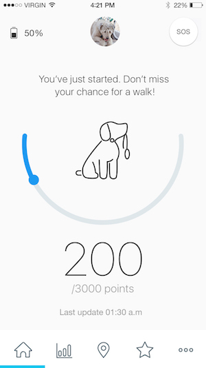
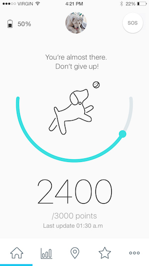
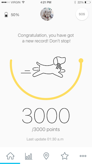
As you can see, it has become much easier and clearer. Blue, we celebrated the "normal" day when the dog did not reach the goal by points. As the goal is achieved, the color changes first to blue, and then to yellow - when a new record is already “taken”.
At the same time, we tested a version with a circle, which “pulls” new circles of a different color onto itself. Here is this option:
What was the problem? We decided to test this hypothesis on visualization: one of our designers was in Berlin and rode a bicycle. And the following happened to him: when the points went over the first round, the color changed from dark blue to blue (that is, the second round began). But when the subject exceeded the second round and moved to the third, the circle began to simply spin on the new one. It was very inconvenient and incomprehensible. Therefore, we added extra. colors over this to avoid such overlays.
During a series of experiments with visualization, for example:
... We have come here to this final option:
We abolished all the extra "circles", left only the basic minimum. It was decided to kill the schedules for the day with time, too, because of the results of the tests, we saw that this was unnecessary information for most dog breeders.
What about activity charts? Oh, that's another story. Go
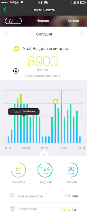
The first thing we thought when we started working with statistics is that it is always hardcore for the average user. It seemed to us that when the user climbs into the data, he is immediately ready for "tin". And the “meaner” the data looks, the more beautiful graphs there are, the more interesting the user is. And we tried to experiment with it. It turned out to be interesting, but on the whole, complex graphs raised more questions than answers to users. See for yourself and try to figure it out:
A related question that we often discussed was the need to reduce the numbers when we talk about points. The reason is simple: at first we divided the details into 1000-2000 points or even hundreds. Hundreds of shoals first: they are often confused with percentages and this is a bad association.

Then we added another “zero”, started testing the device algorithms, and saw that with a score of about 2000, you already have additional points for a large number of steps. That is, you will receive a conditional +1 point not for 15 steps, but for at least a hundred. And since the whole tracking happens almost in real time, it seems that there are no updates or they do not work when you walk a short distance. Then we came to more frightening numbers (20-30 thousand), which in return give a tangible result with any number of points. I walked - got a couple of thousand, walked a couple of steps - got a couple of dozen points.
As a result, we brought the design of statistics to this minimalist form:

How do you like it? Let's discuss)
Especially for our blog, we asked leading designer Mishiko Daria Ivaschenko to tell the story of the design of the application Mishiko.
Daria Ivaschenko, Mishiko:
')
When a project is created for several years, it is impossible to avoid global change. In the case of Mishiko, the mobile application is only one part of a large cycle, which includes the platform, hardware, and production. The evolution - or, rather, the change of the project development vectors - can be traced already by the application icon and how dramatically it changed from time to time:
But let's start in order.
So, the first thing we encountered was the development of the main page of the application. At the start, we reflected on the content, which should be displayed here. It could be a Facebook-type feed, or just basic information about dog activity. Either the main function is the location of the dog, and everything else should have been in additional tabs?
We thought a lot about different elements of gamification, achivkami and badges like Foursquare, and therefore we wanted to place on the first page as much information as possible about friends of dog owners of the gadget owner. The parallel functionality (from which we, however, did not refuse) was the idea of a social network to search for lost dogs. Therefore, at the same time, we had an idea with a map of dogs nearby (including announcements about “losers”), as well as the opportunity to simply meet new friends near the house.
By our logic, to get achievements, it was not necessary to take new records every time. On the contrary - you give everyone a lucky one: did the dog lie at home all day? Catch the "stone" achivka. But such comic rewards did not interfere with the main line with the achievement of new goals and competitions in activity with neighboring dogs.
We had a lot of thoughts about gamification and socialization inside the application. Ideally, we wanted to do these two things together. We think that it would be cool not just to share with friends information about new achievements of goals, but also about beaten records. That is, when your dog was most active in the history of using Mishiko.
Finally, we also wanted to make special achievements. For example, visiting the same places many times: you walk with a dog to a pet-shop and you go, and bam: you have a badge “main on the district”. Or you have 50 friends of dog breeders - hurray, get an achivka. Or your pug became the most active dog in the area that day! Keep a new badge.
The idea of achivok especially turned our heads when we initially chose the overall cartoon style of the project. Then this guy should be the main character mascot:
Why did we decide to give it up? Because our business tasks have changed.
Yes, it's a little sad when you had to redraw everything so much, but in general, the situation is normal. It is important to understand that we were constantly tied to the "iron", which is constantly changing, on the final price of the device and other issues - and all this influenced the style of Mishiko. The cartoon style began to look simply ridiculous when we received more or less final versions of the tracker's industrial design, its layout and, of course, when we learned its final price - about 10 thousand rubles.
Bye, cartoon style!
We test further
When developing the first MVP of the application, we began with the development of draft wiframes. Here they are:
And already at this stage, one of the first hypotheses surfaced, which we rejected almost immediately - this is navigation from the “left”, like this:
The very first tests showed that navigation in the bottom in our case increases the user’s time in the application several times. Using the Mishiko app is much more like Instagram than any tracking app like car sharing. We do not want the user to log in, see the pet's location - and run away. Instead, our goal is for him to come in, look at interesting data on the activity of the dog, study in the charts the data on activity for a week or a month, he remembered his walks. Well, or went to the calendar of events and updated the list of "dog affairs" like going to the vet or grooming salon. We do not want the user to use the application in a hurry.
Painful changes
Understanding that we cannot move from MVP to the final product in one step, we began to cut the main and optional features. The first thing I had to refuse to release was a tape like Facebook.
The second change - we began to measure activity in points, and not in the “activity time”, as it was at the start. Tests have shown that it is much easier to perceive achievements in points than in the “time” of how much time the dog spent in which mode (strong activity / weak / sleep).
We understand that points are, of course, also an abstract system of measures. But she explains the goal: here you need so many points for your dog. And the ordinary user is not so important as they are considered - and to whom it is interesting, he will already study the detailed graphs and our calculation method. Perhaps we will eventually move away from the point system, but most fitness applications also measure everything in points. It simplifies working with a variety of types of activity - whether it will be running, swimming, walking, whatever.
Thirdly, we changed the display format of the main activity screen. Let's tell about it in more detail.
Show activity
When working on the activity screen - the main one in the Mishiko application - received basic input data from the engineering team. So, the device collects acceleration data from the accelerometer, sufficient to distinguish the activity of the three types. Rest, medium activity and high activity.
To visualize this (seemingly simple) data, we encountered a number of technical problems. Here is one of the first visualization options that we came up with:
What was it that confused people? At a minimum, the activity types were the same color as the daily records. It seemed to everyone that if the day was blue, the dog was inactive for some time. Although in fact it is simply not the most active day for the sum of all three types of activity. This was a design mistake. Another point - at this stage, we still considered the activity in minutes, not points, and it was also terribly inconvenient for the user.
Then we tried this option:
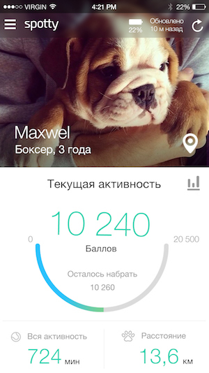
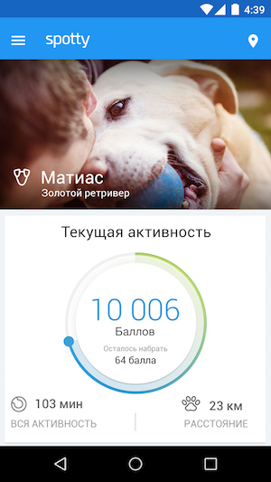
As you can see, it has become much easier and clearer. Blue, we celebrated the "normal" day when the dog did not reach the goal by points. As the goal is achieved, the color changes first to blue, and then to yellow - when a new record is already “taken”.
At the same time, we tested a version with a circle, which “pulls” new circles of a different color onto itself. Here is this option:
What was the problem? We decided to test this hypothesis on visualization: one of our designers was in Berlin and rode a bicycle. And the following happened to him: when the points went over the first round, the color changed from dark blue to blue (that is, the second round began). But when the subject exceeded the second round and moved to the third, the circle began to simply spin on the new one. It was very inconvenient and incomprehensible. Therefore, we added extra. colors over this to avoid such overlays.
During a series of experiments with visualization, for example:
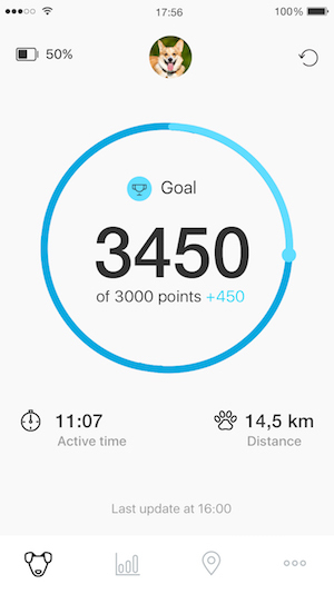
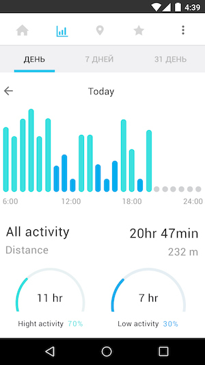
... We have come here to this final option:
We abolished all the extra "circles", left only the basic minimum. It was decided to kill the schedules for the day with time, too, because of the results of the tests, we saw that this was unnecessary information for most dog breeders.
What about activity charts? Oh, that's another story. Go
Show activity statistics
The first thing we thought when we started working with statistics is that it is always hardcore for the average user. It seemed to us that when the user climbs into the data, he is immediately ready for "tin". And the “meaner” the data looks, the more beautiful graphs there are, the more interesting the user is. And we tried to experiment with it. It turned out to be interesting, but on the whole, complex graphs raised more questions than answers to users. See for yourself and try to figure it out:
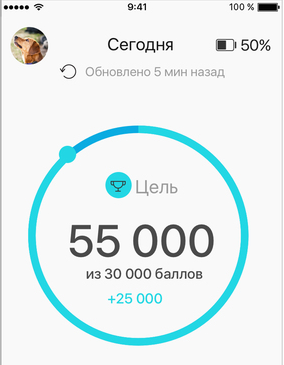
A related question that we often discussed was the need to reduce the numbers when we talk about points. The reason is simple: at first we divided the details into 1000-2000 points or even hundreds. Hundreds of shoals first: they are often confused with percentages and this is a bad association.
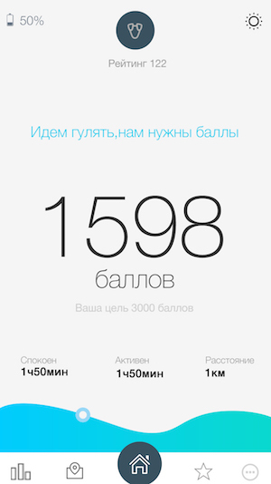
Then we added another “zero”, started testing the device algorithms, and saw that with a score of about 2000, you already have additional points for a large number of steps. That is, you will receive a conditional +1 point not for 15 steps, but for at least a hundred. And since the whole tracking happens almost in real time, it seems that there are no updates or they do not work when you walk a short distance. Then we came to more frightening numbers (20-30 thousand), which in return give a tangible result with any number of points. I walked - got a couple of thousand, walked a couple of steps - got a couple of dozen points.
As a result, we brought the design of statistics to this minimalist form:
How do you like it? Let's discuss)
Source: https://habr.com/ru/post/402383/
All Articles