Mozilla has introduced a new logo and style of the company.

The Mozilla Foundation presented its new logo and corporate identity to the public. The announcement took place in the official blog of the developer Firefox.
At the public court a new design was issued in order to receive feedback from the community, which, in the opinion of the company, should participate in the choice of design.

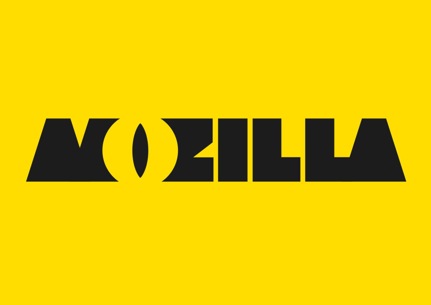
New company logo
')
The choice of a new logo and style began in the summer of 2016. Then the company also asked the community to leave feedback on possible design options. No vote was taken, but Mozilla listened to opinions that everyone could leave in the comments.
One of the previously considered new logo options
As a result, the winner came out the option where the letters I and two L in the title are stylized as a colon with two right-slashes ": //", a combination that is used when entering any URL-address.
Presentation video of the new design
The new logo uses the free font Zilla, which was created by Typotheque especially for Mozilla. In the future, the font will be available to everyone.
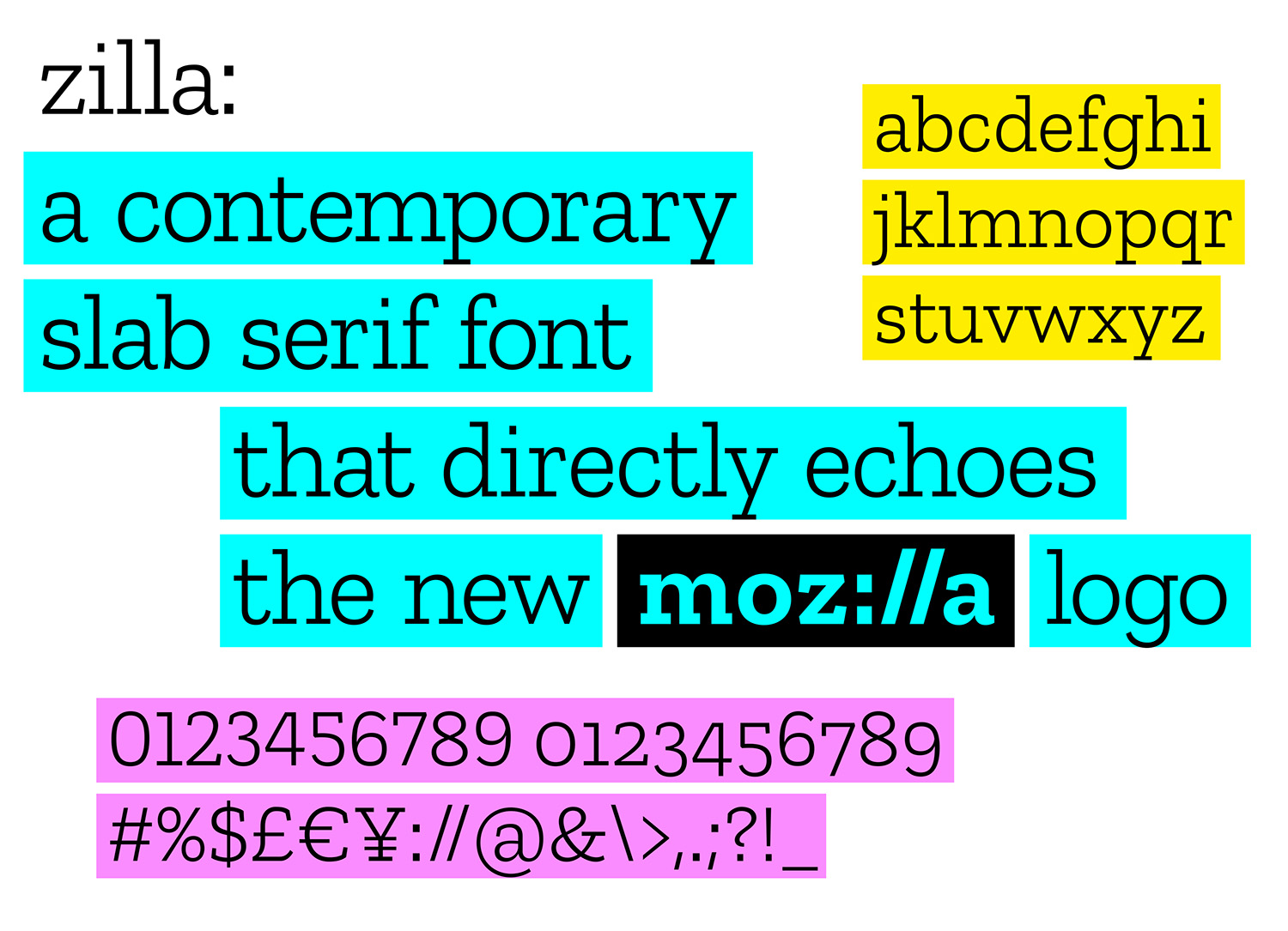
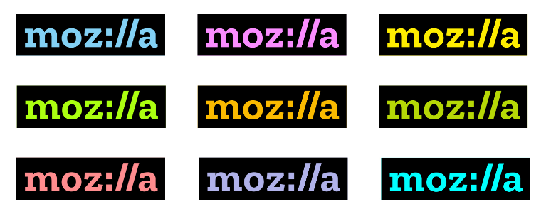
The minimalism of the logo (free font with black underlay) at the same time opens up the opportunity for the company to “play” with the color palette, filling its own logo with symbolism, which is directly stated in the blog. Mozilla plans to change the color of its own logo depending on the situation and context.
You can leave a feedback about the new logo and style of the company in the official Mozilla blog .
Source: https://habr.com/ru/post/400713/
All Articles