Pavel Durov commented on the redesign of "VKontakte"

Tonight, from August 16 to 17, the social network VKontakte forced all users to a new version of the design. Large-scale changes affected all sections of the site. Pavel Durov, who has not taken the position of general director of the social network for quite a long time, nevertheless spoke about the update on his personal page in VK:
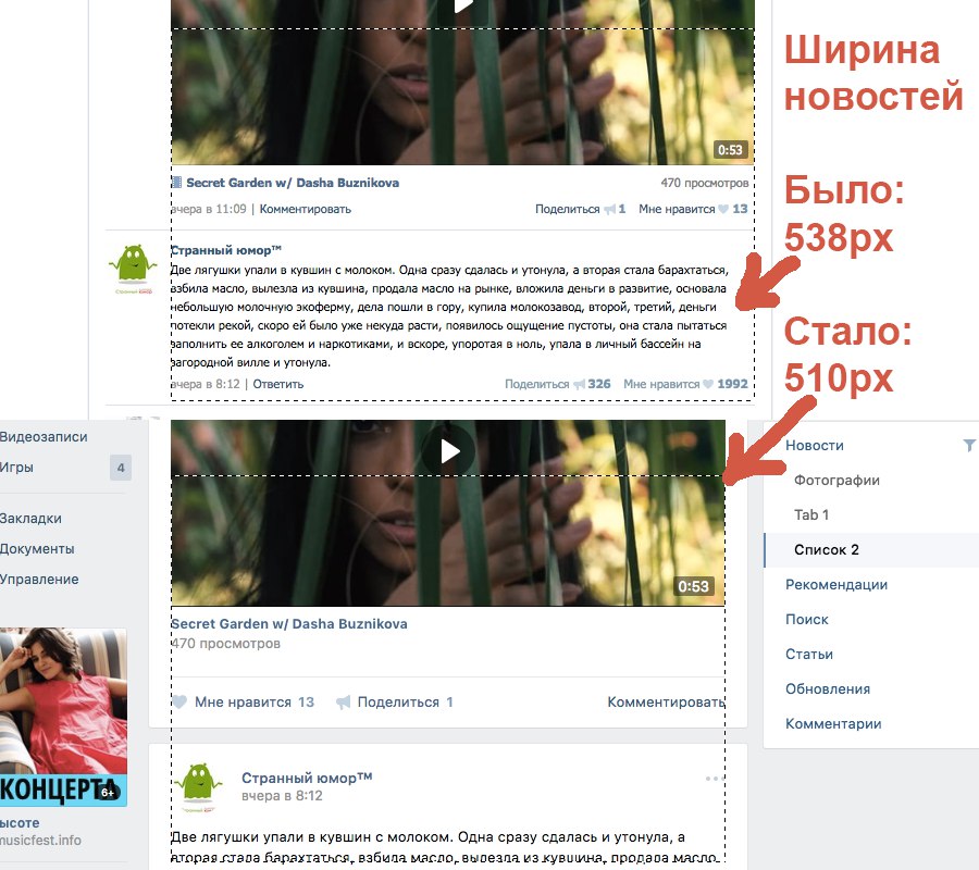
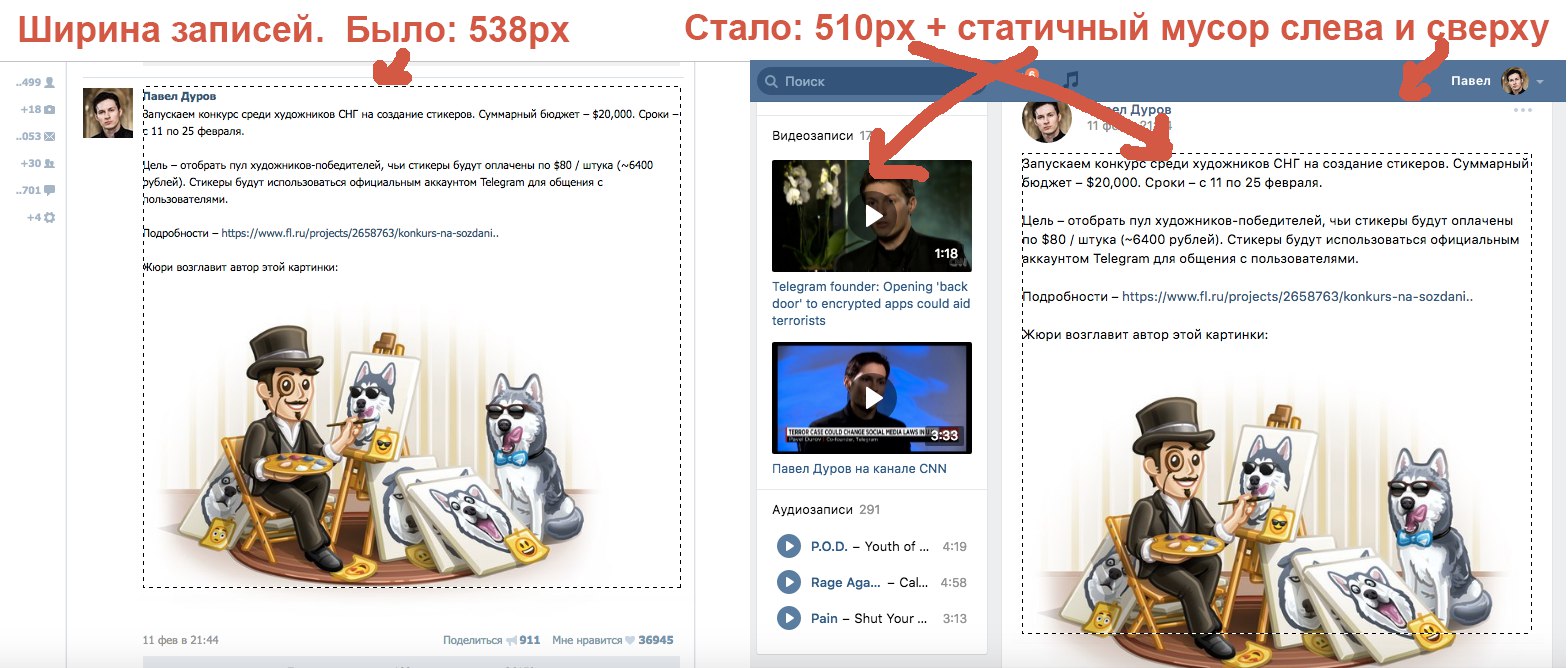
1. The main section of the site - News - has already become. Paradoxically, the need for redesign was justified by the desire to more effectively use the screen. In fact, if we compare the width of the records in the old and the new version, the news only narrowed by 28px.
')
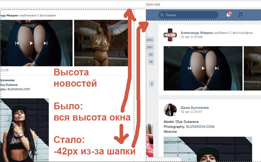
2. News - like all other sections - are down 42px. Due to the fixed header, the vertical space of the site has become less, you need to scroll more. This is a serious change for the worse: it is the vertical scroll that represents the deficit on most displays.
3. When viewing the main section of the site - News - the focus on content is lost. In the new version, visual garbage appeared in the form of a rarely used fixed right column. Given the fixed caps and narrow widths, viewing the news has become doubly cluttered.

4. When viewing photos lost focus on the picture itself. The photos are shifted to the left, and the bright spot of the white comment column that appears on the right pulls the focus of attention on itself. This solution was copied from Facebook, which once introduced the right column to accommodate additional ad units.

5. A static left column when flashing old records of personal pages not only does not provide the necessary information, but also narrows the horizontal space for viewing records in comparison with the old version. A similar situation is observed when viewing records in groups and public.
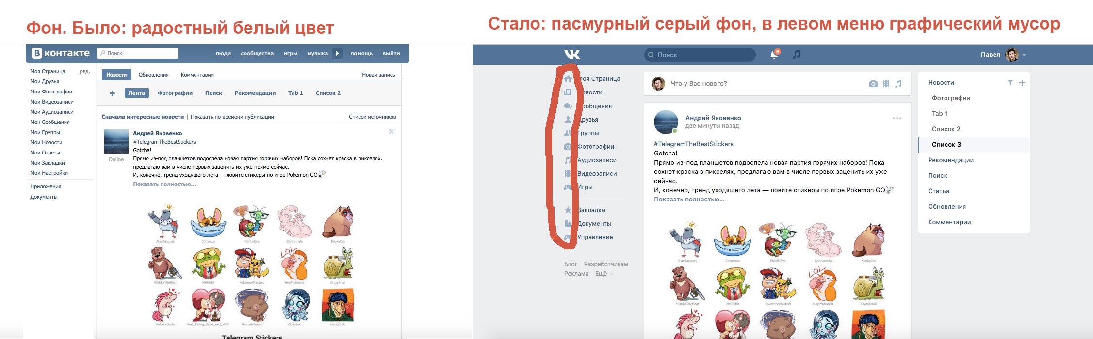
6. Replacing the white color of the background with gray not only reduced the feeling of cleanliness and minimalism, but also generally made the site more sad and cloudy. The gray icons that appeared on the gray menu on the left on all pages are redundant and represent visual trash.
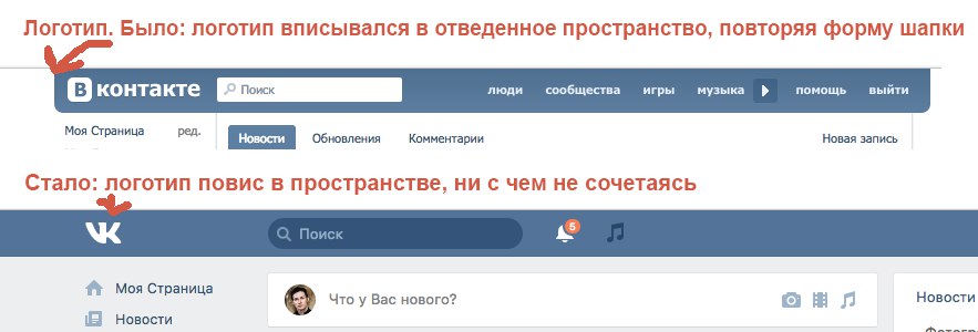
7. The old “VKontakte” logo, due to the composition, fit into the horizontal cap better than the new “VK” logo. I drew both logos quite a while ago (the first about 10 years ago, the second about 5), but in the Russian version I did not replace the old logo with an international one precisely because of this — fairly obvious — circumstance.
Bottom line: the old VKontakte design, which has not changed for several years, certainly needed a number of improvements and aesthetic rethinking as part of the new styles. However, the redesign not only does not meet the standards of 15-16 years (such as Material), but also reduces the usability of the resource.
All the listed elements of the new design were blindly copied from Facebook 2012. Facebook was forced to increase profitability during the IPO during these years, therefore in designing the design it sacrificed the interests of users for the sake of adding new ad units. From here came the right column in the News and Photos, and the reduction of focus on content for the sake of advertising.
Today, when the monetization of VKontakte is transferred to the “smart” tape and mobile clients, such steps are not justified. In 2016, Facebook had to copy the VKontakte experience, and not vice versa.
In general, the innovation of social network users met negatively. For many, rejection is caused by new navigation, opinions were expressed about a not entirely successful font, from which the eyes get tired on non-Retina displays.
Also, the analogies in terms of making photo comments with another project belonging to Facebook - Instagram are very clearly seen. The image viewing window and its general structure almost completely copy the competitor's photo service.
The Vkontakte leadership apparently returned to the practice of copying competitor solutions in the person of Facebook, and with a serious delay, changing the course taken by Durov about 5 years ago to independent development.
Source: https://habr.com/ru/post/396799/
All Articles