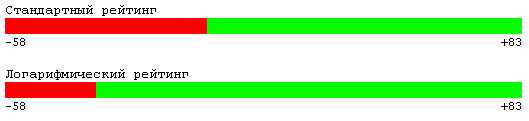
Logarithmic rating
Given : there are articles, you can vote for them. Moreover, the result of the vote is not one digit, but both, i.e. all the pros and all the cons. Both numbers will be output, as well as a bar graph illustrating them.
Find : the best way to present graphics, relative to numbers.
Solution : there are two obvious options: to present the ratio of points linearly and logarithmically. On the one hand, the linear representation is banal and it doesn’t see the preponderance of votes (difference on the 100-pixel 1500 strip from 1400), on the other hand, everyone is accustomed to the linear one and the users will not be afraid of the overweight, as large as the whole graph and 1500 (no overweight).
The logarithmic has pros and cons, directly opposite to the linear: the overweight is immediately visible, but the graph is not linear (sorry, pun) and the user doesn’t immediately see through his chip.
')
A question to the community : how much more clearly / more practical / would you rather do in this situation? It is worth considering that the strip is only attached to real numbers, i.e. the truth can be seen on them.
To understand what, in fact, the question, you can pull a large prototype on oowl.ru/tools/rating .
Source: https://habr.com/ru/post/37818/
All Articles