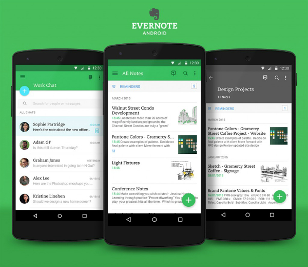
Evernote for Android adopted the Material Design from Google
Last year, Google announced a fresh approach to the design of applications for the new version of Android - Lollipop. Immediately after that, the Evernote for Android team sat down to work on the corresponding update for the Evernote 6 for Android released last year.
We discussed the new design features with product manager Theresa Pittappilly and designer Adam Glynn-Finnegan to better understand what is behind these changes.
')
What improvements did the new version get?
Theresa : We set ourselves two key tasks. First, we relied on user feedback to improve a number of aspects of the application. Secondly, we wanted to take into account the features of Material Design for Android Lollipop. For us, this meant supporting the latest concepts of Google, compliance with the guidelines for the new appearance of the application and unification of the application on all devices.
Adam : When we looked at the material design, it turned out that Evernote 6 for Android is already close to it visually, so the changes may seem insignificant. Nevertheless, they are very important for comfortable work with the application as a whole.

What is the Material Design approach, and how has it influenced the update of the current Evernote design for Android?
Adam : Material Design is the most recent Google vision of how an Android app should look and work. It demonstrates how well a high-quality visual design can be combined with the capabilities of modern Android devices. In a nutshell, we can say that Material Design is designed to provide an intuitive and concise interface.
The rules are quite flexible, so we had space for creativity. We wanted the app to reflect the new approach from Google, but at the same time retain the unique features of Evernote.
Can you describe the visual look of the new Evernote for Android?
Adam : He absorbed the best of a flat design, at the same time receiving tactile elements - shadows and depth. The latter are a kind of tips when working with the application. Since each interface element exists as a separate layer, we can view the application not as a single screen, but as a combination of several independent layers.

On top of this, we added a light animation designed to make the navigation and transitions between screens more comfortable for the eye. The combination of depth, layers and movement allows you to provide a sense of hierarchy and expediency of each component of the application.
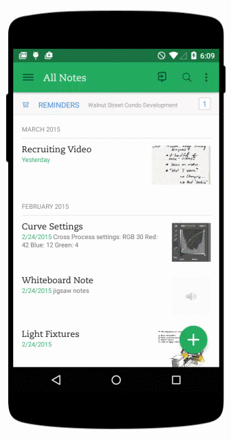
Visually, you can evaluate only a fraction of these changes. For example, we have significantly simplified the design of the editor notes. Evernote is your workspace, and we wanted to remove all unnecessary and make it as concise as possible so that nothing distracts you from your current work.
Teresa : The application also received new Evernote functions for collaboration in a convenient and easy-to-learn way. In the note viewing mode, photos of colleagues working with you on this note are currently visible. This is combined with easy access to Work Chat, where you can discuss the work - this way provides a dynamic and lively environment for interaction in Evernote.

How did the user feedback influence the design?
Adam : We tested the beta version, which turned out to be very useful - we received a lot of feedback. In most cases, these reviews have shown us in which cases it is necessary to deviate from the principles of Material Design. Some of Google's recommendations did not fit Evernote, and users have reported this. As a result, we got a fully unique application.
Teresa : User experience formed the basis for the redesign of some buttons. For example, we added the ability to customize the actions of the new note button and change their order in the list. And this button is the main for the entire application. We sought to provide users with the flexibility to create their own system. We believe that the best workspace is one that takes into account the variety of tasks and features of individual users.
Some users are surprised by the differences in the design of Evernote for Android and Evernote for iOS. Why are they so different?
Theresa : The only way to make these applications similar is standardization. In order to implement identical solutions for different platforms would have to sacrifice the uniqueness of each platform.
Adam : It is this philosophy that helps Evernote to make our applications organic for each platform, we think it improves the usability of them. Therefore, as an Evernote designer, I constantly create a design taking into account the features of the platform. We did this update on the same principle, and this allowed us to get a very modern Android application.
Try Evernote for Android >>
Source: https://habr.com/ru/post/377363/
All Articles