Office 2016 for Mac is available to anyone.
Just recently, Microsoft released the beta version of the long-awaited Office 2016 for Mac. The previous version of the office suite for OS X was released more than five years ago, and many users complained about the lack of support for Retina-displays, slow roll-out updates for Yosemite and other inconveniences.
However, not so long ago, Microsoft released its office applications for iOS, the OneNote diary appeared in the Mac App Store, and some time later, screenshots of the new Outlook appeared on the network. It became obvious that soon the world would see the new Office suite under OS X, and a couple of days ago, without any press releases, Preview became available for download.
The short review and some screenshots of the new version - under a cat.
')

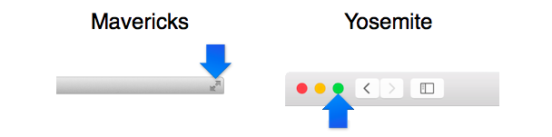
The devil is known to be in the details. For example, only a few months ago one of the updates in Office 2011 was added to the standard full-screen mode (when the entire application occupies a separate virtual desktop). At the same time, the implementation was carried out according to Mavericks guidelines, although Yosemite was released a long time ago! In fairness, now everything is in order, but the sediment remained.
The first thing that catches your eye after installing Office 2016 is newnon-boring icons, see the first picture. They immediately hint that the whole package was aligned with the style of OS X 10.10, and this is true: the old interface is in the best traditions of skevomorphism behind. Engadget's Gif shows well how the look has changed:
The contrast between flat Yosemite and volume, "toy" icons, old controls really hurt the eyes. Microsoft designers managed to find the perfect balance between visual cleanliness of flat design and standard solutions like Ribbon-panels or a colored status bar.

The Register collage allows you to evaluate how successful and consistent the final solution looks:
The layout of the controls is almost the same as the Windows version, but the window control buttons are placed in the window title in the same way as in standard Apple applications. Functional elements in the title and icons in the status bar are flat and look organic. If you grab and drag the file name placed in the header, then the current document file will appear under the cursor - again, the standard behavior of native programs (unfortunately, you cannot rename or duplicate the file by clicking on the name).
However, the most important happiness is that the names of the Ribbon tabs are NOT CAPSOM typed, but they could have. In the above-mentioned outgoing screenshots of Outlook it was exactly like that. Ffuh, carried by.
Well, the most long-awaited - support for Retina-displays. Everyone is happy.
Short work in Word did not cause any discomfort - everything functions as it should. From the number of noticeable changes is to highlight the new tabs ribbon menu, "Designer" and "Layout." The set of tools placed on these panels is a cross between the Paragraph window, where text settings are configured, and the old Markup panel.

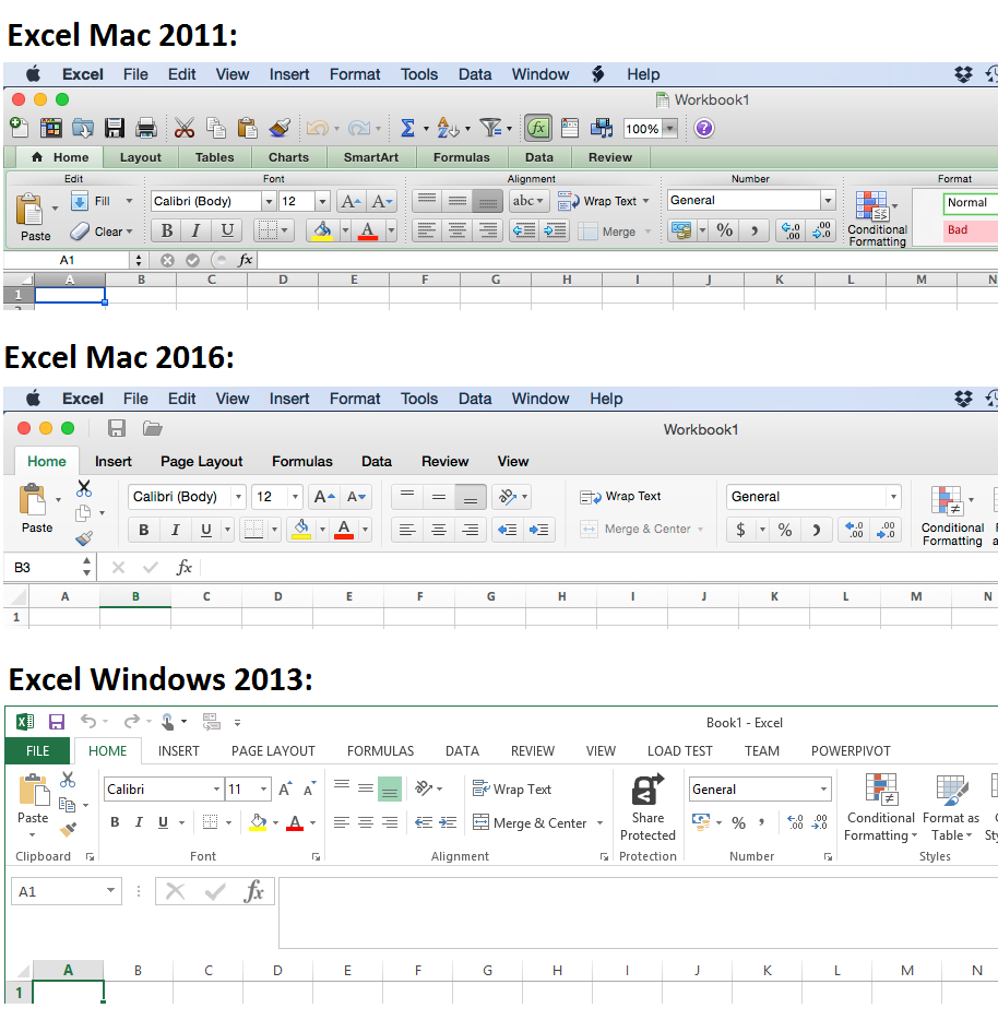
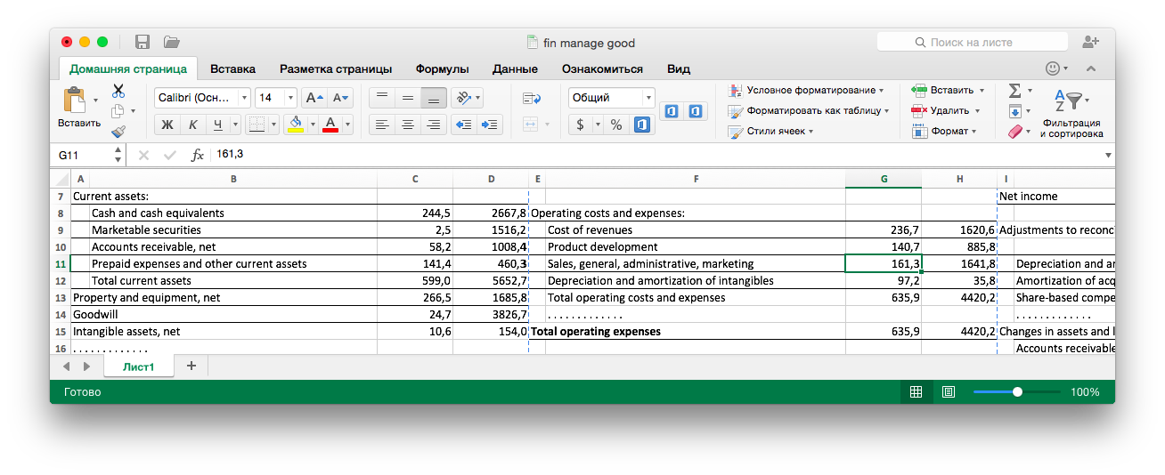
The only point in Word that is still puzzling is the lack of a smooth scrolling of the document. In search of consolation, I launched Excel, which under Windows recently allows you to scroll a sheet without jerks the size of a cell, and was unpleasantly surprised by the selective responsiveness of the interface.
For some reason, the application did not always respond to attempts to select or start editing cells. The sheet was scrolling, the buttons on hover were highlighted, the program did not freeze, but stubbornly ignored any press on the sheet for several seconds. It was not possible to reproduce the bug and determine the causes of the problem, so I did not use the feedback, which is available for the testing time by a smile in the upper right corner. Frankly, at first I suggested that this is an Emoji panel, and I have mixed feelings.
However, smooth scrolling in Excel is not the only pleasant change. More admirable change in the scale of the sheet with a double-finger gesture! Pleasure and response are comparable to viewing pdf. Not so fast, but at least support for pinch-gesture is implemented in PowerPoint. Alas, Word and this feature does not support.
All the rest does not cause any complaints. Worse than before, it definitely did not :-) For example, personally, my old Office was working on hotkeys to “copy” and “paste” with a delay of about half a second, which is why the text often did not get on the clipboard. Now there is no such problem.
The main change in the new version of the office suite is tight integration with Office 365. When saving a document, the online storage is offered each time by default, an extra click is needed to go to the local disk, hence the conclusion: the emphasis is placed on the cloud component.
At the moment, it is not known exactly how Office 2016 will be distributed. Perhaps the boxed version of the package will not be released. First, it was previously stated that Office 365 subscribers will be able to use the Mac version for free. Secondly, experience has shown that Microsoft does not shy away from releasing its products in the App Store.
The official list of changes looks like this:
By the way, this is how the “Speaker mode” from PowerPoint looks like:

This is an image on the main screen, while on the second screen (or through a projector) the entire presentation is shown simultaneously.
The conciseness of the list of changes forces us to admit that the revolution did not happen. The main goal of the update is to attract corporate users to integrate with SharePoint and OneDrive, as well as to attract individual users with the convenience of Office 365 and sharpen competition with iWork. Especially sensible, it looks in light of recent news about free access to the online version of the office suite Apple.
New Office is good, first of all, because it is new. The visual part was aligned with the surrounding system. The functionality of individual applications has finally grown to Office 2013 under Windows. The main focus is on Office 365, which fits into the general logic of Microsoft.
Despite the fact that the published Office 2016 is just a preview, it looks complete and quite suitable for daily use. At least, much more suitable than Office 2011. Minor bugs will inevitably be corrected for release. Only the translation looks noticeably raw: in the installer and in some places there are hanging lines in the settings, and the names of themes and templates sometimes make Promt recall.

Until the official release of the preview will remain in the public domain. After the start of sales, the use will be possible either with an Office 365 subscription, or through the purchase of a license (the existence of such an opportunity and the cost is still in question).
Download Office 2016 for Mac Preview for free, without registration and SMS - http://products.office.com/ru-ru/mac/mac-preview
However, not so long ago, Microsoft released its office applications for iOS, the OneNote diary appeared in the Mac App Store, and some time later, screenshots of the new Outlook appeared on the network. It became obvious that soon the world would see the new Office suite under OS X, and a couple of days ago, without any press releases, Preview became available for download.
The short review and some screenshots of the new version - under a cat.
')
Interface
The devil is known to be in the details. For example, only a few months ago one of the updates in Office 2011 was added to the standard full-screen mode (when the entire application occupies a separate virtual desktop). At the same time, the implementation was carried out according to Mavericks guidelines, although Yosemite was released a long time ago! In fairness, now everything is in order, but the sediment remained.
The first thing that catches your eye after installing Office 2016 is new
The contrast between flat Yosemite and volume, "toy" icons, old controls really hurt the eyes. Microsoft designers managed to find the perfect balance between visual cleanliness of flat design and standard solutions like Ribbon-panels or a colored status bar.
The Register collage allows you to evaluate how successful and consistent the final solution looks:
The layout of the controls is almost the same as the Windows version, but the window control buttons are placed in the window title in the same way as in standard Apple applications. Functional elements in the title and icons in the status bar are flat and look organic. If you grab and drag the file name placed in the header, then the current document file will appear under the cursor - again, the standard behavior of native programs (unfortunately, you cannot rename or duplicate the file by clicking on the name).
However, the most important happiness is that the names of the Ribbon tabs are NOT CAPSOM typed, but they could have. In the above-mentioned outgoing screenshots of Outlook it was exactly like that. Ffuh, carried by.
Well, the most long-awaited - support for Retina-displays. Everyone is happy.
Experience of use
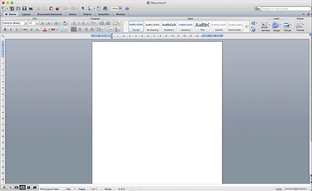
Short work in Word did not cause any discomfort - everything functions as it should. From the number of noticeable changes is to highlight the new tabs ribbon menu, "Designer" and "Layout." The set of tools placed on these panels is a cross between the Paragraph window, where text settings are configured, and the old Markup panel.
The only point in Word that is still puzzling is the lack of a smooth scrolling of the document. In search of consolation, I launched Excel, which under Windows recently allows you to scroll a sheet without jerks the size of a cell, and was unpleasantly surprised by the selective responsiveness of the interface.
For some reason, the application did not always respond to attempts to select or start editing cells. The sheet was scrolling, the buttons on hover were highlighted, the program did not freeze, but stubbornly ignored any press on the sheet for several seconds. It was not possible to reproduce the bug and determine the causes of the problem, so I did not use the feedback, which is available for the testing time by a smile in the upper right corner. Frankly, at first I suggested that this is an Emoji panel, and I have mixed feelings.
However, smooth scrolling in Excel is not the only pleasant change. More admirable change in the scale of the sheet with a double-finger gesture! Pleasure and response are comparable to viewing pdf. Not so fast, but at least support for pinch-gesture is implemented in PowerPoint. Alas, Word and this feature does not support.
All the rest does not cause any complaints. Worse than before, it definitely did not :-) For example, personally, my old Office was working on hotkeys to “copy” and “paste” with a delay of about half a second, which is why the text often did not get on the clipboard. Now there is no such problem.
Innovations
The main change in the new version of the office suite is tight integration with Office 365. When saving a document, the online storage is offered each time by default, an extra click is needed to go to the local disk, hence the conclusion: the emphasis is placed on the cloud component.
At the moment, it is not known exactly how Office 2016 will be distributed. Perhaps the boxed version of the package will not be released. First, it was previously stated that Office 365 subscribers will be able to use the Mac version for free. Secondly, experience has shown that Microsoft does not shy away from releasing its products in the App Store.
The official list of changes looks like this:
- New themes, styles and templates in Word, Excel, PowerPoint.
- Support for tree comments in Word and PowerPoint.
- Excel finally supports the Data Analysis package (hooray!), Slices in pivot tables, almost all the functions from Excel 2013, and also new charts and Microsoft Equation. Work hotkeys Windows-version.
- Word received the Layout tab (see above), the document navigation bar was improved.
- PowerPoint, in addition to the usual slide show, has got a “Speaker Mode” (convenient for a dual-screen system or a projector), supports animation and transitions from PowerPoint 2013. Removed the ability to save to QuickTime format.
- Outlook supports Message Preview and Online Archive, whatever that means. But Exchange is now only 2010 and higher. I have no idea why the hell with such an Outlook.
- OneNote, which has been distributed separately for free for a year, has been added to the kit.
By the way, this is how the “Speaker mode” from PowerPoint looks like:
This is an image on the main screen, while on the second screen (or through a projector) the entire presentation is shown simultaneously.
The conciseness of the list of changes forces us to admit that the revolution did not happen. The main goal of the update is to attract corporate users to integrate with SharePoint and OneDrive, as well as to attract individual users with the convenience of Office 365 and sharpen competition with iWork. Especially sensible, it looks in light of recent news about free access to the online version of the office suite Apple.
Conclusion
New Office is good, first of all, because it is new. The visual part was aligned with the surrounding system. The functionality of individual applications has finally grown to Office 2013 under Windows. The main focus is on Office 365, which fits into the general logic of Microsoft.
Despite the fact that the published Office 2016 is just a preview, it looks complete and quite suitable for daily use. At least, much more suitable than Office 2011. Minor bugs will inevitably be corrected for release. Only the translation looks noticeably raw: in the installer and in some places there are hanging lines in the settings, and the names of themes and templates sometimes make Promt recall.
Until the official release of the preview will remain in the public domain. After the start of sales, the use will be possible either with an Office 365 subscription, or through the purchase of a license (the existence of such an opportunity and the cost is still in question).
Download Office 2016 for Mac Preview for free, without registration and SMS - http://products.office.com/ru-ru/mac/mac-preview
Source: https://habr.com/ru/post/377185/
All Articles