Millennial features cards
Maps are a product that countless people have been working on for more than six thousand years. Cartography appeared before writing, and the methods of drawing the terrestrial and sea surfaces changed along with the entire human civilization: from the first rock paintings to digital online and offline maps containing ethnographic, economic, and social information about the inhabitants.
From the first day, when the maps were used for orientation in the world, they revealed weaknesses: rivers changed channels, fires destroyed forests, settlements of people wandered from place to place, making it difficult to fix objects on the map. So the history of maps is also the oldest history of fixing bugs in an attempt to create the perfect product.
')
Today we will decide whether centuries later we succeeded in approaching the canonical scheme of reflecting the world.
The oldest maps of the world
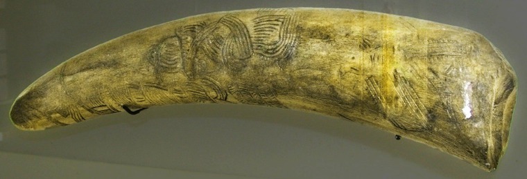
In the picture above, you see an exact copy of the original piece of mammoth tusk found near the town of Pavlov (Czech Republic). After years of research, the ornament on the tusk has been recognized as the oldest known card known today. Her age is estimated at 25–27 thousand years. The tusk depicts bends of the river, ridges, ravines of loose loess slopes, rocky peaks and the house of hunters.
Such a map even for its creators could not serve for a long time. It was necessary to change the drawing each time, make a new map, or find a fundamentally different way of targeting the terrain.
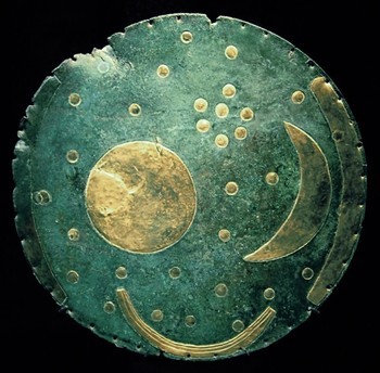
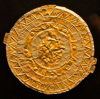
On the left is the Bronze Sky Disc from Nebra. On the right is Murdorf's golden disk (possibly a fake ). Both disks contain maps of the location of celestial bodies.
How to fix the image of the area, if the territory is undergoing constant transformation?
Perhaps you should be guided by unchanging objects - the stars. A polar star entering the Ursa Minor constellation always points to the north, deviating only one and a half degrees during the night (due to the precession the role of the polar star at various times was assigned to different stars). Knowing where the Polar Star is located, it is easy to determine the directions of the world: when you look directly at the star, you will find east on the right, west on the left, and south on your back.
The first constellations were singled out about 16 thousand years ago and fell into various drawings of Paleolithic art. It should be borne in mind that the cartographic feature of the drawings of the night sky was used as a side effect. The heavenly disk from Nebra (≈ 3000 years BC), which depicts the Sun, the Moon and 32 stars, was supposedly used to measure the angle between the points of sunrise and sunset at the time of the solstices.
Selection of perspective
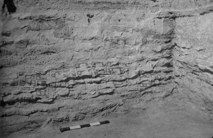
More than 6000 years ago, the first maps appeared from above. The fresco in the ancient settlement of Chatal-Huyuke is regarded as a detailed plan of the settlement. The streets in the village were not marked - probably, the isolation of each house was shown by bright lines.
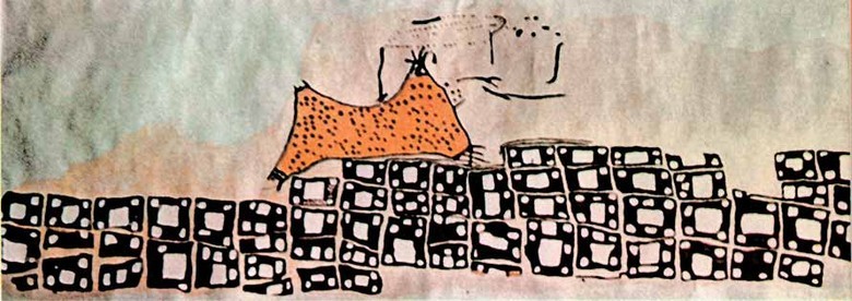
Modern map reconstruction in Chatal-Huyuk. The orange color indicates the supposedly real volcano. White rectangles - houses covered with flat roofs
Many later authors followed a similar map of the terrain. Almost all modern maps today are depicted as a top view.

Fragment of the Turin Papyrus Map - the first known topographic map
The first map, which can now be called really big and detailed, appeared around 1160 BC. e. and showed the mountains east of the Nile. The reconstructed Turin papyrus map is 280 by 41 cm in size.
Symbolism and reality
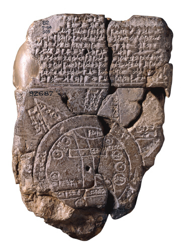
The first map of the entire known world (≈ 600 BC)
Closer to our era, cartographers begin to add politics / religion to facts, distorting the real picture of the world. Thus, there was no place for the Persians and Egyptians well known at that time on the Babylonian map, but much attention was paid to mythological elements, and the edge of the world was displayed according to religious conviction - the world ocean ring.
Earth according to Hecatea, 5th century BC. e.
Similar “problems” after hundreds of years arose among the Greeks. In ancient Greece, the world was depicted as a flat disk surrounded by constantly moving streams of the ocean. The Greeks themselves were naturally located in the center of the disc, and savages and monsters settled along the edges.
However, cartography from the Greeks received projections, meridians, parallels.
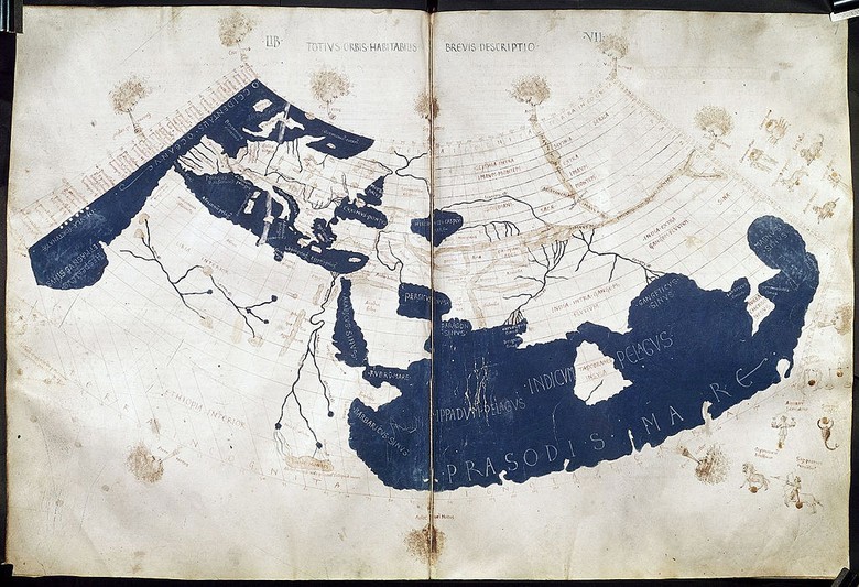
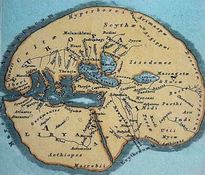
Map of Ptolemy in the reconstruction made in the 15th century
With the advent of our time, and especially in the Dark Ages, the cartographic art in Europe was lost. When in China and the Islamic world maps became more informative and more accurate, in Europe until the era of the Great Geographical Discoveries, the Ptolemy map created in the second century remained the best. Ptolemy developed conic and stereographic cartographic projections, indicated the latitude and longitude of each place to facilitate the search, scale, conventional signs with a legend — those basic elements of maps that we use even now. He also determined that the north on the map should be at the top, and east on the right.
Despite a large number of errors (for example, the Atlantic and Indian oceans are separated on a map), the map has remained popular for many centuries. For the territories of internal Africa, it was the only one at the beginning of the XIX century.

Map of Kazvini , 1340
In many ways, the traditions of Ptolemy continued in the Arab world, where, as early as the 10th century, instructions appeared for creating a rectangular map of the world with equidistant rectangular or cylindrical projections. On maps of the historian and geographer Hamdallah al-Mustafi al-Qazvini, all unnecessary geographical details are removed, only vertical and horizontal lines intersecting at a right angle, and arcs of circles are left. Guided by the same principles in cartography, in 1931, Harry Beck draws the London Underground Tube Map for the London Underground . If you compare it with the current map of the Moscow metro, you will see negligible differences.
Quick reference book of all
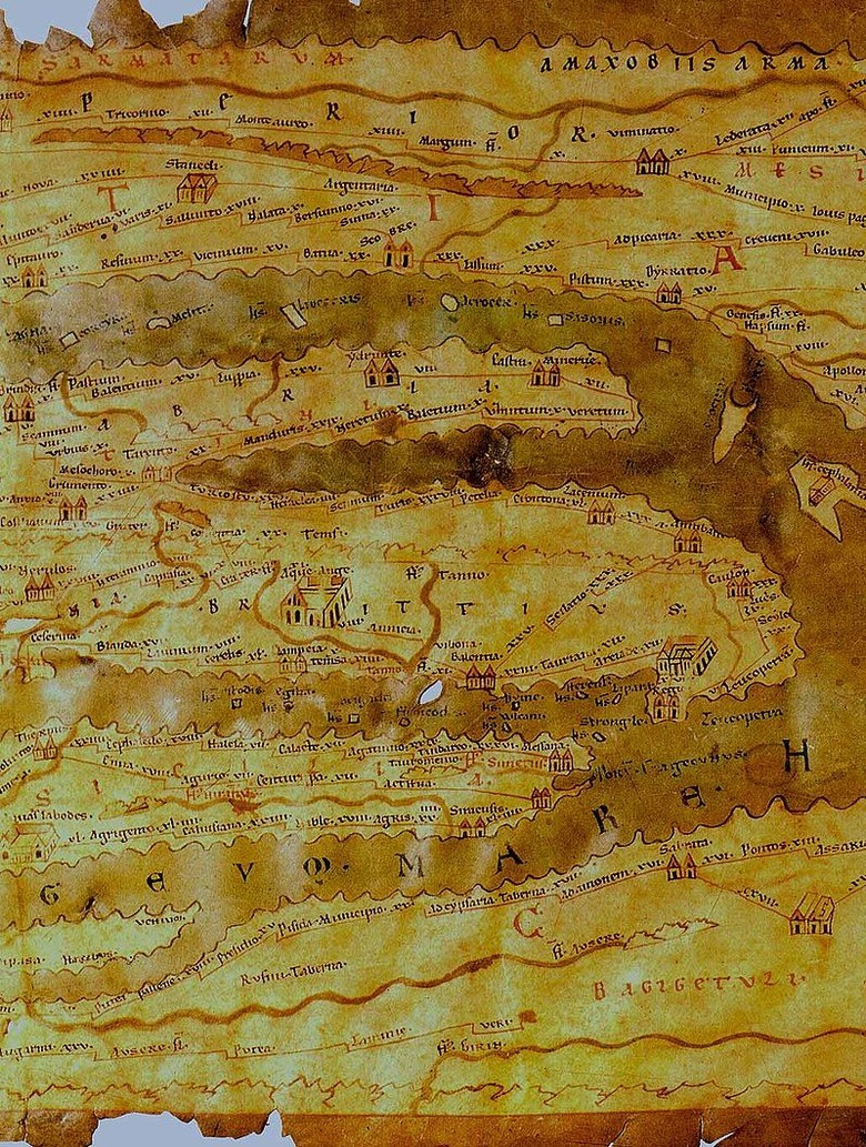
Peutinger table (fragment), created in the period between 1 century BC. e. and 5th century AD e. The map is 6.75 meters long and 0.34 meters wide. On the map are 555 cities and about 3,500 sights.
In the Roman Empire, the idea of adding additional information on maps was absolutized. Maps did not show the terrain, laws of perspective and scaling were not respected, and the roads were depicted only schematically, but the traveler could find on the map information about the stops on the way, the length of individual segments, obstacles or notable places (main cities, temples). After nearly two thousand years, we similarly use the map not only as a way to find the shortest path, but also as a reference book of objects.
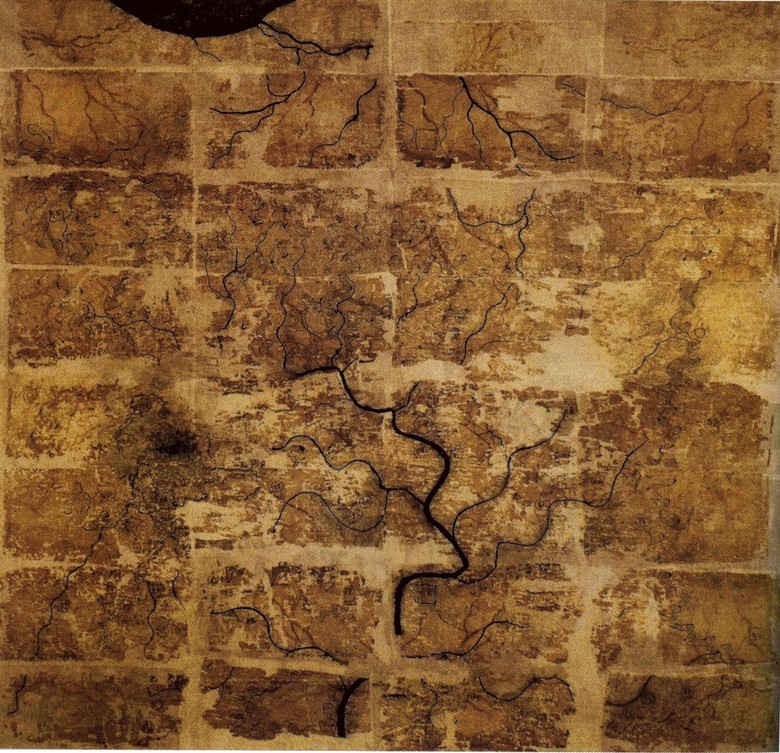
The Han Dynasty Silk Card , around 200 BC. e.
Similar conclusions about the need to add additional useful information to the maps a little earlier came in China. The oldest maps of Chinese territories 4th century BC. e. already contained the economic structure of administrative districts. Maps of the Han Dynasty included information on local military sites and population.
Vertices of cartography
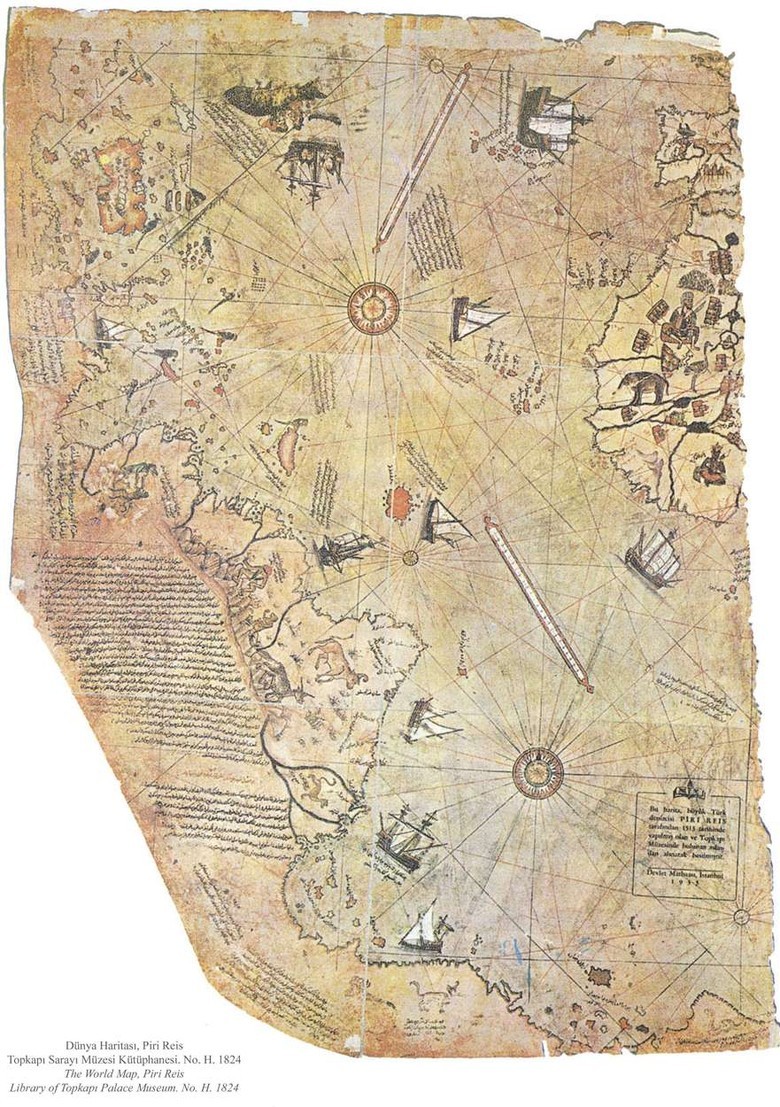
The restored fragment of the Piri-Reis map (1513), which is considered the first authentic map of the modern world. The map, which is a compilation of many sources, contains a large number of puzzles, including the image of the territory associated with Antarctica, officially opened only in 1820. However, the hypothetical “southern lands” were drawn on maps as far as Piri-peis, based only on assumptions
The invention of the compass, telescope, sextant, and other instruments of marine navigation, and the subsequent period of the Great Geographical Discoveries, led to a real boom in cartography. Real masterpieces were created, here and there erroneous from the point of view of geography of objects, but beautiful in details of execution.

Card Bünting Clover Leaf , 1581
In the 13th century, the so-called "T and O" maps (Orbis Terrae, the globe of the Earth) appeared, where "T" is the Mediterranean Sea, the Nile River, and the Don River, dividing the three continents - Africa, Europe and Asia, and "O" - this is a ring ocean. The center of the map was Jerusalem. Empty places on such maps have traditionally been filled with images of mythical creatures.

The largest map, made in T-On design, is the Abstorf map , created from 30 goat skins in the size of 3.58 × 3.56 meters. It was used not for real travel, but to illustrate the facts about the basics of the universe, mentioning, on a par with real geographic objects, events of biblical history and ancient mythology. Such an example of medieval infographics .

A copy of the card " Carta Marina ", made in 1949
The “Carta Marina” map of 1539 is noteworthy because on it, perhaps for the first time, images of creepy sea creatures began to be of practical use - they correspond to currents, storm fronts, dangerous underwater rocks and shoals.

The map of Venice of 1565 is made in a style that is still used in tourist guides.

Equal-angle projection of the Mercator , thanks to which it is possible to build nautical charts on which the ship’s course is represented by a straight line
In 1569, the cartographer Gerard Mercator, trying to make the world display on maps "right looking," developed a new projection using mathematical formulas. With the Mercator projection, the cards take on the familiar look.
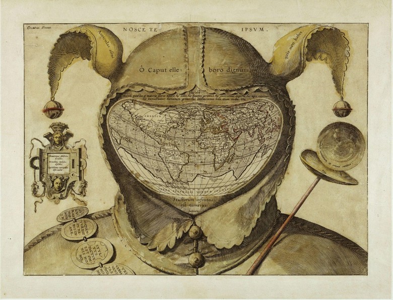
"The World Map placed in the head of the Fool", 1590. The map depicts the world as "dressed" in the traditional entourage of a court jester: a two-horned cap with bells and with a jester's staff

The map of Klas Janson Vishera "Leo Belgicus", 1611. Leo Belgicus is the Latin name for the Dutch lion. Since 1583 the Netherlands has often been depicted as a lion. The map shows the truce period between Spain and the Seven United Provinces of the Netherlands.

In 1675, John Ogilby depicted narrow stripes on the road map, excluding the rest of the surrounding space, leaving only the objects necessary for orientation. This old map became the prototype of maps in modern car navigators.

The fashion on the axonometric projection in the maps was set by the French in the detailed plan of Paris drawn up in 1734–1736. The image above shows the Louvre Palace. To assess the scope of work, open the entire city plan . Almost three hundred years later , the Chinese did something similar for the Baidu search engine.
Have you heard of the "travel map"? On such a map you need to paint over / erase a piece of the territory on which you visited, revealing the name and complete geographic information. The first such map was created in 1761 by John Spilsbury, who invented the "cut geographic map". Each individual piece of the map contained some geographic information. By collecting the necessary plots, it was possible to explore the whole world known at that time.
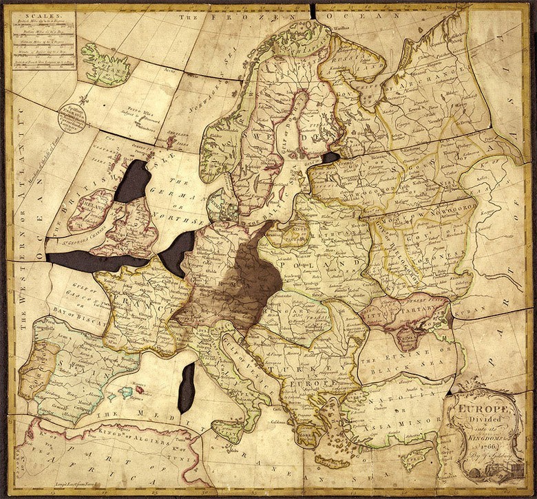
By the 19th century, map makers began to try to visually draw economic, social, political information. However, until the mass introduction of digital maps in the 21st century, the additional information on the maps quickly became outdated.
Ultramodernity
In the 20th century, maps became incredibly detailed due to first aerial photography, then space photography. However, satellite imagery, quickly gaining popularity, also quickly became only a tool for creating schemes. On the scale of the city, they are practically useless. Over the territory of the forest - completely useless. Then projects came to the rescue, in which people began to mark objects that were inaccessible for shooting on their own maps.
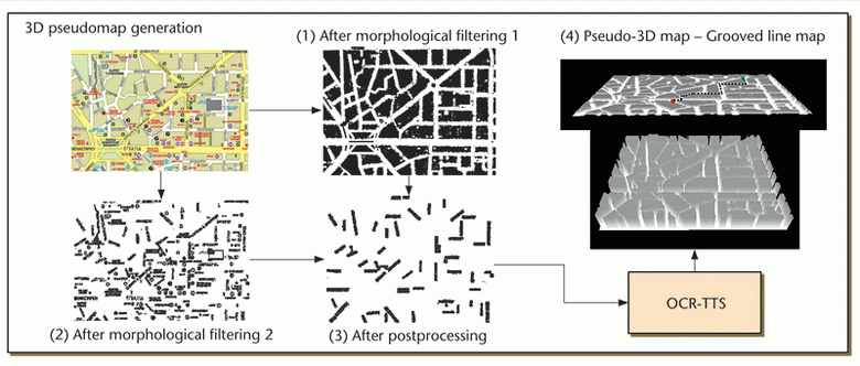
In our time there are maps that reflect the interests of various people. Thus, Greek researchers developed a system that converts images of traditional paper maps into three-dimensional city plans. With the help of virtual reality gloves, the blind can literally touch the map and read the data from it (or turn on the voice engine, voicing the names of the streets).

In Airbnb experimenting with the creation of maps, whose boundaries are outlined on a cultural-contextual basis. On the map above, traditional “tourist” places of residence are highlighted in green, and housing from the Airbnb base is highlighted in red. Any template card advise housing in the "green" zone, but fuller impressions about real life in the city can be found in the "red" territory.
When the white spots finally disappeared, cards with added value quickly became popular. For example, on the map of New York you can see the most criminal areas and areas where you can feel safe.
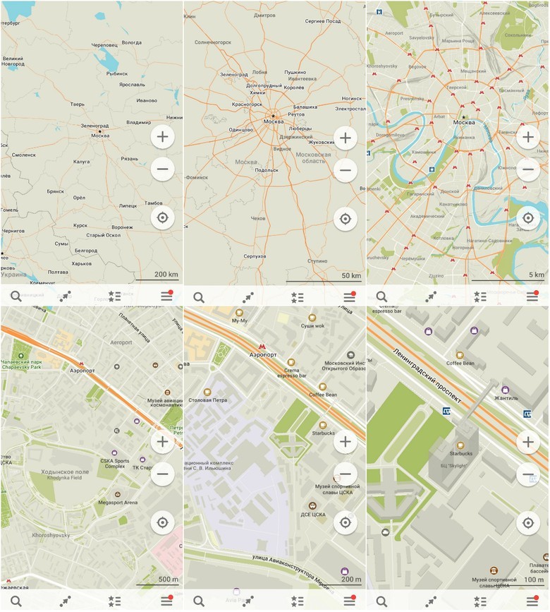
The second open source project in the Mail.Ru Group (after the Tarantool database) was not accidentally the offline MAPS.ME maps based on OpenStreetMap data. The essence of the OSM project (as well as MAPS.ME) is to give every person in the world a free card with which you can do anything. For thousands of years of card history it was hard to imagine such a thing, and only pocket cards appeared only in the 19th century. Now, instead of pockets - a smartphone, but the cards at least do not need the Internet. Another difference between OSM and past mapping is accessibility. Everyone can add to the map on their own almost as easily as editing a Wikipedia article. One of the most notorious MAPS.ME updates this year was the ability to edit maps by the users themselves. Thanks to this, we will be able to find shops, fountains, the best places to take photos on maps.
The advantages of open (in all senses) cards over commercial solutions are in their universality. The same terrain with a different set of data is used in a huge number of situations. With the help of OSM, forest trails and undercoats, food distribution points in the poorest regions, forest fires are marked ... Anything!
Era flaws
Comparing the maps of the past - not only from the Middle Ages, but also two thousand years ago - with the modern ones, one involuntarily concludes that the maps have evolved into a utilitarian information product. The design has become much simpler, and the maps themselves, oddly enough, less detailed. Looking around the three-meter canvas of the Renaissance, you could see dozens, if not hundreds of additional objects along your route. The smartphone proposes to reflect only what reflects the UX-logic of the map creators: that is, the minimum information available per unit area.
You don’t need to hit the digital map with the design, because it seems to be just an add-on above the search bar - we are looking for ATMs, hotels, the shortest way, the nearest point of interest. The map has become not a guide to the world, but a tool to save time. The extra information on it only consumes the time resource of the person. "Folk maps" solve this question as much as they can, introducing filters - there is still an opportunity to see the city with all the diversity of its objects.
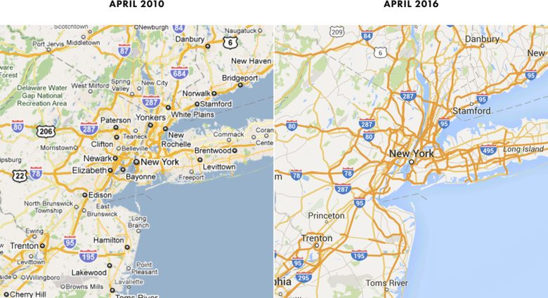
What does minimization of data lead to? The current version of Google Maps is less detailed than it was 6 years ago . This does not mean that some objects from the map disappear: you just need to zoom out. Such a method has both supporters (maps look clearer on a mobile device) and opponents (unfamiliar terrain needs to be scaled and searched in squares if you don’t know the exact name of the object). The map, which at first glance is not overloaded with information, will tell only the shortest route, and not the one where the most beautiful, safe, quiet path opens.
Modern cards are not made by artists / designers, not even cartographers, but programmers. This is the requirement of the era, because if you do not adapt the card for any mobile device, no one will use it. The map has ceased to be a work of art, has lost horrible monsters swallowing ships, while becoming surprisingly monotonous.
However, in comparison with antique cards, modern ones have one significant advantage - they change very quickly. The day is near when the card will become fully personalized. One she will give details that require understanding of all the details and nuances, the other - only a condensed concentrated fact about the terrain.
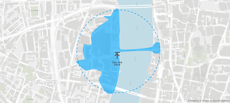
One of the interesting examples of the movement in the direction of "personalization" is the map (with open source) of the real walking places of Galton , built on the basis of OSM. The map is named after Francis Galton, an English explorer and geographer, who in 1881 made a map of the Isochronic passage chart indicating the number of days to travel from the UK to various places.


Fragment of the map of "quiet" areas of New York, obtained from the analysis of data on complaints of noise
What gives such a card? In addition to the obvious solution (where you can get for a certain time, if you do not know how to walk on water and walk through walls), you can calculate the rating of the place, taking into account the many parameters located in the area within walking distance of objects.
***
Sooner or later, a single map of the world will cease to exist, because for different groups of people the world will be filled with different events. Metamorphosis does not affect basic concepts, such as generally accepted state borders or distances between cities, but a motorist, a pedestrian, a cyclist and amateur bars will be able to find in the geography of the surrounding space exactly what interests them.
And the map will again become a source of discovery.
Source: https://habr.com/ru/post/372799/
All Articles