From boiling lead to computers: the history of mathematical typography
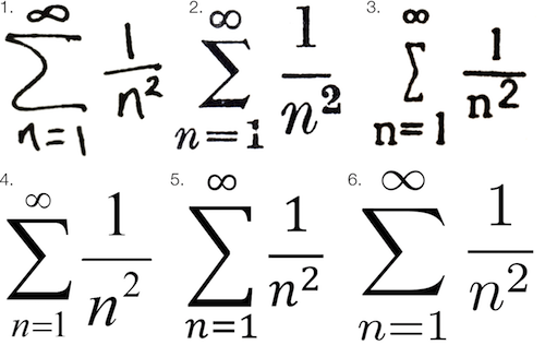
Math fonts of six different printing systems, Chalkdust image
I have always believed that the creation of printed mathematical works is more like a type of art than a conventional polygraph. The one who prints mathematical works is rather not a “typographer”, but an artist, who strives to present abstract data on a two-dimensional surface. Mathematical symbols are themselves a language, but fundamentally it is a visual representation of knowledge gained by a person — knowledge that can be too ineffective if it is conveyed through verbal explanations. This makes printing mathematics closer to the form of data visualization, rather than the usual printed text.
No matter how hard it was to create a printed text - creating printed mathematical symbols was always more difficult. In the pre-digital era, the equation-filled texts were called “penal copies” because the preparation of a mathematical notation for printed presses required a significant extra amount of time and money.
')
Even when modern word processors, for example, Microsoft Word, got editors of equations, they were usually difficult to use and often provided unsatisfactory results. Although LaTeX and systems similar to it provide the highest quality digital math recording, these frameworks create a much higher barrier to learning than conventional word processors.
But all these modern "difficulties" are much more to blame for hedonistic adaptation than any of the tools available to us. It is much easier for us than any other level of civilization, and I believe that it is very important for those who write mathematical texts to have at least a basic knowledge of the history of mathematical printing.
For me, knowing this story has several practical advantages. I began to feel very grateful for the tools that I have today - the tools used to simplify and improve the presentation of quantitative concepts. In addition, it motivated me to strive for greater grace in the presentation of mathematics - I think this aspect of my profession has greatly deteriorated over the past twenty years of the Microsoft Office era.
And the most important thing - it reminded me how much art there was and always was in presenting any languages. Since the pre-Internet press required such a multitude of stages, the participation of so many people, so much physical labor and long wait , that there were much more layers of art between the author’s thoughts and their final presentation on paper. The whole process involved more thinking .
To fully pay tribute to the mathematical printing house, we need to begin to appreciate the entire history of the printing house, which was also the history of human civilization. No other art form has affected our lives more than print.
The first two Internet
Despite the fact that the entire history of printing extends over many centuries, it is difficult not to agree that the invention of the printing press in the fifteenth century by Johann Gutenberg was the moment of the Big Bang for writing. It can also be compared with the advent of the Internet, as the invention of the telegraph and the Internet itself.
Before Gutenberg, reading was the lot of nobility and academics. After Gutenberg there was an explosion of typography, and reading exponentially became more and more accessible to the masses. The literacy rate has increased dramatically. There was a reformation .

Gutenberg Printing Press
I am sure that the invention of the printing press can be compared with the evolutionary “invention” of human speech itself. In The Origins of Political Order , Francis Fukuyama says that oral speech served as a catalyst for separating people from lower primate forms:
The creation of speech not only made it possible to perform short-term coordination of actions, but also opened up the possibility of abstraction and theory, the critical cognitive abilities that are unique to human beings. Words can refer to specific objects, and to abstract classes of objects (dogs, trees), and abstractions associated with invisible forces (Zeus, gravity).
The speech also gave families and social groups practical survival skills:
Without stepping on a snake and not eating a spine, from which his brother died last week, a man not only avoided the same fate, but could quickly pass this rule to his descendant.
Oral communication has become not only a survival skill, but also an instrument of incredible power. Retorics and the art of persuasion are highly valued in ancient Greek and Roman society.
If oral speech became the first human “Internet”, then the mass press turned out to be the next important point in the democratization of human knowledge. The mass production of printed materials on innumerable orders has strengthened the human voice in comparison with oral communication.
About boiling lead and graphics
Like all inventors, Johann Gutenberg actually didn’t do anything new ; he simply combined the available materials and technologies in a new way . Gutenberg did not invent the seal. He did not invent the machine. He didn’t even invent the typesetting font, which usually uses a set of individual letter castings with ink applied to them or immersing them in ink, followed by pressing it onto paper.
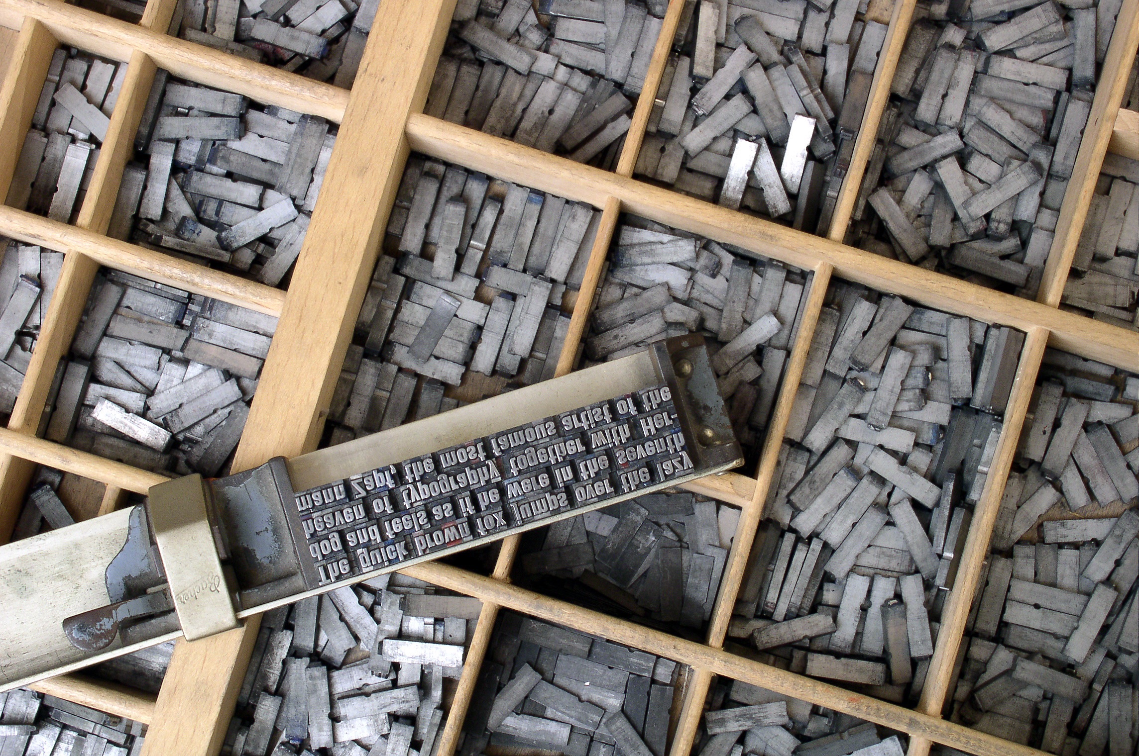
Metal typesetting font assembled into texts manually
The main innovation of Gutenberg actually became the process of casting letters . Before Gutenberg’s time, the creation of letters from metal, wood, and even ceramics on a large scale was an incredibly long and complicated process. Gutenberg made a revolution in the creation of fonts from hot metal, picking up an alloy mainly consisting of lead, which could be melted and poured into a mold called a matrix. He also had to invent ink sticking to lead.
It was thanks to the lead alloy and the matrices that the name of Gutenberg became synonymous with printing. In fact, the resulting lead mixture turned out to be so effective that it continued to be used even in the twentieth century, and in most type-making machines created after its era, they continued to use similar forms of molds for casting fonts.
In terms of workflow, Gutenberg’s innovation was to separate the casting of fonts from printing . Thanks to the greater number of available letters, simply increasing the number of workers could produce more typesetting texts. Due to the greater number of pages typed, printing presses could create more pages per hour. And the more pages, the more books, of course.
But let's not fool ourselves. Even after Gutenberg, typing one book was an incredibly monotonous process. Gutenberg's first masterpiece, the Gutenberg Bible (published around 1450s), was considered (and is considered) a remarkable work of art. It took about 300 individual characters. Each lowercase and uppercase letter, each character required one piece of lead. Not only each character was typed manually, for alignment it was necessary to manually align words, line by line.
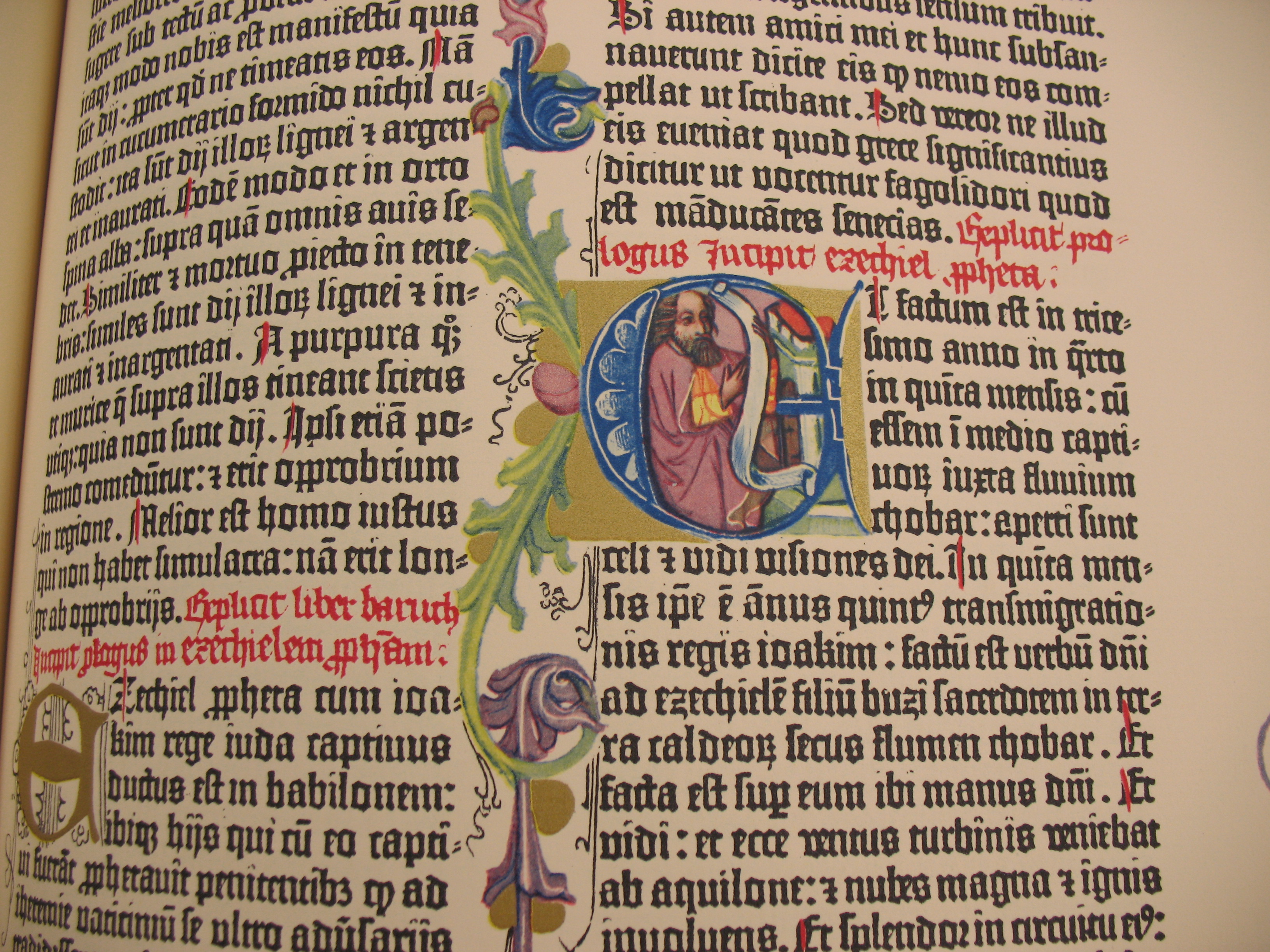
Gutenberg's Bible
Even in spite of the fact that Gutenberg's innovations made it possible to print books at a speed impossible earlier, it was still a painful process by the standards of modern standards. But it was during these moments spent on aligning the characters and lines that what is called the “black art” of typography flourished. Typing even the simplest text was an intimate, lively process.
Improved hot lead casting
The art of handwriting was handed down from generation to generation over 400 years, until the industrial revolution began to replace human hands with machines in all aspects of life. The most famous technologies of the end of the nineteenth century, which improved printing, were the monotype and linotype invented in the USA.
The “monotype” system was invented by Tolbert Lanston, born in the USA, and the linotype was invented by the German immigrant Otmar Mergentaler. Both of them improved the system developed by Gutenberg several centuries ago, but each added their own approach to the art of turning hot lead into print.
Since linotype machines could create completely cast lines of aligned lead fonts at once, they became incredibly popular for most books, newspapers, and magazines. Just imagine the expression of the faces of people who were told that you can type entire lines of metal letters instead of typing each letter manually!

Four lines of linotype, image of Deep Wood Press
The system “monotype” created separate letters. She did not have the same speed of typing as the linotype, but she did allow for individual and flexible adjustment of individual letters. Also, the monotype was closer to the mathematical approach to printing:
In many ways, the main innovation of the “monotype” system was not a mechanical device, however ingenious it might be. To ensure the casting of fully aligned strings of letters, Tolbert Lanston decided not to follow the path of Otmar Mergenthaler, who used spacing wedges to align the spaces between words. Instead, he developed a system of units that assigned each character a value from five to eighteen, corresponding to its width. The letter “i” in the lower case or dot occupied five units, “W” in the upper case occupied eighteen. This made it possible to develop a computational mechanism in the keyboard, which became the main part for performing more complex typing. ( Letterpress commons )
Therefore, it is symbolic that, although it was slower than the linotype, it provided greater complexity, making it the preferred choice for mathematical texts and publications containing non-standard letters and symbols.
The “monotype” system has become a masterpiece of engineering thought, and in many ways it has improved the workflow of Gutenberg using the technologies of the industrial age. It is also a fantastic example of the prototype of “programming” because it used perforated paper tape to convey machine instructions — an innovation that many people associate with the development of computers in the middle of the twentieth century, although punch cards were used as early as 1725 .
Like Gutenberg, Lanston sought to improve the printing process, dividing it into specialized, smaller stages. The “monotype” system consisted of two machines: a huge keyboard and a type founding machine.
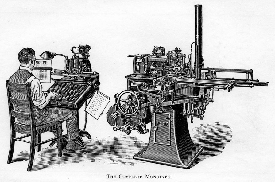
On the keyboard were separate keys for different registers of letters, numbers and common characters. The operator of the keyboard mainly consisted of character-by-character input and selection of the place where lines were to be completed. After completing the line, the machine calculated the distance between the words necessary for aligning the line, and punched holes in the paper tape. The casting machine had to read the patterns from the holes in order to determine how to cast lines.
Thus, the printing house could speed up the “input” stage of printing by simply using more keyboards (and people) in the process. This was a significant improvement over manual typing, because the keyboard operator could generate more instructions on the tape than a manual typesetter.
The type founding machine was also very efficient. She read the tape, line by line, poured hot liquid lead into each printed matrix, and then brought out the water-cooled letter on the dial, where they were assembled into aligned lines.
At this stage, the monotype provided the main advantage over the linotype. If the collector or any other person checking the set found an error, the set can be changed quite easily manually (especially if a single character required the adjustment).
It is easy to understand why the monotype was better than the linotype for technical texts, including mathematical ones. But even though the monotype had a huge number of keys on the keyboard and it could be changed for special purposes, it was not intended to generate a mathematical record.
As I said above, no matter how hard it is to create text, the creation of mathematical texts has always been more difficult. Daniel Rethygan :
Despite the effectiveness of the standard “monotype” system, the mechanical set provided the ability to enter only the simplest mathematical records. Simple single-line expressions could be typed without manual intervention, but most mathematical formulas use a mixture of Latin and italic characters, numbers, Greek characters, superscripts and subscripts, and many other characters. To simplify the process, printers and the company Monotype often urged authors to use alternative forms of recording, which would be easier to type, but for clarity, it was often necessary to write a more complex set.
Even if there was enough space in the matrix for all the characters at the same time, the frequent use of large characters, narrow strips, characters and numbers arranged one above the other required the use of different sizes of shells that came together like a puzzle. A wide choice of font styles and sizes made typing and even moderately complex mathematics expensive [sic], because it took a lot of time and effort to assemble the material manually at the layout stage.
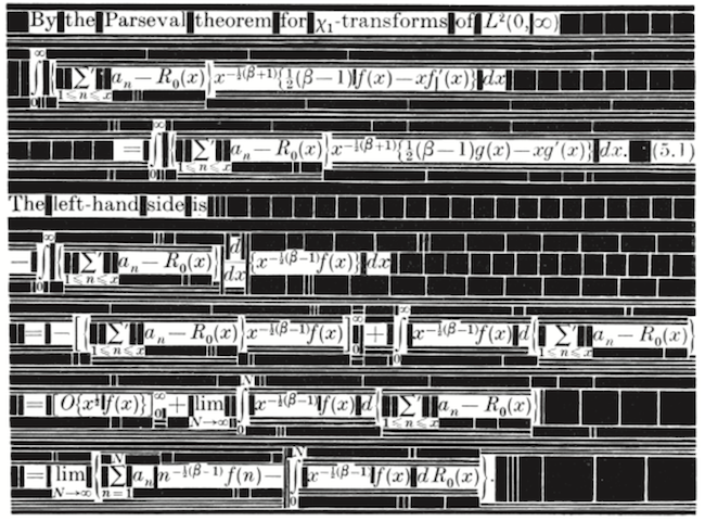
The complex arrangement of characters and spaces required a set of mathematical records of metal letters, the image of The Printing of Mathematics (1954)
Although the monotype failed to replace the manual set of mathematical notation, the British Monotype Corporation made tremendous efforts in the late 1950s, introducing a four-line system for a set of equations. The four-line system broke the standard equation line into four areas: the first and second areas were in the upper half of the line, and the third and fourth in the lower half. She also allowed to insert a thin strip of two pins in height between the second and third areas. The height of this middle band was exactly equal to the standard equal sign (=) and was the main characteristic that distinguished the four-line monotype system from its competitor, “Patton's method” for a set of four-line equations developed in the USA.
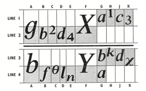
Four-line system, illustration by Daniel Rathigan from “The Monotype 4-Line System for Setting Mathematics”
Although the four-line monotype system even more standardized mathematical typography, allowing you to type many mathematical symbols on a modified monotype keyboard, it turned out to be a “swan song” of the role of a monotype in mathematical typography, and the hot casting era as a whole. Approximately ten years after the introduction of the four-line system into production, the seal has cooled forever.
Typewriter Compromise
In the twentieth century, especially after the Second World War, there was an explosion in the creation of scientific literature, not only in the academic, but also in the public and private sector. The telecommunication boom and space race would not have happened without an active exchange of mathematical knowledge.
The monotype was an acceptable solution only for publications that cost the printing press. Many technical works were “published” only on a typewriter. The equations were either handwritten or compiled on something like an IBM Selectric typewriter , which became very popular in the 1960s. Typewriters firmly established in offices until the end of the twentieth century.
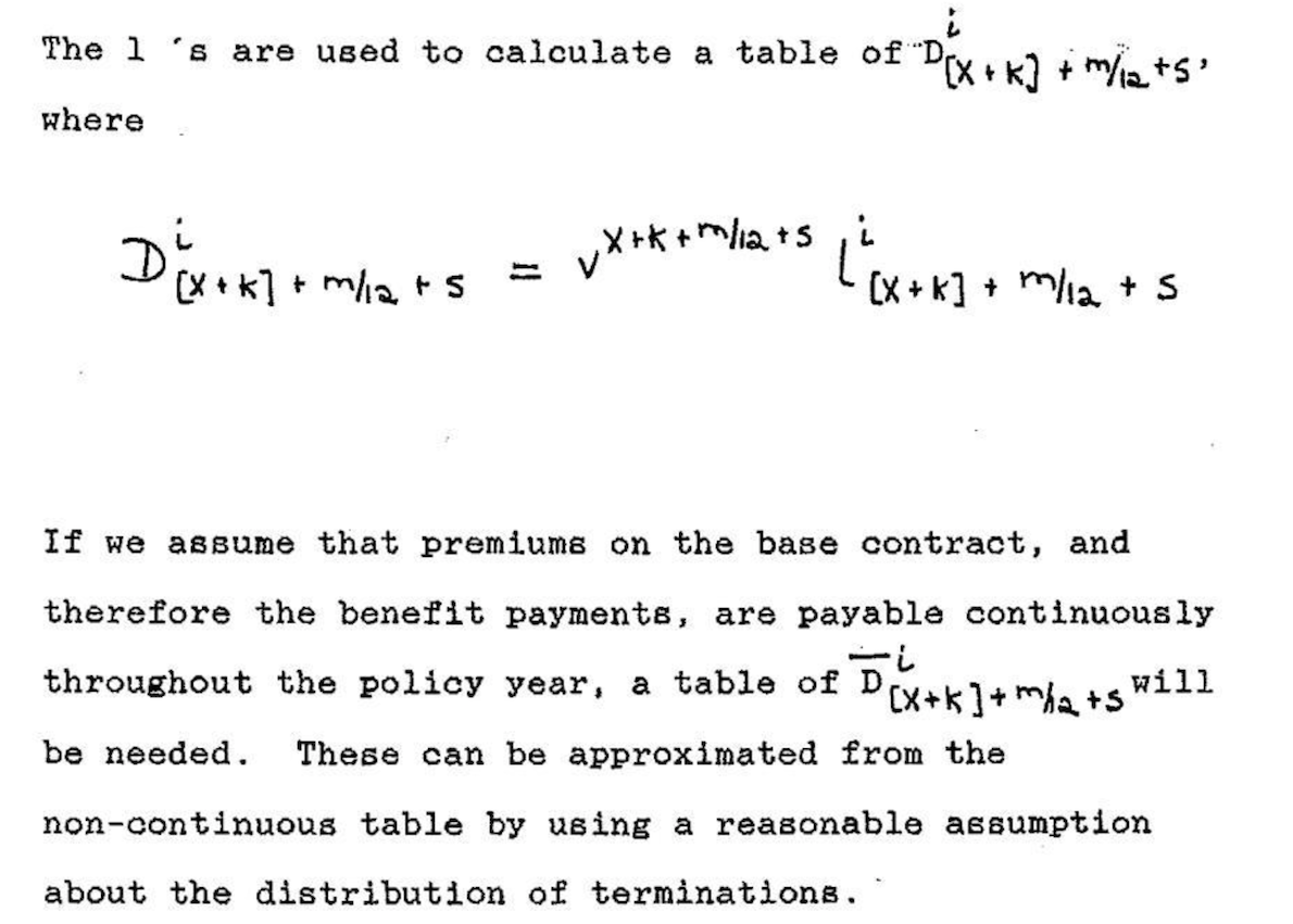
Insurance document typed on handwritten formulas (1989)
Large departments in organizations and universities not only had entire legions of secretaries typing documents, many also had technical typesetters. Interesting stories have happened that make it possible to understand the daily difficulties of work, like this, told by a commentator with Math Overflow by Peter May :
In the 1960s and 1970s, we had a technical typesetter in Chicago, who had mastered the profession so much that, without knowing mathematics, I could find and find mathematical errors just by looking at the text. In addition, he considered himself an artist, and it was very difficult to get the result we needed, not him.
The most important feature of Selectric was a writing ball the size of a golf ball that could be replaced. One of the IBM-created printed balls contained mathematical symbols , so the typesetter, if necessary, could simply change the writing balls and create a document containing mathematical records. However, the printed results were much less beautiful than handwritten formulas, and they were no match for the monotype.

Equation typed on IBM Selectric typewriter, image of Nick Hiem
Casting at the speed of light
The second half of the twentieth century continued, and the technological process made life easier for those who preferred speed to aesthetics. In the 1960s, a photoset - which was actually invented immediately after World War II, but demanded computer era innovations to gain full power - rapidly replaced hot lead and metal matrices with light and film negatives.
The photoset in all aspects was much faster than a set of hot metal letters. After the photoset has matured, the text can be typed on the screen, and not in the process of traditional keyboard typing used in the monotype and linotype. This made it much easier to find errors in the recruitment process.

A man works with a Lumitype 450, a
photosetting machine popular in the 1960s. Photosetting machines could generate hundreds of characters per second due to the fast flickering of light through a matrix of film negative. And instead of a set of lead letters, the typesetters began to collect what were essentially photographs of the text.
Photosetting provided greater versatility. In the monotype and linotype apparatus, font sizes were limited by the physical size of the matrix. Such physical limitations did not interfere with the light, which could easily be scaled in a photo-diagonal machine to create enlarged versions of symbols.
Even though the monotype managed to survive, albeit in a very narrow niche, it was essentially extinct as early as the mid-1970s. Printing companies could not resist the attractiveness of the speed and low cost of photosetting.
Photoset and in fact became a new type of printing house, but in fact it turned out to be a harbinger of the nascent computer era. And as we all know, everything that computers can give life, they can also replace. Clark Coffey :
, , . , , . , , , .
In the late 1970s, computers became powerful enough to cope with these tasks, but of course, computers themselves do not want to engage in the art of printing . Computers need instructions from artists. Fortunately for us, such an artist with the skills of a programmer and the desire to transfer the art of recruitment into the digital age was found .
New matrix filled with ones and zeros
Although many looked at photo-typography with indifference, she was interested in one person. It so happened that a brilliant mathematician and computer science teacher was very worried about how the mathematical records looked like in print.
« » , . 1973 . , , . , , . : , . , — . , , . TeX. ( Barbara Beaton and Richard Pales )
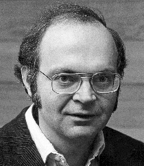
Donald Knut (1970s)
By 1978, Knut was already ready to announce the creation of TeX (“tek” 1 ) to the world at the annual meeting of the American Mathematical Society (AMS). In his lecture, later published by AMS in March 1979, Knut stated the following:
Mathematical books and magazines do not look as beautiful as before. No, their mathematical content did not become bad; rather, it was caused by the fact that the old and well-developed printing traditions became too expensive. Fortunately, it seems that mathematics itself can be used to solve this problem. ( AMS )
The importance of its approval today is difficult to assess fully. This is not so much evidence of Knut's mastery as a mathematician and computer specialist - in the 1970s there were definitely other people with comparable skills in mathematics and computers 2 . Knut’s role in typography’s history made him so special that he was so worried about the quality of the typography of the 1970s, and that he used his technical skills to imitate art, which he appreciated very much from the era of monotypes.
This was not a trivial mathematical task:
[ ] . , , (, «present» , ). : , , , , , , , , .. . ( )
Knut admits that he was not the first to create letters, numbers, and symbols using mathematical methods. The first attempts were made in the fifteenth century, but they were limited by a much more modest mathematical apparatus (mainly lines and circles), which simply could not cope with the thousands of nuances of high-quality printing.
However, by the 1970s, three key innovations had already appeared that Knut could use. First, mathematics has become much more sophisticated: cubic splines made it possible to specify exact formulas for symbols of any shape. Secondly, computers allowed to program Knuth's formulas with exact repeatability. Computers also allowed cycling through the lines of the text, making decisions about the distances between words for alignment, and even retrospectively arranging hyphenation in words to ensure optimal placement of words in a paragraph. Thirdly, digital printing has become viable, and despite Knut’s fastidious taste, the results were quite satisfactory.
Let's give the word to Knut himself:
… , , . : , ! , 1000 ; . , — 1000 — . 500, 1000. , , .
Knut was sure that it was time to help the printing house to jump over the photoset - from the matrices and the red-hot lead to the pages of pixels.
I’m sure that while developing TeX and Metafont, Knut experienced some moments “it should be the future” - but most likely different than Steve Jobs when he was standing in a California garage near the first Apple I prototype a year or two later. In fact, like many other Jobs-like innovators of the late twentieth century, Knut's creative energy was guided by the future that he saw in his innovation:
, , . , , , , , . , . , .
Today, we take for granted that computers can instantly draw almost everything we can think of, but in the late 70s it was like science fiction. Although the main goal of TeX was the use of mathematics to automate the configuration of characters in the output, Knut also wanted to and input data was as enjoyable as possible and logical to the human eye 3 .
For example, the following syntax is TeX:
$y = \sqrt{x} + {x - 1 \over 2}$ will be rendered into this expression:
TeX was an important invention, but its original form was applicable only on small mainframes. The success of TeX was made possible by portability - it was achieved by the release of TeX82, the second version of TeX, released with the help of Frank Liang in 1982 for many platforms. In TeX82, Knut also implemented a hardware-independent file format (DVI) for TeX output. With a suitable DVI driver, any printer could read binary instructions of a DVI file and convert them to graphic (printed) output.
The whip made the only major update to TeX only in 1989: TeX 3.0 allowed to process 256 input characters instead of the original 128. This change was made under the influence of the rapidly growing TeX user base in Europe - people needed the ability to enter diacritical characters and correct hyphenation in non-English-language texts .
With the exception of minor bug fixes, Knut adamantly believed that TeX did not need to be updated after version 3:
I made these systems public domain so that people could freely use my ideas anywhere in the world. I spent thousands of hours to ensure identical results on all computers. I firmly believe that immutable systems are of great value, even though any complex system can be improved. Therefore, I think it would be unwise to make further “improvements” to the TeX and METAFONT systems. Let us consider these systems as unshakable supports, which, a hundred years later, will give the same results as now.
This level of restrictions was as poetic as the work of Knut in preserving the centuries-old art of mathematical printing from the rapidly developing typographic industry. After he decided on the mathematics of the printing house, he saw no reason to disrupt the process solely for the sake of this violation.
Almost thirty years have passed since the release of TeX 3.0, but its complex line alignment algorithm is still used in other desktop publishing tools. There is no better example than the comparison of Roel Zinkstock of the first paragraph " Moby Dick ", printed in Microsoft Word, Adobe InDesign and pdfLaTeX (Macro package LaTeX, which displays TeX directly to PDF).
After version 3.0, Knut wanted to release releases with a dot at which the next part of the number π was added (current version 3.14159265). Knut also stated that after his death, the version number should always be equal to π. “From now on,” he resolved, “all the bugs will become permanent features.”
Content creation enhancement
In The TeXbook, Whip gracefully sets out an evolutionary cycle of feedback between people and technological means of expression:
When you first try to use TeX, you will find that some parts are very simple, others will have to get used to. A day or so later, when you successfully type a few pages, you will become a different person; the concepts that have disturbed you will seem natural, and you will be able to visualize the final result in consciousness even before it gets out of the car. But perhaps you will encounter difficulties of a different kind. After another week, your point of view will change again, and you will begin to grow in another direction, and so on. Over the years, you can use many different types of recruitment methods, and you will realize that your way of working with TeX will change with increasing experience. The same happens with any other powerful tool: you can always learn something new, and there are always better ways to do what you did before.
Even though TeX itself froze on version 3, this did not stop smart people from finding the best ways to use it. The TeX 3 was incredibly good at typing, but its users had to go through a non-trivial learning curve in order to master all its features, especially for complex documents and books. In 1985, Leslie Lamport created LaTeX (“La-tech” or “Lei-tech”) to further ease the input phase in the process of working with TeX. In the 1990s, LaTeX became extremely popular in academia, and the current version (originally released in 1994) remains the “side” of TeX that most TeX users see today.
In essence, LaTeX is a collection of TeX macros that makes creating the contents of a TeX document more efficient and turns the necessary commands into shorter ones. Thanks to this, LaTeX has made TeX even closer to the ideal of human-readable source content, allowing the author to focus on the crucially important task of creating content before proceeding with the appearance of the output.
LaTeX improved the visual representation of the mathematical syntax by adding new commands such as
\frac , which makes it more convenient to separate the divisor and the dividend fraction. Therefore, using LaTeX, the previous equation can be rewritten as follows: $y = \sqrt{x} + \frac{x - 1}{2}$ LaTeX also added many macros that simplify a set of very large documents and books. For example, LaTeX has built-in commands
\chapter , \section , \subsection , and even \subsubsection with specified (but widely customizable) formatting. Such commands allow the ordinary LaTeX user to avoid working directly with the so-called “primitives” in TeX. In fact, the user gives LaTeX commands, and LaTeX gives TeX commands.However, the most powerful feature of LaTeX of all was its extensibility through the use of packages developed by the “superuser” active base. Today there are thousands of LaTeX packages and most come bundled with modern TeX builds, for example, with TeX Live. There are many LaTeX packages that add and extend every imaginable aspect of the design of documents and books, from mathematical extensions containing all existing mathematical syntax (even statistical) to special document styles and powerful vector graphics packages like PGF / TiKZ . There is even a special class of documents called Beamer that generates presentation slides together with transitions from LaTeX.
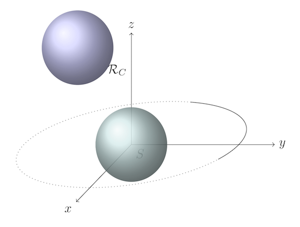
Three-dimensional vector image created using PGF / TiKZ
All these packages, together with the stable TeX code base, make LaTeX an unsurpassed system for preparing and publishing documents. Despite the popularity of Microsoft Word WYSIWYG processors since the 1990s, they cannot come close to the power of LaTeX and the elegance of its output.
It is worth noting that LaTeX is not the only macro layer available for TeX. ConTeXt and other packages have their own unique syntax for achieving the same goals.
Not just printing on paper
No matter how complex TeX is, it plays the same role as typeface and typesetting machines since Gutenberg: TeX’s task is to tell the printer how to apply ink to the paper. Starting with TeX82, this was accomplished using a special DVI (device independent format) file format created by Whip. Although the TeX file was human readable, DVI could only read the printer: in essence, it was a bit matrix telling the printer which pixels should be black and which should remain white.
Even in spite of the fact that computers began to radically change the typographical area since the 1970s, paper remained the main information carrier, which people read until the end of the twentieth century. But everything began to change irrevocably in the 1990s. The computer screens were getting better and they appeared more and more. The Internet also facilitated the transfer of information between computers. It was quite natural that people began not only to “calculate” on computer screens, but also to read more and more from them.
In 1993, Adobe released the New Portable Device Format (PDF) to make it easier to read cross-platform digital documents. In essence, PDF was a simplified version of the popular print format for PostScript desktops, but unlike PostScript, PDF is designed for easier screen reading.
Almost until the late 1990s, PDF was unknown to most people. It was a proprietary format that not only required several thousand dollars for an Adobe Acrobat purchase to create files, but also an Adobe Acrobat Reader reader for $ 50. Later, Adobe made Acrobat Reader free, but the proprietary nature of PDF and the relatively limited Internet connection speed in the early 1990s prevented the PDF environment from developing.
However, by the end of the 1990s, Master Thanh Khan, a magistracy student, drew attention to a PDF, who wanted to publish his thesis and doctoral dissertation directly to PDF. Thanh used his knowledge in micro-typography to create pdfTeX , a version of TeX that can convert TeX files directly to PDF without creating a DVI file.
pdfTeX retained all the excellent typing capabilities of TeX, and also added a few microtypographic features that could be used through the LaTeX
microtype package. Microtipography works with more subtle aspects of typography, including Gutenberg-inspired ways to optimize the alignment of strings — for example, using several variants of a single glyph and hanging punctuation techniques.Also pdfTeX has mastered the digital capabilities of PDF, such as hyperlinks and table of contents structures. With the continued growth in the widespread popularity of PDF in the 2000s and after Adobe opened the PDF standard of the International Organization for Standardization in 2007, pdfTeX became an important version of TeX. Today, it is included by default in all standard TeX packages along with pdfLaTeX, which interprets the LaTeX files for the pdfTeX program.
It is worth understanding that Donald Knut did not create TeX to speed up the publication process. He wanted to mimic the appearance of a monotype using mathematics. But with the development of LaTeX, pdfTeX and the Internet, TeX has become something that people couldn’t think about, until the 1970s, waiting for weeks for their facets to be received by mail. Today, thanks to TeX and modern methods of communication, we can publish extremely complex documents for a virtually unlimited audience in just a few seconds.
Next printing house innovation: slowdown
It seems to me that many believe that pure mathematics is the exact opposite of art. “Left hemisphere versus right hemisphere”, if you please. In fact, I think that the role of mathematics in human experience requires as much art as logical thinking: logic to derive the mathematical truths of our Universe, and art to spread knowledge of these truths throughout the Universe.
As George Johnson wrote in Fire in the Mind :
... numbers, equations and physical laws are neither ephemeral objects in Plato's "vague shadows", nor cultural inventions like chess, but simply compressed patterns of information created by an observer in contact with the world ... The laws of physics are compressed statements made by information collectors. They are stored in the form of marks - in books, on magnetic tapes, in the brain. They are part of the physical world.
Our ability to describe the Universe has greatly expanded since prehistoric people first mixed the physical world with their thoughts on the walls of caves. For most of the recorded history, the letter meant the transfer of thoughts using lead, ink and paper. An innumerable number of qualified professionals participated in the art of the pre-digital set. Even though their skills are outdated due to the evolution of technology, we can be grateful to people like Donald Knuth, who captured the art of typography in timeless mathematics.
And we are here - in time when written texts require only subatomic ingredients like electricity and light to be transferred to other human beings. Our ability to “publish” our own thoughts is almost instantaneous, our audience has become worldwide, if not comprehensive , because we are spreading quantum fragments into space.
Today, the acceleration of publication has ceased to be an interesting task. This equation has already been solved - it can not be simplified.
As with many other aspects of modern life, the technology forced us to invert our evolutionary behavior. For example, to be physiologically healthy, we need to curb our instincts, seeking to eat more and rest. As for the publishing house, today we are faced with the task of setting greater constraints before the publication process for the sake of a more concise presentation and durability of our thoughts.
I believe that at this stage the understanding of the history of printing and printing has become a kind of cognitive resource. Realizing this, I began to oppose automation a little more strongly and began to relate more favorably to the frictions in the creative processes that are necessary even when writing technical works. It also helped me justify the need to spend more , not less time, on the artistic construction of mathematical formulas and the presentation of quantitative information in general.
Technological innovation in the general sense will not help us slow down the publishing process again. Slowing up requires improved thinking technology. It requires the desire to write preliminary drafts, and not to publish drafts. It requires discarding most of our thoughts, because for the most part they do not deserve reading by other people. Most thoughts are distractions — sensuous brain tricks that mislead us, as if we are interested in what is not really interesting, or that we understand what is in fact incomprehensible to us.
Instead of compressing the workflow even more, we need to bring the art of written expression back into the process of thinking, writing and publishing. The last thing is the hardest to achieve - publications only deserve our purest thoughts and conclusions.
- TeX is pronounced “tech”, it is an English display of Greek letters τεχ, which is an abbreviation of τέχνη (or technē). "Techno" is an ancient Greek concept that can mean "art" or "craft", but usually in the context of practical application.
- One of the noteworthy predecessors of TeX was
eqn, a syntax designed for formatting printing equations introff, which was a system developed by AT & T Corporation for Unix in the mid-60s. Theeqnsyntax for mathematical writing had similar features with TeX, which is why some people claimed thateqninfluenced Knut when developing his TeX. We know that Knut was aware oftroffenough to form an opinion about him, and it was not too good. For details, see page 349 TUGBoat, Vol. 17 (1996), No. 4 I thank Duncan Egnew for turning my attention totroffand prompting that he was later replaced bygroff, who writes PostScript and is included in modern Unix-based systems (even in macOS). It can be found through the man page. It is noteworthy that he can still perceive the syntax based ontroff, developed in the 70s, and type it without the slightest change. - Knut's philosophy is that computer code should be as human-readable and self-documenting as possible, which led him to develop competent programming — a pivotal contribution to computer programming that influenced all the popular modern programming languages.
Source: https://habr.com/ru/post/371031/
All Articles