DeviantArt users resist entering a new viewing tape
Since the idea of a tiled interface has been thrown into immature designer minds, designers without any doubts shove tiles wherever possible and even where it is impossible.
Here they look at the interface - and right hands itch it to square.
Another victim of squareing was a well-known social resource for artists of DeviantArt , where on June 1 they launched a new ribbon-tiled interface. However, the majority of users did not like the innovation, leading to the generation of hundreds of kilobytes of hate .
"The administration proudly presents" ...
But at first, nothing foreshadowed trouble. Just one day, quite unexpectedly for all, the resource was decorated with something like this:
In recent months, we've been testing improvements for the grid of thumbnails. Initially announcing it last year, now, after many testing cycles, optimizing, fixing bugs and reducing download time, we are proud to announce that the new grid is available to everyone, including on mobile devices.
According to the creators, the new viewing mode has a whole bunch of advantages over the old version:
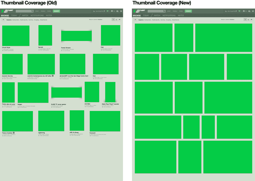
- First of all, the new tape looks much prettier (see CDW for this article). Agree, it is pleasant for any designer when everything is aligned under the ruler, and not scattered as it is necessary with clumsy signatures and irregular gaps.
- The tiles have become larger, and moreover they are more densely arranged - now almost the entire screen space is filled with tiles, and not as before, when a significant part of the screen space fell on the “air”.
- At the same time, at least each individual tile has become larger, the overall consumption of traffic, on the contrary, has decreased , because there is no more page-by-page viewing, but only the beloved endless scrolling that everyone has. Consequently, there is no need to switch pages, each time loading a bunch of HTML / CSS / JS, but loading the images directly.
- Now you can add any tile to your Favorites with one click.
It would seem that users should be satisfied. But...

"640Kb is enough for everyone. And for the rest of the volume, launch the browser"
Alas, users, as is often the case with redesigns, well, absolutely did not appreciate the care shown, literally drowning the topic in negative reviews.
It turns out that people completely dislike the tiled design and just get sick of the very idea of endless scrolling when new pictures are loaded as they scroll.
If you collect the main complaints about the new design, you get something like this:
- The new design does not work without JS (naturally!), Unlike the old one. And the scripts there are very, very cumbersome, so that it significantly slows down even on 3 GHz quad-cores, what can we say about mobile devices, on which the browser manages to fall from time to time and even take the whole device into a reboot. Against this background, the phrase " after many cycles of optimization " begins to seem like a subtle mockery. Guys, have you really optimized anything? - the commentators are surprised.
- An unexpected nuisance occurred with endless scrolling. It loads more and more images until the browser eats up all the memory and hangs. As a result, people began to have problems when trying to scroll more than 1000 images at a time, while the full tape easily contains tens of thousands of tiles. " After a lot of testing cycles ... " - guys, and you really tested?
- The innovative tile laying algorithm turned out to be with a flaw. For some reason, the tiles were often duplicated. Those. the same picture could be found in several places at once. After many cycles of testing and fixing bugs ... - uh, did you test exactly ?
- Viewing can not continue from the place where he stopped, as well as send someone a link to this place. In the case of paging, you could close the browser, and then open it on the same page and continue browsing. In the case of an endless ribbon, difficulties arise.
- Signatures have disappeared. Take another look at KDPV - it is clear that the text was completely removed so that it does not interfere with the tiles. And if earlier it was possible to see information on each work - title, author, number of comments, etc., then the designers of the new tape decided, in full accordance with the current fashion, to align with the content and remove all unnecessary. Users are not rated.
- Contrary to claims, the tiles on the screen began to get no more, but less , because the size has grown very much.
- Design lost integrity, because the innovation only affected search and browse tapes, while the galleries remained with the old design.
"Hmm, but in the galleries, it's all the old ..."
Yes, and this is the only reason why I have not yet crashed to the hell out of my account!
From reviews of grateful users
"You think you do, but you don't"
Further events developed in a quite predictable way. Users tried to explain that all innovations are scientifically and statistically based, and in general they themselves are for the benefit. They, the users, actually want a new design, even if at first they seem to be reversed.
Well, no wonder: after all, a lot of work and time is really invested in the new design. And really wanted the best. Who is to blame for what happened as always?
We have already seen a similar reaction many times, the last such example is the redesign of Kinopoisk . In general, designers are often sure that the users themselves know better what is needed. We are confident that their task is not to follow demand, but to create demand, which is justified by Henry Ford’s famous quote: " if I asked clients about their desires, they would wish a faster horse ."

"We've brought back"
Alas, the pressure of negativity is growing, risking to turn into a real squall. As a result, the administration was forced to back down by entering the ability to return the old mode by installing a special checkmark in the profile settings.
This is how the user’s conservatism has once again pressed down creativity ... So, it’s time to draw conclusions.
So after all, what went wrong?
The main problem, as we see, is about the same as in the case of Kinopoisk: the design was improved due to the functionality for which there was no place in the new design. Those. as a result, there were fewer opportunities, as well as convenience; as a result, users no longer began to appreciate the beauty, immediately meeting the innovation with hostility. So do not.
Conclusion # 1 : Simplification is not always great.
At the same time, a number of drawbacks are inherent in the endless scrolling, because of which users can take it negatively. And if the designer still wants to push it, then it would be advisable to think in advance about eliminating these shortcomings. At least to make memorization of the exact place of the tape with the ability to transfer links to this place.
Conclusion number 2 : Infinite scrolling (BS) - sucks. And the BS on the braked frameworks is doubly sludge.
And, of course, it would be good to collect feedback from users sometime before launching the final version. It is well known that in your own creation it is difficult to notice the flaws, here you need an outside view.
Conclusion number 3 : The desires of users do not always coincide with the desires of the designer.
')
Source: https://habr.com/ru/post/369283/
All Articles