We bring together layouts with ergonomics, and Cyril and Methodius - with modern realities
640KB should be enough for everyone
©
But all the same, in vain the great Russian enlighteners Cyril and Methodius invented a Russian alphabet not on the basis of the Latin alphabet - with computers in our time, mountain-a-much less problems would be! And so it still remains fully "artifact" encodings and layouts , inherited from us "inherited from the troubled times of the beginning of computerization" - in fact, whatever one may say, but what we use now (I mean computers) was invented by people who use just Latin and nothing more ...
Although I can not help but notice that the Cyrillic alphabet, though, will be “more beautiful” than the Latin alphabet, some kind of letters are more proportional, perhaps.
In the epigraph passed a catch phrase, attributed to Bill Gates , who do not stop scolding for his Windows , continuing, however,to eat a cactus to use it. In fact, any "geek" (and not only a geek!) Can name dozens of these "winged" restrictions. But in this article I want to focus on our alphabet, “without thinking” developed by the aforementioned Cyril and Methodius “without regard”, so to speak, to the “international” Latin in its (alphabet) application to the keyboard layout ...
Some time ago I thought about inventing a comfortable and ergonomic keyboard, developed a layout for it, and suddenly thought: but this layout will also be convenient in attaching it to a “regular” (“ordinary powder”, aha!) Keyboard!
It is said - done, and here I present to your attention a set of layouts for Windows (unfortunately, I use Linux occasionally, so I haven't invented anything useful for it), including the YEVAPRO layout modified with YTsUKEN and the QEVAPRO complementary to it phonetic Latin QEVAPRO (in the name The second line of letters is used, as more harmonious).

')
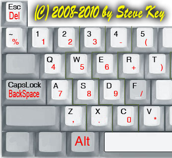
As you can see, for the sake of greater ergonomics, the numbers are “sacrificed” for the convenience of typing (punctuation marks are “at hand”, the most frequently used - even without Shift!). Numbers can be entered either with the right hand on the NumPad numeric keypad, or with the help of this utility:
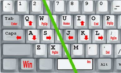
And with the help of this utility, you can control the text cursor without removing your hands (at least when you control the cursor with your right hand, pressing the left Win key with your little finger of your left hand) from the so-called “main position of the blind ten-finger print”:
Compared with YTsUKEN, the letters and,, and , and ((according to the frequency of use) are “built”, in contrast to the “Soviet” layouts, Latin V is set in accordance with the Russian letter B, and W is more similar to our W, with which she and "dalit" the same key. The letters E and b, as well as the characters "\ |" (to the right of Kommersant) “untouched” because of their “distantness” from the same “main position” (far reaching for fingers), in fact, in my keyboard concept they are physically absent: the letter E, IMHO, because of its rather rare use can be “combined” on the same key with the letter E, pressing with any modifier, b in an ordinary letter in general can be, as they say now, “tupo”, replaced with b (believe me, no one will notice, unlike the same , which differs markedly from E, but after all they are replaced by E, and they get used to nothing!), but for adherents ramotnogo letters combined with L (modifier) - for the "hard sign" is used more often as Yo ...
Thus, the layout turned out to be, on the whole,identical to the natural one, quite coinciding with YTZUKEN’s usual “blind typesetters”, and, unlike Dvorak and similar Cyrillic developments, almost not requiring adaptation, but more ergonomic in terms of “frequency” of letters , and the Latin alphabet, to which the “beginners” do not need to be retrained, as in QWERTY, and more optimal than QWERTY, which only the lazy do not speak of nonoptimality (but probably not as optimal for English as Dvorak).
Punctuation marks are also sorted by frequency of use, and not only literary texts were analyzed, but also program code in different languages, so, I hope, there will also be less "splitters" when coding.
By the way, for convenience, the CapsLock key performs the BackSpace function in me (the CapsLock mode in my concept is not needed as such, but on the standard keyboard you can easily turn it on by pressing Shift + CapsLock) - believe it is much easier to press the little finger of your left hand next to it the main position of the key (to destroy an incorrectly entered letter), than to reach with the little finger of the right (and so “overloaded” keys) through three keys to the “real” BackSpace.
On the keys, "containing" Russian letters, which "did not have enough" analogue in Latin (I am a patriot, and initially focus on the Russian language, and the Latin - this is so, "appendage") placed "specifically Latin" characters, like "English quotes" , @ dogs and ^ <> \ | & specifically "programmer" icons, as well as # # grids.
A comma is entered to the right of the letter U “without a shift”, as a more often used punctuation mark, and the full stop is entered “with a shift”, as a chord ending the sentence.
Among the punctuation marks placed in the upper (former digital) version, in addition to all sorts of ([{brackets}]), there are normal “Russian quotes-paws”, which allows you to beautifully draw quotes.
In fact, all the characters that I would like to have “in quick access” (and which are not too difficult to remember - well, like in typographic layouts, where they are 4-5 pieces per key) in the top row did not fit, so I it also “works” with the Win (left) modifier, by pressing “giving out” the characters `~ § '€ ± hit - - × ÷ ‰, and the key to the left of the right shift produces a three-dot ... However, the euro symbol can also be thrown out, not so often (IMHO) a normal Russian person uses it. Notice, after the "hit" (there is such an icon in Unicode, it is very convenient, you can put over any letter!) There are "dash" and "hyphen", also the necessary characters.
A side effect of the phonetic Latin will be that when you print in Russian on the “English”, as it is called, layout, you get ne abrakadabra, a po <ti ponqtnyj tekst!
The disadvantage is that the current fashion becomes unavailable to enter passwords "in Russian, but in English letters" ...
From my own experience, I can add that I have been using this layout for almost a year (on the home computer on which this article was typed) - like, convenient!
The only thing you have to remember is which programs react to the scan codes of the keys (the so-called “hot” keys like Ctrl + ZXCV remain “in place”), and which - to the characters (the “hot” combinations “leave” in accordance with the new layout) ...
Here, shared ...
I would be glad if someone pushes a useful thought, well, or just seems comfortable to someone!
©
But all the same, in vain the great Russian enlighteners Cyril and Methodius invented a Russian alphabet not on the basis of the Latin alphabet - with computers in our time, mountain-a-much less problems would be! And so it still remains fully "artifact" encodings and layouts , inherited from us "inherited from the troubled times of the beginning of computerization" - in fact, whatever one may say, but what we use now (I mean computers) was invented by people who use just Latin and nothing more ...
Although I can not help but notice that the Cyrillic alphabet, though, will be “more beautiful” than the Latin alphabet, some kind of letters are more proportional, perhaps.
In the epigraph passed a catch phrase, attributed to Bill Gates , who do not stop scolding for his Windows , continuing, however,
Some time ago I thought about inventing a comfortable and ergonomic keyboard, developed a layout for it, and suddenly thought: but this layout will also be convenient in attaching it to a “regular” (“ordinary powder”, aha!) Keyboard!
It is said - done, and here I present to your attention a set of layouts for Windows (unfortunately, I use Linux occasionally, so I haven't invented anything useful for it), including the YEVAPRO layout modified with YTsUKEN and the QEVAPRO complementary to it phonetic Latin QEVAPRO (in the name The second line of letters is used, as more harmonious).
')
As you can see, for the sake of greater ergonomics, the numbers are “sacrificed” for the convenience of typing (punctuation marks are “at hand”, the most frequently used - even without Shift!). Numbers can be entered either with the right hand on the NumPad numeric keypad, or with the help of this utility:
And with the help of this utility, you can control the text cursor without removing your hands (at least when you control the cursor with your right hand, pressing the left Win key with your little finger of your left hand) from the so-called “main position of the blind ten-finger print”:
Compared with YTsUKEN, the letters and,, and , and ((according to the frequency of use) are “built”, in contrast to the “Soviet” layouts, Latin V is set in accordance with the Russian letter B, and W is more similar to our W, with which she and "dalit" the same key. The letters E and b, as well as the characters "\ |" (to the right of Kommersant) “untouched” because of their “distantness” from the same “main position” (far reaching for fingers), in fact, in my keyboard concept they are physically absent: the letter E, IMHO, because of its rather rare use can be “combined” on the same key with the letter E, pressing with any modifier, b in an ordinary letter in general can be, as they say now, “tupo”, replaced with b (believe me, no one will notice, unlike the same , which differs markedly from E, but after all they are replaced by E, and they get used to nothing!), but for adherents ramotnogo letters combined with L (modifier) - for the "hard sign" is used more often as Yo ...
Thus, the layout turned out to be, on the whole,
Punctuation marks are also sorted by frequency of use, and not only literary texts were analyzed, but also program code in different languages, so, I hope, there will also be less "splitters" when coding.
By the way, for convenience, the CapsLock key performs the BackSpace function in me (the CapsLock mode in my concept is not needed as such, but on the standard keyboard you can easily turn it on by pressing Shift + CapsLock) - believe it is much easier to press the little finger of your left hand next to it the main position of the key (to destroy an incorrectly entered letter), than to reach with the little finger of the right (and so “overloaded” keys) through three keys to the “real” BackSpace.
On the keys, "containing" Russian letters, which "did not have enough" analogue in Latin (I am a patriot, and initially focus on the Russian language, and the Latin - this is so, "appendage") placed "specifically Latin" characters, like "English quotes" , @ dogs and ^ <> \ | & specifically "programmer" icons, as well as # # grids.
A comma is entered to the right of the letter U “without a shift”, as a more often used punctuation mark, and the full stop is entered “with a shift”, as a chord ending the sentence.
Among the punctuation marks placed in the upper (former digital) version, in addition to all sorts of ([{brackets}]), there are normal “Russian quotes-paws”, which allows you to beautifully draw quotes.
In fact, all the characters that I would like to have “in quick access” (and which are not too difficult to remember - well, like in typographic layouts, where they are 4-5 pieces per key) in the top row did not fit, so I it also “works” with the Win (left) modifier, by pressing “giving out” the characters `~ § '€ ± hit - - × ÷ ‰, and the key to the left of the right shift produces a three-dot ... However, the euro symbol can also be thrown out, not so often (IMHO) a normal Russian person uses it. Notice, after the "hit" (there is such an icon in Unicode, it is very convenient, you can put over any letter!) There are "dash" and "hyphen", also the necessary characters.
A side effect of the phonetic Latin will be that when you print in Russian on the “English”, as it is called, layout, you get ne abrakadabra, a po <ti ponqtnyj tekst!
The disadvantage is that the current fashion becomes unavailable to enter passwords "in Russian, but in English letters" ...
From my own experience, I can add that I have been using this layout for almost a year (on the home computer on which this article was typed) - like, convenient!
The only thing you have to remember is which programs react to the scan codes of the keys (the so-called “hot” keys like Ctrl + ZXCV remain “in place”), and which - to the characters (the “hot” combinations “leave” in accordance with the new layout) ...
Here, shared ...
I would be glad if someone pushes a useful thought, well, or just seems comfortable to someone!
Source: https://habr.com/ru/post/367821/
All Articles