Why the palette of modern films is orange-blue
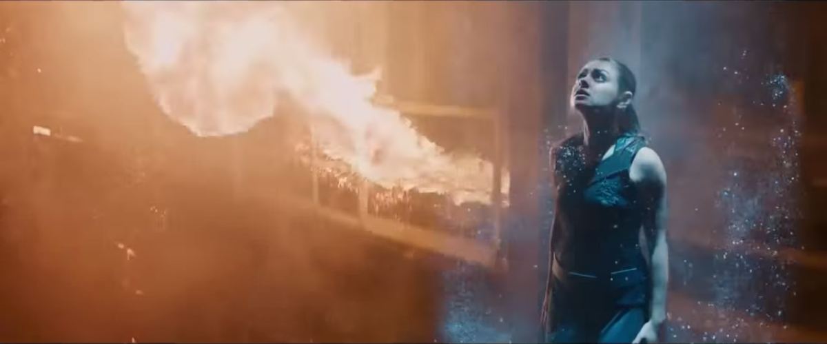
Jupiter Rising (2015)
Maybe you did not notice, but over the past 20 years in Hollywood has developed a steady course on the orange-blue palette of pictures. Also, this color scheme is known as "orange and greenish blue" or "amber and greenish blue." Do not believe? Let's check. I warn you immediately - after what you see, you can’t see it anymore, you will notice this palette everywhere.

The Imitation Game (2014)

Into the Woods (2014)
')

The Wolf of Wall Street (2013)

Mad Max (2015) (slightly more yellow than previous examples, but nonetheless)
And, of course, do not forget about advertising posters. They must be bright and flashy, so their richness is stronger - but the palette is the same.

Yes, this palette can be seen not in every scene of every film. Some directors prefer the original color schemes. But all the rest to the orange-blue. One of the bloggers, analyzing the trailer palette in 2013, derived the following scheme:

Edmund Helmer - Movie Trailer Analysis 2013
Digital coloring

The Wizard of Oz precedes the trend
What's the matter? Previously, the colors of the film depended only on the conditions of filming and the use of color filters of cameras, since all films were filmed. It was possible to repaint the result only frame by frame.
Now all the films are shot on digital cameras, and it is quite easy to give the image any desired look. But it still needs to be done specifically. And if the result is bad, then you will have problems.
O 'Brother Where Art Thou (2000) is often cited as an example of strong post-processing. The Coen brothers wanted him to look retrograde, so the whole film was made in sepia. The operator said: “They needed to make the film look like an aged picture, where the intensity of the color is determined by the scene, and the skin tones would be of all the colors of the rainbow.”
But how did we go from all colors of the rainbow to orange?

Modern video tools allow you to apply one color scheme to many scenes at once. The more movie scenes will look good with the same scheme, the less work you will have. In addition, if filmmakers bring several different movie formats into one film, using the same color scheme links them together.
One way to find a good picture is to establish the common denominator of most scenes. And so it turns out that actors take part in most scenes. And actors are usually people. And people - they are orange (well, almost). Most skin tones fall in the range from pale peach to dark brown, which leaves them in the orange segment of any color chart. And blue and cyan are at the opposite end of the circuit.

You may have heard that pairs of opposite colors complement each other. That is, being together, they create a good color contrast - more than with any other color. And usually we achieve exactly good contrast.
Therefore, the theory of the origin of the trend says the following: if you make the colors of actors as warm and orange as possible, and the colors of the background as blue as possible, you will have a very contrasting picture and complementary colors. As Dan Seitz writes from Cracked :
This is not necessarily a matter of laziness. A color specialist should process a two-hour film, sometimes frame-by-frame, in about two weeks. You do not have to pay too often attention to the deadline hanging in the calendar in order to throw up your hands and say: “Fuck it, everyone loves blue and orange!”.
Each movie has its own look.

Blade Runner. Blue with orange before it became a trend
In general, this is just a theory. Although this color scheme has become popular recently, it used to be used as well. Resource TV Trope notices:
Unlike other pairs of complementary colors, fiery orange and cold blue are associated with opposing concepts: fire and ice, earth and sky, land and sea, day and night, humanism and indifference, explosions and futuristic views. This image enhancement method is used because it makes sense.
There is a meaning or not, but now this method of coloring films has become generally accepted. However, according to color expert Stefan Sonnenfeld : “There is no special process for choosing a color palette, in which we would sit in a room and say:“ We will use only these complementary colors to make a certain impression on the viewer ”. Each film has its own look. ”
Sonnenfeld is known for working on some of the most spectacular and one of the most orange-blue films of the past 15 years: the Transformers series.


“Transformers” are so orange-blue that one team of researchers working on an automatic coloring algorithm took their palette as one of the main ones. Their algorithm allows you to color the video in any of the palettes taken from any movie:

Above - "Amelie", painted in a palette of transformers. Below - “Transformers”, painted in the “Amelie” palette.
The method is not fully automatic, you need to choose where the background is in the picture, and where is the foreground. But the results are impressive anyway.
As technology develops, we can see new trends in the choice of palettes. In the meantime, look and notice orange with blue.
Source: https://habr.com/ru/post/366071/
All Articles