How restaurants create menus: 4 design techniques
Nowadays, restaurants not only introduce automation systems and study visitors with the help of Google, but also pay more and more attention to design issues. Today we look at several approaches that are used to create more attractive menus (traditional and, say, for viewing on the iPad).
In preparing the topic used materials 99design and restaurant.org
')
Watch patterns are always taken into account.
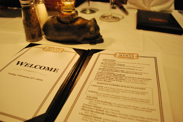
In the restaurant business for many years, it was believed that visitors are browsing the menu according to a scenario that begins in the upper right corner of the sheet. Therefore, usually there are always the most favorable places for meals and drinks.

However, the new eye-tracking-studies by American experts have shown that this is not entirely true. The participants in the experiments were more inclined to read the menu like a book: first, the first page from top to bottom, then in the same way, the second:

Therefore, the most advanced in design issues restaurants now create their menus, taking into account the fact that the “point of attraction” where users are looking, is not in the upper right corner, but on the left.
Simplification of navigation: sections, typography, cells
The most traditional and common technique is to divide the menu into logical sections (salads, meats, desserts, etc.). Another way to highlight the most popular or important from a business point of view dishes - group them into a separate cell.

To facilitate the process of interaction with the menu is possible through the use of different fonts. For example, institutions often write in different fonts the name of the dishes and their descriptions - this helps customers to better navigate. In addition, a stylish font gives the restaurant solidity. Also in some countries, restaurateurs will soon be obliged to indicate the calorie content of the dish, it can also be highlighted.
Another important point - the use of images of food in the menu works only if the pictures are really high quality.
This is not easy to achieve, so many even very expensive restaurants prefer not to include images of dishes in their menu.
The price is not written in large print.
Various studies are being conducted, the purpose of which is to find correlations between the size of the check and how exactly the price is written in the menu. One recent study showed that visitors who were offered a menu with a price without a currency sign (dollar, euro, etc.) spent significantly more than those who were given a price with such a sign ($ 3.99) or wrote it in words ("five hundred rubles").

From the point of view of psychology, the latter option would have led to a greater increase in sales, but in practice this did not happen.
The color scheme speaks about belonging to a particular kitchen.
Restaurants are trying to choose the color scheme of the menu so that it matches the theme of the restaurant. So usually, steak houses use dark colors, and, say, Mexican restaurants - more bright yellow, red and green.

In addition, the very color of the food is very important - it should look natural, otherwise it will not look appetizing. That is why it is almost impossible to find non-standard bright colors in restaurants. In nature, there is no blue pepper or meat, so a person instinctively does not want to eat them, respectively, and they will not offer them.
Source: https://habr.com/ru/post/366059/
All Articles