New Player - Jolla and Sailfish OS
A few weeks ago, official sales of the first Jolla smartphone based on Sailfish OS began in Russia. The main interest, of course, is the new operating system based on the Linux kernel. I have been using the device for about two weeks and am eager to share feedback on the device, and especially the OS.
A bit of history
For those who do not follow the situation on the smartphone market - a small insight into the history of the emergence of the company and the device.
 In 2011, when Nokia decided to close the MeeGo project, a certain group of developers and managers did not agree with this management decision, they left the company and founded their own startup, Jolla, to continue working on the new operating system. In fact, Sailfish OS is a development of the ideas embodied in MeeGo and Maemo. Initially, the first product was promised to be presented to the market in 2012, but the display of the device to the public was postponed until May 2013. Already in November 2013, sales started in Finland, but the device reached us only a year later, in November 2014. Due to this delay, one should not be surprised at the somewhat outdated iron platform, but people working on bringing the product to the Russian market assured me that in the future, sales of new devices will begin almost simultaneously with Europe, because the stakes are very serious, in general like the old Nokia.
Appearance

')
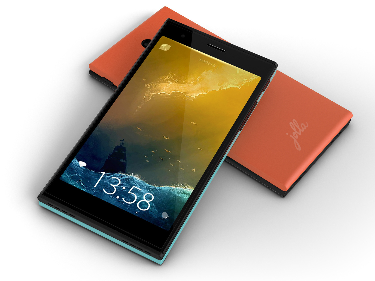
First of all, I would like to say a few words about the quality of the phone’s assembly: the quality of the monoblock is excellent, I would note approximately the same level of manufacturing with Nokia, which is actually not surprising ... The back cover is made of soft-touch soft Soft-touch plastic. The device does not creak when twisting, the back cover sits very tightly. If you have ever held the latest Nokia smartphones in your hands, then I think Jolla will make you feel about the same feelings, I asked many friends and colleagues to evaluate the device, and most often I heard something like that at the very beginning of the conversation - “ New Nokia? By the way, the device physically always left pleasant sensations among the fans, but the opponents had everything diametrically opposed ... if people didn’t like Nokia, then the design of Jolla most often spat ...

As for my personal opinion, I still have a pleasant sensation from the development of appearance, yes, one can say that this is a “new Nokia”, but there is a feeling of elaboration. I especially want to mention the Jolla logo on the end of the device, in reality it gives the device a feeling of a certain high cost. Twisting the phone in the hands to find fault in appearance is nothing, everything is in place and looks almost perfect.

It is worth noting the presence of rear interchangeable panels of different colors, the manufacturer calls this solution TheOtherHalf . In the Russian official store for the panel they want almost 2000 rubles, which is somewhat discouraging ... but if you get to the bottom of it, the panel is not just a piece of plastic, but it can contain its own hardware, let's say changing the panel, you will also change and personalization of the appearance of the operating system, or how do you like the socket, when you install it, do you have a new software? The scope for creativity is wide enough, over time, the manufacturer will undoubtedly find different options for applying this idea, but will users be ready to lay out real money for these features?
What's inside?
As I mentioned above, the sale of the phone in Finland started more than a year ago, so the hardware platform looks a bit modest ...
- CPU: 2 cores, 1.4 GHz, Qualcomm Snapdragon 400 MSM8930
- GPU: Adreno 305
- RAM: 1 GB, internal memory 16 GB
- Operating system: Sailfish OS
- Display: 4.5 ", 960 x 540 pixels, IPS, Gorilla Glass 2, 245 ppi
- Memory card: microSD
- Network: GSM / GPRS / EDGE, WCDMA / HSPA, LTE Cat.6 (800/900/1800/2100/2600 MHz)
- Camera: 8 megapixel (1080p video @ 30fps)
- Front camera: 2 megapixel
- Navigation: GPS, A-GPS and GLONASS
- Bluetooth 4.0 BLE
- Wi-Fi 2.4Ghz (802.11 a / b / g / n), MIMO (2x2)
- microUSB 2.0
- Accelerometer, gyroscope, proximity sensor, compass, barometer, light sensor, gesture sensor
- Battery: 2100 mAh
- Dimensions: 131 x 68 x 9.9 mm
- Weight: 141 g
In Russia, in the official online store they want for a device 19,990 rubles . Expensive? If we convert the ruble to the euro at the current exchange rate, we get about 300 euro ...
LTE works in Russia, at least with Beeline, I didn’t find any problems, I had enough battery power for a maximum of two days - in general, more or less enough.
Face to face

My everyday smartphone is the iPhone 5S, the device is no longer new, it went on sale even a little earlier than the hero of this article. I propose to compare the size of the two devices and the quality of the built-in camera. The size of the device, as for me, is already on the very verge of convenient use with one hand, it will be even less convenient for men to reach the entire screen area, but women will have to take the phone with both hands anyway ...

In both devices, the sensor resolution is 8 megapixels, but in the Apple device, the pixel size is slightly larger, which best affects the quality of shooting in poor lighting ... The above are two photos from both devices, on the left, iPhone, to the right of Jolla, both shots were taken at insufficient lighting. In good weather, the differences are noticeable by and large only in color rendering. Original photographs are available at the link or by clicking on the collage above.
Sailfish OS
 Finally we got to the most interesting part of this material, it is the operating system that puts the Jolla device in a completely different row compared to its competitors. For under the hood is not all familiar Android, and its own development. By the way, applications from Android without problems can be run on top of Sailfish OS. Developers emphasize all attention when using the device on gestures, the device has no physical buttons, except for the power and volume buttons, i.e. All navigation in OS rests solely on the shoulders of gestures and the experience of interacting with devices based on Sailfish depends on their thoughtfulness.
On gestures, there are actually two basic gestures - holding a finger from the left edge of the screen to the right edge and a reverse gesture. The first gesture executes the command back, the second is essentially the “Home” button. I did not find any problems in working with these two gestures, the only negative is that at first you are constantly confused, but this is a matter of habit. Plus, two additional gestures are available - the context menu of native applications is called, it is executed from top to bottom with a swipe, and a gesture from bottom to top pulls the notification center "from under the floor".

As such, Sailfish has no standard home screen, there are as many as 3 of them here, and it is impossible to customize them either. Screens scroll from top to bottom. Actually, the screenshot shows all three screens, the left one is the top starting screen when it is turned on, it is the very first one. Scrolling down the screens, you can navigate to the next screen. The first screen in addition to notifications and date display is not used at all, you cannot drag favorite applications or anything else onto it ... The second screen gives access to four selected applications at the bottom of the screen, and also displays the currently running applications in the form of squares. Tap on the square takes us to the running application. The third screen opens in front of us installed applications.

The official application store Jolla currently represents a very pitiful sight and contains almost nothing at all meaningful and useful. From the useful thing that I managed to find throughout the store, it is worth noting several applications - screenshot (takes a screenshot after a specified period of time, yes, the OS itself does not know how to take screenshots), MeeCast (weather forecast), Bash Reader from our developer ( for what he thinks you don’t need to tell) and it’s possible to use the File Browser, that's all, I didn’t manage to find anything else useful, but it’s not a problem since Yandex Store is preinstalled in which you can cash in with Android applications.

When using Android applications, the OS kindly gives us a virtual button back located at the bottom of the screen ... Apparently, we had to refuse to use the back gesture because of the possibility of intersecting the applications themselves with the UI, but the “Home” gesture naturally works, without it it would be impossible to exit the application accordingly, it can intersect with UI applications, the “Home” gesture will of course take precedence over the application gesture, because of which you can face insurmountable problems in some applications and especially games ...

In native applications, points are highlighted in the upper left corner, duplicating the gesture back, by clicking on the points, you go backwards, and depending on the number of points you can conclude how many steps you can return in the application.
Plus, there is some analogue of the good old T9, the so-called predictive text input, which by the way with the Russian language does not work very well yet (seen on the screenshot), I think it will be corrected over time.

When connected to a PC in front of us, the device provides full access to the file system. For Android applications, dedicated storage adnroid_storage is allocated in which all data from non-native software live. The rest of the FS structure is understandable by looking at the screenshot above. Pouring or downloading anything from the phone is no problem ...
Flaws
I want to draw attention to the thought - the Sailfish system is quite young, and naturally some flaws can be found here and there. Let us recall how much the same Android \ WP \ iOS was brought to mind, and at the moment there is still something to work on. In this case, we are seeing the first device on the new OS in general, we can hope that over time the developers will bring the system to mind and small jambs will only remain in memory, but unfortunately at this point there are enough moments to which the eye clings. I will focus on a few minor troubles in my opinion, which immediately catch the eye. And so, three screenshots with problems.

Suppose we have a desire to find out the battery charge or signal strength of a cellular network, the user who picked up the device for the first time, I doubt that he can quickly find this data, on one main screen there is no data, but they are located between the first and second screen! It turns out if we want to look at the battery charge, we need to activate the phone and slide the screen slightly higher with our finger until the ill-fated battery is in front of our eyes, but as soon as we remove our finger this information will run away from us again ...
The next problem is the font, in many places it is crookedly transferred to another line or does not fit into the field, take a look at the date on the first screen, why transfer the “r” if it fits nicely, well, do you expand the field a bit, feel sorry for the pixels? I hope these minor bugs are caused by localization and will soon be gone ...
The notification center surprised me, it is impossible to delete any one notification, i.e. if we admit the facebook notification, they don’t interest me at the moment and I want to remove them, but leave information about the new SMS for later ... unfortunately there’s no way to do it ...
Interesting solutions
In addition to frank shoals, of course, there are unique solutions that I have never met.

As I mentioned above, the menu in native applications is invoked from top to bottom by swipe, this functionality is extremely interesting. When we start dragging our fingers from top to bottom and the menu starts to appear, we notice a highlighted bar at the top of the screen, if we stop any menu item under the bar, this action will immediately take place. If, however, extend the menu completely, then the choice of the menu item becomes standard - on click. As a result, this small feature with proper skill can save a small amount of time.
I liked the feature of activating the screen, it is not necessary to reach for the power button, you can just quickly and quickly tap the center of the screen and the device is activated, it’s convenient if you need to look at the time and the device is on the table.
Results
The operating system is currently very damp, the store is almost empty, will the developers pay attention to the platform on which their Android applications work? This of course will show time. In the meantime, the system is being actively developed, updates over the air come almost several times a month. The situation today seems to me like this - this device is the choice of geeks and people who are not very demanding of smartphone functionality. Yes, the device itself is pleasant both to the touch and to the appearance, and the OS causes genuine interest, but this is not enough, I doubt everyone’s desire to possess such a thing.

In the future, apparently, the system will be able to bring to mind, there will be new devices, to the ear of the Jolla Tablet, which has already collected over indiegogo more than $ 1.8 miles instead of the $ 380 000 needed to start production. Apparently, there is interest in the product.
At the moment, there are two things to write down the advantages of the device: the uniqueness of the device and the operating system, as well as excellent build quality. How will Jolla devices take root in Russia? We'll see.
Source: https://habr.com/ru/post/364243/
All Articles