Monday begins on Saturday, or that you can learn about life in another country from sci-hub logs
Want to know how religion affects the working day, who has the longest lunch break, and is it true that Moscow never sleeps? But this is Habr, and not a yellow newspaper, so the story will be told to you by the most objective narrator of all - the data of user activity.

Have you ever found apirate real treasure? Such that at first glance it becomes clear that you are now a rich man. If found, then probably spent the first month, surrounded with books, magnifying glasses and everything that can help you learn about the find all. And the next few months, you boasted about finding all your friends.
Something like this happened to me when I came across sci-hub logs. It seems the Internet is full of open data, but to get a log book of 195 million records is not so lucky every day. For a few weeks I studied the wealth I got, and now I came to Habr to tell you what I’ve dug up.
Sci-hub is the largest pirate site for scientists. With its help, researchers around the world download scientific articles in circumvention of expensive paywalls. About half a million articles are downloaded via sci-hub per day. Recently, Alexandra Elbakyan - the author of saikhab - posted logs of downloads of articles for 2017. Studying these records, you can learn a lot about how science works, but I decided to come up from a slightly different side and find out how scientists work.
')
The peculiarity of this data is that they show the track not only of network activity, but of worker activity. Reading scientific articles is not like cats. For us, download statistics is an opportunity to more or less objectively look at how the working year of a scientist or engineer is organized, without relying on stereotypes. You, after all, want to know at least my life how your life will be arranged when you emigrate to China or, say, Colombia.
At once I will make a reservation that my analysis does not pretend either for completeness or depth of coverage. The more I fiddled with the data, the more I felt in the role of a zoologist, who studies not so much the general signs of different little animals as their differences. Where I can not confidently explain the results, I will desperately speculate. The article should be treated as a story about interesting findings, and how I came to them. And you should not treat your work as a comprehensive description of how the world works.
All the pictures in the article are hidden in the spoilers - this will help the article to fit into your browser. To read the article was more interesting, you can try to predict the result before opening the picture.
For a start, a little excursion into what I managed to do before me. It all started with an article by journalist John Bohannon in Science, who asked Alexander Elbakyan to give him the logs of saikhab. It was 2016, and the public did not understand who uses the pirate resource. For many, the conclusion of Bohannon was unexpected: it was used in both rich and poor countries. As a side effect of the article was published dataset with semi-annual download logs. Along the way, the author of the saikhab has debugged the geolocation engine for downloads - and in the beginning of 2018, Alexandra published a similar log, but already for the whole 2017 year (the main part , the lost supplement from Elziver). During this time, the site’s audience has only become more active, and instead of 200 thousand downloads per day, the sahab serves more than 500 thousand downloads.
After the publication of the article by Bohannon several more publications appeared. Here, for example, he gave a comment , accompanying him with a map illustrating the work of a sahab for two days.
Bianca Kramer noted that many use the sci-hub even if there is legal access to the publication, because It provides a uniform interface that works in one click. She studied the geography of downloads in the Netherlands, trying to figure out why they are using sahab: because researchers have no access to publications or because it is more convenient. But a clear answer to this question could not be obtained.
Bastian Zovaras also tried to estimate the proportion of users in universities. Both researchers found out that about 9% of downloads come from university addresses. In addition, Zovaras built correlations in the number of downloads by country with different economic indicators of these countries. This showed that in rich countries even more is pumped. He also made some comments about the seasonality of downloads (but these notes are of rather dubious quality).
The study of user geography by IP address has been criticized . The authors of the note state that cities where many people shake correlate well with the locations of major providers, since IP can be resolved not to the coordinates of the user, but to the coordinates of the provider. When interpreting the results, it should be borne in mind that the geocoding of IP addresses is inaccurate. We will have the opportunity to brightly observe this effect on a pair of case studies, but on the whole the geo-referencing seems to be done decently.
Let us return to ourbander logs and see what information we have at our disposal. We have access to the doi-identifier of the article being downloaded (this is such a special permanent link), server time, geographical coordinates, country and city. The IP address and user ID in order to anonymize users are translated into meaningless numbers. Identity of the user is probably determined by cookies, because you cannot log in on the site. This leads to some obvious limitations: the session can be reset from time to time, and the user on the home and work computers will be recognized as two different users.
Time logs indicated server; indirectly, we can say that the server lives in the Moscow time zone (UTC + 3, without switching the clock to summer time). It does not suit us, because we want to know the work schedule of people, not the server. Even the statistics on the days of the week will be incorrect without such a conversion, because while the server is Saturday, users in other countries may have another Friday or already Sunday.
The first thing we do is transfer the clock. Most countries have very successfully decided that one time zone is enough for them - everything is easy with them. For most of the remaining downloads, we know either the name of the city (the city still lives in one particular time zone), or coordinates - they are also easy to correlate with the time zone. For approximately 2% of the records, it was not possible to accurately identify the time zone - we discard them. We have enough of the remaining 190 million records.
Interestingly, such unrecognized records are very unevenly distributed throughout the year. For example, in the middle of the year there were a lot of records from an unknown place in the USA, at the beginning and end of the year - ten times less. It’s unclear whether this is a geocoder’s error or particular features of a bot / provider’s work.
In the process of converting time, a couple of unobvious moments came to light. In several countries (for example, in Germany) there are formally two time zones, but for 2017 they coincide. Another interesting fact: two years ago, the geography of the Sahab covered all continents except the Antarctic, but over the last year this omission was corrected, which resulted in the appearance of the mysterious time zone None. Sayhabyat from there are mostly pretty sad things, but there are some rather unexpected interests among local inhabitants, like this article about the development of wine tourism in Spain. Later, this user was not looking for anything, but I hope he is fine.
The main rule of date-journalism, as I understand it: "You see the coordinates - make a map." Alas, as I wrote, the download map has already been done to me. But it was a long time ago, so, as they say, we can repeat it. Unfortunately, we need two choroplets at once:
and
Otherwise, we will not see the difference either in the field of small values (South Africa with its 400 thousand downloads will be indistinguishable from Namibia with 6 thousand), or in the field of high values (we will not be able to distinguish China from Russia).
Additionally, here is a map.
Here I had to throw countries with a very small population and a very low number of downloads - so that they did not distort the color scale. Singapore, Hong Kong, and rather unexpectedly Portugal, Tunisia, and the Netherlands are expectedly becoming the leaders.
Now we will study the scientific activity in a little more detail - by areas of knowledge. The doi-identifier prefix encodes the publisher, but most of the world's scientific periodicals are controlled by just a few very versatile publishers: Elseiver, Springer-Nature, Wiley. However, there are a couple of very large publishers of “narrowly specialized” topics: IEEE for electronic engineers and the American Chemical Society plus The Royal Society of Chemistry for chemists. With chemists, everything turns out not very interesting, and electronics engineers are distributed very unevenly.
Frankly, initially I expected to check not IEEE, but Elsevier, in the hope that I would see a surge in downloads in Germany, where 60 universities refused to subscribe to the magazines of the giant publishing business. But the cards show a completely different picture: the share of Elziver is on average 30%, in Germany it is a couple percent less. And the leaders - Morocco, Algeria, Bolivia, Tunisia and Peru - as much as 50% of articles
I later read that Elsevier restored access to universities, despite the lack of agreement. To analyze the effect, I looked at the first 40 days of the year when the ban lasted, but the picture has not changed much.
Another interesting discovery for me was the serious popularity (a few percent of all downloads) of articles with the prefix
As I mentioned, an attempt was made to study the time profile of using a sahab, but ... it was done for a tick: only two countries were considered, with low resolution and incorrect attribution of the day of the week. And the most important and most outrageous is the interpretation in the spirit of “see, the working hours are the same - it means the graphs are similar”. Although the graphics of Germany and Hong Kong are really similar, they have a rather serious difference. And the profiles of using saikhab throughout the day in many other countries differ dramatically!
We will soon build our own, correct graphics, but first I will tell you how they work and why. If you want to go quickly to kartinochkam, you can skip the following two sections.
To study how users work in different countries, we will build graphs of the number of downloads over a certain time period. There is a lot of data, but we still have to balance between the detail and clarity of the picture - after all, in order to see something, the statistics must stabilize. Initially, I built a graph of the number of downloads in each hour of the day, summed over all days of the year. Already from such graphs, it became clear that the story emerges extremely interesting. If you increase the resolution to 10 minutes, you can see more details, and the noise is still at an acceptable level. Leave!
In parallel, I built graphs of the number of downloads by day of the week, but they were not very clear (and ugly: only seven points). However, if you cross these charts and count downloads at noon on Monday and at noon on Sunday separately, the picture looks more than entertaining. It becomes clear how weekdays smoothly flow on weekends, and weekends on weekdays. Thus, we present what the average day of the year and the average week of the year look like.
To make graphs comparable between different cities and countries, they are normalized to the maximum.
In parallel, I tried to study how a year is arranged, not a day. For example, I plotted the number of downloads on each of the 365 days of the year. It turned out absolutely nothing at all. First, noisy, but this can be solved by median smoothing with a window a week. And secondly, it was very difficult to interpret, and this is already more difficult to fix.
I also introduced such a characteristic as the “center of mass of the day” - this is the averaging of the time when the download occurred (an alternative approach is the median moment of download). The idea was to calculate one characteristic by which one could find out how early the working day begins and ends at different times of the year. However, it turned out that I do not know how to describe this chart in one sentence - a sure sign that no one will understand it. The complexity of the description and interpretation led me to look for other ways of visualization.
It turned out that it is enough to cross the graphs again and build a heat map. The weeks of the year will alternate along one axis, and the time relative to the beginning will be delayed along the other. For example, we can postpone every hour of the year as one point. To make the picture clearer, you can still sum up all the days within one week.
On such a map, the patterns of the weekly schedule are also visible, although it is still easier to read them according to the “one-dimensional” schedule of the average week (and even more so to compare). It is much more important that artifacts become visible on the heat map - it turns out to look at the differences between days and weeks of the year.
We will have to do zoom in / zoom out from time to time in order to look at the big picture from afar and make comparisons between countries, and explain in particular, going down to the highest possible level of detail.
We can look at heat maps for different purposes: when we look at the activity of work in different periods of the year, it is more logical for us to study the absolute values of the download. And if we look at how the schedule of the day changes over the course of a year, it is more convenient to look at the normalized values. In particular, rationing of the number of downloads in a heat map cell per total number of downloads per week works fine.
At the same time, I don’t want to lose information on the absolute number of downloads per week. Without this, for example, we may not understand in what weeks there were serious server interruptions. In addition, I would like to understand when scientists are hard at work, and when they go on holidays in large quantities.
To take the best of both approaches, I drew mostly normalized heat maps, and along the edges, histograms aggregated by time of day (or time of week) and by week.
With the heat maps, another difficulty awaited me: the details were not visible either in the zone of low intensity or in the zone of active work. When we built choroplets cards, we had to build two maps at once: in normal and logarithmic scales. But there will be a lot of heat maps, doubling their number seemed like a bad idea to me. Fortunately, it turned out that using a uniformly perceived color palette, you can solve the problem. With geographical maps, however, this trick is not rolling.
When the heat map is renormalized for weekly downloads, the issue of emissions is very pronounced. When in a week (as a rule, due to a failure) very few articles were downloaded, the proportion of a specific interval becomes very large. I cut such emissions (only emissions upwards) by the quadruple median - it turns out well.
Finally, the last couple of comments, before moving on to the pictures - about how much these pictures should be believed. When we summarize events in coincident time intervals, we need to take multiple intervals throughout the year. But the number of intervals relating to different days of the week and even different times of the day will not be completely balanced.
Non-persistent availability can be ignored, we figured it out. But the bots can not be ignored. I did not undertake to honestly clear the data from the bots, this task is still waiting for its researcher. Just keep in mind that somewhere in the background they work. When bots come, it's impossible not to notice them.
It can be assumed that the most active bots never sleep and work with more or less constant intensity, and real people at night still need to rest. Then we can just subtract the background level of activity. As you will see, this allows you to get more or less plausible estimates of activity.
What is not taken into account in the analysis? First, there are cities that geocoder converts into different names.
Secondly, and this is important, we cannot separate the seasonality of work from the effects of the growth of the service audience. In particular, it would be naive to assume that audience growth is occurring at a constant rate. Or that it is the same in different countries. I would be glad if someone in the comments describes how these effects are better divided, or even take it to count.
Ok, let's finally see how the working hours are distributed in different countries. To begin with, we, of course, look at the default city, the hero city of Moscow, with its 2.4 million downloads. We will watch the work schedule at once for the whole week.
It is worth noting that all of Russia lives about the same. Is that in Novosibirsk and Kazan (unlike Moscow and St. Petersburg), researchers are trying to sleep at night, and most of the work activity is concentrated during the day.
You should have noticed that Moscow never sleeps - and the activity even on a Saturday night is only 10 times different from the activity at the busiest time - about 14-15 hours on Tuesday. Bots in Moscow are clearly more active than in Novosibirsk. Let's subtract the background level from both graphs.
What do we see? Firstly, in Moscow, scientists, indeed, often prefer to postpone work to a later time and work much more on weekends. Secondly, it seems that in Moscow there are not only round-the-clock bots, but also those who rest on weekends (although they work at night). However, it can be real people.
In many countries, you can still see a small hump in the evening - about 21-22 hours. Parents open this site to read sci-fi tales to children for the night. Another alternative explanation is also possible: the scientist comes home, opens the browser, and new closed articles are downloaded from him again.
This, by the way, is almost seriously speaking. The logs show how some users simultaneously open a couple of articles that have already been read before. This is clearly an artifact from rebooting the browser. Not the fact that the researcher decided to work right now (read the article), but the download occurred.
Another hypothesis is that this hump comes from behind the deadlines. After all, by midnight (sometimes by midnight GMT or New York), you will certainly need to complete the list of references in your conference abstracts. This hypothesis, by the way, can be verified by comparing the time of this knoll in different time zones.
We found that all of Russia lives about the same, and who lives wrong? It's amazing, but ... everything.
Let's compare Russia, for example, with France. See what has changed?
They sleep earlier in Europe, but they also go to work in a more organized way. But the most interesting thing is that there was a deep dip in the middle of the day. It can be assumed that the French more or less synchronously go for a lunch break in the interval from 12 to 14 (at the weekend the effect is slightly weaker, but also noticeable).
If you look at Paris, the failure there is noticeably less pronounced than throughout France as a whole. Germany occupies an intermediate position between Russia and France, there is a “lunch” dip there, but much less deep than in France.
Probably my favorite example is China. Firstly, there are a lot of users there, so the statistics are very smooth. Secondly, different cities do not differ much at all, surprising consistency for a rather large country. And, of course, China is not at all like Russia. I will draw many cities at once on one chart, so the scale of one day will suit us better, especially since the weekend differs from weekdays in China only quantitatively.
In China, two breaks. In the region of half past twelve and half past six. And working peaks in 11, 16 and 22. Breaks are very wide. This could be explained by the fact that everyone goes to dinner at different times, but! You can see that the break begins quite sharply - compare, for example, with France. That is, the lunch begins almost at the same time, but it ends at all at different times.
If you read about the daily routine in China, you can learn about the tradition of an afternoon nap; it looks like it's not a bike. Where does the evening peak come from (which, by the way, is not in Hong Kong), someone will surely tell in the comments.
upd: According to lockywolf , many Chinese companies rely on dinner, so people work up to 20. And there are two breaks in total: lunch and dinner.
On days of the week, most cities in China are also very similar, but there is a mysterious city of Dingxi, in which the picture is significantly different. Work there is shifted to the evening, and the weekend is not so noticeable. The fact that the relatively small and unremarkable town of Dingxi was ranked third in the list of the most active cities in China, most likely indicates that the geocoder is mistaken. Perhaps there is one of the traffic filtration points. Or simply the coordinates were determined incorrectly.
upd: As lockywolf suggests, Dingxi is the geographical center of China. And it is possible that China is not the only country that puts unidentified IPs in the center.
I think you coped well with guessing how the charts look in Europe. And now ... try to guess what the download schedule looks like in Colombia (or in Brazil with Mexico - the situation is quite similar).
To make the contrast stronger, I painted Colombia and Russia next to it. Night and the beginning of the working day looks “as it should be”, and in the evening something unusual is happening.
Whether scientists prefer to work when it gets cooler. Whether at work, a sajab is blocked / not required by many, and one has to contact him from home. Or maybe they just decided to work with their hands during the day and read in the evenings. But the fact remains that the peak of downloads does not fall on working hours at all, but on a late evening.
Note also that this is not always the case, but only from Monday to Thursday. Friday evening researchers probably prefer to spend not in front of the monitor, but in a bar.
When looking at Colombia, it seems that the main weekend is there on Friday and Saturday, and Sunday is a normal working day.At this moment, it's time to figure out that in some countries the week does not start on Monday, and go read Wikipedia about how the work week is organized in different countries. Wikipedia says about Colombia that the work week is the same as ours, i.e. It lasts from Monday to Friday or Saturday ... But life, apparently, is not quite the same as was customary. Anticipating questions, I want to assure you that this is not an error in determining the day of the week in the western hemisphere: in the nearby USA and Cuba, the working week is determined, as it should, from Monday to Friday.
Let's look at one more schedule with a shifted week - Israel. As you know, the work week is from Sunday to Thursday, and on Friday evening the Sabbath begins. And there are no surprises, everything is happening.
What other weekend are there? India and, especially, Cuba differ markedly from other countries. In most countries, scientists begin to return to work on Sunday. In India and Cuba, on the contrary: Sunday is a full-fledged day off with a very strong failure even on Saturday.
Judging by how abruptly the working day in Cuba ends, it’s not so much laziness or national traditions, but the fact that Cuba simply does not have the opportunity to work from home. In India, the picture looks different - see for yourself. I built two graphics separately:
The country usually has general trends that apply to all cities. But it also happens that the city has its own specifics. Calcutta, for example, is unusual for India’s Sunday sundry.
Surprisingly, in many countries in Africa and the Middle East (Iran, Iraq, Algeria, Egypt) there is no significant difference between the days of the week. In Iran, Monday starts on Saturday. On weekends, Thursday-Friday for them work a little less, but the difference between the busiest and most relaxed days of the week is only 10-20%.
However, it does not follow from this that these countries are similar to each other. It would seem that Iran and Iraq should be similar: two nearby Muslim countries, and even the names are similar, but - no. At one peak of work in the morning, at others - in the evening.
We will return to this riddle, armed with heat maps, but now let's talk about something else.
You must have noticed that I have bypassed the United States, although they are one of the largest users of Sahab. So, this has good reasons. The fact is that most of the traffic in the US is created by bots. As I said, it is impossible to confuse.
Traffic at night differs from traffic at the most loaded time only twice. If we assume that bots get articles at a constant speed, and at night the level of downloads from real people is negligible, then we can roughly estimate that just over 70% of the traffic is generated by bots. For comparison, in Russia this indicator is about 15% (for Moscow - 20%). At this point, you can gloatly notice that after subtracting 70% of downloads, the United States whistles from three top piracy leaders (immediately to 10th place), giving up its place to Iran and Brazil.
Construct a weekly schedule without this background level. It shows that the general patterns are viewed. At night, calm. A sharp increase in activity is observed with the beginning of the working day and in the evening around 22 hours. On Saturday, the work subsides. Everything is as it should be.
They say that people never sleep in metropolitan areas, but look at the difference between
In Los Angeles, the situation is even worse than in Chicago. In New York, a little bit better, but the night falls are not at 4 am, but at 19 pm - as if these downloads came from another time zone.
We see a similar situation with bots in London and in Canadian Toronto. It can be assumed that in the US and UK, someone set out to save the entire site, but did not cope with torrents on libigen.
But among the American cities there are absolutely “decent” ones. For example,
Where else do bots behave so brazenly? In the central area of Tokyo, Chiyoda-ku, the bot runs every half hour and downloads a bunch of articles from several IP addresses. On the chart you can see the perfect saw.
What other anomalies are there? I already mentioned geocoding errors. We are probably dealing with one in Chinese Dingxi, but it’s hard to be absolutely sure. But in Canada, found two major cities with the names of Montreal and Montréal, which have virtually the same coordinates. Both have fairly clear download schedules ... The peak of downloads, however, they have shifted hours by 9-10 relative to each other.
It looks like all the users of some distant city from another continent go to the side of the site via a shared VPN. Or, more likely, their IPs were incorrectly recognized.
We looked at how the average day of the year works. But is it possible that in the summer the work goes the same way as in the winter? Close, but not identical. Unfortunately for the analysis of the most interesting places - in the Arctic Circle - not enough statistics. But there are many other interesting places.
For a start, we look at Russia. On the heat map, you can see that the working day in the summer begins earlier - in the morning hours, the arc is visible, although not strong.
If you look at this graph in a weekly section, the effect will be less pronounced. But it becomes clear that this effect is manifested only on weekends. On weekdays, scientific workers observe the schedule, and on weekends, they both wake up and work.
The mode of operation is almost continuous throughout the year, without unexpected bursts. The intensity throughout the year varies. The proximity of the New Year in Russia (and many other countries) begins to be felt from the beginning of December - the number of downloads drops one and a half times.
I was tormented by a mystery: why Iran and Iraq differ so much (at the first peak of activity in the morning, at the second - in the evening). I did not find the answer to this question, but it turns out to be quite useful to compare the maps of their activity throughout the year. It turns out that in Iraq there is no clear time to work with the sahab and we see a rather wide spot in the evening. This works in favor of the hypothesis that many Iraqis have a banned sci-hub at the workplace, and have to work with it from home.
It is also instructive to take a look at the irregular schedule. It shows most clearly how it is pumped in the first weeks of November. Guided by my limited experience, I would again suggest that at this time in Iraq it is time for deadlines for applications for grants and every night for some kind of laboratory is the “last one”.I warned that I would desperately speculate without good reason. In Iran, by the way, the same days are active.
upd: domage explains why life in Iran and Iraq is designed that way. I was very far from the truth.
Is the evening “peak” everywhere as ugly smeared as in Iraq? Not at all. In China or Colombia, for example, you can see a clear peak that appears throughout the year:
Although Iran is very different from Iraq according to the daily routine, the year they have is similar. But from Iran there are much more downloads, so the statistics show patterns more clearly. The third country like them is Morocco. Look!
It is absolutely impossible to ignore the June anomaly. In June, as a whole, the intensity of work decreases, but around eight o'clock in the evening (in Iran - an hour later), the activity diminishes - almost completely to zero. But at night, work continues until almost six in the morning! And it is not surprising that the morning after such nights also shifts to a later time.
The clock transfer, by the way, is also visible in the Iranian picture (I translated the time zones, of course, taking into account the switch transfers). In Iraq, time is not translated - there is no use searching for a time transfer. In Iran, the watches are converted one hour ahead from March 22 to September 21. As you can see, in fact, two more weeks, people start working as if the clock had not been transferred, then the work schedule adjusts to the new schedule. The September switch in the opposite direction takes place much more smoothly: some people continue to come to the biological clock - because of this, they find themselves at work a little earlier than what they are supposed to, but they quickly realize that they can sleep longer and return to the typical schedule.
The attentive reader may note that when translating the clock we must first see a jump, then a smooth attenuation. And in September we see a smooth picture of not only the attenuation, but also the translation itself. I suppose that aggregation by weeks contributes to this: the clock transfer is in the middle of the week, and we see a mixture of work according to the old and new schedules.
On the map of Morocco, unfortunately, time translations are not visible. And Ramadan is less pronounced (the work ends not by 6, but rather by 4). But it is possible that these facts are even related: in Morocco, the watches are translated in a rather exotic way - 4 times a year. Their main time zone is UTC. From the last Sunday of March to the last Sunday of October, the time is translated one hour ahead. But for the time of Ramadan (or rather, from May 21 to July 1), the clock returns to UTC, which slightly compensates for the shift in starting work at a later time.
Surprisingly, in other countries I didn’t find any evidence of the clock transfer at all. It is necessary to reorganize to a new schedule - everything is immediately rebuilt.
If you return to the heat map of Russia, you will see non-weak activity on summer nights, in some weeks - uniform activity. It is difficult to say exactly who has tried here: people or robots. But quite often heat maps (in this section it will be more convenient for us to use irregular schedules) help to clearly localize the attacks of bots. Probably, in many cases, the safest and easiest way for a clean analysis is to simply cut out the periods of anomalous activity entirely.
Let's take a look at Germany with France.
First, you have the opportunity to make sure that Christmas is celebrated there and there. France works almost the entire year, but about a week before Christmas, the work subsides and resumes only around February. Secondly, in Germany they began to actively use sahab from June. It is difficult to confidently say whether this is a manifestation of seasonality, audience growth or policies of German universities in relation to journal subscriptions. And thirdly, the first week of August speaks for itself.
The peak of the activity of the soulless piece of iron in many countries fell in the summer months. Moreover, some bots obviously worked simultaneously with addresses in several countries.
But these episodic invasions of the Huns in the lands of Germany and France completely fade against the background of South Korea.
Something tells me that just in those weeks, South Korea tried to pump out the entire IEEE (if you remember, she was one of the leaders in downloading engineering articles along with India).
In the Seychelles, the situation is even stranger. It was as if a group of scientists arrived there for six months, and then left together. Or as if the bot turned off at night with the laptop of its author.
Finally, I will give a very alternative characteristic for the temporary localization of bots. Many bots do not want to save cookies, which means they will receive more and more new user id. And in the summer, when bots revived in Russia, one can notice an amusing picture: the average number of unique users is growing, and the number of unique ip is falling.
I hope that I managed to convey at least a small part of that surprise and admiration for the diversity of the world that I experienced, checking country after country and inventing new ways to look at the data. It's amazing how much you can find out from the simple log of a popular site.
In conclusion, I would like to remind you that it is dangerous to make hasty conclusions. When I had not yet looked at the heat maps, but only considered the “center of mass” of the day and looked at the failure in June, I was sure that in Iran, work in June starts early, because the weather has. Then I realized that a sharp failure is not the weather and realized about Ramadan. But still believed that the people just get up early because of some morning prayer. The fact that the shift of the center of the day is not due to work early in the morning, but very late at night - after zero - I didn’t realize much at once. And who knows how many more details I let out of my mind ...
Two obvious problems that have yet to be resolved are filtering traffic from bots and separating the effects of seasonality from the growth effects of the user base. It is possible that the data for the 2018th year will help to cope with this task.
It seems that I managed to remove the cream from this data, but do not forget that under the cream there is usually no less valuable substance left, and in much larger volumes. After all, we did not even try to look at what articles users read. And this is the richest field for research, because each user (if he is a human being) reads articles in a rather narrow range of topics - which means it’s ready for training a machine that determines the semantic similarity of articles. If you really fantasize, it is also a tool for industrial espionage: you can see what your competitors read ... last year.
You can look in which areas the researchers read the classics, and where only the articles of the last year. How do downloads of open and closed articles in hybrid access journals. How does the presence of a preprint on the likelihood that the article will download to saykhab. In which countries do they read articles in German?
However, even without analyzing the articles, there are gaps in unexplored issues. For example, you can classify IP as “day,” “night,” and “round-the-clock.” And also regularly and irregularly used (in the scientific research institute the ip-addresses of many laboratories are common, which means that every working day somebody uses saikhab). After that we will be able to study the individual components of the work schedule, and not the whole mixture.
We can study whether users work from a single laptop at home and at work, or they use working computers. Or maybe you want to check whether deadlines of grant applications are visible on the charts? Or maybe you will be able to detect the correlation of the peak of the working day with the geographical latitude or, perhaps, with the weather on the day of downloading?
It would be curious to understand what bots are: do they download random articles or entire magazines? Or maybe some users with abnormal activity are “telegram bots”, which are the gateway for many real users. Yes, at least look at the activity card of living users, cleared of extraneous activity - it would be great.
All data is open - dare! To make it easier for you, II attach preparatory scripts on a githaba , a jupyter notepad with pictures and a small set of processed data sufficient to build similar graphs for all countries (and for one-dimensional graphs - even for all cities).
If you want to see how the work is arranged in your favorite country, you can independently build charts plotly, in a notebook you just need to write exactly one line.
Thank you sci-hub for the opportunity to make a fascinating journey, and praise the open data!
upd: Alexandra Elbakyan considers the estimate of the number of bots in the US incorrect and leadsas an argument, the statistics of Yandex. metrics (which bots, presumably, do not use). In terms of Yandex metrics, the United States returns from tenth to fourth place. However, I do not see how this can explain the temporal distribution, which led me to think about bots. The question of US traffic clearly requires a separate detailed analysis.
By the way, Alexandra mentioned several times that if your task requires a massive downloading of articles, you can write to her - and you no longer have to break the captcha. Use this option and do not distort the statistics. :)
Have you ever found a
Something like this happened to me when I came across sci-hub logs. It seems the Internet is full of open data, but to get a log book of 195 million records is not so lucky every day. For a few weeks I studied the wealth I got, and now I came to Habr to tell you what I’ve dug up.
Sci-hub is the largest pirate site for scientists. With its help, researchers around the world download scientific articles in circumvention of expensive paywalls. About half a million articles are downloaded via sci-hub per day. Recently, Alexandra Elbakyan - the author of saikhab - posted logs of downloads of articles for 2017. Studying these records, you can learn a lot about how science works, but I decided to come up from a slightly different side and find out how scientists work.
')
The peculiarity of this data is that they show the track not only of network activity, but of worker activity. Reading scientific articles is not like cats. For us, download statistics is an opportunity to more or less objectively look at how the working year of a scientist or engineer is organized, without relying on stereotypes. You, after all, want to know at least my life how your life will be arranged when you emigrate to China or, say, Colombia.
At once I will make a reservation that my analysis does not pretend either for completeness or depth of coverage. The more I fiddled with the data, the more I felt in the role of a zoologist, who studies not so much the general signs of different little animals as their differences. Where I can not confidently explain the results, I will desperately speculate. The article should be treated as a story about interesting findings, and how I came to them. And you should not treat your work as a comprehensive description of how the world works.
All the pictures in the article are hidden in the spoilers - this will help the article to fit into your browser. To read the article was more interesting, you can try to predict the result before opening the picture.
What do we know about world science
For a start, a little excursion into what I managed to do before me. It all started with an article by journalist John Bohannon in Science, who asked Alexander Elbakyan to give him the logs of saikhab. It was 2016, and the public did not understand who uses the pirate resource. For many, the conclusion of Bohannon was unexpected: it was used in both rich and poor countries. As a side effect of the article was published dataset with semi-annual download logs. Along the way, the author of the saikhab has debugged the geolocation engine for downloads - and in the beginning of 2018, Alexandra published a similar log, but already for the whole 2017 year (the main part , the lost supplement from Elziver). During this time, the site’s audience has only become more active, and instead of 200 thousand downloads per day, the sahab serves more than 500 thousand downloads.
After the publication of the article by Bohannon several more publications appeared. Here, for example, he gave a comment , accompanying him with a map illustrating the work of a sahab for two days.
Bianca Kramer noted that many use the sci-hub even if there is legal access to the publication, because It provides a uniform interface that works in one click. She studied the geography of downloads in the Netherlands, trying to figure out why they are using sahab: because researchers have no access to publications or because it is more convenient. But a clear answer to this question could not be obtained.
Bastian Zovaras also tried to estimate the proportion of users in universities. Both researchers found out that about 9% of downloads come from university addresses. In addition, Zovaras built correlations in the number of downloads by country with different economic indicators of these countries. This showed that in rich countries even more is pumped. He also made some comments about the seasonality of downloads (but these notes are of rather dubious quality).
The study of user geography by IP address has been criticized . The authors of the note state that cities where many people shake correlate well with the locations of major providers, since IP can be resolved not to the coordinates of the user, but to the coordinates of the provider. When interpreting the results, it should be borne in mind that the geocoding of IP addresses is inaccurate. We will have the opportunity to brightly observe this effect on a pair of case studies, but on the whole the geo-referencing seems to be done decently.
What we do not know about world science
And how do we not know what we do not know
Let us return to our
| timestamp | doi | ip | user | country | city | lat | lng |
|---|---|---|---|---|---|---|---|
| 2017-01-01 00:00:28 | 10.1016 / j.ajodo 2004.08.024 | 46 | 48 | Egypt | N / A | 30.0527614 | 31.3641695 |
| 2017-02-02 21:13:37 | 10.1109 / 4.818917 | 1855983 | 2715037 | Singapore | Singapore | N / A | N / A |
| 2017-04-16 20:25:05 | 10.1016 / j.jsg.2005.01.014 | 1752366 | 105597 | Poland | Warszawa | 52.2296756 | 21.0122287 |
Time logs indicated server; indirectly, we can say that the server lives in the Moscow time zone (UTC + 3, without switching the clock to summer time). It does not suit us, because we want to know the work schedule of people, not the server. Even the statistics on the days of the week will be incorrect without such a conversion, because while the server is Saturday, users in other countries may have another Friday or already Sunday.
The first thing we do is transfer the clock. Most countries have very successfully decided that one time zone is enough for them - everything is easy with them. For most of the remaining downloads, we know either the name of the city (the city still lives in one particular time zone), or coordinates - they are also easy to correlate with the time zone. For approximately 2% of the records, it was not possible to accurately identify the time zone - we discard them. We have enough of the remaining 190 million records.
Interestingly, such unrecognized records are very unevenly distributed throughout the year. For example, in the middle of the year there were a lot of records from an unknown place in the USA, at the beginning and end of the year - ten times less. It’s unclear whether this is a geocoder’s error or particular features of a bot / provider’s work.
In the process of converting time, a couple of unobvious moments came to light. In several countries (for example, in Germany) there are formally two time zones, but for 2017 they coincide. Another interesting fact: two years ago, the geography of the Sahab covered all continents except the Antarctic, but over the last year this omission was corrected, which resulted in the appearance of the mysterious time zone None. Sayhabyat from there are mostly pretty sad things, but there are some rather unexpected interests among local inhabitants, like this article about the development of wine tourism in Spain. Later, this user was not looking for anything, but I hope he is fine.
Where do engineers live
The main rule of date-journalism, as I understand it: "You see the coordinates - make a map." Alas, as I wrote, the download map has already been done to me. But it was a long time ago, so, as they say, we can repeat it. Unfortunately, we need two choroplets at once:
number of downloads by country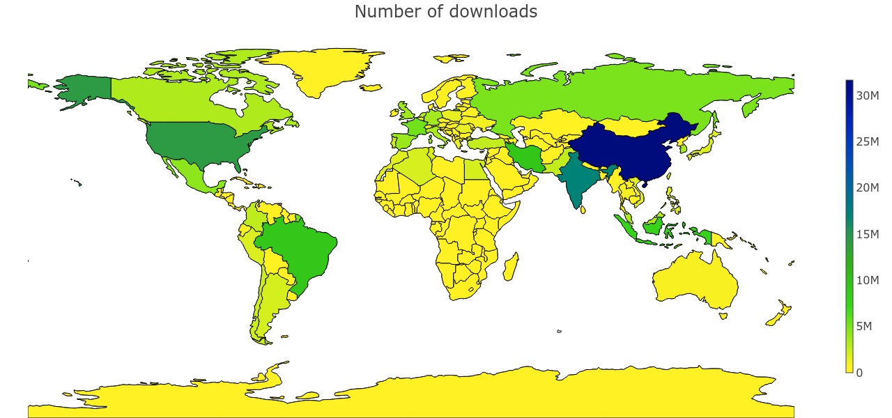
and
decimal logarithm of the number of downloads.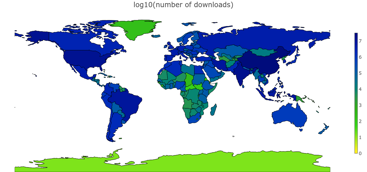
Otherwise, we will not see the difference either in the field of small values (South Africa with its 400 thousand downloads will be indistinguishable from Namibia with 6 thousand), or in the field of high values (we will not be able to distinguish China from Russia).
Additionally, here is a map.
downloads per capita (on a logarithmic scale)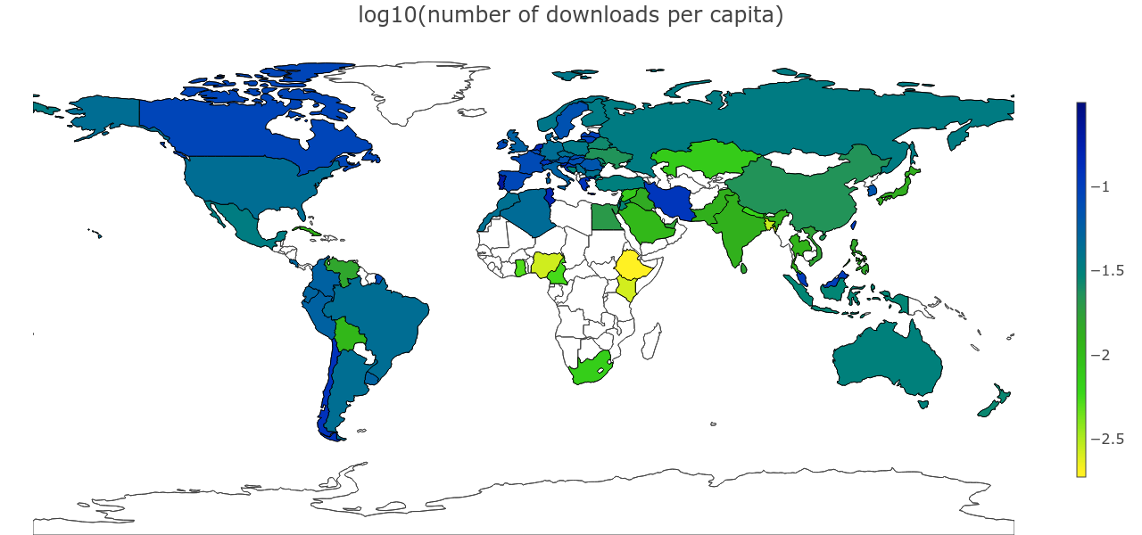
Here I had to throw countries with a very small population and a very low number of downloads - so that they did not distort the color scale. Singapore, Hong Kong, and rather unexpectedly Portugal, Tunisia, and the Netherlands are expectedly becoming the leaders.
Now we will study the scientific activity in a little more detail - by areas of knowledge. The doi-identifier prefix encodes the publisher, but most of the world's scientific periodicals are controlled by just a few very versatile publishers: Elseiver, Springer-Nature, Wiley. However, there are a couple of very large publishers of “narrowly specialized” topics: IEEE for electronic engineers and the American Chemical Society plus The Royal Society of Chemistry for chemists. With chemists, everything turns out not very interesting, and electronics engineers are distributed very unevenly.
Guess where they live?
India will be the absolute leader in downloading IEEE articles. Although in general it has two times less downloads than in China, specifically IEEE articles they pump out as much as three times more in absolute terms than China! On average, IEEE magazines account for 6.5% of downloads of the total, but in India, South Korea, Bangladesh and Singapore, this share reaches as much as 15-20%. More only in the Seychelles (but where those of the Seychelles) and countries where they hardly use the site (there are five active users able to shift the statistics).
Maybe the Chinese have already pumped out all IEEE, and the Indians only in the process? Or did India launch its moon program? I hope that someone will come in the comment and tell you what we do not know about India and China, which could explain such a strange bias.
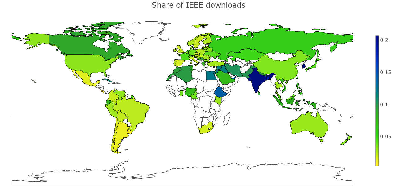
Maybe the Chinese have already pumped out all IEEE, and the Indians only in the process? Or did India launch its moon program? I hope that someone will come in the comment and tell you what we do not know about India and China, which could explain such a strange bias.
Frankly, initially I expected to check not IEEE, but Elsevier, in the hope that I would see a surge in downloads in Germany, where 60 universities refused to subscribe to the magazines of the giant publishing business. But the cards show a completely different picture: the share of Elziver is on average 30%, in Germany it is a couple percent less. And the leaders - Morocco, Algeria, Bolivia, Tunisia and Peru - as much as 50% of articles
swing with Elsivera.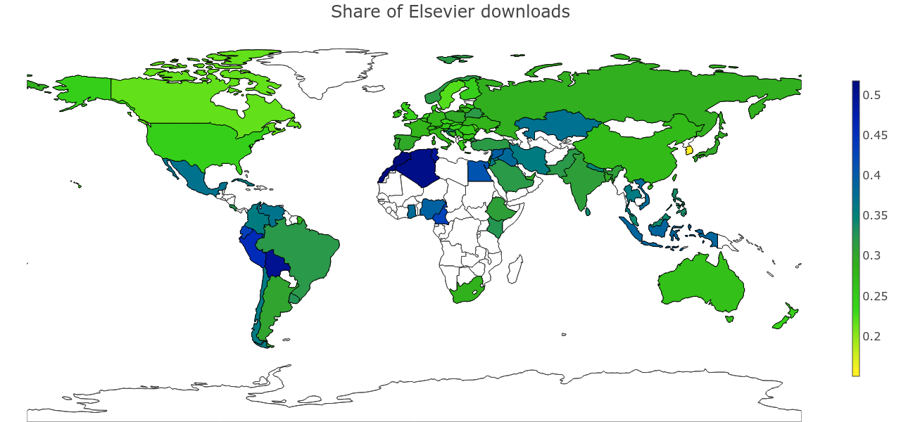
I later read that Elsevier restored access to universities, despite the lack of agreement. To analyze the effect, I looked at the first 40 days of the year when the ban lasted, but the picture has not changed much.
Another interesting discovery for me was the serious popularity (a few percent of all downloads) of articles with the prefix
10.1111/ , belonging to a rather exotic publisher: The Korean Society of Plant Taxonomists. What do you think, why?Solution
It turned out that the doi-prefix does not completely encode the publisher. Although the zone
10.1111/ previously belonged to Korean botanists, it has now come under the control of Wiley."Eighty-three percent of all the days in the year start the same way: the alarm clock rings."
As I mentioned, an attempt was made to study the time profile of using a sahab, but ... it was done for a tick: only two countries were considered, with low resolution and incorrect attribution of the day of the week. And the most important and most outrageous is the interpretation in the spirit of “see, the working hours are the same - it means the graphs are similar”. Although the graphics of Germany and Hong Kong are really similar, they have a rather serious difference. And the profiles of using saikhab throughout the day in many other countries differ dramatically!
We will soon build our own, correct graphics, but first I will tell you how they work and why. If you want to go quickly to kartinochkam, you can skip the following two sections.
Kickback tactics
To study how users work in different countries, we will build graphs of the number of downloads over a certain time period. There is a lot of data, but we still have to balance between the detail and clarity of the picture - after all, in order to see something, the statistics must stabilize. Initially, I built a graph of the number of downloads in each hour of the day, summed over all days of the year. Already from such graphs, it became clear that the story emerges extremely interesting. If you increase the resolution to 10 minutes, you can see more details, and the noise is still at an acceptable level. Leave!
In parallel, I built graphs of the number of downloads by day of the week, but they were not very clear (and ugly: only seven points). However, if you cross these charts and count downloads at noon on Monday and at noon on Sunday separately, the picture looks more than entertaining. It becomes clear how weekdays smoothly flow on weekends, and weekends on weekdays. Thus, we present what the average day of the year and the average week of the year look like.
To make graphs comparable between different cities and countries, they are normalized to the maximum.
Why so
Normalizing to the total number of downloads is not very convenient: then a decrease in the share of downloads in one place will lead to an increase in the share in another. With such normalization in a country with a pronounced day off, there will be an illusion that on weekdays they work much more hard than in other countries.
It should be understood that we cannot correctly compare the absolute level of work of the two countries among themselves, and compare only the relative level of work within one country at different times of the day. Normalization to the maximum perfectly solves this problem.
It should be understood that we cannot correctly compare the absolute level of work of the two countries among themselves, and compare only the relative level of work within one country at different times of the day. Normalization to the maximum perfectly solves this problem.
In parallel, I tried to study how a year is arranged, not a day. For example, I plotted the number of downloads on each of the 365 days of the year. It turned out absolutely nothing at all. First, noisy, but this can be solved by median smoothing with a window a week. And secondly, it was very difficult to interpret, and this is already more difficult to fix.
I also introduced such a characteristic as the “center of mass of the day” - this is the averaging of the time when the download occurred (an alternative approach is the median moment of download). The idea was to calculate one characteristic by which one could find out how early the working day begins and ends at different times of the year. However, it turned out that I do not know how to describe this chart in one sentence - a sure sign that no one will understand it. The complexity of the description and interpretation led me to look for other ways of visualization.
It turned out that it is enough to cross the graphs again and build a heat map. The weeks of the year will alternate along one axis, and the time relative to the beginning will be delayed along the other. For example, we can postpone every hour of the year as one point. To make the picture clearer, you can still sum up all the days within one week.
On such a map, the patterns of the weekly schedule are also visible, although it is still easier to read them according to the “one-dimensional” schedule of the average week (and even more so to compare). It is much more important that artifacts become visible on the heat map - it turns out to look at the differences between days and weeks of the year.
We will have to do zoom in / zoom out from time to time in order to look at the big picture from afar and make comparisons between countries, and explain in particular, going down to the highest possible level of detail.
We can look at heat maps for different purposes: when we look at the activity of work in different periods of the year, it is more logical for us to study the absolute values of the download. And if we look at how the schedule of the day changes over the course of a year, it is more convenient to look at the normalized values. In particular, rationing of the number of downloads in a heat map cell per total number of downloads per week works fine.
At the same time, I don’t want to lose information on the absolute number of downloads per week. Without this, for example, we may not understand in what weeks there were serious server interruptions. In addition, I would like to understand when scientists are hard at work, and when they go on holidays in large quantities.
To take the best of both approaches, I drew mostly normalized heat maps, and along the edges, histograms aggregated by time of day (or time of week) and by week.
With the heat maps, another difficulty awaited me: the details were not visible either in the zone of low intensity or in the zone of active work. When we built choroplets cards, we had to build two maps at once: in normal and logarithmic scales. But there will be a lot of heat maps, doubling their number seemed like a bad idea to me. Fortunately, it turned out that using a uniformly perceived color palette, you can solve the problem. With geographical maps, however, this trick is not rolling.
When the heat map is renormalized for weekly downloads, the issue of emissions is very pronounced. When in a week (as a rule, due to a failure) very few articles were downloaded, the proportion of a specific interval becomes very large. I cut such emissions (only emissions upwards) by the quadruple median - it turns out well.
You can not believe anyone. I can
Finally, the last couple of comments, before moving on to the pictures - about how much these pictures should be believed. When we summarize events in coincident time intervals, we need to take multiple intervals throughout the year. But the number of intervals relating to different days of the week and even different times of the day will not be completely balanced.
Why? And why can this be ignored?
The fact is that approximately one month of observations is absent in the logs (although the service’s work at that time continued), divided into two or three large intervals: April 21-29, October 7-29, plus single failures and blockages of the Sahab in certain countries. On heat maps on such days you will see bands with zero or reduced (if we aggregate downloads by the week from which only a few days fell) the level of downloads.
Let's estimate the server “availability” periods (meaning only the representation of the period in the logs) in order to estimate the scale of the error. We divide each week into 10-minute intervals of the form “Friday, 13: 40-13: 50” and estimate at each such interval the availability of the server as follows: the number of such intervals per year for which the logs contain records divided by the total number of such intervals. It turns out that server availability ranges from 86% to 92%, i.e. a difference of about 6.5%. At the end of Friday-Saturday (in UTC) there were a little more failures than on other days. You can increase the number of downloads on Saturday and its surroundings by 5-10% per cent in your mind, but this will hardly change the overall picture.
This figure does not include local locks. I separately considered that it was published in Russia (where the sci-hub was blocked from September 6 to September 9) - the error increases to 9.5%. What else have we not considered? It is likely that holidays are unevenly distributed throughout the week and are often carried closer to weekends. Theoretically, this could slightly distort the picture of the average Friday.
In addition, it is worth remembering that the server lives according to server time, and local time, it crashes at different intervals of the week. Because of this, for example, while the first week of the year is going on in one city, the last week continues in another city. I would not particularly trust the statistics of the first and last weeks of the year (especially since the first week of the year was incomplete).
Non-persistent availability can be ignored, we figured it out. But the bots can not be ignored. I did not undertake to honestly clear the data from the bots, this task is still waiting for its researcher. Just keep in mind that somewhere in the background they work. When bots come, it's impossible not to notice them.
It can be assumed that the most active bots never sleep and work with more or less constant intensity, and real people at night still need to rest. Then we can just subtract the background level of activity. As you will see, this allows you to get more or less plausible estimates of activity.
What is not taken into account in the analysis? First, there are cities that geocoder converts into different names.
Not very significant
For example, Saint Petersburg and Sankt-Peterburg. Or Tokyo (and partly Paris), which split into many municipalities. With countries, this also happens, but rarely. I found only a couple of cases, of which one is important - Czechia and the Czech Republic. One name prevails, but the difference is not an order of magnitude. This, of course, somewhat distorts the picture (and could cause a problem when building horoplets, who have to decide which of the numbers to visualize). An error with the names of the countries, of course, would have been easy to fix, but I noticed it only after the work of computationally intensive steps, which I did not want to redo for the sake of not very significant amendments.
Secondly, and this is important, we cannot separate the seasonality of work from the effects of the growth of the service audience. In particular, it would be naive to assume that audience growth is occurring at a constant rate. Or that it is the same in different countries. I would be glad if someone in the comments describes how these effects are better divided, or even take it to count.
“Labor legislation was violated maliciously and everywhere”
Our wise schedule
Ok, let's finally see how the working hours are distributed in different countries. To begin with, we, of course, look at the default city, the hero city of Moscow, with its 2.4 million downloads. We will watch the work schedule at once for the whole week.
Guess what he looks like?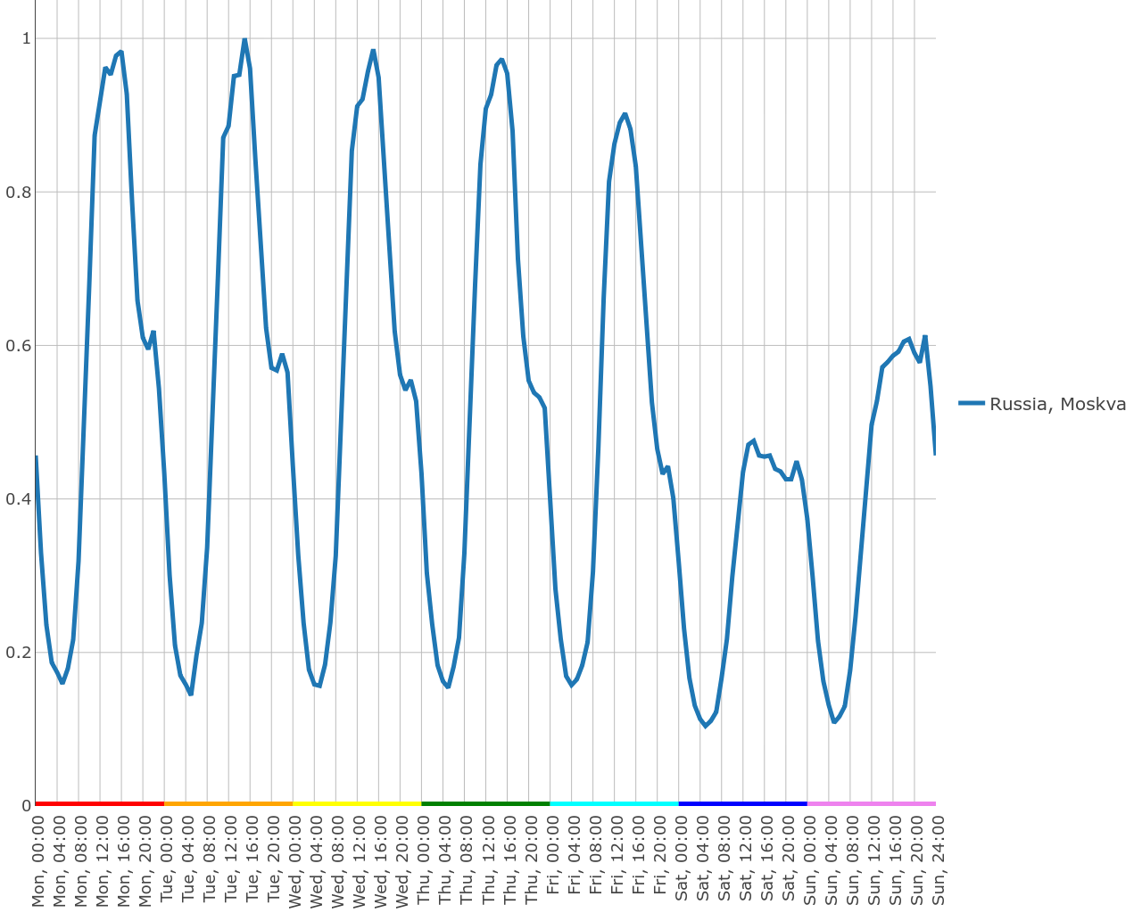
The graph shows that scientists are trying to live according to the usual schedule: hours at 8-9 come to work, hours at 17-18 leave. True, many continue to work deep into the night. At 2-3 o'clock in the night, the city falls asleepand the mafia wakes up . If you look at the activity by day of the week, it becomes clear that on Saturday, readers of scientific journals are more likely to rest, and on Sunday they are slowly returning to work.
The graph shows that scientists are trying to live according to the usual schedule: hours at 8-9 come to work, hours at 17-18 leave. True, many continue to work deep into the night. At 2-3 o'clock in the night, the city falls asleep
It is worth noting that all of Russia lives about the same. Is that in Novosibirsk and Kazan (unlike Moscow and St. Petersburg), researchers are trying to sleep at night, and most of the work activity is concentrated during the day.
Hidden text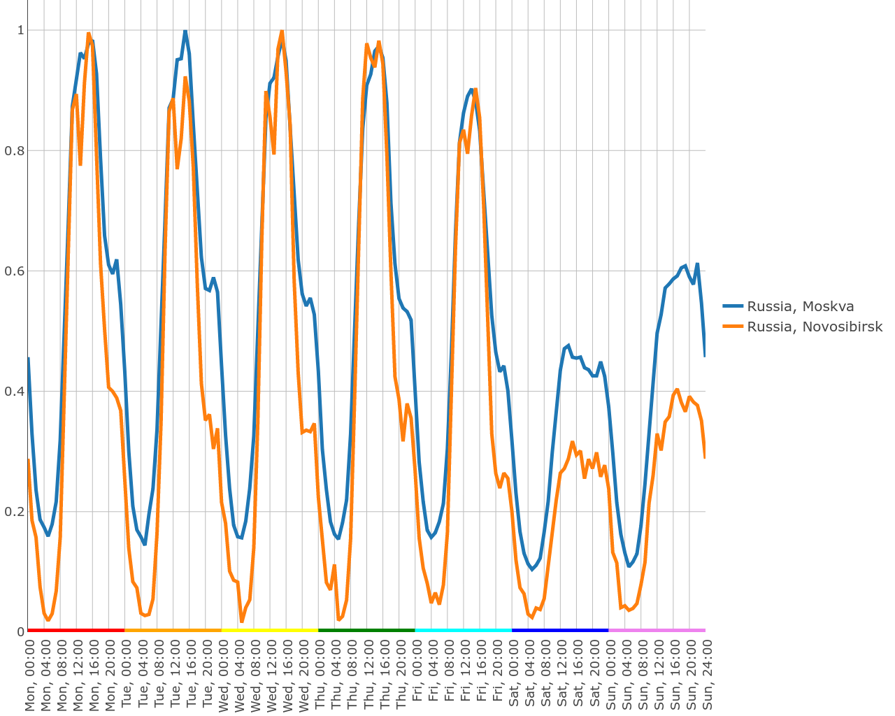
You should have noticed that Moscow never sleeps - and the activity even on a Saturday night is only 10 times different from the activity at the busiest time - about 14-15 hours on Tuesday. Bots in Moscow are clearly more active than in Novosibirsk. Let's subtract the background level from both graphs.
Hidden text
What do we see? Firstly, in Moscow, scientists, indeed, often prefer to postpone work to a later time and work much more on weekends. Secondly, it seems that in Moscow there are not only round-the-clock bots, but also those who rest on weekends (although they work at night). However, it can be real people.
In many countries, you can still see a small hump in the evening - about 21-22 hours. Parents open this site to read sci-fi tales to children for the night. Another alternative explanation is also possible: the scientist comes home, opens the browser, and new closed articles are downloaded from him again.
This, by the way, is almost seriously speaking. The logs show how some users simultaneously open a couple of articles that have already been read before. This is clearly an artifact from rebooting the browser. Not the fact that the researcher decided to work right now (read the article), but the download occurred.
Another hypothesis is that this hump comes from behind the deadlines. After all, by midnight (sometimes by midnight GMT or New York), you will certainly need to complete the list of references in your conference abstracts. This hypothesis, by the way, can be verified by comparing the time of this knoll in different time zones.
Their crazy schedule
We found that all of Russia lives about the same, and who lives wrong? It's amazing, but ... everything.
Let's compare Russia, for example, with France. See what has changed?
Hidden text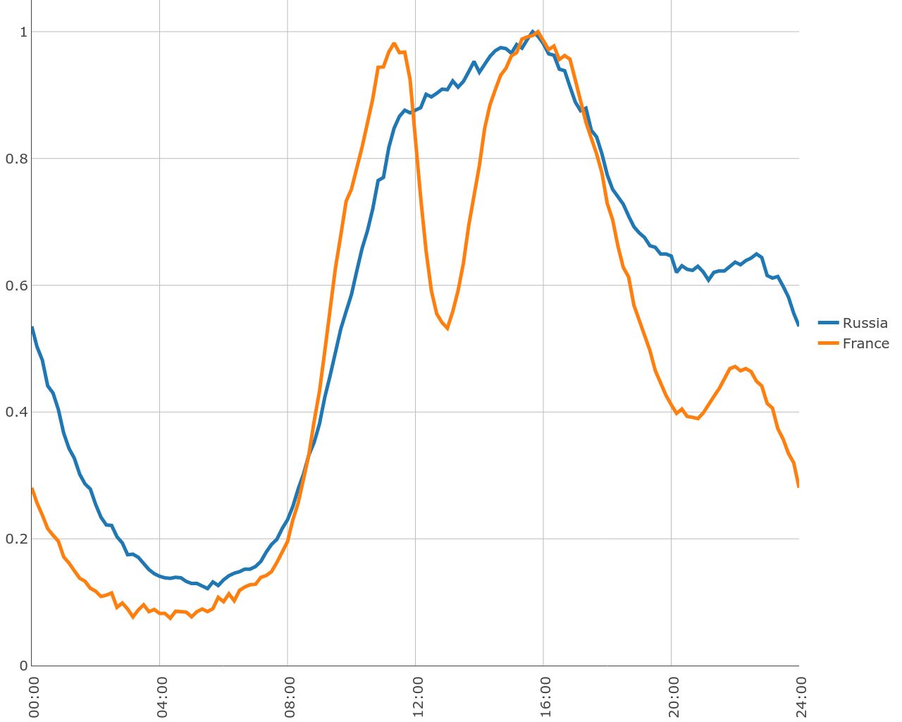
They sleep earlier in Europe, but they also go to work in a more organized way. But the most interesting thing is that there was a deep dip in the middle of the day. It can be assumed that the French more or less synchronously go for a lunch break in the interval from 12 to 14 (at the weekend the effect is slightly weaker, but also noticeable).
If you look at Paris, the failure there is noticeably less pronounced than throughout France as a whole. Germany occupies an intermediate position between Russia and France, there is a “lunch” dip there, but much less deep than in France.
Probably my favorite example is China. Firstly, there are a lot of users there, so the statistics are very smooth. Secondly, different cities do not differ much at all, surprising consistency for a rather large country. And, of course, China is not at all like Russia. I will draw many cities at once on one chart, so the scale of one day will suit us better, especially since the weekend differs from weekdays in China only quantitatively.
Chinese City Day
In China, two breaks. In the region of half past twelve and half past six. And working peaks in 11, 16 and 22. Breaks are very wide. This could be explained by the fact that everyone goes to dinner at different times, but! You can see that the break begins quite sharply - compare, for example, with France. That is, the lunch begins almost at the same time, but it ends at all at different times.
China, Hong Kong, France and Germany (adjusted for background level)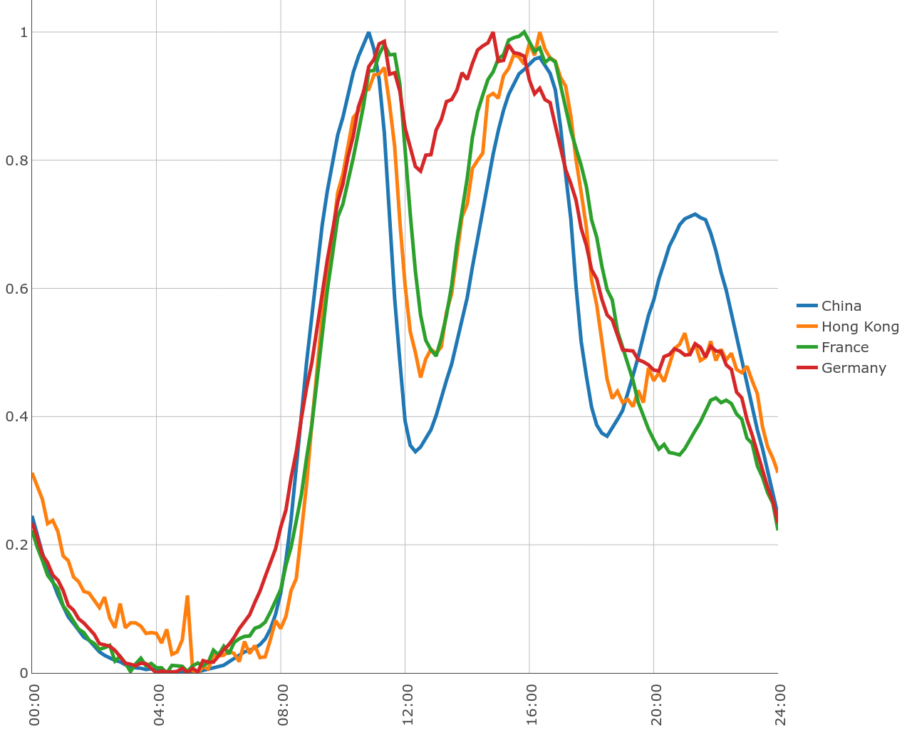
If you read about the daily routine in China, you can learn about the tradition of an afternoon nap; it looks like it's not a bike. Where does the evening peak come from (which, by the way, is not in Hong Kong), someone will surely tell in the comments.
upd: According to lockywolf , many Chinese companies rely on dinner, so people work up to 20. And there are two breaks in total: lunch and dinner.
On days of the week, most cities in China are also very similar, but there is a mysterious city of Dingxi, in which the picture is significantly different. Work there is shifted to the evening, and the weekend is not so noticeable. The fact that the relatively small and unremarkable town of Dingxi was ranked third in the list of the most active cities in China, most likely indicates that the geocoder is mistaken. Perhaps there is one of the traffic filtration points. Or simply the coordinates were determined incorrectly.
China and Dingxi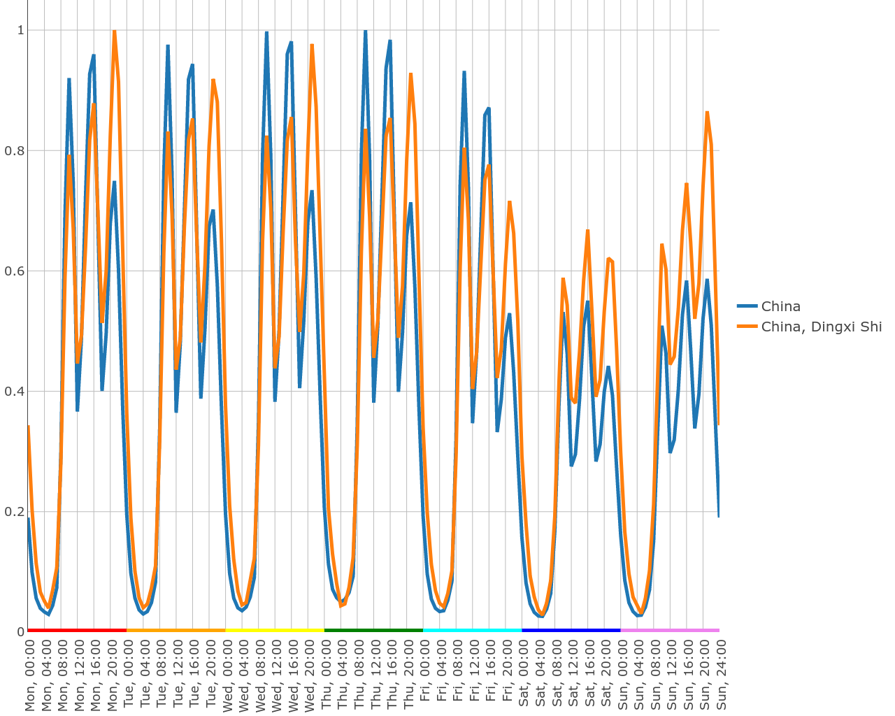
upd: As lockywolf suggests, Dingxi is the geographical center of China. And it is possible that China is not the only country that puts unidentified IPs in the center.
I think you coped well with guessing how the charts look in Europe. And now ... try to guess what the download schedule looks like in Colombia (or in Brazil with Mexico - the situation is quite similar).
I myself failed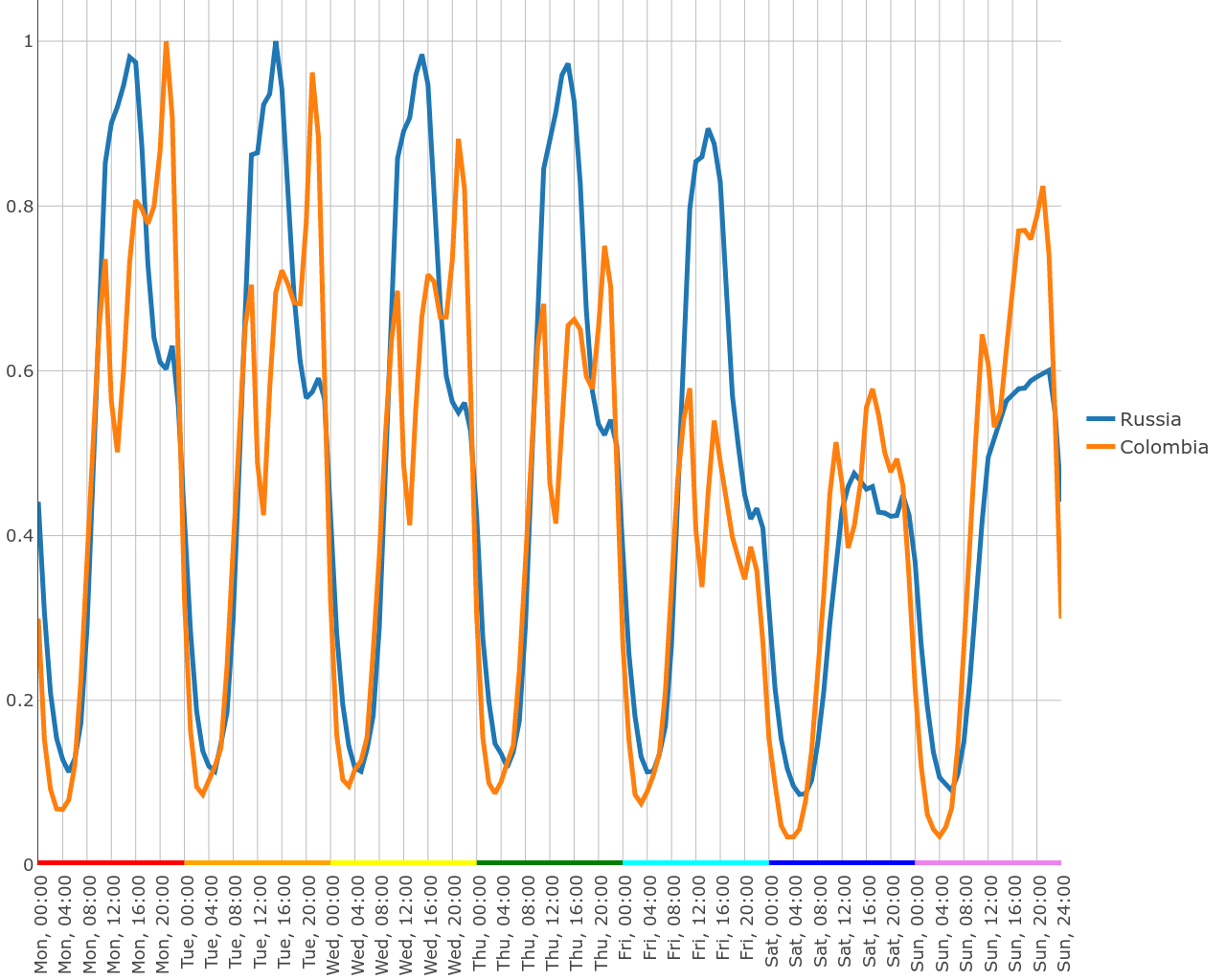
To make the contrast stronger, I painted Colombia and Russia next to it. Night and the beginning of the working day looks “as it should be”, and in the evening something unusual is happening.
Whether scientists prefer to work when it gets cooler. Whether at work, a sajab is blocked / not required by many, and one has to contact him from home. Or maybe they just decided to work with their hands during the day and read in the evenings. But the fact remains that the peak of downloads does not fall on working hours at all, but on a late evening.
Note also that this is not always the case, but only from Monday to Thursday. Friday evening researchers probably prefer to spend not in front of the monitor, but in a bar.
Monday begins on Saturday
When looking at Colombia, it seems that the main weekend is there on Friday and Saturday, and Sunday is a normal working day.At this moment, it's time to figure out that in some countries the week does not start on Monday, and go read Wikipedia about how the work week is organized in different countries. Wikipedia says about Colombia that the work week is the same as ours, i.e. It lasts from Monday to Friday or Saturday ... But life, apparently, is not quite the same as was customary. Anticipating questions, I want to assure you that this is not an error in determining the day of the week in the western hemisphere: in the nearby USA and Cuba, the working week is determined, as it should, from Monday to Friday.
Let's look at one more schedule with a shifted week - Israel. As you know, the work week is from Sunday to Thursday, and on Friday evening the Sabbath begins. And there are no surprises, everything is happening.
Hidden text
What other weekend are there? India and, especially, Cuba differ markedly from other countries. In most countries, scientists begin to return to work on Sunday. In India and Cuba, on the contrary: Sunday is a full-fledged day off with a very strong failure even on Saturday.
Judging by how abruptly the working day in Cuba ends, it’s not so much laziness or national traditions, but the fact that Cuba simply does not have the opportunity to work from home. In India, the picture looks different - see for yourself. I built two graphics separately:
Cuba with Russia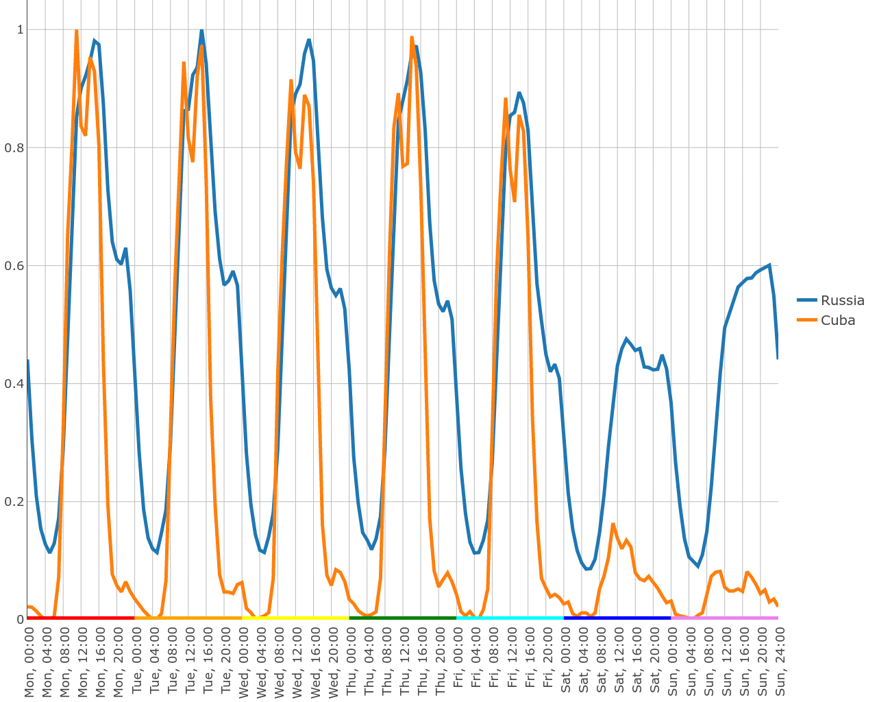
India with Russia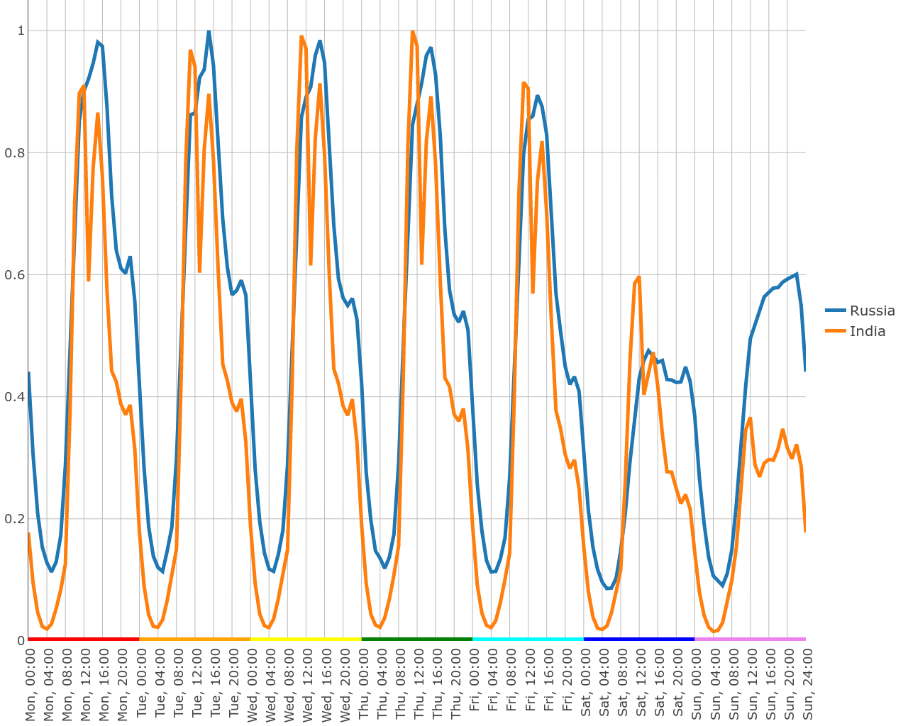
The country usually has general trends that apply to all cities. But it also happens that the city has its own specifics. Calcutta, for example, is unusual for India’s Sunday sundry.
Hidden text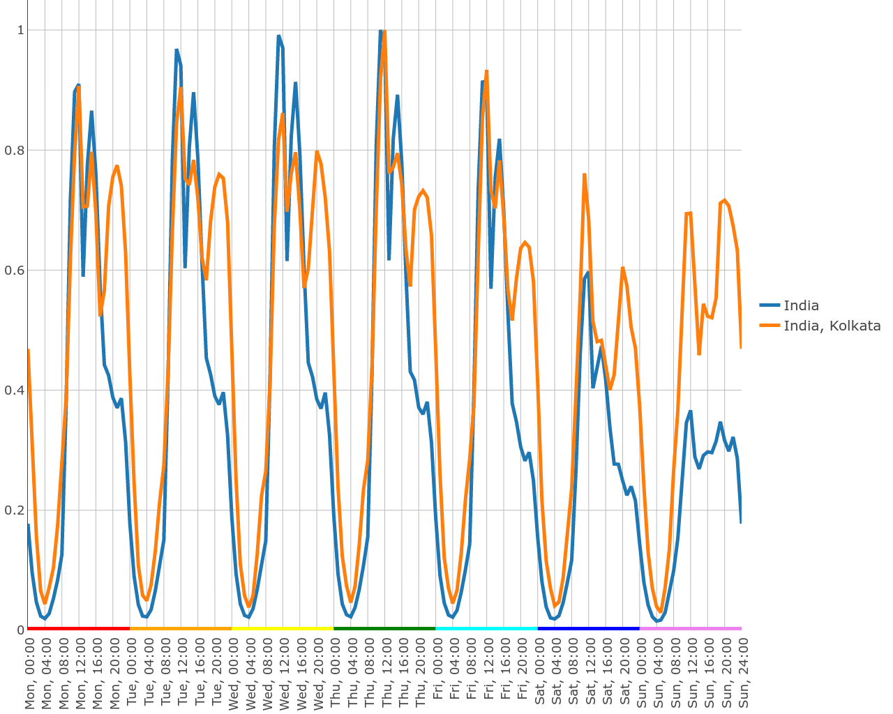
Surprisingly, in many countries in Africa and the Middle East (Iran, Iraq, Algeria, Egypt) there is no significant difference between the days of the week. In Iran, Monday starts on Saturday. On weekends, Thursday-Friday for them work a little less, but the difference between the busiest and most relaxed days of the week is only 10-20%.
However, it does not follow from this that these countries are similar to each other. It would seem that Iran and Iraq should be similar: two nearby Muslim countries, and even the names are similar, but - no. At one peak of work in the morning, at others - in the evening.
Hidden text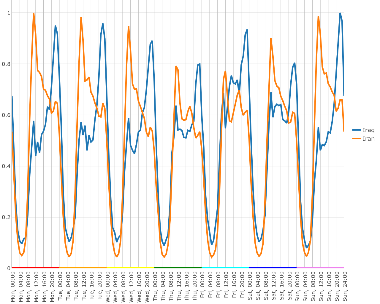
We will return to this riddle, armed with heat maps, but now let's talk about something else.
Mor, glad, invasion of bots and other misfortunes
You must have noticed that I have bypassed the United States, although they are one of the largest users of Sahab. So, this has good reasons. The fact is that most of the traffic in the US is created by bots. As I said, it is impossible to confuse.
USA-Russia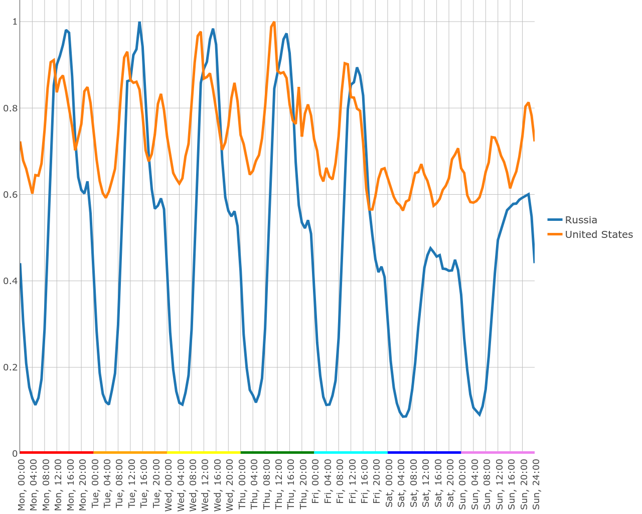
Traffic at night differs from traffic at the most loaded time only twice. If we assume that bots get articles at a constant speed, and at night the level of downloads from real people is negligible, then we can roughly estimate that just over 70% of the traffic is generated by bots. For comparison, in Russia this indicator is about 15% (for Moscow - 20%). At this point, you can gloatly notice that after subtracting 70% of downloads, the United States whistles from three top piracy leaders (immediately to 10th place), giving up its place to Iran and Brazil.
Construct a weekly schedule without this background level. It shows that the general patterns are viewed. At night, calm. A sharp increase in activity is observed with the beginning of the working day and in the evening around 22 hours. On Saturday, the work subsides. Everything is as it should be.
Russia and the United States, corrected on the background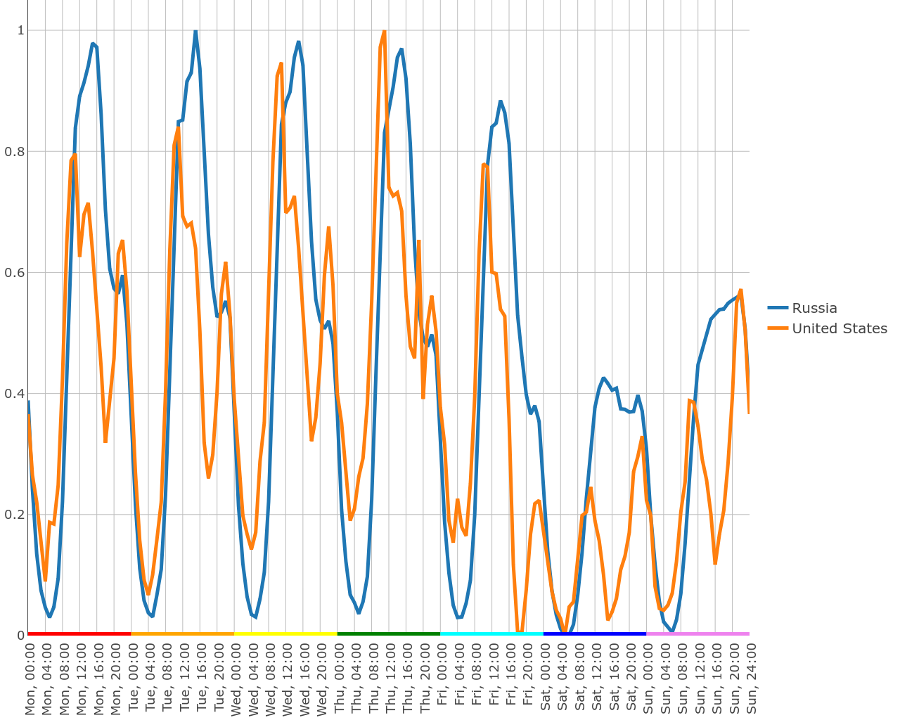
They say that people never sleep in metropolitan areas, but look at the difference between
Moscow and Chicago!
In Los Angeles, the situation is even worse than in Chicago. In New York, a little bit better, but the night falls are not at 4 am, but at 19 pm - as if these downloads came from another time zone.
We see a similar situation with bots in London and in Canadian Toronto. It can be assumed that in the US and UK, someone set out to save the entire site, but did not cope with torrents on libigen.
But among the American cities there are absolutely “decent” ones. For example,
Boston against Moscow.
Where else do bots behave so brazenly? In the central area of Tokyo, Chiyoda-ku, the bot runs every half hour and downloads a bunch of articles from several IP addresses. On the chart you can see the perfect saw.
Hidden text
What other anomalies are there? I already mentioned geocoding errors. We are probably dealing with one in Chinese Dingxi, but it’s hard to be absolutely sure. But in Canada, found two major cities with the names of Montreal and Montréal, which have virtually the same coordinates. Both have fairly clear download schedules ... The peak of downloads, however, they have shifted hours by 9-10 relative to each other.
Hidden text
It looks like all the users of some distant city from another continent go to the side of the site via a shared VPN. Or, more likely, their IPs were incorrectly recognized.
Zoom in: studying seasonality
We looked at how the average day of the year works. But is it possible that in the summer the work goes the same way as in the winter? Close, but not identical. Unfortunately for the analysis of the most interesting places - in the Arctic Circle - not enough statistics. But there are many other interesting places.
For a start, we look at Russia. On the heat map, you can see that the working day in the summer begins earlier - in the morning hours, the arc is visible, although not strong.
Russia
If you look at this graph in a weekly section, the effect will be less pronounced. But it becomes clear that this effect is manifested only on weekends. On weekdays, scientific workers observe the schedule, and on weekends, they both wake up and work.
Hidden text
The mode of operation is almost continuous throughout the year, without unexpected bursts. The intensity throughout the year varies. The proximity of the New Year in Russia (and many other countries) begins to be felt from the beginning of December - the number of downloads drops one and a half times.
I was tormented by a mystery: why Iran and Iraq differ so much (at the first peak of activity in the morning, at the second - in the evening). I did not find the answer to this question, but it turns out to be quite useful to compare the maps of their activity throughout the year. It turns out that in Iraq there is no clear time to work with the sahab and we see a rather wide spot in the evening. This works in favor of the hypothesis that many Iraqis have a banned sci-hub at the workplace, and have to work with it from home.
Hidden text
It is also instructive to take a look at the irregular schedule. It shows most clearly how it is pumped in the first weeks of November. Guided by my limited experience, I would again suggest that at this time in Iraq it is time for deadlines for applications for grants and every night for some kind of laboratory is the “last one”.
Irregular Iraq.
upd: domage explains why life in Iran and Iraq is designed that way. I was very far from the truth.
Explanation
. . :
1) , . — — .
2) « » : , . — 8 , — 3-4 . . .
3) — ( ). , - + . ( ), . . - , .
1) , . — — .
2) « » : , . — 8 , — 3-4 . . .
3) — ( ). , - + . ( ), . . - , .
Is the evening “peak” everywhere as ugly smeared as in Iraq? Not at all. In China or Colombia, for example, you can see a clear peak that appears throughout the year:
Colombia
China
Although Iran is very different from Iraq according to the daily routine, the year they have is similar. But from Iran there are much more downloads, so the statistics show patterns more clearly. The third country like them is Morocco. Look!
Iran
Morocco
It is absolutely impossible to ignore the June anomaly. In June, as a whole, the intensity of work decreases, but around eight o'clock in the evening (in Iran - an hour later), the activity diminishes - almost completely to zero. But at night, work continues until almost six in the morning! And it is not surprising that the morning after such nights also shifts to a later time.
Guess why?
, . . , . . - , .
The clock transfer, by the way, is also visible in the Iranian picture (I translated the time zones, of course, taking into account the switch transfers). In Iraq, time is not translated - there is no use searching for a time transfer. In Iran, the watches are converted one hour ahead from March 22 to September 21. As you can see, in fact, two more weeks, people start working as if the clock had not been transferred, then the work schedule adjusts to the new schedule. The September switch in the opposite direction takes place much more smoothly: some people continue to come to the biological clock - because of this, they find themselves at work a little earlier than what they are supposed to, but they quickly realize that they can sleep longer and return to the typical schedule.
The attentive reader may note that when translating the clock we must first see a jump, then a smooth attenuation. And in September we see a smooth picture of not only the attenuation, but also the translation itself. I suppose that aggregation by weeks contributes to this: the clock transfer is in the middle of the week, and we see a mixture of work according to the old and new schedules.
On the map of Morocco, unfortunately, time translations are not visible. And Ramadan is less pronounced (the work ends not by 6, but rather by 4). But it is possible that these facts are even related: in Morocco, the watches are translated in a rather exotic way - 4 times a year. Their main time zone is UTC. From the last Sunday of March to the last Sunday of October, the time is translated one hour ahead. But for the time of Ramadan (or rather, from May 21 to July 1), the clock returns to UTC, which slightly compensates for the shift in starting work at a later time.
Surprisingly, in other countries I didn’t find any evidence of the clock transfer at all. It is necessary to reorganize to a new schedule - everything is immediately rebuilt.
Chronology of the fighting
If you return to the heat map of Russia, you will see non-weak activity on summer nights, in some weeks - uniform activity. It is difficult to say exactly who has tried here: people or robots. But quite often heat maps (in this section it will be more convenient for us to use irregular schedules) help to clearly localize the attacks of bots. Probably, in many cases, the safest and easiest way for a clean analysis is to simply cut out the periods of anomalous activity entirely.
Russia
Let's take a look at Germany with France.
France
Germany
First, you have the opportunity to make sure that Christmas is celebrated there and there. France works almost the entire year, but about a week before Christmas, the work subsides and resumes only around February. Secondly, in Germany they began to actively use sahab from June. It is difficult to confidently say whether this is a manifestation of seasonality, audience growth or policies of German universities in relation to journal subscriptions. And thirdly, the first week of August speaks for itself.
The peak of the activity of the soulless piece of iron in many countries fell in the summer months. Moreover, some bots obviously worked simultaneously with addresses in several countries.
But these episodic invasions of the Huns in the lands of Germany and France completely fade against the background of South Korea.
Hidden text
Something tells me that just in those weeks, South Korea tried to pump out the entire IEEE (if you remember, she was one of the leaders in downloading engineering articles along with India).
In the Seychelles, the situation is even stranger. It was as if a group of scientists arrived there for six months, and then left together. Or as if the bot turned off at night with the laptop of its author.
Hidden text
Finally, I will give a very alternative characteristic for the temporary localization of bots. Many bots do not want to save cookies, which means they will receive more and more new user id. And in the summer, when bots revived in Russia, one can notice an amusing picture: the average number of unique users is growing, and the number of unique ip is falling.
Survivors dedicated
I hope that I managed to convey at least a small part of that surprise and admiration for the diversity of the world that I experienced, checking country after country and inventing new ways to look at the data. It's amazing how much you can find out from the simple log of a popular site.
In conclusion, I would like to remind you that it is dangerous to make hasty conclusions. When I had not yet looked at the heat maps, but only considered the “center of mass” of the day and looked at the failure in June, I was sure that in Iran, work in June starts early, because the weather has. Then I realized that a sharp failure is not the weather and realized about Ramadan. But still believed that the people just get up early because of some morning prayer. The fact that the shift of the center of the day is not due to work early in the morning, but very late at night - after zero - I didn’t realize much at once. And who knows how many more details I let out of my mind ...
Two obvious problems that have yet to be resolved are filtering traffic from bots and separating the effects of seasonality from the growth effects of the user base. It is possible that the data for the 2018th year will help to cope with this task.
It seems that I managed to remove the cream from this data, but do not forget that under the cream there is usually no less valuable substance left, and in much larger volumes. After all, we did not even try to look at what articles users read. And this is the richest field for research, because each user (if he is a human being) reads articles in a rather narrow range of topics - which means it’s ready for training a machine that determines the semantic similarity of articles. If you really fantasize, it is also a tool for industrial espionage: you can see what your competitors read ... last year.
You can look in which areas the researchers read the classics, and where only the articles of the last year. How do downloads of open and closed articles in hybrid access journals. How does the presence of a preprint on the likelihood that the article will download to saykhab. In which countries do they read articles in German?
However, even without analyzing the articles, there are gaps in unexplored issues. For example, you can classify IP as “day,” “night,” and “round-the-clock.” And also regularly and irregularly used (in the scientific research institute the ip-addresses of many laboratories are common, which means that every working day somebody uses saikhab). After that we will be able to study the individual components of the work schedule, and not the whole mixture.
We can study whether users work from a single laptop at home and at work, or they use working computers. Or maybe you want to check whether deadlines of grant applications are visible on the charts? Or maybe you will be able to detect the correlation of the peak of the working day with the geographical latitude or, perhaps, with the weather on the day of downloading?
It would be curious to understand what bots are: do they download random articles or entire magazines? Or maybe some users with abnormal activity are “telegram bots”, which are the gateway for many real users. Yes, at least look at the activity card of living users, cleared of extraneous activity - it would be great.
All data is open - dare! To make it easier for you, II attach preparatory scripts on a githaba , a jupyter notepad with pictures and a small set of processed data sufficient to build similar graphs for all countries (and for one-dimensional graphs - even for all cities).
If you want to see how the work is arranged in your favorite country, you can independently build charts plotly, in a notebook you just need to write exactly one line.
Thank you sci-hub for the opportunity to make a fascinating journey, and praise the open data!
upd: Alexandra Elbakyan considers the estimate of the number of bots in the US incorrect and leadsas an argument, the statistics of Yandex. metrics (which bots, presumably, do not use). In terms of Yandex metrics, the United States returns from tenth to fourth place. However, I do not see how this can explain the temporal distribution, which led me to think about bots. The question of US traffic clearly requires a separate detailed analysis.
By the way, Alexandra mentioned several times that if your task requires a massive downloading of articles, you can write to her - and you no longer have to break the captcha. Use this option and do not distort the statistics. :)
Source: https://habr.com/ru/post/359342/
All Articles