Material Design Updates: How to Live
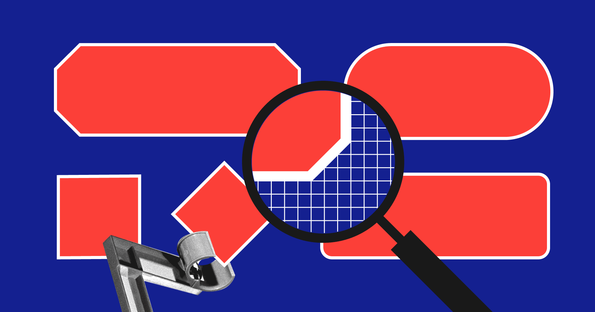
Can buttons be hexagonal?
Google I / O 2018 left a huge amount of material for reflection. What's new? How to live on? Is my application out of date? Can buttons be hexagonal? Are designers no longer needed again? Comprehend more pleasantly slowly and in small portions. This portion is about design.
For four years, Material Design rather fed up. According to Google, 1.5 million applications have been created based on this design system. Why? After all, it was originally created for the internal needs of Google.
- It solved the problems of design heterogeneity for Android and the absence of any system
- It was universal for different devices: tablets, smartphones, web.
- It is thought out from the user's point of view and is intuitive.
')
Read more about its principles here .
The system was accused of inflexibility and, as a result, obtaining a design for a carbon paper. If to design the service, strictly following the guidelines, then visually the applications really turned out to be characterless. On the other hand, why blame the system? Guidelines have never been a bible, you can retreat from them. Maybe you have chosen the color for your application only in the Google Color palette? I hope not.
On the other hand, by adding custom elements, you risked meeting your Android developers in a dark alley and listening to a long speech about why and how wrong you are. These were dangerous times.
Also all the winners of the Material Design Award risked. Have you noticed how custom UI is for these projects? But Google encouraged them, and everyone was amazed.

Now it’s obvious: Google wants us to customize our apps. Products must be beautiful and different. The updated MD is an attempt to show designers and businesses how to customize a UI, without fear of being cursed by developers.
material.io - Design, Develop, Tools
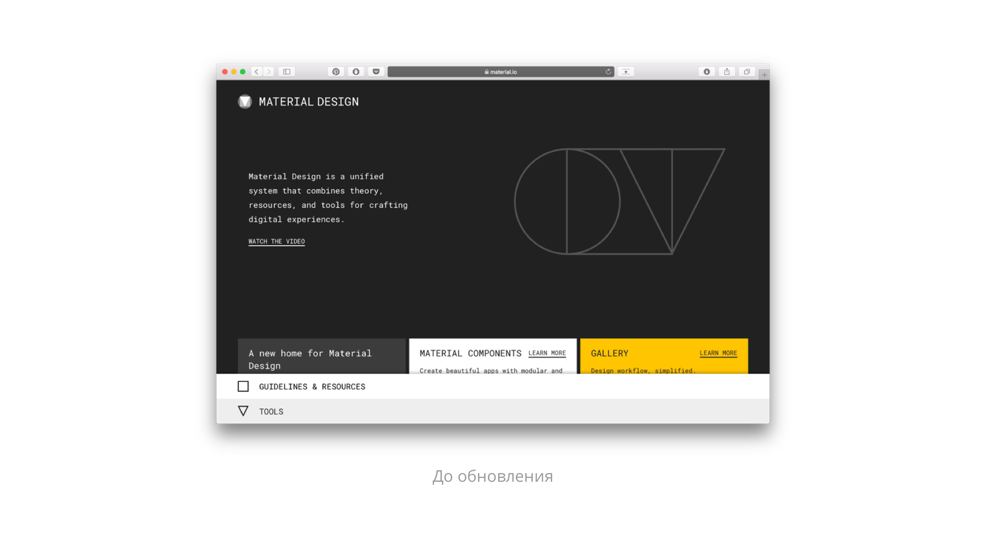
You can begin to study the design system from the site - not only part of the content has been updated there, but also the visual style. Now even the 404 screen will teach you, and by clicking on an element from the guides, you will see its specification with all the distances, fonts and download links from the Google library.

Leave links to guidelines and resources for developers . In the new system design + development = <3
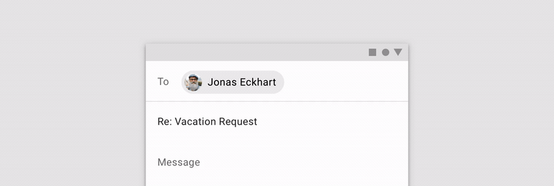
App bars: bottom
An interesting attempt to simplify the life of the user and move the key navigation elements down. Up to four actions can be added to this panel, including the floating action button.

Use
1. On mobile devices
2. In sidebar applications
3. On screens with 2-5 shooters
Do not use
1. In applications with Bottom navigation
2. On screens where there are no actions, or it is only one

Recommendations for the color of the floating button remain the same: it should be a contrast. If you want the floating action button to be in the App Bar color, then add an additional shadow under the button or select it in another way. When scrolling the button can remain in place
More from the important. All popup items like snackbars should not overlap the Bottom App Navigation. A keyboard on the contrary appears over the panel and hides it.

The relationship between the Botton App Bar and the navigation bar remains complex. The back button still has to live on top. The top panel should be dimmed, without additional shadows. And the icons for action can be juggled by grouping them by context.
Chips
Compact elements for use in the form of tags, filters, choice of options or action games. Everyone used them anyway, but now it is officially possible with ready-made components in the code.

Also Chips can be opened to show more information, move with a drag & drop gesture and scroll horizontally.
Backdrop
Variety of modal window. Its main purpose is to display contextual content with actions. Backdrop consists of two layers: front and back. Unlike iOS modal windows, for Android, the back and front layers are related to each other. When you perform an action on the back layer, the contents of the front layer will also be changed.
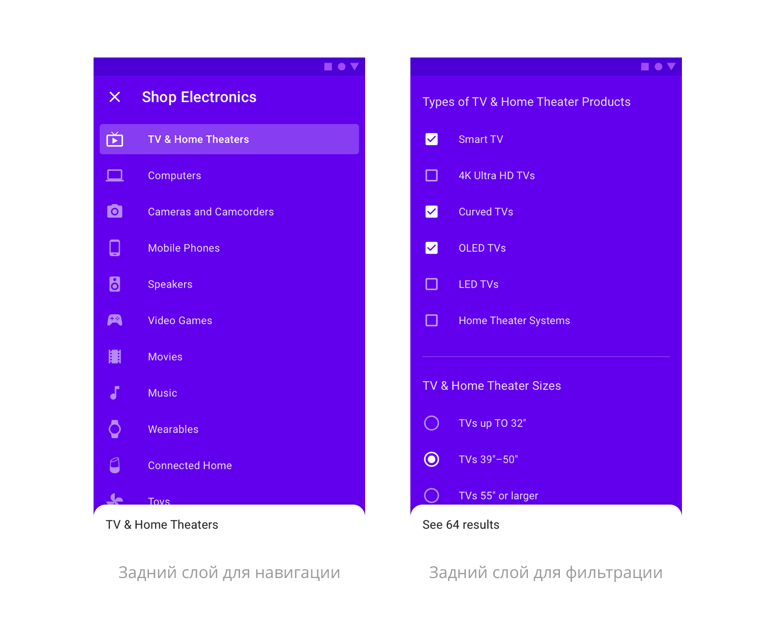
The front layer is needed to display relevant information and interact with it. You can add a subtitle to it, which, if needed, is fixed when scrolling. The content on the card can be any and scroll vertically or horizontally.
The form of Backdrop depends on the style of the application, you can play with it using the Sketch-plugin, which we will talk about later. There is a template for Figma.
Banners
Good alternative to alerts. The banner displays an important message to which the user can either respond or close it at any time.
Banners appear at the top of the screen, under the App Bar. On the screen there can be only one banner.
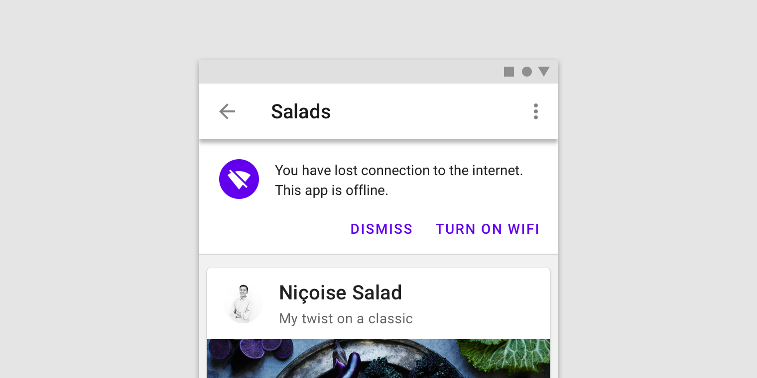
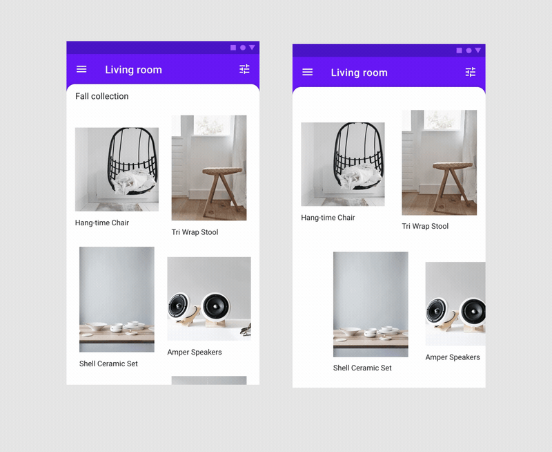
Image lists
Images can be set to a repeating pattern - now it does not take a lot of hours of development hours.

Dividers
Nothing unusual. Now the dividers officially exist.
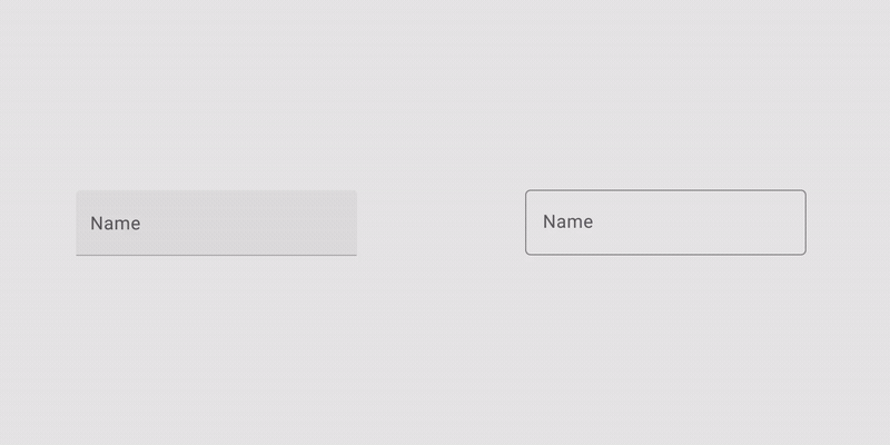
Input fields
In the guidelines appeared flooded and contour text fields. Text can be entered in several lines in height, add an explanatory line and icons. Guidelines have all the necessary states.
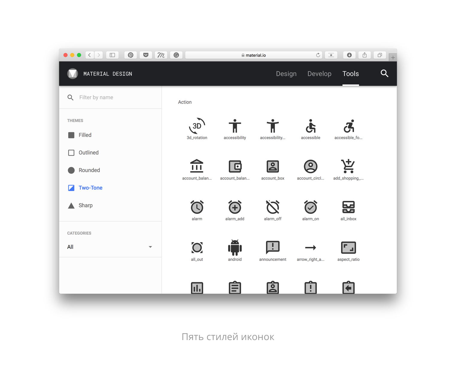
In addition to the components, the site has updated the section with icons and typography. You can change the font grid, select custom fonts and change icon styles. Many elements can now have straight, hexagonal, cut or rounded corners. The interfaces in the Google products themselves, for example, have become more rounded.
To be sure that the native elements are available, you can use the Sketch plugin .
Material theming
The plugin allows you to quickly create your own library in characters, consisting of native MD elements. You can customize the color, font, icons and shapes of objects. And if before Google advised to use only their palette of colors - now you are free to choose.

The color can be any, and the plugin will select the appropriate shades and check the readability of the text. In their presentations, Google designers have mentioned many times that this will "increase the speed of creating applications." While this statement is true only if you use native Android elements, it will be much easier to work with them, and many UX problems have already been solved by the Google design team.
The plug-in works only with Sketch so far - Windows users are again deprived for some unknown reason. The teams Lyft, Pocket casts, Zappo, NPR and Genius already use the capabilities of the updated Material Design.
The picture below should inspire you to update your apps.

When testing the library, there was a problem with a quick search for the necessary characters - it is unusual to use what I did not create myself. Plus, not all states are enough, there are errors, and not all elements are suitable for scripts. When choosing a non-standard font, its size can be, for example, 11.72pt. So while it is still necessary to double-check for the plugin.
But despite the flaws, if your application uses native Android elements, be sure to test the library.
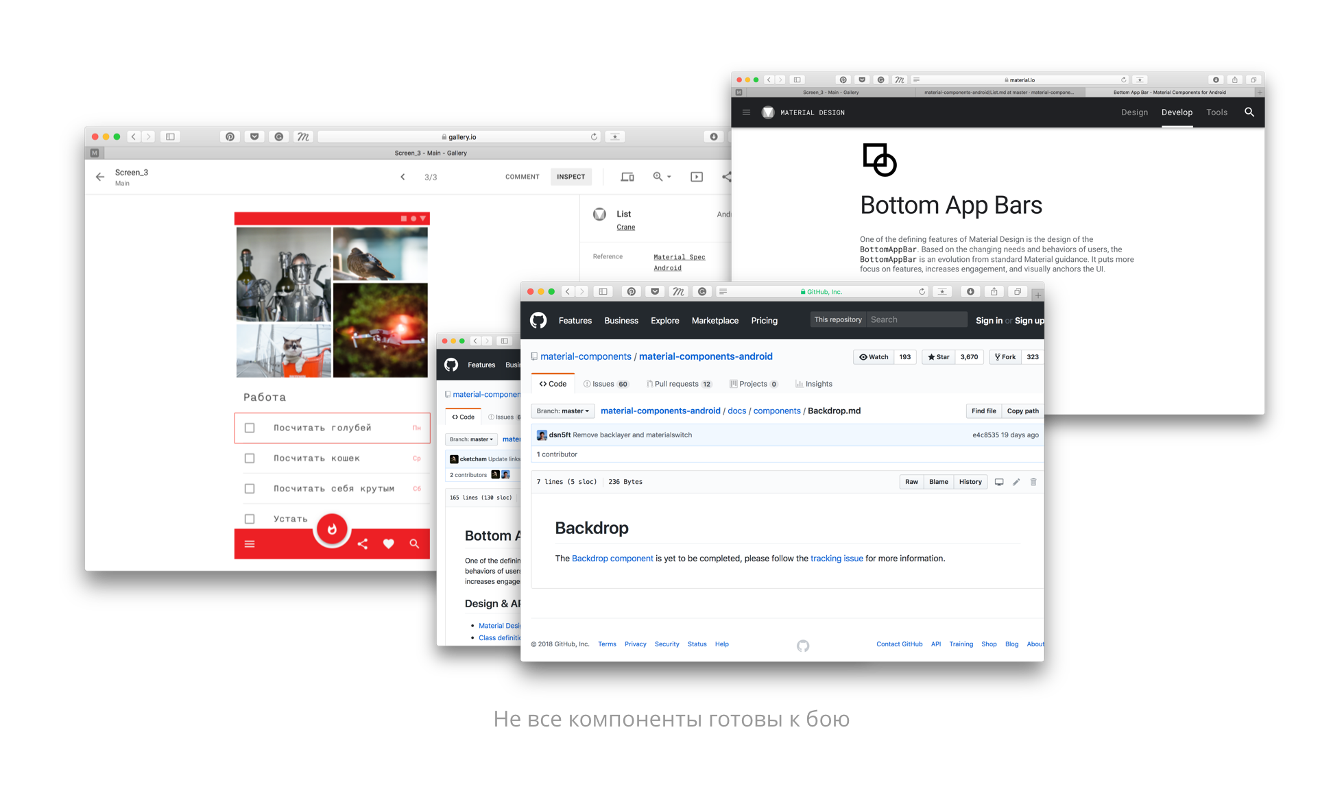
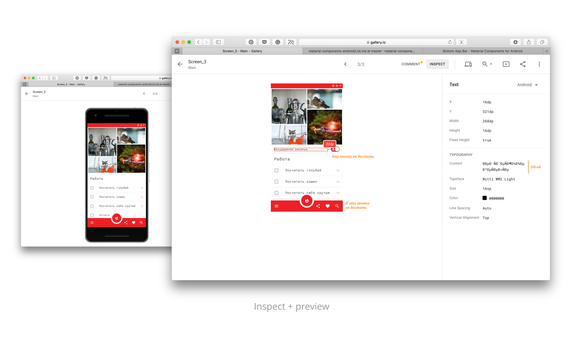
Gallery
Google finally presented its service for loading screens, commenting and viewing the markup of elements, like in Zeplin. You can add artboards, either by uploading them to the Gallery, or using the already mentioned Sketch plugin, and you can watch and comment on the screens from a computer or iOS and Android applications .
The result is not impressive. The biggest plus should have been the ready-made code for native elements, but the GitHub link is not so cool. It is also early to ask developers to add new elements to your application - the code for them has not yet been submitted.
And what if your elements are not native? You can see the markup, but get the cut icons will not work. So it’s too early to talk about replacing Zeplin.
Commenting on screens separately is not a new idea, so why not create a tool for viewing artboards in a script like in Realtimeboard? Or at least add the ability to prototype, to understand which screen is connected with which, it was easier.
The tool must be refined until it loses with the existing one.
What else?
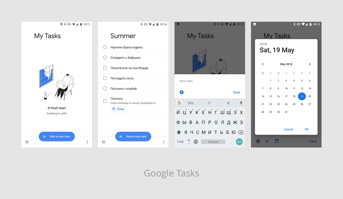
Updated the design of Gmail and Google Drive . A new Google Tasks application has appeared. You can also see the application for Google I / O participants - the updated guidelines are also used there. If you have something to add - do not hesitate and write in the comments.
There are many unusual rounds appearing in Google applications, due to which non-updated products look obsolete. The system is a bit lost in recognition and character. But it's interesting to follow the development of Google’s internal products and the consistency of them.
Source: https://habr.com/ru/post/359158/
All Articles