New BILLmanager interface
Meet the global redesign of the client part of BILLmanager, a large and complex product for hosting. I am the head of the ISPsystem UX group and I want to tell you how and why we did it. Two years ago, at the beginning of our work, we had little idea what we had to do. During this time, not only designers and interface designers appeared in the company, but also the staff of frontend-developers has grown. We learned to work on the Scrum methodology and implemented Youtrack to manage the development processes. Who cares, why we all did it and what we did - welcome under cat.
BILLmanager from ISPsystem is a complex software product for automating hosting management. On the one hand, this is a working space for the work of hosting employees (admin panel), where they can manage services, create tariffs, etc. On the other hand, this is a personal account for a client hosting provider. Our redesign has so far affected only the client part, that is, the user's personal account.
In a private office, a client hosting provider can make payments and keep track of their history, order and manage services, their account, and write to customer support. The product is very flexible, depending on the settings of the user's personal account may look different, which creates additional difficulties in the design and redesign.
')
ISPsystem appeared at the turn of the 2000s. Any automation tool at the time was a competitive advantage in itself. For technology companies of the time, it was the norm that the product itself and its design were invented by the founding developers. It was the same with us.
But today the situation is different. Now hosting is ordered by people far from technical details - small and medium business owners who need a simple and inexpensive website. They do not want to deal with a complex interface and are entitled to it. Faced with difficulties, they turn to support or leave, not just from BILLmanager, but from a hosting provider. It's time to change the interface, make it simple and clear for a new audience.
We do not make a new product, but we rework an existing one, it is used by thousands of people every day. Therefore, the work began with the collection of information. We went to our partner hosting providers. The support service and the marketing department reported a lot of valuable information about BILLmanager 5 users, including daily problems and tasks that they encounter in the interface. Then we wrote Job Stories, we divided them into categories and prioritized them, built a job map ...
Then we drew in Axure the first interactive prototypes of the new interface that made the concept clear and tested. The prototypes turned out to be rough, far from being put into development, but they helped to understand where to go next. It took about four months ...
Then I will talk about some of the problems of BILLmanager 5 and about the most important principles of the BILLmanager 6 interface, which will help to avoid such problems.
Consider the problems of the interface BILLmanager 5 from the point of view of a beginner. For experienced users, they are not so significant, but to become experienced, you need to use the product every day or almost every day. And the clients of the hosting providers do not enter the personal account, while the ordered services (for example, a virtual server) are ok.
According to our data, most of the providers' clients visit their personal account less than once a week. At the same time, it is impossible to become an experienced user, which means that interface solutions that are not obvious, incomprehensible from the first time will most likely remain unclear.
Below is a screenshot of an example of such a solution. When first used, it confuses many.

The functions highlighted in the screenshot become available if you click on a row in the table (in this case, the rows are virtual servers). But the row in the table, even when you hover the mouse, does not seem clickable at all. In this case, the selected functions are visually unrelated to the rows in the table. And there are a lot of such problems in the BILLmanager 5 interface, we’ll focus on the biggest ones.
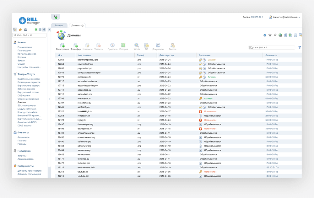
In the screenshot, a dashboard, how it sees a novice user BILLmanager 5. A lot of diverse information, which is provided on the principle of "because it is." Useful information (highlighted in red) is lost among the less important.

This leads to the fact that novice users are faced with problems when performing even such simple tasks as ordering services, top-up balance, a request to the support service. Many people simply do not notice the necessary buttons and menu items (we checked it on users).
On the one hand, the provider can configure everything very flexibly, on the other hand, a novice user faces three main problems:
When a user performs actions with these or other objects, he may need to write to the support service. The screenshot is an example of a virtual server.
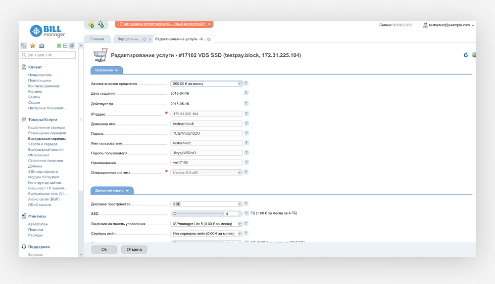
You can write in support from this state (not very obvious, but in the lower left corner of the large menu there is “Support → Requests”). But if you click on the "Requests", then to return to the properties of VDS will have to make at least three clicks through the global navigation. The user context will be lost, and the “back” button in the browser will not help either - it just does not work with BILLmanager 5 tabs.
This approach is manifested in everything. There are two main interface components: forms and lists. It is necessary to provide information with the text - we display it in the form of a form with fields not available for editing. Date format as in a database. Almost in all tables there is an id field (why, if there is no information in it that is understandable to man?).
Our team needed to force the company to reconsider the approach to the design and development of the product, to put the interests of the user before the interests of the programmers. And we could do it :)
Design is always a hypothesis, more precisely, many hypotheses. Even if we have a lot of statistics, the results of research and revelations of the support service, all the same, everything fits together in the hands and head of the designer and he designs the product. Data about users and their behavior improves the quality of hypotheses. That's right, when the design changes evolutionary, there are few hypotheses in one iteration, they affect part of the product, are checked on prototypes and immediately after release on real users. The designer understands which solutions are good and which are bad, and where to dig further. But such an ideal world is not our story.
In fact, we are the first designers in a company that are engaged in a product, before us designers painted icons. Our task was to remake the interface completely. This means a huge number of hypotheses, and I felt blind in a dark room. Therefore, we formulated principles that could be tested on prototypes, and which helped to make our design hypotheses realizable.
At the same time, the user does not need all the capabilities of the product, he has no task to enter every corner of the site or personal account. But BILLmanager 5 is designed to make it easier to do, and it’s so easy to add one more item to the infinite left menu ... and now you need to search to find the menu item in global navigation (which is actually a disaster).
In BILLmanager 6, we made the main menu horizontal. At first, it looks quite simple, but it still contains all the possibilities that were. So we have significantly simplified the interface for the vast majority of users, slightly complicating it for the rest.

Yes, the horizontal menu is more difficult to implement, we had to work through all the elements of global navigation in detail and test these hypotheses on prototypes. But now the most important thing is available immediately.
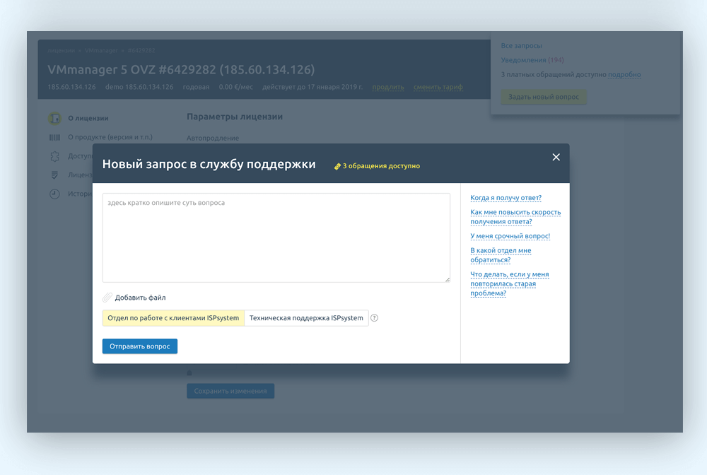
One of the main elements that made the structure simple is the object cards. They are concentrated all the features and properties of the object. Whatever the complex object, the card is designed to allow you to manage it from one place. For example, VMmanager license card:
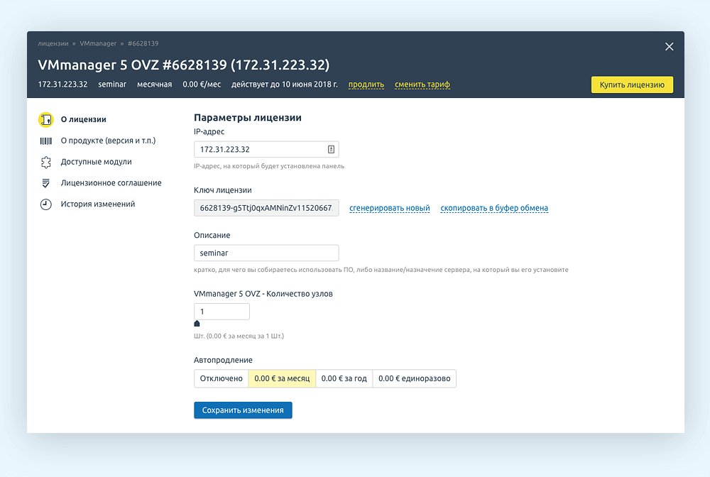
In BILLmanager 5, the same information is either scattered across several pages (and sometimes sections), or not at all.
In BILLmanager 6, we made all the service user tasks (profile operations, balance replenishment, contacting support service and viewing the recycle bin) so that they can be called from any context (system state), and then, after execution, it is easy to return to interrupted task. In the screenshot, an example with support service. We write a request (or read the FAQ, which is shown right there, and decide the question ourselves), click “send”, get information about the response time and return to the interrupted work without unnecessary transitions.
The process of choosing and buying a domain is very different from the process of buying a virtual server. Therefore, we have worked and made these operations different for the most important services of our clients: virtual and dedicated servers, domains and SSL certificates, virtual data centers. We will also refine and recycle, but in general, ordering these services has already become simpler.
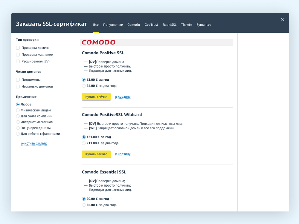
We also know that users most often order one thing. In this case, the step “add to cart” is redundant. Therefore, BILLmanager 6 has the opportunity to order and pay for the service immediately, bypassing the basket. For example, this is how you can configure the order of SSL certificates:
At the very beginning of the BILLmanager 5 problem talk, we showed a novice user dashboard, where useful information is lost among the less important. In BILLmanager 6 this will not happen.
Dashboard has several states depending on the number of active services of the user and the settings of the provider. If there are no services, billing shows the services available to the order, sorted in the order specified by the provider, or immediately send the main service to the order (but we would recommend the providers to set up services on the dashboard). If the ordered services are not enough, simply bring them to the dashboard. If there are many services, the most problematic ones will be displayed on dashboards.
And we will no longer show empty tables to the user, as BILLmanager 5 is doing now. For example, if the user goes to the “virtual servers” section and does not have servers, the virtual server order process starts.
The more changes are made to the product design at the same time, the more difficult the users perceive change. The entire interface has been reworked, so the reaction of users is important for us. We track it in the Personal Account of the ISPsystem, which was updated first. We look at conversions to various actions (for example, purchasing and renewing licenses, contacting support services, balance replenishment), monitor the share of returned users (it continues to grow), etc. And we can conclude that the negative is from a change in the interface of a private office the minimum, the majority of users almost painlessly switched to using the new interface.
Mobile interface . This is what you want to do as quickly as possible. We expect to give the user of the mobile device the same features that are in the desktop version of BILLmanager. Let's start with the basic functionality — ordering services, depositing a personal account, quickly reviewing key parameters — and gradually expanding it.
Integration into the site provider . We want the provider site to “know” when the user is logged in to the personal account. In this case, the user will see his balance, will be able to quickly write to the support service and order the service without unnecessary obstacles.
Integration of ISPmanager and VMmanager . We want to make the user's personal account a single point of resource management, which he bought from the provider.
BILLmanager from ISPsystem is a complex software product for automating hosting management. On the one hand, this is a working space for the work of hosting employees (admin panel), where they can manage services, create tariffs, etc. On the other hand, this is a personal account for a client hosting provider. Our redesign has so far affected only the client part, that is, the user's personal account.
In a private office, a client hosting provider can make payments and keep track of their history, order and manage services, their account, and write to customer support. The product is very flexible, depending on the settings of the user's personal account may look different, which creates additional difficulties in the design and redesign.
')
Why did you decide to change the interface
ISPsystem appeared at the turn of the 2000s. Any automation tool at the time was a competitive advantage in itself. For technology companies of the time, it was the norm that the product itself and its design were invented by the founding developers. It was the same with us.
But today the situation is different. Now hosting is ordered by people far from technical details - small and medium business owners who need a simple and inexpensive website. They do not want to deal with a complex interface and are entitled to it. Faced with difficulties, they turn to support or leave, not just from BILLmanager, but from a hosting provider. It's time to change the interface, make it simple and clear for a new audience.
Where did we start
We do not make a new product, but we rework an existing one, it is used by thousands of people every day. Therefore, the work began with the collection of information. We went to our partner hosting providers. The support service and the marketing department reported a lot of valuable information about BILLmanager 5 users, including daily problems and tasks that they encounter in the interface. Then we wrote Job Stories, we divided them into categories and prioritized them, built a job map ...
Then we drew in Axure the first interactive prototypes of the new interface that made the concept clear and tested. The prototypes turned out to be rough, far from being put into development, but they helped to understand where to go next. It took about four months ...
Then I will talk about some of the problems of BILLmanager 5 and about the most important principles of the BILLmanager 6 interface, which will help to avoid such problems.
BILLmanager 5 Interface Issues
Consider the problems of the interface BILLmanager 5 from the point of view of a beginner. For experienced users, they are not so significant, but to become experienced, you need to use the product every day or almost every day. And the clients of the hosting providers do not enter the personal account, while the ordered services (for example, a virtual server) are ok.
According to our data, most of the providers' clients visit their personal account less than once a week. At the same time, it is impossible to become an experienced user, which means that interface solutions that are not obvious, incomprehensible from the first time will most likely remain unclear.
Below is a screenshot of an example of such a solution. When first used, it confuses many.
The functions highlighted in the screenshot become available if you click on a row in the table (in this case, the rows are virtual servers). But the row in the table, even when you hover the mouse, does not seem clickable at all. In this case, the selected functions are visually unrelated to the rows in the table. And there are a lot of such problems in the BILLmanager 5 interface, we’ll focus on the biggest ones.
A lot of unnecessary information
In the screenshot, a dashboard, how it sees a novice user BILLmanager 5. A lot of diverse information, which is provided on the principle of "because it is." Useful information (highlighted in red) is lost among the less important.
This leads to the fact that novice users are faced with problems when performing even such simple tasks as ordering services, top-up balance, a request to the support service. Many people simply do not notice the necessary buttons and menu items (we checked it on users).
The process of ordering services in BILLmanager 5 is complicated
On the one hand, the provider can configure everything very flexibly, on the other hand, a novice user faces three main problems:
- Many steps of ordering service, some useless. Even with the purchase of one virtual server, you must first add it to the cart, and only then pay. Some steps in the service order wizards may contain one parameter at a time, sometimes one that cannot be edited. At each step, a certain number of users necessarily fall off.
- The service has to choose from a large list of tariff plans without modern filters on the parameters.
- After ordering the status of the ordered service is not obvious. For example, we found out from the support service of one of our partners that users contact support after ordering a virtual server asking why it is not working. It turned out that these users have not confirmed the phone: the service is ordered, paid, but not activated. This is normal billing behavior (such settings are necessary to exclude anonymous use of services), but the user needs to provide information about what is happening and how to solve this problem in the process and immediately after ordering, and not in the support service.
Loss of user context
When a user performs actions with these or other objects, he may need to write to the support service. The screenshot is an example of a virtual server.
You can write in support from this state (not very obvious, but in the lower left corner of the large menu there is “Support → Requests”). But if you click on the "Requests", then to return to the properties of VDS will have to make at least three clicks through the global navigation. The user context will be lost, and the “back” button in the browser will not help either - it just does not work with BILLmanager 5 tabs.
BILLmanager 5 problems cannot be corrected by cosmetic changes. It's not about the icons or the size of the text (although in them too). The point is: the product is made as it was convenient to DO, but you need to be convenient to USE it.
This approach is manifested in everything. There are two main interface components: forms and lists. It is necessary to provide information with the text - we display it in the form of a form with fields not available for editing. Date format as in a database. Almost in all tables there is an id field (why, if there is no information in it that is understandable to man?).
Our team needed to force the company to reconsider the approach to the design and development of the product, to put the interests of the user before the interests of the programmers. And we could do it :)
BILLmanager 6 Interface Principles
Design is always a hypothesis, more precisely, many hypotheses. Even if we have a lot of statistics, the results of research and revelations of the support service, all the same, everything fits together in the hands and head of the designer and he designs the product. Data about users and their behavior improves the quality of hypotheses. That's right, when the design changes evolutionary, there are few hypotheses in one iteration, they affect part of the product, are checked on prototypes and immediately after release on real users. The designer understands which solutions are good and which are bad, and where to dig further. But such an ideal world is not our story.
In fact, we are the first designers in a company that are engaged in a product, before us designers painted icons. Our task was to remake the interface completely. This means a huge number of hypotheses, and I felt blind in a dark room. Therefore, we formulated principles that could be tested on prototypes, and which helped to make our design hypotheses realizable.
Simple user information structure
At the same time, the user does not need all the capabilities of the product, he has no task to enter every corner of the site or personal account. But BILLmanager 5 is designed to make it easier to do, and it’s so easy to add one more item to the infinite left menu ... and now you need to search to find the menu item in global navigation (which is actually a disaster).
In BILLmanager 6, we made the main menu horizontal. At first, it looks quite simple, but it still contains all the possibilities that were. So we have significantly simplified the interface for the vast majority of users, slightly complicating it for the rest.
Yes, the horizontal menu is more difficult to implement, we had to work through all the elements of global navigation in detail and test these hypotheses on prototypes. But now the most important thing is available immediately.
Object Cards
One of the main elements that made the structure simple is the object cards. They are concentrated all the features and properties of the object. Whatever the complex object, the card is designed to allow you to manage it from one place. For example, VMmanager license card:
In BILLmanager 5, the same information is either scattered across several pages (and sometimes sections), or not at all.
Context is important
In BILLmanager 6, we made all the service user tasks (profile operations, balance replenishment, contacting support service and viewing the recycle bin) so that they can be called from any context (system state), and then, after execution, it is easy to return to interrupted task. In the screenshot, an example with support service. We write a request (or read the FAQ, which is shown right there, and decide the question ourselves), click “send”, get information about the response time and return to the interrupted work without unnecessary transitions.
Different ways to order services
The process of choosing and buying a domain is very different from the process of buying a virtual server. Therefore, we have worked and made these operations different for the most important services of our clients: virtual and dedicated servers, domains and SSL certificates, virtual data centers. We will also refine and recycle, but in general, ordering these services has already become simpler.
We also know that users most often order one thing. In this case, the step “add to cart” is redundant. Therefore, BILLmanager 6 has the opportunity to order and pay for the service immediately, bypassing the basket. For example, this is how you can configure the order of SSL certificates:
We think that the user needs
At the very beginning of the BILLmanager 5 problem talk, we showed a novice user dashboard, where useful information is lost among the less important. In BILLmanager 6 this will not happen.
Dashboard has several states depending on the number of active services of the user and the settings of the provider. If there are no services, billing shows the services available to the order, sorted in the order specified by the provider, or immediately send the main service to the order (but we would recommend the providers to set up services on the dashboard). If the ordered services are not enough, simply bring them to the dashboard. If there are many services, the most problematic ones will be displayed on dashboards.
And we will no longer show empty tables to the user, as BILLmanager 5 is doing now. For example, if the user goes to the “virtual servers” section and does not have servers, the virtual server order process starts.
We test on ourselves
The more changes are made to the product design at the same time, the more difficult the users perceive change. The entire interface has been reworked, so the reaction of users is important for us. We track it in the Personal Account of the ISPsystem, which was updated first. We look at conversions to various actions (for example, purchasing and renewing licenses, contacting support services, balance replenishment), monitor the share of returned users (it continues to grow), etc. And we can conclude that the negative is from a change in the interface of a private office the minimum, the majority of users almost painlessly switched to using the new interface.
What's next
Mobile interface . This is what you want to do as quickly as possible. We expect to give the user of the mobile device the same features that are in the desktop version of BILLmanager. Let's start with the basic functionality — ordering services, depositing a personal account, quickly reviewing key parameters — and gradually expanding it.
Integration into the site provider . We want the provider site to “know” when the user is logged in to the personal account. In this case, the user will see his balance, will be able to quickly write to the support service and order the service without unnecessary obstacles.
Integration of ISPmanager and VMmanager . We want to make the user's personal account a single point of resource management, which he bought from the provider.
Source: https://habr.com/ru/post/359156/
All Articles