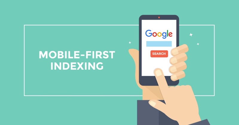
Mobile-first indexing - Google's search revolution
So, what was predictable and expected over the past few years, finally happened. Following the ever-growing traffic from mobile devices, search giants are changing search algorithms, adapting to the interests of their users. In a recent release from Google, it says that starting July 1, 2018, a mechanism will be launched, ranking the websites according to the Mobile-first principle.
But before we figure out what it is, let's see some statistics. According to the company "SEO-Auditor" in March 2018, the share of the 2 main search engines in Russia is distributed as follows:
- Google - 49.04%
- Yandex - 46.08%
On mobile devices, the picture is more striking (according to Liveinternet):
')
- Google - 67.5%
- Yandex - 31.5%
Looking at the statistics figures, it is clear that Google has a significant market share and a significant audience share. This means that any changes in Google’s algorithms will obviously affect the results of Internet search and, of course, all sites.
And now let's understand what “Mobile-first indexing” is and why this can be safely called a revolution in Internet search.
In 2016, Google announced the start of testing a new search algorithm based on the priority issue of sites adapted for mobile devices to meet the needs of most of its users. If Google’s crawling, indexing and ranking systems initially used the desktop versions of the site pages, it will now look at sites through the eyes of a mobile browser.
As Google said: "Mobile-first indexing means that we will use the mobile version of the page for indexing and ranking." That is, not a separate index of sites with layout for mobile devices is introduced, but priorities change in the existing one - the advantage in search results will be given to sites optimized for mobile devices!
But that's not all. In addition to the fact that your site should be correctly displayed on a mobile device, its content must fully correspond to the desktop version. That is, all menu items, sections and texts should be identical. And this means that creating a separate version of the website for mobile devices will not save the situation.
Of course, Google said that it will still index all websites and still sites with an interesting context and relevant queries will have good search positions, but .... From July 2018, Mobile-first will be a priority.
Yes, and like a cherry on a cake, it is impossible to take any actions for priority inclusion in the new index. Google says - we ourselves determine which sites and when to include in the Mobile-first. That this happened we will notify you with this message:

After you have understood the essence of the issue, let's figure out what to do to the site owners.
If your site exists only because it is so accepted and you do not consider it as an aid in business development, then do nothing, it will not be worse.
But if your website is a marketing tool, your store is aimed at increasing the customer base and business, then you should take at least one action (if you have not received a happy email from Google) - check your website for optimization for mobile devices. This, of course, is not true in the last resort, and Google itself says that the Mobile-first works regardless of mobile evaluation, but without optimization you can’t exactly expect acceptable results.
So, consider several sites through the "prism" of Google. For greater clarity, we take sites from different industries - 2 from medicine and 2 from dacha subjects.
| Clinic for Aortic and Cardiovascular Surgery 1 MGMU them. THEM. Sechenov: | Site of the city clinical hospital №71 them. M.E. Zhadkevich |
 |  |
| Website of the company “Fleur” | Site of the company "Semitvetik" |
 | 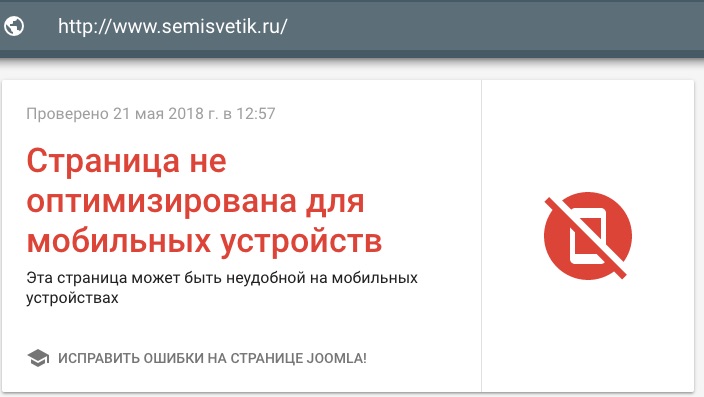 |
If you get the first result, you can breathe a sigh of relief, but do not relax - because, as Google said, adaptability for mobile devices does not mean the best position in the issue.
But if you get 2 results, then you should think about a new website - this is an obvious signal that your current website will lose its position over time.
And deciding to make a new website you need to keep in mind the following:
- Your new site should have an adaptive layout - that is, be able to adapt to the screens of multiple devices.
- Website design should not only be adaptive, but also contain such visualization and control elements that are comfortable enough for the finger to work on the screen.
- The design of the site and its content should be concise - as normal for desktop viewing, the text of 5,000 characters on the smartphone will turn into 5-6 screens and will stop the visitor’s desire to explore your site.
- The structure of the site should not be too extensive with a lot of menu items-submenu - on the smartphone it will be extremely inconvenient.
- Be prepared that your idea of the design and design of the site can go against the need and limitations of responsive design.
Given the fact that traffic from mobile devices is constantly growing, and the search engines give them increasing importance, it will not be possible to ignore the changes. There is data according to which, among the million of the most popular sites of Runet, only about 20% are optimized for mobile devices, which means that a new revolution is coming on the Internet and those who have been in the shadows can come out on top.
Of course, adaptive layout is not a panacea, providing high-quality website content and correctly filling in SEO parameters is still mandatory for ranking by search engines. But still, given the growing traffic from mobile devices, adaptability to your site is highly desirable.
Source: https://habr.com/ru/post/359092/
All Articles