Not Delisamokat one: how small usability errors create big problems with a real example
A few weeks ago in San Francisco, I rented a scooter just standing in the middle of the street. The time from installing the application to the actual lease took no more than two minutes, of which half went to download the application itself. I did not even notice how the registration went. Everything was native and led to the main goal - to start a movement.
Varlamov's crushing article about the unsuccessful launch of Delisamokat, where the main problems of users were connected precisely with registration in the application and an attempt to take an electric scooter, recalled the story two years ago with an ambiguous end.
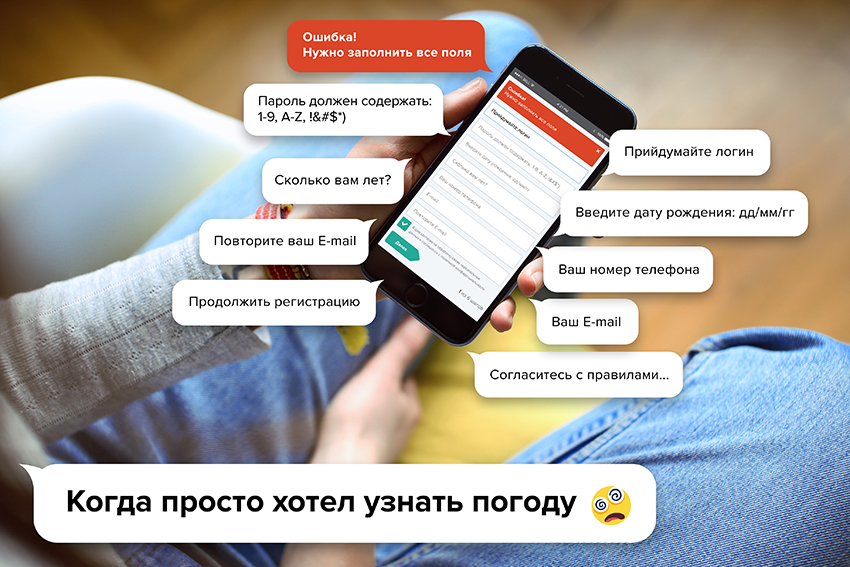
Read further: a detailed analysis of usability errors and recommendations for their elimination on the example of a mobile application for a wide audience.
Then at the conference I listened to the report of the marketing director of one of the national networks of petrol stations about the success of the loyalty program application. The figures were impressive growth dynamics installations. The report was a success.
Impressed later, I decided to download the app. And, to put it mildly, was surprised.
The application rejected the first interaction. Each step of the registration did a challenge to self-control. There was such a strong dissonance between what I saw and the presentation impressions that I decided to spend several hours and prepared a usability audit of the most important part in shaping the involvement: the initial launch process and registration / authorization and sent it to the company representatives.
I was answered and it turned out that they know or guess about these weaknesses, and they will definitely correct it.
2 years have passed
The company changed the marketing director, launched several new services, integrating them into the application, but never solved a single problem from the usability audit.
Well, let's consider how the company continues to lose money and user confidence while ignoring the basic principles of usability. Perhaps someone, inspired by this material, will look at another product and make it more user-friendly.
For ethical reasons, I erased all references to a usability audit company.
A usability audit of a mobile loyalty program
The audit reflects only gross “technical” usability errors. I did not conduct user interviews, did not create characters, did not write out the needs of the target audience. In general, I did it like I never do in work projects. But for the problems described below, this is quite enough to significantly increase the conversion from the initial opening of the application to the registration.
The audit is based on the principle: problem description - solution. First, we analyze the reasons for which changes are necessary - then specific actions.
Case №1: the first launch of the application
The first contact with the application is the most important. The user does not yet have a formed value and the probability of losing it at the first contact is rather high.
Problem
 There is no presentation of typical application usage scenarios. Such a presentation is in the application description in the App Store - a brief description of the values of the application and screenshots help users make a decision about the download. The first contact with the application after installation should do the same.
The banner “All the benefits of a loyalty program in your smartphone” is understandable only to existing participants of the program.
Meanwhile, the application allows you to find out the actual price of gasoline, find the nearest gas station, understand where you can buy burgers, or pay for gasoline without leaving your car. That is what creates value, but there is not a word about it.
Recommendation
When you first start the application, show the presentation of typical application usage scenarios. This will create value, make the application more understandable and increase the motivation to complete registration / authorization.
An example of what this might look like:

When you first start the application, the user sees a slide show with a presentation of the main features of the application. For example, the most obvious values were taken. What exactly to display in the working version will help determine usability research.
Problem
 In iOS, there is only one chance to get permission from the user to send notifications. If the user forbids and, for some reason, wants to change his decision later, he will have to go through a difficult path to change this setting. If sending notifications is important, hoping for a second chance is impossible. It is necessary to immediately motivate the user to make the right decision.
Now the standard request window for permission to send notifications appears immediately after the first launch of the application, making it impossible for users to understand why this is necessary. The application has not yet managed to create value, but it already requires something to be resolved.
Any notification is an irritant, and, considering their number in the life of the average user, the probability of choosing the option “Do not allow” is quite high.
Recommendation
Request permission to send notifications at the right time and place. Before asking for an explanation of how much the user will benefit from this. If notifications are directly linked to a loyalty card, then it’s worth asking for permission after authorization in the application.
An example of how this might look is shown below:
 Before a system request for sending notifications is displayed, the application focuses the user's attention on the context associated with the further action and offers a specific value.
The presence of an alternative “Ask Later” action will close the window in the application, but the system window will not be requested. This means that there is still a chance to get permission later, perhaps in the process of performing a particular task. For example, if a user, while in an unfamiliar city, is looking for the nearest gas station, using the map in the application, it would be appropriate to show a window with a proposal to automatically report on the nearest gas stations in new places for him, and for this you need to enable notifications.
Context-sensitive communication gives specific value, and not only hopes that the user's desire to save, will force him to turn on notifications in order to receive information about promotions.
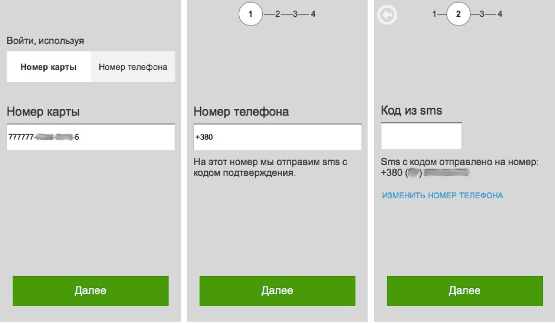
Case №2: scenario “I do not have a card”
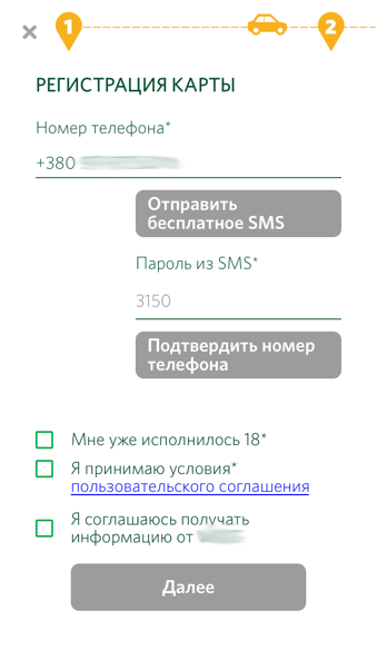
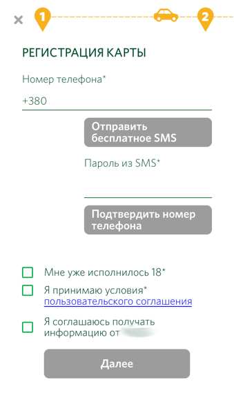 The card registration screen forces the user to perform more than one action at a time. The screenshot shows 3 equivalent buttons. But they must be pressed consistently. This creates certain difficulties and creates a negative interaction experience.
The buttons are painted in gray, which creates a feeling of inactivity, and clicking on them does not lead to anything, thereby creating the feeling "something does not work."
There are two text fields on the screen: for entering a phone number and for entering a password from sms. Both of them are active, but entering any data in the “Password from sms” field does not lead to any action.

If you enter a phone number, then immediately two buttons “Send a free SMS” and “Confirm phone number” are colored green. At the same time, pressing the second button naturally causes the error "Code is incorrect."
The text on the “Send Free SMS” button (now changed to “Send SMS”) forms the expectation that an SMS for some reason will be sent from my number, but not to me.
After receiving the SMS and entering the confirmation code, a “Thank you” pop-up window appears, and the buttons in the interface are again painted gray. Is something not working again?
Checkboxes are convenient when working on a computer, and on the screen of a mobile phone, you need to try to get a finger into a small square. The decision to “tap” in the text saves the situation a little, but is not native in this context. Surely, if you look at the map of clicks, you can see how small the percentage of users will really “tap” on the text and how much the map of clicks around checkboxes will be smeared.
The item “I have already turned 18” is redundant, since on the next screen the application asks for a date of birth. If the user is less than 18 years old, he can be informed about it.
The item “I accept the terms of the user agreement” is redundant and in the wrong place (registration is not completed yet). The best implementation will be the signature under the button: “By clicking the registration button and I accept the User Agreement”. (Perhaps with the start of the GDPR, the decision with the user agreement needs to be reconsidered.)
The item “I agree to receive information ...” is posted at the wrong time and place that could potentially affect the number of subscriptions. (After 2 years, the checkbox "I agree to receive information ..." disappeared from this screen.)

Up to the current time all the buttons were green. The appearance of the yellow button starts the automatic response “Is everything OK? Maybe I was wrong somewhere? ”.
Recommendation
The interface should be redesigned, following the principle of one screen - one task. This approach will speed up and simplify registration, despite the increase in the number of screens.
An example of how this might look is shown below:

The initial screen included the solution of three tasks: enter the phone number, enter the code from the SMS, select the checkboxes, and only then proceed to the next screen. I deliberately exclude actions with flags from this scenario and lay out the remaining tasks on two screens.
On the first screen, the user has no choice: you can only enter a phone number. The “Next” button is always active and can be clicked. If you press it without entering the phone number, an error message appears asking you to enter the phone number first.
After entering the phone number, the following screen appears, prompting you to enter the code from the SMS. The caption to the text field indicates exactly which number the SMS was sent. If the number was entered incorrectly, it remains clear how to fix it.
Problem
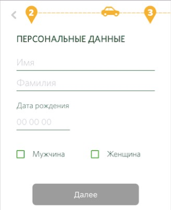 Using the checkbox to select the user's gender implies that you can select both items at once.
Recommendation
Change the view to a more associative switch.
Problem
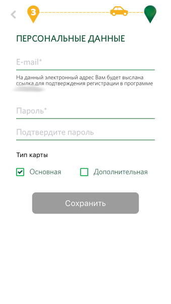 The requirement to enter e-mail is justified only by the desire to get the client's e-mail.
The rationale “e-mail is needed for confirmation” works when interacting on a computer, but on the phone it is a bad idea.
First, the motivation “e-mail is needed for confirmation” raises the logical question “Why? I have already confirmed my phone number, ”secondly, the user may simply not have mail or access to mail from the phone. Given the context of using the application (at the gas station, on the road, etc.), it is likely that the registration will be interrupted at this step.
The suggestion to enter a password is not clear. Why enter a password? For what purpose should it be used? When will you need it in the future?
Incorrect use of the checkbox as a switch creates the feeling that you can select both items at once. Moreover, it is absolutely incomprehensible what the “Card Type” generally means and why the “Additional” is needed.
Recommendation
If at all possible, opt out of this screen or make an e-mail input field optional with honest arguments. The password entry field is completely removed. The company already has a user phone number to which, if necessary, you can send any access password. It is worth using this opportunity.
Case №3: scenario “I have a map”
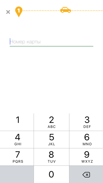 The presence of a customer loyalty card does not mean its actual presence at the time of registration in the application. If the user is an existing customer loyalty program, why the only possibility of authorization in the application can be realized only through the card number?
Recommendation
Implement an alternative way to authorize an existing loyalty program client using a mobile phone number.
An example of how this might look is shown below:

Thus, customers who have a loyalty card on hand will be able to choose a convenient option for them: either enter the card number or enter the phone number.
Problem
 The need to enter a password or code word enters into a stupor - it is not clear what exactly you need to enter: the code from the SMS or what the user entered in the previous step. In addition, passwords are often entered at random during registration. In this regard, it is very interesting to see the statistics of using the button "Forgot your password?". Most likely it is popular.
UPD: Two years later, after all, there were changes in this screen. To the right of the “Password” text field, an icon has appeared, pressing which leads to the opening of the popup with a suggestion to call the hotline number in case of difficulties with authorization. As a result, instead of solving simple usability problems, the company increases the load on the call center, and therefore costs in general.
Recommendation
The solution using SMS authorization (see above) completely solves the problem of the need to invent and memorize redundant passwords.
Problem
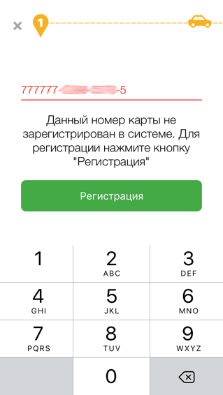 If the card is already there, but not yet activated, an error message appears and the "Register" button launches the "I do not have a card" script, but with an additional field with the number of the entered card displayed.
Such a decision is unfriendly towards the user and creates a feeling of anxiety.
Recommendation
If the check has shown that the card has not yet been activated, immediately display the card registration screen without the need for the user to click the Register button. This solution creates a linear process without negative hue. Everything happens as if it should be.
An example of how this might look is shown below:
The user enters the number of the card not yet activated and clicks "Next." The next screen prompts you to enter a phone number and displays the remaining screens required to complete registration.
Are all these little things worth the attention?
10 years ago, when the penetration of technology into our lives was not so significant, and the experience of user interaction was not formed, it was rarely and not long to feel like a fool. Today, grocery store cashiers are no longer surprised by paying for goods using watches, autopilot-driven vehicles knock people off, and each of us has to interact daily with a lot of different interfaces.
And, despite the pleasant tendency for me to develop the UX industry, most contractors continue to do it either “beautifully” or as the customer wants. We suffer from this, of course, we are users who are forced to interact with it every day.
It can be considered that everything described above is small, insignificant and generally obvious. You can continue to travel on the strength of the brand, if it exists - many customers will put up with their own stupidity for some time and even convince themselves that the application is convenient: it works somehow, but before that it was not. But the world is changing, and more progressive competitors will soon make what seemed comfortable yesterday, awkward and annoying tomorrow.
Convenient to all interfaces!
')
Source: https://habr.com/ru/post/359086/
All Articles