Figma - we make design systematically

Greetings to you colleagues! My name is Dmitry Volkov and I have been working in the profession for more than ten years. I decided to write an article for those who create web and mobile design in modern programs.
Very often there is a problem when the designer made the source, which is hard for both the developer and another designer to work with.
Therefore, I will share my personal experience in the development of interface design on the example of the popular editor Figma.
')
I will not tell about Figma, as there are already many articles on this topic. I just want to draw your attention to the fact that it stands on the same level with Sketch and Adobe XD. So my approach can be easily transferred to these editors.
Where does the interface design begin? Of course, with the receipt of the task, which is formed from the tasks, testing various hypotheses, research user experience, etc.
We will assume that this is all done and we need to start working on the visual part of the interface.
I divided my work process into several steps.
Step One: Define the mounting areas
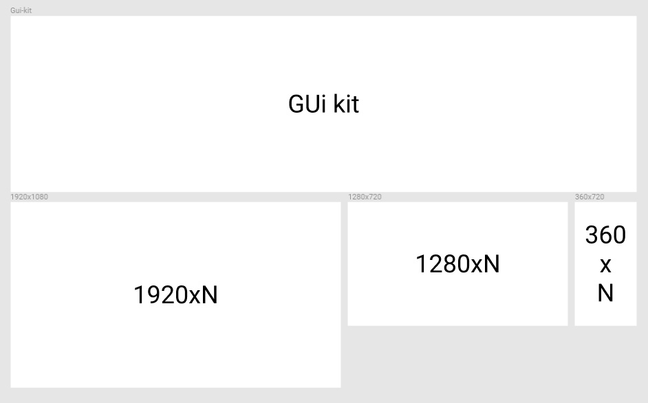
The topmost mounting area is called the Gui-kit. There I will collect all the interface elements and their behavior. Components will be stored in the same place (in other programs they are called symbols).
And below I place several assembly areas, each of which corresponds in size to a key point in adaptive layout.
I have the following layout layout logic. Horizontally, I place the edit areas related to a particular screen (for example, the “main page”) including the content states. Vertically I have other screens.
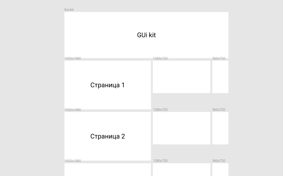
Step Two: Determine the names of the installation areas
This very important step will allow you not to get confused in the layouts.
The name of the artboard we will denote as follows:
Permission_page number_status state_page_name
We get:
1920x1080_01_01_home_page
And if, for example, on the main one, it is required to consider the content change, then assign the following number to the state:
1920x1080_01_02_home_page
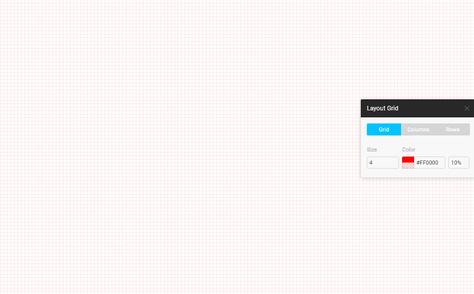
Step Three: Module Size and Modular Grid
If we take a notebook in mathematics and look at its sheet, we will see that it is lined in a cell. So one cell from the set is called a module.
In all layouts I use the module size in multiples of 4th.
I will not tell the details why this figure and why. There are many articles on this topic. We are studying a completely different question.
And we create a modular grid with settings so that all columns and indents fit into the module dimensions. That is, coincided with its boundaries. This will allow all elements to be built clearly in increments equal to the module.
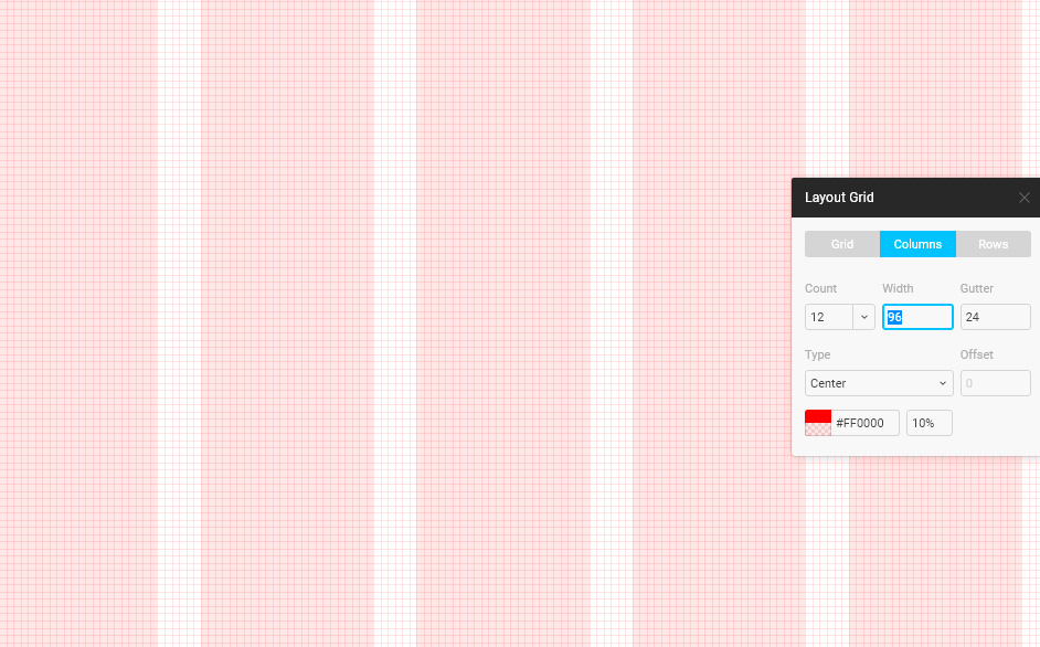
We set the modular grid for each artboard. She is her own.
Step Four: Create the design correctly
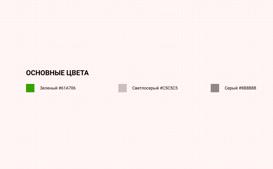
I always start with basic colors. These colors are indicated in the Gui-kit installation area. These colors may change while working on the design. Appear new colors or fade old ones. I understand that tracking is hard, but it will allow you to control their number in the project.
Also, who will work with your source code will get an idea of their number and will know that you have one “red” for the whole project.
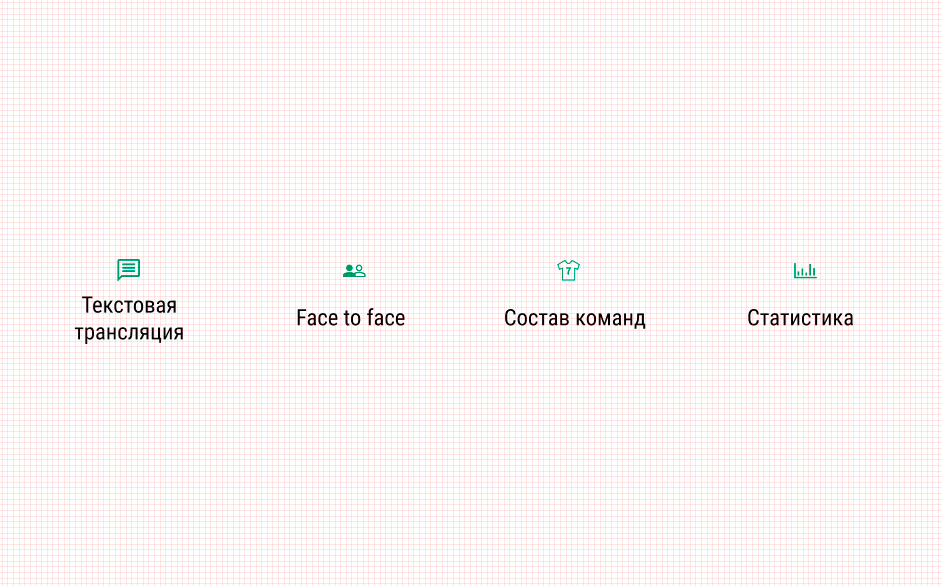
Most of the elements in the interfaces are repeated. Therefore, components (symbols) were invented. We take a component and duplicate it several times, on different assembly areas. If necessary, due to changes in the master component, its duplicates change.
Therefore, you should try to bring all the elements of the interface to the components. Whether icons or menu items. This is done so that in case of replacing the icon with another, you can easily change them in the whole project.
In Figma, you can create complex components that can contain other components and visible and invisible layers.
Therefore, many make a mistake. They create a component, add disconnected layers to it and consider that everyone knows about them. Therefore, all the states of the component must be placed in the Gui-kit with different combinations of on and off layers.
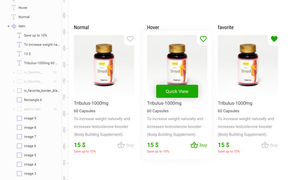
By the way, don't forget to use bindings in components. This makes it easy to scale components to resize them if necessary.
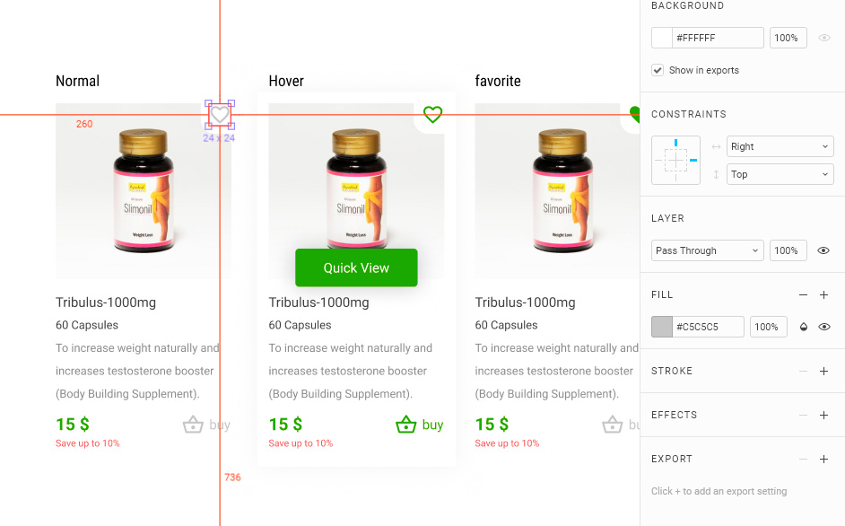
As you can see the favorite icon is aligned to the top right. When changing the scale, it will always be in the same place with the same indentation as in the original one.
I think it's time to finish. Ready to answer questions in the comments. Perhaps these questions will push me to write the next article.
Yours sincerely,
Dmitry Volkov
Source: https://habr.com/ru/post/358784/
All Articles