How to pack three large banks in one site
Until recently, the site vtb.ru fully met the requirements of VTB Bank. But after the merger of the Bank of Moscow and VTB24, it began to cover only a small segment of the expanded array of products and services. Own sites of the Bank of Moscow and VTB24 should eventually cease to exist. Therefore, we had to figure out how to combine all the information so that the user clearly understood what was happening on his display. In this post we will tell you how you solved this problem and came to the updated vtb.ru, launched at the beginning of the year.

The VTB digital business team, together with USABILITYLAB experts, conducted research, summarized the requirements of users and bank employees, formed the logic of the new site and developed page layouts. Bank specialists transformed the layouts into interfaces: they analyzed UX prototypes, discussed solutions, all coordinated and interacted with designers and technical specialists.
But first things first. This is how we created the new VTB official website - a single point of access to all bank products.
')
Any large bank consists of a set of units with different functionality. Information about them should be on the site, so it was necessary to take into account the opinion of colleagues. The plan seems to be simple: we hold meetings, collect feedback, make a website. But in the end we are left with a scattering of blocks that can hardly be tied together.
How to solve a problem? Examine the views of employees and users. We conducted more than 100 in-depth interviews with customers and bank employees. The obtained information turned out to be extremely useful - supported by our assessment, they became the foundation for finding the best solution. According to the site structure, we communicated mainly with the bank employees. And the structure and content of individual pages helped us determine visitors to the site. They told why they come to the site, what they are looking for, what they lack.
Communication with colleagues and clients changed our ideas. At first, we planned to merge sections for medium and large businesses into one called “Medium and Large Business” (or “Corporate Business”). And in the same place for simplicity, to place information for financial organizations. After meetings with colleagues and clients from the “corporate business”, it became clear that in such a structure one could easily get lost. As a result, we left the initial plan and smashed sections into separate blocks.
Or here's an example from customers. People come to our site who want to take a small loan. They see that the minimum amount is 100 thousand rubles, and they leave - they don’t need that much money. But a lot of such visitors could have a credit card, they just don’t know about it. Therefore, if a visitor enters a cash loan in the amount of less than 100 thousand into the loan calculator at the new site, we will show him the credit card offer.
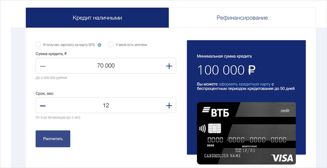
If the client enters in the loan calculator the amount less than 100 thousand, he will see an offer to issue a credit card.
From the study, we also learned that on the old version of the site, start-up entrepreneurs found it difficult to find tariffs for services and understand complex documents. On the new site, on the first screen of the “Small Business” section, we duplicated the link to tariffs twice, and now we show the tariffs themselves in the form of an understandable table.
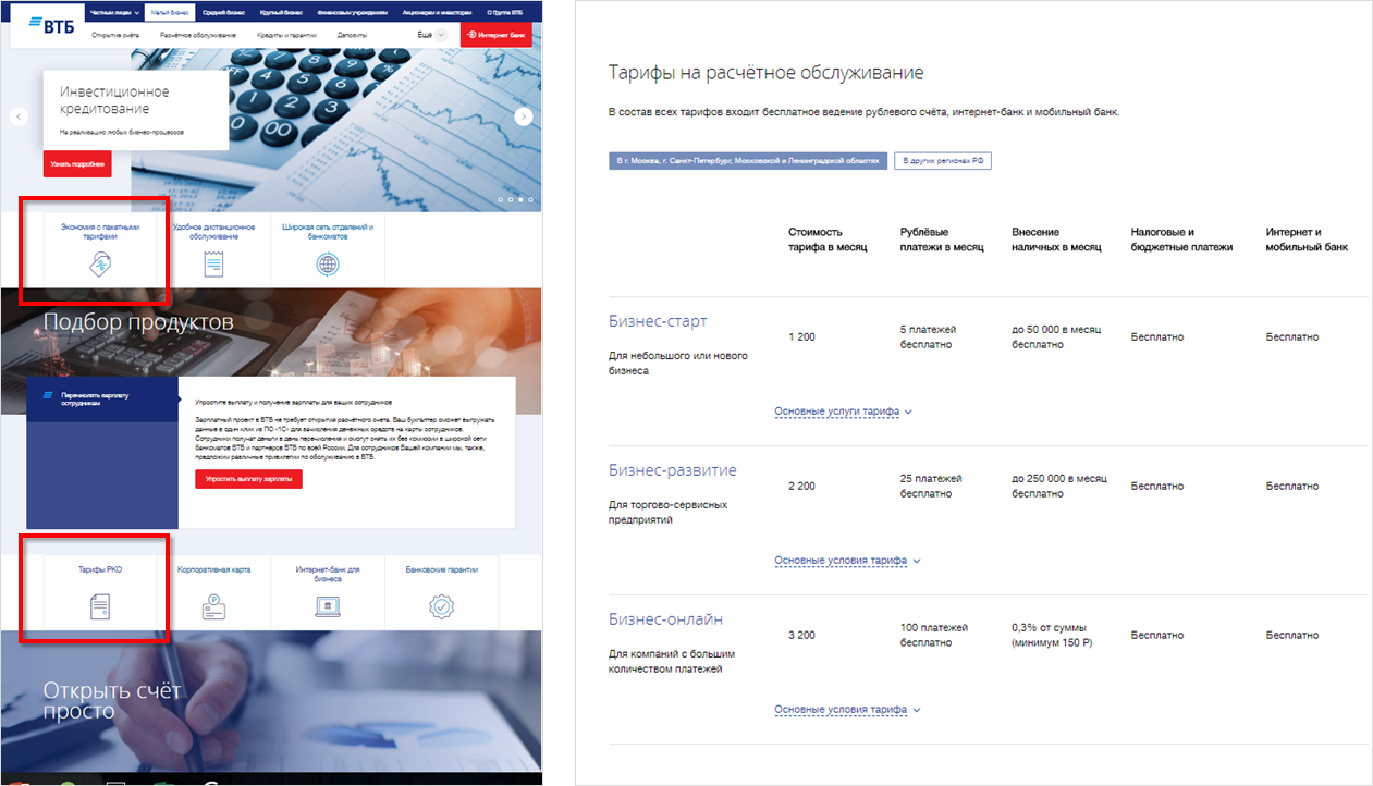
Two pages for small businesses on the new site: the main page of the section and the page with tariffs. Transitions to the page with the tariffs on the screenshot are circled in red.
Another example, this time from the area of Private Banking. We found out that many customers from this segment did not understand and did not use the benefits of premium services, because on the old site this information was presented imperceptibly. On the new site, we divided all services for such clients into four categories and made major links to them. In the screenshot below one of them is outlined - “Family Office”.
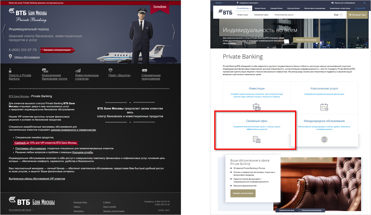
Old and new versions of the page for Private Banking customers.
In addition to the interviews, we conducted card sorts to form or adjust the structure of some sections. To check our structure of the “Shareholders and Investors” section, we cut the cards with the names of the sections and asked the real shareholders of the bank to make a site menu out of them. Separation into groups coincided! It was great news.

Card sorting to check the structure of the "Shareholders" section
When creating the site, we took into account that it will be used by people with disabilities. Visually impaired users can scale up to 500% without scrolling horizontally, and the site will display correctly ( WCAG accessibility guidelines require you to scale up to 200% without problems).
Homepage of the site at a scale of 400%
All texts on the site are typed in large and contrasting fonts: the size of the main text is 15px, the size of headings is 23px. String width does not exceed 80 characters, as recommended by WCAG.
The main colors of the bank are cyan and blue. But they have too low contrast in relation to each other, but when using red, there are no such problems. Therefore, in the digital environment, in addition to the two primary colors, we use red:
Contrast red buttons on the VTB website
For users with disabilities, we have created a separate settings panel. In it, you can choose a color scheme, interline and letter spacing, serif font or without; enable and disable underlining of all links and images. Thus, users with special needs can fully customize the site for themselves.

Display a site with increased font contrast, underlined links, and increased line spacing
To ensure that the site is accessible to people with serious vision problems, we have ensured the correct operation of the site with screen access programs. They voice what is displayed to the user.
A fragment of a document with markup reading sequence on the layout of one of the internal pages of the site
Now setting up the site for visually impaired users is already fully implemented. Interaction with screen-access programs is still at the debugging stage and will become fully functional in the near future.
Our new site is based on the Sitecore Web CMS platform and has several hundred pages. If you draw layouts of each of them, and even do it in a uniform way, you can spend a lot of time. So in order to facilitate this task and ensure scalability in the future, we decided to create templates for all sample pages.
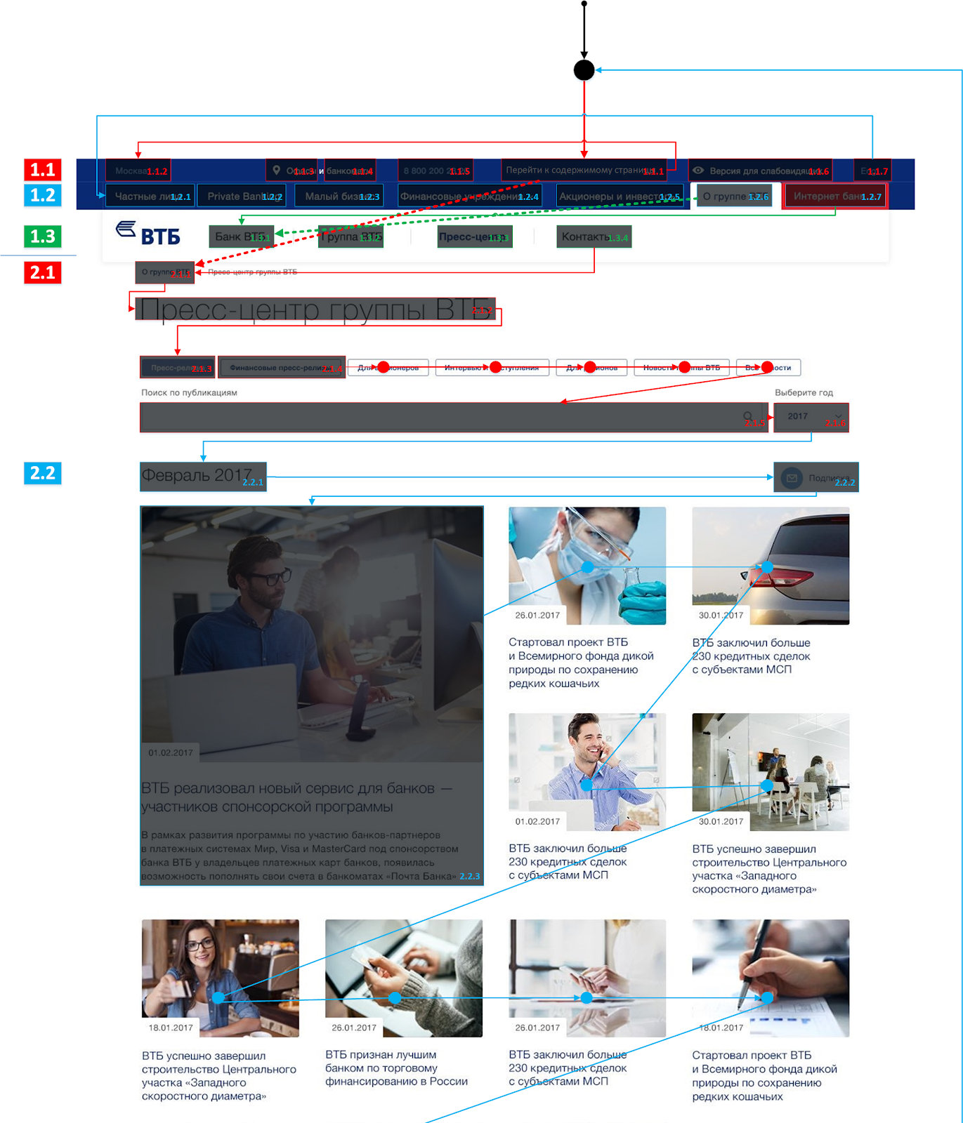
We started this work with the design systematization of all pages of the old VTB website, Bank of Moscow websites, VTB24 and all attached documents. The result was 18 types of pages: 7 for individuals, 6 for corporate clients and 5 in sections for shareholders, investors, analysts and the press. Created 18 templates.
They can put any page of the old or new site.

Template "Product with benefits" (left) and its implementation on the site (center and right). Page length may vary depending on the amount and nature of the content.
One of the templates was developed taking into account not only the convenience of users, but also the requirements of SEO - this is a “dividing page” template from sections for legal entities. Initially, we planned that the user would switch between subsections within the same section using the top drop-down menu. But for bank products to be well indexed by search engines, links to them should be collected on a separate page.

An example of a “reseller” page template that lists the main services related to settlement services.
The interfaces of the new site began with sketches, which we gradually changed according to the results of research and internal discussions.
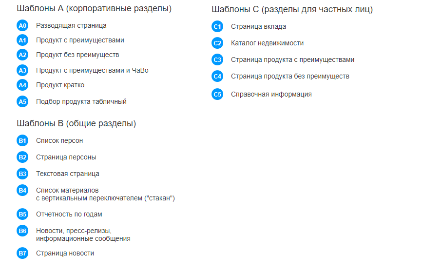
First on the page for a small business we wanted to make a filter of cards with descriptions of bank products in the main part of the screen. But after the next series of interviews with users, they realized that they first needed information about opening a bank account: a tariff, a set of necessary documents, etc. This is what we placed on the first page of the section instead of what we had previously collected.
Page "Small Business": two intermediate concepts and the final implementation on the site
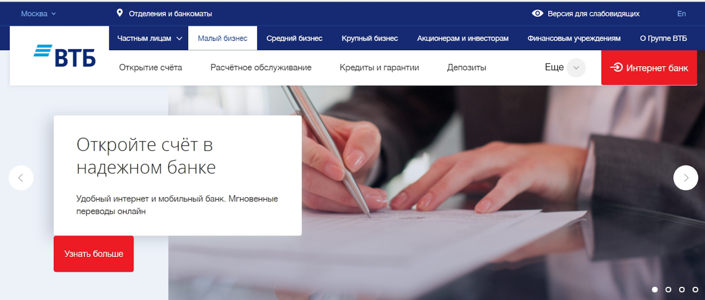
Many discussions caused, of course, the layout of the main page. Initially, there were three concepts: the main page as the cover of the site, the main page as a showcase of products and the more familiar option for corporate websites with a banner at the top, which we ended up on.
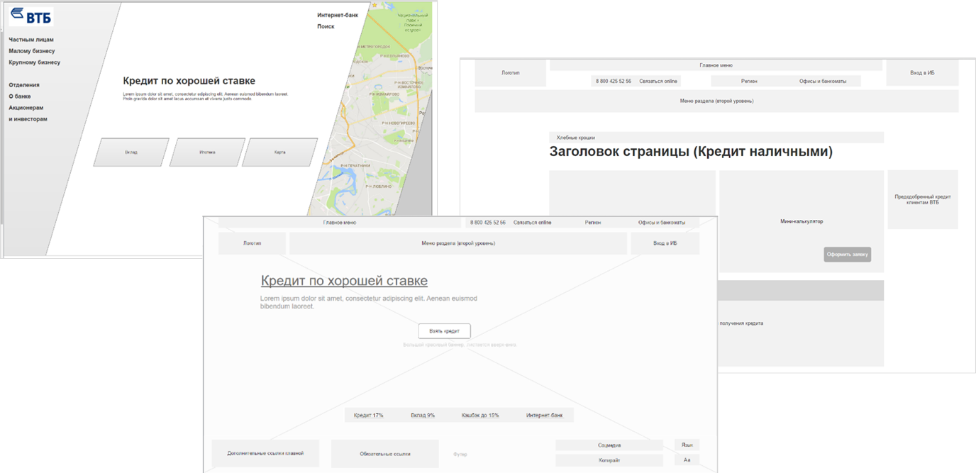
The first, not yet detailed, concept of the main page of the site
We chose a concept with a large banner for two reasons. Firstly, this ensured continuity with the Bank of Moscow website and VTB24, which was important for the customers of these banks. Secondly, it was a proven solution in terms of promoting the key products of the bank - it proved its effectiveness long ago.
The block “Products for all occasions” was created according to the concept of “block of integrated solutions” - a convenient showcase of bank products. Something like this is on many internal pages of the site. But only on the main page the block fully embodies our original intention: to show the bank’s products through the prism of the life tasks of the site visitors, which we identified as a result of the interview (for example, “accumulate a large amount”).

The block “Products for all occasions” on the main page of the site
In the future, using the Sitecore platform, we plan to completely personalize the contents of the main page of the site for each specific user.
The preparatory stage for the creation of the site - analysis of the requirements of different parties, the development of layouts, coordination, design - took a year and a half, from the beginning of 2016 to mid 2017. The development took a few more months, and in January 2018 a new site was launched.

Project discussion log: 109 topics, 1199 comments, 417 files
In the next articles, we plan to talk about the technical side of the issue: site implementation using Sitecore Web CMS and content personalization. In the meantime, we are waiting for your comments.
The VTB digital business team, together with USABILITYLAB experts, conducted research, summarized the requirements of users and bank employees, formed the logic of the new site and developed page layouts. Bank specialists transformed the layouts into interfaces: they analyzed UX prototypes, discussed solutions, all coordinated and interacted with designers and technical specialists.
But first things first. This is how we created the new VTB official website - a single point of access to all bank products.
')
Personal experience is the main thing.
Any large bank consists of a set of units with different functionality. Information about them should be on the site, so it was necessary to take into account the opinion of colleagues. The plan seems to be simple: we hold meetings, collect feedback, make a website. But in the end we are left with a scattering of blocks that can hardly be tied together.
How to solve a problem? Examine the views of employees and users. We conducted more than 100 in-depth interviews with customers and bank employees. The obtained information turned out to be extremely useful - supported by our assessment, they became the foundation for finding the best solution. According to the site structure, we communicated mainly with the bank employees. And the structure and content of individual pages helped us determine visitors to the site. They told why they come to the site, what they are looking for, what they lack.
Communication with colleagues and clients changed our ideas. At first, we planned to merge sections for medium and large businesses into one called “Medium and Large Business” (or “Corporate Business”). And in the same place for simplicity, to place information for financial organizations. After meetings with colleagues and clients from the “corporate business”, it became clear that in such a structure one could easily get lost. As a result, we left the initial plan and smashed sections into separate blocks.
Or here's an example from customers. People come to our site who want to take a small loan. They see that the minimum amount is 100 thousand rubles, and they leave - they don’t need that much money. But a lot of such visitors could have a credit card, they just don’t know about it. Therefore, if a visitor enters a cash loan in the amount of less than 100 thousand into the loan calculator at the new site, we will show him the credit card offer.
If the client enters in the loan calculator the amount less than 100 thousand, he will see an offer to issue a credit card.
From the study, we also learned that on the old version of the site, start-up entrepreneurs found it difficult to find tariffs for services and understand complex documents. On the new site, on the first screen of the “Small Business” section, we duplicated the link to tariffs twice, and now we show the tariffs themselves in the form of an understandable table.
Two pages for small businesses on the new site: the main page of the section and the page with tariffs. Transitions to the page with the tariffs on the screenshot are circled in red.
Another example, this time from the area of Private Banking. We found out that many customers from this segment did not understand and did not use the benefits of premium services, because on the old site this information was presented imperceptibly. On the new site, we divided all services for such clients into four categories and made major links to them. In the screenshot below one of them is outlined - “Family Office”.
Old and new versions of the page for Private Banking customers.
In addition to the interviews, we conducted card sorts to form or adjust the structure of some sections. To check our structure of the “Shareholders and Investors” section, we cut the cards with the names of the sections and asked the real shareholders of the bank to make a site menu out of them. Separation into groups coincided! It was great news.
Card sorting to check the structure of the "Shareholders" section
Working on accessibility
When creating the site, we took into account that it will be used by people with disabilities. Visually impaired users can scale up to 500% without scrolling horizontally, and the site will display correctly ( WCAG accessibility guidelines require you to scale up to 200% without problems).
Homepage of the site at a scale of 400%
All texts on the site are typed in large and contrasting fonts: the size of the main text is 15px, the size of headings is 23px. String width does not exceed 80 characters, as recommended by WCAG.
The main colors of the bank are cyan and blue. But they have too low contrast in relation to each other, but when using red, there are no such problems. Therefore, in the digital environment, in addition to the two primary colors, we use red:
Contrast red buttons on the VTB website
For users with disabilities, we have created a separate settings panel. In it, you can choose a color scheme, interline and letter spacing, serif font or without; enable and disable underlining of all links and images. Thus, users with special needs can fully customize the site for themselves.
Display a site with increased font contrast, underlined links, and increased line spacing
To ensure that the site is accessible to people with serious vision problems, we have ensured the correct operation of the site with screen access programs. They voice what is displayed to the user.
A fragment of a document with markup reading sequence on the layout of one of the internal pages of the site
Now setting up the site for visually impaired users is already fully implemented. Interaction with screen-access programs is still at the debugging stage and will become fully functional in the near future.
Templates
Our new site is based on the Sitecore Web CMS platform and has several hundred pages. If you draw layouts of each of them, and even do it in a uniform way, you can spend a lot of time. So in order to facilitate this task and ensure scalability in the future, we decided to create templates for all sample pages.
We started this work with the design systematization of all pages of the old VTB website, Bank of Moscow websites, VTB24 and all attached documents. The result was 18 types of pages: 7 for individuals, 6 for corporate clients and 5 in sections for shareholders, investors, analysts and the press. Created 18 templates.
They can put any page of the old or new site.
Template "Product with benefits" (left) and its implementation on the site (center and right). Page length may vary depending on the amount and nature of the content.
One of the templates was developed taking into account not only the convenience of users, but also the requirements of SEO - this is a “dividing page” template from sections for legal entities. Initially, we planned that the user would switch between subsections within the same section using the top drop-down menu. But for bank products to be well indexed by search engines, links to them should be collected on a separate page.
An example of a “reseller” page template that lists the main services related to settlement services.
Mockups and search for compromises
The interfaces of the new site began with sketches, which we gradually changed according to the results of research and internal discussions.
First on the page for a small business we wanted to make a filter of cards with descriptions of bank products in the main part of the screen. But after the next series of interviews with users, they realized that they first needed information about opening a bank account: a tariff, a set of necessary documents, etc. This is what we placed on the first page of the section instead of what we had previously collected.
Page "Small Business": two intermediate concepts and the final implementation on the site
Many discussions caused, of course, the layout of the main page. Initially, there were three concepts: the main page as the cover of the site, the main page as a showcase of products and the more familiar option for corporate websites with a banner at the top, which we ended up on.
The first, not yet detailed, concept of the main page of the site
We chose a concept with a large banner for two reasons. Firstly, this ensured continuity with the Bank of Moscow website and VTB24, which was important for the customers of these banks. Secondly, it was a proven solution in terms of promoting the key products of the bank - it proved its effectiveness long ago.
The block “Products for all occasions” was created according to the concept of “block of integrated solutions” - a convenient showcase of bank products. Something like this is on many internal pages of the site. But only on the main page the block fully embodies our original intention: to show the bank’s products through the prism of the life tasks of the site visitors, which we identified as a result of the interview (for example, “accumulate a large amount”).
The block “Products for all occasions” on the main page of the site
In the future, using the Sitecore platform, we plan to completely personalize the contents of the main page of the site for each specific user.
The preparatory stage for the creation of the site - analysis of the requirements of different parties, the development of layouts, coordination, design - took a year and a half, from the beginning of 2016 to mid 2017. The development took a few more months, and in January 2018 a new site was launched.
Project discussion log: 109 topics, 1199 comments, 417 files
In the next articles, we plan to talk about the technical side of the issue: site implementation using Sitecore Web CMS and content personalization. In the meantime, we are waiting for your comments.
Source: https://habr.com/ru/post/358770/
All Articles