Redesign with a capital letter: we are studying the restart of Smashing Magazine in 2017
Redesigning a popular site is always a big and difficult task, where in a million questions everything can go wrong. And when it comes to Smashing Magazine , everything becomes even more interesting: what decisions did the creators of the site, which tells millions of readers just about possible web solutions?
Vitaly Friedman, co-founder of Smashing Magazine, talked about this at our HolyJS conference in great detail, starting with a general design approach, continuing with the details of the implementation of the frontend and eventually reaching the backend. And now, in anticipation of the next HolyJS, where Vitali will come up with new topics, we have made for you a text version of this report, translating everything from English to Russian.
It turned out the most detailed text with 70 illustrations (caution, traffic). And in case you prefer to watch the English original, or if in our translation some places turn out to be unclear, we attach the video:
')
I will talk about the changes that have occurred in Smashing Magazine over the past two and a half years. Before, I had never participated in a project that would have taken such a time, if not a full-time job. It was worth quite a lot of effort to move from this option:
To that:

If you do not like red (although this is probably not typical for Russia), you can turn it off.
Today I want to cover both the design, and the frontend, and the backend. I know that most of you are developers, but some themes from the design will be important. They explain why certain things we did in a certain way. And then we move on to the frontend and backend.
To begin, I will answer the question "what are you just thinking about." Because I received this question so many times. I received a bunch of letters, the authors of which were perplexed, or angry, or annoyed, and sometimes they wrote absolutely ruthless things. Therefore, I want to clarify some things.
In my opinion, in the case of design, there is an important problem in how we understand creativity, workflow, and interaction with each other. The problem lies in the lack of individuality, but not of ourselves, but of the individuality of what we create together. Can you recall any site (except those that you developed yourself) that would be so memorable that you still think about it?
The question is wider: should websites be memorable at all? Why don't most of us remember the sites we visit? Are they not important? Do we just create invisible artifacts that do not play any significant role? I think that the process of creation (including both design and development) is extremely complex and strange, because it constantly deals with people and systems, and they are very often complex and strange.
Often they look at the creative process in such a way (no matter what it is about - design, development, or something else): you start at a certain point, then continue, sometimes confusingly, until you reach the finish line.
But for people who are engaged in this process themselves, the matter looks quite different. From each point where you start, there are many different possibilities that you explore, until you reach a point where you feel “oh, this looks promising,” from which a bundle of possibilities is reopened, etc.
Many possibilities turn out to be dead ends, from which one must get out, time is wasted on it. The main route to the finish line is not obvious.
Therefore, we usually prefer to use things that are already tested and work. You could see this tweet asking: which of these two sites are you developing now? Site left or right? Because there are no other options. Unless there can be a difference in the arrangement of the carousel, sometimes from above, sometimes from below.
We, especially the designers, are very rotated in pixels. Which of you participated in the debate: let's change the border-radius from 14 to 12 pixels? A month later, decide that it is still better 13. Does this have real value? Do we lose prospects for this?
If we look at the evolution of the interface presented on the screen, we see that in 30 bloody years almost nothing has changed, except for border-radius and a few icons here and there.

Maybe we need more serious changes? They talk about 67 shades of blue from Google, how they test different colors of links in order to understand what response they cause to users. And Facebook applications generally have 228 icon variations. And they have a tradition to introduce a new type almost every day and see what results it gives.
I really don't like A / B testing, much more I like A / Z testing, when fundamentally different things are compared. Probably, details like word order also need to be tested, but one should not lose sight of perspective. Sometimes it comes to the point of absurdity.
Often we over-follow fashion. Who of you had the following dialogue with the designer: because of the iPhone X we have a cover. This thing above will ruin us all, it will radically change the way people watch websites. But in fact, this problem does not matter, since 98% of people on iPhones read pages on the Internet vertically, not horizontally.
We really like the data. How many apps do people download per month? Almost half - none. How many applications have you personally downloaded this month and are you really using? Also, probably not five?
Here is another statistic: 2 out of 1000 mobile phone users use the dedicated share button. The same goes for the rest of the buttons for sites — like, tweet, LinkedIn, and so on. And at the same time, people ask: why do you have no special buttons for social networks? Therefore, just no, people do not use them.
Or other statistics, 90% of requests for permission (for using the user's history, position, etc.) are rejected or ignored by the users without even reading. Most likely, most of you do the same. Indeed, who wants to share their personal information?
So, we like data, we like things that are already working reliably. I asked myself: where is the place of individuality here? When we first started to work, we asked ourselves the question: not just “what will make us different from others”, but what can give us a voice in the community? I did not want us to be neutral, I wanted to cause some kind of emotion - to be loved or hated.
Danish designer Mogens Møller at a conference a few months ago said a thing that, in general, they say at all conferences. Since we all have a fairly high level, we all need to stand out on a general level. Need individuality, the design should be memorable, attention to detail should be unsurpassed.
When I hear it, I think of sites like dada-data.net , dedicated to Dada. How much time would you need resources to develop this site? How many iterations would have to go through, what should the budget be? I think everyone will agree that the site has a personality, but I personally can not afford it. Over the weekend, something like this does not collect.

Further, Muller said that one should promise little and give a lot, capture and skillfully hold attention, and ultimately it all comes down to the art of storytelling, relying on an outstanding director.
In my opinion, there is a fundamental difference between applications such as Uber and MailChimp. I asked myself: why do I have absolutely no attachment to Uber? If the service appeared 10 cents cheaper, I would instantly switch to it. But for me to stop using MailChimp, someone would have to directly pay me money. I have a lot more attachment to MailChimp.

I, as it seems to me, are not a stupid person, I understand that the monkey here is pure marketing, and yet this marketing is very human, close, I like the personality of this company. And their individuality and humanity will permeate their product. In my opinion, this is extremely important. Therefore, they create, for example, coloring for children and give them. They don’t have a “hello, we’re a great and great email service” button, because email is boring, if you only sell it, no one will buy it. And in another package, it will look much more interesting.
In this coloring, in my opinion, the beautiful design and choice of words. "Hello! My name is Freddie. Be me fun! And you? ”How can you answer this negatively? “Am I bored, am I the most terrible person in the world?” There is a lot more, and the last picture: “I like being me. Do you like to be you? ”I hate myself every day since the morning I wake up.
Another story I want to tell you concerns Tijuana Flats, a chain of Mexican restaurants in the United States. Here is an example of their interior:
Regardless of whether you like them or not, I think you will agree that they have an individuality with this zombie styling. They have high ceilings and high walls, and every four months they hire new artists who paint new graffiti for them. What says about the degree of their attention to the interior. They have a similar style in the menu, and their website was designed in the same way:
However, as we all know, parallax and web fonts are evil, textures when rendering are evil, performance matters, and, in general, the site should work quickly and still shine. Guided by these standard settings for us, they created a new design for their website, in which, in my opinion, much has been lost. I like the initial version more because it reflects their individuality.
In my experience, this lesson was learned very well by Bloomberg. They hired designers and gave them free rein. The resulting product can be a lot to blame, however, it is beautiful, and does its job: tickets began to be sold much faster than in the previous year. When was the last time you used the <marquee> tag?
We recommend to follow the link , a screenshot does not pass
No answer. Well, we work in JavaScript, we don’t need this tag. But in general, why not use different crazy things, at least just to try? And many other things that are considered to be “not worth it.”
Take a look at another Bloomberg material that you will never forget. Fix the date now because it will change your life. This material is dedicated to the projects of Ilona Mask.
He winds time into the past almost until 1998, where everything was not the way it should be. Now you can hear from designers that we live in an era of “brutalism” in design, when everything looks creepy and broken, because broken things are in fashion. In my opinion, these are just desperate attempts of various companies to look original against the general background, because otherwise no one will pay attention to them.
And in this project about Ilona Mask there is still a lot of things, look for him yourself. He is the place in the museum.
And I asked myself the question: what does this all mean for Smashing Magazine? I do not want to create such a “broken” design. But I came up with several options. Let's take something the most boring or most annoying of all. Say, who likes pop-ups? It seems to be one person in the hall, and, perhaps, to someone else who is not ready to admit this publicly.
But if you think about it, then what's wrong with them? Yes, this is an advertisement, but you can arrange it in different ways. I present to you a pop-up window with volkshotel.nl : the most annoying and most beautiful pop-up window in the world.
I would like all sites to have one. He's so annoying that I can't stop using him! And it is perfectly combined with the general spirit of the site, I am sure that the conversion is also high.
Another example. Let's take something extremely boring, for example, the window for choosing the form of Mr. / Mrs / Miss appeal. We all know why we really need it - to target spam across the floor. Let's try to change this window, for example, instead of making a free choice, make a closed, but very long list. With options like "Your Excellency" and "Comrade. lieutenant". This may be enough to change the whole personality of your site.
Or another example, here the owl closes its eyes with its wings when you start entering a password. This is cute, and sometimes it can be quite enough. When we started our work, we thought about how to make such an approach to individuality a part of our community.
The problem that we faced from the very beginning was ad blockers. If I do a survey now, most likely it will turn out that 80% use them, and 20% lie in the polls. I also use the blocker, I consider them useful, and I advise you, if you have not installed it yet.
Nevertheless, blockers became a problem for our company, as advertising revenues began to fall. The last 5 years every year they have fallen by 2 times. During the last design change, somewhere in 12% of our users blockers were installed, and now in 66%. We have an audience of people like you, of course, you use ad blockers, you're not stupid!
But this means that our profit is 1/16 of what it was five years ago. That is, there was a problem requiring solution. The problem is in advertising itself, it does not work and, in any case, I do not believe in the traditional “media advertising”. We needed to find a different approach, present a new product, which should become the center of all our activities. I don’t want to speak in too much detail, but the bottom line is that this is a subscription giving access to Smashing TV, webinars and things like that. And access must occur to all this at once.
At that time, our system consisted of the following components. The magazine had already worked by that time as many as 10 years under the good old WordPress with a lot of additions. In addition, there was an online store that initially worked for Magento and then switched to Shopify. It worked well, but it was difficult to connect it with a magazine on WordPress, until a plugin for Shopify appeared. In addition, we used Kirby to create static sites for Smashing.com, and a vacancy site was based on a Ruby application. Putting it together was quite difficult. To create a project that combines all these elements, it must be associated with them. For example, you log in once and then get a discount on systems on WordPress, Magento, Ruby, etc., without creating a separate account on each platform. This project we had to write from scratch.
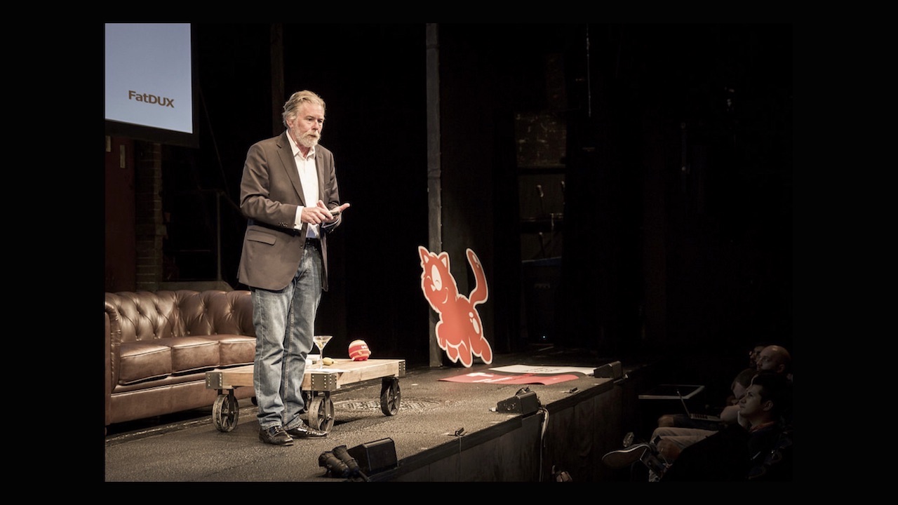
We put together a team, and despite the fact that I presented this project alone, the work of the people listed on the screen was really important, it took a lot of time and effort. Most of the CSS was written by Sara Soueidan, most of the JavaScript by Ilya Puchalsky. Many people worked here, including the “cat illustrator” - you will soon understand what this means. And besides, we used Netlify in this project. The project turned out to be expensive, and initially we wanted to start everything on the 10th anniversary of the advent of Smashing Magazine, then on the 11th anniversary, we completed it only a few weeks ago. I want to tell you about how we acted and why.
We started with the text, with the names of the components. This was one of the main things. We started by looking at the interface like this:
This was my first sketch. You think about what components are needed page or site, write them all. It defines how you will build your interaction with customers. I have prototypes of micro-interactions here: “Do you really want to delete this file?” You don’t need to implement anything yet, but you need to think about what you need and give it a name. And, in particular, I was thinking about error messages from the very beginning:
Out of context, it looks weird, but if you're in context, everything falls into place. I wanted to find the individuality of the application. I wanted you to smile when confronted with an error, and turn this experience into a positive one.
Then we went to the font selection. The option that we chose for headlines - I hate it. However, when we began to ask people what Smashing was associated with, it turned out that it was not with respected and professional publications, but, for example, with cats. And I didn’t want cats to be my legacy. Raise your hands, which of you like cats? And the dogs? Wow, this is probably the only country where cats love more. Usually, 40% of dog owners, 30% of cat-owners, and the rest do not care about those and others.
The fact is that we organize conferences five times a year, and each has an image of a cat. I personally don’t like cats at all, but when organizing the first conference in 2012, the illustrator asked me “if we don’t draw a cat,” I replied, “Why not?” - the first conference, who cares. And then at the second conference there were already more of them, it went away, and now everything is in cats. Sad, or joyful, depending on whether you are a cat owner.
I decided that it’s not my preferences that matter, but how people perceive us. Now we have these cats 68 pieces in different places in the interface.If you manage to find them all, I promise that I will pay you a trip in business class to any of our conferences anywhere in the world, taking into account your accommodation, food, and whatever you want. All of them you will not find. I have acquaintances who, when I offered them this bet, said “you don’t know who you’ve contacted”, and wrote an algorithm with machine learning that tried to look for these pictures. They can only wish good luck, because some of the pictures are written in ASCII, and some - in print.css.
It was important for us to look at things from the right angle - and in the literal sense of the word. We experimented with the layout, reached the possibility of turning and looked at our logo, which was already at an angle. Previously, this angle was 10.6 degrees, and when redesigned it was 11 degrees. Big step for us! This means that everything else should also be at an angle of 11 degrees, as can be seen in our stylgide; we have everything based on the components.
A small digression. I'm impressed with Airbnb. I understand that everything is completely different for them, but what matters to me is how far they have carried this idea of the style template library. They created a kind of search engine for developers and designers. If you need a specific workflow, testing certain components, you simply type it, choose a platform and other settings. And you are shown, for example, options for login forms for the iPhone 6, with a view of all the components and an overview of the interfaces.
Then they developed this idea even further, and called it air / shots. Surely many of you have seen the link they created between Sketch and React. According to Benjamin Wakins, they decided that if machine learning can be distinguished from each other by complex handwritten images (such as Chinese characters), then you can certainly be taught to recognize each of the 150 components of our system.
Now you can draw a component by hand, and, after analyzing the image, the machine will generate the corresponding React-component from a predetermined set. This approach impresses me to the extreme. Imagine what the process will look like in the future.
Of course, we did not reach this point, but our components were also based on our work. Here is an example of our design, as you can see - everything is tilted.
Another idea that can, in my opinion, help to grasp our individuality. To be consistent, I initially wanted to use emoji cats in the code, but it turned out that there are too many emoji and they are not uniform. This made debugging difficult, and the idea failed. But you could!
We paid a lot of attention to things like Print Style Sheet. I'm a lazy person, so it seemed to me much easier than doing the generation of .pdf. Here is an example of a check made in this way, and no extensions are needed. The same with articles. We were engaged in the creation of electronic books, and they often have articles. I decided that once I had to spend enough time creating a Print Style Sheet that would combine several articles into one document, and a decently designed book would be created at the exit, with links and other things.
We turn to the frontend. We started working on it in December 2015 and saw what browsers the audience used:
Most of them are good, because visitors like you come to our site - you won’t think of using IE 8, right? Since then, Firefox has dropped to 7%, and Chrome has only gained popularity to 66% - that is, people are switching from IE to Chrome, not Edge or Firefox. Edge even fell in popularity, from 1.2 to 0.6%. Who among you uses Edge? 0.0%? This is a little sad. The data is slightly hampered by the fact that a user with an IE 666 user-agent visits the site every two years. This is, of course, cute.
When we started writing components, we followed a specific pyramid. Are you familiar with Maslow's pyramid of needs? Patti Toland and the FilamentGroup in Boston came up with the idea to apply the principle of this pyramid to responsive design. The lowest level is speed, you need to think about it first of all when writing any page or component. Then comes accessibility, scaling, and finally, style (logos, colors, fonts, animations, etc.).
CSS we wrote, guided by this principle, going from the bottom up. We tried not to use frameworks, not because it was fundamentally against them, but because in specific situations there was no point in them. When using frameworks, too much remains behind the scenes. We did not want to use something excessively large. It was much more convenient for us to use smaller libraries. We originally planned to use React, but then we stopped at Preact, a small library that mimics React. You may have to switch to React soon. The reason is that we had to write significantly more of our own things to Preact than we had planned. Every thing has to do separately, which is somewhat sad.
In addition, we did not want to use media queries. I suppose you think “Is there something wrong with them?” It would not be “something is wrong” with them, but it’s quite difficult to support them. When everything is designed for two different screens, a small mobile and a large computer, difficulties arise in the middle.
If you take a regular application and narrow the window between two supported permissions, then we will immediately see how the “breakdowns” occur, especially in the middle of the page.
To combat this, you can add a breakpoint. And then another. And then another. But in the end it turns out a terrible fuss at changes in the structure of the page. Of course, we use things like Sass and Less, but I still have to go through media queries and repair them, but I don’t like to do repairs.
So we came to the idea of the need for fluid sizing for all components. How to effectively resize any UI element (even the slider, even the calendar) while maintaining the proportions, but without directly accessing their latitude and height parameters? With a little trick that you might already be aware of.
Have your component. There is a body size. There is a rem unit, it is tied to the root element (body or html). 1 rem is always equal to the body font size. If the font size of a component is set in units of rem, and everything else is in units of em, then when you increase the window, everything will grow. Instead of changing everything in the media query, you just need to specify that we move from font size 75% to 125%. Everything inside the element will grow accordingly.
But this is only the first step. We do not need the component to grow in this way:
It does not suit us if the element is 1 pixel in size on a small screen and 500 pixels on a large one. Growth must be controlled, it must begin and stop at certain points:
Let's try to make a graph on which the font sizes will be indicated on the vertical axis, and the viewport width on the horizontal axis. Then we can line up the breakpoints. It will not be direct:
Since we all like mathematics, this relationship can be described by the equation y = mx3 + mx2 + mx + b.
In CSS, this, of course, can not be done. Maybe this is possible in JavaScript, but still it is absurd. But the idea itself is important: imagine that each component would have a function that determines its behavior. Instead of writing endpoints endlessly, you can describe a component once, and it will be displayed correctly on any screens, even on television. Even if it is an approximation, it will be fairly accurate. You can split the curve into several straight lines, each of which will be defined as y = mx + b. As a result, you come to this:

But you most likely do not have the desire to implement such in CSS or JavaScript, doesn’t it? Well, I got it, but it really wasn't worth it. In the end, we need a fairly simple behavior: that from a certain point the element begins to grow, and after a certain point - it ceases to grow. In CSS, this principle can be implemented using the formula:
In CSS, calc allows you to perform basic arithmetic operations. At the start of the formula, 16 pixels is the minimum font size. Then the difference between the maximum and minimum sizes is searched. Then there is a range in which growth can still continue, and finally, the difference between the maximum and minimum screen sizes. That's all you need. And get something like codepen.io/MadeByMike/pen/VvwqvW .
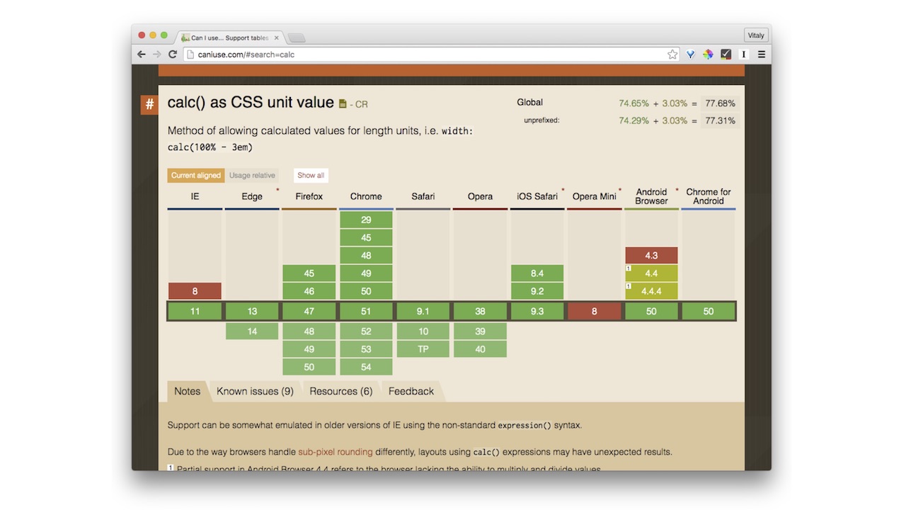
I will add just in case that popular browsers support this, there is no reason not to use:
We thought: why not use this method in general everywhere: with borders, indentation, width, up to the height of lines. In the latter case, again, this is not about uncontrolled growth, but about a change between 1.3 and 1.5. The principle here is the same, you just need to recalculate the formula.
There are two ways to achieve these results. You can simply set the dynamic font size on the HTML element in CSS.
And then, depending on the viewport, all internal elements will automatically be scaled to scale. If you need a fixed-size container, you can simply define fixed-container with the font size in pixels and the size of the internal components in em.
Or, on the contrary, it is possible to include flexible behavior for a separate container, and leave the rest to a fixed size.
On this option, we finally stopped. If you open Smashing Magazine and start changing the width of the window, you will see that all the components change: width, height, line spacing, font size, SVG-logo in the corner and so on.
Of course, this requires a lot of “magic” numbers in CSS. But all this is done through calc. Other properties may be somewhat sad about this, but calc is the most used one here.
It really helped us organize our namespace. Here is a quote from Harry Roberts: “I don’t know what the function is. I do not know where it is still used. I do not know whether it can be erased, changed, or used elsewhere. I don’t know anything about this at all! ”Each of us has come across a situation where you, being a designer or a developer, turn to CSS and JavaScript and don’t understand what’s what. As a result, we began to use many consoles for various components, for example, such:
This helps a lot when you read the code, it’s immediately clear what’s what. It is only necessary to understand at what levels the components are located.
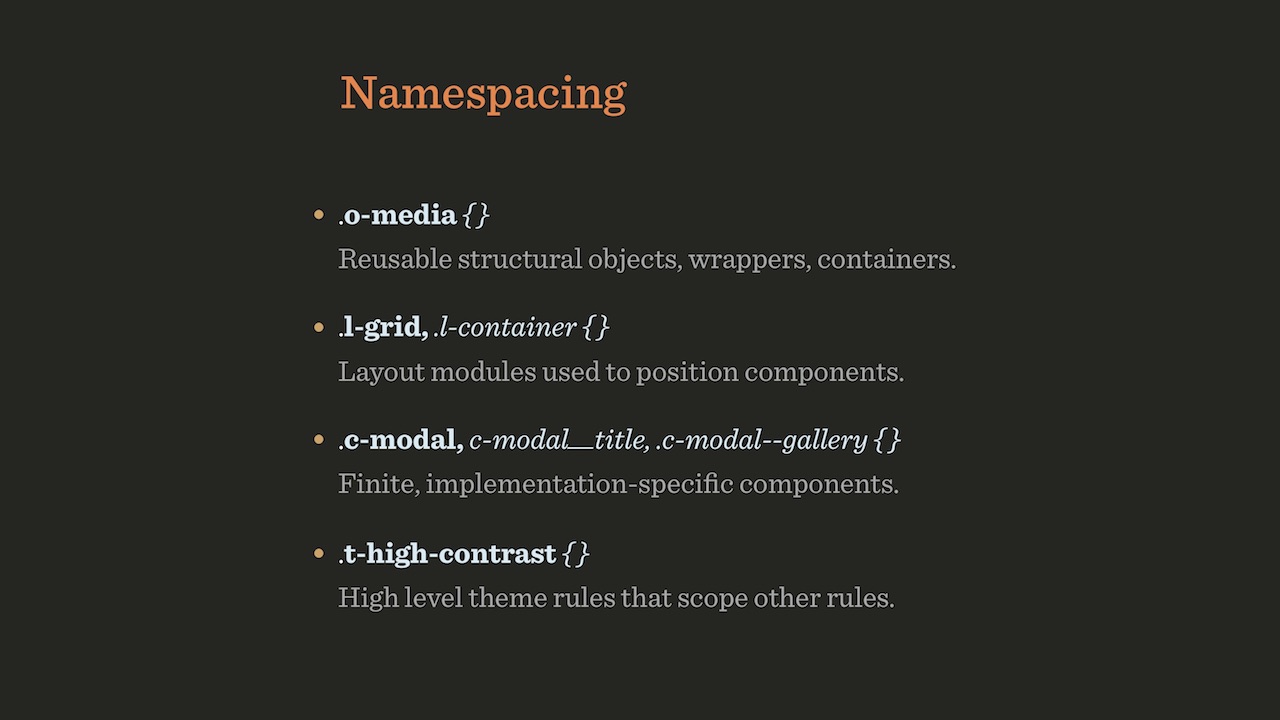
Of course, we also used BEM to define relationships. I assume that in Russia they have heard about BEM. Although, perhaps, he is not respected because of the perseverance with which Yandex advertises it. By the way, this policy is incomprehensible to me, since, as it seems to me, BEM is well known in Europe and in the USA, there is no need to promote it so aggressively.
Another important topic is the responsive suffixes with which you can do something like this:
The goal is this: it should be clear from the code what it does, without having to look into CSS or JavaScript. If the class says “c-image-list @ small-screen c-carousel @ large-screen”, then it immediately becomes clear to me what is what. All that remains to be done in CSS is to put the “\” character before “@”.
Some of this code was written by other people, and some by me.
We call the classes for which refactoring is planned, or for which it has already been conducted, with the prefix .rf- *. Thanks to this, it is possible, for example, to highlight in the green on the interface all elements that have already undergone refactoring, and red - those that are yet to be refactored. It is very convenient.
Another extremely useful thing is the modular grid in CSS, that is, the Grid Layout. How many of you have heard of her? It turns out everything. And who tried to play with her? Let's see what can be done with its help.
When they try to advertise it (it is not clear why, it is so beautiful), often the following picture is shown:
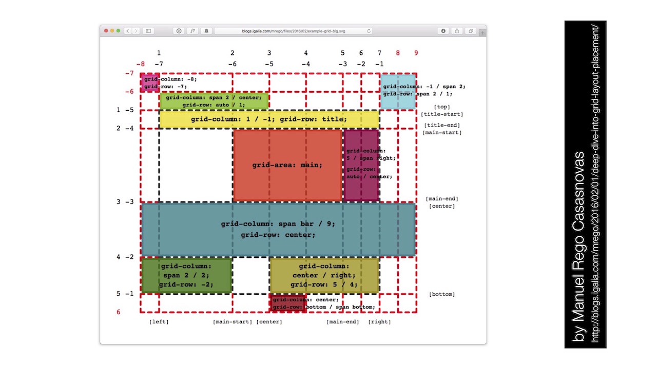
But this is the most terrible introduction to the modular grid that you can think of. It is complicated. But the grid does not have to be complicated at all. With it, you can create simple things, for example, such an unusual design:
Make it extremely simple, just five minutes. Jen Simmons on the site has other examples of using the Grid. And, by the way, in terms of browser support, there’s nothing to worry about either.
A few things to know when using it. There are grid lines that can be horizontal and vertical. Between these lines are the grid tracks, at the intersection of the horizontal and vertical lines are cells of the network, and several cells together form a network area.

The network is defined by specifying grid-template-columns, and various notations can be used for this. For example, using the repeat () keyword you can create multiple tracks with the same parameters.
Another useful feature is minmax (), which allows you to grow between two values. Suppose we have a container with contents, and there is something that goes beyond this container.
We have a simple example of building such a container:

The lazy developer closes the container, connects the image, opens the container again, calms down on it and goes for a drink.

Please do not do this. There is a much better way.
The problem itself should be presented in a slightly different way. Suppose we have three columns in a modular grid, one on the right, one on the left, and in the middle a column with the contents.

The first thing we add is supports . If all of a sudden you don’t know, this is a function for defining capabilities in CSS. It can be used instead of Modernizr. The only hitch is that not all is well with browser support, so to speak, support. But any browser with a support will have a support: “display: grid”.

Next, we define the grid columns, and assign the names to the separation lines: “full-start”, “main-start”, “main-end”, “full-end”. There will always be one more lines than columns. Each line may have several names.

Now it remains only to specify: everything that is in the container must be placed in the main column. Then, if you need to bring something outside of the container, “grid-column: full” is indicated, and the content takes up all three columns.
The advantage of this approach is the absence of media queries and, accordingly, references to the viewing window. Due to this, such a container can be placed inside another, adding, for example, also a side menu:

Designers for some reason really like the idea of "vertical rhythm." I wondered how it can be implemented. Imagine the structure of the page with headings, text, images, in which all elements should be aligned with the correct lines. On the screen of two examples, this is done correctly in the one on the right.

To do this, in fact, is quite simple.

There is a tag figure, which is displayed outside the parent container (“breaks out”). Sorry for so much CSS, I really like this business.

For body, you can set the calc property, then set root for the --gutter property, which determines the gap between the lines.

And finally, it remains to transfer to the grid-row-gap the value that we defined for gutter as root.
It is interesting that here I use the unit of measurement ch, the "character", which is rarely used. Quite often, designers have a requirement that each line should have, for example, 60 or 70 characters. And it turns out 12 tracks of 4.85 characters.
The ch unit (character unit) is based on the width of the character "0" in this font. Leah will correct me if I'm wrong. (The voice of Leah Vera from the audience: “Right”).
Compare two options:

Of these, the second is obviously more readable. Just in case, add that, of course, ch has long been supported in browsers.
So, the page structure was quite short. CSS has become incredibly simple. Or complex, depends on how you look. In addition, you will, of course, need to use the “*” selector.

He is wonderful. Here is an example of its use: elements that fall under the “* + *” rule will get the margin property: 0, and the content will be limited to the central column. Anything more is not necessary. No media queries occur. And in terms of flexibility and topography, everything is built in this way.
Let's go to our site, scroll down a bit ... A small digression: here we see a button that says that it “does not do anything”.

This is also part of the personality that we are trying to impart to our site. So, it is on this button that is most often clicked! What is wrong with people?
Let's return to the topic. We have implemented everything as I described, and with this approach there is a difficulty. There are browsers that support supports , but they do not support modular grids well enough. For example, in Edge 13, the code I just showed you is interpreted in a very original way:

Therefore, in the code, you need to replace display: grid with grid-gap: 0, do not ask why. It took a long time to figure out what caused this. Madness.
In the end, I want to talk about backend. An extremely important topic, especially, I think, for you. Someone may have heard of the JAM Stack. One man. Hmm, I did not expect this. Nothing wrong.
I talked about how we made our magazine based on WordPress, everything was in PHP (except for parts in Ruby). In 2012, I met Matt, who later became one of the founders of Netlify . This is a platform for automating web projects using a CDN instead of traditional servers, and they have invested well in this CDN. When I was interested in their creation, Matt demonstrated the transfer of our resources to CDN Netlify, thanks to which productivity increased threefold (despite the fact that we had already spent a lot of effort at that time to optimize our WordPress process).
This project took us two whole years due to the fact that we had a lot of activity parallel to it. Although there were a lot of people involved, the most part is our work with Ilya on CSS and JavaScript. Sometimes they say that we hate WordPress. This is not entirely true. I don't hate him. Just not really love! Well, in general, he is the norm - a tool like any other. Just at a certain moment he stopped approaching us. We switched to a system based on static site generators, which is also often called “JavaScript, API, and markup” or JAM Stack (markup). How is it arranged?

We all know that interest in FTP is falling and it is slowly dying, and interest in Git is growing. In addition, of course, grow Gulp, Grunt and similar tools. Finally, there are so many different APIs for them.
Recall the story. Initially, we only had an interactive browser and server. Then someone said, “No, you need another program for interactive things on cgi-bin and Perl”. After that, they said “this is not enough,” they added databases on servers in PHP, MySQL and Apache. But this was not enough, we need caching to increase performance. When it was implemented, we decided that we need what? Right, CDN. All this led to a huge increase in the number of interacting entities in the system:

And then an idea arose: perhaps we should return to the simplest possible scheme. Let's just do “browser and CDN”.
It works as follows. We have a system that most likely is also present in all of you, from Git, the build tools and the API. The code is fed into the assembly tools. Every article, every comment, every author, every job is recorded as a markdown file. Then HTML is created from all this, CSS and JavaScript are added. This is then sent to the CDN, where the user has access to it. Interactive things like searching and comments are done using JavaScript on top of this entire system.
We used Preact, which often raised the question: are there any problems with loading time? It does not occur, since this is not a one-page application, but a set of one-page applications. Thanks to this, in order to start displaying our pages or reading articles, JavaScript is not needed at all. We don’t have a single blocking request, as you simply go to the page and load the critical CSS at the top. For different pages we have five or six blocks of critical CSS. And, of course, our application is PWA (“progressive web application”), although by and large there are probably no others today.

Before us is a stack, nothing complicated in it. We have a lot of microservices and APIs, but nothing especially complicated happens. Of course, there is a subscription check and similar things. Stripe is used for payment. For the "back office" in the backend system is used on Go.
I was impressed with the speed of this system. Most likely, we were one of the first projects of such magnitude that switched to the JAM Stack. I did not expect that we will succeed, and was glad to be mistaken. If interested, we use Hugo as a static site generator, and we use Webpack.And also Gulp and Grunt, because we need different plugins.
In two years, many things have been created. Netlify made CMS for us, GoTell for comments, GoTrue for authentication, GoJoin for a subscription to Stripe, GoCommerce instead of Shopify, and Gotiator, also for authentication. It was a big way for us.
Many people think that because of this approach, we have a lot of dependencies. In fact, it is not. Everything is available without using javascript.

If for some reason you cannot or do not want to use JavaScript, there are spare mechanisms for all actions (well, comments are not available yet, we have yet to fix it). For example, in a search as a fallback, we simply use Google, and then JavaScript is superimposed on it.
In terms of performance, our solution with web fonts, which I talked about in my report yesterday, helped us the most . On this alone, we managed to save 600 milliseconds.

For responsive images, we use the picture element in outdated articles, but the Cloudinary service also works with us. In addition, we have Preload, Zopfli / Brotli and gzip. We use critical CSS, not server-initiated loading. In the deployment we have one bundle so far, we plan to go to 8 or 10.

I'll try to demonstrate. Before you is what a CMS looks like. This is similar to WordPress, but, of course, much worse. However, it copes with our tasks. Best of all, everything is in the same place, and here we have custom-made authors, vacancies, events, speeches, etc.

Productivity was incredible. Here you see the results six months ago, before we started optimizing. For example, we have not done anything with web fonts. Initially, drawing started at 700 milliseconds here, now, with a stable connection, up to 0.5 seconds. Try to achieve this with any database under WordPress. It just won't work.
There is still a lot of work, but the system is already working, you can see for yourself. People do not like the color red, you can talk about it separately.
As a conclusion, I will share with you a little secret that will allow you to save. Let's try, for example, to order a book on our website. There is a window for entering the coupon code, which will give a discount. If there is no such code, and you want a discount, what are we doing? That's right, we are starting to search for the code in Google. How many of you do that? (Raise hands). We in Russia, of course, we do that.
I worked a lot in commerce, was engaged in testing things related to these codes. How to improve the conversion? We know from experience that when using the “from Google” code it will work in a minority of cases, respectively, there will be many erroneous entries. Why am I telling all this? If we try to enter a random coupon code in our window, it will inform us that the code looks “fishy” (“suspiciously”), and prompts you to enter “FISH” instead. And this code will already give us a discount of 1%.

And the user, seeing this, will buy the book anyway, even if he has to borrow a credit card from a neighbor for this. Because it is not known what will happen next - there are a lot of meaningless things on the site, for example, a tick box with the caption "I just like to tick." We lose here 1% of the price, but these are far less ordinary discount codes like $ 10.
There are many more things that we could talk about later. In general, we spent most of the time on this project with pleasure, because we analyzed how the most advanced technologies work today, and combined them with each other. It is worth remembering what a wonderful world we live in and enjoy it. On this note, I would like to say “meow” and thank everyone for participating.

Vitaly Friedman, co-founder of Smashing Magazine, talked about this at our HolyJS conference in great detail, starting with a general design approach, continuing with the details of the implementation of the frontend and eventually reaching the backend. And now, in anticipation of the next HolyJS, where Vitali will come up with new topics, we have made for you a text version of this report, translating everything from English to Russian.
It turned out the most detailed text with 70 illustrations (caution, traffic). And in case you prefer to watch the English original, or if in our translation some places turn out to be unclear, we attach the video:
')
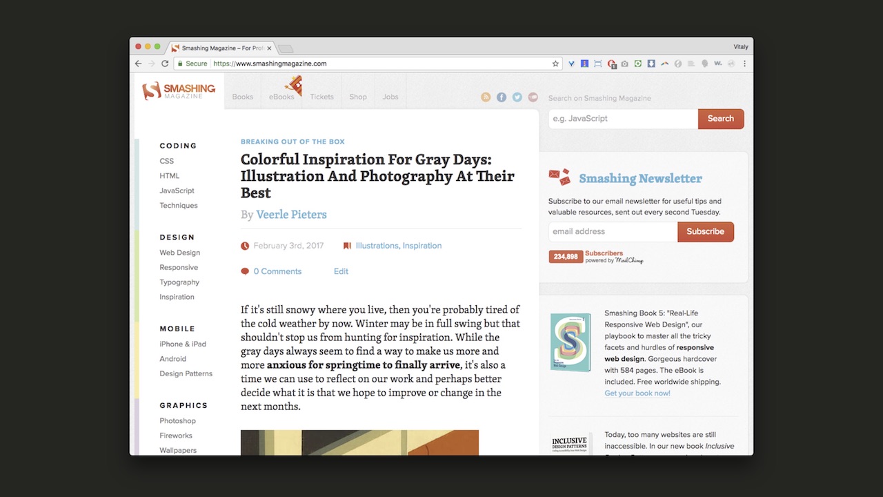
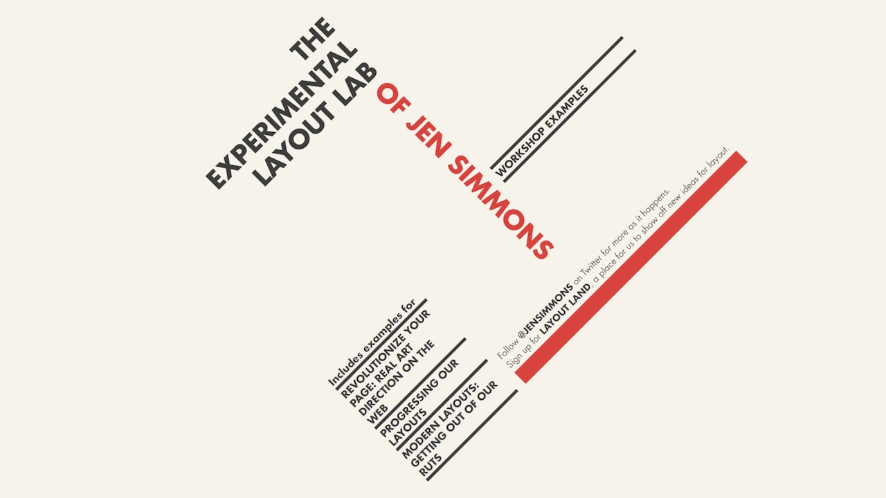
I will talk about the changes that have occurred in Smashing Magazine over the past two and a half years. Before, I had never participated in a project that would have taken such a time, if not a full-time job. It was worth quite a lot of effort to move from this option:
To that:
If you do not like red (although this is probably not typical for Russia), you can turn it off.
Today I want to cover both the design, and the frontend, and the backend. I know that most of you are developers, but some themes from the design will be important. They explain why certain things we did in a certain way. And then we move on to the frontend and backend.
Design
To begin, I will answer the question "what are you just thinking about." Because I received this question so many times. I received a bunch of letters, the authors of which were perplexed, or angry, or annoyed, and sometimes they wrote absolutely ruthless things. Therefore, I want to clarify some things.
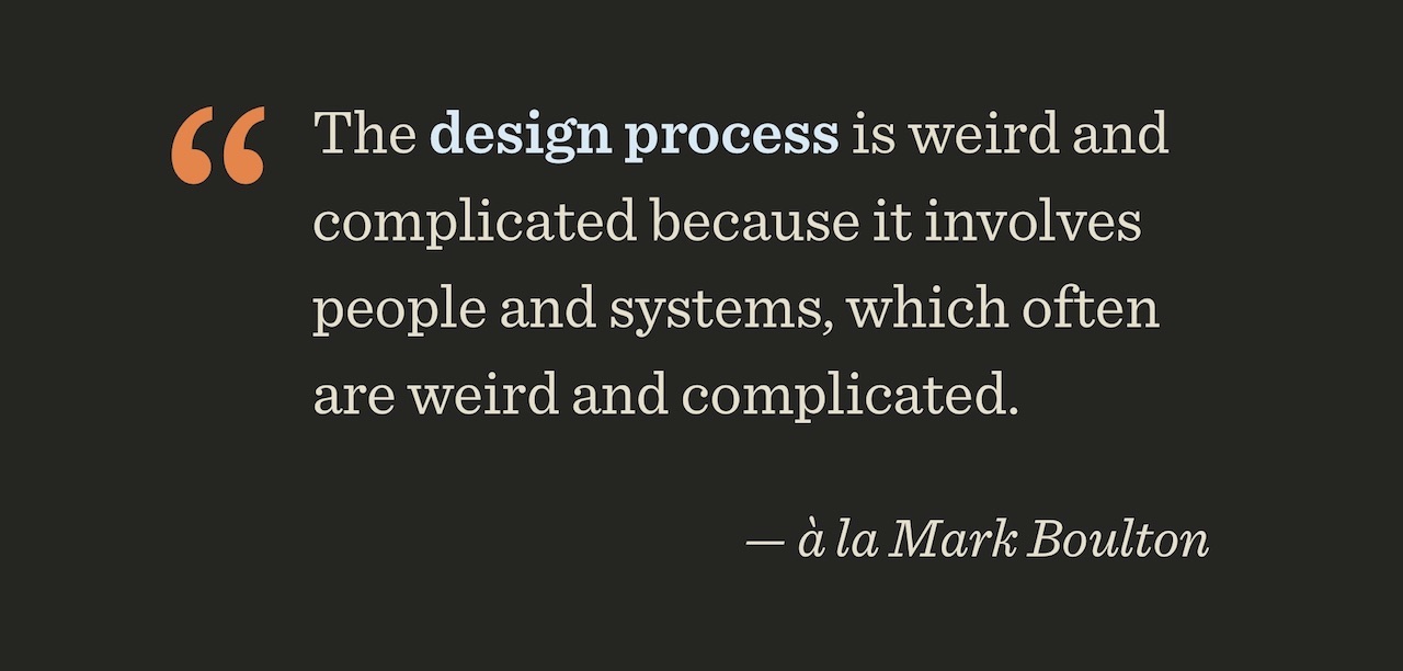
In my opinion, in the case of design, there is an important problem in how we understand creativity, workflow, and interaction with each other. The problem lies in the lack of individuality, but not of ourselves, but of the individuality of what we create together. Can you recall any site (except those that you developed yourself) that would be so memorable that you still think about it?
The question is wider: should websites be memorable at all? Why don't most of us remember the sites we visit? Are they not important? Do we just create invisible artifacts that do not play any significant role? I think that the process of creation (including both design and development) is extremely complex and strange, because it constantly deals with people and systems, and they are very often complex and strange.
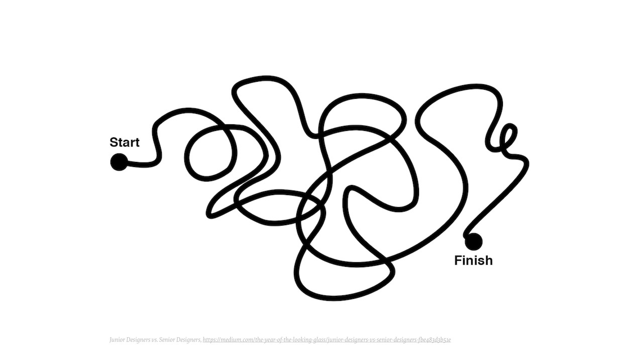
Often they look at the creative process in such a way (no matter what it is about - design, development, or something else): you start at a certain point, then continue, sometimes confusingly, until you reach the finish line.
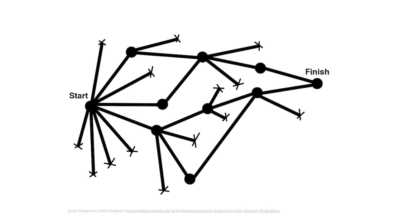
But for people who are engaged in this process themselves, the matter looks quite different. From each point where you start, there are many different possibilities that you explore, until you reach a point where you feel “oh, this looks promising,” from which a bundle of possibilities is reopened, etc.
Many possibilities turn out to be dead ends, from which one must get out, time is wasted on it. The main route to the finish line is not obvious.
Therefore, we usually prefer to use things that are already tested and work. You could see this tweet asking: which of these two sites are you developing now? Site left or right? Because there are no other options. Unless there can be a difference in the arrangement of the carousel, sometimes from above, sometimes from below.
We, especially the designers, are very rotated in pixels. Which of you participated in the debate: let's change the border-radius from 14 to 12 pixels? A month later, decide that it is still better 13. Does this have real value? Do we lose prospects for this?
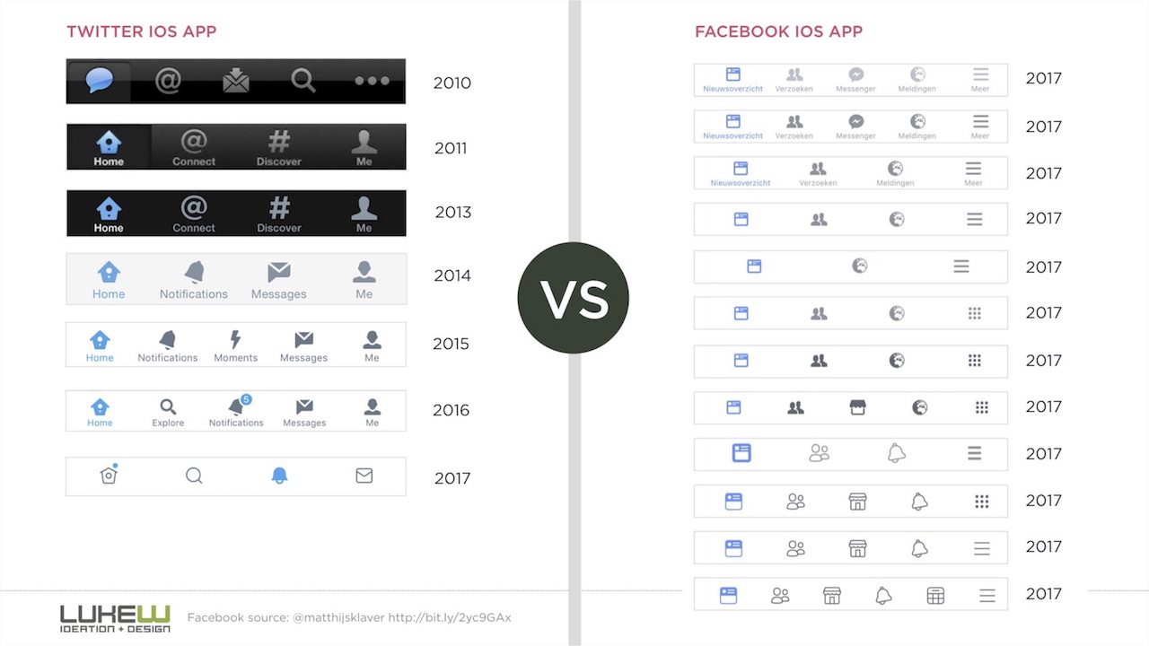
If we look at the evolution of the interface presented on the screen, we see that in 30 bloody years almost nothing has changed, except for border-radius and a few icons here and there.
Maybe we need more serious changes? They talk about 67 shades of blue from Google, how they test different colors of links in order to understand what response they cause to users. And Facebook applications generally have 228 icon variations. And they have a tradition to introduce a new type almost every day and see what results it gives.
I really don't like A / B testing, much more I like A / Z testing, when fundamentally different things are compared. Probably, details like word order also need to be tested, but one should not lose sight of perspective. Sometimes it comes to the point of absurdity.
Often we over-follow fashion. Who of you had the following dialogue with the designer: because of the iPhone X we have a cover. This thing above will ruin us all, it will radically change the way people watch websites. But in fact, this problem does not matter, since 98% of people on iPhones read pages on the Internet vertically, not horizontally.
We really like the data. How many apps do people download per month? Almost half - none. How many applications have you personally downloaded this month and are you really using? Also, probably not five?
Here is another statistic: 2 out of 1000 mobile phone users use the dedicated share button. The same goes for the rest of the buttons for sites — like, tweet, LinkedIn, and so on. And at the same time, people ask: why do you have no special buttons for social networks? Therefore, just no, people do not use them.
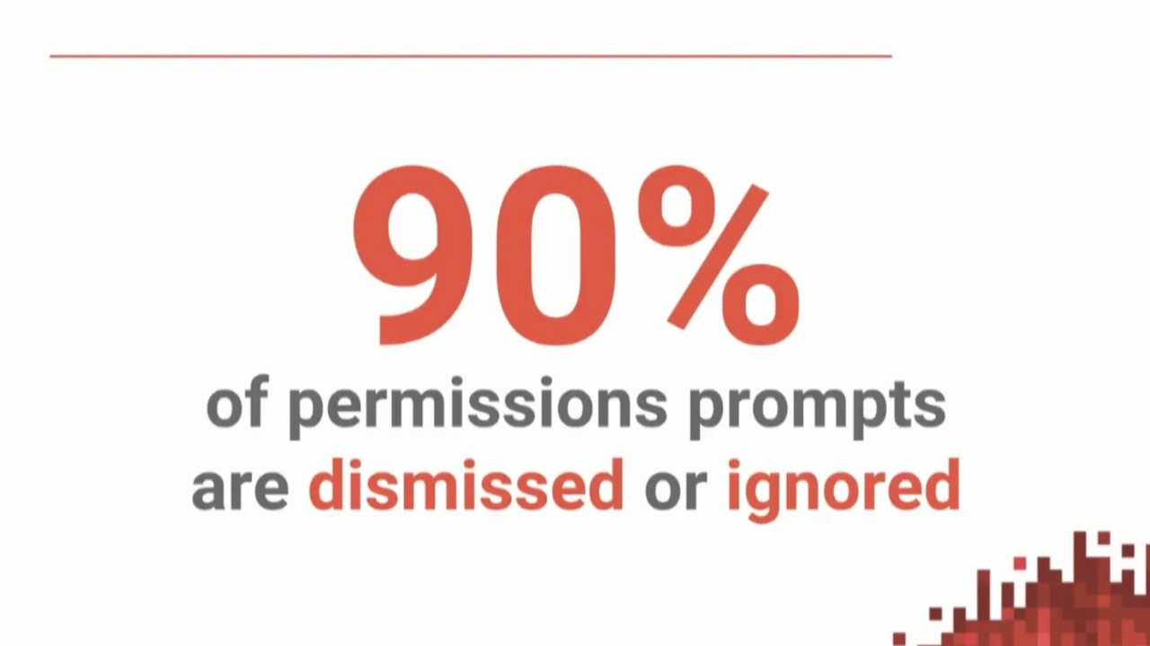
Or other statistics, 90% of requests for permission (for using the user's history, position, etc.) are rejected or ignored by the users without even reading. Most likely, most of you do the same. Indeed, who wants to share their personal information?
So, we like data, we like things that are already working reliably. I asked myself: where is the place of individuality here? When we first started to work, we asked ourselves the question: not just “what will make us different from others”, but what can give us a voice in the community? I did not want us to be neutral, I wanted to cause some kind of emotion - to be loved or hated.
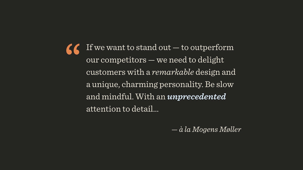
Danish designer Mogens Møller at a conference a few months ago said a thing that, in general, they say at all conferences. Since we all have a fairly high level, we all need to stand out on a general level. Need individuality, the design should be memorable, attention to detail should be unsurpassed.
When I hear it, I think of sites like dada-data.net , dedicated to Dada. How much time would you need resources to develop this site? How many iterations would have to go through, what should the budget be? I think everyone will agree that the site has a personality, but I personally can not afford it. Over the weekend, something like this does not collect.
Further, Muller said that one should promise little and give a lot, capture and skillfully hold attention, and ultimately it all comes down to the art of storytelling, relying on an outstanding director.
In my opinion, there is a fundamental difference between applications such as Uber and MailChimp. I asked myself: why do I have absolutely no attachment to Uber? If the service appeared 10 cents cheaper, I would instantly switch to it. But for me to stop using MailChimp, someone would have to directly pay me money. I have a lot more attachment to MailChimp.
I, as it seems to me, are not a stupid person, I understand that the monkey here is pure marketing, and yet this marketing is very human, close, I like the personality of this company. And their individuality and humanity will permeate their product. In my opinion, this is extremely important. Therefore, they create, for example, coloring for children and give them. They don’t have a “hello, we’re a great and great email service” button, because email is boring, if you only sell it, no one will buy it. And in another package, it will look much more interesting.
In this coloring, in my opinion, the beautiful design and choice of words. "Hello! My name is Freddie. Be me fun! And you? ”How can you answer this negatively? “Am I bored, am I the most terrible person in the world?” There is a lot more, and the last picture: “I like being me. Do you like to be you? ”I hate myself every day since the morning I wake up.
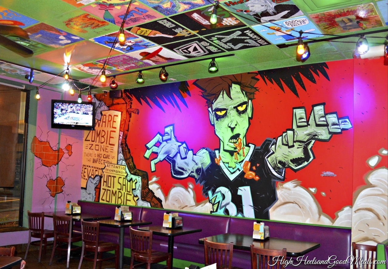
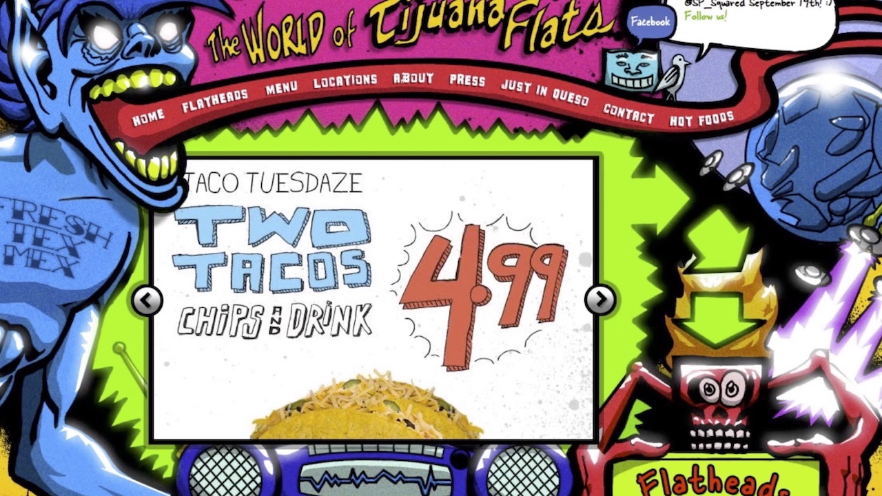
Another story I want to tell you concerns Tijuana Flats, a chain of Mexican restaurants in the United States. Here is an example of their interior:
Regardless of whether you like them or not, I think you will agree that they have an individuality with this zombie styling. They have high ceilings and high walls, and every four months they hire new artists who paint new graffiti for them. What says about the degree of their attention to the interior. They have a similar style in the menu, and their website was designed in the same way:
However, as we all know, parallax and web fonts are evil, textures when rendering are evil, performance matters, and, in general, the site should work quickly and still shine. Guided by these standard settings for us, they created a new design for their website, in which, in my opinion, much has been lost. I like the initial version more because it reflects their individuality.
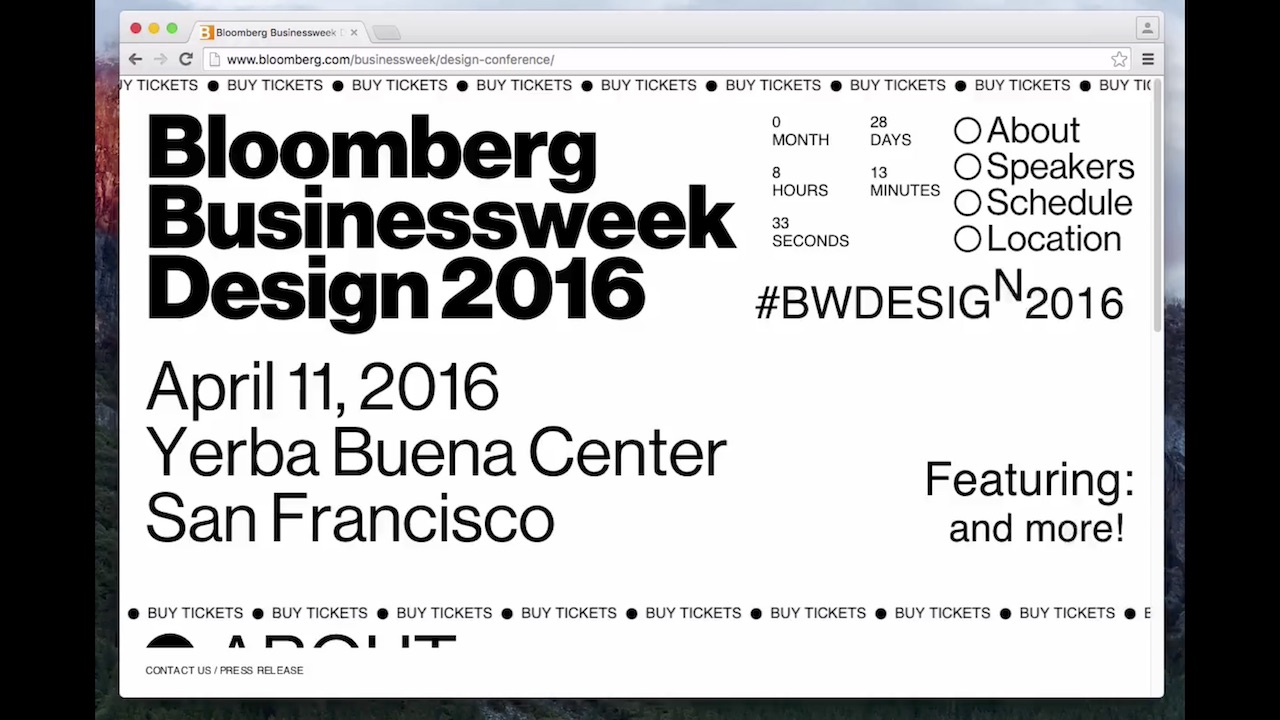
In my experience, this lesson was learned very well by Bloomberg. They hired designers and gave them free rein. The resulting product can be a lot to blame, however, it is beautiful, and does its job: tickets began to be sold much faster than in the previous year. When was the last time you used the <marquee> tag?
We recommend to follow the link , a screenshot does not pass
No answer. Well, we work in JavaScript, we don’t need this tag. But in general, why not use different crazy things, at least just to try? And many other things that are considered to be “not worth it.”
Take a look at another Bloomberg material that you will never forget. Fix the date now because it will change your life. This material is dedicated to the projects of Ilona Mask.
He winds time into the past almost until 1998, where everything was not the way it should be. Now you can hear from designers that we live in an era of “brutalism” in design, when everything looks creepy and broken, because broken things are in fashion. In my opinion, these are just desperate attempts of various companies to look original against the general background, because otherwise no one will pay attention to them.
And in this project about Ilona Mask there is still a lot of things, look for him yourself. He is the place in the museum.
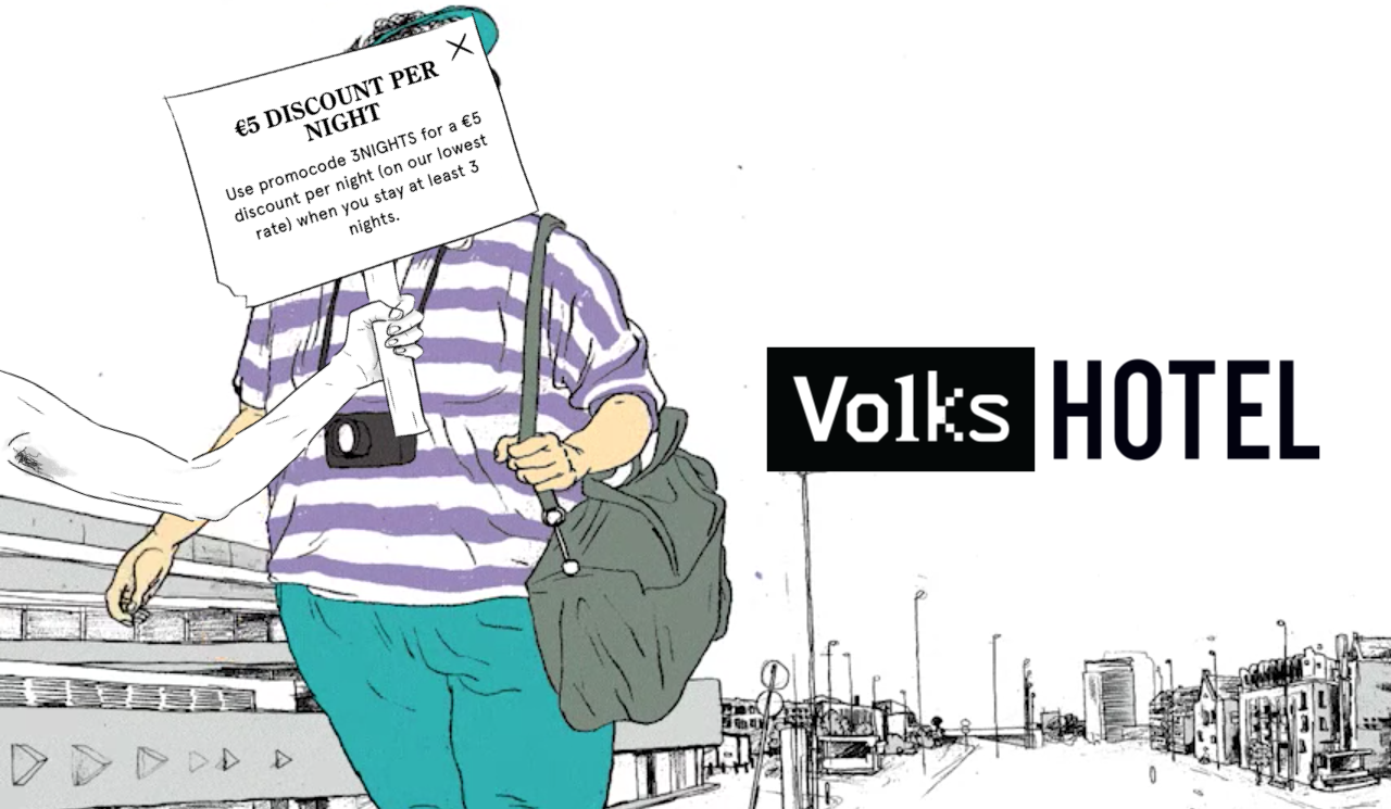
And I asked myself the question: what does this all mean for Smashing Magazine? I do not want to create such a “broken” design. But I came up with several options. Let's take something the most boring or most annoying of all. Say, who likes pop-ups? It seems to be one person in the hall, and, perhaps, to someone else who is not ready to admit this publicly.
But if you think about it, then what's wrong with them? Yes, this is an advertisement, but you can arrange it in different ways. I present to you a pop-up window with volkshotel.nl : the most annoying and most beautiful pop-up window in the world.
I would like all sites to have one. He's so annoying that I can't stop using him! And it is perfectly combined with the general spirit of the site, I am sure that the conversion is also high.
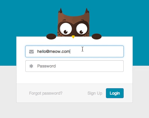
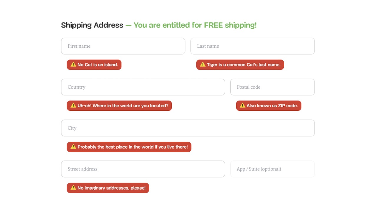
Another example. Let's take something extremely boring, for example, the window for choosing the form of Mr. / Mrs / Miss appeal. We all know why we really need it - to target spam across the floor. Let's try to change this window, for example, instead of making a free choice, make a closed, but very long list. With options like "Your Excellency" and "Comrade. lieutenant". This may be enough to change the whole personality of your site.
Or another example, here the owl closes its eyes with its wings when you start entering a password. This is cute, and sometimes it can be quite enough. When we started our work, we thought about how to make such an approach to individuality a part of our community.
The problem that we faced from the very beginning was ad blockers. If I do a survey now, most likely it will turn out that 80% use them, and 20% lie in the polls. I also use the blocker, I consider them useful, and I advise you, if you have not installed it yet.
Nevertheless, blockers became a problem for our company, as advertising revenues began to fall. The last 5 years every year they have fallen by 2 times. During the last design change, somewhere in 12% of our users blockers were installed, and now in 66%. We have an audience of people like you, of course, you use ad blockers, you're not stupid!
But this means that our profit is 1/16 of what it was five years ago. That is, there was a problem requiring solution. The problem is in advertising itself, it does not work and, in any case, I do not believe in the traditional “media advertising”. We needed to find a different approach, present a new product, which should become the center of all our activities. I don’t want to speak in too much detail, but the bottom line is that this is a subscription giving access to Smashing TV, webinars and things like that. And access must occur to all this at once.
At that time, our system consisted of the following components. The magazine had already worked by that time as many as 10 years under the good old WordPress with a lot of additions. In addition, there was an online store that initially worked for Magento and then switched to Shopify. It worked well, but it was difficult to connect it with a magazine on WordPress, until a plugin for Shopify appeared. In addition, we used Kirby to create static sites for Smashing.com, and a vacancy site was based on a Ruby application. Putting it together was quite difficult. To create a project that combines all these elements, it must be associated with them. For example, you log in once and then get a discount on systems on WordPress, Magento, Ruby, etc., without creating a separate account on each platform. This project we had to write from scratch.
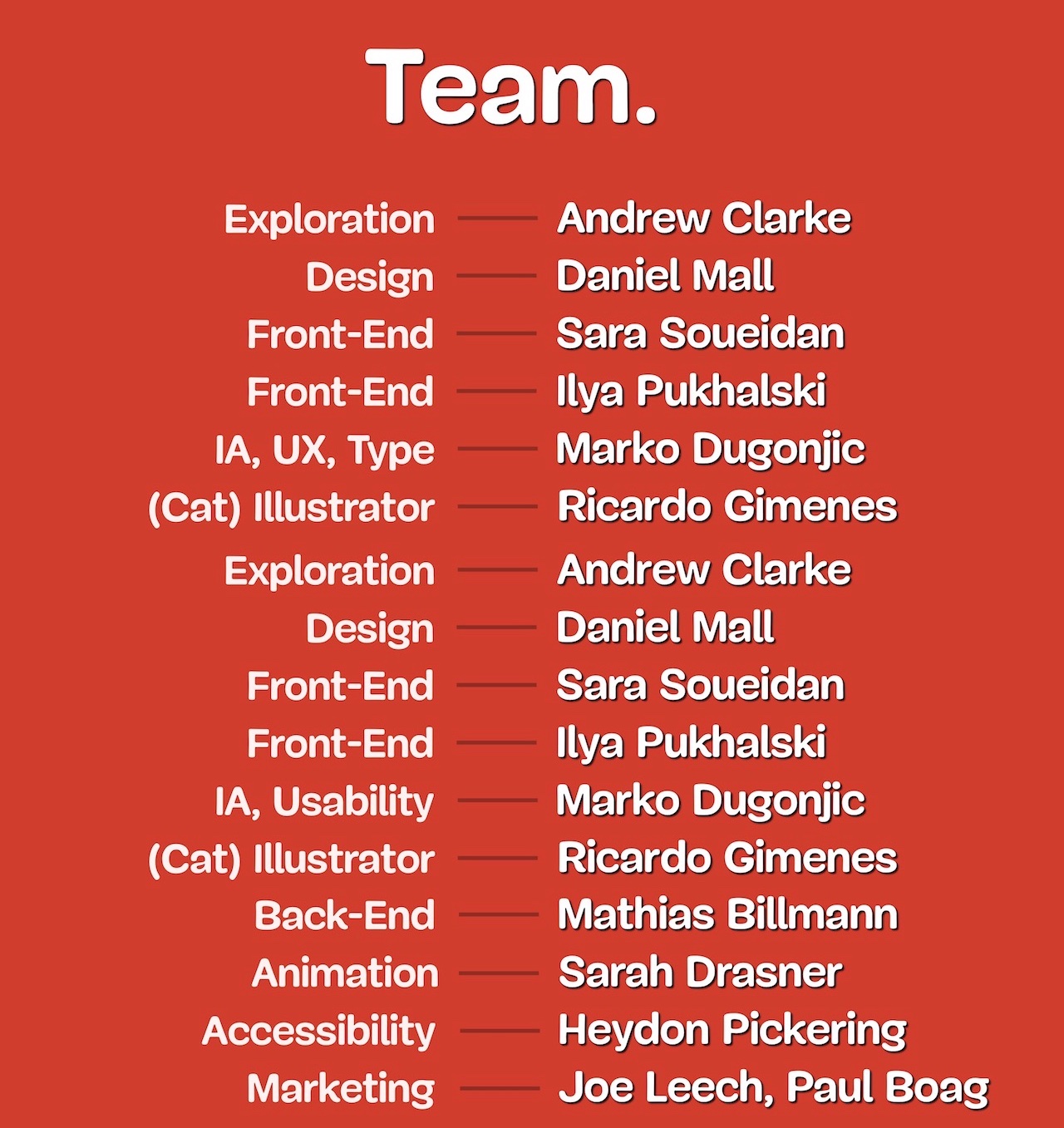
We put together a team, and despite the fact that I presented this project alone, the work of the people listed on the screen was really important, it took a lot of time and effort. Most of the CSS was written by Sara Soueidan, most of the JavaScript by Ilya Puchalsky. Many people worked here, including the “cat illustrator” - you will soon understand what this means. And besides, we used Netlify in this project. The project turned out to be expensive, and initially we wanted to start everything on the 10th anniversary of the advent of Smashing Magazine, then on the 11th anniversary, we completed it only a few weeks ago. I want to tell you about how we acted and why.
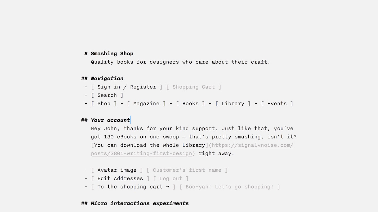
We started with the text, with the names of the components. This was one of the main things. We started by looking at the interface like this:
This was my first sketch. You think about what components are needed page or site, write them all. It defines how you will build your interaction with customers. I have prototypes of micro-interactions here: “Do you really want to delete this file?” You don’t need to implement anything yet, but you need to think about what you need and give it a name. And, in particular, I was thinking about error messages from the very beginning:
Out of context, it looks weird, but if you're in context, everything falls into place. I wanted to find the individuality of the application. I wanted you to smile when confronted with an error, and turn this experience into a positive one.
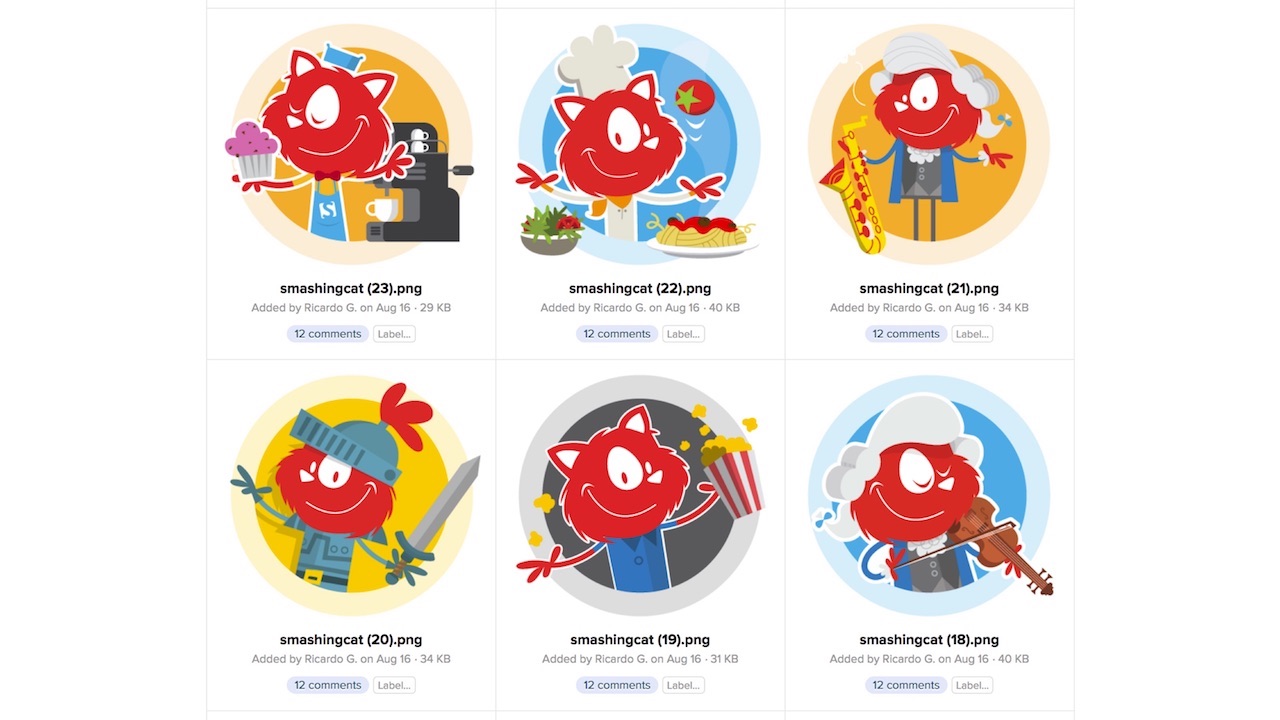
Then we went to the font selection. The option that we chose for headlines - I hate it. However, when we began to ask people what Smashing was associated with, it turned out that it was not with respected and professional publications, but, for example, with cats. And I didn’t want cats to be my legacy. Raise your hands, which of you like cats? And the dogs? Wow, this is probably the only country where cats love more. Usually, 40% of dog owners, 30% of cat-owners, and the rest do not care about those and others.
The fact is that we organize conferences five times a year, and each has an image of a cat. I personally don’t like cats at all, but when organizing the first conference in 2012, the illustrator asked me “if we don’t draw a cat,” I replied, “Why not?” - the first conference, who cares. And then at the second conference there were already more of them, it went away, and now everything is in cats. Sad, or joyful, depending on whether you are a cat owner.
I decided that it’s not my preferences that matter, but how people perceive us. Now we have these cats 68 pieces in different places in the interface.If you manage to find them all, I promise that I will pay you a trip in business class to any of our conferences anywhere in the world, taking into account your accommodation, food, and whatever you want. All of them you will not find. I have acquaintances who, when I offered them this bet, said “you don’t know who you’ve contacted”, and wrote an algorithm with machine learning that tried to look for these pictures. They can only wish good luck, because some of the pictures are written in ASCII, and some - in print.css.
It was important for us to look at things from the right angle - and in the literal sense of the word. We experimented with the layout, reached the possibility of turning and looked at our logo, which was already at an angle. Previously, this angle was 10.6 degrees, and when redesigned it was 11 degrees. Big step for us! This means that everything else should also be at an angle of 11 degrees, as can be seen in our stylgide; we have everything based on the components.
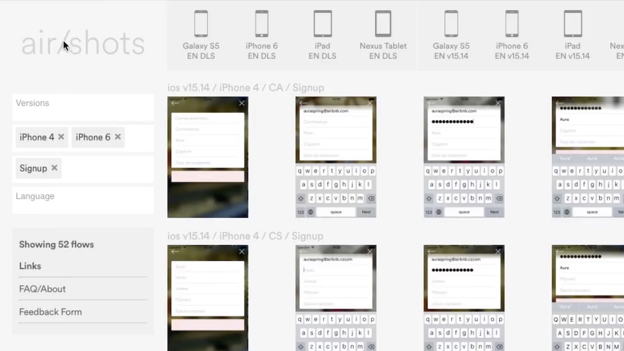
A small digression. I'm impressed with Airbnb. I understand that everything is completely different for them, but what matters to me is how far they have carried this idea of the style template library. They created a kind of search engine for developers and designers. If you need a specific workflow, testing certain components, you simply type it, choose a platform and other settings. And you are shown, for example, options for login forms for the iPhone 6, with a view of all the components and an overview of the interfaces.
Then they developed this idea even further, and called it air / shots. Surely many of you have seen the link they created between Sketch and React. According to Benjamin Wakins, they decided that if machine learning can be distinguished from each other by complex handwritten images (such as Chinese characters), then you can certainly be taught to recognize each of the 150 components of our system.
Now you can draw a component by hand, and, after analyzing the image, the machine will generate the corresponding React-component from a predetermined set. This approach impresses me to the extreme. Imagine what the process will look like in the future.
Of course, we did not reach this point, but our components were also based on our work. Here is an example of our design, as you can see - everything is tilted.
Another idea that can, in my opinion, help to grasp our individuality. To be consistent, I initially wanted to use emoji cats in the code, but it turned out that there are too many emoji and they are not uniform. This made debugging difficult, and the idea failed. But you could!
We paid a lot of attention to things like Print Style Sheet. I'm a lazy person, so it seemed to me much easier than doing the generation of .pdf. Here is an example of a check made in this way, and no extensions are needed. The same with articles. We were engaged in the creation of electronic books, and they often have articles. I decided that once I had to spend enough time creating a Print Style Sheet that would combine several articles into one document, and a decently designed book would be created at the exit, with links and other things.
Frontend
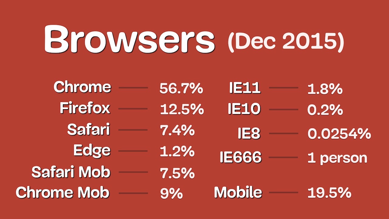
We turn to the frontend. We started working on it in December 2015 and saw what browsers the audience used:
Most of them are good, because visitors like you come to our site - you won’t think of using IE 8, right? Since then, Firefox has dropped to 7%, and Chrome has only gained popularity to 66% - that is, people are switching from IE to Chrome, not Edge or Firefox. Edge even fell in popularity, from 1.2 to 0.6%. Who among you uses Edge? 0.0%? This is a little sad. The data is slightly hampered by the fact that a user with an IE 666 user-agent visits the site every two years. This is, of course, cute.
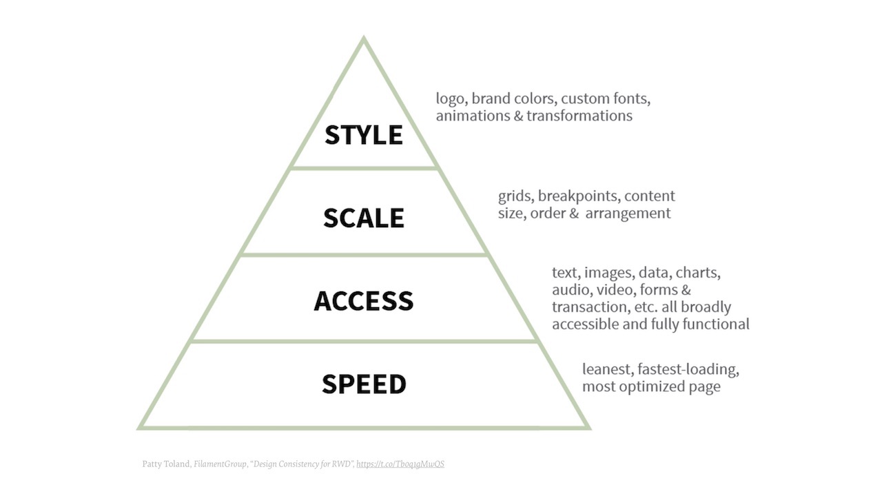
When we started writing components, we followed a specific pyramid. Are you familiar with Maslow's pyramid of needs? Patti Toland and the FilamentGroup in Boston came up with the idea to apply the principle of this pyramid to responsive design. The lowest level is speed, you need to think about it first of all when writing any page or component. Then comes accessibility, scaling, and finally, style (logos, colors, fonts, animations, etc.).
CSS we wrote, guided by this principle, going from the bottom up. We tried not to use frameworks, not because it was fundamentally against them, but because in specific situations there was no point in them. When using frameworks, too much remains behind the scenes. We did not want to use something excessively large. It was much more convenient for us to use smaller libraries. We originally planned to use React, but then we stopped at Preact, a small library that mimics React. You may have to switch to React soon. The reason is that we had to write significantly more of our own things to Preact than we had planned. Every thing has to do separately, which is somewhat sad.
In addition, we did not want to use media queries. I suppose you think “Is there something wrong with them?” It would not be “something is wrong” with them, but it’s quite difficult to support them. When everything is designed for two different screens, a small mobile and a large computer, difficulties arise in the middle.
If you take a regular application and narrow the window between two supported permissions, then we will immediately see how the “breakdowns” occur, especially in the middle of the page.
To combat this, you can add a breakpoint. And then another. And then another. But in the end it turns out a terrible fuss at changes in the structure of the page. Of course, we use things like Sass and Less, but I still have to go through media queries and repair them, but I don’t like to do repairs.
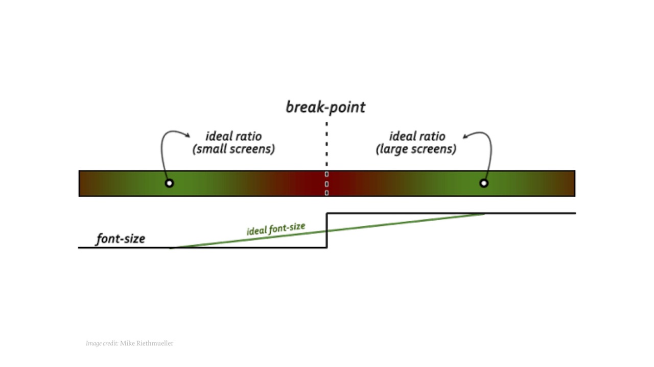
So we came to the idea of the need for fluid sizing for all components. How to effectively resize any UI element (even the slider, even the calendar) while maintaining the proportions, but without directly accessing their latitude and height parameters? With a little trick that you might already be aware of.
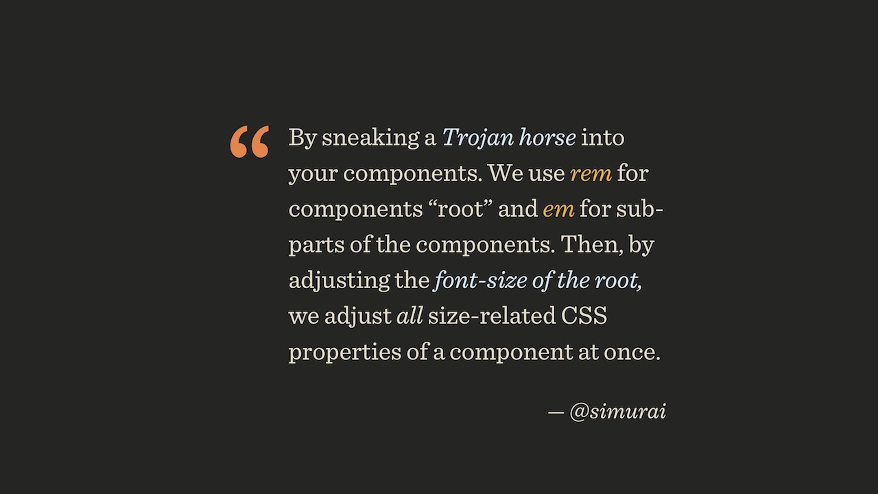
Have your component. There is a body size. There is a rem unit, it is tied to the root element (body or html). 1 rem is always equal to the body font size. If the font size of a component is set in units of rem, and everything else is in units of em, then when you increase the window, everything will grow. Instead of changing everything in the media query, you just need to specify that we move from font size 75% to 125%. Everything inside the element will grow accordingly.
But this is only the first step. We do not need the component to grow in this way:
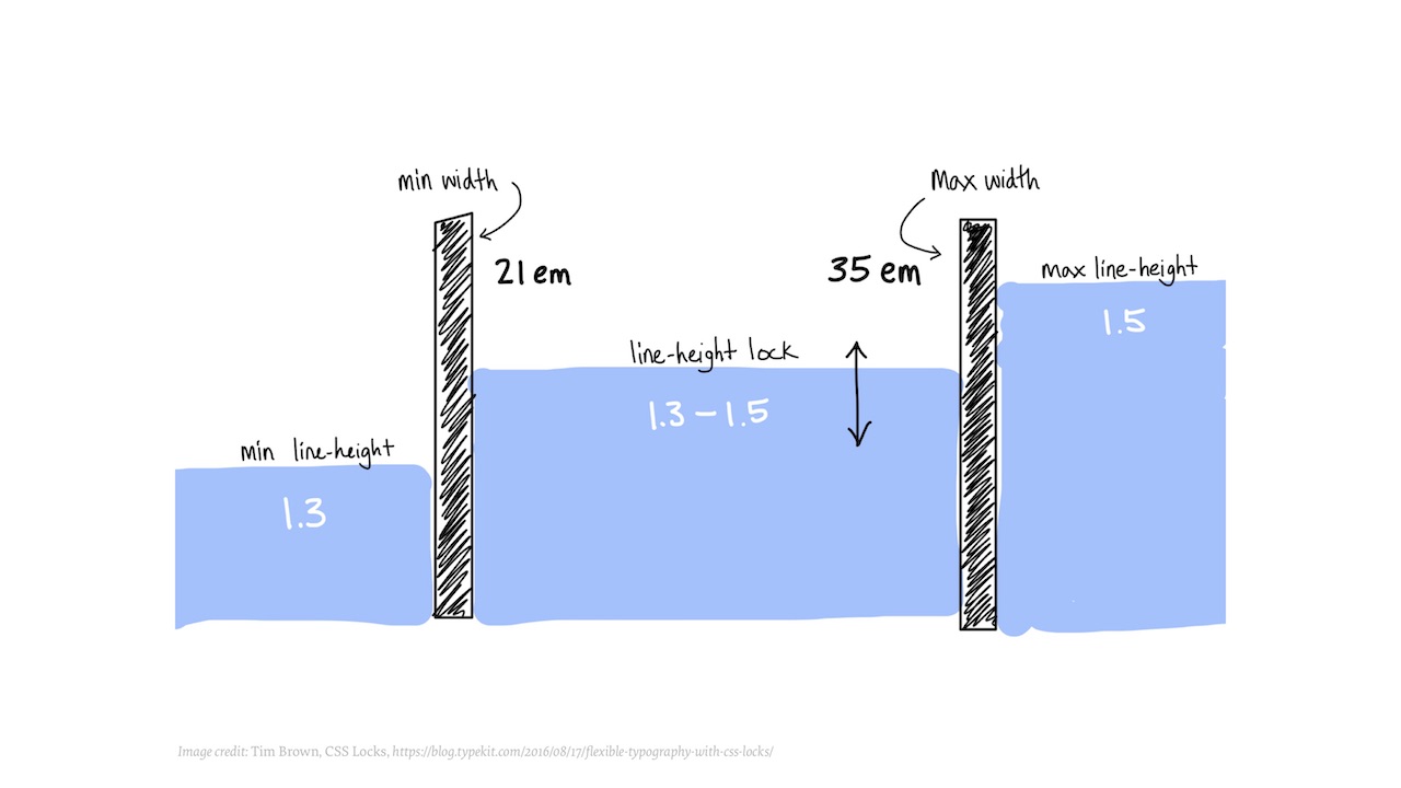
It does not suit us if the element is 1 pixel in size on a small screen and 500 pixels on a large one. Growth must be controlled, it must begin and stop at certain points:
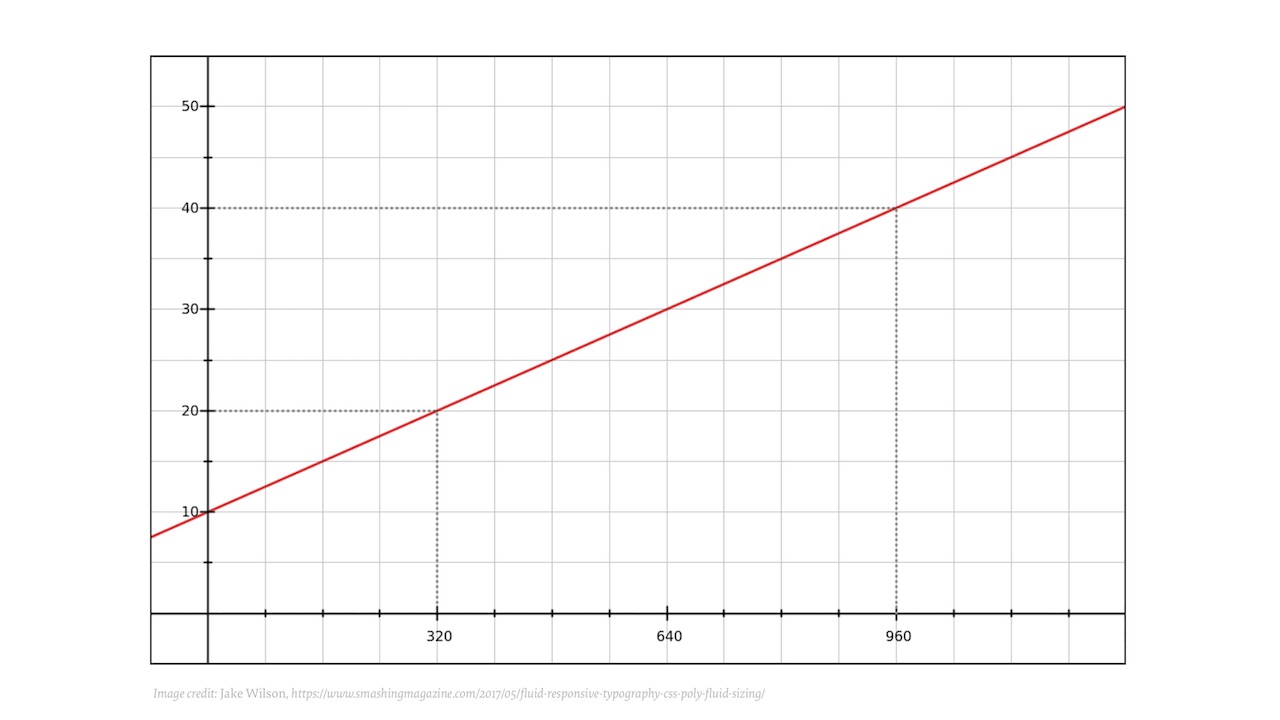
Let's try to make a graph on which the font sizes will be indicated on the vertical axis, and the viewport width on the horizontal axis. Then we can line up the breakpoints. It will not be direct:
Since we all like mathematics, this relationship can be described by the equation y = mx3 + mx2 + mx + b.
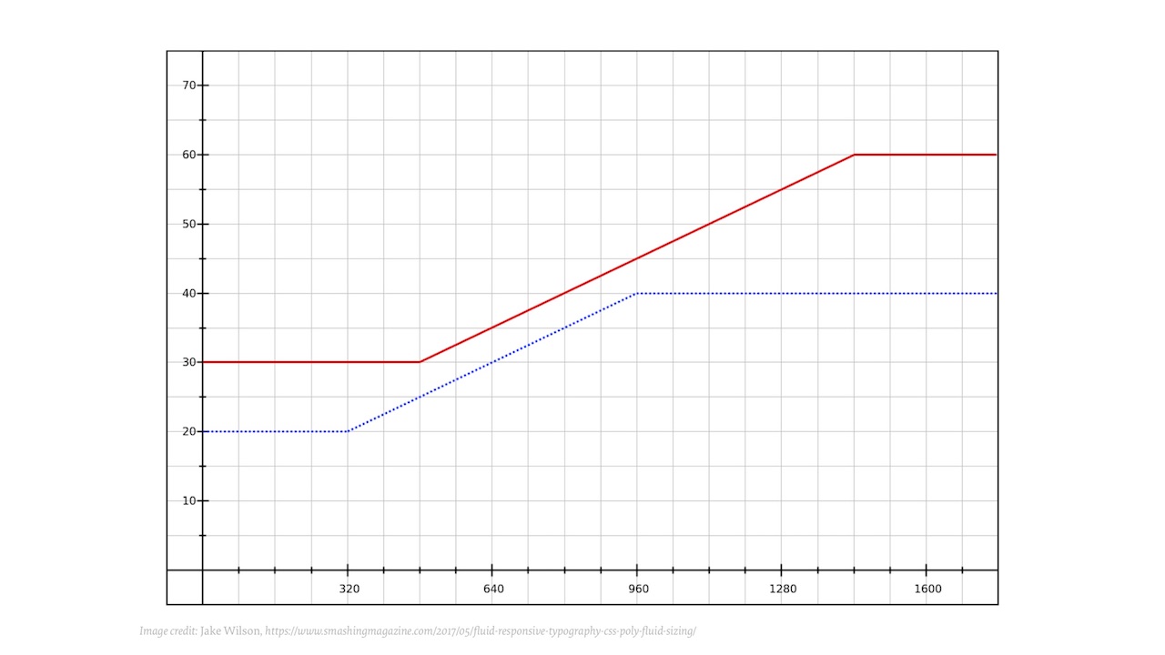
In CSS, this, of course, can not be done. Maybe this is possible in JavaScript, but still it is absurd. But the idea itself is important: imagine that each component would have a function that determines its behavior. Instead of writing endpoints endlessly, you can describe a component once, and it will be displayed correctly on any screens, even on television. Even if it is an approximation, it will be fairly accurate. You can split the curve into several straight lines, each of which will be defined as y = mx + b. As a result, you come to this:
But you most likely do not have the desire to implement such in CSS or JavaScript, doesn’t it? Well, I got it, but it really wasn't worth it. In the end, we need a fairly simple behavior: that from a certain point the element begins to grow, and after a certain point - it ceases to grow. In CSS, this principle can be implemented using the formula:
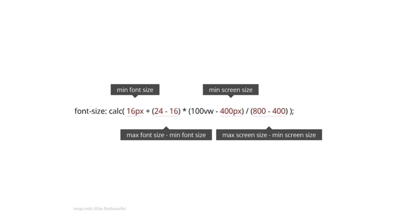
In CSS, calc allows you to perform basic arithmetic operations. At the start of the formula, 16 pixels is the minimum font size. Then the difference between the maximum and minimum sizes is searched. Then there is a range in which growth can still continue, and finally, the difference between the maximum and minimum screen sizes. That's all you need. And get something like codepen.io/MadeByMike/pen/VvwqvW .
I will add just in case that popular browsers support this, there is no reason not to use:
We thought: why not use this method in general everywhere: with borders, indentation, width, up to the height of lines. In the latter case, again, this is not about uncontrolled growth, but about a change between 1.3 and 1.5. The principle here is the same, you just need to recalculate the formula.
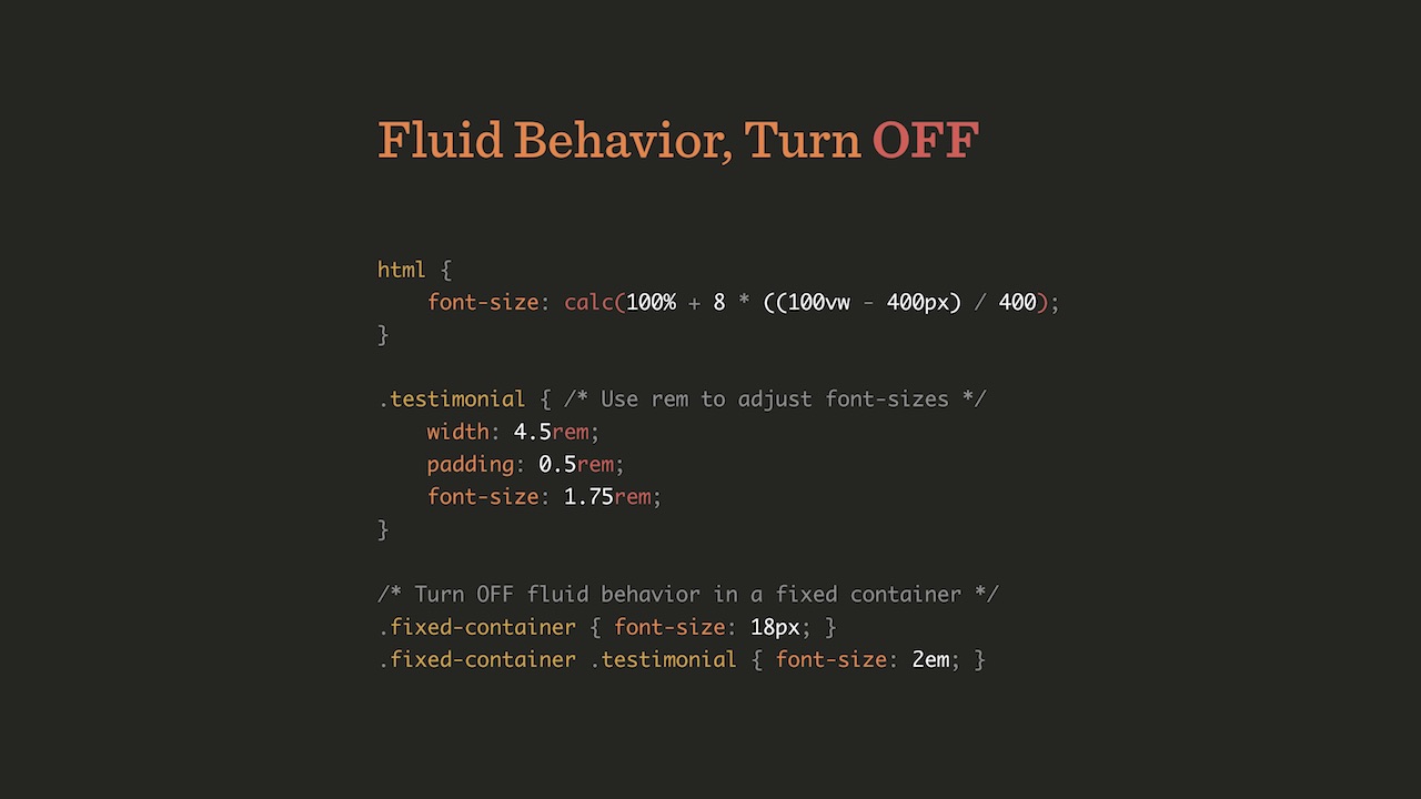
There are two ways to achieve these results. You can simply set the dynamic font size on the HTML element in CSS.
And then, depending on the viewport, all internal elements will automatically be scaled to scale. If you need a fixed-size container, you can simply define fixed-container with the font size in pixels and the size of the internal components in em.
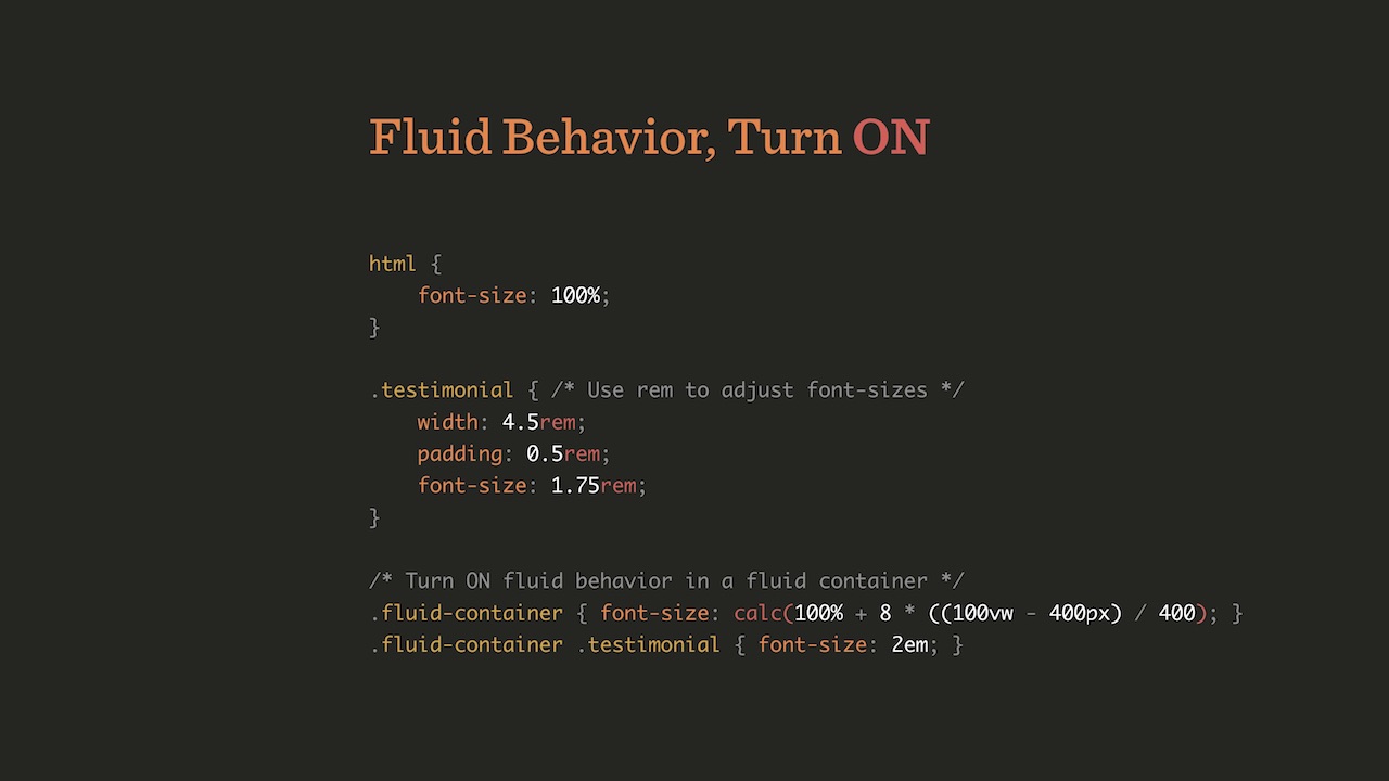
Or, on the contrary, it is possible to include flexible behavior for a separate container, and leave the rest to a fixed size.
On this option, we finally stopped. If you open Smashing Magazine and start changing the width of the window, you will see that all the components change: width, height, line spacing, font size, SVG-logo in the corner and so on.
Of course, this requires a lot of “magic” numbers in CSS. But all this is done through calc. Other properties may be somewhat sad about this, but calc is the most used one here.
It really helped us organize our namespace. Here is a quote from Harry Roberts: “I don’t know what the function is. I do not know where it is still used. I do not know whether it can be erased, changed, or used elsewhere. I don’t know anything about this at all! ”Each of us has come across a situation where you, being a designer or a developer, turn to CSS and JavaScript and don’t understand what’s what. As a result, we began to use many consoles for various components, for example, such:
This helps a lot when you read the code, it’s immediately clear what’s what. It is only necessary to understand at what levels the components are located.
Of course, we also used BEM to define relationships. I assume that in Russia they have heard about BEM. Although, perhaps, he is not respected because of the perseverance with which Yandex advertises it. By the way, this policy is incomprehensible to me, since, as it seems to me, BEM is well known in Europe and in the USA, there is no need to promote it so aggressively.
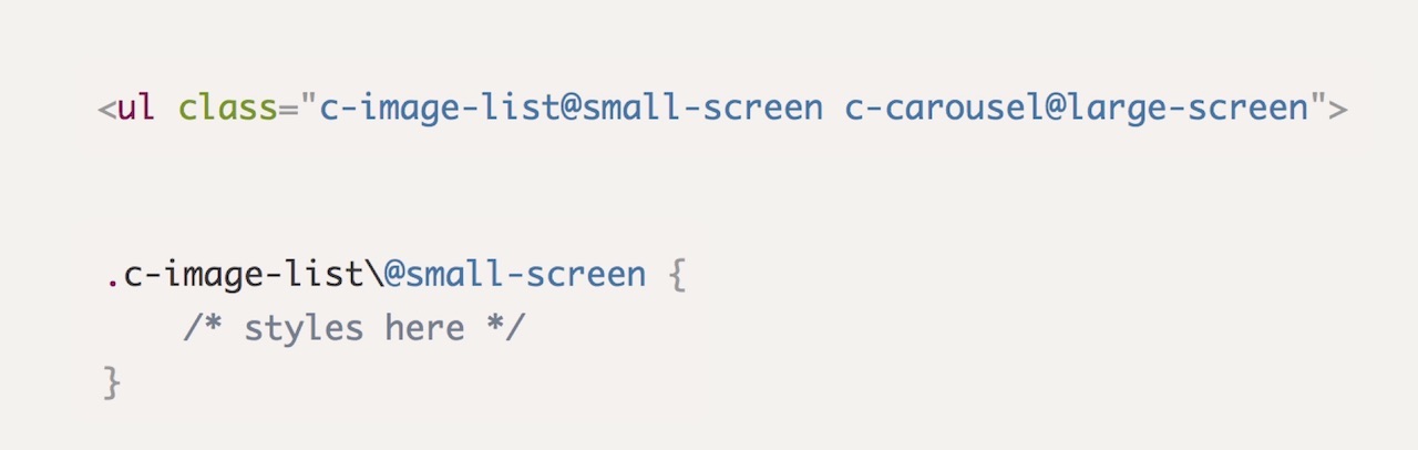
Another important topic is the responsive suffixes with which you can do something like this:
The goal is this: it should be clear from the code what it does, without having to look into CSS or JavaScript. If the class says “c-image-list @ small-screen c-carousel @ large-screen”, then it immediately becomes clear to me what is what. All that remains to be done in CSS is to put the “\” character before “@”.
Some of this code was written by other people, and some by me.
We call the classes for which refactoring is planned, or for which it has already been conducted, with the prefix .rf- *. Thanks to this, it is possible, for example, to highlight in the green on the interface all elements that have already undergone refactoring, and red - those that are yet to be refactored. It is very convenient.
Another extremely useful thing is the modular grid in CSS, that is, the Grid Layout. How many of you have heard of her? It turns out everything. And who tried to play with her? Let's see what can be done with its help.
When they try to advertise it (it is not clear why, it is so beautiful), often the following picture is shown:
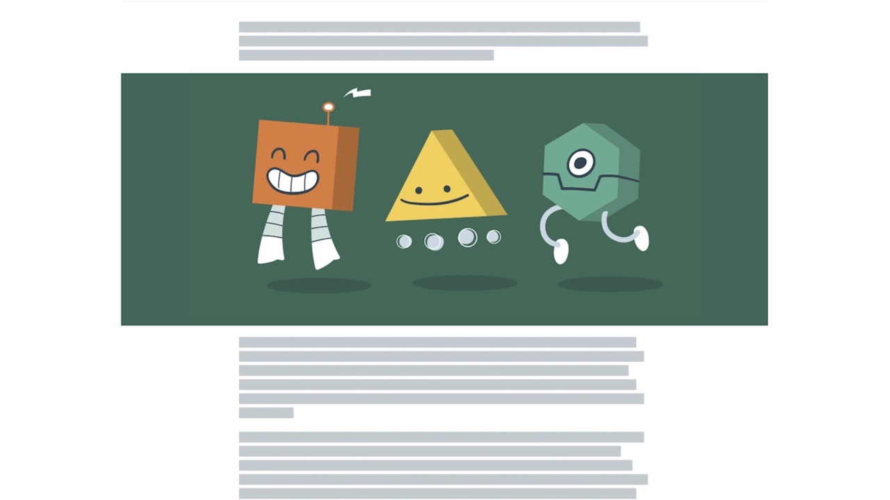
But this is the most terrible introduction to the modular grid that you can think of. It is complicated. But the grid does not have to be complicated at all. With it, you can create simple things, for example, such an unusual design:
Make it extremely simple, just five minutes. Jen Simmons on the site has other examples of using the Grid. And, by the way, in terms of browser support, there’s nothing to worry about either.
A few things to know when using it. There are grid lines that can be horizontal and vertical. Between these lines are the grid tracks, at the intersection of the horizontal and vertical lines are cells of the network, and several cells together form a network area.
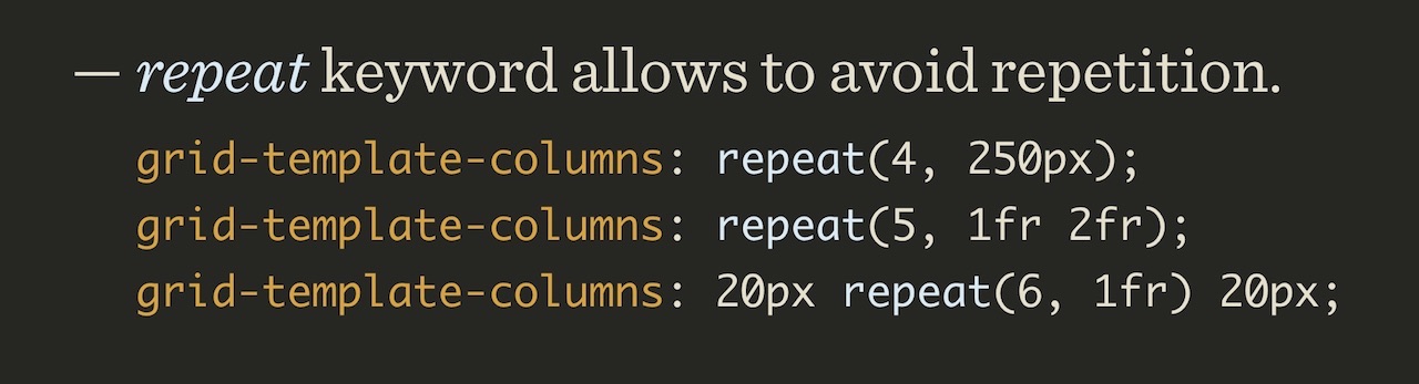
The network is defined by specifying grid-template-columns, and various notations can be used for this. For example, using the repeat () keyword you can create multiple tracks with the same parameters.
Another useful feature is minmax (), which allows you to grow between two values. Suppose we have a container with contents, and there is something that goes beyond this container.
We have a simple example of building such a container:
The lazy developer closes the container, connects the image, opens the container again, calms down on it and goes for a drink.
Please do not do this. There is a much better way.
The problem itself should be presented in a slightly different way. Suppose we have three columns in a modular grid, one on the right, one on the left, and in the middle a column with the contents.
The first thing we add is supports . If all of a sudden you don’t know, this is a function for defining capabilities in CSS. It can be used instead of Modernizr. The only hitch is that not all is well with browser support, so to speak, support. But any browser with a support will have a support: “display: grid”.
Next, we define the grid columns, and assign the names to the separation lines: “full-start”, “main-start”, “main-end”, “full-end”. There will always be one more lines than columns. Each line may have several names.
Now it remains only to specify: everything that is in the container must be placed in the main column. Then, if you need to bring something outside of the container, “grid-column: full” is indicated, and the content takes up all three columns.
The advantage of this approach is the absence of media queries and, accordingly, references to the viewing window. Due to this, such a container can be placed inside another, adding, for example, also a side menu:
Designers for some reason really like the idea of "vertical rhythm." I wondered how it can be implemented. Imagine the structure of the page with headings, text, images, in which all elements should be aligned with the correct lines. On the screen of two examples, this is done correctly in the one on the right.
To do this, in fact, is quite simple.
There is a tag figure, which is displayed outside the parent container (“breaks out”). Sorry for so much CSS, I really like this business.
For body, you can set the calc property, then set root for the --gutter property, which determines the gap between the lines.
And finally, it remains to transfer to the grid-row-gap the value that we defined for gutter as root.
It is interesting that here I use the unit of measurement ch, the "character", which is rarely used. Quite often, designers have a requirement that each line should have, for example, 60 or 70 characters. And it turns out 12 tracks of 4.85 characters.
The ch unit (character unit) is based on the width of the character "0" in this font. Leah will correct me if I'm wrong. (The voice of Leah Vera from the audience: “Right”).
Compare two options:
Of these, the second is obviously more readable. Just in case, add that, of course, ch has long been supported in browsers.
So, the page structure was quite short. CSS has become incredibly simple. Or complex, depends on how you look. In addition, you will, of course, need to use the “*” selector.
He is wonderful. Here is an example of its use: elements that fall under the “* + *” rule will get the margin property: 0, and the content will be limited to the central column. Anything more is not necessary. No media queries occur. And in terms of flexibility and topography, everything is built in this way.
Let's go to our site, scroll down a bit ... A small digression: here we see a button that says that it “does not do anything”.
This is also part of the personality that we are trying to impart to our site. So, it is on this button that is most often clicked! What is wrong with people?
Let's return to the topic. We have implemented everything as I described, and with this approach there is a difficulty. There are browsers that support supports , but they do not support modular grids well enough. For example, in Edge 13, the code I just showed you is interpreted in a very original way:
Therefore, in the code, you need to replace display: grid with grid-gap: 0, do not ask why. It took a long time to figure out what caused this. Madness.
Backend
In the end, I want to talk about backend. An extremely important topic, especially, I think, for you. Someone may have heard of the JAM Stack. One man. Hmm, I did not expect this. Nothing wrong.
I talked about how we made our magazine based on WordPress, everything was in PHP (except for parts in Ruby). In 2012, I met Matt, who later became one of the founders of Netlify . This is a platform for automating web projects using a CDN instead of traditional servers, and they have invested well in this CDN. When I was interested in their creation, Matt demonstrated the transfer of our resources to CDN Netlify, thanks to which productivity increased threefold (despite the fact that we had already spent a lot of effort at that time to optimize our WordPress process).
This project took us two whole years due to the fact that we had a lot of activity parallel to it. Although there were a lot of people involved, the most part is our work with Ilya on CSS and JavaScript. Sometimes they say that we hate WordPress. This is not entirely true. I don't hate him. Just not really love! Well, in general, he is the norm - a tool like any other. Just at a certain moment he stopped approaching us. We switched to a system based on static site generators, which is also often called “JavaScript, API, and markup” or JAM Stack (markup). How is it arranged?
We all know that interest in FTP is falling and it is slowly dying, and interest in Git is growing. In addition, of course, grow Gulp, Grunt and similar tools. Finally, there are so many different APIs for them.
Recall the story. Initially, we only had an interactive browser and server. Then someone said, “No, you need another program for interactive things on cgi-bin and Perl”. After that, they said “this is not enough,” they added databases on servers in PHP, MySQL and Apache. But this was not enough, we need caching to increase performance. When it was implemented, we decided that we need what? Right, CDN. All this led to a huge increase in the number of interacting entities in the system:
And then an idea arose: perhaps we should return to the simplest possible scheme. Let's just do “browser and CDN”.
It works as follows. We have a system that most likely is also present in all of you, from Git, the build tools and the API. The code is fed into the assembly tools. Every article, every comment, every author, every job is recorded as a markdown file. Then HTML is created from all this, CSS and JavaScript are added. This is then sent to the CDN, where the user has access to it. Interactive things like searching and comments are done using JavaScript on top of this entire system.
We used Preact, which often raised the question: are there any problems with loading time? It does not occur, since this is not a one-page application, but a set of one-page applications. Thanks to this, in order to start displaying our pages or reading articles, JavaScript is not needed at all. We don’t have a single blocking request, as you simply go to the page and load the critical CSS at the top. For different pages we have five or six blocks of critical CSS. And, of course, our application is PWA (“progressive web application”), although by and large there are probably no others today.
Before us is a stack, nothing complicated in it. We have a lot of microservices and APIs, but nothing especially complicated happens. Of course, there is a subscription check and similar things. Stripe is used for payment. For the "back office" in the backend system is used on Go.
I was impressed with the speed of this system. Most likely, we were one of the first projects of such magnitude that switched to the JAM Stack. I did not expect that we will succeed, and was glad to be mistaken. If interested, we use Hugo as a static site generator, and we use Webpack.And also Gulp and Grunt, because we need different plugins.
In two years, many things have been created. Netlify made CMS for us, GoTell for comments, GoTrue for authentication, GoJoin for a subscription to Stripe, GoCommerce instead of Shopify, and Gotiator, also for authentication. It was a big way for us.
Many people think that because of this approach, we have a lot of dependencies. In fact, it is not. Everything is available without using javascript.
If for some reason you cannot or do not want to use JavaScript, there are spare mechanisms for all actions (well, comments are not available yet, we have yet to fix it). For example, in a search as a fallback, we simply use Google, and then JavaScript is superimposed on it.
In terms of performance, our solution with web fonts, which I talked about in my report yesterday, helped us the most . On this alone, we managed to save 600 milliseconds.
For responsive images, we use the picture element in outdated articles, but the Cloudinary service also works with us. In addition, we have Preload, Zopfli / Brotli and gzip. We use critical CSS, not server-initiated loading. In the deployment we have one bundle so far, we plan to go to 8 or 10.
I'll try to demonstrate. Before you is what a CMS looks like. This is similar to WordPress, but, of course, much worse. However, it copes with our tasks. Best of all, everything is in the same place, and here we have custom-made authors, vacancies, events, speeches, etc.
Productivity was incredible. Here you see the results six months ago, before we started optimizing. For example, we have not done anything with web fonts. Initially, drawing started at 700 milliseconds here, now, with a stable connection, up to 0.5 seconds. Try to achieve this with any database under WordPress. It just won't work.
There is still a lot of work, but the system is already working, you can see for yourself. People do not like the color red, you can talk about it separately.
As a conclusion, I will share with you a little secret that will allow you to save. Let's try, for example, to order a book on our website. There is a window for entering the coupon code, which will give a discount. If there is no such code, and you want a discount, what are we doing? That's right, we are starting to search for the code in Google. How many of you do that? (Raise hands). We in Russia, of course, we do that.
I worked a lot in commerce, was engaged in testing things related to these codes. How to improve the conversion? We know from experience that when using the “from Google” code it will work in a minority of cases, respectively, there will be many erroneous entries. Why am I telling all this? If we try to enter a random coupon code in our window, it will inform us that the code looks “fishy” (“suspiciously”), and prompts you to enter “FISH” instead. And this code will already give us a discount of 1%.
And the user, seeing this, will buy the book anyway, even if he has to borrow a credit card from a neighbor for this. Because it is not known what will happen next - there are a lot of meaningless things on the site, for example, a tick box with the caption "I just like to tick." We lose here 1% of the price, but these are far less ordinary discount codes like $ 10.
There are many more things that we could talk about later. In general, we spent most of the time on this project with pleasure, because we analyzed how the most advanced technologies work today, and combined them with each other. It is worth remembering what a wonderful world we live in and enjoy it. On this note, I would like to say “meow” and thank everyone for participating.
? HolyJS 2018 Piter : «Dirty little tricks from the dark corners of eCommerce» «New adventures in frontend, Season 2». — .
Source: https://habr.com/ru/post/358642/
All Articles