Material Design 2.0 and Android P
Google showed the updated Material Design 2.0 design system at the I / O conference. This is a major change in the visual style and expansion of the toolkit, the first bells of which appeared in March .
Visually, Android P continued its convergence with iOS (the differences between the platforms are erased on both sides):
')
You can call it a taste, but the first version of Material Design had its own face and it was possible to talk about the character of the brand, expressed in the interface. Someone complained that the guidelines are too hard and make applications identical. But for many companies it was a strong reference point - how can you create a feeling of unity of products without using a logo. Although it will be easier to maintain two platforms.
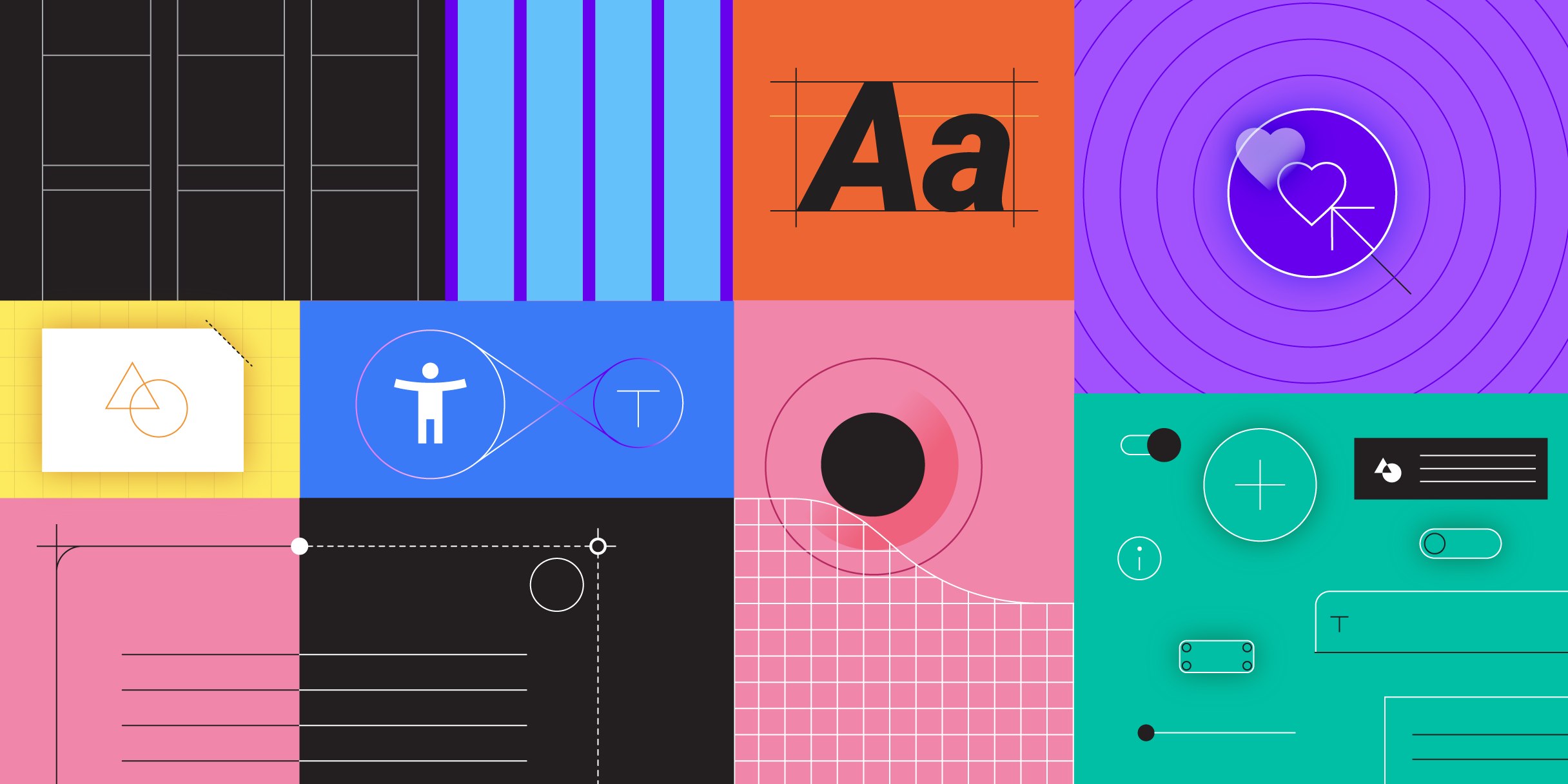
On the other hand, now Material Design supports a more advanced thematisation than just a color change. You can change the font grid, the rounding of interface elements (more precisely, even their shape - for example, you can make diagonal bevels), icons. This includes a plugin for Sketch (you can quickly try on the style on your layout) and an icon library (in five styles). Recently updated Google products also use this approach (although their style is just emasculated).
https://vk.com/video-157244248_456239017

And the most important thing is that now it is a full-fledged design system with components in the code , and not just large-scale guidelines and templates for them with some separate examples. These components also support the thematisation, so that the system looks complete (the components themselves began to appear a year ago). The new site Material Design made the focus on two components - design and development - more pronounced. They also launched the long-promised Gallery tool, an analogue of Zeplin and Wake. But this is somehow sluggish against the background of promises made after the purchase of Pixate (the founder went to Figma) and Form (Google confirms the reputation of the rotator of the purchased companies).
From other interesting details of the announcement:
The beta version can already be put on some phones. The final version will appear in the fall. Roll up sleeves, there will be a lot of work.
Visually, Android P continued its convergence with iOS (the differences between the platforms are erased on both sides):
')
- There are many rounds , which strongly echoes iOS 10-11. Perhaps this is done with an eye to frameless telephones, which are becoming more and more - this is better combined with their rounded edges of the screen.
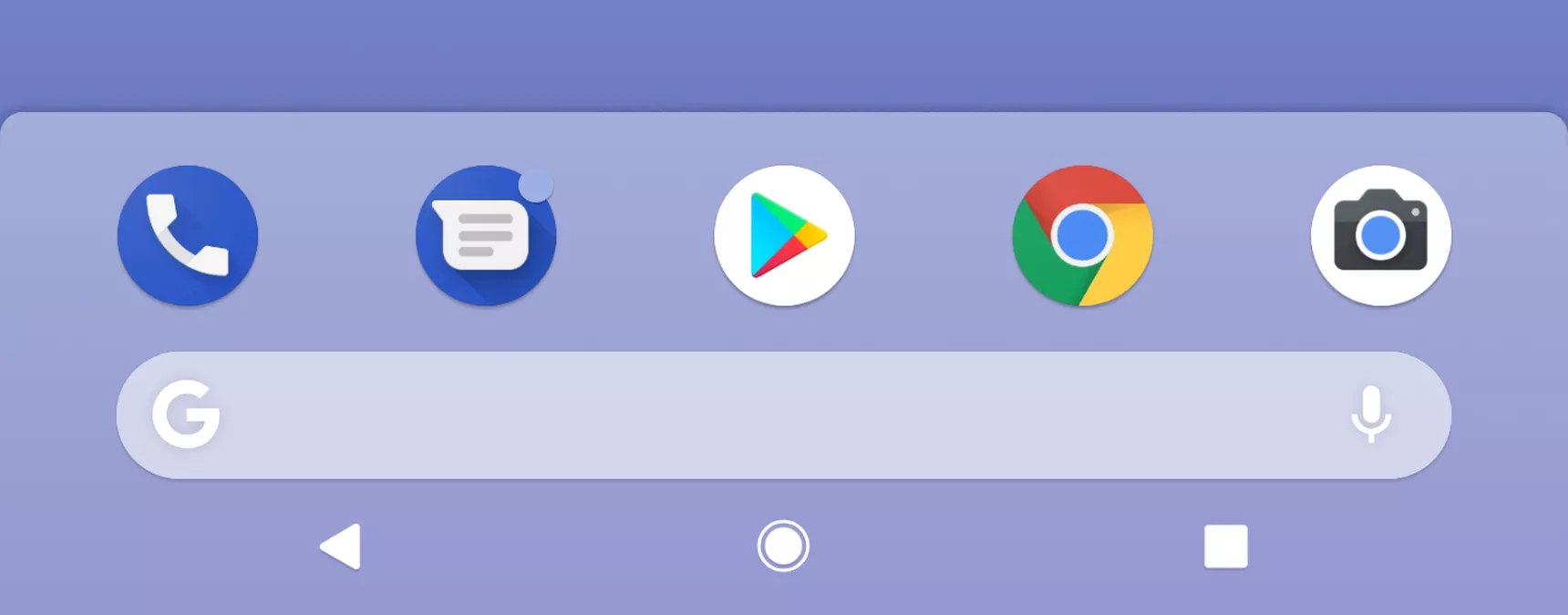
- The mood color is white . There is no longer a bright cap of the application and gray substrates, a solid white space with a minimum of accents. In some Google applications, there is a color bottom panel and the idea of accent colors does not leave the guidelines, but the trend is clear (including the Gmail web and Drive ).
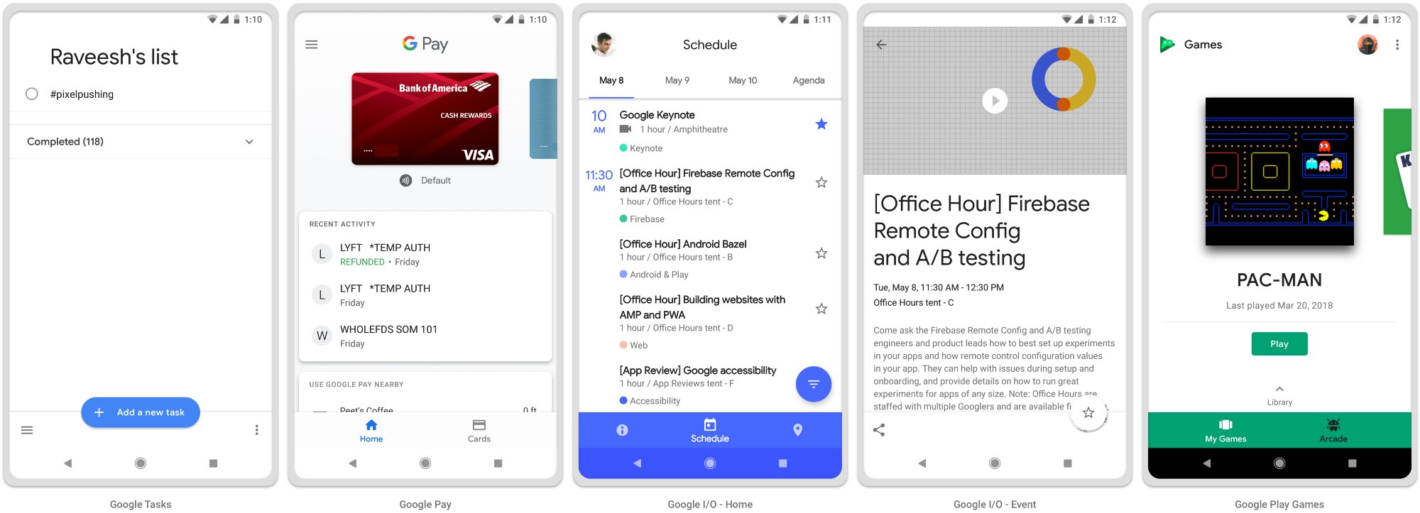
- Navigating the operating system in the spirit of the iPhone X. The “handle” pattern instead of the “home” button with almost similar mechanics, the rejection of a separate button from the list of applications (also called by swipe from the bottom), and the lower navigation bar that has become official in recent years. All this helps to manage modern phones, which have become not only bigger, but also higher due to framelessness. By the way, in some new Google applications, navigation tools are almost everywhere below . It remains to simplify the "back" button (it has already disappeared from the home screen).

You can call it a taste, but the first version of Material Design had its own face and it was possible to talk about the character of the brand, expressed in the interface. Someone complained that the guidelines are too hard and make applications identical. But for many companies it was a strong reference point - how can you create a feeling of unity of products without using a logo. Although it will be easier to maintain two platforms.
On the other hand, now Material Design supports a more advanced thematisation than just a color change. You can change the font grid, the rounding of interface elements (more precisely, even their shape - for example, you can make diagonal bevels), icons. This includes a plugin for Sketch (you can quickly try on the style on your layout) and an icon library (in five styles). Recently updated Google products also use this approach (although their style is just emasculated).
https://vk.com/video-157244248_456239017
And the most important thing is that now it is a full-fledged design system with components in the code , and not just large-scale guidelines and templates for them with some separate examples. These components also support the thematisation, so that the system looks complete (the components themselves began to appear a year ago). The new site Material Design made the focus on two components - design and development - more pronounced. They also launched the long-promised Gallery tool, an analogue of Zeplin and Wake. But this is somehow sluggish against the background of promises made after the purchase of Pixate (the founder went to Figma) and Form (Google confirms the reputation of the rotator of the purchased companies).
From other interesting details of the announcement:
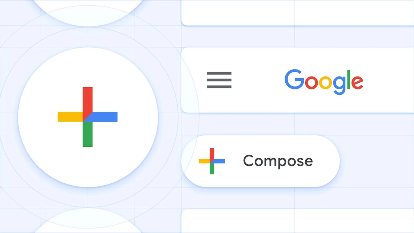
- Four colors of the logo as the basis of the visual language . It worked out well in Gmail for the web - the “+” icon and the colors of the indicators clearly inherit the idea.
- New style of Google illustrations .

- It seems that for their products, the company will switch to the Google Sans font .
- Self-restrictions on the use of the phone and individual applications . The user himself sets them, after that the application becomes black and white, motivating to stop. At night, the phone completely goes into this mode.
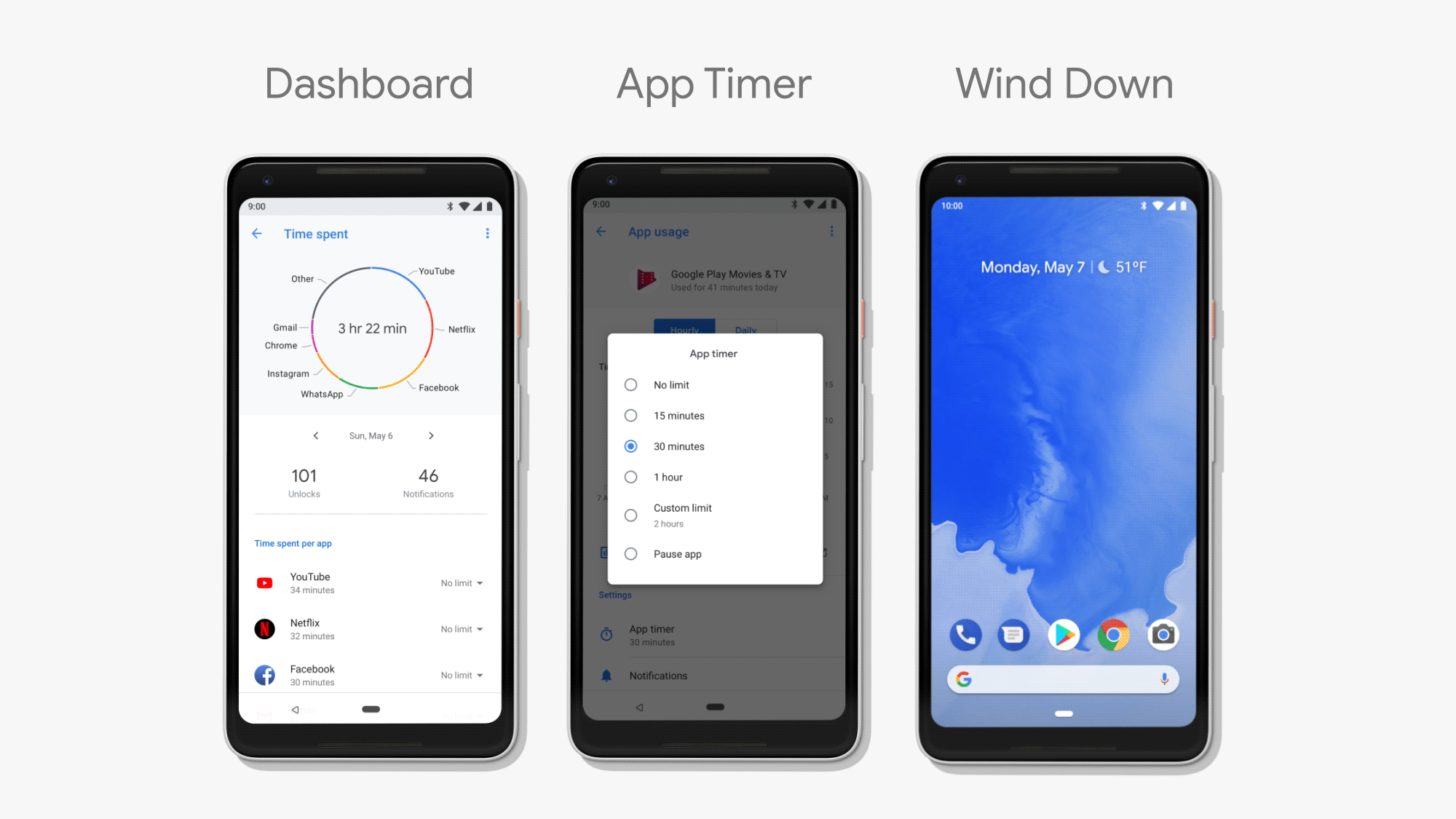
- Easier to configure the frequency of notifications . If the user repeatedly hides the notification from the application without reading, Android will offer to hide it altogether. Pixel Buds headsets can read some voice notifications .
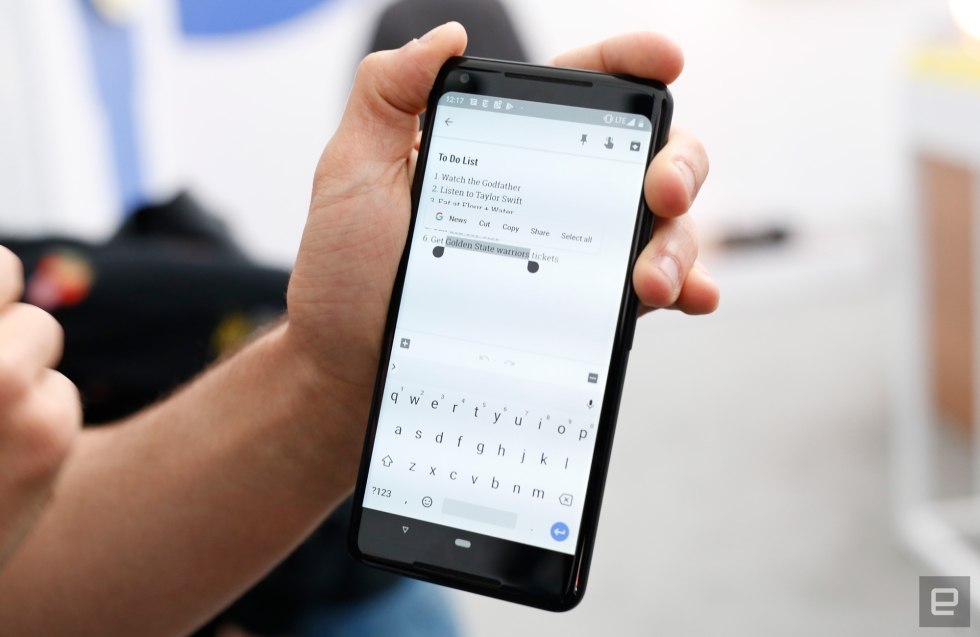
- Integration of third-party applications into search results and context menus as Slices and search by the highlighted word.

- Mobile hrome will support augmented reality .
- Experimental camera Google Lens has learned to do more and become part of the standard application .
The beta version can already be put on some phones. The final version will appear in the fall. Roll up sleeves, there will be a lot of work.
Source: https://habr.com/ru/post/358246/
All Articles