Opera introduced the new browser Neon

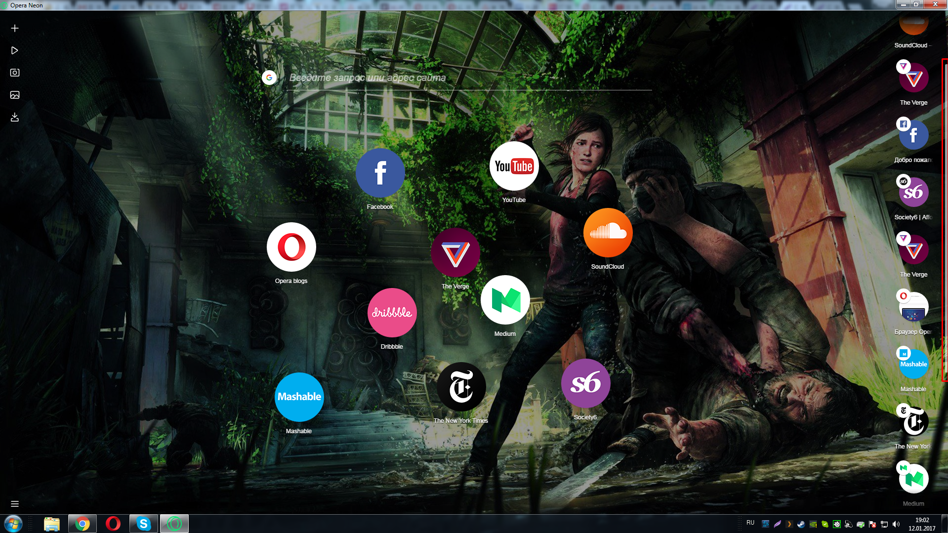
The real look of the Neon start page in the Windows version. The image here and then clickable
Software maker Opera Software has launched a new browser project of its own production called Neon, as reported in the company's official blog .
Work on the browser began about a year ago. The new product from Opera is positioned as the next generation browser for desktop computers. Neon is already available for Windows and MacOS.
Opera Software has been working on browsers for over 20 years. The company believes that now there is a need to revise the basic browser-building doctrine, in which everything is classically based on pages and documents.
')
The company emphasizes that Neon is not just another incarnation of Opera, as one might think, but an attempt to completely rethink what a browser should be in today's web.
Opera Software specialists thoroughly approached the redesign and upgrade of UX and UI. Here are some features of Neon against classic browsers:
- a new start page that uses desktop wallpaper as a background;
- left sidebar with its own video player, download manager and image viewer;
- a vertical tab bar on the right side of the browser window, making it easier to distinguish between them with tabs;
- intelligent tab management system. Frequently used tabs will move up when less used "settle" down;
- completely new Omnibox, supporting both the main and less popular search engines;
- Split screen mode for viewing two tabs at the same time.
A live example of the appearance of the site in Neon
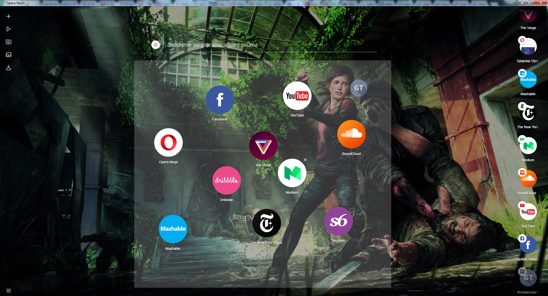
Immediately it should be noted that because of the side panels that use the wallpaper of the desktop as a substrate, the working area of the screen becomes significantly smaller. It is also conditionally difficult to navigate through a large number of tabs, since the icons of the sites on the left side of the screen, which play the role of tabs, do not become smaller, but are collected into the list with a slightly noticeable scroll bar:
Demonstration of the tabs navigation area. If there are too many pages, they are arranged in a vertical list.
Immediately it should be noted that this browser is unlikely to appeal to those who have to operate with a large number of tabs during surfing or work. At the same time, Neon has a number of nice features and a fresh UI that can come up for daily surfing the Internet after work.
Adding a new site to the start page is done by simply dragging an icon from the right column to the center of the screen. Everything is quite simple and intuitive. Obviously, the solution was borrowed from the mobile environment:
Adding a site to the "cloud" on the start page
Certainly successful solution can be called split-screen mode. Moreover, when using it, the user can select the page visibility area himself up to the 20% to 80% ratio.
Split screen mode. Enabled by dragging the tab icon to the workspace with the selection of the display side
The developers of Opera, with more, have achieved their. Neon looks fresh and unlike other browsers. It is worth paying tribute that the attempt to break the established doctrine of UI and UX is worthy of respect.
Of the minuses that immediately caught my eye, it is worth noting the visual narrowing of the working area due to the side panels. At the same time, the vertical working area on the screen with a resolution of 1920x1080 is 25 pixels less than in popular Google Chrome and 10 pixels less than in Opera. This is due to the massive address-search bar at the top of the screen.
In addition, Neon, like Opera or Chrome, creates a separate process for each browser tab with the corresponding RAM consumption, and smooth animations and other effects out of the box hint that developers are not targeting the budget market and expect decent performance from a desktop PC. To understand whether Neon is worth more attention, time must pass.
Source: https://habr.com/ru/post/355672/
All Articles