Common mistakes made by developers in the UX
I hold the position of UX consultant for one of the partners of Mendix , and I often have to work with small self-organized teams that create great applications for solving internal problems. My task is to improve the UX in these applications.
The best moments in my work are when I am completely taken aback by the originality and creativity of the approaches to solving problems and I find myself forced to explain why some seemingly logical practices actually turn out to be a bad idea.
All the solutions that I propose here are not the only correct ones, in each case there are exceptions; consider everything written below not as a direct guide to action, but as a starting point for further discussion.

')
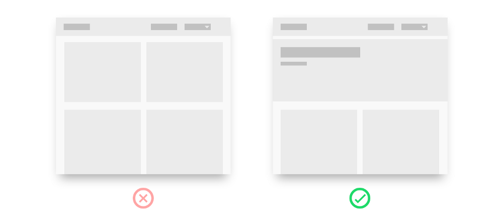
Of all the bad practices in UX, this is the most popular.
First, you have a modest application with a compact interface, then you add a couple more functions and you do not have time to look back - there are already solid buttons on the screen. There is nothing to be ashamed of, it all happened.
When I see such solutions, a folding Swiss knife comes to my mind immediately, with all the blades being pulled at once, although in reality only one corkscrew is used.
Too much
When the user has all the possibilities before his eyes, it may seem that it creates a good overview. However, the problem here is that our brain is capable of encompassing at best 9 options for action, and even if it’s clean, 95% of these buttons will be needed by the user only occasionally.
Proximity
Another problem is that the buttons should be located as close as possible to the information with which they interact. The more of them, the more this visual intimacy is lost.
Users are ready to scroll
The opinion that no one likes to flip through usually arises as a side effect in a situation where the necessary context is not provided at the right time and the developer tries to solve this problem by stuffing as much information as possible into one screen so that it becomes clearer.
“But our analytics show that only 10% of users reach the end of a one-page site,” seems to be convincing evidence that 90% of the audience absolutely does not want to scroll.
However, the problem here is not scrolling, the problem is in the amount of information. The fact that you move a large part of it to the top of the page does not mean that users will read and understand everything that is there - rather, that they will get tired faster and leave.
Miller's Law on the Laws of UX
Law of proximity on the Laws of UX

So, you decided to clean the main screen and removed all the buttons in the drop-down menu.
Secret in balance
Imagine that your interface is a physical space. If you hide a page in a closed cabinet, you will have to open the drawers until you find what you are looking for. A similar process occurs with the UX in the digital environment.
If the boxes are all laid out in a logical way and the cabinet is in a convenient place, it can work. On the other hand, if you keep everything for the garden in the barn (it seems to be reasonable), is it worth sending barbecue facilities there too? Or is it better to keep them in the kitchen? Or both there and there?
Here the crucial role is played by balance. The answer to the question of where the barbecue facilities should lie - in the kitchen or in the barn - is determined by how often you will use them.
If you have five buttons, it is possible that they should not be removed in the drop-down menu, but if there are six of them, this is another story.
If you consistently adhere to the chosen design system and brand style, in the eyes of users all pages will look the same. Soon they will feel that they have lost their way in this maze of pages and no longer remember whether they got here earlier or if it was some other screen with a similar set of states.
Imagine: Friday, the end of the day, you have attention deficit disorder, you are distracted from viewing the tape in social networks to questions from colleagues, from questions from colleagues - to private messages and still trying to work. The last thing you think about is which link you just clicked and at which stage of the process you are.
Design all the pages in the calculation of just such a user.
Another example of how developers are trying to squeeze the most out of the available space on the screen.
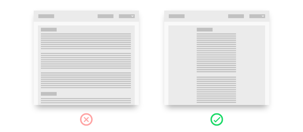
The basic rule of web typography is no more than nine words per line. Once the line has been read, the eyes should immediately find the beginning of the next; if the string is too long, it will take effort.
“But so much space is wasted!” The original of this article is posted on the Medium site. Have you ever noticed how much space is “lost” in them? In fact, this “loss” is nothing more than an investment. If you are ready to give so much empty space under the text, then it means something important. And if not, then he is not needed at all.
Read more: " Typographical approach to the design of letters " from 1910
To save space, you add a pop-up window. When you click on one of its buttons, another window appears on the screen.
But what happens if I ...
The problem is that the user in the mind collapses the model of the process, including its current position in it. What will happen if he clicks on the second window - he will transfer it to the first? Will he return to the main screen?
Therefore, you must either turn the first window into a full screen, or display an error message in the form of text embedded in it.

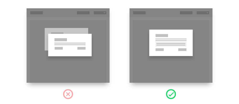
Cards are now in a trend and, accordingly, only a card in a card can be better than one card. Breathtakingly.
The visual hierarchy is a popular topic among UX specialists. It is about the arrangement of elements on the page, which clearly shows the user how important each of them is. Gradually, for this purpose, they developed a special physical representation - cards.
In their prototype, a deck of cards, all cards are the same size. They are placed in a certain order - on top, under, or next to others, to denote certain states or relations.
When you put one card into another, users lose their understanding of what can be done with them. They subconsciously begin to question the relationship between other elements of the interface, and all logic collapses.
The solution here is easy! Do not put the cards into each other, but place them side by side, close to each other or with a small overlap (like cards on the table in the casino).

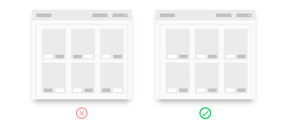
How is it better to display fields in the form of a long list? Or maybe break the process into several steps? Or make three columns of fields, so that everything went on one screen?
The main problem is not the number of fields or pages, but how many fields are displayed on the screen at the same time. As with the buttons, this number should be kept to a minimum while maintaining context and ease of use.
Be limited to one column
The best practice is to always build input fields in one column. Then the user's view will be able to easily move upwards, noting each new section.
Is there a narrative?
Sometimes the information requested in the fields relates to the journey that the user is to take (for example, onboarding), it happens that it has serious consequences (for example, entering data on tax payments). In such cases, it's time to spread the field across multiple pages. This gives the user a visual break to take a short break, and you - the opportunity to explain in more detail what they are doing and why it is so great or so important.
Drop down menus
If there are no more than five options to choose from, please do not remove them in the drop-down list. I understand that it is so elegant and all that, but it is simply not worth the extra effort from the user. Attaching radio buttons to them is a much more convenient approach.
More details:
“ How to make a better shape ” from UX Collective
“ One or more pages in forms? »By Stackoverflow
Some elements on the page serve to orient the user and show his current location, while others should be designed as standard and simple as possible.
The most common example is the Accept and Cancel buttons and disputes about which of them should be set to the right and which one to the left. The general rule is as follows: the button for the action, which takes the user to the next stage of the process, should be green, located on the right and have a signature explaining why it is needed (“Accept”, “Continue”, “Order”).
The situation is complicated with the so-called destructive actions. For example, how should the buttons on the screen be marked for those who want to cancel the subscription - “Unsubscribe” and just “Cancel”? Such cases are discussed in the article “ Writing text for destructive actions ” from UX Collective.
The best moments in my work are when I am completely taken aback by the originality and creativity of the approaches to solving problems and I find myself forced to explain why some seemingly logical practices actually turn out to be a bad idea.
All the solutions that I propose here are not the only correct ones, in each case there are exceptions; consider everything written below not as a direct guide to action, but as a starting point for further discussion.
All on one screen
')
Of all the bad practices in UX, this is the most popular.
First, you have a modest application with a compact interface, then you add a couple more functions and you do not have time to look back - there are already solid buttons on the screen. There is nothing to be ashamed of, it all happened.
Arguments in favor of:
Less clicks
But immediately everything is clear, a good review
Users do not like to scroll
When I see such solutions, a folding Swiss knife comes to my mind immediately, with all the blades being pulled at once, although in reality only one corkscrew is used.
Too much
When the user has all the possibilities before his eyes, it may seem that it creates a good overview. However, the problem here is that our brain is capable of encompassing at best 9 options for action, and even if it’s clean, 95% of these buttons will be needed by the user only occasionally.
Proximity
Another problem is that the buttons should be located as close as possible to the information with which they interact. The more of them, the more this visual intimacy is lost.
Users are ready to scroll
The opinion that no one likes to flip through usually arises as a side effect in a situation where the necessary context is not provided at the right time and the developer tries to solve this problem by stuffing as much information as possible into one screen so that it becomes clearer.
“But our analytics show that only 10% of users reach the end of a one-page site,” seems to be convincing evidence that 90% of the audience absolutely does not want to scroll.
However, the problem here is not scrolling, the problem is in the amount of information. The fact that you move a large part of it to the top of the page does not mean that users will read and understand everything that is there - rather, that they will get tired faster and leave.
Miller's Law on the Laws of UX
Law of proximity on the Laws of UX
Drop down menus
So, you decided to clean the main screen and removed all the buttons in the drop-down menu.
Arguments in favor of:
More focal
No clutter, easier to find what you need
Secret in balance
Imagine that your interface is a physical space. If you hide a page in a closed cabinet, you will have to open the drawers until you find what you are looking for. A similar process occurs with the UX in the digital environment.
If the boxes are all laid out in a logical way and the cabinet is in a convenient place, it can work. On the other hand, if you keep everything for the garden in the barn (it seems to be reasonable), is it worth sending barbecue facilities there too? Or is it better to keep them in the kitchen? Or both there and there?
Here the crucial role is played by balance. The answer to the question of where the barbecue facilities should lie - in the kitchen or in the barn - is determined by how often you will use them.
If you have five buttons, it is possible that they should not be removed in the drop-down menu, but if there are six of them, this is another story.
Where I am?
If you consistently adhere to the chosen design system and brand style, in the eyes of users all pages will look the same. Soon they will feel that they have lost their way in this maze of pages and no longer remember whether they got here earlier or if it was some other screen with a similar set of states.
Arguments in favor of:
Persistence in a visual style
Design based on a systems approach
Effective use of space on the screen
Imagine: Friday, the end of the day, you have attention deficit disorder, you are distracted from viewing the tape in social networks to questions from colleagues, from questions from colleagues - to private messages and still trying to work. The last thing you think about is which link you just clicked and at which stage of the process you are.
Design all the pages in the calculation of just such a user.
- Each page should have a clear title or title.
- If the user moves farther than one step away from the main page, enter bread crumbs.
- If a process is carried out in several steps, show their entire sequence on the screen.
Long lines, small text
Another example of how developers are trying to squeeze the most out of the available space on the screen.
Arguments in favor of:
Users do not like to scroll
Effective use of space on the screen
The basic rule of web typography is no more than nine words per line. Once the line has been read, the eyes should immediately find the beginning of the next; if the string is too long, it will take effort.
“But so much space is wasted!” The original of this article is posted on the Medium site. Have you ever noticed how much space is “lost” in them? In fact, this “loss” is nothing more than an investment. If you are ready to give so much empty space under the text, then it means something important. And if not, then he is not needed at all.
Read more: " Typographical approach to the design of letters " from 1910
One popup in another
To save space, you add a pop-up window. When you click on one of its buttons, another window appears on the screen.
Arguments in favor of:
Better understand the context
But what happens if I ...
The problem is that the user in the mind collapses the model of the process, including its current position in it. What will happen if he clicks on the second window - he will transfer it to the first? Will he return to the main screen?
Therefore, you must either turn the first window into a full screen, or display an error message in the form of text embedded in it.
Card in the card
Cards are now in a trend and, accordingly, only a card in a card can be better than one card. Breathtakingly.
Arguments in favor of:
Cards are needed to create a visual hierarchy.
The visual hierarchy is a popular topic among UX specialists. It is about the arrangement of elements on the page, which clearly shows the user how important each of them is. Gradually, for this purpose, they developed a special physical representation - cards.
In their prototype, a deck of cards, all cards are the same size. They are placed in a certain order - on top, under, or next to others, to denote certain states or relations.
When you put one card into another, users lose their understanding of what can be done with them. They subconsciously begin to question the relationship between other elements of the interface, and all logic collapses.
The solution here is easy! Do not put the cards into each other, but place them side by side, close to each other or with a small overlap (like cards on the table in the casino).
Form fields and what to do with them
How is it better to display fields in the form of a long list? Or maybe break the process into several steps? Or make three columns of fields, so that everything went on one screen?
Arguments in favor of:
Users do not like to scroll
The main problem is not the number of fields or pages, but how many fields are displayed on the screen at the same time. As with the buttons, this number should be kept to a minimum while maintaining context and ease of use.
Be limited to one column
The best practice is to always build input fields in one column. Then the user's view will be able to easily move upwards, noting each new section.
Is there a narrative?
Sometimes the information requested in the fields relates to the journey that the user is to take (for example, onboarding), it happens that it has serious consequences (for example, entering data on tax payments). In such cases, it's time to spread the field across multiple pages. This gives the user a visual break to take a short break, and you - the opportunity to explain in more detail what they are doing and why it is so great or so important.
Drop down menus
If there are no more than five options to choose from, please do not remove them in the drop-down list. I understand that it is so elegant and all that, but it is simply not worth the extra effort from the user. Attaching radio buttons to them is a much more convenient approach.
More details:
“ How to make a better shape ” from UX Collective
“ One or more pages in forms? »By Stackoverflow
Why do you need this button?
Some elements on the page serve to orient the user and show his current location, while others should be designed as standard and simple as possible.
Arguments in favor of:
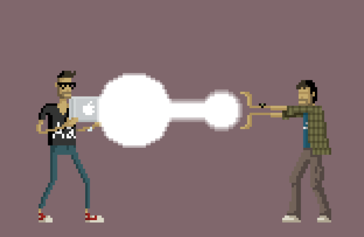
But so does Apple / Google!
The most common example is the Accept and Cancel buttons and disputes about which of them should be set to the right and which one to the left. The general rule is as follows: the button for the action, which takes the user to the next stage of the process, should be green, located on the right and have a signature explaining why it is needed (“Accept”, “Continue”, “Order”).
The situation is complicated with the so-called destructive actions. For example, how should the buttons on the screen be marked for those who want to cancel the subscription - “Unsubscribe” and just “Cancel”? Such cases are discussed in the article “ Writing text for destructive actions ” from UX Collective.
Source: https://habr.com/ru/post/355016/
All Articles