3 common design mistakes that are easy to fix

About the #logomachine_help Category
Hello! The VKontakte community has a rubric in which we give subscribers design tips. We show what can be changed in graphics to make the design look neater and clearer. Today, on the example of the participants in our column, consider what techniques can refresh your design.
PS: we show only the direction, many concepts need further elaboration.
')
1. Jam Music: remove unnecessary items
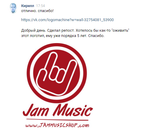
Project Description and Original Logo
Sometimes the path to improvement lies on the surface: just get rid of unnecessary elements in the logo, so that it becomes cleaner and easier to use.

Before after
We got rid of a lot of strokes, removed the site address, and also simplified the image of a hand in a sign.

Deciphering the concept
More air appeared in the logo , now the sign can “live” separately from the name, and a horizontal version also appeared.

Vertical and horizontal versions, as well as color solutions

Brand Media

Corporate Sticker
Total
Without the extra "weighting" elements, the sign was transformed graphically and became easier to use.
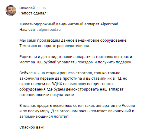
2. Alpenroad: simplify the details
Project Description

Original logo
The original logo was heavily overloaded with details: it was difficult to use, especially in a small size. In addition, all its elements were in different styles and were not combined with each other and with a font style, and the graphics were frankly outdated.
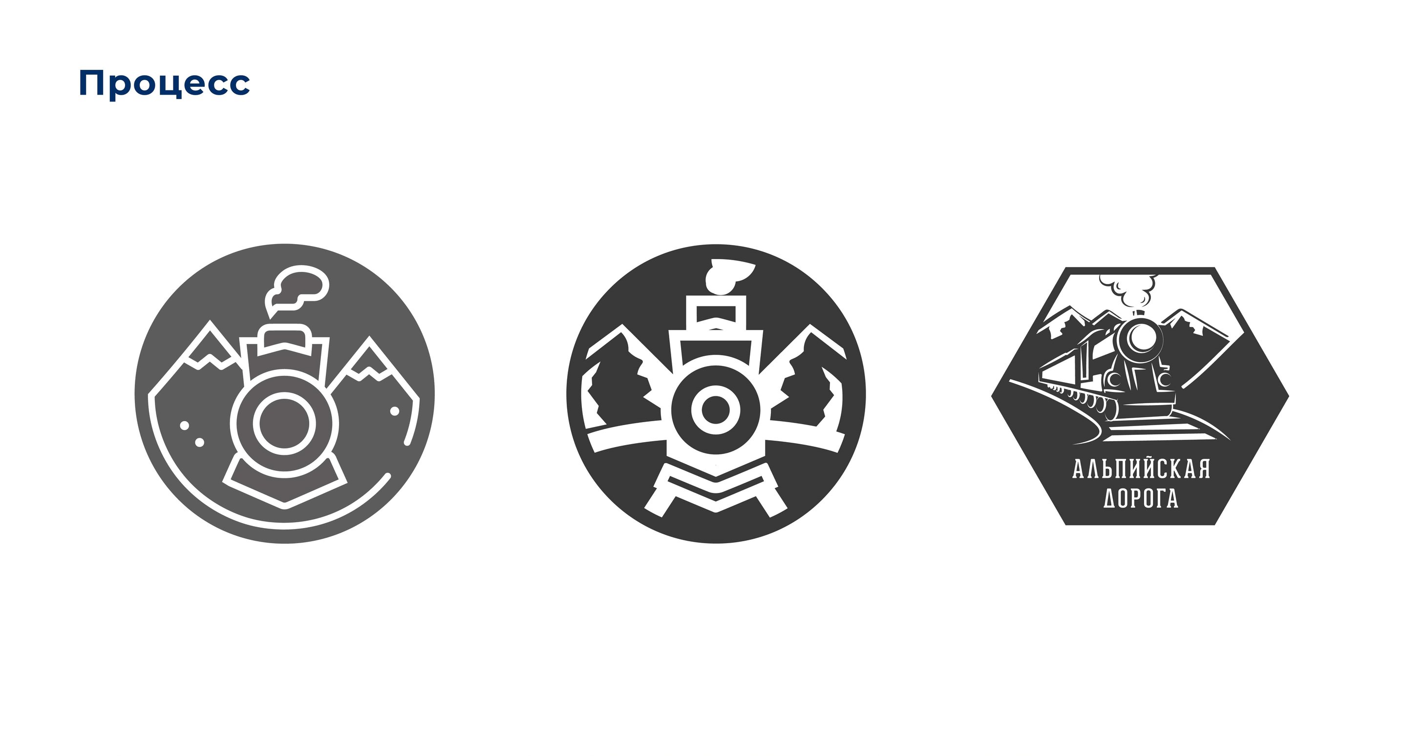
Development process
After going through the styles, we realized that we didn’t want to go into minimalism. It was important to leave the details, making the sign more readable.
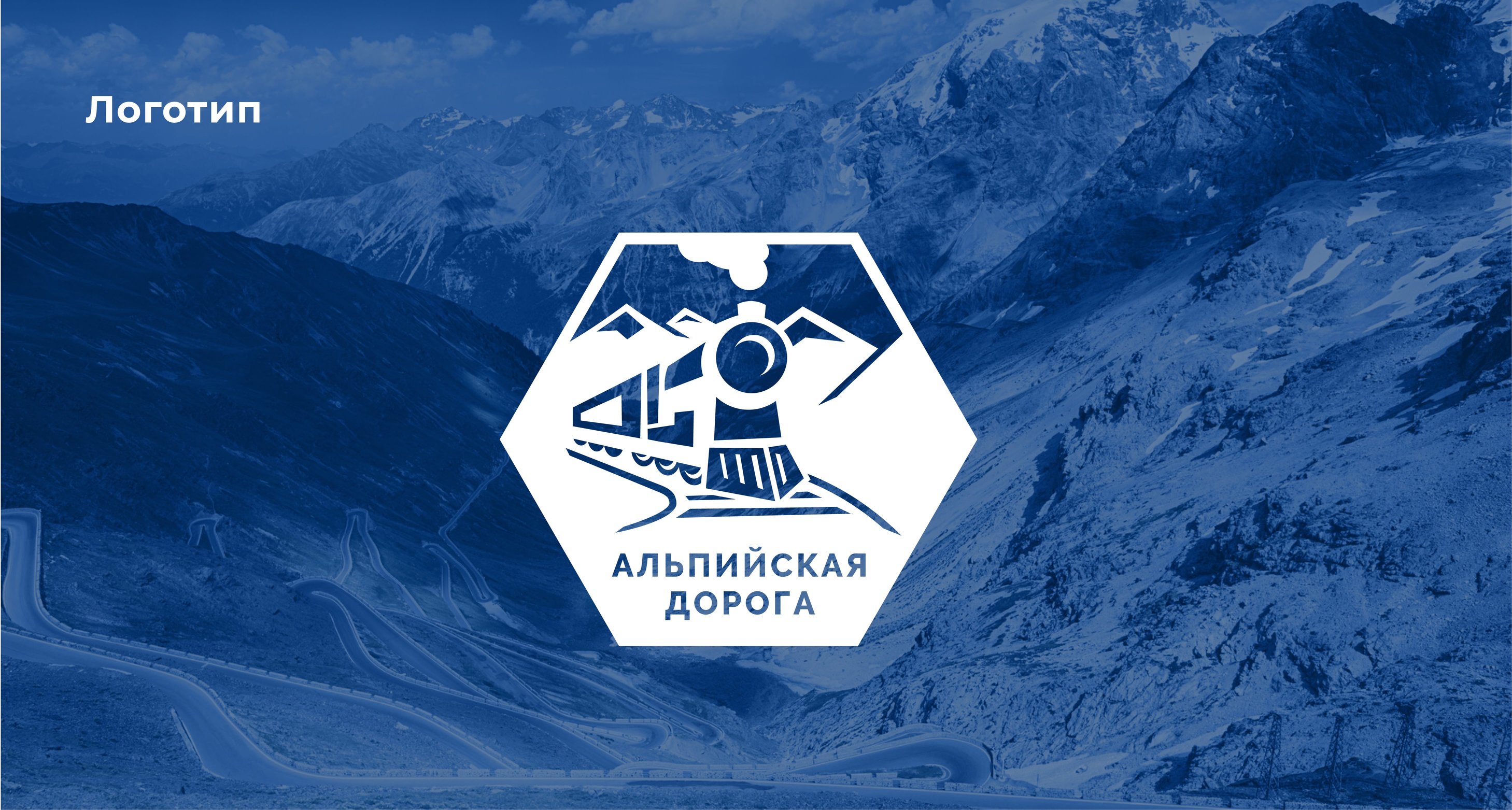
New logo
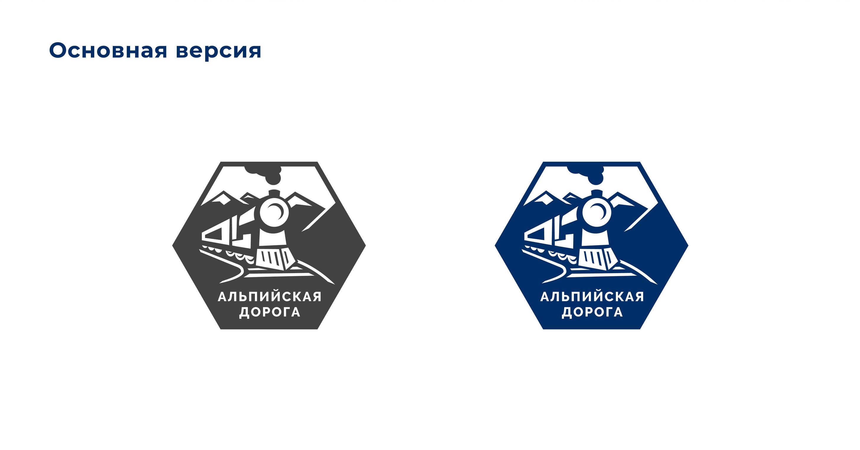
Black and white and color versions.
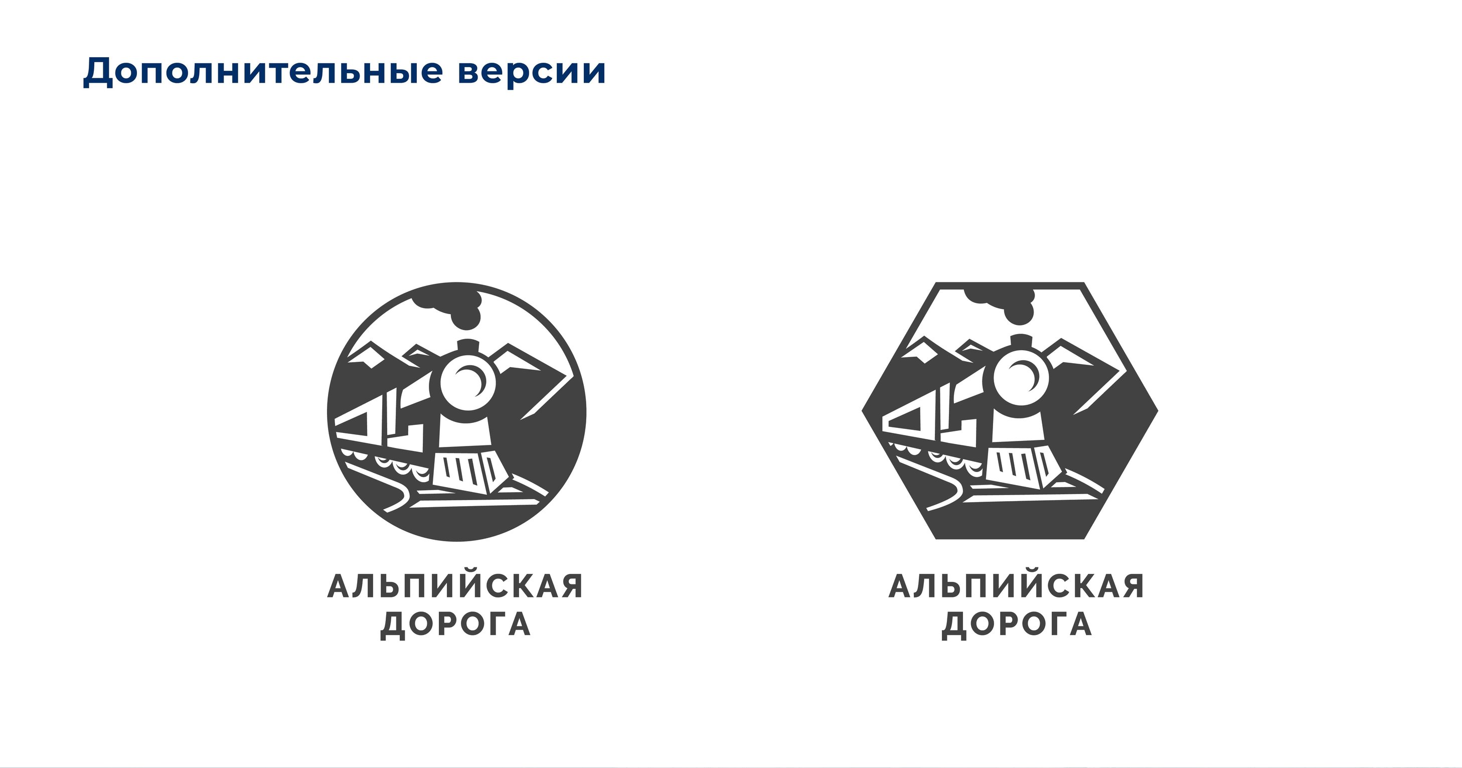
Additional logo versions
The silhouettes of the train and the mountains have become more distinguishable in a small format, so even on the badges the logo looks good.

Car branding

Variants of badges and signs
Total
Sometimes you can only simplify and clean the details of the logo to make it more readable.
3. Ilim Telecom: we get rid of the effects

Project Description and Original Logo
The original logo suffered greatly from being overloaded with effects: a dirty gradient, odd texture in the sign, small details. We fix:
Before after

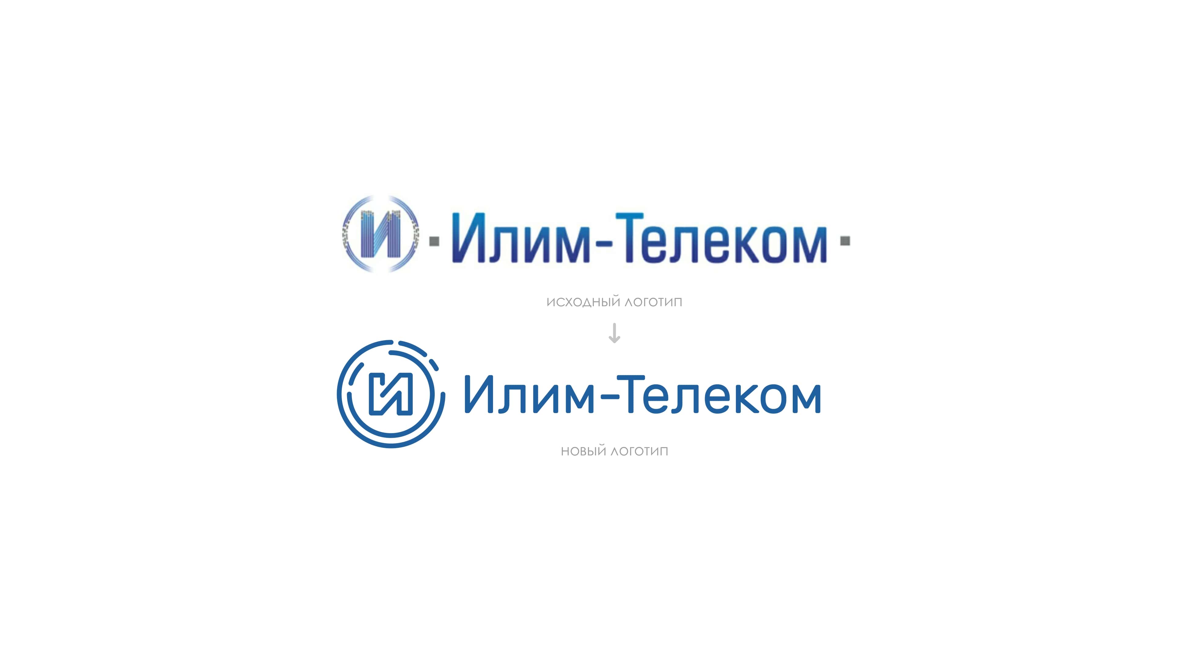
New logo
We did not move away from the original composition and structure of the logo in order to maintain continuity.

Sample brand media
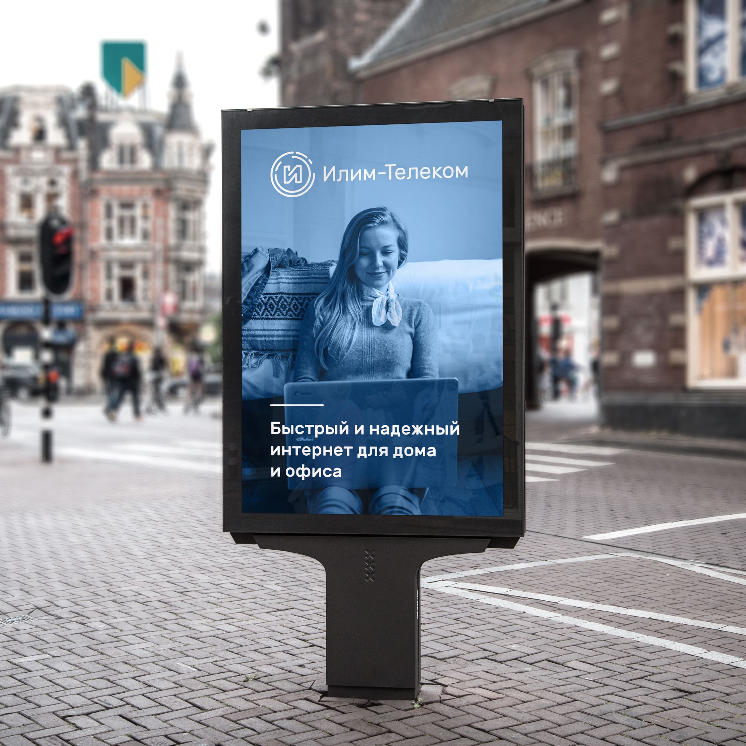
Sample poster
Total
To refresh the logo - get rid of unnecessary effects that load it.
That's all!
If you want to become a member of the #logomachine_help category, leave a description of your project and current logo in the comments. We will select interesting projects and help them with the logo as in this issue.
The article was prepared by Danya from Logmachines.
Source: https://habr.com/ru/post/354622/
All Articles