Optimum screen space utilization with WPF Data Triggers and Stack
This article will discuss how to use WPF Data Triggers in the Stack monitor partitioning scheme in order to fully automatically give the application all of the desktop space when no other applications are running. Stack is a tile window manager for Windows that uses WPF XAML as its screen layout language.
The screen partitioning scheme for large monitors (see under the cut) that comes out of the box splits the desktop into 2 main zones - the central (I usually use it for browsers and IDE) and the side (RSS Reader, messengers and terminal windows get there). This scheme is fixed. Those. if you have only a browser open, the Stack will leave empty space to the left of it. In this article, I will show you how to use WPF Data Triggers and Data Binding to jump around this area automatically when it is empty.
Here is the partitioning scheme before working on it:

')
Here you can get the source code of the latest version.
First you have to create a copy with a different name, because there is a mark in the original
Actually, you will basically have to work with the outermost Grid, since it defines the left column and everything else.
As you can see, the columns are fixed in size as 1: 3. We do not need this, and we will try to compress the left column if there is nothing in it.
Fortunately, we already have tabs in the left column, which should show all the windows in it. And that means we can use their Items. Count as a source for a DataTrigger.
To do this, you will have to give them a name (they are defined at the beginning of the diagram inside the first column):
This is where the DataTrigger magic comes into play. We take the definition of the first column (see above) and change the fixed Width to the style with DataTrigger:
Note that 1 * is used as the default value, and the trigger turns on with 0 items. It would be more logical to specify a trigger with> 0 elements, but WPF XAML does not know how.
So, save, select the new scheme in Stack and see ... that we can no longer put anything on the left side, since it collapses at launch due to the fact that there is nothing in it (we wrote it ourselves), and therefore it is impossible to hover the mouse there. Win + arrow, by the way, is already working, so if you do not use the mouse, you can skip the next part.

If you used to make custom schemes for Stack, you already know that the zone where you can put a window does not have to coincide with the zone where this window will be. Therefore, we will do it very simply - we will add a zone on the left, which will be visible even when the column is collapsed. This can be done if we put the left column of the Canvas in the Grid - the Canvas does not trim elements that do not fit into it.
This Canvas will replace Border, which was used in the original layout to stretch elements to the entire left column. Here is what it will look like:
Since Canvas is generally designed for drawing, there is no easy way to stretch elements across its entire width. Therefore, the size of the elements in it are screwed to the size of the Canvas itself through data-binding:
Also, they all have MinWidth set so that when the column along with the Canvas are collapsed, the elements would still have a non-zero width.
In general, it already looks right, but if you save now and try to move something to the left with the mouse, you will fail. Because of the order of the elements in the XAML file, the main zone is above our DropOverlay in a z-order, turning it into a useless “DropUnderlay” :)
To fix this is very simple - swap the Grids that describe the columns. It was:
It became:
Now the left column will be higher in the z-order than the central part, and DropOverlay will be able to accept the mouse.
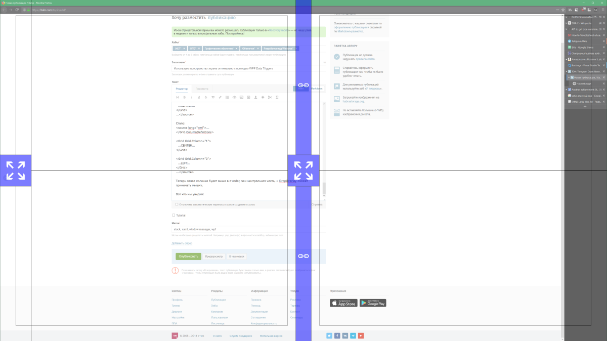
Here is what we will see:

The full code of the partitioning scheme is here: pastebin
With this scheme, the screen breakdown is much more convenient than with a fixed one. However, additional improvements would not hurt. For example, it is not convenient that when you drag the first window with the mouse to the left, it does not show where exactly it will move, since the corresponding zone is collapsed. This problem can be solved with the help of a MouseOver trigger, which would expand the entire left column when you hover the mouse.
In general, I have not tried it yet, but it would be possible to use data obtained from external sources in triggers and markup elements. It would have turned out to be something like custom desktop widgets, for example, with course quotes. The only problem is that WPF cannot update data from a source by timer.
In general, it is very cool that you can use XAML to customize the desktop in Windows. Opens many opportunities.
The screen partitioning scheme for large monitors (see under the cut) that comes out of the box splits the desktop into 2 main zones - the central (I usually use it for browsers and IDE) and the side (RSS Reader, messengers and terminal windows get there). This scheme is fixed. Those. if you have only a browser open, the Stack will leave empty space to the left of it. In this article, I will show you how to use WPF Data Triggers and Data Binding to jump around this area automatically when it is empty.
Where do we start?
Here is the partitioning scheme before working on it:

')
Here you can get the source code of the latest version.
First you have to create a copy with a different name, because there is a mark in the original
This file is overwritten after every update. Please, modify a copy!I called my scheme Large Horizontal Left Autocollapse.
Actually, you will basically have to work with the outermost Grid, since it defines the left column and everything else.
<ColumnDefinition Width="1*"/> <ColumnDefinition Width="3*"/> As you can see, the columns are fixed in size as 1: 3. We do not need this, and we will try to compress the left column if there is nothing in it.
Data trigger
Fortunately, we already have tabs in the left column, which should show all the windows in it. And that means we can use their Items. Count as a source for a DataTrigger.
To do this, you will have to give them a name (they are defined at the beginning of the diagram inside the first column):
<zones:WindowTabs>... -> <zones:WindowTabs x:Name="SideTabs"> <zones:WindowTabs.ItemsSource> <CompositeCollection> <zones:ZoneElement Content="{Binding ViewModel, Source={x:Reference SideStack}}"/> <CollectionContainer Collection="{Binding Windows, Source={x:Reference SideSingle}}"/> </CompositeCollection> </zones:WindowTabs.ItemsSource> </zones:WindowTabs> This is where the DataTrigger magic comes into play. We take the definition of the first column (see above) and change the fixed Width to the style with DataTrigger:
<ColumnDefinition> <ColumnDefinition.Style> <Style> <Setter Property="ColumnDefinition.Width" Value="1*"/> <Style.Triggers> <DataTrigger Binding="{Binding Items.Count, ElementName=SideTabs}" Value="0"> <Setter Property="ColumnDefinition.Width" Value="0"/> </DataTrigger> </Style.Triggers> </Style> </ColumnDefinition.Style> </ColumnDefinition> Note that 1 * is used as the default value, and the trigger turns on with 0 items. It would be more logical to specify a trigger with> 0 elements, but WPF XAML does not know how.
So, save, select the new scheme in Stack and see ... that we can no longer put anything on the left side, since it collapses at launch due to the fact that there is nothing in it (we wrote it ourselves), and therefore it is impossible to hover the mouse there. Win + arrow, by the way, is already working, so if you do not use the mouse, you can skip the next part.

What to do with the mouse
If you used to make custom schemes for Stack, you already know that the zone where you can put a window does not have to coincide with the zone where this window will be. Therefore, we will do it very simply - we will add a zone on the left, which will be visible even when the column is collapsed. This can be done if we put the left column of the Canvas in the Grid - the Canvas does not trim elements that do not fit into it.
This Canvas will replace Border, which was used in the original layout to stretch elements to the entire left column. Here is what it will look like:
<!-- Canvas is visible even though its container is collapsed --> <Canvas x:Name="DropOverlay" HorizontalAlignment="Stretch" VerticalAlignment="Stretch" zones:Layout.IsHint="True"> <zones:Zone Target="{Binding ElementName=SideStack}" MinWidth="160" Width="{Binding ActualWidth, ElementName=DropOverlay}" Height="{Binding ActualHeight, ElementName=DropOverlay}"/> <Grid MinWidth="160" Width="{Binding ActualWidth, ElementName=DropOverlay}" Height="{Binding ActualHeight, ElementName=DropOverlay}" HorizontalAlignment="Stretch"> <Border Height="160" Width="160" Background="#44F"> <TextBlock HorizontalAlignment="Center" VerticalAlignment="Center" FontFamily="Segoe UI Symbol" Foreground="White" Text="" FontSize="80"/> </Border> <zones:Zone HorizontalAlignment="Center" VerticalAlignment="Center" Height="160" Width="160" Target="{Binding ElementName=SideSingle}"/> </Grid> </Canvas> Since Canvas is generally designed for drawing, there is no easy way to stretch elements across its entire width. Therefore, the size of the elements in it are screwed to the size of the Canvas itself through data-binding:
Width="{Binding ActualWidth, ElementName=DropOverlay}" Also, they all have MinWidth set so that when the column along with the Canvas are collapsed, the elements would still have a non-zero width.
In general, it already looks right, but if you save now and try to move something to the left with the mouse, you will fail. Because of the order of the elements in the XAML file, the main zone is above our DropOverlay in a z-order, turning it into a useless “DropUnderlay” :)
To fix this is very simple - swap the Grids that describe the columns. It was:
... </Grid.ColumnDefinitions> <Grid> ...LEFT... </Grid> <Grid Grid.Column="1"> ...CENTER... </Grid> ... It became:
... </Grid.ColumnDefinitions> <Grid Grid.Column="1"> ...CENTER... </Grid> <Grid Grid.Column="0"> ...LEFT... </Grid> ... Now the left column will be higher in the z-order than the central part, and DropOverlay will be able to accept the mouse.
Here is what we will see:

The full code of the partitioning scheme is here: pastebin
Afterword
With this scheme, the screen breakdown is much more convenient than with a fixed one. However, additional improvements would not hurt. For example, it is not convenient that when you drag the first window with the mouse to the left, it does not show where exactly it will move, since the corresponding zone is collapsed. This problem can be solved with the help of a MouseOver trigger, which would expand the entire left column when you hover the mouse.
In general, I have not tried it yet, but it would be possible to use data obtained from external sources in triggers and markup elements. It would have turned out to be something like custom desktop widgets, for example, with course quotes. The only problem is that WPF cannot update data from a source by timer.
In general, it is very cool that you can use XAML to customize the desktop in Windows. Opens many opportunities.
Source: https://habr.com/ru/post/354572/
All Articles